
In the previous chapter, we built our website's basic skeleton. Using Bootstrap's grid system, we structured our website into five distinct sections. We then styled these sections and learned how to use Bootstrap's navbar and tab system to make these sections navigable. In this chapter, we will continue adding to the knowledge obtained in Chapter 3, Building the Layout by leveraging even more Bootstrap components, adding more content and streamlining our website's design. We will begin by improving our navbar. We will first learn how to fix our navbar's position. We will then use a Bootstrap plugin (Scrollspy) to automatically update the navbar tab item appearance based on the user's navigation. Next, we will customize the website's scrolling behavior, making the transition between sections smoother.
Once we have improved our website's navigation, we will focus on improving and customizing our website's overall look and feel. That is, we will learn how to apply and customize alerts, and how to use buttons and brand images. We will also discover how to style different text elements, use media objects, and apply citations and figures.
As we progress through this chapter, we will be examining each of the aforementioned components individually. This way, we will have the chance to see how they are actually composed under the hood.
To summarize, in this chapter we shall do the following:
- Learn how to fixate our navbar
- Use the Bootstrap plugin Scrollspy to improve our website's navigation
- Use icons to customize and improve the overall design of our website
- Introduce Bootstrap alerts and customize them
- Style our website's footer
- Apply buttons to improve our website's overall usability
Our website already looks pretty decent. We have a navigation bar in place, a footer placeholder, and various sections populated with some sample content. But we are not quite there yet. The website's overall user experience is still a bit edgy, and does not yet feel very refined. Take user navigation, for instance. While clicking on a navbar link, indeed does take the user to the correct section, the navbar disappears once we navigate across the sections. This means that the navbar loses its purpose. It no longer facilitates easy navigation across the different sections of our website. Instead, the user will need to scroll to the top of the page every time they wish to use the navbar. To make the navbar persistent, append navbar-fixed-top to the class attribute of our nav element:
    <nav
class="navbar navbar-myphoto navbar-fixed-top">
    ...
    </nav>
Save, refresh, and scroll. Voila! Our navbar now remains fixed at the top of our page. The navbar-fixed-top works as follows:
- The element's position is set to
fixed. This positions the element relative to the browser window (not relative to other elements), meaning that the element will remain in the same place, regardless of the positioning of other elements on the page. - The element's
topis set to 0. This means that the distance between the navbar and the top of the browser window is 0.
In addition to some minor margin and padding changes,
navbar
-
fixed
-
top
also changes the element's
z
-
index
to 1,030, therefore ensuring that the element will appear above all other elements on the page (that is, all elements that have a
z
-
index
of less than 1,030).
Should you desire to fixate the navbar at the bottom of the page, you can use the
navbar-fixed-bottom
class. This class behaves in exactly the same way as the
navbar-fixed-top
class, except that, instead of setting the element's top to 0, it sets the
bottom
property to 0, thereby ensuring that the element resides at the bottom of the page.
If we wanted to quickly change the color of the navbar without wanting to write a whole bunch of custom rules, then we could apply the
navbar-*
and
bg-*
classes:
navbar-dark: This is used to indicate that the navbar's foreground color should be adjusted to match a dark background. As such, the rule will apply a white foreground color to all navbar items.navbar-light: This is the opposite of the aforementionednavbar-dark, and applies a dark foreground color in order to support a light background.bg-*: This will set the background color to that of the desired context class (we will cover the various context classes later on in this chapter). For example,bg-primary,bg-success, andbg-info.bg-inversemimics an inverted background, setting the background color to#373a3c.
Take a look at the following screenshot:
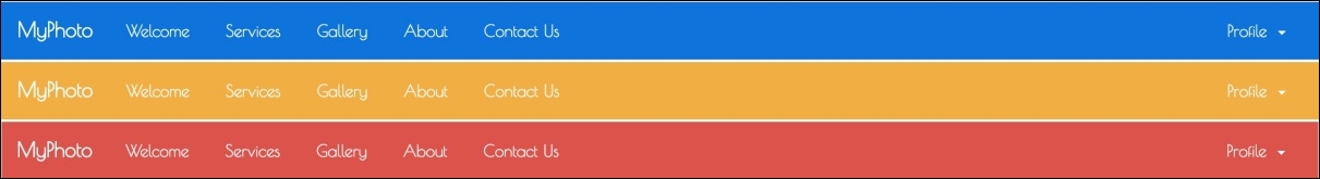
Figure 4.1: The MyPhoto navbar with three different context styles: pg-primary, bg-warning, and bg-danger.