In the previous chapter, we showed you a first glimpse of MyPhoto, the Bootstrap website that we are going to build up throughout the following chapters. Now it is time to get our hands dirty, and actually start building the first section of this website. A first pass at an element of the Services section that presents the list of print sizes available to order. We will achieve this by building a grid using Bootstrap's grid system, creating image elements within the grid system, applying image modifiers, and leveraging Bootstrap's utility classes to create visual indicators and optimized layouts specific to different display resolutions.
By the end of this chapter, through code examples and studying the Bootstrap source code, you will have gained a deep understanding of the following:
- Bootstrap's grid system
- Responsive images within Bootstrap
- Bootstrap's helper classes
- Bootstrap's responsive utilities
Bootstrap's grid system is arguably its most impressive and most commonly used feature. Therefore, mastering it is essential for any Bootstrap developer as the grid system removes many of the pain-points associated with page layouts, especially responsive page layouts. The grid system solves issues such as the horizontal and vertical positioning of a page's contents and the structure of the page across multiple display widths.
As already noted in Chapter 1, Revving up Bootstrap, Bootstrap 4 is mobile-first. As such, it should come as no surprise that the grid system is optimized for smaller viewports and scales up to suit larger viewports, as opposed to scaling down to smaller viewports.
Note
What is a viewport?
A viewport is the available display size to render the contents of a page. For example, the size of your browser window, minus the toolbars, scrollbars, and so on, on your display is your viewport. As already noted in
Chapter 1
, Revving Up Bootstrap, mobile devices may indicate their viewport to be larger than it actually is, in order to allow for the display of websites that have not been optimized for display on mobile devices. As a consequence, websites that take mobile viewports into consideration, may often not render as intended. As a remedy, the viewport meta tag was introduced by Apple on iOS, and has since been uniformly adopted by all other major browsers. The viewport meta tag allows you to define the viewport's display size.
The grid is a structure that consists of three distinct, but fundamentally linked, parts: an all encapsulating container, split into horizontal rows which are themselves split into 12 equal columns. We will take an in depth look into the three building blocks of Bootstrap's grid system:
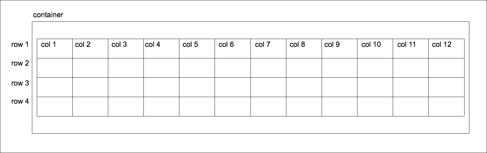
Figure 2.1: The Bootstrap grid structure: a container (outermost box) containing a table-like structure consisting of rows and 12 columns. It is important to note that rows must be contained inside the container. Likewise, columns can only exist within the context of rows. While grids can be used to construct tables, they are not tables in themselves. Unlike tables, independent rows may consist of a different number of columns. So, for example, row 1 may consist of 12 columns, while row 2 may contain only three columns.
Note
Flexbox support
Flexbox is a CSS box model which allows for simple implementation of complex layouts, as opposed to the CSS2 layout modules such as block, inline, table, and positioned. Flexbox is designed to allow a layout to make the most use out of the available space, through a set of simple rules. Bootstrap 4 allows the developer to configure the framework to use flexbox for certain components, by changing one variable in _variables.scss-$enable-flex. Set $enable-flex to true, recompile Bootstrap and a number of Bootstrap components will have their display property set to flex. This includes the grid system itself, input groups, and the media component. You can find out more about flexbox at
https://www.w3.org/TR/css-flexbox-1/.
Containers are at the core of Bootstrap's grid system, and practically the parent of all Bootstrap pages. A container is exactly what it sounds like. It encapsulates all other content within a section of a page, providing the base for how the section is rendered. You can think of a container as representing a canvas in a browser window for your content to be displayed on a canvas that can transform based on its environment. Unless explicitly specified, your content will never creep outside of this canvas, regardless of the viewport. A container can apply to the entire contents of a page, where you would have one root container element, or to different sections of a page, where you would have numerous container elements on the page.
There are two types of container classes provided by Bootstrap: container and container-fluid.
The container class renders the contents of the page to a fixed width. This width is typically based upon the width of the viewport, leveraging CSS media queries to determine which width is most suitable.
Note
What are media queries?
Media queries are expressions, which resolve to a Boolean value. They are used to trigger @media rules that define styles for different media types. See
https://developer.mozilla.org/en-US/docs/Web/Guide/CSS/Media_queries
for further information.
The grid system has five core breakpoints it references, which are defined in _variables.scss. These are, extra-small (xs), small (sm), medium (md), large (lg) and extra-large (xl).
Note
What are Breakpoints?
Breakpoints in relation to web development layouts are predefined vertical and horizontal dimensions at which the style rules change. As these rules break, they trigger another set of rules optimized for those dimensions. These rules are triggered by media queries, querying the dimensions of the viewport. For example, @media (min-width: 768px) will trigger a set of rules when the viewport is more than 768px wide.
Let's take a look at _variables.scss:
    $grid-breakpoints: (
        // Extra small screen / phone
        xs: 0,
        // Small screen / phone
        sm: 544px,
        // Medium screen / tablet
        md: 768px,
        // Large screen / desktop
        lg: 992px,
        // Extra large screen / wide desktop
        xl: 1200px
        ) !default;
Here, Bootstrap is defining the five breakpoints' minimum and maximum width variables, and the associated display types. Bootstrap will reference these variables throughout all its Sass code as the breakpoints can now be accessed as properties of $grid-breakpoints. We can also see the variables for the various container sizes, associated with the appropriate breakpoints. Look at the following code:
    // Grid containers
    //
    // Define the maximum width of `.container` for different screen sizes.
    $container-max-widths: (
        sm: 576px,
        md: 720px,
        lg: 940px,
        xl: 1140px
    ) !default;
    // Grid columns
    //
    // Set the number of columns and specify the width of the gutters.
    $grid-columns: 12 !default;
    $grid-gutter-width:    1.875rem !default; // 30px
For example, container-tablet is set to 750 px: 720px plus the value of grid-gutter-width, which is 30px. As you can see from the comments in the code, container-** is associated directly with screen-**. Then, these sizes are leveraged via media queries in _grid.scss to set the desired width of the container. Let's take a look inside _grid.scss at the .container class:
    .container {
        @include make-container();
        @include make-container-max-widths();
    }
Let's break this down.
The make-container() and make-container-max-widths()
are mixins with rules to center the container within the viewport and set
max-width
rules, respectively.
You will also find make-container and make-container-max-widths within _grid.scss. The make-container mixin centralizes the alignment of the container using margin and padding rules. Have a look at the following code:
    @mixin make-container($gutter: $grid-gutter-width) {
        margin-left: auto;
        margin-right: auto;
        padding-left: ($gutter / 2);
        padding-right: ($gutter / 2);
        @if not $enable-flex {
        @include clearfix();
        }
    }
The make-container-max-widths mixin is more complex. The mixin loops through the global $breakpoint variable, synonymous with $grid-breakpoints, and sets a max-width rule for each breakpoint, using media queries. Take a look at the following code:
    // For each breakpoint, define the maximum width of the
    container in a media query
    @mixin make-container-max-widths($max-widths: $container-max-widths) {
        @each $breakpoint, $container-max-width in $max-widths {
            @include media-breakpoint-up($breakpoint) {
                max-width: $container-max-width;
            }
        }
    }
The completed code then looks like the following:
    @media (min-width: 544px) {
        .container {
            max-width: 576px;
                   }
        }
    @media (min-width: 768px) {
        .container {
            max-width: 720px;
                    }
    }
    @media (min-width: 992px) {
        .container {
            max-width: 940px;
                    }
    }
    @media (min-width: 1200px) {
        .container {
            max-width: 1140px;
                    }
    }
There are four media queries, defining the horizontal breakpoint to trigger a width style rule. For example, @media (min-width: 768px) instructs the browser to only set the width property to the max-width of the container to 720px for viewports wider than or equal to 768px. This property is then superseded by the @media (min-width: 992px) rule when the viewport is wider than or equal to 992px.
In the vast majority of cases, the width of the contents of the page is fixed to the width of the container. There are cases where the width of the container is ignored. One such case is Bootstrap's navbar class, in which the navbar element is allowed to fill the entire horizontal width of the viewport. We will come across this scenario in a later chapter.
Now that we have seen how the container is constructed and the theory behind the container, let us see it in practice. A container is generally a div with a container class in the body of the markup, wrapping around the page's main content. For example:
    <body>
        <div class="container">
            <h1>Help, I'm trapped in a container!</h1>
        </div>
        <div>
            <h1>I'm free!</h1>
        </div>
    </body>
Take a look at the following screenshot:
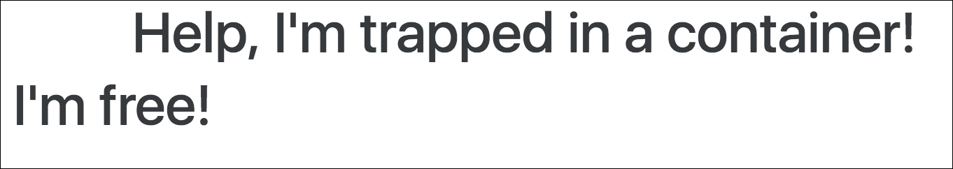
Figure 2.2: Using the container class
The other type of container, container-fluid, differs from container in two distinct ways:
- It takes up the full-width of the viewport, except for 15 pixels padding left and right
- It doesn't concern itself with breakpoints
The container-fluid allows the page to be fully responsive to all widths, providing smoother transitions. When responding to breakpoints, container snaps the layout to the appropriate width, while container-fluid progressively alters the layout.
The only difference in the markup is that instead of the container class being applied to the container div, the container-fluid class is applied. Look at the following code snippet:
    <body>
        <div class="container-fluid">
            <h1>Help, I'm trapped in a container!</h1>
        </div>
        <div>
            <h1>I'm free!</h1>
        </div>
    </body>
Take a look at the following screenshot:
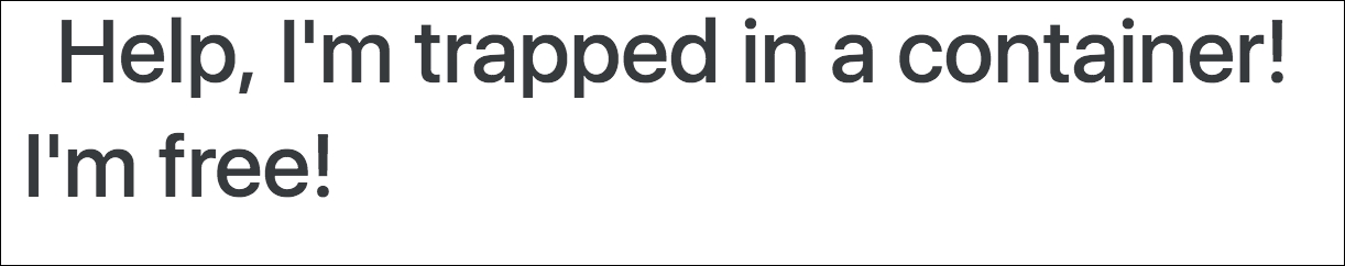
Figure 2.3: Using the container-fluid class
Note that the container element now sits 15 pixels from the edge of the browser. When we use container, the container already has a hard-coded width defined. This width is based on the viewport. For example, at a resolution of 1200 px wide, the container would be 1140 px wide. At a resolution of 1280 pixels, the container would remain at 1170 px wide, because the container only responds to certain breakpoints. When we use container-fluid, the container width is dynamic, because container-fluid responds to every horizontal change and bases the width solely on the padding values from the make-container mixin. container, on the other hand, responds only at specific widths. container-fluid is the approach to take when building a page which needs to work across all display sizes and forms, especially when building mobile-first applications.
The container ensures that our contents will always display within a defined area on the page. But what about positioning content within the container? This is where rows come into play.
Note
Box sizing
In CSS, every element is represented as a rectangle, or box. Each box has a number of properties associated with it to define how the element is rendered. This is the CSS Box Model. The box-sizing property of an element defines how the Box Model should calculate the width and height of elements.
The default value for box-sizing in the CSS box model is content-box. The content-box property only includes the content of an element when calculating the size of that element.
Bootstrap 4 defaults the value of box-sizing to border-box. The border-box property includes the padding and border, as well as the content of the element in the calculation of the height and width of the element. Note that the margin is not included in the calculation. The third possible value for box-sizing is padding-box. The padding-box property, as the name suggests, only uses the content and the padding in calculating the size of an element.
A row is used to define a selection of elements that should be dealt with as a horizontal group. As such, rows reside within a container element. The power of the row lies in being able to stack content vertically. Almost like containers within a container, or defining a section of the page. Creating a row is as simple as applying the row class to the desired element:
    <body>
        <div class="container">
            <h1>Help, I'm trapped in a container!</h1>
            <div class="row">
                <div>Section 1</div>
            </div>
            <div class="row">
                <div>Section 2</div>
            </div>
            <div class="row">
                <div>Section 3</div>
            </div>
        </div>
        <div>
            <h1>I'm free!</h1>
        </div>
    </body>
Take a look at the following screenshot:
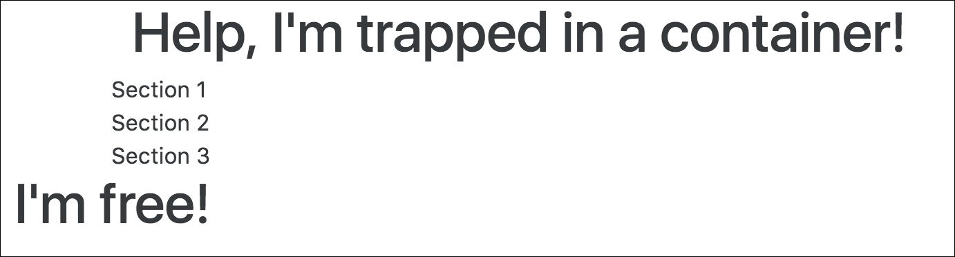
Figure 2.4: Using rows
The true power of rows only becomes apparent when they are used with columns.
Arguably, columns are the most important piece of the grid system. Rows exist within containers, and those rows are split up into 12 equal columns. Before we get into the nitty-gritty details, let's take a look at an example, by taking the first step into creating the print sizes section of MyPhoto. There will be 12 print sizes offered. Let's list those sizes horizontally:
    <div class="container">
        <h1>Our Print Sizes</h1>
        <div class="row">
            <div class="col-sm-1">6x5</div>
            <div class="col-sm-1">8x10</div>
            <div class="col-sm-1">11x17</div>
            <div class="col-sm-1">12x18</div>
            <div class="col-sm-1">16x20</div>
            <div class="col-sm-1">18x24</div>
            <div class="col-sm-1">19x27</div>
            <div class="col-sm-1">20x30</div>
            <div class="col-sm-1">22x28</div>
            <div class="col-sm-1">24x36</div>
            <div class="col-sm-1">27x39</div>
            <div class="col-sm-1">27x40</div>
        </div>
    </div>
As usual, we have our container. Within that container, we have a row, and within that row we have twelve individual elements with the col-sm-1. This produces a very neat list of evenly spaced elements in a single row on the page. Observe the following screenshot:

Figure 2.5: Using columns to display print sizes
Let's break down col-xs-1 and explain each part individually:
col: This means that we want this element to act as a column.sm: This is a reference to all viewports above or equal to544px. This class means we apply this rule for all viewports equal to or larger than544px.1: This means that the element takes up one column width of the row (1/12 of the row width).
Because col-sm-1 references viewports larger than 544px, smaller viewports (such as phones) revert to a stacked view. Take a look at the following screenshot:
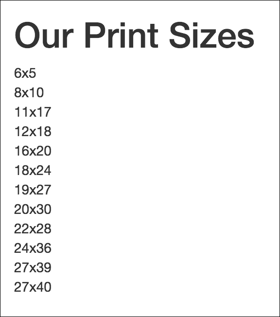
Figure 2.6: Viewports smaller than 544px revert to a stacked view when using col-sm-1
Columns are split up into five distinct breakpoints:
col-xs-: This is for viewports below544px(extra-small)col-sm-: This is for viewports of544pxor greater (small)col-md-: This is for viewports of768pxor greater (medium)col-lg-: This is for viewports of992pxor greater (large)col-xl-: This is for viewports of1200pxor greater (extra-large)
Note
The Bootstrap 3 column breakpoints
Bootstrap 3 did not have col-xl. Furthermore, its four distinct breakpoints were:
col-xs-: This was for viewports below768px(extra-small)col-sm-: This was for viewports of768pxor greater (small)col-md-: This was for viewports of992pxor greater (medium)col-lg-: This was for viewports of1200pxor greater (large)
These classes are then appended with the number of columns an element should cover. Let's split the print sizes into five separate categories, namely: Small, Medium, Large, and Extra Large. As we know, a row is split into 12 columns. We have four print size categories, so we divide the number of columns by the number of elements, and that is the number of columns we want the element to cover. So, we append the number 3 to the col-sm- classname:
    <div class="container">
        <h1>Our Print Sizes</h1>
        <div class="row">
            <div class="col-sm-3">Small</div>
            <div class="col-sm-3">Medium</div>
            <div class="col-sm-3">Large</div>
            <div class="col-sm-3">Extra Large</div>
        </div>
    </div>
Check out the following screenshot:
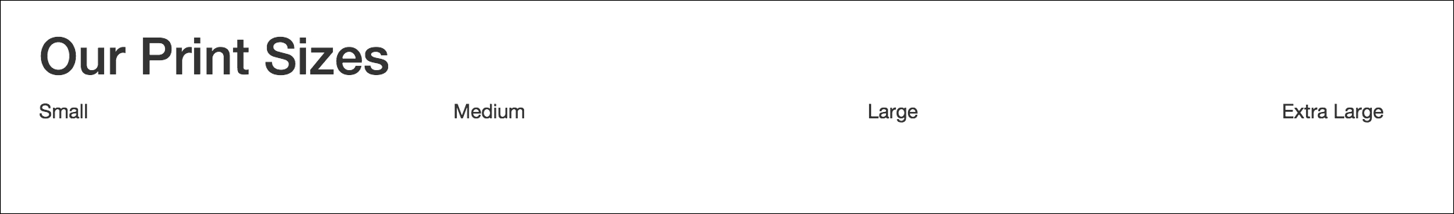
Figure 2.7: Print Categories split it into even columns across the grid system
But again, on an extra small viewport we are going to see the elements stacked. That is, the elements will appear one on top of the other. But what if we do not want this to happen? What if we would like the elements to take up a different number of columns as the viewport size changes? Well luckily Bootstrap allows you to define the column widths for all breakpoints, and it will decide which rule to apply. Let's try the following:
    <div class="container">
        <h1>Our Print Sizes</h1>
        <div class="row">
            <div class="col-xs-6 col-sm-3">Small</div>
            <div class="col-xs-6 col-sm-3">Medium</div>
            <div class="col-xs-6 col-sm-3">Large</div>
            <div class="col-xs-6 col-sm-3">Extra Large</div>
        </div>
    </div>
We have retained col-sm-3, but now we have included col-xs-6. This means that for viewports below 544px wide, we want each element to take up 6 columns. This will result in the first two elements displaying on one line, and the last two below that.
On a viewport of 544px or wider, the categories appear in one horizontal row (as previously suggested, this is a drastic change from Bootstrap 3; with the previous version of Bootstrap, using the code, categories would appear in a horizontal row for viewports of 768px or wider). Look at the following screenshot:
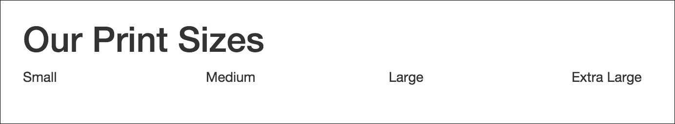
Figure 2.8: The print sizes at a resolution above 544px
On a viewport of less than 544px wide, the categories are split across two rows. Observe the following screenshot:
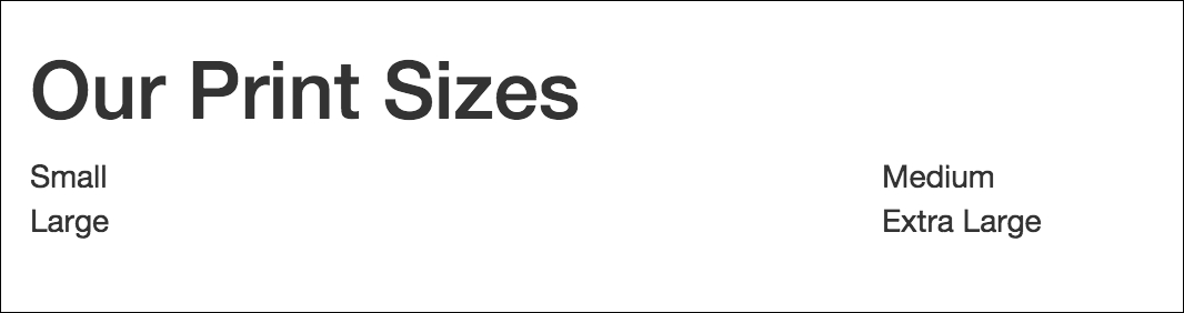
Figure 2.9: The print sizes at a resolution below 544px
Not only does the grid system split rows horizontally into columns, it also allows you to split the columns vertically, by supporting nested rows. These nested rows themselves are split into 12 columns within the space provided by the parent column. There is nothing special needed in terms of mark up to achieve row inception. All that is needed to achieve this is to nest the elements appropriately and apply the row and column classes.
Let's organize our print sizes into the relevant categories. We want 12 size options, split equally into the four size categories. Each category will contain one row element with each print size taking up one column in the grid. Let's try the following:
    <div class="container">
        <h1>Our Print Sizes</h1>
        <div class="row">
            <div class="col-xs-6 col-sm-3">
                <h5>Small</h5>
                <div class="row">
                    <div class="col-sm-4">6x5</div>
                    <div class="col-sm-4">8x10</div>
                    <div class="col-sm-4">11x17</div>
                </div>
            </div>
            <div class="col-xs-6 col-sm-3">
                <h5>Medium</h5>
                <div class="row">
                    <div class="col-sm-4">12x18</div>
                    <div class="col-sm-4">16x20</div>
                    <div class="col-sm-4">18x24</div>
                </div>
            </div>
            <div class="col-xs-6 col-sm-3">
                <h5>Large</h5>
                <div class="row">
                    <div class="col-sm-4">19x27</div>
                    <div class="col-sm-4">20x30</div>
                    <div class="col-sm-4">22x28</div>
                </div>
            </div>
            <div class="col-xs-6 col-sm-3">
                <h5>Extra Large</h5>
                <div class="row">
                    <div class="col-sm-4">24x36</div>
                    <div class="col-sm-4">27x39</div>
                    <div class="col-sm-4">27x40</div>
                </div>
            </div>
        </div>
    </div>
Check out the following screenshot:
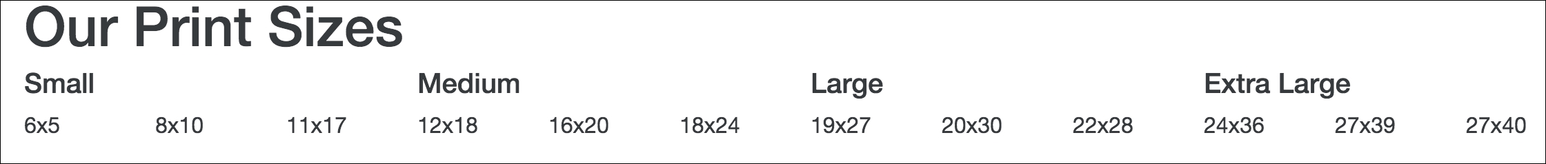
Figure 2.10: The print sizes using nesting
Within our category columns, we have nested a row. We split each row into three equal columns for viewports larger than or equal to 544px wide, using col-sm-4, to display the print sizes. Simple as that. Typically, it is good practice to ensure that the sum total of columns defined within the nested rows doesn't exceed the 12 columns allocated, as Bootstrap applies widths based on the assumption of 12 columns. Exceeding the 12 columns may result in unequal or unexpected column widths. However, on some occasions you may want to force a column onto another line at certain resolutions. For example, text content of columns may slightly overlap at certain resolutions.
In that case, we would like to force certain columns onto another line at a small resolution. To do this, we add col-md-* classes, and give the columns requiring a new line at 544px the class col-sm-12. Let's force the third size in the Large category onto its own line and force all Extra Large sizes onto separate lines. Let's try the following:
    <div class="col-xs-6 col-sm-3">
        <h5>Large</h5>
        <div class="row">
            <div class="col-sm-4">19x27</div>
            <div class="col-sm-4">20x30</div>
            <div class="col-sm-12 col-md-4">22x28</div>
        </div>
    </div>
    <div class="col-xs-6 col-sm-3">
        <h5>Extra Large</h5>
        <div class="row">
            <div class="col-sm-12 col-md-4">24x36</div>
            <div class="col-sm-12 col-md-4">27x39</div>
            <div class="col-sm-12 col-md-4">27x40</div>
        </div>
    </div>
Observe the following screenshot:
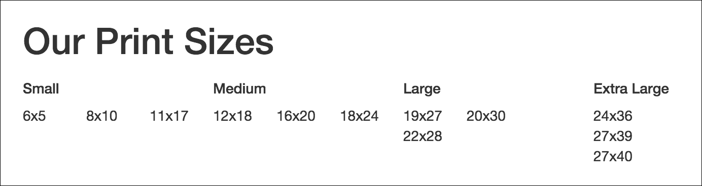
Figure 2.11: The print sizes with the "Extra Large" category forced onto a separate line for viewports below 544px
Nice and neat. If you have been paying attention, then you will have noticed that we do not actually need to define the resolutions below Medium if we want the elements to have separate lines, as this is the default behavior. We would only need to define it if we wanted a resolution below that (such as xs) to have a different behavior. So, this does the trick:
    <div class="col-xs-6 col-sm-3">
        <h5>Large</h5>
        <div class="row">
            <div class="col-sm-4">19x27</div>
            <div class="col-sm-4">20x30</div>
            <div class="col-md-4">22x28</div>
        </div>
    </div>
    <div class="col-xs-6 col-sm-3">
        <h5>Extra Large</h5>
        <div class="row">
            <div class="col-md-4">24x36</div>
            <div class="col-md-4">27x39</div>
            <div class="col-md-4">27x40</div>
        </div>
    </div>
Note
Columns and flexbox
If the grid system has flexbox enabled, by setting $enable-flex to true as described previously, it is possible to have Bootstrap automatically set the column sizes to equal width. To do this simply use col-*, where * is the breakpoint. An example would be col-xs. Given two sibling elements in a row, both with the class col-xs, then both of those columns will automatically be given the same width.
The grid system also lets you order your columns independently of how they are ordered in the markup. Bootstrap 4 achieves this through the pull-*-* and push-*-* classes. These classes took the form of col-*-pull-* and col-*-push-* in Bootstrap 3.
The pull-*-* and push-*-* classes allow for columns to be moved horizontally along their parent row. For instance, perhaps you wanted the Extra Large category to appear as the first category in certain resolutions. You would simply dynamically apply the appropriate push and pull classes to the appropriate columns. In this case, apply push-sm-9 to the Extra Large column, as you are pushing the column 9 columns left, and pull-sm-3 to the rest, as you are pulling those three columns to the right. Take a look at the following code snippet:
    <div class="container">
        <h1>Our Print Sizes</h1>
        <div class="row">
            <div class="col-xs-6 col-sm-3 push-sm-3">
                <h5>Small</h5>
                <div class="row">
                    <div class="col-sm-4">6x5</div>
                    <div class="col-sm-4">8x10</div>
                    <div class="col-sm-4">11x17</div>
                </div>
            </div>
            <div class="col-xs-6 col-sm-3 push-sm-3">
                <h5>Medium</h5>
                <div class="row">
                    <div class="col-sm-4">12x18</div>
                    <div class="col-sm-4">16x20</div>
                    <div class="col-sm-4">18x24</div>
                </div>
            </div>
            <div class="col-xs-6 col-sm-3 push-sm-3">
                <h5>Large</h5>
                <div class="row">
                    <div class="col-sm-4">19x27</div>
                    <div class="col-sm-4">20x30</div>
                    <div class="col-md-4">22x28</div>
                </div>
            </div>
            <div class="col-xs-6 col-sm-3 pull-sm-9">
                <h5>Extra Large</h5>
                <div class="row">
                    <div class="col-md-4">24x36</div>
                    <div class="col-md-4">27x39</div>
                    <div class="col-md-4">27x40</div>
                </div>
            </div>
        </div>
    </div>
Observe the following screenshot:
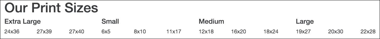
Figure 2.12: Using Bootstrap's pull-*-* to re-arrange the Extra Large category column
You may have noticed that in the markup, we have only applied sm pull and push classes, even though we have xs classes applied. The reason for that is simple. The push and pull classes only work on groups of columns that exist on a single horizontal plane. Pushing Extra Large 9 columns to the left will just force them out of the viewport completely. Pushing Extra Large 6 columns will only push the columns to the position of Large, an unfortunate shortcoming of this feature.
One neat feature of the grid system is how it allows you to create empty space within your row by using columns. If you wanted to list the categories and sizes, but for some reason you wanted to leave the space for Medium empty, in other grid systems you might need to add the empty elements to the markup to get the desired effect. For example:
    <div class="container">
        <h1>Our Print Sizes</h1>
        <div class="row">
            <div class="col-xs-6 col-sm-3 push-sm-3">
                <h5>Small</h5>
                <div class="row">
                    <div class="col-sm-4">6x5</div>
                    <div class="col-sm-4">8x10</div>
                    <div class="col-sm-4">11x17</div>
                </div>
            </div>
            <div class="col-xs-6 col-sm-3 push-sm-3">
            </div>
            <div class="col-xs-6 col-sm-3 push-sm-3">
                <h5>Large</h5>
                <div class="row">
                    <div class="col-sm-4">19x27</div>
                    <div class="col-sm-4">20x30</div>
                    <div class="col-md-4">22x28</div>
                </div>
            </div>
            <div class="col-xs-6 col-sm-3 pull-sm-9">
                <h5>Extra Large</h5>
                <div class="row">
                    <div class="col-md-4">24x36</div>
                    <div class="col-md-4">27x39</div>
                    <div class="col-md-4">27x40</div>
                </div>
            </div>
        </div>
    </div>
Observe the following screenshot:
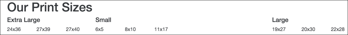
Figure 2.13: Adding spacing between columns
While it has the desired effect, it is adding markup simply for the sake of layout, which isn't really what we want to do if we can avoid it. Bootstrap allows us to avoid it via the offset classes. The offset classes follow the same convention as the rest of the column classes, offset-*-*. Now, we can remove the empty layout elements and simply add the offset classes to the Large columns. Take a look at the following code:
    <div class="col-xs-6 col-sm-3 push-sm-3">
        <h5>Small</h5>
        <div class="row">
            <div class="col-sm-4">6x5</div>
            <div class="col-sm-4">8x10</div>
            <div class="col-sm-4">11x17</div>
        </div>
    </div>
    <div class="col-xs-6 col-xs-offset-6 col-sm-3 offset-sm-3 push-sm-3">
        <h5>Large</h5>
        <div class="row">
            <div class="col-sm-4">19x27</div>
            <div class="col-sm-4">20x30</div>
            <div class="col-md-4">22x28</div>
        </div>
    </div>
    <div class="col-xs-6 col-sm-3 pull-sm-9">
        <h5>Extra Large</h5>
        <div class="row">
            <div class="col-md-4">24x36</div>
            <div class="col-md-4">27x39</div>
            <div class="col-md-4">27x40</div>
        </div>
    </div>
Voila. The same result with less code. The goal we all aim to achieve.
With containers, rows, and columns, we can now reason about our layout more easily. By splitting a viewport into understandable chunks and concepts, the grid system gives us a structure to apply our content.