While there are many plugins to customize, we will choose two that we have already come across in the previous chapters:
- Bootstrap's jQuery alert plugin
- Bootstrap's jQuery carousel plugin
The alert plugin, as we have seen, is exceedingly simple. The alert is rendered on the page, displaying a message, and the only functionality it has is the ability to close and disappear when a user clicks on a certain element.
To demonstrate how to customize or extend a plugin, in this case alert, we are going to keep it very simple. We are going to add an extra bit of functionality, when a user clicks on a certain element, the alert will minimize. We also, obviously, want to give the user the ability to expand the alert when it is in its minimized state. To do this, we need to extend both the JavaScript and the styling of alert.
Before we get to the coding of the plugin functionality and styling, let's put together the markup for an alert on the MyPhoto page.
As an example use case, let's display an alert informing the user of a special offer. We will add our alert above the unsupported browser alert:
<div class="alert alert-info" style="position: fixed; margin-top:
4em; width: 90%;margin-left: 4em;">
<a href="#" class="close" data-dismiss="alert"
aria-label="close">×</a>
<strong><i class="fa fa-exclamation"></i> Special Offer - </strong>
<span>2 FOR 1 PRINTS TODAY ONLY WITH PROMO CODE <span style="font-
style: italic">BOOTSTRAP</strong></span>
</div>We're using Bootstrap's contextual information class, alert-info, to style the alert box, and we're following the same pattern as the unsupported browser alert. The special offer alert has inline styles applied, and the unsupported browser alert has styles linked to its id. Before we go any further, let's extract that out into a single class in myphoto.css for reusability and maintainability. Remove the #unsupported-browser-alert rules and add the following:
    .alert-position {
        position: fixed;
        margin-top: 4em;
        width: 50%;
        margin-left: 25%;
        z-index: 10;
    }
    .alert-position #unsupported-browser-alert {
        display:none;
    }
We've made some slight changes here. The alert will now have a hard-set width of 50% of the viewport and will be rendered 25% from the left. To make sure the alert is always rendered above any other content on the page, we set the z-index to 10. As long as no other elements have a higher z-index, then the alert will always be visible. Now, we remove the inline styles on the alert elements and add the alert-position class. We extend the class slightly for elements with the unsupported-browser-alert id to make sure it isn't displayed. Update the alert elements with the alert-position class:
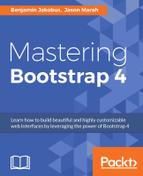
<div class="alert alert-info alert-position">
Take a look at the following screenshot:

Figure 6.1: A modified alert used to display special promotions. Unlike the default alert, this alert has its width hard-set to 50% of the viewport and will be rendered 25% from the left.
Okay, great. We now have our special offers alert. Now let's add our minimize and expand elements. We want these elements to function and display similarly to the close element, so we can use the close element as a template. Observe the following code:
<a href="#" class="close" data-dismiss="alert"
aria-label="close">×</a>
<a href="#" class="close minimize" data-minimize="alert"
aria-label="minimize">_</a>
<a href="#" class="close expand" data-expand="alert"
aria-label="expand">+</a>We have replicated the close element twice. We have added a minimize and expand class, while retaining the close element as we want to inherit everything the close class includes. We have added new data attributes—instead of data-dismiss, we have data-minimize and data-expand. These are the data attributes that the plugin will listen to. We then updated the aria-label with the appropriate names, and applied appropriate content inside the element—an underscore (_) to indicate minimization and a plus (+) to indicate expansion (see Figure 6.2). Take a look at the following screenshot:
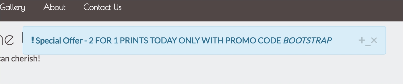
Figure 6.2: Our custom promotion alert with expand and minimize functionality
Besides the close button, we now have the expand and minimize buttons. We don't want to show the expand button when the alert is already expanded, and we don't want to show the minimize button when the alert is already minimized. As the alert is expanded by default, we'll add a hidden-xs-up class to the expand element. Recall that hidden-xs-up hides a given element for viewports that are xs or larger. That is, the element will be hidden for all viewports (hidden-xs-up is the equivalent of hide in Bootstrap 3). Observe the following code:
<a href="#" class="close" data-dismiss="alert"
aria-label="close">×</a>
<a href="#" class="close minimize" data-minimize="alert"
aria-label="minimize">_</a>
<a href="#" class="close expand hide" data-expand="alert"
aria-label="expand">+</a>Take a look at the following screenshot:
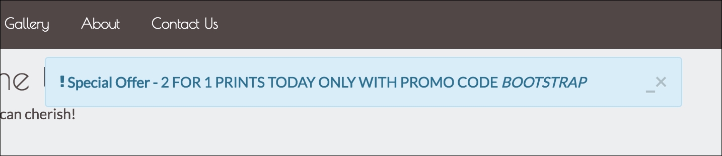
Figure 6.3: Our custom promotion alert with the expand element hidden
Nice. The alert is starting to look the way we want it. With that, we are ready to customize the styling of the alert plugin.
As we mentioned before, it is bad practice to modify Bootstrap's Sass files directly, due to maintenance issues. Instead, we are going to create our own style sheet—styles/alerts.css.
Before we create any new classes, we should extract any alert-related CSS from myphoto.css into this new style sheet in order to improve code maintainability. The only classes we have so far are alert-danger and alert-position. Place them into our new alert specific style sheet, and include the style sheet in our HTML. Be sure to include it after bootstrap.min.css and myphoto.css, to make sure the style rules in alert.css take priority. Observe the following code:
    <link rel="stylesheet" href="bower_components/bootstrap/dist/css
    /bootstrap.min.css" />
    <link rel="stylesheet" href="styles/myphoto.css" />
    <link rel="stylesheet" href="styles/alert.css" />
To create the ability to minimize and expand an alert, we actually do not need many style rules at all. In fact, we are going to use just one new class—alert-minimize. When a user clicks on the minimize button, the alert-minimize class will be applied to the root alert element. To expand it, the alert-minimize class will simply be removed.
Update alert.css with the following rules:
    .alert-minimize {
        width: 60px;
    }
    .alert-minimize * {
        display: none;
    }
    .alert-minimize.close {
        display: block;
    }
The alert-minimize class will force a 60px element width. All descendants of the alert-minimize class will be given the display value of none so they do not appear on screen. To make sure the functional buttons are still visible, any element with the close class (remember we retained the close class for all our functional buttons in the alert) will be given the display value of block. Let's manually apply alert-minimize to our alert to see how it renders. Take a look at the following screenshot:
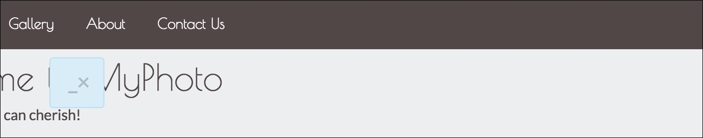
Figure 6.4: Our minimized custom promotion alert
Next up, let's remove the alert-minimize class and extend the alert plugin JavaScript to apply and remove the class dynamically.
As with extending the styles, to extend the JavaScript we could modify Bootstrap's alert.js directly, but, again, that is a bad idea in terms of maintainability. Instead, we are going to create a js directory in our project, and a file called alert.js. Include this file in your HTML, after bootstrap.min.js:
    <script
    src="bower_components/bootstrap/dist/js/bootstrap.min.js"></script>
    <script src="js/alert.js"></script>
The first thing we are going to do is to create an immediately invoked function, and add the function to the jQuery object:
    +function ($) {
        'use strict';
        var Alert = $.fn.alert.Constructor;
    }(jQuery);
The function assigns a variable Alert to the alert plugins prototype, which, as we saw earlier, is made available through the Constructor property.
With this reference to the Alert prototype, we can add our own functions to the prototype to handle minimizing and expanding an alert. Taking the close function we studied earlier, and with a few changes, let's create a function to minimize the alert:
    Alert.prototype.minimize = function (e) {
        var $this = $(this)
        var selector = $this.attr('data-target')
        if (!selector) {
            selector = $this.attr('href')
            selector = selector && selector.replace(/.*(?=#[^s]*$)/, '')
            // strip for ie7
        }
        $this.addClass('hidden-xs-up')
        $this.siblings('.expand').removeClass('hidden-xs-up')
        var $parent = $(selector)
        if (e) e.preventDefault()
        if (!$parent.length) {
            $parent = $this.closest('.alert')
        }
        $parent.trigger(e = $.Event('minimize.bs.alert'))
        if (e.isDefaultPrevented()) return
        $parent.addClass('alert-minimize')
    }
The function is quite similar to the close function, so we will highlight the important differences. Line 15 and line 16 handle hiding the minimize button and showing the expand button, adding the hide class to the element that triggered the event, and removing the hide class from any sibling element with the expand class. Line 32 adds the alert-minimize class, which handles the shrinking of the Alert element, to the parent of the element that triggered the event. Essentially, the minimize function will shrink the alert, hide the minimize button, and show the expand button. Let's hook a listener up to this function.
We do this in the same way as the Bootstrap alert plugin links the data—dismiss the click event to the close function, adding the following to alert.js, below the minimize function definition:
    $(document).on('click.bs.alert.data-api', '[data-minimize="alert"]',
    Alert.prototype.minimize)
Now, an element with the data-minimize attribute with an "alert" value will call the Alert.prototype.minimize function on a click event. The minimize element in our special offers alert has this attribute. Open up MyPhoto and click the minimize button. Take a look at the following screenshot:
Figure 6.5: Our minimized custom promotion alert - note the expand and close buttons
Excellent. Our minimize button and functionality are wired up correctly to shrink our special offers alert and replace the minimize button with an expand button when clicked.
The last thing we need to do now is make sure the user can expand the alert when they click on the expand button. To do this, we follow the same steps as we did for the minimize functionality. Let's add an expand function to the Alert prototype:
    Alert.prototype.expand = function (e) {
        var $this = $(this)
        var selector = $this.attr('data-target')
        if (!selector) {
            selector = $this.attr('href')
            selector = selector && selector.replace(/.*(?=#[^s]*$)/, '')
            // strip for ie7
        }
        $this.addClass('hidden-xs-up')
        $this.siblings('.minimize').removeClass('hide')
        var $parent = $(selector)
        if (e) e.preventDefault()
        if (!$parent.length) {
            $parent = $this.closest('.alert')
        }
        $parent.trigger(e = $.Event('expand.bs.alert'))
        if (e.isDefaultPrevented()) return
        $parent.removeClass('alert-minimize')
    }
The differences between the expand and minimize functions are very small, so small that it probably makes sense for them to be encapsulated into one function. However, for the sake of simplicity, we will keep the two functions separate. Essentially, the actions of minimize are reversed. The hidden-xs-up class is again applied to the element triggering the event, the hide class is removed from any sibling with the minimize class, and the alert-minimize class is removed from the parent element. Simple and effective. Now, we just need to hook up a click event on an element with the data-expand attribute set to alert to the expand method. Observe the following code:
    $(document).on('click.bs.alert.data-api', '[data-expand="alert"]',
    Alert.prototype.expand)
That's it. With our extension to the alert plugin, when a user clicks expand in the minimized state, the alert reverts back to its initial expanded state and the expand button is replaced by the minimize button. Our users now have the ability to reduce the screen real estate our alert covers, but are still able to retrieve the information from the alert at a later stage if needed.
While these alert customizations are relatively simple, they do provide a strong example of how to extend a plugin's functionality and teach principles that can be applied to more complex extensions.
MyPhoto uses Bootstrap's carousel as a gallery to display sample images. The carousel is a very neat component, allowing the user to cycle through images. We are going to add some new functionality to the carousel plugin. Specifically, we are going to implement the ability to surface a larger version of the image in a modal window when there is a click event on a carousel slide. We will be using Bootstrap's modal plugin to surface the modal, and we will dynamically pass the image source and carousel caption from the markup of the slide to the modal. First, let's write the markup.
The only thing we really need to do in the markup is create a modal element, and reference that modal in the carousel's slide elements, so as to link them together. First, let's create the modal. We only want a bare-bones modal here—an image, a close button, and a title. We've seen how to create modals before, so let's just add the markup we need to our HTML. We will add it just above the carousel element:
<div class="modal fade carousel-modal" id="carousel-modal"
tabindex="-1" role="dialog">
<div class="modal-dialog">
<div class="modal-content">
<div class="modal-header">
<button type="button" class="close" data-dismiss
="modal" aria-label="Close"><span aria-hidden=
"true">×</span></button>
<h4 class="modal-title"></h4>
</div>
<div class="modal-body">
<img>
</div>
</div>
</div>
</div>We have created a very simple modal here. We added a carousel-modal class to the parent element for any styles we may need to apply, and we attributed carousel-modal as the id for the modal. We have an empty modal-title element, which we will populate dynamically. Most interestingly, we have an empty img tag in the modal-body element. It isn't often that you see an img tag with no src attribute, but our extension will create this attribute dynamically. We could, of course, have created a different modal for each image, but that wouldn't scale, and it just wouldn't be interesting!
That's our simple modal window declared. Great. Now we just need to reference the modal in our slides. On each img element within the carousel, simply add a data-modal-picture attribute with the value #carousel-modal. Observe the following code:
    <div class="carousel-inner" role="listbox">
        <div style="height: 400px" class="carousel-item active">
            <img data-modal-picture="#carousel-modal"
            src="images/brazil.png">
            <div class="carousel-caption">
                Brazil
            </div>
        </div>
        <div style="height: 400px" class="carousel-item">
            <img data-modal-picture="#carousel-modal"
            src="images/datsun.png">
            <div class="carousel-caption">
                Datsun 260Z
           </div>
        </div>
        <div style="height: 400px" class="carousel-item">
           <img data-modal-picture="#carousel-modal"
           src="images/skydive.png">
           <div class="carousel-caption">
               Skydive
            </div>
        </div>
    </div>
The data-modal-picture attribute is the data-attribute we are going to hook our on-click listener to, in the very same way that alert hooked into data-dismiss. Let's set up our carousel plugin extension and wire all this together.
Just like with our alert extension, we will create a new JS file for the carousel extension. Create a js/carousel.js file and include the file on the MyPhoto page:
<script src="js/carousel.js"></script>
Again, we want to create an IIFE and assign the carousel constructor to a variable we can work with. Observe the following code:
    +function ($) {
        'use strict';
        var Carousel = $.fn.carousel.Constructor;
    }(jQuery);
From our markup, we know what data-attribute we want to listen to—data-modal-picture. Observe the following code:
    +function ($) {
        'use strict';
        var Carousel = $.fn.carousel.Constructor;
        $(document).on('click.bs.carousel.data-api', '[data-modal-
        picture]', Carousel.prototype.zoom)
    }(jQuery);
Notice that, unlike with alert, we are not referencing any particular value for the data-modal-picture attribute. We will be using the attribute value to identify which modal to use, so of course we want the plugin to be flexible enough to handle more than one modal id. We have also defined which function we want to call when the event is triggered—Carousel.protoype.zoom. Let's create that function:
    Carousel.prototype.zoom = function () {
        var $this = $(this)
        var $src = $this.attr('src')
        var $title = $this.next('.carousel-caption').text()
        var $modal = $this.attr('data-modal-picture')
        var $modalElement = $.find($modal)
        $($modalElement).find('.modal-body').find('img').attr('src', $src)
        $($modalElement).find('.modal-title').text($title)
        $($modal).modal('show')
    }
First, as before, we create a jQuery wrapper of the element that triggers the event. Next, we use the attr method to find the value of the element's src attribute. We then use the next method to find the next carousel-caption element, and assign the inner text of that element to $title. We need these to dynamically update the blank modal.
Next, we grab the value of the data-modal-picture element, which we then use as a reference to find the modal we want to use to render our picture. We use the find method to first find the modal-body of this element, then the nested image element. We then create an src attribute on this element, passing in a reference to the source of the slide's image element. Similarly, we inject the caption of the slide into the modal's title element.
Finally, we use the modal API to show the modal. Take a look at the following screenshot:
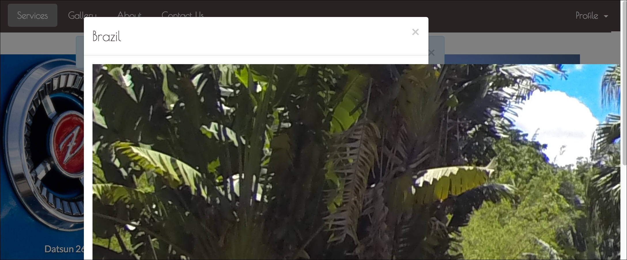
Figure 6.6: Our modal showing an enlarged version of a slide image
The modal is now surfacing. The dynamic title is working well, too. The dynamic image is getting applied and loaded. Perfect, except that the entire thing looks terrible. But that's nothing a bit of CSS can't fix.
Thanks to our forward thinking, we already have the carousel-modal class applied to the modal parent element. We just need to set some rules.
As this modal is directly related to our carousel plugin extension, we will create a CSS file explicitly for handling styling born out of our extension. Create styles/carousel.css and include the file in our page:
    <link rel="stylesheet" href="bower_components/components-font-
    awesome/css/font-awesome.min.css" />
    <link rel="stylesheet" href="styles/alert.css" />
    <link rel="stylesheet" href="styles/carousel.css" />
There are two things wrong that we need to address. First, the modal is too narrow. We want it to be almost the full width of the page. Observe the following code:
    .carousel-modal.modal-dialog {
        width: 95%;
    }
Now, if an element has the modal-dialog class and its parent has the carousel-modal class, it will have have 95% of the available horizontal screen real estate. Take a look at the following screenshot:
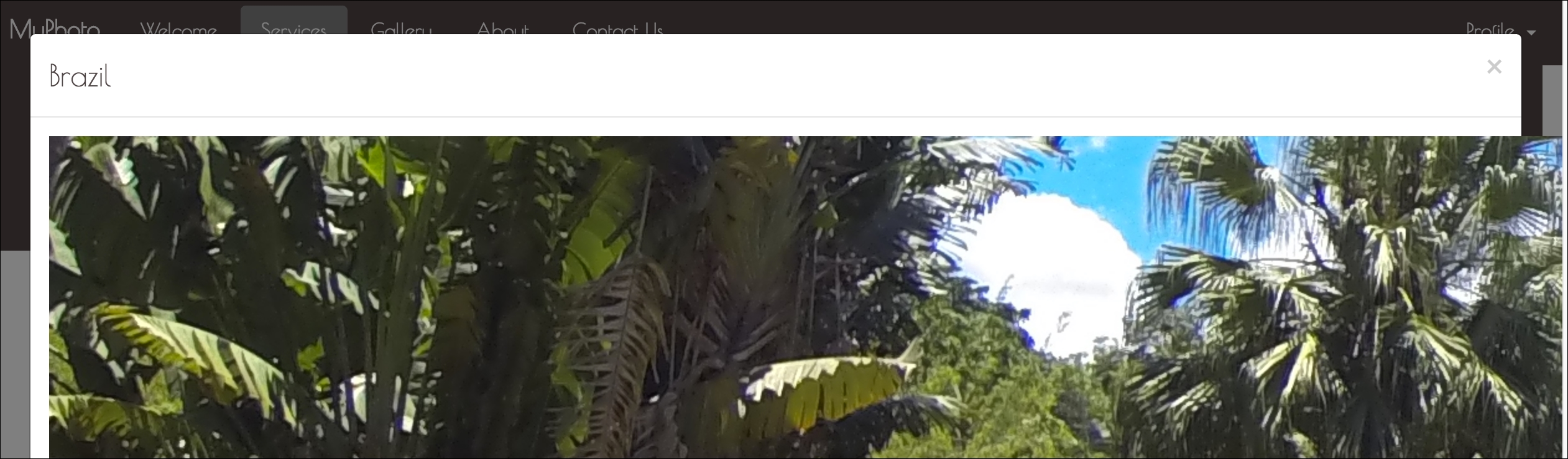
Figure 6.7: Our modal showing an enlarged version of a slide image with applied changes
Now, we just need to make sure the image doesn't breech the borders of the modal. The fix here is simple. We will just give any img element that is a descendent of a carousel-modal element a width of 100%, so that it will only take up the width explicitly available to it. Observe the following code:
    .carousel-modal img {
        width: 100%;
    }
Take a look at the following screenshot:
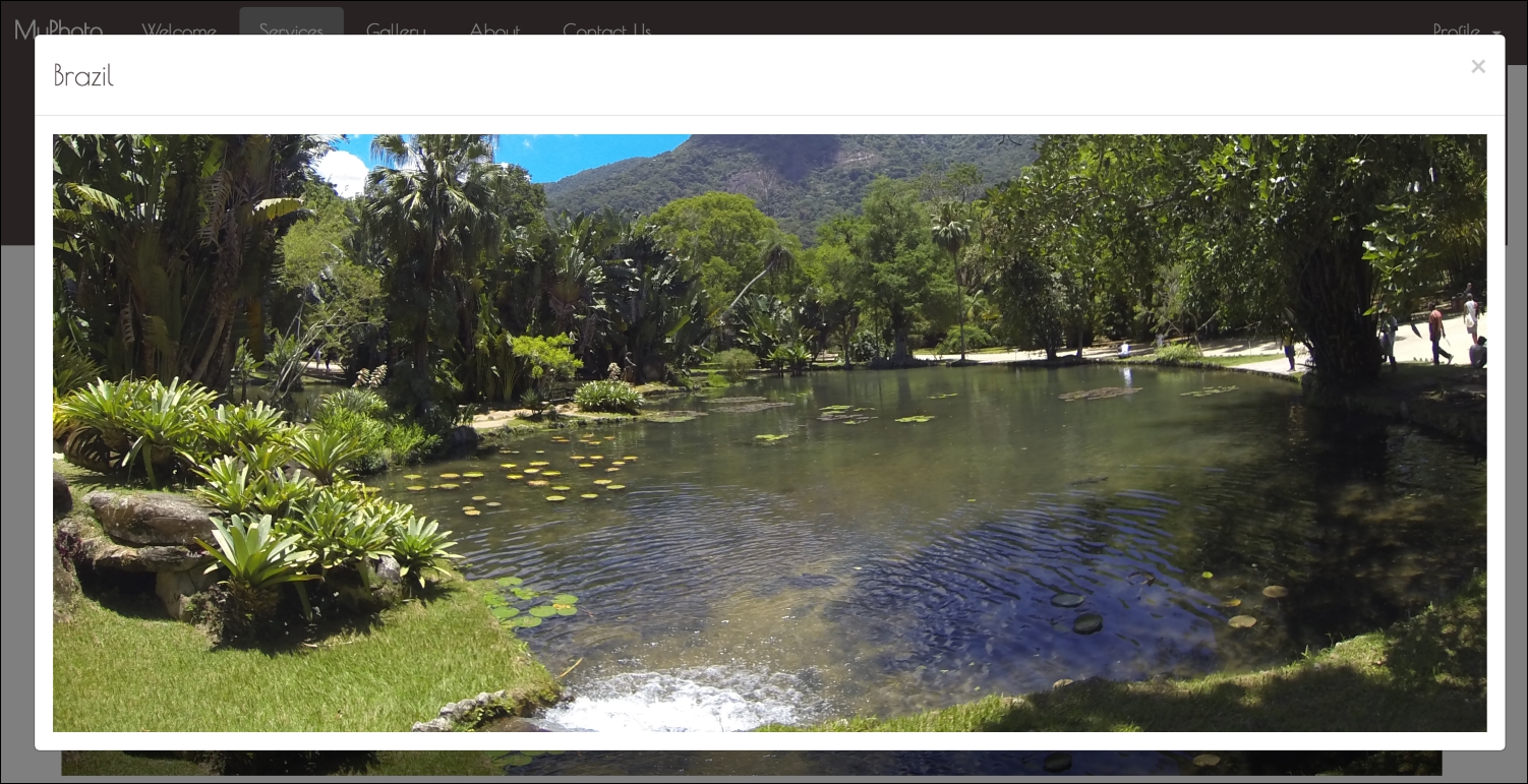
Figure 6.8: Our modal showing an enlarged version of a slide image, with the image fitting the modal
Much better. Our customization is complete. We have surfaced a modal on a click event from the carousel, passed data from the carousel component into the modal component, and rendered the image successfully. Very neat.
Now that we have successfully customized two of Bootstrap's jQuery plugins, let's build a plugin from scratch.