
Hover, http://ianlunn.github.io/Hover/, is a neat, pure CSS library that provides transition effects. Adhering to the "Do one thing, do one thing well" approach, Hover only concerns itself with hover transitions, as you may have guessed from the name. Hover comes baked in with a huge array of transitions and provides easy integration with CSS, Less, and Sass.
Hover breaks these transitions into seven distinct groups:
- 2D transitons
- Background transitions
- Icons, by leveraging Font Awesome icons
- Border transitons
- Shadow and glow transitions, simulating 3D transitions
- Speech bubbles
- Curls
Throughout this section, we will touch on a number of these different groups. An extensive list of the transitions is available on the Hover website. Before we get to that, let's add Hover to MyPhoto.
Add Hover to MyPhoto via Bower:
bower install Hover
Within the
bower_components
directory, there should now be a Hover directory. We will reference the minified CSS straight into our markup. Add the following link tag in the
head
of the MyPhoto HTML, below the existing CSS references:
    <link rel="stylesheet" href="bower_components/Hover/css/
    hover-min.css" />
Let's add a Hover transition to make sure everything is in working order.
As a quick test to make sure we have completed setting up of Hover correctly, let's apply some Hover transitions to the MyPhoto
navbar.
Using Hover transitions is even simpler than Animate.css. We simply add one class to the element, and voila, a Hover transition is applied. As you will notice, all Hover classes are prefixed with
hvr
-
to help avoid conflicts with other style sheets on the page.
We're going to spice up our
nav
-
link
links with one of the border transitions from Hover:
hvr
-
underline
-
from
-
center
. The
hvr
-underline-from-center
class renders an underline on a given element, which grows from the center of the element. Let's add this to our five
nav
-
link
links:
    <ul class="nav nav-pills">
        <li class="nav-item"><a class="nav-link hvr-underline-from-
        center" href="#welcome">Welcome</a></li>
        <li class="nav-item"><a class="nav-link hvr-underline-from-
        center" href="#services">Services</a></li>
        <li class="nav-item"><a class="nav-link hvr-underline-from-
        center" href="#gallery">Gallery</a></li>
        <li class="nav-item"><a class="nav-link hvr-underline-from-
        center" href="#about">About</a></li>
        <li class="nav-item"><a class="nav-link hvr-underline-from-
        center" href="#contact">Contact Us</a></li>
        <li class="nav-item dropdown pull-xs-right">
            ...
        </li>
    </ul>
Take a look at the following screenshot:

Figure 7.10: A border transition temporarily added to our navigation menu items. As the user hovers over one of the navigation links, they receive a clear visual cue.
Now, when a user hovers on one of our navigation links, they get a nice indicator providing a clear visual aid.
As previously mentioned, Hover has a range of icon effects. Hover leverages the Font Awesome library, to render icons, which Hover then animates. Hover provides a range of different effects, but each effect actually only applies to one icon. All these effects are prefixed with
hvr
-
icon
-
<effect name>
. Open
bower_components/hover/css/hover.css
and check out the
hvr
-
icon
-
bob:before class
:
    .hvr-icon-bob:before {
        content: "f077";        position : absolute;
        right: 1em;
        padding: 0 1px;
        font-family: FontAwesome;
        -webkit-transform: translateZ(0);
        transform: translateZ(0);
    }
Using the pseudo-selector
before
,
hvr
-
icon
-
bob
is creating an element with
content: f077
, which relates to the icon specified by that id in Font Awesome, as the
font
-
family
is set to
FontAwesome
. Taking a look at
FontAwesome.css
, we can see that
f077
represents the
fa
-
chevron
-
up
class. As you can see, the icon is hardcoded into the class, so we can only ever use
hvr
-
icon
-
bob
with the upward chevron icon, unless we override the content rule of that class. The transform properties with the value of
translateZ(
0
)
are used to make the transition smoother, as it creates a new stacking context. The new stacking context forces rendering of the animation to the GPU, creating a smoother transition.
Let's see hvr-icon-bob in action by updating the Profile drop-down button, replacing the caret class with the hvr-icon-bob class. Replace the Profile button markup with the following:
    <a href="#" class="nav-link" data-toggle="dropdown" role="button"
        aria-haspopup="true" aria-expanded="false">
        <span class="hvr-icon-bob">Profile</span>
    </a>
Take a look at the following screenshot:

Figure 7.11: An inverted chevron that moves up and down as the user hovers over it
When a user hovers over the icon, the icon will animate up and down. Great! Well, except that it is upside down and misaligned. Let's fix that. In
myphoto.css
, we will override the content property of
hvr-icon-bob
with
f078
, which is the
fa-chevron-down
class, and we will vertically align it correctly:
    .hvr-icon-bob :before {
        content: "f078";
    }
    .hvr-icon-bob {

        vertical-align: top;
    }
We also need to ensure that
myphoto.css
is loaded after Hover:
    <link rel="stylesheet" href="bower_components/bootstrap/dist/css
    /bootstrap.min.css" />
    <link rel="stylesheet" href="bower_components/Hover/css/hover-min.css"
    />
Take a look at the following screenshot:

Figure 7.12: An animated chevron facing down
Better! However, this approach can easily become a maintenance nightmare. There are other approaches to managing Hover icon classes so they're more usable. For instance, we could use specific classes to determine which icon to display. Add the
.
myphoto
-
chevron
-
down
selector to the
hvr
-
icon
-
bob:before
rule in
myphoto.css
:
    .myphoto-chevron-down.hvr-icon-bob:before {
        content: "f078";
    }
Refresh the page, and the upwards chevron will be displayed again.
But, if we add the
myphoto
-
chevron
-
down
class to the element, the downward chevron will be rendered:
<span class="myphoto-chevron-down hvr-icon-bob">Profile</span>
The approach described here makes using the Hover icon animations far more maintainable, and adds much more context than just using
hvr
-
icon
-
bob
, which just describes the animation and not the icon. We could also simply use the actual FontAwesome classes to describe the behavior, but Font Awesome also provides display rules that may not be in line with how Hover designed these classes to work.
We can also use Hover to improve a user's interaction with our Salvattore-powered testimonials component. The testimonials component already leverages Animate.css to add an interesting transition when rendering the grid, but we can use Hover to add an interesting transition when a user actually interacts with it.
The grid is quite flat and fails to grab the user's attention once loaded. The individual columns also fail to gain focus. To solve this, we can use Hover to increase the size of the column when a user hovers on the column. One of the classes provided by Hover is
hvr-grow-shadow
, which adds a hover state to an element that expands the column and adds a drop-shadow, but doesn't affect the other columns or rows within the grid. All we need to do here is add
hvr-grow-shadow
to each testimonial column:
    <div class="myphoto-testimonial-grid animated fadeIn" data-columns>
        <div class="myphoto-testimonial-column hvr-grow-shadow">
            <h6>Debbie</h6>
            <p>Great service! Would recommend to friends!</p>

        </div>
        <div class="myphoto-testimonial-column hvr-grow-shadow">
            <h6>Anne</h6>
            <p>Really high quality prints!</p>

        </div>
        <div class="myphoto-testimonial-column hvr-grow-shadow">
            <h6>Oscar</h6>
            <p>Declared their greatness, exhibited greatness.</p>

        </div>
        <div class="myphoto-testimonial-column hvr-grow-shadow">
            <h6>Joey</h6>
            <p>5 stars! Thanks for the great photos!</p>
        </div>
        <div class="myphoto-testimonial-column hvr-grow-shadow">
            <h6>Mary</h6>
            <p>Made a stressful event much easier! Absolute
            professionals!</p>

        </div>
        <div class="myphoto-testimonial-column hvr-grow-shadow">
            <h6>Alice</h6>
            <p>Wonderful! Exactly as I imagined they would turn out!</p>

        </div>
        <div class="myphoto-testimonial-column hvr-grow-shadow">
            <h6>Jack & Jill</h6>
            <p>So happy with how the photos turned out! Thanks for
            capturing the memories of our day!</p>

        </div>
        <div class="myphoto-testimonial-column hvr-grow-shadow">
            <h6>Nick</h6>
            <p>Perfectly captured the mood of our gig. Top notch.</p>
        </div>
        <div class="myphoto-testimonial-column hvr-grow-shadow">
            <h6>Tony</h6>
            <p>Captured our Cup final win! Great stuff!</p>

        </div>
    </div>
Take a look at the following screenshot:
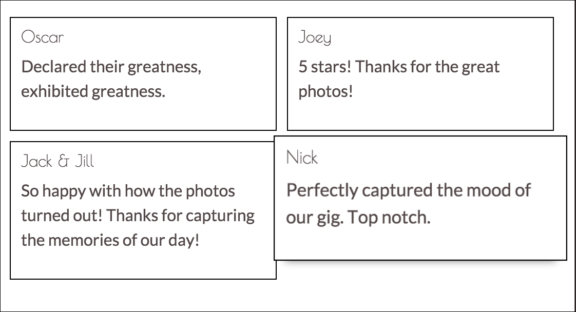
Figure 7.13: After applying the hvr-grow-shadow class, hovering over an individual testimonial will cause it to "grow" without effecting the rest of the grid
Now, when a user hovers over a column, the individual column grows, without affecting the rest of the grid. One of the cool things about Hover is that all the classes play nicely with each other, following the cascading nature of CSS. No JavaScript magic, just pure CSS. To see an example of this, we will add another Hover class. This one is from the range of Hover background transition classes,
hvr
-
sweep
-
to
-
top
. The
hvr
-
sweep
-
to
-
top
class animates a change in the background color with a fill effect from the bottom to the top. Let's add
hvr
-
sweep
-
to
-
top
to the testimonial columns:
    <div class="myphoto-testimonial-grid animated fadeIn" data-columns>
        <div class="myphoto-testimonial-column hvr-grow-shadow
        hvr-sweep-to-top">
            <h6>Debbie</h6>
            <p>Great service! Would recommend to friends!</p>

        </div>
        <div class="myphoto-testimonial-column hvr-grow-shadow
        hvr-sweep-to-top">
            <h6>Anne</h6>
            <p>Really high quality prints!</p>

        </div>
        <div class="myphoto-testimonial-column hvr-grow-shadow
        hvr-sweep-to-top">
            <h6>Oscar</h6>
            <p>Declared their greatness, exhibited greatness.</p>

        </div>
        <div class="myphoto-testimonial-column hvr-grow-shadow
        hvr-sweep-to-top">
            <h6>Joey</h6>
            <p>5 stars! Thanks for the great photos!</p>

        </div>
        <div class="myphoto-testimonial-column hvr-grow-shadow
        hvr-sweep-to-top">
            <h6>Mary</h6>
            <p>Made a stressful event much easier! Absolute
            professionals!</p>

        </div>
        <div class="myphoto-testimonial-column hvr-grow-shadow
        hvr-sweep-to-top">
            <h6>Alice</h6>
            <p>Wonderful! Exactly as I imagined they would turn out!</p>

        </div>
        <div class="myphoto-testimonial-column hvr-grow-shadow
        hvr-sweep-to-top">
            <h6>Jack & Jill</h6>
            <p>So happy with how the photos turned out! Thanks for
            capturing the memories of our day!</p>
        </div>
        <div class="myphoto-testimonial-column hvr-grow-shadow
        hvr-sweep-to-top">
            <h6>Nick</h6>
            <p>Perfectly captured the mood of our gig. Top notch.</p>
        </div>
        <div class="myphoto-testimonial-column hvr-grow-shadow
        hvr-sweep-to-top">
            <h6>Tony</h6>
            <p>Captured our Cup final win! Great stuff!</p>

        </div>
    </div>
Take a look at the following screenshot:
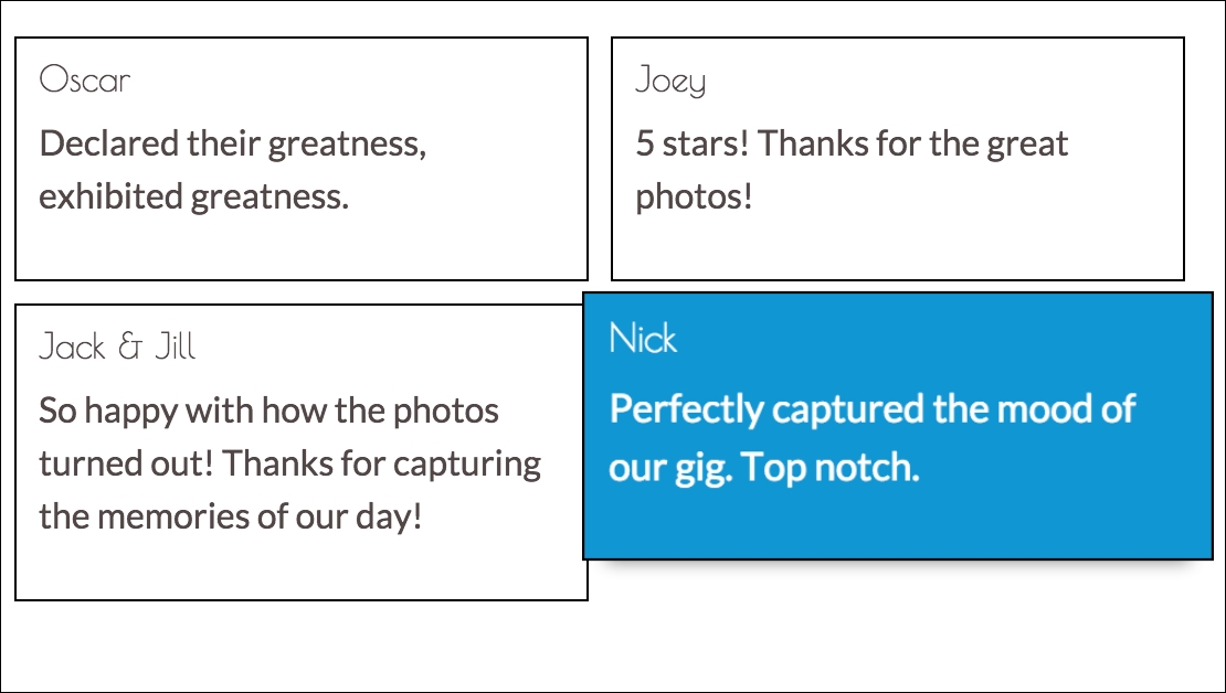
Figure 7.14: After applying the hvr-grow-shadow and hvr-sweep-to-top classes, hovering over an individual testimonial will cause it to "grow" and change color
Now we have both the expanded columns, with a drop-shadow, along with the fill effect provided by the
hvr
-
sweep
-
to
-
top
class. As we have seen, Hover provides very simple to use but very elegant transitions to add an extra layer of interaction for users. Being pure CSS, Hover is also exceedingly simple to integrate with most libraries and frameworks.