Responsive utilities are a group of media query-based classes that control when an element should be hidden or shown depending on the viewport. One popular use case for this is controlling display specific navigations. For example, a page may have a navigation bar on large displays and have a hidden navigation on small displays which is only displayed when a user chooses to open the navigation.
Let's look at a quick example with our Print Size page. Add the hidden-xs-down class to the img elements:
    <div class="container">
        <h1>Our Print Sizes</h1>
        <div class="row">
            <div class="col-xs-6 col-sm-3 push-sm-3">
                <img src="images/small.jpg" class="img-fluid img-circle
                hidden-xs-down">
                <h5>Small</h5>
                ...
            </div>
            <div class="col-xs-6 col-sm-3 push-sm-3">
                <img src="images/medium.jpg" class="img-fluid img-rounded
                hidden-xs-down">
                <h5>Medium</h5>
                ...
            </div>
            <div class="col-xs-6 col-sm-3 push-sm-3">
                <img src="images/large.jpg" class="img-thumbnail
                hidden-xs-down">
                <h5>Large</h5>
                ...
            </div>
            <div class="col-xs-6 col-sm-3 pull-sm-9">
                <img src="images/extra-large.jpg" class="img-fluid
                hidden-xs-down">
                <h5>Extra Large</h5>
                ...
            </div>
        </div>
    </div>
Take a look at the following screenshot:
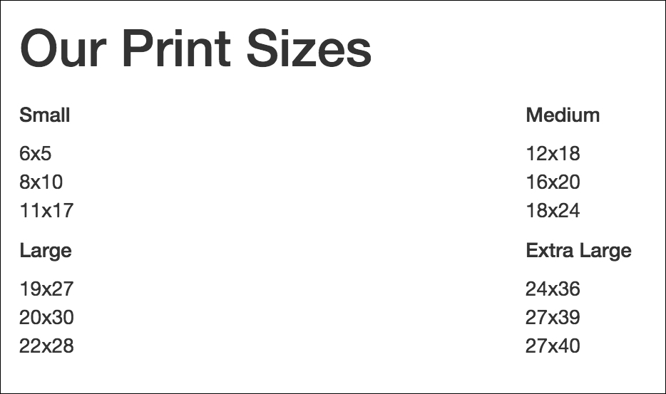
Figure 2.18: Hiding elements based on the viewport size using the hidden-xs-down class
The hidden-xs-down property hides the element only when the display is extra-small, according to Bootstrap's grid system.
The hidden classes stick to the conventions found in the grid system, along with hidden-xs-*, there are hidden-sm-*, -md-*, and -lg-* classes. In the grid system, col-md targets all Medium displays and below. Likewise, hidden-md-down will target only Medium displays or displays smaller than Medium (that is, small and extra small).
Aside from hidden-xs-down, Bootstrap also offers the hidden-*-up class, which hides an element if the viewport is at or above the threshold. For example, hidden-lg-up would hide the element when the display is Large or Extra Large (that is, unless the viewport is extra small, small or medium)
Let's apply the hidden classes so that:
- Images are hidden on
xs,sm, andmddisplays. - The page title is hidden on
mdor smaller displays - Category titles are hidden on
lgand bigger displays.
Observe the following code:
    <div class="container">
        <h1 class="hidden-lg-down">Our Print Sizes</h1>
        <div class="row">
            <div class="col-xs-6 col-sm-3 push-sm-3">
                <img src="images/small.jpg"
                class="img-fluid img-circle hidden-md-down">
                <h5 class="hidden-lg-up">Small</h5>
                ...
            </div>
            <div class="col-xs-6 col-sm-3 push-sm-3">
                <img src="images/medium.jpg" class="img-fluid img-rounded
                hidden-md-down">
                <h5 class="hidden-lg-up">Medium</h5>
                ...
            </div>
            <div class="col-xs-6 col-sm-3 push-sm-3">
                <img src="images/large.jpg" class="img-thumbnail
                hidden-md-down">
                <h5 class="hidden-lg-up">Large</h5>
                ...
            </div>
            <div class="col-xs-6 col-sm-3 pull-sm-9">
                <img src="images/extra-large.jpg" class="img-fluid
                hidden-md-down">
                <h5 class="hidden-lg-up">Extra Large</h5>
                ...
            </div>
        </div>
    </div>
Viewing the page on a viewport smaller than 544px, the categories will be displayed over two rows, with the category title text instead of images. Have a look at the following screenshot:
Figure 2.19: Screenshot depicting our page with the title and image elements hidden at displays smaller than sm
Viewing the page on a viewport larger than 768px (md) and smaller than 992px (lg), the categories will be displayed over one row with both the category title text and images, as in Figure 2.20. Viewing the page on a viewport larger than 992px will remove the category title text. Take a look at the following screenshot:
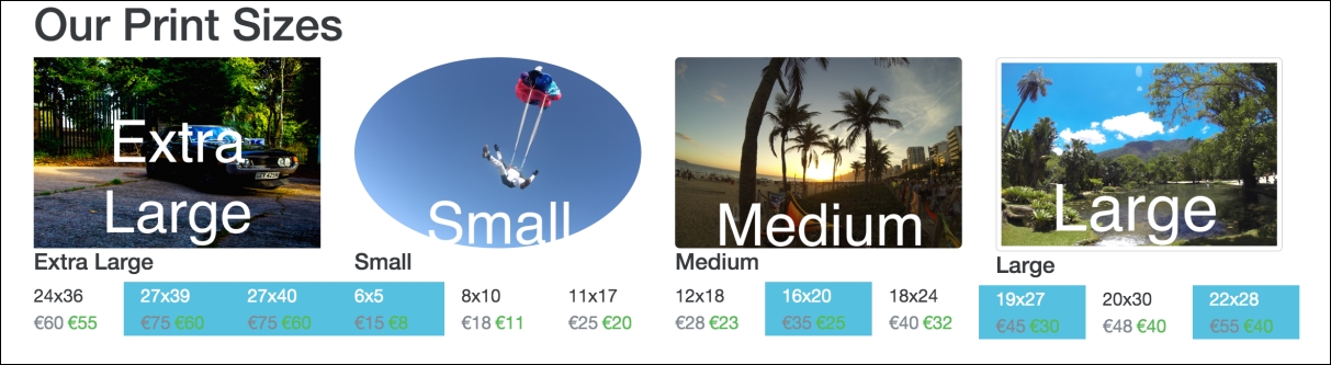
Figure 2.20: Screenshot depicting our page with the title element hidden for lg displays