If we want to display image information on a map, we must prepare a visual output of what we got. A common and efficient form of visual representation is to separate values into classes and give each class a different color. In our case, we can split the data into altitude classes. NumPy makes it easy for us. Let's write a method that can be called in the pipeline to get started:
- Add a new method to the
RasterDataclass:#... def colorize(self, style): """Produces an BGR image based on a style containing limits and colors. :param style: A list of limits and colors. """ shape = self.data.shape limits = [] colors = [] # Separate the limits and colors. for item in style: limits.append(item[0]) colors.append(self._convert_color(item[1])) colors = np.array(colors) # Put each color in its limits. flat_array = self.data.flatten() di_array = np.digitize(flat_array, limits) di_array = di_array.reshape((shape[0], shape[1], 1)) results = np.choose(di_array, colors) # Convert from RGB to BGR. results = np.asarray(results, dtype=np.uint8) results = cv2.cvtColor(results, cv2.COLOR_RGB2BGR) self.data = results return selfIn order to achieve what we want, two important things happen here. First, the data is indexed into classes by NumPy's
digitizefunction. Then, each class receives an RGB value with the defined color. This is done using thechoosefunction.This method takes a
styleas an argument. This style is a list of limits and colors, like a map legend. For example, thestylecan be defined as:style = [[700, "#f6eff7"], [900, "#bdc9e1"], [1100, "#67a9cf"], [1300, "#1c9099"], [1800, "#016c59"]]
This means that all the values below 700 will have the color "#f6eff7" and so on. The colors are expressed in hex notations. This notation is popular with web applications and is chosen here because it's short and easy to type or copy.
At this point, note that inside this method, we called the _convert_color method that will perform the conversion of the color notation. Let's add this method to the class:
- Add the
_convert_colormethod to the class:#... def _convert_color(self, color_code): """Converts the color notation. :param color_code: A string containing the color in hex or JavaScript notation. """ if color_code[0] == "#": result = (int(color_code[1:3], 16), int(color_code[3:5], 16), int(color_code[5:7], 16)) elif color_code[:3] == "rgb": result = map(int, color_code[4:-1].split(',')) else: raise ValueError("Invalid color code.") return result - Finally, edit the
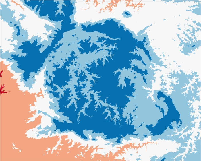
if __name__ == '__main__':block to test our code:if __name__ == '__main__': raster_data = RasterData('output/dem.tif') style = [[700, "#f6eff7"], [900, "#bdc9e1"], [1100, "#67a9cf"], [1300, "#1c9099"], [1800, "#016c59"]] raster_data.colorize(style).write_image( 'output/classified.png') - Run the code and then open the output image to see the results:
The choice of what colors to use in a map is one determining factor as to whether the map would be capable of correctly passing the desired information. In order to choose a good set of colors, some factors should be considered:
- The ability of the human eye to distinguish hues—the classes need to be visually distinguishable, otherwise the map may contain colors that may look the same to some people
- The media that the map will be presented on (for example, paper or screen)—depending on the media, the colors may suffer small changes that may compromise the readability of the map
- Colorblind safety—this is an inclusion measure and it allows the information to be interpreted by a wider audience
- The type of data (for example, sequential or qualitative)—use colors that match what you want to show
There are a number of studies on this subject and the ones made by Cynthia Brewer are very practical and popular among modern map makers. She produced an extensive set of colors to be used in maps and made this information available for use under the name of ColorBrewer.
Let's change the colors of our map with the help of ColorBrewer:
- Access the http://colorbrewer2.org/ website. You should see this interface:
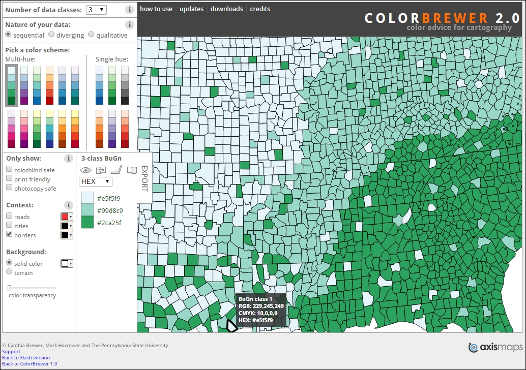
- The left-hand side panel allows you to set the parameters to choose the color. At the top, change Number of data classes to 5 as in our data.
- About the nature of our data, two options would go well, sequential or diverging. I will choose diverging for this example.
- Before choosing a color scheme, if you wish, you can filter the schemes by colorblind safe, print friendly and photocopy safe.
- Now, pick a color scheme that pleases you and note that the bottom right section of the panel and the map will change to show the colors of this scheme.
- Let's export this scheme in a practical way to it use in our code. Click on the EXPORT tab just to the right of the colors. A new panel will open as follows:
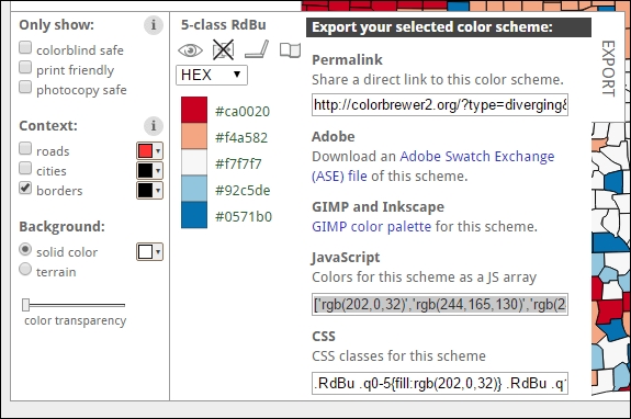
- Note that the JavaScript box contains a list of RGB values. We can easily parse this information in our code. So, we will select its contents and copy it.
- Go back to our code and paste the colors to a variable named
colorbrewerin theif __name__ == '__main__':block:if __name__ == '__main__': colorbrewer = ['rgb(202,0,32)','rgb(244,165,130)', 'rgb(247,247,247)','rgb(146,197,222)', 'rgb(5,113,176)'] raster_data = RasterData('data/dem.tif') style = [[700, "#f6eff7"], [900, "#bdc9e1"], [1100, "#67a9cf"], [1300, "#1c9099"], [1800, "#016c59"]] raster_data.colorize(style).write_image( 'output/classified.png')At this point, the style is not yet complete. There are two problems: the colors are in a format different from what we need and we don't have the limits associated with them. Since we want the process to be as practical as possible, we will write the code to solve these two issues instead of manually converting the colors and associating them with the limits.
First, let's implement the capability of our program to accept colors and limits separately.
- Put the limits that were in the style definition into a different list:
if __name__ == '__main__': colorbrewer = ['rgb(202,0,32)','rgb(244,165,130)', 'rgb(247,247,247)','rgb(146,197,222)', 'rgb(5,113,176)'] limits = [700, 900, 1100, 1300, 1800] raster_data = RasterData('data/dem.tif') raster_data.colorize(style).write_image('output/classified.png') - Now edit the
colorizemethod:#.. def colorize(self, limits, raw_colors): """Produces an BGR image based on a style containing limits and colors. :param limits: A list of limits. :param raw_colors: A list of color codes. """ shape = self.data.shape colors = [] for item in raw_colors: colors.append(self._convert_color(item)) colors = np.array(colors) # Put each color in its limits. flat_array = self.data.flatten() di_array = np.digitize(flat_array, limits, right=True) di_array = di_array.reshape((shape[0], shape[1], 1)) results = np.choose(di_array, colors) # Convert from RGB to BGR. results = np.asarray(results, dtype=np.uint8) results = cv2.cvtColor(results, cv2.COLOR_RGB2BGR) self.data = results return selfThis method now takes two arguments instead of just the style. The only task that remains is to convert this new color format.
- Edit the
_convert_colormethod:#... def _convert_color(self, color_code): """Converts the color notation. :param color_code: A string containing the color in hex or JavaScript notation. """ if color_code[0] == "#": result = (int(color_code[1:3], 16), int(color_code[3:5], 16), int(color_code[5:7], 16)) elif color_code[:3] == "rgb": result = map(int, color_code[4:-1].split(',')) else: raise ValueError("Invalid color code.") return resultThis method is now able to detect and convert the two color codes that we use. It can also raise an exception in case the color code is not recognized.
- To test the code, edit the
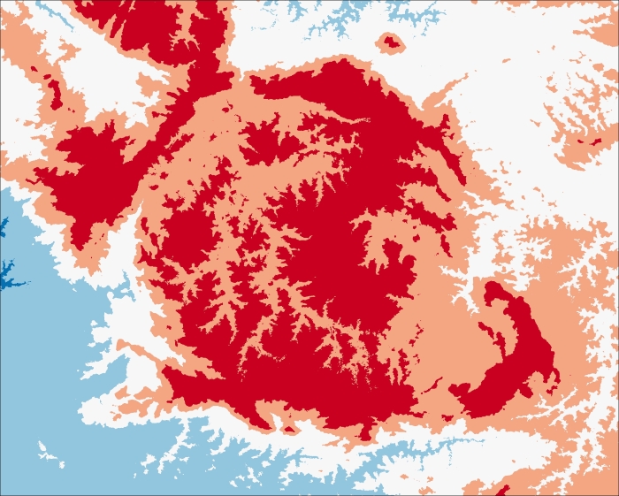
if __name__ == '__main__':block to be compliant with the new format:if __name__ == '__main__': raster_data = RasterData('output/dem.tif') colors = ['rgb(202,0,32)', 'rgb(244,165,130)', 'rgb(247,247,247)', 'rgb(146,197,222)', 'rgb(5,113,176)'] limits = [700, 900, 1100, 1300, 1800] raster_data.colorize(limits, colors).write_image( 'output/classified.png') - Finally, run the code with Shift + F10 and check the output. The schema I chose produced the following result:
Despite the fact that this is a beautiful image, there is a mistake in the choice of colors. The warm colors are representing lower altitudes. This could lead to confusions, since on most maps, the rule is warmer the color, higher is the value.
It's only a mater of inverting the colors. Let's add an option to our
colorizemethod to do this. - Edit the
colorizemethod:#... def colorize(self, limits, raw_colors, invert_colors=False): """Produces an BGR image based on a style containing limits and colors. :param limits: A list of limits. :param raw_colors: A list of color codes. :param invert_colors: Invert the order of the colors. """ shape = self.data.shape colors = [] if invert_colors: raw_colors = list(reversed(raw_colors)) # Convert the colors. for item in raw_colors: colors.append(self._convert_color(item)) colors = np.array(colors) # Put each color in its limits. flat_array = self.data.flatten() di_array = np.digitize(flat_array, limits, right=True) di_array = di_array.reshape((shape[0], shape[1], 1)) results = np.choose(di_array, colors) # Convert from RGB to BGR. results = np.asarray(results, dtype=np.uint8) results = cv2.cvtColor(results, cv2.COLOR_RGB2BGR) self.data = results return self - Now, edit the
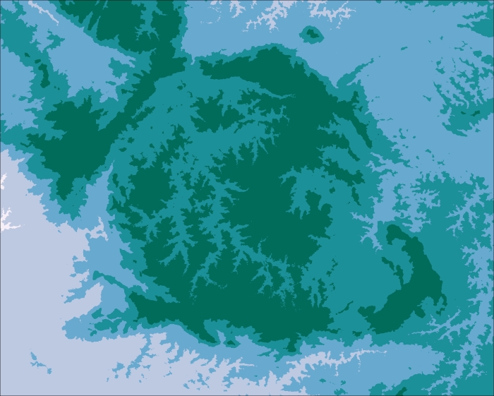
if __name__ == '__main__':block again:if __name__ == '__main__': raster_data = RasterData('output/dem.tif') colors = ['rgb(202,0,32)', 'rgb(244,165,130)', 'rgb(247,247,247)', 'rgb(146,197,222)', 'rgb(5,113,176)'] limits = [700, 900, 1100, 1300, 1800] raster_data.colorize(limits, colors, True).write_image( 'output/classified.png') - Run the code and look at the new output: