
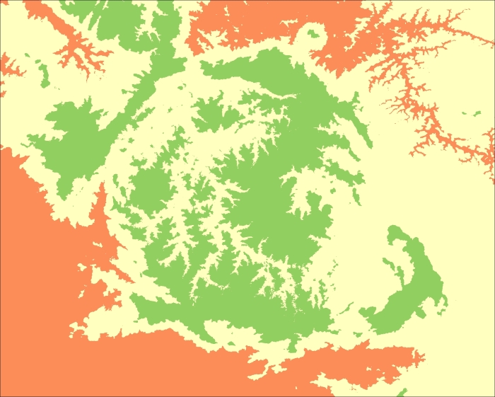
How the map is colorized is only a matter of defining the limits and colors in the style. So, if we want to translate statistical information into colors, we just need to associate the values that we want with a sequence of colors.
First, let's try it with the quartiles:
- Since everything is prepared in our class, we just need to change the code in the
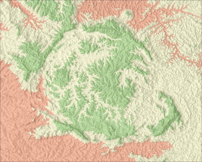
if __name__ == '__main__':block:if __name__ == '__main__': dem = RasterData('output/dem.tif') shaded = RasterData('output/shaded.png') limits = [dem.stats['Q1'], dem.stats['Q3'], dem.stats['Maximum']] colors = ["#fc8d59", "#ffffbf", "#91cf60"] dem.colorize(limits, colors).write_image('output/stats.png') dem.alpha_blend(shaded).write_image('output/shaded_stats.png')The following image illustrates the colored output for the analyzed parameters:
For this image you can start the lead-in this way:
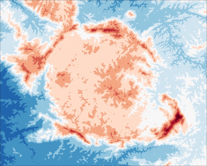
We can also use the histogram to colorize the maps. The histogram generated by NumPy is composed of two one-dimensional arrays. The first contains the number of occurrences in a given interval (that is, the number of pixels). The second one contains the bins or the limits. By default, the histogram is produced with 11 bins, so we also need 11 different colors to produce a map. Let's change our tests to see how this works:
- Edit the
if __name__ == '__main__':block:if __name__ == '__main__': dem = RasterData('data/dem.tif') shaded = RasterData('output/shaded.png') colors = ['rgb(103,0,31)','rgb(178,24,43)','rgb(214,96,77)', 'rgb(244,165,130)','rgb(253,219,199)', 'rgb(247,247,247)','rgb(209,229,240)', 'rgb(146,197,222)','rgb(67,147,195)', 'rgb(33,102,172)','rgb(5,48,97)'] limits = dem.stats['Histogram'][1] dem.colorize(limits, colors, True).write_image('output/hist.png') dem.alpha_blend(shaded).write_image('output/shaded_hist.png')The colors here are also obtained from ColorBrewer. They are of a diverging nature from red to blue. The limits were taken from the histogram by simply using the
statsproperty and the second array, which contains the bins. - Run the code and look at the output.
And the shaded result should look as the following image:
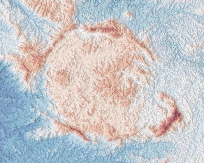
Using more classes resulted in a better representation of the altitude variation and it allowed us to clearly see the peaks with high altitudes.