So far, we have only used a single phone emulator. As we will be building some layouts more suited to Android tablets, it is time to look at configuring a tablet emulator. We will then be in a position to be a bit more daring with our UI designs. We will build two different UI designs, however, we will do so in just one mini-app. We will soon see how we can change our Java code to see the layout we are currently interested in. In this chapter we will cover the following:
- Configuring a tablet emulator
- Building a scrolling list-detail layout
- Building a fairly intricate form submission layout
These simple yet practical projects will begin to demonstrate how we can create some designs that might actually make it into a real app.
As usual, you can find all the code for this section in the download bundle in the Chapter 5/RealUI folder.
For a bit of variation, we can see the process of creating a new emulator; let's make ourselves a Nexus 7 AVD.
So, we can really go to town on our designs and add loads of new widgets and views; let's make an emulator with more screen real estate. Note that the subsequent UI projects will work fine on a phone (although look a bit more squashed) but now seemed like a good time to take a look at making a new emulator:
- Click the AVD Manager icon in the toolbar.

- On the Your Virtual Devices screen, left-click the Create Virtual Device... button.
- Now we can see the Select Hardware window. In the Category column left-click Tablet. In the Name column left-click Nexus 7 (2012). Now left-click Next.
- On the System Image screen left-click Next to accept the default options.
- Left-click Finish and we have a shiny new Nexus 7 emulator ready to test our future apps on.
You can repeat these steps and choose a different device type and model at step 3, and at step 4 you can further customize the device to your liking.
Tip
Help, my emulator is stuck
Some emulators will appear slightly off-screen when you run them. If it is the title bar of their window that is hidden, this can be really awkward to move or close. Press Alt + Space, then select Move from the context menu. You can now move your emulator window with the keyboard arrow (cursor) keys or the mouse. Left-click to place the emulator window in a better position.
Now we will build two real-world UI's. Create a new project and call it Real UI. As usual choose a Blank Activity and leave all the other settings at their defaults.
Now switch to our new Nexus 7 in design view by left-clicking it from the drop-down list of AVDs we discovered during the Android Studio guided tour. Click on the rotate button to switch the design view to landscape.
All of our practical UI's will be in this one project. However, for each we will create a new layout file. The automatically generated layout_main.xml file will not be used. Of course, when we are done building our UI we will need to change the call to setContentView in our Java code to choose the UI that we would like to see in action.
Let's start with a LinearLayout.
A common layout seen in quite a few Android apps is the list-detail layout. That is on one part of the screen there is a list of some item types (perhaps small images and product names), and then on another part of the screen there is the detail of whichever item from the list is currently selected.
Making a fully functional app of this type will take a little more Java practice but we can quickly see how to make a simple layout along these lines:
- Use the Real UI project we recently created but let's start with a completely clean sheet for the layout. Right-click the
layoutfolder in the project explorer. From the pop-up context sensitive options menu, choose New | Layout resource file. - Make sure LinearLayout is selected for the Root element.
- Name the file
list_detail_layoutthen left-click OK. - In the Properties window, find the orientation property of the
LinearLayout, which is provided by default, and change it tohorizontal. - Drag a LinearLayout(vertical) onto the design.
- Now drag a LinearLayout(horizontal) onto the design.
- To be able to discern between the two new layouts we have just added you will probably need to look at the component window. Here is an image of the component window after step 6:
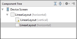
- Select the first (vertical)
LinearLayoutwithin the rootLinearLayout, find its layout:weight property, and set it to40. Set itsbackgroundto a color of your choice by finding and left-clicking the background property ellipses ..., then left-clicking the Color tab and choosing a color. - Select the second (horizontal)
LinearLayoutwithin the rootLinearLayout, find its layout:weight property, and set it to60. We now have two clearly discernible areas of the screen: one taking up 40%, the other 60%, as shown next: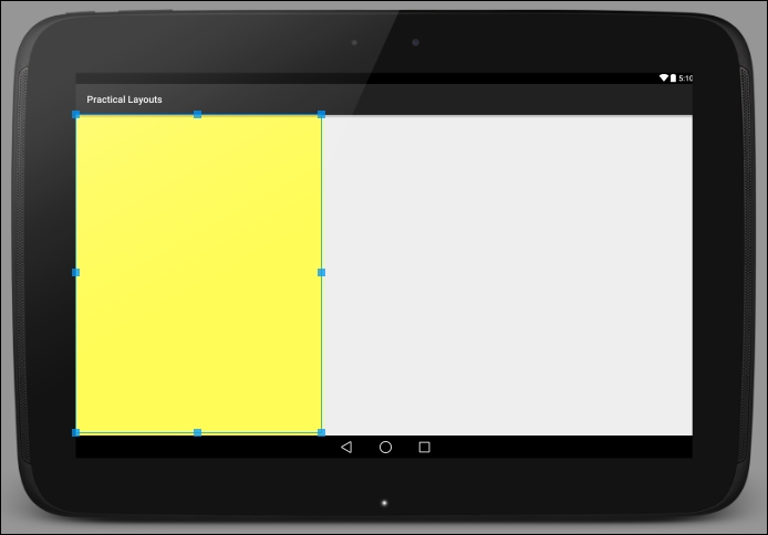
- Now drag a ScrollView from the Containers section of the palette and drop it on the left-hand smaller (40%) width
LinearLayout. - Now drag another LinearLayout(vertical) on top of the
ScrollView. - Now drag around 20 (seriously!) Large Text widgets onto the
LinearLayoutyou added in the previous step. As theLinearLayoutis initially squashed flat, it will be easier to start by dragging the Large Text widgets onto theLinearLayoutvia the component tree window. - Now drag an ImageView to the right-hand
LinearLayout. Make it display the Android icon by finding its src property and browsing to ic_launcher at the end of the list on the Projects tab, as we did while experimenting withImageViewearlier. The image serves no purpose here other than to demonstrate that it is completely distinct from the functionality we are about to witness in the left-hand side of our UI. - Change the
ImageViewlayout:weight property to1to make the image larger. - Change the call to
setContentViewinMainActivity.javato the same as the next line of code:setContentView(R.layout.list_detail_layout);
- The code will now set our new layout as the layout for our app. Run the app on the Nexus 7 emulator.
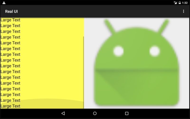
When the app is running you can left-click and drag the left-hand pane of the app to scroll the contents up and down. Notice that the Android image in the right-hand pane stays still:
We achieved this by adding two LinearLayouts to our root LinearLayout. We made one cover 40% and the other 60% of the parent by setting their layout_weight properties to 40 and 60 respectively. Then we put a ScrollView into the left-hand LinearLayout and put another vertical LinearLayout into the ScrollView. We did this step because ScrollView can only have one child (very wise). However, once we have the
LinearLayout inside the ScrollView we can add as many widgets as we like and they will all scroll nicely, as we saw.
We have already played around with RelativeLayout as it is the default layout when we create a new project. With this project we will lay out a fairly comprehensive form—similar to what you might ask a user to fill out when subscribing to a service.
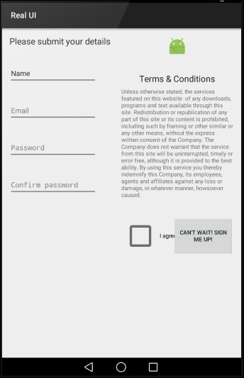
It will probably help to see the layout before we get started. So here it is with the name and password fields already filled out so we can see what different fields will look like:
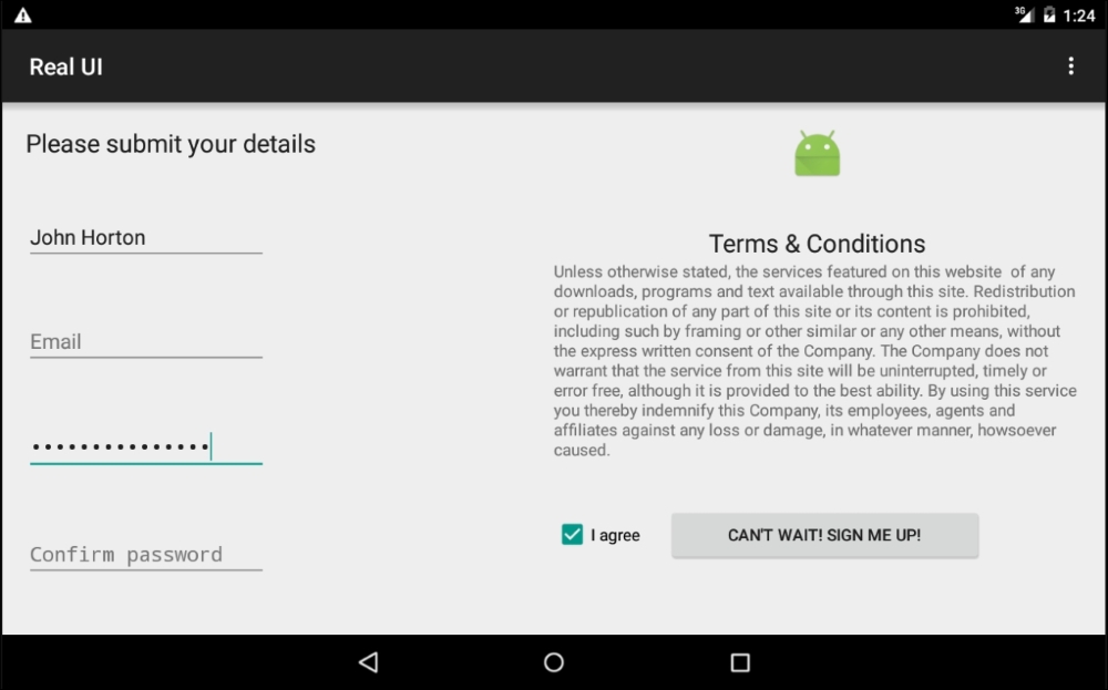
Now we can see the end goal, let's get on with creating it for real:
- Use the same project as we did for the previous layout but let's start with a completely clean sheet for the layout. Right-click the
layoutfolder in the project explorer. From the pop-up context sensitive options menu, choose New | Layout resource file. - Make sure LinearLayout is selected for the Root element. Why we use
LinearLayoutwhen we are supposed to be learning aboutRelativeLayoutwill soon become apparent. - Name the file
form_layoutthen left-click OK. - Select the
LinearLayoutat the root of our design and change its orientation property fromverticaltohorizontalfrom the properties window. - Drag and drop two
RelativeLayoutelements onto the design. Make sure they are both children of the rootLinearLayout. If this is awkward, remember you can drag them directly onto the component tree view to make sure they have the intended parent. The end result is as shown in the following component tree image: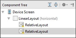
- Now we will make sure that each of the
RelativeLayoutelements take up exactly half the screen each. Find thelayout:weightproperty of each in turn and set them both to.5. By doing so each layout will take up half the space. As long as the amounts are relative to each other they will work. So you could use 50 and 50 if you prefer. - As a precautionary step, check that there are no values set in the layout:margin property for either of the RelativeLayout elements. Sometimes when we drag and drop elements onto the design, Android Studio will add a margin without us realizing. If there are any values for any of the
RelativeLayoutmargins, delete them. You should now have two equal-sized layouts filling the design. - Drag and drop a Large Text widget onto the top-left corner of the design. Put it right in the corner, don't worry about leaving a margin at the moment.
- Double left-click the widget from the previous step to open up an editing window for its
textproperty. Enter the textPlease submit your details. This has exactly the same effect as editing thetextproperty in the Properties window. - From the Text Fields category of the palette, drag a Person Name widget onto the design but don't drop it straight away. Position the widget hard to the left of the design and slightly below the previous text we added in step 9. Notice that as you move the Edit Text up and down you can see the margin property changing. The next image should make this clear:
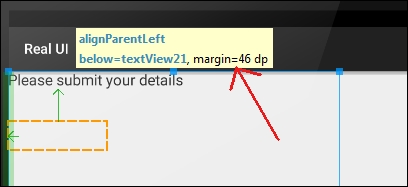
- Try and get the margin property as close as possible to
46 dp, then, while still against the left side of the design, drop the Edit Text. If you didn't get the margin quite right, in the Properties window set margin:top to46dp. - In the properties window find the hint property and set it to
Name. This will put text on our widget but as soon as the user taps it to enter his name the text will disappear. - From the Text Fields category of the palette, drag an Email widget onto the design but don't drop it straight away. Position the widget hard to the left of the design and slightly below the previous text we added in step 9. Notice, as before, that as you move the widget up and down you can see the margin property changing. Drop it when it is
46 dpexactly or edit margin:top in the Properties window. - Find the hint property and change it to
Email. - From the Text Fields category of the palette, drag a Password widget onto the design but don't drop it straight away. Position the widget hard to the left of the design and slightly below the previous text we added in step 9. Drop it when it is
46 dpexactly or edit margin:top in the Properties window. The Password widget is simply an editable text field that obscures what the user has entered. You can see this in action in the image showing the completed layout that we saw before this tutorial. - Find the hint property and change it to
Password. - From the Text Fields category of the palette, drag a Password widget onto the design but don't drop it straight away. Position the widget hard to the left of the design and slightly below the previous text we added in step 15. Drop it when it is
46 dpexactly or edit margin:top in the Properties window. - Find the hint property and change it to
Confirm password. At this point your layout should look like this next image: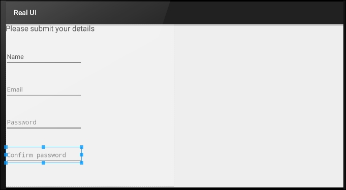
- Moving on to the right-hand side of the form, drag an ImageView and drop it on the hard left and top of the right-hand
RelativeLayout. - Set its src property to
ic_launcherby browsing to it on the Projects tab after left-clicking the ... link, as we have done before. - Set the layout:width property to
match_parent. This doesn't make the actual image larger but it prevents it being wrapped so that the next step will work. - Find the layout:centerInParent property and set it to
horizontal. The Android robot image should now be in the center-top of the right-handRelativeLayout. - Drag a Large Text widget from the palette onto the right-hand
RelativeLayout. You should be able to center it and set the margin between theImageViewto46 dpbefore letting go of it. If your mouse doesn't have quite the right sensitivity to achieve this, you can set margin:top in the Properties window. You can also use the Properties window to set the layout:centerInParent property tohorizontalif necessary. - Now we will add the actual terms and conditions. Obviously, following in the long tradition of all terms and conditions, we want to make this text smaller than the rest of the text on the form. Drag a Small Text widget to
10 dpbelow and exactly central to the previousLarge Textwidget. You can achieve this using exactly the same techniques that we used in the previous step. - Find the text property in the Properties window. Copy and paste some random text, sufficient to fill about the same amount of space as the terms and conditions takes up in the completed layout image we looked at before this tutorial. Leave just enough space for a button and some margin below.
- Drag a Check Box widget onto the layout and position it on the hard left of the right-hand
RelativeLayoutand 46 dp below the terms and conditions. - Edit the text property to
I agree. - Drag a Button onto the layout and line it up with the bottom edge of the
Check Boxand around85 dpfrom the right. This next image should make this clear, as well as show all our progress to date: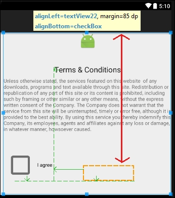
- Change the text property to
Can't wait! Sign me up!. - Next, you will notice that the base of the button is in line with the check box base but the top isn't. In the Properties window find the layout:alignComponent property and in the top:top sub-property select the checkBox widget.
- Now go to the root
LinearLayoutand find the padding property and set its sub-property all to20dp. - Change the call to
setContentViewinMainActivity.javato the same as the next line of code:setContentView(R.layout.form_layout);
- The code will now set our new layout as the layout for our app. Run the app on the Nexus 7 emulator.
You should have a nearly-identical layout to the image we saw before the start of the tutorial. We achieved these tidy results by inserting two RelativeLayouts in a parent horizontal LinearLayout. Actually we could have achieved an initially neat looking layout in just one RelativeLayout. The problem is that if we had done this, the second column of widgets would have been positioned using a margin from the left-hand column. The dp units are perfect for creating small margins and padding, but when we use them across a significant amount of screen real estate then we get very inconsistent results on different devices.
By first dividing the screen into two halves, based on the weight property, we get a consistently neat layout. If the form was more complicated we would probably want to further sub-divide the screen to be even more sure that when we lay out the individual widgets relatively, they are always consistent.
As an experiment, try rotating the screen to portrait orientation. You can do so on an emulator with the Ctrl + F11 keyboard combination.
Not too bad but certainly imperfect. There are a few possible solutions to this problem:
- Provide an additional layout in a file with the same name and put it in a folder named
layout-portraitin theresfolder. - Lock the layout to landscape and prevent the user from rotating the layout. We can do this in either XML or Java code.
- Come up with an entirely more elegant but slightly more complex solution using Fragments.
We will use the second solution when we build our first full app from Chapter 12, Having a Dialogue with the User to Chapter 17, Sound FX and Supporting Different Versions of Android. We will see the third solution when we build more advanced apps starting from Chapter 18, Design Patterns, Fragments, and the Real World. There are pros and cons to all of the solutions, and which one you use depends upon the experience you want your user to have. They are all as valid as each other.