
Understanding components
Convert layers and groups to custom components
Convert artwork to a button
Convert artwork to a toggle button
Convert artwork to a text field
Convert artwork to sliders
Create radio buttons and checkboxes
Create data lists and scroll panels
Convert artwork to a scrollbar
When you create a project in Catalyst, you are creating the groundwork for a Flex project. Flex is a component-based application framework, and Flex developers working in Flash Builder or coding in some other environment create modular applications. That is, they avoid creating single, large files with all of the code for their application, and instead create a series of smaller files, each with a distinct purpose.
These individual modules are known to Flex developers as components. Almost everything a Flex developer works with is a component, from large application-specific modules such as a shopping cart down to individual user interface items like buttons and text fields.
In order for your Catalyst project to be easily imported into Flash Builder, you will want to define the contents of your artwork as components. Catalyst has the ability to convert artwork into a number of common Flex components, as well as custom, generic components.
Almost everything in your Catalyst project needs to be converted into a component before you hand the project over to your developer. Almost the only thing not converted to a component is the background of your application, and in certain situations, that is as well.
Tip
Static graphics should be converted to optimized graphics, but although they are given a different name in Catalyst, an optimized graphic is in fact a type of component.
Note
See Chapter 8 for details on optimized graphics.
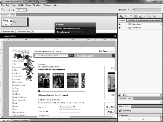
You can use the Heads Up Display (HUD) to convert any object or group on the art board to a component (see Figure 9.1).
You can convert selected artwork into one of several predefined common Flex components (see Table 9.1) or into a custom component.
Note
You may need to use the Direct Select tool to select artwork in sublayers. The Selection tool generally selects only the layer. You can also select objects by clicking their appropriate layer or sublayer in the Layers panel.
Once artwork is selected, you convert it to a component by simply selecting the appropriate component from the drop-down list on the HUD. Once converted, the HUD changes to display any necessary settings for the component.
Tip
If you have turned the HUD off, you can convert selected artwork to a component by right-clicking (
Table 9.1. Available Components
Description | |
|---|---|
Button | A clickable component, designed to respond to user interaction. |
A selectable component for fillable forms. Normally, checkboxes are grouped into a set where the user can select one or more options. | |
Radio Button | A selectable form component, most often used within a mutually exclusive group. |
Toggle Button | Similar to a button. Toggle buttons have a Selected state that remains active until the button is clicked again. |
Text Input | A single-line form field for user-entered data. |
Sliders can be used to allow the user to select from a range of values. | |
Scroll Panel | A panel component is a container for other content. The panel contains a title area and can take Horizontal or Vertical Scrollbars. |
Horizontal Scrollbar and Vertical Scrollbar | Scrollbars can be added to components to allow you to add more data than can fit. |
Data List | A table-like structure for displaying rows and columns of data. |
A component to use anytime your objects do not make sense as one of the other component types. |
The component types listed in the HUD represent common user interface components that appear in many applications. However, most of the interface of your application is unique to that application, and therefore converts to custom components.
With the exception of static items such as small blocks of text and images, you will want to convert almost everything into a component. Anything that does not logically make sense as one of the common component types should be converted to a custom/generic component.
The main portions of your application should also be converted to custom components. You will likely be planning on building multiple states or pages in your application, and all of the pieces that make up any particular state should be combined into a component. This not only makes it simpler for you to define the parts that make up states, because it is much easier to hide, move, and animate a single component than it is to do the same to a series of smaller pieces, but it also aids your Flex developer in working with the application in Flash Builder.
You can edit any components at any time. You can edit a component by double-clicking it on the artboard (see Figure 9.2). This switches Catalyst to an Edit in Place mode, where you can select and manipulate the parts that make up the component. The remainder of your application will still be visible but grayed out.
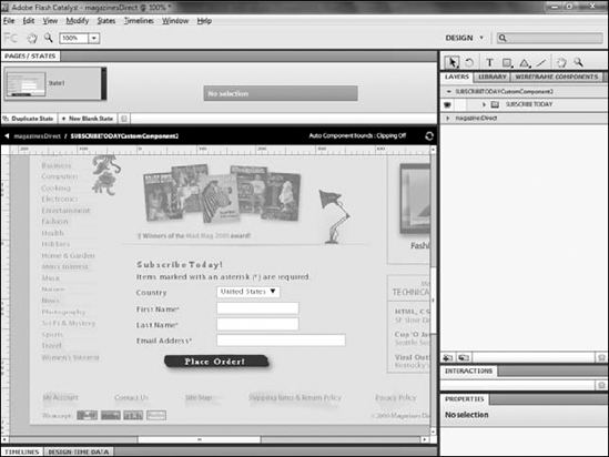
You can return to editing the entire application by clicking the small left-facing arrow on the left side of the black bar that runs just below the Pages/States panel or by double-clicking an area of the art board that does not contain a part of the component.
You can nest almost any component type within almost any other type (see Figure 9.3). For example, Scrollbar components can be nested within Scroll Panel or Data List components.
Any of the common user interface components will likely end up nested within your custom components: a series of Text Input, Radio Button, Checkbox, and Button components might, collectively, be combined into a single Form custom component. That form component might then itself be nested within a large component making up the overall page or state on which the form resides.
You can nest components by either selecting them as part of the set of objects that you convert when you create the component, or add nested components later by dragging them from the Library to the artboard while you are editing the component.
You should get in the habit of immediately naming all components. Every time you create a component, it gets added to the Library. You can double-click the name of this component to rename it, ensuring that you give it a descriptive label that aids both you and your Flex developer later in referring to and using it in your application.
Names of components can contain only letters, numbers, and underscores, and need to begin with a letter. In addition, names are case-sensitive. Most Flex developers rely on a system known as camel casing for naming items, whereby multiple-word names are combined into a single word, with the first letter of the name in lowercase and the first letter of each additional word capitalized. For example, a name such as Home Address would be written homeAddress.
Buttons allow for interactivity with your user. You can convert any artwork into a button, so there is no limit as to the visual appearance of a button you create.
Buttons have four predefined states that allow you to define how the button looks initially:
When the mouse is positioned over the button
When the button is being clicked
When the button is disabled
You can use separate artwork for each state, or simply modify the existing artwork.
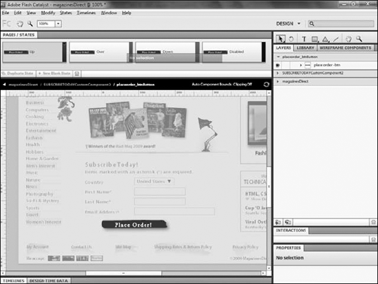
Once a button is created, the HUD displays buttons of its own to allow you to access each of these states. Clicking any one of them, or double-clicking the button on the artboard, allows you to edit the states of the button directly (see Figure 9.4).
The Pages/States panel along the top of the screen shows you each of the button's states:
Up. Defines the appearance of the button when the user is not interacting with it.
Over. Defines its appearance when the user positions the mouse over the button.
Down. How it will look when the user is pressing and holding the mouse button.
Disabled. Shows what the button will look like when it is disabled, or unclickable.
Note
You cannot set a button to Disabled in Catalyst; you can merely define what the state looks like. Your Flex developer uses code to determine when the button is enabled or disabled.
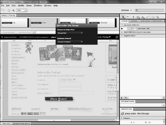
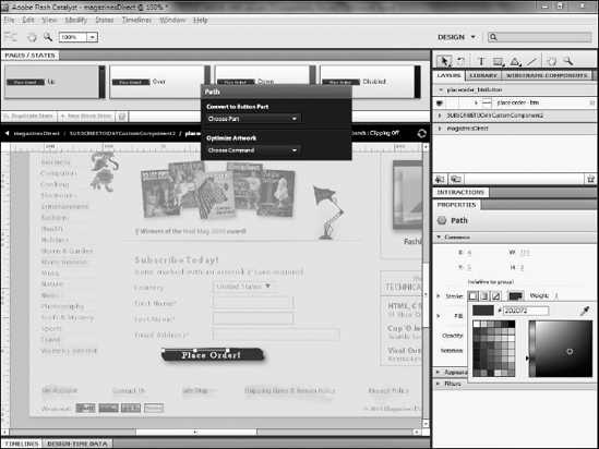
Each of the component parts of the button can be edited in each state. You can change the colors of the fills or strokes (see Figure 9.5) or even replace the artwork with something else altogether.
To change the fill color of a button in different states, follow these steps:
Double-click the button to edit its states.
Click the state you want to change.
Select the button's fill with either the Select or Direct Select tool.
Use the Properties panel to change the fill's color.
Tip
You do not have to define the appearance for each state if you do not want to. Any state that you leave unchanged inherits its appearance from the state to its left, so if you define an appearance only for Up and Down, the Over state will look like Up, and Disabled like Down.
Note
All components that contain multiple states can have animated transitions between those states. See Chapter 10 for details on defining these animations.
Once you have completed your work on the button, you can return to the main artboard by clicking the project's name on the black bar that runs across the screen, just below the Pages/States panel. You can return to editing the button at any time if further changes are necessary.
You cannot view the states of the button directly in Catalyst; instead, you need to run the project. Click File
Note
See Chapter 4 for more details on running a project.
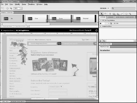
Toggle button components allow you to provide a visual clue when the button is selected (see Figure 9.6). Regular button components respond to mouse actions but do not have any selected states.
You can create a toggle button in the same way you create a normal button, except that you select Toggle Button from the HUD's Convert Artwork to Component drop-down.
Toggle buttons have all of the same properties as buttons. However, when you edit the button's states, you see that it contains the same four states as a button — Up, Down, Over, and Disabled — but also contains four additional states:
Selected Up
Selected Down
Selected Over
Selected Disabled
Edit these states to define the visual appearance of the toggle function of the button.
Many Web applications today require forms, whether to provide the ability to search the application, allow the user to register or log in to a site, or provide credit card information to purchase products.
When designing an application using Catalyst, you are free to design your forms as you want. Simply draw the elements needed for the form in your design comp in Illustrator or Photoshop, and then use Catalyst to convert the drawings to form fields.
The most basic and most common type of field is a single-line text field. Most often, these are represented in the design comp as a simple rectangle. As with buttons, you can select the rectangle and use the HUD to convert to a Text Input component. Once converted, click the Edit Parts button to configure the input component (see Figure 9.7).
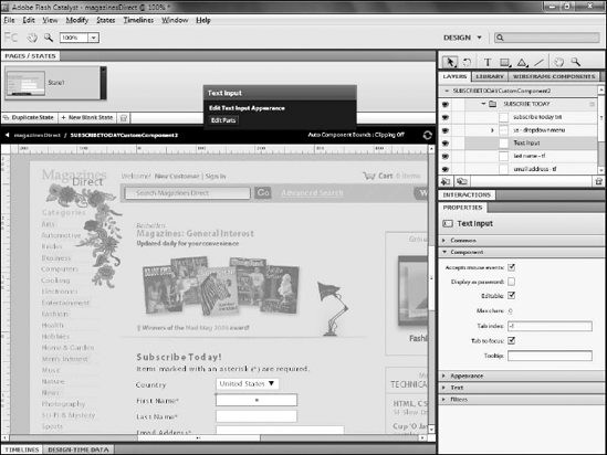
Text Input components contain two states:
Normal
Disabled
Most contain two parts:
The Text Display
The Rectangle or other shape defining the border of the field
The Text Display part provides the most options for editing on the Properties panel. There, you can set text to display in the field by default, select the font, and configure font properties such as size and color.
You can also set whether or not the field accepts mouse events or displays as a password, whether it contains user-editable text, and the maximum characters that can be entered into the field, and provide a tooltip that appears when the user mouses over the field. Options to add strikethrough and underlining to the text are also available.
A slider is a component that allows your user to drag left and right, or up and down, to change a value (see Figure 9.8).
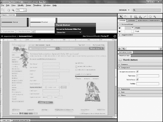
Sliders have two required parts:
A thumb
A track
The thumb is the part that the user drags to change the value, and the track defines the path along which the thumb slides. Therefore, you need to design your artwork in Illustrator to include these two pieces.
Warning
While designing the track, be aware that Catalyst supports only sliders that move along straight tracks.
To convert artwork to a slider, follow these steps:
Import your artwork into Catalyst, either as part of your design comp or as separate art.
Select both pieces of art.
On the HUD, click Convert Artwork to Component
Select the resulting component.
Click Edit Parts on the HUD.
Select the thumb art.
On the HUD, click Convert Artwork to Horizontal Slider Part
Repeat steps 6 and 7 to define the track.
The slider contains a set of properties that can be configured on individual instances of the component (see Table 9.2).
Table 9.2. Slider Instance Properties
Property | Description |
|---|---|
Accepts mouse events | Defines whether or not mouse events can be added by the Flex developer to this component. |
Data tip while dragging | Adds a tooltip displaying the current position's data value while the user drags the thumb. |
Maximum | The maximum data range for the slider. |
Minimum | The minimum data range for the slider. |
Snap interval | The amount by which the value changes as the user drags the slider. |
Step size | Defines the space between steps on the slider or how far the user needs to drag to get to the next snap interval. |
Tab index | An integer value defining the component's tab order in the application. |
Tab to focus | Allows the user to set the focus on the slider with the Tab key. |
Tooltip | Sets a tooltip to appear when the user mouses over the slider. |
Note
Sliders are often attached to a text input field or some other component to accept their value. This association must be done in Flash Builder, not Catalyst.
Radio button and checkbox components are common form elements that allow your user to select from a set of predetermined choices. A user can select only one radio button from amongst a group, whereas multiple checkboxes may be selected.
Both components are defined in much the same way and share almost all the same properties. Radio button and checkbox components share the same set of states as toggle buttons:
Up
Down
Over
Disabled
Selected Up
Selected Down
Selected Over
Selected Disabled
Use the selected states to provide visual clues to your users as they navigate over the buttons for the option or options they have chosen, and the others for the options they have not yet selected.
Tip
In almost every application, both on the Web and on the desktop, radio buttons provide circular selection areas, and checkboxes provide squares. You should consider maintaining this distinction when designing your buttons, because square radio buttons or circular checkboxes may confuse users.
The only difference between radio buttons and checkboxes is that you need to group sets of the former. Radio buttons allow users to choose one option within a set. You can define this set by clicking each radio button component and, from the Properties panel, enter a name in the Radio button group field.
Catalyst provides two predefined components to use when you need to display a lot of data in a limited space:
The scroll panel
The data list
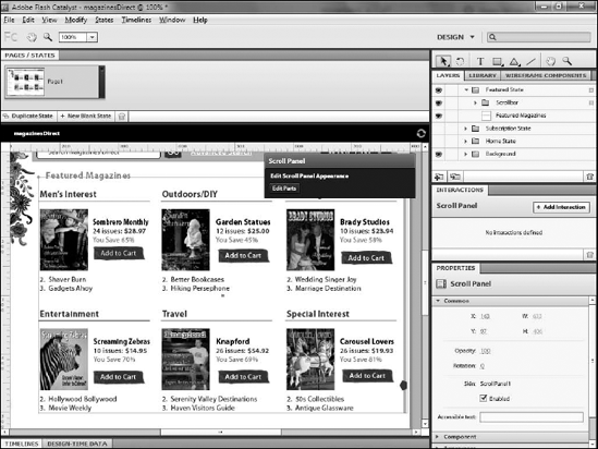
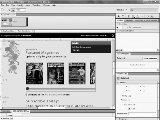
You can use the scroll panel for large blocks of text or similar content (see Figure 9.9), whereas the data list provides a table-like component for structured data (see Figure 9.10).
Both components have a single required part: the data to be scrolled.
Scroll panels refer to this internal part as scrolling data, whereas data lists call it a repeated item. This scrolling information can be another component, text, or simple artwork. Often, it may end up being nothing more than placeholder information, with the plan that the final application will pull this information from a back-end server source such as a database.
For example, you might have a scrolling panel that will display the products your application is selling. When you do the initial design in Catalyst, you would likely represent those products with placeholders, but in the final application, the actual products would be pulled from a database.
Both components also need a scrollbar, which is a separate component that you create and define as such. The components can take a horizontal or vertical scrollbar or both.
You can create a scroll panel or a data list by simply selecting the item to be repeated and choosing the appropriate component type from the HUD. Then, edit the component and define the scrolling data or repeated item.
Data lists provide a few additional properties to set up the layout and spacing of the repeated item.
Once you define the item using the HUD, the component automatically populates itself with five copies of the item. Using the Properties panel, you can set the item to repeat vertically in a single column, repeat horizontally in a single row, or tile.
If you choose Tile, you can set the direction, specifying whether the data should go across a row before going down to the next column, or vice versa, going down a column before it repeats to a new row. You can set the alignment of the items within each column or row, and the vertical and horizontal spacing between each item.
Note
The alignment buttons for data list properties appear to do something only if the items in the list are different sizes.
Most of the time, the actual data that populates the data list is from a server-side source and populated at run-time. This requires significant coding and is done by the Flex developer in Flash Builder.
Therefore, as a designer, you are most likely doing nothing more than adding placeholder information; you want to be able to see what the list will look like, even though you are not using the actual, live data.
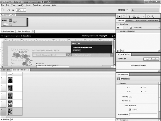
Catalyst provides a Design-time Data panel (see Figure 9.11) that allows you to create a simple table of information to populate the data list. This way, you can have data that looks and feels like your real data, without having to worry about potentially complex coding.
If you define a set of objects that contain one or more individual elements as the repeating item of the list, the Design-time Data panel's table automatically populates with that information. If the table contains text data, you can simply click each item and type a new value.
You can swap images out with other images in your Library by double-clicking the image thumbnail in the panel. An Add Row button at the bottom of the panel allows you to insert additional data items.
Note
The Design-time Data panel does not automatically populate itself if you use a component as the repeating item in a data list. Instead, you need to double-click the component within the data list and then select the parts of the component you want to use as data and click the Add to Design-time Data button on the HUD.
Many applications require areas that can contain more data than can fit in a limited space and thus require scrollable content. Although several Flex components include automatic scrollbars that look like those that are standard in the operating system, Catalyst provides the ability to completely customize scrollbars, using your own artwork (see Figure 9.12).
Scrollbars require a minimum of two parts:
You can also add left and right buttons, but they are optional.
You can create a scrollbar by following these steps:
Select at least two pieces of artwork.
Choose Convert Artwork to Component
Once converted, either double-click the component on the artboard or click the Edit Parts button on the HUD to go into editing the component (see Figure 9.13).
Tip
The HUD displays a Component Issues message in its top-right corner anytime a component is selected that does not have required parts defined.
Once you are in the editing mode for the scrollbar, select the art to be used as the thumb.
Click the Convert Artwork to Scrollbar Part drop-down on the HUD.
Select Thumb (required).
Repeat this process for the track and, if desired, the right and left buttons.
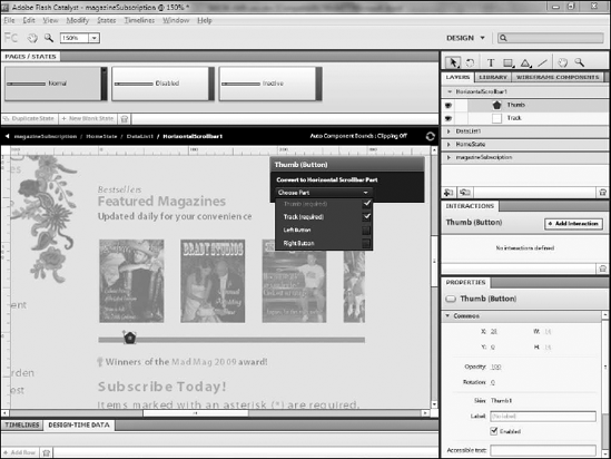
As with other components, scrollbars also contain states:
Normal
Disabled
Inactive
Disabled is a state that can be selectively controlled through code when your Flex developer takes over the project. Inactive defines the scrollbar's appearance when it is visible on the screen in a component that does not contain enough data to require scrolling.
Scroll panel and data list components need a scrollbar in order to function properly. You can associate a scrollbar component with either of these by simply adding the scrollbar component to the scroll panel or data list.
You can do this before you create the component by following these steps:
Place the scrollbar near the item you plan to use as the data.
Select both.
Convert the group to a Scroll Panel or Data List component.
Alternately, you can add the scrollbar after the creation of the component: Double-click the scroll panel or data list to edit it; then drag an instance of the scrollbar from the Library.
In this chapter, you were introduced to the idea of using components as building blocks for your application. You learned what components are for and how to:
Convert layers and groups to custom or generic objects
Create buttons, toggle buttons, radio buttons, and checkboxes
Covert artwork to text input fields, sliders, and scrollbars
Create data lists and scroll panels