Chapter 4
Building UI in VR
Building intuitive, well-designed user interfaces in VR requires hybrid expertise in visual design, user experience, and front-end software engineering. This chapter introduces you to this set of skills through design concepts and methodologies used by Google when designing user interfaces for VR. It then guides you through the practical steps of applying these methods to build engaging UI systems for VR games and apps.
Designing User Interfaces in VR
Designing great user interfaces (or UI) for VR is a deceptively challenging task. Unlike other digital mediums, such as mobile or desktop, where creative possibilities are constrained by screen sizes and flat surfaces, the potential permutations of interfaces in virtual reality are limitless.
As a VR creator, the process of building UI requires a hybrid skillset encompassing design and engineering. Underpinning these two disciplines are other considerations spanning user experience (UX), art direction, psychology, ergonomics, and software engineering. Each of these areas offers a complex challenge in their own right, but when combined in the medium of VR, they become an ambitious undertaking.
Additionally, people’s expectations for product excellence in VR have been set very high. Being experts in everyday “meat space” reality (also known as everyday life), we expect a higher quality in VR because of the extra possibilities it affords. With AAA game play, high-end graphics, and special effects, people anticipate an enhanced experience.
Simply creating a functional, usable experience is then not enough. It also needs to be aesthetically beautiful and innovative, empowering the user to do more than the options they have in real life by giving them playful agency over the world. Many VR games successfully walk this line, but it is really not an easy one to tightrope along.
With that said, the most important thing is to get the basics right. This chapter focuses on creating spatial UI rendered in world space using Unity’s built-in UI system. World space UI in Unity is simply UI rendered as 2D panels, placed in the 3D environment.
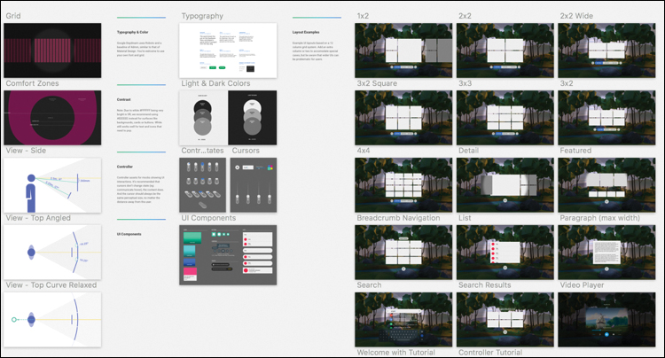
By the end of this chapter, you will have built a template for a game menu that can asynchronously load in game levels, as well as a complex scrolling panel system for an app that lays out content similar to the UI in the Daydream Home world (see Figure 4.1).
Even with the multitude of possibilities in VR, it turns out that the easiest way to consume basic information is the same way we do in the real world: on flat rectangular screens and often in text format.
This section discusses various principles of design worth considering when creating UI for these flat rectangles. The design system and workflow developed by Google’s Daydream design team is then presented as a way to apply these design principles in practice.
Design VR, Use VR
It sounds obvious, but the best way to design for VR is to use VR. This means not only systematically testing your work in the VR environment, but researching and exploring what other people are doing in VR; in other words, immersing yourself in it. You cannot create well-designed UI if you are not using VR regularly.
User Experience Design in VR
The principles of human-centered design hold true in virtual reality just as they do in any other design-related medium.
The goals and needs of the user are paramount to the experience, and as such they should drive the design process across all stages of product development. Good design in VR is a constantly reiterative process of evaluation, creation, and testing: as is all good design, essentially.
The overarching principle of human-centered design1 (or HCD) is of working out the goals and requirements of the user by placing them at the center of all design thinking. Through this methodology the system is analyzed, pain points for the user are identified, and an attempt is made to transform difficult tasks into simple ones.
The usability of a VR system can be tested against classic HCD principles in the same way as they are in any other traditional design practice.
When iterating on interface design, VR designers should be looking for ways to simplify complex tasks by
Limiting choices to, where possible, the correct ones.
Applying clear mapping between the relationship of a UI element, and what it actually does—its function or outcome.
Making sure enough information is available in the world for users to build a clear mental model in their heads of how the system works.
Designing for error. People make mistakes, particularly in VR, and the system should not punish human error, lock people out, or become stuck in a state that is difficult to exit out of.
Falling back on convention. When the design solution is unclear, use an existing or industry standard. If an accepted way of doing something already exists, then do not reinvent the wheel.
Ergonomics
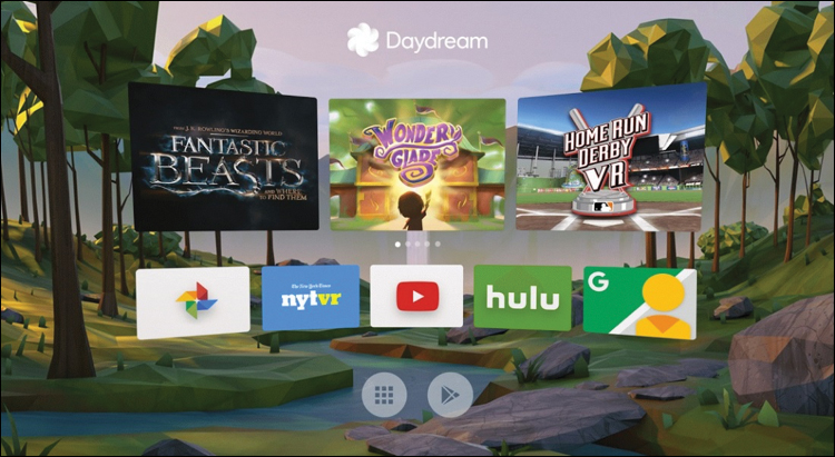
The particular ergonomic factor of users’ sitting position and hand position plays a significant role in how they will interact with UI in Daydream VR. Most importantly for us, the primary location of most users when using Daydream VR is lounging on a couch or some similar furniture.
Different viewing positions and postures affect the users’ gaze and focus on the screen. Daydream users tend to tilt their head down slightly by 10 to 15 degrees, while their eyes look up, moving the center point of focus to around 6 degrees below the horizon (see Figure 4.2).
Although they are seemingly minor, being aware of these factors is a crucial step to improving usability and should be considered with a high degree of importance when deciding on placement of UI.
Material Design
Material Design is Google’s design language created to visually unify all of Google’s various products and services.
It uses the concept of material planes as a visual metaphor that builds a theory for rationalizing interfaces in space and a system for how they should move.
Although Material Design was not made specifically for VR, Daydream’s design team has done some great work in applying Material Design principles to Daydream’s UI.
Find out more about Google’s Material Design system by visiting https://material.io/.
Daydream’s Design System: dmm
A smart way to design user interfaces for VR is to base them around the legibility of text.
However, the further UI moves away from the user in 3D space, the less coherent it becomes. How can a designer create UI in a 2D application that will be clear and readable in VR at any distance?
The Daydream UX team has developed a system and workflow that solves this problem and makes working with UI consistent across different screens, 2D and 3D, and at any distance. At its core, it uses a system of angular units.
Conceptually, at an atomic level, virtual screens and real screens share the same properties. They have content that needs to be displayed, and they each have an intended viewing distance and size.
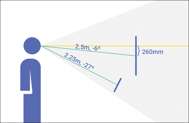
In the real world, when you look at a billboard across the street and then hold your phone up next to it, the text on each of those screens will be legible and appear to be at a similar size. The same principle applies to UI in VR. As things move further away, they must be scaled up to stay legible. Text in the foreground and background look the same if they have the same angular scale. This phenomenon of angular scale is the core concept behind Daydream’s design system.
The Daydream team’s system for designing comfortably legible UI using angular scale is called distance-independent millimeter (dmm, pronounced “dim”). A dmm is described as one pixel (in your 2D design application) being equal to one millimeter at one meter distance away in VR. The scale then increases based on the distance. So, at 2 meters distance it doubles to 2mm, at 3 meters it triples to 3mm, and so on (see Figure 4.3).
This elegant solution means you simply scale the UI by a factor of its distance from the user, making it legible at any distance. As a designer, you can have confidence your pixel precision mocks will look the same in VR as they do in Sketch.
Sketch
Sketch is a design application that has become popular with digital designers in recent years. Because of its simplicity for rapidly mocking up mobile app interfaces, Sketch has quickly become the industry standard. It turns out that Sketch is also great for designing UI in VR.
You can download a free trial of Sketch from https://www.sketchapp.com/. I recommend you install it along with the Daydream Sketch UI sticker sheet (https://developers.google.com/vr/design/sticker-sheet). Sketch is currently only available on Mac.
To help designers easily apply the concept of dmms to their VR UI in Unity, the Daydream design team has open-sourced a Sketch template that is based in dmms (see Figure 4.4). It has standard minimum text sizes and various Material Design and UI components included. They all conform to the system of dmms, so your interfaces will transfer easily from a 2D application into Unity’s 3D space, and they will look correct at any distance.
If using dmms still sounds complicated, do not worry. The first recipe in this chapter steps you through the process of creating a template using dmms to handle UI in Unity, with textures exported from the sticker sheet. Go ahead and download the Sketch sticker sheet from the Daydream VR developer site at https://developers.google.com/vr/design/sticker-sheet.
UI, Unity, and the Google VR SDK
Moving on from UX and design concepts, let’s head to the practicalities of actually building the UI in Unity. As in the previous chapters, the methods described here use a combination of Unity’s built-in components and those provided by the Google VR SDK.
Unity has its own robust system for laying out complex UI, conveniently called the UI System. It comes with standard components for visual elements, layouts, interaction, buttons, and other useful controls.
In Daydream, these components are made interactive using the custom Event System provided by the Gvr SDK, the GvrPointerGraphicsRaycaster. The Event System is the same one outlined in the previous chapter, with a minor addition of the custom Graphics raycaster, as opposed to the Physics raycaster.
Note
As you work through this book and become familiar with Unity’s UI system, it is worthwhile digging around in the demo scenes included with the SDK and Elements. Of particular relevance to this chapter is the ScrollingUIDemo found in the Elements code base. It contains several great examples of complex scrolling and interactive UI, similar to the ones we build in this chapter.
Let’s take a look at several of the essential components that form the backbone of Unity’s UI System.
Canvas
The Canvas is a component that determines how UI elements should be rendered and all UI elements must be children of a Canvas.
After you place a Canvas in the scene, if its render mode is in world space, you can add elements to it and position it in 3D space accordingly. There can be multiple Canvases in a scene, and a Canvas can be nested within another Canvas.
Canvases have three different types of render mode (Screen Space Overlay, Screen Space Camera, and World Space) that determine how they appear in your app:
Screen Space Overlay: Means the UI is overlaid on top of the camera. In a mobile app the UI will always sit on top of everything else and is locked to the screen.
Screen Space Camera: The UI is locked to the camera, but can extend back in space. This is useful for creating heads-up displays that stay locked to the camera but exist in volumetric space.
World Space: The Canvas and UI will be placed in the 3D environment. Objects in world space can be static and fixed in the scene, or move relative to GameObjects that they are attached to, such as tags and power ups.
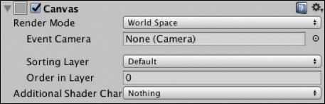
The recipes in this chapter only use World Space render mode, but the default render mode is Screen Space, so when adding a new Canvas, update this in the Inspector (see Figure 4.5).
A Canvas in World Space render mode has these properties:
Event Camera: This is the camera that is used to render the Canvas and UI elements. In VR, this is usually set to the Main Camera attached to the
PlayerGameObject in your scene.Sorting Layer: Allows for a custom layer so you can easily manage the order in which the Canvas element or elements are rendered. This overrides the Canvas distance from the camera as the method of rendering order.
Order in Layer: Explicitly sets the Canvas’s depth within the layer for even more granular control over render order.
Rect Transform
The Rect Transform component is applied to all UI elements (see Figure 4.6) and is slightly different from the Transform component used by non-UI GameObjects. It represents a 2D rectangle specified by a width and height related to a pivot point. The 2D rectangle can be manipulated in 3D space through position, rotation, and scale.
The pivot point of a UI element is the center point around which it moves when rotated. The pivot point can be moved, altering the center of rotation.
Rect Transforms contain anchors that allow them to be anchored to a parent UI object. This also affects how they are dynamically moved and sized based on the size and position of the parent. This is useful for creating fluid layouts.
Rect Tool
The Rect tool (see Figure 4.7) is used to manipulate UI elements in the scene view.

With the Rect tool selected, click and drag on the edges of the UI element to scale it, and then click and drag inside the boundary to reposition. Click and drag outside near any of the corners to rotate.
The pivot point of a UI element is depicted by a blue circle in its center; this can be clicked and dragged to move it to another location, changing the center of the rotation of the element.
GvrPointerGraphicsRaycaster
Though technically not a member of Unity’s UI System, the GvrPointerGraphicsRaycaster is an essential part of the UI System in Daydream and utilizes raycast modes specific to Gvr. It is a custom Graphics raycaster that works with the Gvr event system (also called the Pointer system) introduced in the previous chapter.
Only one change is needed when interacting with UI elements instead of 3D objects: A Graphic raycaster is added to the Canvas instead of the Physics raycaster attached to the camera.
Similar to the Physics raycaster, the GvrPointerGraphicsRaycaster works in conjunction with the GvrPointerInputModule. This Input Module is already attached to the GvrEventSystem prefab. The GvrEventSystem has already been added to all scenes in this chapter’s recipes based on the original Daydream Unity scene template from Chapter 2, “Daydream and Unity.”
The Graphics raycaster determines which of the Canvas’s UI elements is intersecting with the controller’s pointer by casting a ray from the location of the reticle through the Canvas, triggering any event handlers attached to the intersecting object.
To handle pointer events from the controller, each UI element must have a script on it that responds to the generated events. This can be done in the same way as outlined in the previous chapter either through an Event Trigger or by attaching a script that implements the standard Unity event interfaces. You will use both methods in the following recipes.
Building the UI
Now it is time to move on from talking about UI to actually building it. All the recipes in this chapter use Google’s dmm system of angular scale outlined previously.
The first recipes lead you through the basics of adding UI elements to a Canvas. You then use this UI to build a game menu template for loading in game levels asynchronously.
Later, you will build various interactive cells and layouts, including a panel-based layout that borrows some fancy interaction from the Daydream’s Home world UI.
Recipe 4.1: Adding a Canvas in dmms
This recipe sets up an empty Canvas as a child of a GameObject following the dmm system. It can then be used as a template for all your UI Canvas needs: Simply scale and position the root GameObject, keeping the UI legible.
Although it sounds complicated at first, using dmms is straightforward. When you work in Sketch (or Photoshop), it is a simple conversion: 1 dmm = 1 pixel.
Over in Unity, that transfers to placing the unscaled UI at 1 meter distance from the camera. Whatever distance the UI is from the camera is the amount to scale the UI by. If you move the UI away from the camera 2 meters, you need to scale it by 2.
The first thing that needs to happen when working with UI in Unity is to create a Canvas to house the interface. Open Recipe_4.1_Start to start building the UI:
Create an empty GameObject to house the UI and call it
MainUI, so choose GameObject > Create Empty. I find it useful when working with UI in Daydream and sizing Canvas elements in dmms to parent the Canvas to its own GameObject. I then reposition and scale this root GameObject based on dmms.Create a new
CanvasGameObject as a child of theMainUIby right-clicking theMainUIin the Hierarchy window and choosing UI > Canvas. The hierarchy should look like Figure 4.8.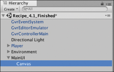
Figure 4.8 The Canvas child of MainUI.Select the Canvas, and in the
Canvasscript in the Inspector window, change its Render Mode to World Space, as shown in Figure 4.9. In VR, UI will almost always exist in World Space.
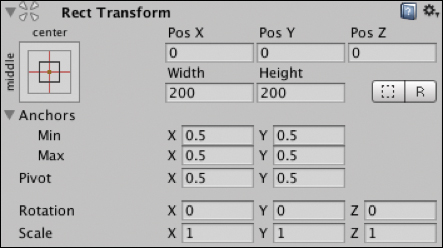
Figure 4.9 World Space render mode. In the Canvas’s Rect Transform component, change the
Widthto 1200 and theHeight to 800 and itsPosX,PosY, andPosZall to 0. Update itsScaleproperties for X, Y, Z to 0.001.This will now work perfectly with the dmm system and allows you to then move back the UI in meters and scale it up and down based on distance, while keeping the angular size the same (see Figure 4.10).
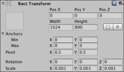
Figure 4.10 Rect Transform. Reposition the
MainUIGameObject so the UI is in line with thePlayer’s Main Camera and can be seen clearly. Set theMainUI’s position to X:0, Y:1.6, Z:3 (see Figure 4.11).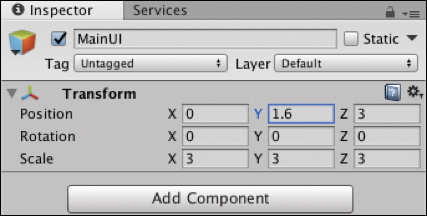
Figure 4.11 The MainUI’s Transform component.Because the Z position of the
MainUIis 3, you need to scale up theMainUIby a multiplier of 3 to compensate for the loss in distance, making the angular size the same. Set theMainUI’sScaleproperty to 3 on X,Y, and Z (see Figure 4.11).Delete the default Graphics raycaster that is attached to the Canvas. Do this by selecting the Canvas, and in the Inspector click the gear icon at the top right of the Graphics raycaster component, and select Remove Component from the dropdown.
Adding a
GvrPointerGraphicsRaycaster(see Figure 4.12) to the Canvas to intercept the pointer’s events is crucial. Select the Canvas, and in the Inspector window click Add Component > GvrPointerGraphicsRaycaster.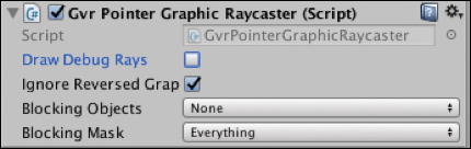
Figure 4.12 The GvrPointerRaycaster component.
Now that you have added the GvrPointerGraphicsRaycaster, your Canvas is ready for UI to be added. This current Canvas is a great setup for using dmms in VR UI.
The next step is to add some interactive UI components.
Recipe 4.2: Adding an Image
Building on Recipe 4.1, the next step to start turning it into a structure for a menu is to add a hero image to the Canvas.
The trick to adding images in VR world space is to continue using the dmm system and export the image from Sketch or Photoshop at 1:1 scale. In other words, export it at exactly the same pixel size as you have it in Sketch as if 1 pixel equals one dmm. Starting from either the end of the previous recipe or Recipe_4.2_Start, follow these steps:
Import the image you want to add to your UI. This is as simple as dragging and dropping it from the desktop into the Assets folder in the Project window. I added a PNG for you to use: Assets/DaydreamVRBook/Recipe02_AddingImage/Assets/DaydreamLogo.
Changing the Texture Type of the imported image to Sprite (2D and UI) is important. Select the image in the Project window and in the Inspector, under Texture Type, select Sprite from the dropdown (see Figure 4.13). In the same component change the Max Size value from 2048 to 256 (if your image is larger than 256, select whatever the highest max size is), and then click Apply down at the bottom of the component.
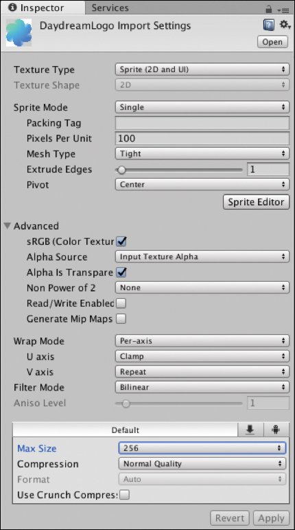
Figure 4.13 Sprite import settings. The image texture is now ready to be used in the UI.
Back in the Hierarchy window, right-click the Canvas and choose UI > Image.
With the newly added image selected in the Inspector, in the
Imagecomponent, drag and drop the imported image (DaydreamLogo) from the Project window into the empty Source Image field; see Figure 4.14.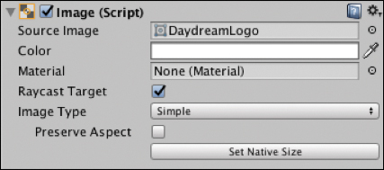
Figure 4.14 Image component. In the Image’s Rect Transform, you now need to update the width and height of the properties to match the actual width and height of the image. The DaydreamLogo image supplied in this recipe is 239x259 pixels. Update the Height and Width accordingly (see Figure 4.15).
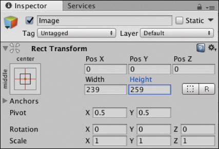
Figure 4.15 Image’s Rect Transform component. The image is now perfectly centered in the Canvas, which suits this layout, but you could easily move it around by updating the X and Y position.
Recipe 4.3: Adding Text
Now it’s time to add some text to the UI using the UI Text component. To be legible, your text size shouldn’t be less than 20, but 24 is a comfortable body text size.
Right-click the Canvas and from the drop-down menu, choose UI > Text.
With the
TextGameObject selected in the Inspector, update the Text field in theTextcomponent to be the title of the game for the menu screen we’re building. I’m calling this game Daydream VR Games.Still in the
TextGameObject’s Inspector, update the PosY to 208, and change the Width to 600 and the Height to 100. If you don’t change the width and height, the text will be masked out when you scale it up.Under the Character section, change the Font to Roboto-Medium, update the size to 48 and the Paragraph alignment to Center. Your text should look like Figure 4.16.
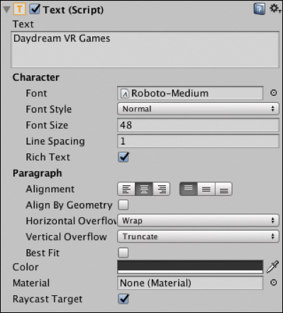
Figure 4.16 Text component. Create a subtitle by adding another
TextGameObject to the Canvas by repeating step 1, and update the Text field in the Inspector to be your subtitle. I’ve written From the Daydream VR Book.Update the Font size to be 24 and the paragraph alignment to be centered. The width is 600, Height is 30, and the PosY is 176.
You now have some basic UI with an image and text that is clearly legible from the starting location of the Player. Build and Run this to your phone and play around with repositioning on the z axis and scaling the MainUI GameObject to see the effect it has.
Text Protection
Depending on the background of your game, text in world space can be difficult to read. In VR, “protecting” the legibility of text by adding a slightly transparent background panel behind the text to increase legibility is good practice.
Recipe 4.4: Adding a Button
This recipe adds a button to the UI that will be used to trigger an event; this could be any event you want. For now, it will activate a GameObject that could potentially hold your game play. In Recipe 4.5, you will use it to asynchronously load in a game level as a separate scene.
Continuing from the previous recipe (or Recipe_4.4_Start), follow these steps:
Import an image to use as your button’s background by dragging and dropping the image from the desktop into the relevant folder in the Project window. I’ve included an image for you to use (Assets/DaydreamVRBook/Recipe04_AddingButton/assets).
Update the image’s Texture Type to be Sprite (2D and UI) in the same way as done in Recipe 4.2. Select the image and choose Sprite from the Texture Type drop-down menu in the Inspector.
In the Hierarchy window, right-click the Canvas and choose UI > Button to add a button.
In the button’s
Imagecomponent in the Inspector, drag your imported image from the Project window into the Source Image field (see Figure 4.17), and resize the width and height of the button’s Rect Transform to match the size of your button’s image. The image supplied for the tutorial is 160x64.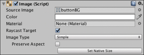
Figure 4.17 The button’s Image component. In the Hierarchy window expand out the
ButtonGameObject to expose its childTextobject. Update theTextcomponent’s Text field to read PLAY, and change the color of the text to white, the Font Size to 24, and the font to Roboto-Medium.In the Inspector, reposition the Button’s PosY to –247 so it sits below the Daydream logo in the center (see Figure 4.18).

Figure 4.18 The menu with text, image, and button. Hook up the button to a script to handle the pointer’s click event by creating a new empty GameObject called
Scriptsand adding a new script to it calledGameMenuManager. Update the class to look like Listing 4.1.Listing 4.1
GameMenuManagerScript
using UnityEngine;

public class GameMenuManager : MonoBehaviour {

    public GameObject gamePlay;
    public GameObject mainUI;

    void Start(){
        gamePlay.SetActive (false);
    }

    public void HandlePointerClick () {
        gamePlay.SetActive (true);
        mainUI.SetActive (false);
    }
}
Go back to the Unity Editor and in the button’s Inspector, inside the Button component, click the + button in the
On Click()Event Trigger list (see Figure 4.19).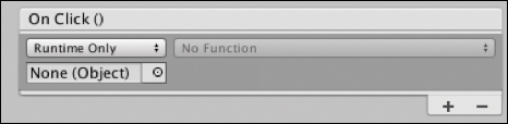
Figure 4.19 The Button component’s On Click()Event Trigger.Drag the
ScriptsGameObject from the Hierarchy window into theOn Click()Event Trigger’s Object field (see Figure 4.20).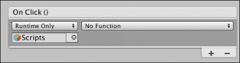
Figure 4.20 The On Click()Event Trigger withScriptsobject added.From the Function Selection dropdown, choose GameMenuManager.HandlePointerClick (see Figure 4.21).
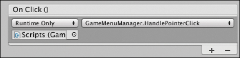
Figure 4.21 The On Click()Event Trigger hooked up to a function.In the
GameMenuManagerclass you created in step 7, a couple of public variables need to be hooked up in the Editor. One is for theMainUIGameObject that houses the UI, and the other is for aGamePlayGameObject. I’ve added theGamePlayto the scene already; it contains a robot GameObject as a placeholder for a game. In the Hierarchy window select theScriptsGameObject and drag theGamePlayandMainUIGameObjects into their corresponding fields in theGameMenuManagerscript (see Figure 4.22).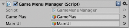
Figure 4.22 The GameMenuManagerscript.
The button is now hooked up to a script and triggers a method inside that script. That method deactivates the menu UI and activates the GamePlay GameObject. For simple games, game assets can be housed in the GamePlay GameObject. Using your knowledge of the controller’s App button from the previous chapter, you could easily add some code to switch the UI back on when the App button is clicked—you implement this in the next recipe by creating a more complicated system that loads in and out actual scenes that contain the levels of your game.
Recipe 4.5: Implementing a Game Menu
This recipe puts everything you have learned together so you can build a UI game menu that loads in levels dynamically.
Recipe_4.5_Start starts with the UI built in the previous recipes in this chapter.
The menu in this recipe requires another button for Settings above the Play button. You could just add the button directly, but a better way to do it is to lay the buttons out in a vertical layout group. Do this by creating an empty GameObject as a child of the Canvas and call it
Buttons.Select
Buttonsand in the Inspector, click Add Component, search for Vertical Layout Group, and add it (see Figure 4.23).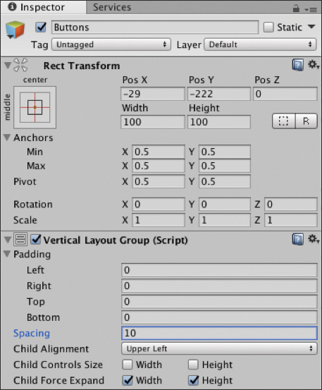
Figure 4.23 Vertical Layout Group.Duplicate the Play button by right-clicking it in the hierarchy and choosing Duplicate. Call this new button Settings. Expand it out in the hierarchy, select its
Textcomponent, and in the Inspector change the text of the button to Settings (see Figure 4.24).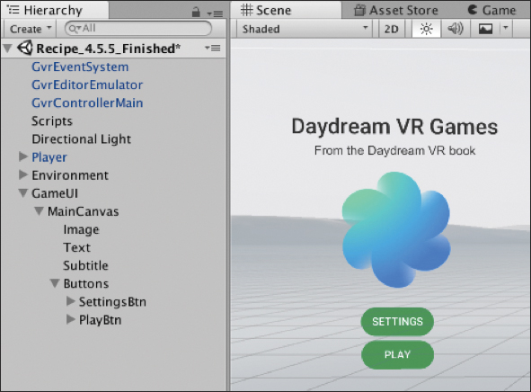
Figure 4.24 The finished menu layout. Create the Settings menu. Create a new Canvas as a child of the
GameUIGameObject and lay it out to look like Figure 4.25 by creating the title text and the button in the same way you did theMainUI in Recipes 4.2 and 4.3. The main difference is that this Canvas has a slider. Add it by right-clicking on the Canvas, choosing UI > Slider, and positioning the slider appropriately. Also, double the slider’s scale so that it is more legible. Add anotherTextcomponent underneath the slider that reads Game Volume. You will hook up this slider to an actual audio source in Chapter 5, “Video and Audio.”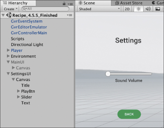
Figure 4.25 The Settings menu. Repeat step 4 to create a Pause menu by adding a new Canvas called
PauseCanvas. Lay it out with two buttons, one for Resume and one for Quit. Add title text similar to that shown in Figure 4.26.
Figure 4.26 The Paused menu. Hook it all up with some scripts: Add a new script to the
GameUIGameObject and call itMenuManager. Update it to look like Listing 4.2.
using UnityEngine;
using UnityEngine.UI;

public class MenuManager : MonoBehaviour {

    public GameObject mainMenuUI;
    public GameObject settingsMenuUI;
    public GameObject pauseMenuUI;
    private bool isInGame;

    void Start () {
        isInGame = false;
        pauseMenuUI.SetActive (false);
        settingsMenuUI.SetActive (false);
    }

    void Update () {
        if (GvrControllerInput.AppButtonDown) {
            OnAppButtonClicked ();
        }
    }

    // APP BUTTON CLICKED, pause the game
    private void OnAppButtonClicked() {
        // show pause panel and pause game, set time to 0
        if (isInGame) {
            isInGame = false;
            pauseMenuUI.SetActive (true);
        }
    }

    // MAIN MENU PANEL
    public void OnStartGameClicked () {
        isInGame = true;
        mainMenuUI.SetActive(false);
    }

    public void OnSettingsClicked () {
        mainMenuUI.SetActive(false);
        settingsMenuUI.SetActive(true);
    }

    // SETTINGS MENU PANEL
    public void OnSettingsBackClicked () {
        mainMenuUI.SetActive(true);
        settingsMenuUI.SetActive(false);
    }

    // PAUSE MENU PANEL
    public void OnQuitGameClicked () {
        // handle the end of your game here
        mainMenuUI.SetActive(true);
        pauseMenuUI.SetActive(false);
    }

    public void OnResumeGameClicked () {
        isInGame = true;
        pauseMenuUI.SetActive(false);
    }

    // Game Over triggered from the loaded scene
    public void OnGameOver (){
        isInGame = false;
        mainMenuUI.SetActive(true);
        pauseMenuUI.SetActive(false);
    }
}
This script manages the appearance of the menus from the buttons and which menu is visible. Three public variables link to the three menus, and a boolean tracks the game state. In the
Start()function the Pause and Setting menus are hidden; set theisInGamebool to false. TheUpdate()function listens for an App Button click and triggers a function to display the pause menu—if the game is active.The rest of the functions in the class are linked to button clicks from the menus you just built. You hook them up next.
In the Editor, drag the three menus from the hierarchy into their respective slots in the
MenuManagerin the Inspector.Hook up the Event Triggers for the buttons, starting with the
MainCanvas. Select the Settings button and in the Inspector add an Event Trigger with a newPointerClickevent, add a new object to the list, and drag in theMenuUIGameObject into the slot. In the Event Trigger’s dropdown, choose MenuManager > OnSettingsClicked.Repeat step 8 for the Back button, selecting MenuManager > OnSettingsClicked.
Hook up the Event Triggers for the
PauseCanvas. Link the Resume button to theMenuManager's OnResumeGameClicked()function and the Quit button to theOnQuitGameClicked()button.Now is a good time to test your work. When you run the app you should be able to activate and deactivate the menus by clicking the buttons. Try clicking the App button while the game is playing (that is, after clicking Play from the main menu) to present the pause menu, then quit or resume.
The next steps load in a game level from a separate Unity scene when you click Play. Create a new C# script attached to the
GameUIGameObject, call itGameManager, and update it to look like Listing 4.3.
using System.Collections;
using System.Collections.Generic;
using UnityEngine;
using UnityEngine.SceneManagement;

public class GameManager : MonoBehaviour {

    public static GameManager instance = null;

    private const string SCENE_NAME_01 = "Recipe_4.5_Level1";

    public MenuManager;

    void Awake()
    {
        // Create a singleton
        if (instance == null) {
            instance = this;
        } else if (instance != this) {
            Destroy (gameObject);
        }
        DontDestroyOnLoad(gameObject);
    }

    public void OnPlayGameClicked (){
        StartCoroutine(LoadScene(SCENE_NAME_01));
    }

    IEnumerator LoadScene (string sceneName) {
        yield return null;

        AsyncOperation asyncOp = SceneManager.LoadSceneAsync (sceneName, LoadSceneMode.Additive);
        asyncOp.allowSceneActivation = false;

        while (! asyncOp.isDone) {
            float progress = Mathf.Clamp01(asyncOp.progress / 0.9f);

            // Load is complete at 0.9
            if (asyncOp.progress == 0.9f) {
                // Scene loaded, now activate
                asyncOp.allowSceneActivation = true;
            }

            yield return null;
        }
    }

    public void OnGameOver (){
        StartCoroutine(UnloadScene());
        menuManager.OnGameOver();
    }

    IEnumerator UnloadScene (){
        yield return SceneManager.UnloadSceneAsync (SCENE_NAME_01);
    }
}
The
GameManagerscript handles the loading of an external scene into the current scene. It is a singleton class, meaning there will only ever be one instance of it. The singleton is set up in theAwake()function.The loading is kicked off when the
OnPlayGameClicked()function is called, starting a coroutine. A coroutine is similar to a function but it has the ability to continue executing over a series of frames, instead of in a single frame update. For this reason, it is perfect for asynchronously loading levels.The
LoadScene()function is where most of the action is. It executes theLoadSceneAsync()on theSceneManager, passing in the name of the scene and usingAdditiveas theLoadSceneMode. UsingAdditivemeans that the scene loads into the current one.The load process is assigned to an
AsyncOperation, andallowSceneActivationis set to false. This fully loads the scene but does not activate it, and the asynchronous progress will stop at .9 (or 90%). SettingallowSceneActivationto true will then activate the scene. The reason for doing it this way is that it allows for the use of a buffer animation when loading in a very large scene.Next, a while loop is run that waits for the asynchronous progress to reach 0.9. When it does, the
allowSceneActivationBoolean is set to true and the scene appears.The other function in the script,
OnGameOver(), unloads the scene asynchronously, again using a coroutine.On the Event Trigger attached to the Play button in the
MainCanvas, add another object to thePointerClicktrigger by pressing the + button. Drag in theGameUIto the empty slot and this time choose GameManager > OnPlayGameClicked(). This kicks off the loading from the menu.Back in the
MenuManagerscript, you need to add one more line of code in theOnQuitGameClicked()function:GameManager.instance.OnGameOver ();This unloads the scene.
Now that everything is in place to load another scene, you need to create a scene to load. I’ve already included a basic scene in the demo project. Feel free to use it or create your own scene. The important thing is to make sure it is added in the Build Settings, and that it is named correctly in the code. The scene’s name in this recipe is being hard coded as a
string constcalledSCENE_NAME_01at the top of theGameManagerscript. The actual name of the scene is the stringRecipe_4.5_Level1.In the Project window, search for the actual scene to load called
Recipe_4.5_Level1, open it, and then choose File > Build Settings under the Scenes To Build list. Click Add Open Scenes, and make sure it is selected (see Figure 4.27) and that the GameMenu scene is above the level scene. Now it is ready to be loaded in dynamically.
Figure 4.27 Build Settings, adding the scene to dynamically load. Build and Run to test out the scene load.
The Game Over button still needs to be handled from the loaded scene. Open the scene to load in; there’s already UI created in the example scene with a GameOver button. It’s hooked up to a script called
Level1Managerwith a method calledHandleGameOverClicked(). This triggers theGameOver()method to unload the scene in theGameManagersingleton, and now it is game over. See Listing 4.4.
using UnityEngine;

public class Level1Manager : MonoBehaviour {

    public void HandleGameOverClicked (){
        GameManager.instance.OnGameOver ();
    }
}
You can now Build and Run this recipe to test out loading and unloading an external scene. In the next chapter you learn how to hook up the slider to an audio source to update the volume dynamically.
UI Layouts in VR
A common UI pattern in VR is for panels to be swipeable and the cells to have engaging interactive effects when the user’s laser hovers over them. The rest of this chapter takes you through building this style of layout, starting with animated cells and moving through to more complex, professional UI, similar to that found in the Daydream Home world.
Tweening Libraries
Tweening libraries are code libraries that make it easy to do standard translation, scale, and rotation animations programmatically. The word tween comes from traditional animation where the animators who draw the animation frames between the key frames are called “in between” artists. This book uses the free Lean Tween library available from the Unity Asset Store and distributed under the MIT license. I have already added it to the sample projects for when it is needed.
Recipe 4.6: Creating an Animated Cell
This recipe creates a reusable cell that animates toward the user on hover, giving it an expanding effect.
The code in this recipe uses the LeanTween library for the animations. If you are not using the sample project for this chapter, you need to download LeanTween now from the Asset Store and import it into your project. I’ve already included the framework in this chapter’s sample code, so if you are following along then you don’t need to do anything.
Recipe_4.6_Start has an empty Canvas; open it and follow these steps:
Add a new empty GameObject to the Canvas and call it
HoverCard.Add a new Image as a child of the
HoverCardand update its size to 270x270.I like to have a GameObject as the base of the cell like this. It makes it easier to add more layers to the cell later on, all contained within the single GameObject.
For the purpose of this recipe leave that image as the default white placeholder image. For cells in your own app you would want to swap this out with custom images or load in images dynamically from a backend.
Select the Image child of the
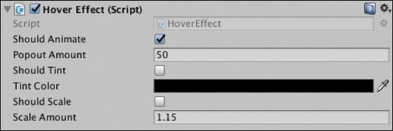
HoverCardand add a new script to it calledHoverEffect.Update the
HoverEffectscript to look like Listing 4.5.Listing 4.5
HoverEffectScript
using UnityEngine;
using UnityEngine.EventSystems;
using UnityEngine.UI;

public class HoverEffect : MonoBehaviour, IPointerExitHandler, IPointerEnterHandler{

    public bool shouldAnimate = true;
    public GameObject animationElement;
    public float popoutAmount = 50f;

    public bool shouldTint = false;
    public Color tintColor;

    public bool shouldScale = false;
    public float scaleAmount = 1.15f;

    private float initZ;
    private Color initColor;
    private float animationTime = 0.25f;

    void Start () {
        // Store the initial z position
        initZ = this.gameObject.transform.localPosition.z;

        // Store the initial color
        if (shouldTint) {
            initColor = gameObject.GetComponent<Image>().color;
        }
    }

    public void OnPointerEnter (PointerEventData eventData){

        if (shouldAnimate) {
            LeanTween.moveLocalZ (gameObject, initZ - popoutAmount, animationTime).setEaseInOutCubic ();
        }

        // Tint the element
        if (shouldTint) {
            gameObject.GetComponent<Image>().color = tintColor;
        }

        // Scale the element by the scaleAmount
        if (shouldScale) {
            LeanTween.scale (gameObject, new Vector3 (scaleAmount, scaleAmount, scaleAmount), animationTime).setEaseInOutCubic ();
        }
    }

    public void OnPointerExit (PointerEventData eventData){
        if (shouldAnimate) {
            LeanTween.moveLocalZ (gameObject, initZ, animationTime) .setEaseInOutCubic ();
        }

        // Tint the element back to default
        if (shouldTint) {
            gameObject.GetComponent<Image>().color = initColor;
        }

        // Scale back to 1
        if (shouldScale) {
            LeanTween.scale (gameObject, new Vector3 (1f, 1f, 1f), animationTime).setEaseInOutCubic ();
        }
    }
}
As you can see in the class declaration, this script implements the enter and exit handlers of the Pointer interface introduced in the previous chapter. The Start() function records some initial variables for position and color. These will be used to reset the cell when the hover is complete.
In the OnPointerEnter() function, LeanTween is used to animate out the cell’s position on the z axis, the tint color is updated, and the cell is scaled.
The OnPointerExit() function basically does the opposite to the OnPointerEnter() function, animating the position back to its initial location, changing its tint color back, and scaling it back down.
You can now adjust the various animation-related properties of the cell directly in the Unity Editor (see Figure 4.28).
Note
Many of the recipes in this section require code from Daydream Elements. This has already been added to the companion files. However, if you are building everything from scratch, make sure you start from the Daydream Elements base project created in Chapter 2.
Recipe 4.7: Cell Tilt and Hover Effect
This recipe builds on the cell animation effects in the previous recipe and adds a tilt effect controlled by the pointer’s hover location.
Some of the tilt code in this recipe is similar to the UpdateDesiredRotationMethod() in the FloatTile class included with the PaginatedScrolling demo in Elements (DaydreamElements/Common/Demo/PaginatedScrolling). It also uses the IGvrPointerHover interface to update the cell’s tilt effect.
This HoverEffectTilt script can be added to any cell in the same way as the HoverEffect script from the previous recipe. In this case it is being added to the image child of the cell. See Listing 4.6.
Listing 4.6 HoverEffectTilt Script
using System.Collections;
using System.Collections.Generic;
using UnityEngine;
using UnityEngine.EventSystems;
using UnityEngine.UI;

public class HoverEffectTilt : MonoBehaviour, IPointerExitHandler, IPointerEnterHandler, IGvrPointerHoverHandler {

    private const float _360_DEGREES = 360.0f;
    private const float _180_DEGREES = 180.0f;

    public bool shouldAnimate = true;
    public GameObject animationElement;
    public float popoutAmount = 50f;

    public bool shouldTint = false;
    public Color tintColor;

    public bool shouldScale = false;
    public float scaleAmount = 1.15f;

    [Range(0.0f, 5.0f)]
    [Tooltip("Maximum tile rotation towards the pointer.")]
    public float maximumRotationDegreesPointer = 3.0f;
    [Range(0.0f, 30.0f)]
    [Tooltip("Maximum tile rotation towards the camera.")]
    public float maximumRotationDegreesCamera = 15.0f;
    [Range(1.0f, 10.0f)]
    [Tooltip("Speed used for lerping the rotation/scale/position of the tile.")]
    public float interpolationSpeed = 8.0f;

    private float initZ;
    private Color initColor;
    private float animationTime = 0.25f;
    private Quaternion desiredRotation = Quaternion.identity;
    private bool isHovering = true;

    void Update() {
        UpdateRotation();
    }

    public void OnPointerEnter (PointerEventData eventData){

        isHovering = true;
        initZ = this.gameObject.transform.localPosition.z;

        // Store the initial color
        if (shouldTint) {
            if (animationElement != null) {
                initColor = animationElement.GetComponent<Image>().color;
            } else {
                initColor = gameObject.GetComponent<Image>().color;
            }
        }

        if (shouldAnimate) {
            if (animationElement != null) {
                LeanTween.moveLocalZ (animationElement, initZ - popoutAmount, animationTime).setEaseInOutCubic ();
            } else {
                LeanTween.moveLocalZ (gameObject, initZ - popoutAmount, animationTime).setEaseInOutCubic ();
            }
        }

        // Tint the element
        if (shouldTint) {
            if (animationElement != null) {
                animationElement.GetComponent<Image>().color = tintColor;
            } else {
                gameObject.GetComponent<Image>().color = tintColor;
            }
        }

        // Scale the element by the scaleAmount
        if (shouldScale) {
            if (animationElement != null) {
                LeanTween.scale (animationElement, new Vector3 (scaleAmount, scaleAmount, scaleAmount), animationTime).setEaseInOutCubic ();
            } else {
                LeanTween.scale (gameObject, new Vector3 (scaleAmount, scaleAmount, scaleAmount), animationTime).setEaseInOutCubic ();

            }

        }
    }

    public void OnPointerExit (PointerEventData eventData){
        isHovering = false;

        if (shouldAnimate) {
            if (animationElement != null) {
                LeanTween.moveLocalZ (animationElement, initZ, animationTime).setEaseInOutCubic ();
            } else {
                LeanTween.moveLocalZ (gameObject, initZ, animationTime) .setEaseInOutCubic ();
            }
        }

        // Tint the element back to default
        if (shouldTint) {
            if (animationElement != null) {
                animationElement.GetComponent<Image>().color = initColor;
            } else {
                gameObject.GetComponent<Image>().color = initColor;
            }
        }

        // Scale back
        if (shouldScale) {
            LeanTween.scale (gameObject, new Vector3 (1f, 1f, 1f), animationTime).setEaseInOutCubic ();
        }

        desiredRotation = Quaternion.identity;
    }

    public void OnGvrPointerHover(PointerEventData eventData) {
        isHovering = true;
        UpdateDesiredRotation(eventData.pointerCurrentRaycast. worldPosition);
    }

    private void UpdateRotation() {
        Quaternion finalDesiredRotation = desiredRotation;
        if (!isHovering) {
            finalDesiredRotation = Quaternion.identity;
        }

        if (finalDesiredRotation != transform.localRotation) {
            Quaternion localRotation = transform.localRotation;
            localRotation = Quaternion.Lerp(localRotation, finalDesiredRotation, Time.deltaTime * interpolationSpeed);
            transform.localRotation = localRotation;
        }
    }

    private void UpdateDesiredRotation(Vector3 pointerIntersectionWorld Position)
    {
        Vector3 localCenter = CalculateLocalCenter();
        Vector3 worldCenter = transform.TransformPoint(localCenter);
        Vector2 localSize = CalculateLocalSize();
        Vector3 pointerLocalPositionOnTile = transform.InverseTransformPoint(pointerIntersectionWorldPosition);
        Vector3 pointerDiffFromCenter = pointerLocalPositionOnTile - localCenter;
        float pointerRatioX = pointerDiffFromCenter.x / localSize.x;
        float pointerRatioY = pointerDiffFromCenter.y / localSize.y;
        Vector2 pointerRatioFromCenter = new Vector2(pointerRatioX, pointerRatioY);

        float axisCoeff = maximumRotationDegreesPointer * 2.0f;

        Vector3 worldDirection = worldCenter - Camera.main.transform. position;
        Vector3 localDirection = transform.parent.InverseTransformDirection(worldDirection);
        Quaternion lookRotation = Quaternion.LookRotation(localDirection, Vector3.up);
        Vector3 lookEuler = clampEuler(lookRotation.eulerAngles, maximumRotationDegreesCamera);
        float eulerX = lookEuler.x - pointerRatioFromCenter.y * axisCoeff;
        float eulerY = lookEuler.y + pointerRatioFromCenter.x * axisCoeff;
        desiredRotation = Quaternion.Euler(eulerX, eulerY, lookEuler.z);
    }

    private Vector3 CalculateLocalCenter() {
        RectTransform rectTransform = GetComponent<RectTransform>();
        if (rectTransform) {
            Vector3 localCenter = rectTransform.rect.center;
            return localCenter;
        }
        return Vector3.zero;
    }

    private Vector2 CalculateLocalSize() {
        RectTransform rectTransform = GetComponent<RectTransform>();
        if (rectTransform) {
            Vector3 localMax = rectTransform.rect.max;
            Vector3 localMin = rectTransform.rect.min;
            return localMax - localMin;
        }
        return Vector2.zero;
    }

    private Vector3 clampEuler(Vector3 rotation, float maxDegrees) {
        rotation.x = clampDegrees(rotation.x, maxDegrees);
        rotation.y = clampDegrees(rotation.y, maxDegrees);
        rotation.z = clampDegrees(rotation.z, maxDegrees);
        return rotation;
    }

    private float clampDegrees(float degrees, float maxDegrees) {
        if (degrees > _180_DEGREES) {
            degrees -= _360_DEGREES;
        }

        return Mathf.Clamp(degrees, -maxDegrees, maxDegrees);
    }
}
The HoverEffectTilt class is similar to the HoverEffect class from the previous recipe, except with a number of additions. It adds a public field for an animationElement GameObject; if a GameObject is connected this will be the object that is animated. If no object is attached, it animates the component’s GameObject.
There are also three public float properties: maximumRotationDegreesPointer, maximumRotationDegreesCamera, and interpolationSpeed. The two rotation floats update the amount of tilt added to the cell on hover; increase the value for a more exaggerated tilt effect. The interpolation speed adjusts the duration of the hover animation.
Daydream Elements UI Examples
For inspiration and examples of unique and creative UI systems, take a look at the Click Menu, Constellation Menu, and Swipe Menu scenes in Daydream Elements.
Recipe 4.8: Cell Masking Animation Effect
This recipe uses a mask to crop an image and then animates it with a parallax-style effect based on the position of the pointer.
Creating a mask requires two things: a mask element to be masked out and a shape to define the outline of the mask. The mask’s shape is defined by either an image or the bounds of the Rect Transform the mask component is attached to. This recipe uses the Rect Transform of the cell to define the mask.
Similarly to the previous recipe, this recipe repurposes some code from the PaginatedScrolling demo included with Daydream Elements and combines it into a single class that you can add to any cell for a mask effect.
Recipe_4.8_Start already has a Canvas as a starting point.
Add a new empty GameObject to the Canvas and call it
MaskCell.Right-click the
MaskCellin the hierarchy and add a UI Image as a child. Set the source image of theImagecomponent to be Beach_yellow from Daydream Elements (or create a new asset) and set its size to 270, 270.Update the Image so that its Rect Transform Anchor Preset is top left (see Figure 4.29). This will automatically update the Pos X and Pos Y to be 100 and –100, respectively.
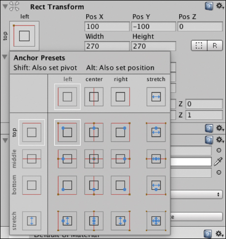
Figure 4.29 Rect Transform Anchor Presets. Select the
MaskCelland in the Inspector, click Add Component and search for theRect Mask 2Dcomponent. Adding this component will create the mask using the Rect Transform’s size as the bounds. It is important to use the Rect Mask 2D and not the standard mask as there is a Unity bug in which the standard mask component sometimes doesn’t work on mobile devices.Set the width and height of the
MaskCellto 200, 200.Create a new script called
MaskHoverEffect, attach it to theMaskCell, and update it to look like Listing 4.7.Drag the
ImageGameObject into theMaskHoverEffect’s empty image field (see Figure 4.30).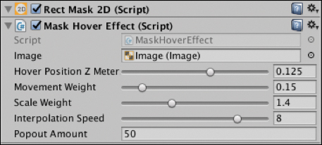
Figure 4.30 Mask Hover Effect adjustable properties. Build and Run, and hover over the cell to test the animated mask effect.
Listing 4.7
MaskHoverEffectScript
using UnityEngine;
using UnityEngine.UI;
using UnityEngine.Events;
using UnityEngine.EventSystems;

public class MaskHoverEffect : MonoBehaviour, IPointerEnterHandler, IPointerExitHandler, IGvrPointerHoverHandler{

    public Image image;

    [Range(0.01f, 0.2f)]
    [Tooltip("Tile forward distance when the pointer over the tile.")]
    public float hoverPositionZMeters = 0.125f;

    [Range(0.1f, 0.5f)]
    [Tooltip("Image scroll amount when the pointer over the tile.")]
    public float movementWeight = 0.15f;

    [Range(1.1f, 2.0f)]
    [Tooltip("Image scale amount when the pointer over the tile.")]
    public float scaleWeight = 1.4f;

    [Range(0.1f, 10.0f)]
    [Tooltip("Speed used for lerping the rotation/scale/position of the tile.")]
    public float interpolationSpeed = 8.0f;

    public float popoutAmount = 50f;

    // Ratio between meters (Unity Units) to the parent canvas that
    // this tile is part of.
    private float? metersToCanvasScale;

    private Vector3 originalMaskedPosition;
    private Vector3 maskedScrollOffset;
    private Vector2 originalImageSize;
    private Vector2 enlargedImageSize;
    private float desiredPositionZ;
    private bool isHovering = false;

    private float initZ;
    private float animationTime = 0.25f;

    // Use this for initialization
    void Start () {
        metersToCanvasScale = null;
        // Save size data.
        originalImageSize = image.rectTransform.sizeDelta;
        enlargedImageSize = originalImageSize;
        enlargedImageSize.x *= scaleWeight;
        enlargedImageSize.y *= scaleWeight;

        // Save position data.
        originalMaskedPosition = new Vector3(100f, -100f, 0);
        // Set data that varies.
        maskedScrollOffset = Vector3.zero;
    }

    // Update is called once per frame
    void Update () {
        UpdateScrollPosition ();
        UpdateScale ();
    }

    public void OnPointerEnter(PointerEventData eventData) {
        isHovering = true;
        desiredPositionZ = -hoverPositionZMeters / GetMetersToCanvasScale();

        LeanTween.moveLocalZ (gameObject, initZ - popoutAmount, animationTime).setEaseInOutCubic ();
    }

    public void OnPointerExit(PointerEventData eventData) {
        isHovering = false;
        maskedScrollOffset = Vector3.zero;
        desiredPositionZ = 0.0f;

        LeanTween.moveLocalZ (gameObject, initZ, animationTime) .setEaseInOutCubic ();
    }

    public void OnGvrPointerHover(PointerEventData eventData) {
        isHovering = true;
        Vector3 pos = eventData.pointerCurrentRaycast.worldPosition;

        RectTransform rectTransform = null;
        if (image) {
            rectTransform = image.GetComponent<RectTransform>();
        }

        if (!rectTransform) {
            return;
        }

        Rect rect = rectTransform.rect;
        Vector3 localCenter = rect.center;
        Vector3 worldCenter = image.transform.TransformPoint(localCenter);

        Vector3 localMin = new Vector3(rect.min.x, rect.min.y, 0.0f);
        Vector3 worldMin = image.transform.TransformPoint(localMin);

        worldCenter -= worldMin;
        pos -= worldMin;

        Vector3 direction = pos - worldCenter;
        maskedScrollOffset.x = (movementWeight * enlargedImageSize.x * direction.x);
        maskedScrollOffset.y = (movementWeight * enlargedImageSize.y * direction.y);
    }

    private void UpdateScrollPosition() {
        Vector3 desiredPosition = originalMaskedPosition;

        if (isHovering) {
            desiredPosition.x += maskedScrollOffset.x;
            desiredPosition.y += maskedScrollOffset.y;
        }

        Vector3 position = image.rectTransform.anchoredPosition3D;
        position = Vector3.Lerp(position, desiredPosition, Time.deltaTime * interpolationSpeed);
        image.rectTransform.anchoredPosition3D = position;
    }

    private float GetMetersToCanvasScale() {
        if (metersToCanvasScale == null) {
            metersToCanvasScale = GvrUIHelpers.GetMetersToCanvasScale (transform);
        }

        return metersToCanvasScale.Value;
    }

    private void UpdateScale() {
        Vector2 currentSize = image.rectTransform.sizeDelta;
        Vector2 desiredSize;

        if (isHovering) {
            desiredSize = enlargedImageSize;
        } else {
            desiredSize = originalImageSize;
        }

        currentSize = Vector2.Lerp(currentSize, desiredSize, Time.deltaTime * interpolationSpeed);
        image.rectTransform.sizeDelta = currentSize;
    }
}
Recipe 4.9: Horizontal Layout
Unity’s auto layout groups are an easy way to evenly space objects into rows and columns. This recipe uses Unity’s Horizontal Layout Group component to lay out a horizontal row of cells.
A prefab of the animated cell created in Recipe 4.6 (Assets/DaydreamVRBook/Recipe09_LayoutHorizintal/HoverCard) is used in this recipe; however, it will work with any of the cells created in the previous recipes.
Recipe_4.9_Start scene has an empty Canvas ready for you to start laying out some cells.
Create a new empty GameObject in the Canvas and call it
HorizontalLayout.Select the
HorizontalLayoutGameObject and add aHorizontal Layout Groupcomponent to it by clicking Add Component in the Inspector and searching for Horizontal Layout Group.Make the
HorizontalLayoutGameObject’s width, 1080, and height, 270. TheHoverCardcells are 270x270, so four cells will be flush against each other horizontally. The Layout Group automatically resizes the objects to fit the size of the layoutAdd four
HoverCardprefabs to the layout by dragging them from the Project window directly onto theHorizontalLayoutin the hierarchy (see Figure 4.31).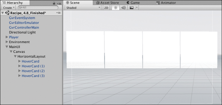
Figure 4.31 Horizontal layout group cells. In the Horizontal Layout Group, set the spacing to 20 and the Child Alignment to Middle Center (see Figure 4.32).
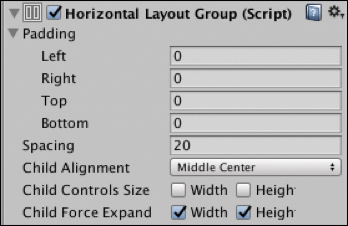
Figure 4.32 Horizontal Layout Group.Build and Run to view the horizontal layout.
Here are the descriptions of the adjustable properties in the layout group:
Padding: Pads the space around the outside of the layout.
Spacing: The spacing between the cells.
Child Alignment: If the cells do not fill the space, use this alignment.
Child Controls Size: The child cells will adjust the size of the layout.
Child Force Expand: Expands the child cells to fill the extra space.
Recipe 4.10: Nested Layouts
Layout groups can be nested within each other. This recipe builds a vertical layout nested within a horizontal layout.
Recipe_4.10_Start has a blank Canvas to get you started building a simple nested layout.
Add an empty GameObject to the Canvas and call it
HorizontalLayout.Add a
Horizontal Layout Groupcomponent to it by selecting it, and in the Inspector click Add Component and search for Horizontal Layout Group.Select the
HorizontalLayoutGameObject, and update its width to 850 and height to 560.Add a new empty GameObject as a child of the
HorizontalLayoutGameObject, call itVerticalLayout, and add aVertical Layout Groupcomponent to it.Using the prefabs built from the same
HoverCellprefab from the previous recipe (Assets/DaydreamVRBook/Recipe09_LayoutHorizintal/HoverCard), drag and drop twoHoverCardsonto theVerticalLayoutGameObject in the Hierarchy, and make their sizes 270x270.Add 20 pixels of spacing to the
Vertical Layout Group'sspacing property and deselect the Child Force Expand Width and Height check boxes. TheVertical Layoutcomponent should look like Figure 4.33.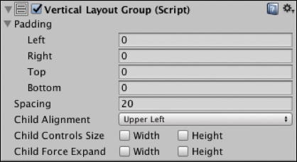
Figure 4.33 Vertical Layout Group. Add a HoverCard prefab to the Horizontal Layout, call it
LargeCard, update its size to 560x560, and update the size of its child image to be the same. The Hierarchy should look like Figure 4.34.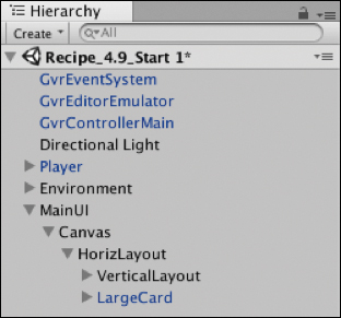
Figure 4.34 Nested layout hierarchy. Set the spacing in the
Horizontal Layout componentto 20 and turn off Child Force Expand check boxes (see Figure 4.35).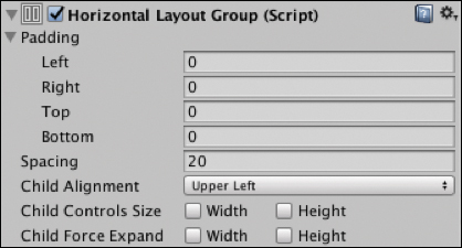
Figure 4.35 Horizontal Layout Group.The end result should look like Figure 4.36.

Figure 4.36 Final nested layout.
Recipe 4.11: Grid Layout
Building a grid layout is fairly simple with Unity’s Grid Layout Group component.
Recipe_4.11_Start has a scene with an empty Canvas to get you started.
Add a new empty GameObject to the Canvas, and call it
GridLayout. Set its Rect Transform width and height to 850x810, and set its x, y, and z positions to 0 (see Figure 4.37).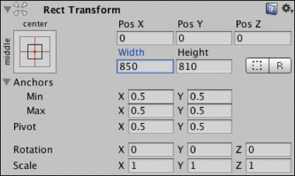
Figure 4.37 GridLayout’s Rect Transform.In the
GridLayout’s Rect Transform component, click on the Anchor Presets button in the upper-left corner of the component to show the Anchor Presets drop-down panel. Click the center preset so vertical and horizontal anchor points are both centered.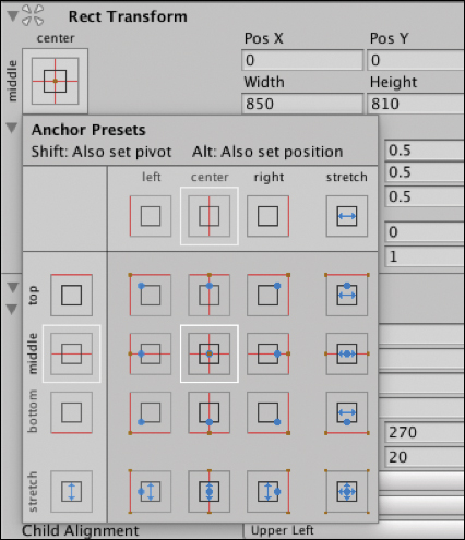
Figure 4.38 Anchor Presets. Add a
Grid Layout Groupcomponent to theGridLayoutGameObject (choose Add Component > Grid Layout Group), and make its Cell Size 270x270 and add 20 pixels spacing (see Figure 4.39).
Figure 4.39 Grid Layout Group.Add nine HoverCard prefabs to the Grid Layout by dragging the prefab from the Project window onto the GridLayout in the Hierarchy, as you did in the previous two recipes.
Build and Run, and your layout should look like Figure 4.40.
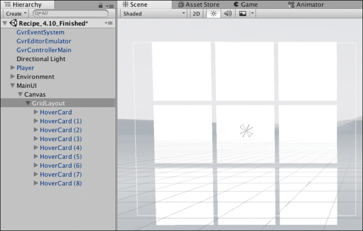
Figure 4.40 The final grid layout.
The Grid Layout Group component has some useful properties; here’s what they do:
Padding: Lets you pad the space around the sides
Cell Size: Scales the size of the cells
Spacing: The spacing between cells on the x and y axes
Start Corner: The location of the first cell
Start Axis: Decides whether the grid fills up horizontally in rows or vertically in columns
Child Alignment: How the cells should align if they don’t fill out the full space
Constraint: Constrains the grid to a fixed number of rows or columns, or makes it flexible
Recipe 4.12: Multipanel Scrolling Layout
This recipe builds a multipanel layout using swipe gestures to animate between them. The panels are made up of a grid of cells similar to the previous recipe and use the HoverCell prefab also used previously. The animation of the multipanel layout uses scripts included in Daydream Elements to add a swipe and fade effect as they scroll through.
Open the Recipe_4.12_Start scene, where there is already a single panel of cells ready to begin.
Create a new empty GameObject on the Canvas and call it
PageScroller.In the Hierarchy window drag the existing
GridLayoutGameObject into thePageScrollerso it is nested inside, as a child.In the Hierarchy window, right-click on the
GridLayoutGameObject. Duplicate it and then duplicate it again, so you have threeGridLayoutsin total. You don’t need to position them; the scripts you’re about to add will position them automatically.Select the
PageScroller, and in the Inspector add aPagedScrollRectscript to it.With the
PageScrollerstill selected, add theChildrenPageProviderscript and set the spacing in the script to 1150. The spacing is the width of the panel plus the spacing between the panels.Add a
FadeScrollEffectto thePageScroller; this script fades in and out the panel based on its positional offset.Add a Canvas, a
CanvasGroup, and aGvrPointerGraphicsRaycasterto thePageScrollerand each of theGridLayouts. TheCanvasGroupautomatically adjusts the alpha of a Canvas’s child objects when the Canvas’s alpha is changed.You can now Build and Run the scene, and the panels will scroll left and right when swiped. The code works by cycling through the children of the
PageScrollerGameObject and adds its children as pages, then lays them out horizontally, fading them based on their offset. You can add more pages by simply adding them as children of thePageScrollerGameObject.
Summary
The design and development of user interfaces is a massive topic, and this chapter only skimmed the surface. It started off by introducing you to some essential concepts and methodologies needed to design interfaces in VR, and then it moved on to the more practical side of building the UI in Unity with code.
The UI you built in this chapter can now be used to house your apps and games that you build from this book, and in the next chapter your knowledge of Unity’s UI system will be applied to hooking up UI controls for audio and video.
1. The Design of Everyday Things, Donald A. Norman.