
CHAPTER
6
INFUSE MEANING

That was an instance of the charts meaning something for everyone, that they excluded nobody, that they allowed several layers of understanding.
MARIE NEURATH, 1898–1986
How do we convey meaning inside visual worlds? Well, there is a universe of possibility to consider. Position, so crucial to world building, is also one of the strongest conduits of meaning. It is joined by many other factors, such as color and size, to provide a multifaceted creative toolbox for linking visual cues to nonvisual concepts.
The canvas, printed page or digital screen, gives us only two dimensions to play with. Each dimension comes with a significant amount of baggage. Some ubiquitous visual metaphors, such as time goes to the right and good goes up, are natural to even data-illiterate audiences. They pack meaning into the Cartesian grid before we even get a chance to do anything with it. Once we know these biases, we can incorporate them into our design to ease audience's reading.
Upwards
The direction of up is usually relative to gravity's downward pull. Our upright posture was critical to our ability to scan the horizon, become the greatest endurance runners on the planet, and free hands for other tasks. Higher altitudes evoke the positivity of the mythological tree home, whose axis stretches against gravity, from downtrodden animalistic roots up to angelic heavens.
Today, we live in a rectangular world. Buildings rise perpendicular to the horizon. They help tune our senses to detect even small deviations from a perfectly vertical line. Upright orientation has also impacted how we think about a myriad of abstract concepts. When we are happy we actually stand taller, things look up, and our spirits soar. When sad, we slouch, feel depressed, and our spirits sink. Consider these other vertically oriented dualities of good and bad:
| HEALTH | MORE | VIRTUE | RATIONAL | PRESTIGE | CONTROL |
| Peak health. | Income went up. | Upright morals. | High-minded | Lofty position. | Control over. |
| Top shape. | Prices soared. | High standards. | intellectual. | Rise to the top. | Height of power. |
| Fell ill. | Stocks fell. | Beneath me. | Rise above your | Fell in status. | Low man on the |
| Dropped dead. | Turn heat down. | Low-down. | emotions. | Bottom of ladder. | totem pole. |
| SICKNESS | LESS | DEPRAVITY | EMOTIONAL | TRIVIAL | SUBJECTED |
In 1980, linguist-philosophers George Lakoff and Mark Johnson introduced these and many other primary concepts in Metaphors We Live By. It revealed how our own spatialization helps us make sense of abstract and invisible worlds. Topside positive connotation is nearly universal across a spectrum of social categories. For data stories, the top of any visual canvas naturally communicates positive emotion.

On the one hand, the vertical y-axis is traditionally associated with the dependent variable. This means the vertical dimension is where a lot of the excitement happens. The horizontal x-axis, on the other hand, is the independent workhorse of the story. It keeps steady time like a metronome while the response gets to go up and down on the vertical y-axis. Both directions are critical to data stories.
We can choose to design against spatial biases in pursuit of more novel storytelling. But this may increase the risk of confusing the message. Creative experiments are laudable, but only when we recognize the responsibility that comes with going against conventions. They may need compelling design and added explanation to be successful. Deploy planar axes judiciously. You only get two and they each wield enormous power.
Onward
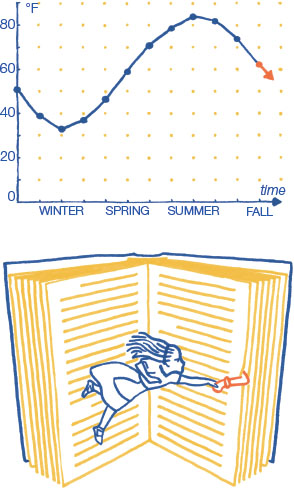
The horizontal x-axis is associated with time, just as metaphoric linear time stretches over the horizon. The x-axis is called independent because it often holds values that are not affected by circumstance. Independent values are self-governing. The x-axis often represents the regular frequency of data collection. We record the high temperature every single day, no matter how hot or cold it is. As the timeline introduction stated, we attribute the direction of time to how we read and write. We usually proceed through time to the right. Its vertical flow can go up or down. Western future is rarely on the left.
The archetypal display of time is the x-axis time-series chart. It tracks a value as it fluctuates up and down through time. There is a practical limit to how quickly data is sampled. We do not actually measure anything continuously. Smaller divisions of time can always be measured. So we choose a data-collection frequency that is precise enough. Showing a phenomenon with a continuous line mirrors our own uninterrupted experience of time, even though we record actual data at discrete moments. We see time-series data as an uninterrupted flow that proceeds to the right, just as we imagine the adventures of a storybook hero like Alice, whose journey progresses to the right as we turn the pages. Time-series charts consider the data's temporal density, value variability, and completeness. We must match the qualities of our data to the way we already perceive time. Visualization expert William Cleveland categorized ways of showing time by how each helps better show the data:

Another way to achieve continuous flow is to use a summary curve. They are generally constructed with some type of moving average. In this way, they differ from a mathematical trend, which uses a formula to fit a single straight line to the data. A smoothing summary curve may benefit data that is too noisy. However, not showing the noise of all the data points can suggest a cleaner story than is actually there. Also, be careful that the summary line does not conceal significant gaps in the data. If you connect sparse points you might suggest more data than is actually available. It is better to leave gaps empty or straddle them with a dashed line.
Even seemingly simple line charts can confuse or, in very poor designs, lead to faulty decoding. Data journalist Dona Wong advocates that axis scales should be segmented into the familiar multiples people already use when thinking about numbers. We often count in fives or tens, but elections sometimes come in four-year cycles. Time should be in days, weeks, months, or years. Line charts 60 do not need to have a baseline at zero, but their baseline 20 should not confuse. Extend axes to zero rather than stopping at a baseline that is close to zero. A zero baseline may be emphasized as heavier, a non-zero baseline should have the same weight as other grid lines.
Sizing Up
We already had a glimpse of the power of size. Recall that big things are important because a bigger object takes up more of your visual field. Bigger things demand notice. When objects are collected into groups, the largest group commands more attention. A taller pile of things has more things in it. More products, more land, more people, more money, and even more time: We can convey all flavors of more with larger size.
The basic metaphorical linkage between physical size and numeric magnitude seems easy enough. However, the way you actually make shapes bigger with data in order to show more is trickier than meets the eye. We are pretty good at decoding linear position along the number line; four looks twice as far from zero as two does. However, decoding the same numbers in two dimensions, with sized areas, is fraught with pitfalls.
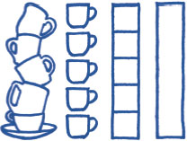
When we encode values in spatial dimensions, we must admit and reconcile the dimensionality of our data. A single column of number values is one-dimensional, no matter what the data is a measurement of in the real world. If our only task is to show values, then we can locate each one on the one-dimensional number line and call it quits. Points on a line are, of course, just positions. Each point has the same size, no matter how large the value it represents. Mere position misses the opportunity to distinguish values using the visual weight of more ink, or more pixels. Harness the visual importance of size by connecting each point back to its baseline. Now, value is also represented by length. If we increase the connector's thickness, then we increase the visual impact of each value's length. The steadfast bar chart appears. Voila.
In order for each bar length to encode the value it represents, it must encompass the entirety of the value, all the way from zero. Truncate a bar with a non-zero baseline and its size ceases to have meaning. It is perfectly fine to leave the data as points if you want to focus on a narrow range of positions, but, once you introduce the physicality of length, you have to show it all. Otherwise, the length is worse than meaningless; it is misleading.

Bar charts can have horizontal or vertical orientations. The dominant horizontal metaphor is that of progress towards a goal, often a target of 100% completion. Horizontal bars, like the number line, convey travel away from an origin baseline. They are like runners on a straight dash or miners cutting tunnels into the sheer side of a mountain. Horizontal progress bars are one of the most often experienced data visualizations. Horizontal bars also make great companions to the horizontal text of category titles. However you lay your bar, remember that its journey, how far it has come, is more meaningful if you can see where it began.
A different conceptual meaning is conveyed if the horizontal bar chart is rotated to create columns. The dominant visual metaphor for the vertical bar chart is a stack of stuff. Each column represents a total number of things, items that are often not actually stackable in the real world. A row of columns can show time progressing to the right. Like the horizontal bar chart, each vertical column must extend all the way to zero or it will lose its meaning. You would not be able to appreciate the height of a stack of stuff if you were only allowed to see its top.

As long as visual comparisons are of the more-or-less variety (e.g., 18 versus 13), not the multiplicative x-times more (e.g., 18 versus 1), we are pretty good at reading linear comparisons for what they are. A pair of bars, one longer than the other, whose lengths are encoded with values, one larger than the other, has a good shot at being decoded by the reader accurately.
Both horizontal and vertical bar charts encode numeric magnitude with length, a one-dimensional size encoding. But bars and columns must be drawn in two dimensions so that they can be seen. So, the bar widths are held constant, only their lengths change. Sizing only one dimension requires that the encoded-value be one of the two positional axes, even when we work in polar coordinates.
Using only a single dimension to convey importance is not always satisfactory because it constrains design. We can layer more data into our story with other methods. It is time to reach for more.
Area of Influence
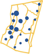
The 1-D length of lines, bars, and columns can be exchanged for the 2-D area of shapes. This can be an appealing trade. Shapes are often better fits for design because shapes have a more even aspect ratio. Circles and squares are more compact than long lines. Shapes are also more freely scattered about the page. Unlike a bar chart, shapes do not have to be anchored to any position baseline. Compactness and freedom combine to allow more information to be packed into a design. Shapes spread around can layer more meaning onto a canvas. For example, the geographic map of Columbia County at left locates cities while circle size tells you how many people lived in each one in 2010. Two axes, x-y or longitude-latitude, encode position while sized marks add a third dimension of meaning.
Mere 1-D length, compared to 2-D area, also misses an opportunity to reflect the dimensionality of the real world. A list of numbers is one-dimensional, but its associated units often allude to something more in the real world. The area of a plot of land, a single number, is seen in our head as a two-dimensional field. The weight of an animal, also a single number, comes from the amount of matter the animal has, something we experience in the real world as a complex 3-D shape. Money is an abstract idea. It is best compared in the single dimension of the bar chart. But in real life, money can be seen as the 1-D height of a stack of bills, 2-D area of a sheet of bills that just rolled-off a mint's printing press, or 3-D volume of a pallet of currency waiting to be robbed from a bank vault in a Hollywood heist film.

We use 2-D size to layer more meaning into a data story and reflect the physicality of the real world. To gain these benefits we must consider the total graphic design. We do not encode in isolation, but across an entire graphic composition. How do we expect the reader to decode meaning from size?
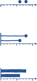
Small dots indicate points in space, even though points actually have no form at all. Points on the 2-D plane exist where two lines intersect. By themselves, points have no area. They have only positions. But if we want to see points in space, we have to mark them somehow. Just as we gave 1-D bars a constant width so we could see their length, we need to mark points. A small dot does the trick.
All locations around a circle's edge are equally far away from the center point. Unlike other shapes, the circle has no orientation. It has no sharp corners. There is nothing distracting about the circle. We like circles because they are almost formless.
To help layer more data onto each point position, it is natural to enlarge each dot to represent a value. Bigger circles attract more attention, so they must be more important. It is considered best practice to encode the data value in the circle by sizing its area, not its diameter. Our eye sees all of the 2-D circle's pixels, not just the pixels across its 1-D diameter. So we relate each of the circle's pixels, its entire area, to the data value. This creates a power relationship between a set of data values and the radius (r) of their associated circles because the area of a circle equals πr2.
Unfortunately, even with the recommended encoding of area, it turns out that we are not particularly skilled at decoding quantitative values from circle areas. Circles engulf many pixels in increasingly larger rings that get added on to represent higher and higher values. It is easy to underestimate a circle's area that is storing a relatively large value. For example, each ring depicted here has the same area as the inner circle. See how quickly they thin. Imperfect decoding of circle area makes us aware of area encoding limitations. Do not encumber your reader with the task of discerning precise values from circle areas. Instead, use circles when they can enhance a design by enabling rough comparisons. To convey precise values, augment circle area encoding by directly labeling them with the encoded value.

If two-dimensional area is problematic, decoding values from three-dimensional volumes is impossible. Spheres and cubes are no good on 2-D screens and sheets of paper. Too much of any volume just cannot be seen at any single time. Each vantage hides more than it shows. For example, how could we even begin to know how much more volume is packed into the larger of these two spheres?

The argument against encoding data in volumes goes on. Surprisingly, we do not actually see 3-D. Every instance of sight is 2-D and, quickly over time, we build 3-D models of the world in our mind. Most of what lets us build our mental model of the world is missing from the 2-D page. The page lacks natural depth cues such as lighting, shadows, and nearby familiar objects, which we use for size comparison. Stereoscopic two-eye perspective and the different views we get by moving through the environment are also real-world aids missing from our experience of the 2-D page. In the real world we can concentrate our eyes on objects near and far and learn about their distance as they come in and out of focus. It is impossible to replicate these non-pictorial experiential cues on the canvas.
Finally, recall that a column of data values is one-dimensional, no matter what real world physical thing it represents. We may stretch this 1-D data into a 2-D area, but extending a single value into 3-D is a dimension too far. Did you guess that the larger sphere has triple the volume of the smaller? No chart is more easily mocked than a 3-D chart. Not only does it make data decoding ugly, but critics will always be able to snicker that 1-D data could have been more easily and more accurately presented in a 1-D bar chart. Do not wade into 3-D representation of numbers unless you are prepared to mount a strong defense.
The circle is an amiable introduction to why encoding data with size is troublesome, and why 3-D shapes are best to avoid. With each dimension added to form, the visual impact of the data becomes compressed. Below is one more comparison between dimensions. The gist of both the 1-D bar chart and 2-D area plot is created by grouping the same set of marks into different forms. See how rearranging the same parts into different wholes changes the nature of the comparisons made.
Assembling smaller shapes into bigger patterns can enable a variety of multi-layered data storytelling. By showing all the parts that make the whole, you reveal something more about its makeup. By creating an array of marks, you also have a set of miniature canvases on which you can encode even more data detail.
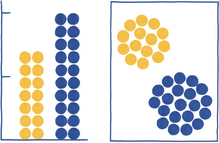
The 1-D linear comparison of the stacked bar chart puts the difference between the total values at center stage. On the one hand, the 2-D packed circle comparison can only help us see that one group is bigger than the other, but leaves us guessing by how much. On the other hand, packed circles are ready to be positioned wherever we want, while bars should remain anchored to the same baseline. Trade-offs in size encoding abound. The ability to make precise comparisons must be evaluated against everything else the design needs.