
CHAPTER
18
FOCUS ATTENTION
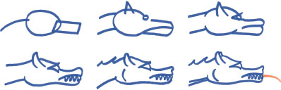
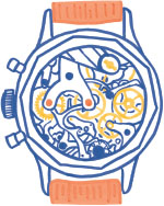
Vision without execution is hallucination. WALTER ISAACSON, 2014 The previous chapter began with a visual metaphor about two lenses. The first diverging lens expanded creative exploration. It set loose a search for insights, and better forms for conveying those insights. The second lens is a converging lens. It catches the products of our creative exploration and focuses them to the audience. That is what this chapter is about. There are two ways to draw a dragon. In one approach, first block out the general shapes with light lines so it is easy to correct errors. As you become satisfied with the form, begin adding detail. Gradually, darken lines. The dragon emerges through a conversation between the productive hand and the critical eye. The other way starts from the head of the dragon and includes every detail in one continuous flow toward its tail. Some master artists are able to draw like this. They may claim that the creative planning occurs in their mind's eye before pen hits the page. I cannot draw anything by making only a single detailed attack. I also do not know how to produce a successful data story without many cycles of creative iteration. Editing is one way of thinking about creative iteration. Its association with deletion can cast a negative connotation. Throw out the bad and keep the good. This attitude portrays editing as a purely subtractive process, like carving a statue from stone. Editing is more like working with clay, which allows you to add as you remove. As you critique existing forms, new forms may emerge. You might call editing revision, the work of seeing something anew. Instead of editing, I call the process of revision workshopping. When we workshop a project, we scrutinize it in pursuit of making it better, just as a musical is refined through its rehearsals. Here is the cast of characters who help the creator workshop a project. The creator is the most important editor. While you are creating, you are the most ruthless critic. During creation, the mind is always considering and rejecting ideas. Some make it to the page. Everything else gets destroyed. Once on the page, you determine what to save and what new directions to try. To inhabit both creator and destroyer personas is to straddle a tension known as the creative process. The next most important critic is also you. Future you. Allow some time to pass between creation and evaluation. The chain of thoughts that were present in production will fade. Your mind will internalize other thoughts. After a night's rest, or longer, you can re-attack the work with fresh eyes. Beyond you, the creator, the most valuable critic is anyone else willing to engage with the work. They bring a lot to the table simply by not being you. You suffer from the curse of knowledge. Your critique is clouded by your expertise and familiarity with the story. Things that are still abstract to everyone else have grown familiar to you. Any random reviewer may not be able to tell you how to fix your story. But everyone can help you identify where the story is going off the rails. Do not trust a large focus group's positive reception as a guarantee of future success. Instead, pay attention to where others get lost or bored, or misunderstand what is going on. Other data storytellers can give some of the most valuable feedback. They understand the process you are waging. You are freer to show a fellow creator an unfinished story. Creators are able to differentiate between aspects that are rough because they are merely unfinished, and aspects that are rough because you are struggling. These colleagues and mentors have the power to not only identify issues, but can also advise how to fix them. Nurture these relationships; they are most valuable. But what exactly do we mean by improved? How do we know that we are editing our stories toward something better? What are we looking for while we workshop? Advice beyond what we have already explored threatens to get us lost. We will try to navigate between the detail of the weeds and the poetry of the clouds. Here is a smattering of practical perspectives to keep in mind as you workshop a data story. Mitigate abstraction. Identify conceptual jargon that bars access to the uninitiated. The cathedral story requires some context and explanation. Before you can appreciate cathedral orientation, you have to know what “cathedral orientation” is. I expect many people to have heard of Notre-Dame de Paris, but do not expect anyone to know how many Gothic cathedrals still survive in France. The changing location of the sunrise might be familiar to general audiences. But few think about sunrise in angled degrees. The audience must scale conceptual barriers to appreciate the core insight of the story. A story-first attitude tries to simplify a story. An audience-first attitude builds from its ready level of understanding. Choose your actors. The unit of analysis determines which data elements receive a mark. Here, the individual cathedrals are the actors. They are the nouns. Like a mythological hero or grammatical subject, actors do things. Each cathedral faces a certain direction; that is the action. But there were alternatives to our cast of characters. During my analysis, I considered the difference between actual orientation and bearing to Jerusalem. This difference advanced our exploration, but would be a difficult way to introduce someone to the story. We could also choose to tell the story using an aggregate value. Instead of individual cathedrals, countries could be the actors. A set of French cathedrals could be compared to sets of German and English cathedrals. Or we could aggregate across time, comparing early Gothic to high Gothic periods. Aggregation is sometimes needed to see what is interesting. But making the actor a familiar noun, something you can see in real life, makes the story more accessible. Spotlight the action. We see physical objects, like cathedrals, but life is not about things. Life is about what things do and how they relate to one another. If actors are nouns, then a change in actor state or the relationship between actors is the verb. The verb makes the story interesting. Arrange actors so the audience can see the action for themselves. Meaning builds in the mind of the reader who can detect comparisons and patterns, the action. In a bar chart, the bars are the nouns and the gap between two bars is the action. Layer context. Reveal the guts of aggregated data. Display a layer of information more detailed than a story's actors. You trust and understand a summary value more when you see its contributing factors. But how do we layer context into non-aggregate values? There are no sub-units for individual cathedrals, but there is a lot of subcontext. The final cathedral histogram highlights sunrise locations with a yellow band. Here, each blue rectangle is a cathedral positioned at its angle of orientation. This representation proves the finding to me, but might strain the audience. They do not know what these angles are. They do not know how these angles were measured. They do not have any reason to trust that these angles were measured correctly. As the creator, I do not suffer these barriers because I actually did the measuring. An audience that only looks at the abstract histogram is totally detached from my personal journey of understanding. They miss out on the trust building of the creative experience. Is there a way to show the subcontext surrounding each measured angle? De-clutter, but that does not always mean delete. As you develop a story, its many elements and nuances swell. It would be lazy to hand a platter of competing details to the audience and expect them to figure it out. Sure, some extraneous facets might have to go. However, tidy stories are not necessarily simple stories. If a story requires many features and complications, then it should have them. Keep them from becoming cluttered by grouping elements into a visual hierarchy. Elevate or diminish each element's salience according to its importance. Audiences can only absorb so much at once. Instead of swamping them with details, chunk information into layers of meaning. Wrangle information energy. The content's form should fit its importance. We must think about what parts of the data story deserve the most attention. Good data stories quickly inform the audience what they are about and that they have something to say. You do not have to wallop the audience with the big insight immediately. They may not have the context yet to appreciate what you want to show. But you do have to give them a reason to stay engaged. Whatever the audience notices first should be something that encourages them to want to see more. In 1967, Jacques Bertin used the word energy to describe the total salience of how data appears to us. Energy is the visual quality that can distinguish a graphic element from the rest of its field. The energy of a data story is powered by both data-driven and design-driven decisions. Bertin's retinal variables each have the ability to change how the value of a data point hits the sensors of the eye's retina. They include position, size, darkness, hue, texture, shape, and orientation. Others have since reshuffled and relabeled Bertin's stack of data-driven retinal variables. Important non-data design decisions include composition, emotional aesthetics, and what details receive annotation. Both data and design-driven decisions should be creatively explored. Together, they can build information chunks, each with the right amount of energy. Use graphic redundancy to infuse an element with more meaning. It is fine to emphasize a single data value with unique position and circle size and fill color and texture and label. The purpose of a data story is to inform. We care about people being informed efficiently, not about graphic efficiency. Minimal design is risky design because it assumes perfect decoding by the audience. To workshop a data story is to become obsessed with conveying context, insights, and meaning. Provide quick access to what is going on. Create perceptual groupings and match each one's energy to the attention it deserves. Make it easy to discriminate between elements. Annotations should guide understanding and provide additional context. Incorporate them at multiple levels of salience. Owning a timepiece used to be a big deal. Experts crafted them from precious metals and jewels. Watches were physical signals of wealth and sophistication. They represented the age of enlightenment, which sought an ever-finer model of the world. Over time, watches became more and more complicated. Features crept in. Outstanding showmanship of ingenuity took command. Super-wealthy collectors pushed makers to the limit of what a watch could do. Designs inflated past practicality to include dozens of functions. Watches could tell you the day, phase of moon, time of sunset, temperature, and help keep track of passing time with chime and stopwatch functions. These features were called complications. It was not enough to just have these features. Owners wanted to display the micro-mechanical marvels, behind the face, that made the complications tic. Transparent backs became fashionable. Now, others could admire the craftsmanship of the watchmaker, and the wealth of the owner. Telling the time became a second thought. We have to ask ourselves what side of the clock we want to present to the audience of our data stories. On one end of the spectrum is intricate encoding so original that it is a marvel to behold. On the other end is a simple bar chart. It rests quietly on a dashboard, waiting to alert us when an indicator is off-target. Do we wish to dazzle our audience with our complications or help them tell the time? The watchmaker, the data storyteller, will delight in the complexity of their creation. Technical creators must exercise some awareness. We love the back of the watch. We are obsessed with pushing data story forms into the future. New chart types and new ways of implementing data stories across a vast array of technologies is part of our craft. To be a good storyteller, though, you must fall in love with the front of the watch. Sometimes that means employing wellproven forms to push new content into the world. Sometimes that means a new invention under the hood. In either case, the storyteller transcends the celebration of the artifact for its own complications. The storyteller focuses on delivering to the audience. Whatever kind of data storytelling you engage in, I hope you are able to pause and consider: What side of the watch am I showing to the audience? Many views of the cathedral story appeared on the way to arriving to the central insight: Gothic cathedrals face worshipers toward sunrise. We can revisit them by placing our map, diagram, and chart on the corners of the triangle below. These pure forms were also blended for new views, shown on the sides of the triangle. Each one reveals something interesting—but showing an audience the whole platter would not help illuminate anything. We must workshop all of our findings into a coherent story. Perhaps there is a final form that mixes useful views from charts, diagrams, and maps. Considering the essence of this particular data: what form belongs in the center of the triangle? The chart, a histogram of cathedral angles with the yellow sun band, most clearly tells me the story. But it is not accessible. How can we make it more relatable? The pure diagram, with the guts of Notre-Dame de Paris revealed, explains how a cathedral faces worship. It is impossible to appreciate the project without this understanding. The maps of France advanced the search by helping refute the Jerusalem hypothesis. As explorers, we now know that Jerusalem was a mistaken recipient of the cathedrals' orientation. As storytellers, we need not burden the audience with this futile pursuit. Seeing the distribution of cathedrals across France is nice, but no longer critical. The country map offers no real insight other than showing that we are in France. The map-diagram was created to explain how to measure cathedral angle. It best reflects the most meaningful part of my own investigation, where I visited each city on a web map and recorded each angle. I return to consider the yellow-banded histogram. The thing that bugs me is that angles are circular, not rectangular like the chart on the triangle. It should really be represented in polar coordinates, as redrawn here. It may not be as natural to analyze distributions in this form as with Cartesian coordinates, but it helps in other ways. The radial histogram is less abstract. It reflects how the angles were measured, and how we think about angles generally. It also looks like a compass. Thinking about compasses gives me an idea for a visual metaphor I could use to arrange the whole story. I begin workshopping a new form that takes into account this idea and everything I have learned from the other views. Workshopping is a messy process. There is no satisfactory way to show you all the erasures and tweaks I made between thinking of compasses and putting together a coherent story. For now, I invite you to turn the page, and engage with the finished cathedral story by rotating this book.
The cathedral story came together across many weeks, during which it benefited from input by several friends. Now that you have seen it too, I can further detail the thinking behind its design. The familiar convention to put north on top is honored, but the story is all about facing east. So, the text is oriented eastward. This requires you to interact with the story by turning the book, as if you were turning a compass or map, and face east, too. The turning action also reflects how a cathedral faces its worshipers. This gimmick takes advantage of the special properties of the printed book. It also creates a unique experience for you to associate with the story. The tiny cathedral maps cumulate into larger coherent structures, producing a story that contains many micro and macro readings: Comparisons between cathedral sizes, cruciform plans, and surroundings with the tiny maps. A distribution of cathedrals inside the yellow band of sunrises. A cluster of cathedrals on only one side of the compass. Showing the actual building outlines, instead of representing each cathedral with a labeled abstract circle, assures that they are in the right spot. You do not need to trust that their orientation was measured correctly because the order is apparent. Any cathedral out of line would pop out as an error. Including the buildings, parks, and streets that surround each cathedral pushes the limit of how much room is available on the page. If the graphic was any smaller we might lose the cathedral. The discs give even salience to a group of cathedrals of varying size. They also remind us that each church is one piece of a bigger world. Most of the story is desaturated to spotlight the distribution of cathedrals. Yellow highlights the sun. Orange connects the inset Paris diagram to the broader story. The piece is heavily annotated. Text is rotated, arced, colored, and sized—lavishing more context wherever possible. Is this information a success? That is for you to determine. I expect everyone might want to shape this form a little differently and I hope you have enjoyed seeing how I thought about telling this story.

Workshopping
Keep Watch

Ad Orientem


