CHAPTER
15
MAKE
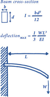
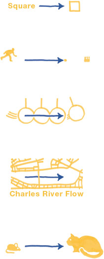
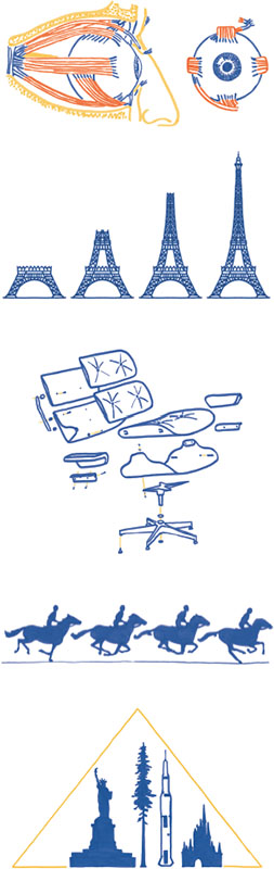
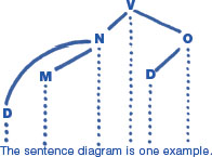
Engineers are passionate about making things. We want to make new objects and we want to make new understandings. Most of all, we want to make new realities. Taking a look at some of the ways engineers use pictures to build can point us to how we can all create diagrams to understand, explain, and make better worlds. Mechanical designers have to think in ranges of numbers Not just 100, but 100 plus or minus two. They have to because the real world is not perfect. Have you ever measured the length of a wall? You likely found a value that suited your purpose, but how precise was it? Perhaps you measured the wall to the nearest quarter-inch. Yet, many of the objects that enrich our lives, including computer chips and Lego bricks, are manufactured with delicate precision too fine for us to fathom. The creation of any physical object from raw materials is subject to all kinds of variation. The cross-section here shows two parts that a designer wishes to fit together. It is not enough to merely specify the desired dimensions, a one-inch metal peg to fit a one-inch hole. If the hole is drilled a little too narrow, and the peg left a little too thick, then these manufacturing errors may compound to make the fit impossible. In addition to the one-inch dimensions, the designer must also specify a tolerable amount of variation. This variation is indicated here as the darkly lined region of each part's cross-section. As long as both parts are created within their ranges, the desired fit will be achieved. By defining the acceptable range of variation for each dimension, the designer can build a trusting relationship with the machinist who creates the parts. They both know the world is messy and have agreed upon how messy these parts can get. This dialog is necessary because more exact precision, which engineers call tighter tolerance, is more expensive. Finer precision is more expensive because it may require more expensive equipment, higher-quality material, a more experienced machinist, more thorough quality inspection, and ultimately more time for each step of the part's production. Tolerance offers a particular embodied understanding of uncertainty. Manufacture the same one-inch hole a thousand times and the actual diameters of all the holes should be expected to vary. The distribution probably looks like a normal curve centered on the desired value. Object dimensions vary in the real world just like data varies in statistical samples. We can dictate finer precision, with tighter tolerances or by sampling more data, but the costs of these efforts must be considered. The engineer's problem-solving method is similar across many domains. The first step is to make a sketch of the problem and label its parts. Below is the illustration and starting formulas from a classic beam problem. Making a drawing orients you to what is going on. It also creates a legend for all of the elements that are relevant to the problem, such as dimensions and material properties. Then, determine which elements are given and what variables are still unknown. Once the knowns and unknowns are identified, the work proceeds a little like solving a puzzle. Using what you know, step forward to find each unknown by using physical laws, methods, and lots of math. Along the way, colorful notation can help keep track of variables. Engineering is classified as an applied science. Like medicine, it transfers formal scientific knowledge to the real world. Its practical emphasis is on problem-solving and making things work. In this regard, engineering's focus is similar to business or politics—influenced by theory but ruled by application. As an engineer, I enjoy entertaining philosophical debate, but my preference will always be for seeing what happens when ideas smash into the real world. Engineers are intensely curious about how things work. Their problem-solving ability depends upon their ability to see how things work. They are specifically trained to create visual knowledge to diagnose and solve problems. Engineers make drawings for many tasks. As we have seen, they include communicating design and guiding problem-solving processes. They also use pictures to coordinate teams, navigate complex systems, record observations, and explore creative design, similar to how artists sketch. Across all of these is a similar through-line: Engineers use pictures to understand reality and to help realize new realities from their imaginations. And here we have come to the heart of what engineering and data storytelling share, diagrams. In Structures, or why things don't fall down, J.E. Gordon uses diagrams to explain an important concept of structural engineering, the thrust line, an invisible force that can wreak very visible disaster: Once you understand how thrust lines work, you can begin to see all sorts of familiar things in new ways. For example, Gothic cathedrals, with their big vaulted ceilings and stained-glass windows, need horizontal support. You can also see how a dam's supporting curve holds back the massive sideways force of its water. I think you could understand thrust lines without the diagrams, but only with lengthy descriptive text that would recreate the same pictures in your mind. Diagrams are certainly not exclusive to engineering. They help a variety of fields make new understandings, new explanations, and new realities. Consider satellite photos. A satellite photo is a very close representation of what things actually look like from above. But they are only useful for specific purposes. What we generally prefer is the abstract map, like paper road atlases and the web maps that give us directions today. Compared to satellite photos, web maps do not closely resemble how the world actually looks, but instead align with how we think about the world. In the realistic photo, a road is thin and faint. On the map, the same road is easily discernible because it has been widened and given a color that pops out. Maps distort and omit in order to direct our attention to what features we care about most. They reduce realism. Exaggerating and diminishing different parts of a scene help diagrams inform. One way to think about diagram transformations is that they take a realistic scene and translate its visible and invisible components into a visual form that mimics how the brain already stores information. In Understanding Comics, Scott McCloud describes a continuum between the physical appearance of realism and the meaningful ideas of concepts, a spectrum that is as relevant to information design as it is to cartooning. We encounter diagrams that transform reality all the time. A set of directions tells you to turn with a right-angled arrow, even if the actual turn is not precisely 90°. A safety placard contains humanoid forms, not realistically dressed people. An architectural blueprint tells the builder only what he needs to know, like the mechanical drawing we began this chapter with. Each of these strengthen the signal of their message by abandoning realism and playing with the salience of their elements. A key component of many diagrams is the arrow. It is an abstract symbol used to show what cannot be seen in the real world. Depending on the context of how it is used, arrows convey different information. Across all uses, the arrowhead provides some kind of meaningful asymmetry that a normal line cannot. The arrow's earliest origins are probably in pointing, the activity of indicating something in the environment with your finger or gaze. Later, an arrow shot from a bow gave us a striking visual of direction and motion toward a target. Today, arrows label, represent motion, reveal invisible forces, indicate direction, and show uneven relations. Diagrams use visuals to focus our attention on ideas and meaning. We have seen how they can distort elements in a scene and how arrows show the invisible, but diagrams are capable of even more. Diagrams eclipse other communication media when they use the freedom of drawing to transcend space and transport reality through time. Spatial constraints have no control over diagrams. By thwarting the rules that govern where physical matter exists, we can gain new views about all sorts of phenomena. Layers can be cut-away from a single scene to show what is inside. Buildings on opposite sides of the world can be placed side-by-side for entertaining comparison. Spatial scales can be adjusted to give new appreciation for the miniature or gargantuan. Disparate items of the same group can be collected and rearranged in a tidy grid. Some of these scenes are conceivable in real life—medical students actually do dissect cadavers to better understand how the body works. In these cases, diagrams help bring exclusive vantages to the masses. Time can similarly be manipulated. Processes that occur over moments or millennia may be sliced into frames and juxtaposed, letting us understand the horse in motion, how a dinosaur fossilizes, or how a structure rises. Diagrams transport, transform, and rearrange physical reality. They pile on layers of context and invisible concepts. What results is a tighter correspondence between how we see the world, and how we understand the world. Many of these diagrams feature small multiples, juxtaposed items arranged for comparison, and maybe even pattern-spotting. Clever diagrams sequence their temporal slices within the same scene, translating the subject in space to show a translation in time, all within a single cohesive environment: An athlete's movement is sliced over the playing field, a product is created over an assembly line, or soldiers move over a battlefield. Sometimes, diagrams show pure concepts. These types have no relationships to physical reality. The sentence diagram is one example. At this extreme, diagrams present total abstraction. But not all abstract concepts must be displayed with abstract lines and boxes. Just as we began our look at diagrams by removing resemblance to strengthen signals, visual-thinking author Dan Roam shows how we can go in the opposite direction too. To strengthen abstract ideas, add resemblance. In Draw to Win, he highlights how two of the most powerful speeches of history use language to paint visual pictures in listener heads. John F. Kennedy inspired American optimism and boldness by declaring “We choose to go to the moon.” Martin Luther King, Jr. told us about his dream using visual metaphors everyone can picture, including cashing a check at the bank of justice. Like JFK, MLK painted a vision of the future, one where freedom can ring across America. From a certain perspective, most statistical charts are also abstract diagrams. We have tried hard to strengthen the correspondence between bar charts and stacks of stuff, but the resemblance is weak compared to a typical pictorial diagram. We have one more picture to examine in this chapter, an abstract diagram I have been waiting to reveal to you ever since we embarked on this journey together. I first drew this diagram to help organize this book, before writing or illustrating anything else. From the beginning, I wanted the sequential flow of this book to mirror the process of working with data. You need data before you can understand it, and you must understand it before you can show it to others. I was very interested in distinguishing just what data is, relevant to the product of our craft, information. One of the first sketches I created was a simple triangle that connected the world, data, and information. But I also knew that I wanted a human, metaphorical framework too. This consideration motivated me to curve the process into a circle. The larger circle acknowledges that we take data from the world in order to inform that same world. The process loops because there is a cyclical, never-ending nature to understanding reality. The world is not separated from the process, rather, the entire process occurs within the world. We are not isolated, unbiased actors. The circle helped me to connect the process of working with data to Joseph Campbell's monomyth and to conceptualize data storytellers as heroes who confront data, pure content, in order to produce information. These connections encouraged me to embrace the “data as chaos” and “information as order” metaphors, which inspired the dividing yellow vertical line and mythic perspective. The heart of the first half of the book, the transformation of data into information, is represented by probe-humanize cycles that straddle content and form. Early on, I found that this conceptual diagram resonated with how I create data stories, both from a process perspective, but also emotionally as a person who must traverse these activities. Perhaps you find it useful, too. Across the last five chapters we paused our journey around this diagram to look at information from different points of view. I hope you realize by now that we have not actually strayed very far. Each chapter allowed us to examine an aspect of data storytelling in a sensational manner. We could keep going of course. Mathematical mosques, home gardening, and musical lyrics all have something to teach the data storyteller. But we have not yet completed our circumnavigation of the diagram, and we only have a few chapters left to do so. Now, with a better appreciation for what it means to inform, it is time to press on.