CHAPTER
14
CONNECT
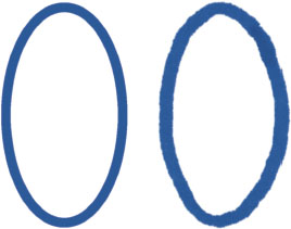
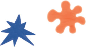
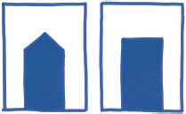
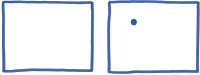
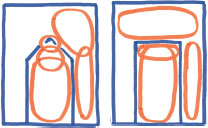
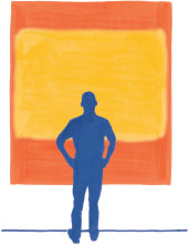
How images make you feel matters. Aesthetic qualities like color palette and line texture arouse responses in us all. They do not convey any particular message content, yet sometimes they excite more meaning than a detailed body of text. A striking flash attracts attention, certainly. But the emotion of great work can also help us transcend the everyday by causing us to reconsider what the experience of life itself can be. Some disparage ornamental qualities as frivolous. To them, style is merely superficial. The arts are called soft in contrast to science and technology; those are hard. We do not analyze and decompose aesthetics in the same way as we do the world of machines, and that somehow makes emotional design less intellectual. How artists accomplish their effect eludes us, and so their effort is trivialized. Emotions are real. Chemical hormones excite and calm us. Like a step function or phase change, an emotional impulse that lasts for only moments can permanently alter how we feel and see the world. Yet we cannot program a computer to spit out perfect emotional design as we can automatically lay out a scatter plot. As I mature as a creator, I have understood that this is cause for celebration. Emotional communication is a fascinating frontier because we humans are the ones uniquely equipped to explore it. I find myself thinking about emotional perspective shifts more and more. To be honest, they cannot be cataloged in a neat framework, like other topics in this book. But that is even more reason to look, and get you thinking about feeling too. Loud design demands to be noticed. Shiny objects catch our eye, perhaps because we are wired to recognize shimmering fresh water sources. Novelty attracts the attention of our curiosity. Despite this, we almost immediately close flashy Internet ads and quickly forget recent pop music sounds. Something more is needed if we are to investigate and become invested in the next new thing. We need emotions. Pleasing experiences make us feel good, causing us to linger and desire more similar enjoyment. In contrast, we naturally distance ourselves from what turns us off. We know that the world assaults our senses with too much to process. Emotional intensity helps us determine what to pay attention to, and ultimately, what to remember. Recall how the patient S., who did not have the power of forgetting, was lost inside a maze of equally salient memories. Emotions move us. They guide us to what is important, in the moment and across time. Color is perhaps most powerful as an indicator of emotional tone, often invoking the feel of a sunny day, rainy storm, or mysterious night. Movies are emotion manipulators, and their color palettes are a primary ingredient in setting a scene's mood. Across the eight Harry Potter films, the color palette darkens as Harry grows up and adventures through more threatening stories. How lines and shapes are drawn can tell you a lot. Their expressive potential should be explored. A fuzzy curve could be perceived as warm and gentle. A crisp corner might be rational and conservative. Irregular points are unwelcoming, scary, and severe, like piercing thorns. Heavier lines attract attention because they are bigger, unless of course all of the lines are heavy. Then, a single thin thread might become most salient. The emotions of shape and character are both obviously powerful and also challengingly mercurial, always subject to context. The clean perfection of the machine is nice, but not always preferable. Our senses often favor a certain roughness, which might be intuited by contrasting the raw authenticity of Nina Simone's jazz with the latest algorithmically manufactured, precisely in-tune pop music. One sound is legendary while the other is fleeting. Or consider the multisensory experience of exploring the winding streets and varying architecture of a Renaissance city center. A cobblestone stroll is more appealing to me than traipsing through a centrally planned metropolitan grid. There, every block is the same and every edifice makes you feel insignificant. Only numbered street signs tell you where you are. And those numbers are pure concept, only weakly associated with any feeling. Perfectly rectangular, a modern grid gives no chance for connection or belonging. Because real life is not perfect, perfection can feel dead. On the page, hand-drawn illustrations are familiar analogs to the spirit of the jazz singer or the crooked mesh of narrow streets. We could be tempted to dismiss the appeal of human-wrought creations with superficial explanations. Roughness connects us to the unique individuality of the creator, appealing to us as social creatures. It also pops out from an increasingly mechanical environment. But the real power of embracing the imperfections of roughness lies somewhere deeper. Many small decisions over an extended period of time, most not according to any master plan, lead to imperfections. Let us illuminate this by returning to the city walk. The old city arrived slowly. Streets were formalized over time and buildings were constructed for specific needs. More people, more small decisions, and ultimately more information—all tuned to the experience of individuals—are embedded in the old city. In contrast, the centrally planned metropolis grid was laid out by a small number of similar people across a narrow window of time, often in service to distant stakeholders like real estate developers and tax collectors. Its plan is information poor and has weak relationships with the people who live there now. The superficial aesthetics of roughness can be mimicked. New housing developments imitate old villages and smartphone apps turn digital photos into pencil sketches. Somehow, these approaches are all still stuck in an uncanny valley, but not because we lack the computing power. Perhaps what such superficial styling misses is the time creators put into handmade production. This time can be spent meditating on the subject matter, which leads to better understanding and intuition. It is also time during which emphasis naturally varies across the creation, giving rise to the roughness. This emphasis may vary, often intuitively, in accordance with the values the creator, who is striving to convey the very essence of the thing, places with the information. I do not mean to suggest we always crowdsource design, or advocate that you draw your final products by hand. Rather, as creators we should give attention and time in order to make space for intuition and variation to naturally appear. I believe that an audience can appreciate when these have been done. When more life goes into making something, it feels more alive. Texture is another way of thinking about the character of a visual. Imperfections and variation are not the only way to create texture, of course. Decorative patterns also change how surfaces make us feel. Gradients, in color and form, create smoother transitions that soften edges and help build connections across elements. If we look past cosmetic qualities, we can see how structure and design relationships change how we feel. Consider the two simple portals below. Which one is more appealing to you? Which one has more life? In 2002, architect Christopher Alexander advocated a design perspective that focuses on the relationships between centers and wholes. A spatial center is some identifiable, marked coherence. Your eyes, nose, and mouth are all centers. Wholeness is a global structure that rises from the interaction, interdependence, and relationships between centers. And so your nose is also a whole, including named centers like the bridge, tip, and nostrils. Yet these parts are not enough to make a nose, just like the named parts of the face are not enough to make a face. It is the subtle relationships between these parts that gives rise to a greater whole. Christopher Alexander showed how a single dot can change the way we experience a piece of paper. We subconsciously perceive a complex system of spatial relationships, and this can change how a design makes us feel. The dot creates zones of perceptual segmentation including a halo around the dot, rectangular divisions, which in turn create even more divided spaces. The two portals are also an example adapted from Alexander. We can begin to understand why the arch feels different if we examine the set of salient centers within each design. The arch creates a system of different-sized centers that overlap. The swooping path from the largest center above the portal to the point of the vertex creates dynamic harmony. In contrast, the centers created by the rectangle are more similar in scale. Their separateness makes them less coherent than the arch's centers. Coherence and connection help the arch feel more alive. Emotional design fills us with wonder, awe, and the joy (and terror) of being alive. When an image arouses emotions in us we feel connected to the art, to the artist, to the great tradition of human experience, and even to existence itself. In the moment of heightened emotion, everything we are, a tangled history spanning failures and success, is recognized. This connection affirms our own identity, simultaneously telling us that we are not alone and who we are matters. This connection can give you confidence, a feeling of inspiration, and energy to flourish. Some visual experiences reach into our depths and grab the soul. Mark Rothko painted thin layer over thin layer to create archetypal fields of color. He invited us to stand inches from his huge canvases and be overwhelmed by the richness of the total visual experience. It is not always about personal identity. The ego desires what is next, it wants more consumption, it wants to be advanced. Great emotion can quiet this voice. Intense feeling can stop time. A work that overpowers you emotionally creates space for you to lose yourself and be fully present with the experience, to feel totally alive. I will not pretend that designing for feeling and emotion is as straightforward as positioning a dot along the number line. But we cannot deny that the form changes how we feel, and that impacts how we perceive. I believe it is a joy to strive toward building more meaningful connections between objective reality “out there” and the personal reality “in here.” Perhaps this softer side of design is the hardest opportunity we can embrace.