CHAPTER
13
FREEZE
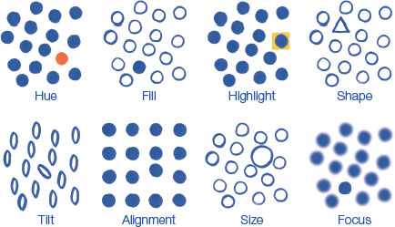
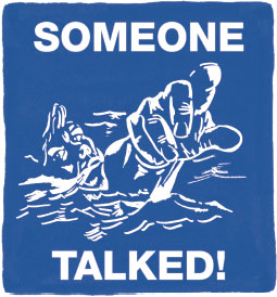
Frederick Siebel's poster plunged the 1942 American public into the sea to face a young man gasping for life. The drowning sailor makes eye contact, reaches out (or is he fingering the gossiper?), and spits out water to use what might be his last breath to warn: Do not gossip, you might be leaking military intelligence to enemy spies. This singular image weaves setting, hero, conflict, and outcome. We know where we are (the aftermath of a sunk ship), who we care about (the archetypal sailor, who represents all servicemen), and gain an insight to how this happened (SOMEONE TALKED!). It only takes a few brushstrokes to convey high-stakes emotions, stoke your adrenal system, and speed your heart rate. We leave the piece with new resolve against careless gossip. Still images do not move, but they can send our minds on causal journeys. Narrative photographs, paintings, and magazine illustrations engage us intellectually and stir our emotions. The frozen stories this chapter is about threaten to drown us in an entire survey of the visual arts. We will resist this deluge and focus on just a few media that help us better connect data to audiences. Not all data stories are frozen, of course. Many interactives, animated films, and presentations sequence data-driven content over time. Yet, each of these build on still comparisons and can benefit from considering the singular image. Illustrator Norman Rockwell became famous for visual stories that caught characters at just the right moment. In The Shiner (1953), a young student sits outside her principal's office with a black eye, smiling. In Rockwell's Freedom From Fear (1943), parents tuck sleeping children into bed, with violent newspaper headlines in view. Many Rockwell illustrations appeared on the cover of The Saturday Evening Post, a weekly magazine that contained another kind of effective visual story, the print advertisement. Advertising has always been on the cutting edge of attracting attention, conveying messages, and motivating action. Across the last hundred years, ads have kept pace with communication technology across newspapers, radio, television, and the Internet. Advertisements blend aesthetics with utility. Pleasing and beautiful design encourages reader engagement, acceptance, forgiveness, and satisfaction. However, a merely stimulating ad is not a successful ad. Radical designs delight creators and win awards, but confuse audiences. Instead, the advertisement that influences is the real success. So it is with data storytelling. If our design is too bold, we may confuse. If we get lost in aesthetics, our efforts to covey information may be reduced to mere decoration. The classic print magazine advertisement is the most relevant analog to our craft. Its format consists of a headline, image, and body text. Advertising tycoon David Ogilvy had advice on each ingredient. Whether it is an advertisement, newspaper article, or data story, large portions of audiences will only consume the headline. Headlines work well if they promise a benefit, and even better if they communicate news. Headlines should offer helpful information, be written in familiar and descriptive language, and appeal as specifically to the target audience as possible. In advertising, bad headlines do not mention what the product is or what it will do for you. Horrible ads have no headline at all. The best visuals arouse curiosity. The reader who wonders what's going on here? is the reader who will stay to find out. We like looking at ads that depict individuals we can identify with, not crowds. Babies, animals, and sex still appeal. Photographs often perform better than illustrations. As data storytellers, we must consider how to grab the reader who only gives us a glance. This can be accomplished in many ways: include a summary comparison, annotate an exemplary data point, or call out a specific insight. Orienting readers to how the chart works is good, but showing something useful the chart can do is better. A celebrity's image slapped onto an advertisement might grab the reader's attention, but they will depart the engagement thinking about the celebrity instead of the story you want to convey. Quick, superficial decoration is not the same as design elements that lure you into meaningful engagement. Getting the reader's attention is not the same as informing them. Our challenge is to connect the busy reader to the essence of what the whole piece is about. For an advertisement, the essence has something to do with a story that the reader identifies with or aspires to. For a data story, the essence is usually about improving how the reader perceives some aspect of the world. Glossy magazine pages arrive from a broad tradition of graphic design that evolved from colonial broadsheets, yellow journalism newspapers, and Belle Époque posters. Since then, posters have been used to promote films, propagandize wars, organize protests, and decorate public spaces. Poster design guidelines help concentrate our attention on composition lessons: Depth is combined with color, line weight, scale, and placement to organize visual elements into a successful composition. For data storytellers, these visual elements include common graphic items, like headlines and captions, and items specific to charts and maps, like an interesting comparison or perceptual cluster of marks. In either case, the human brain can only hold a few elements at once in short-term memory. So, how can we preserve complex visual stories that are comprised of thousands of elements? A chunk is a unit of information that can be stored in short-term memory. We first saw the concept of chunking with the grouped color categories on my hometown map. In 1956, psychologist George Miller introduced us to the idea that we can only hold about seven chunks in our head at once. This total has since been further pared down; researchers now think we can hold only three or four chunks at once. One trick to complex storytelling is to package a set of ideas into a chunk. Then we can navigate the chunks and break them into their sub-elements as necessary. Cognitive psychologist Steven Pinker explains: We can only hold in mind just a few of the letters from an arbitrary sequence like MDPHDRSVPCEOIHOP. But if they belong to well-learned chunks such as abbreviations or words, like the ones that pop-out when we group the letters as MD PHD RSVP CEO IHOP, five chunks, we can remember all sixteen. Our capacity can be multiplied yet again when we package the chunks into still bigger chunks, such as the story “The MD and the PHD RSVP'd to the CEO of IHOP,” which can occupy just one slot, with three or four left over for other stories. Too many visual elements cannot reasonably compete for attention at once. If you overwhelm the reader, then they may disengage. Instead, use gestalt effects, such as enclosure and grouping, to arrange elements into visual chunks. Colin Ware showed how visual search can be enhanced if “smaller objects of search can predictably be associated with larger visual objects.” The use of multiscale design chunks information into visual hierarchies that match conceptual meaning. Visual pop-out occurs when a distinct item stands out from the rest of the field. It is the opposite effect of grouping. Pop-out is a pre-attentive effect, an automatic process that occurs before the act of attention. In nature, it occurs when we are instantly alerted to the presence of a snake after only spotting a portion of its distinctive scales. Like grouping, pop-out can be achieved with different visual channels. Depending on the data, some techniques will be more effective than others. Pop-out and gestalt grouping can be used to match content to its importance, creating a sequenced appreciation for the reader that first attracts, and then holds their attention as they visually unpack individual chunks. Across graphic design, many trade-offs are considered in pursuit of information harmony. As I warned, it threatens to distract us on a dazzling journey deep into the history of two-dimensional art. The methodical geometric abstraction of De Stijl paintings closely resembles the style of modern data visualization, but lessons can be learned from any aesthetic movement. If we pulled the string long enough we would travel all the way back through Egyptian hieroglyphics and Mesopotamian reliefs, perhaps finally resting in Lascaux to marvel at its cave paintings and wonder what was created before and has since been lost to time. Graphic design augments pictures with text to create powerful messages, in a way that fine art painting rarely attempts. Image and words are each better for presenting different information. The two were perhaps first paired by an ancestor pointing to an object and calling out its name. As information-makers, we are still doing the same: showing new pictures and labeling them with words. Images exists across a spectrum of abstraction, from photographs to cartoons. They present complex patterns for our eye to recognize and investigate. Polymath Leonard Shlain detailed in 1998 how images approximate the real world: “they are concrete. The brain simultaneously perceives all parts of the whole integrating the parts synthetically into a gestalt. The majority of images are perceived in an all-at-once manner.” Compared to how we see images, the linear sequence of consuming alphabet writing is a different cognitive process. Its abstract symbols offer other benefits. The A, B, C squiggles we call letters have murky origins. Today, they have lost their connection to the world of experience. Reading abstract symbols lets us explore and communicate the worlds of logic, reason, philosophy, science, and mathematics with amazing efficiency and precision. Data images are clarified with text. A title introduces the reader to the setting. Annotations help navigate and highlight details. Direct labels offer high precision when specific values need to be conveyed. But visual patterns suffer if text commands too much attention. Words are very efficient at providing information, but only in small amounts. They are not good at describing complex patterns. Steven Pinker observed that good writers “write as if they have something important to show.” Great analytic thinkers know that language and vision together helps the mind soar. As data storytellers, we do not have to choose between the two. We get both. Graphic design is a natural lens to view data storytelling through, but once you turn the page, you will see there is one more two-dimensional craft to observe. It does an even better job of telling stories by integrating the power of pictures and words.

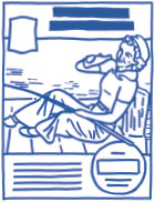
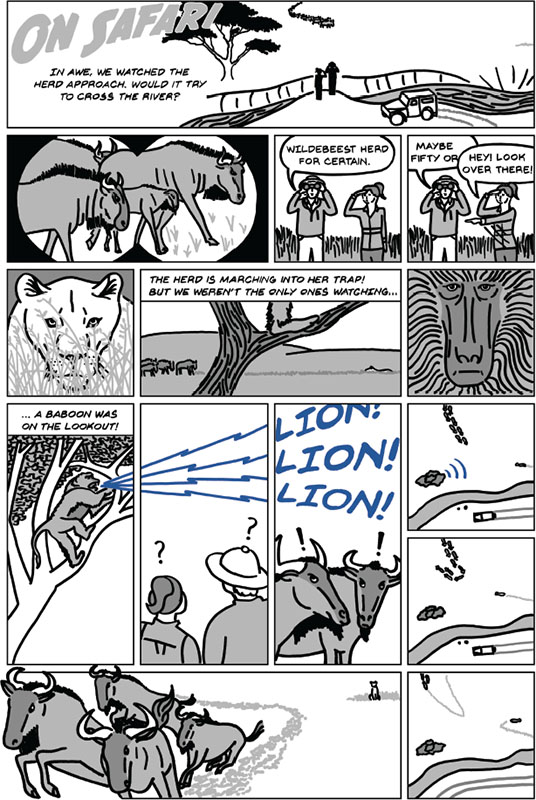
 FOCUS. A clear focal point directs viewers where to look first and keeps them from wandering off the page. Does the eye naturally land on the introductory element?
 DIAGONAL. Diagonal lines break the rectangular grid and help the eye cut across the frame, creating a sequential experience. How does the eye move about the panel?
 DEPTH. Overlapping objects create a 2.5-dimensional visual hierarchy without the perception problems that mimicking 3-D volumes introduces. Objects in front are elevated to our attention.
 STORY. The content of a single frame can communicate setting (context, where are we?), character (what do we care about?), conflict (what contrast and pattern can we see?), and satisfaction (what new knowledge have we learned?).