
CHAPTER
7
TRUE COLORS
Man lives with what he sees, but he only sees what he wants to see. Try different types of people in the midst of any landscape. A philosopher will only vaguely see phenomena; a geologist, crystallized, confused, ruined and pulverized epochs; a soldier, opportunities and obstacles … They all experience a certain arrangement of colors; but each one immediately transforms them into symbols.…
PAUL VALÉRY, 1871–1945
The Grey
Eyespots are tiny light sensors. They help single-cell organisms like green algae get into position for optimal photosynthesis. Primitive biology is able to detect the intensity of light, and we can still accomplish a lot by swimming between black and white. Today, the human eye has millions of photoreceptor cells called rods. Like their eyespot forerunners, rods sense lightness. Concentrated on the periphery of the back of our eye, they have little to do with our modern color vision.
Alone at night in the woods, listen for clues about what nocturnal predator might be staring at you. The fear of being prey is manifest by darkness. The original experiential duality is symbolized by the Chinese yin and yang, literally dark and light. Our oldest visual archetype is rooted in life's daily journey. Through the mysterious night, into the revelation of the sun, and then back into night. Metaphoric light is the antidote to darkness because it lets you see what is going on. With light, real predators are detected, and imagined predators vanish. The sun's warming rays are the source of energy for life on Earth. No wonder so many ancient religions worshipped the sun. No wonder so much symbolic light shines throughout religious texts.
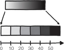
The archetypal colors, black and white, can distinguish two groups. But we can also segment them into shades of grey to do even more. This is like increasing how many flashlights shine against a white wall in a dark room, increasing the ratio of white to black in a paint mixture, or increasing the number of pinholes in a screen. Black has a lightness of 0 percent and white has a lightness of 100 percent. The continuous spectrum between black and white can be keyed to a single dimension of data by stretching a set of greys across a number line. As with area, easily encoded numbers are not always easily decoded. The way we make sense of different lightness is mostly relative. When we compare two shades, we can discern that one is darker than the other, but only if they are located near one another. Too much distance removes too much context, and distorts the comparison.
The background color behind the encoded lightness spectrum matters a lot. The background determines contrast and gives context. Data values of higher interest, usually higher magnitudes, should be more salient. They receive higher contrast. Alternatively, both high and low extremes may deserve attention. Then, greys can appear to diverge by choosing a background with an average lightness. Now, middle values will have the lowest contrast and shrink from notice. Today, digital screens have removed the printing constraints that made full color expensive. Greyscale is a stylistic choice. Still, the minimalism of black and white helps focus design. It avoids the busyness and distraction that the freedom of the full color palette can introduce.
Greyscale allows us to isolate a single dimension of color, lightness, to see how to relate data and color. Quantitative values can be mapped to color spectrums. Background and nearby context is essential to appearance. We must be intentional in how we design sequential and diverging palettes. But who wants to live in austere, desaturated minimalism all the time? And working with color's other dimensions can help us increase the total number of discernible categories. These grey-scale lessons can accompany us as we step out of the proverbial blackand-white Kansas farmhouse and into the wonderful world of color.
Species of Wheels
The world is full of colors that convey categorical, or qualitative, meaning. Some, like the stop-go palette of a trafic light, are more universal than others, like the uniform colors of two competing football teams. A handful of very different colors can convey category groups. They must be very different because the goal of a qualitative palette is to make categories visually distinct from each other. The color wheel sweeps through color hues. Or, perhaps it is better to say a color wheel. You see, connecting the world of color to only a single model is like connecting the globe to only a single map projection. Many color models exist for different purposes, for different technology, and from across the history of always-progressing color science.

Distinct hues are farthest separated from each other around a color wheel. Complement pairs are the most distinct, they straddle the wheel. Distinct palettes interest us because we perceive color according to difference. From a survival perspective, colors are most relevant relative to their background. Throughout the day, and throughout the year, lighting conditions change the perceived color of objects. We have adapted to be sensitive to difference, not absolute value. Imagine you are hunting for ripe apples against a field of tree leaves. To contrast the red color of desire against other environmental cues, we change our pupil size and photoreceptor sensitivity. This lets us hunt for apples at noon and dusk. We change to make effective comparisons across a variety of lighting conditions.

After difference, learnability is the next quality of a good color palette. Colors and categories must be mentally linked, remembered, and referred to in conversation without confusion. Palettes should be comprised of hues that suggest familiar names. Intuitive color palettes that reflect some semantic meaning, such as making bodies of water blue, also helps. In addition to mimicking how we experience the natural world, semantic color builds on other palettes readers have seen before.
Typically, a categorical palette must be limited to a handful of colors. Hues are impossible to distinguish if they are packed too closely around the wheel. Too many colors will make it difficult to remember which colors map to which categories. Shades of the same hue might imply that one category is a lesser version of another. It is difficult to assemble a palette of many more than six hues that does not run into problems.
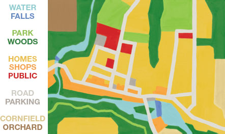
But we do not always have to be typical. Grouped color schemes can increase the number of color categories beyond a handful. They do this by arranging categories into a conceptual hierarchy. Each chunk of the hierarchy gets one of the main colors. Then, inside each chunk, varieties of that named color can distinguish more. For example, consider this map of my Hudson River Valley hometown. Blues are water. Greens are nature. Warm colors are buildings. Greys are paved surfaces. Browns are crops. It really is a colorful little village.
Color demands respect for how an entire stack of technological, biological, and cultural systems conspire against successful decoding. Our technology is not perfectly aligned with our biology. Biology varies across all readers. Each person's mental processing of color is different. It is easy to miss how wacky the handshakes are between our data, color mapping, the way colors are displayed, and the way they are perceived.
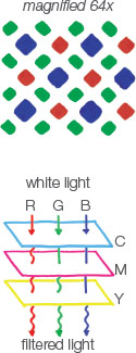
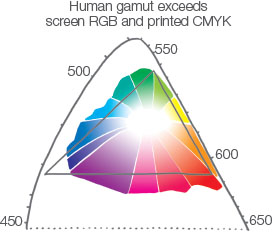
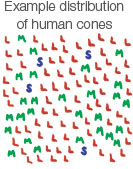
The real color spectrum is expressed with different color models for different purposes. The most familiar models help us program machines to display color. RGB instructs screens how bright to make an array of red, blue, and green light sources, like the iPhone diamond matrix here. The CMYK color model dictates where to print cyan, magenta, yellow, and black (key) ink on the page. No print or display technology is capable of producing all of the colors our eyes can detect. Both RGB and CMYK are languages convenient to machines, not to the human eye. How we actually perceive color makes things complicated because everyone sees differently. We are each equipped with a unique set of biological hardware. Incredibly, our brain generates our rich color experience from relatively simple sensory input: long, medium, and short (LMS) cones, named for the profile of visible light wavelengths each is specialized to detect. The density of our eyes' rods and cones varies amongst all trichromats, people with normal three-cone color vision. Some, mostly men, only have two types of cones. These dichromats suffer some impairment in the perception of the red-green spectrum.
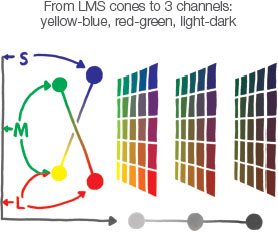
With only three types of cone, we get far more than just three colors. Our brain's visual system interprets the difference between the three LMS cone signals. We can imagine these signals locating colors across a multidimensional space, similar to how multiple satellites can triangulate a specific position. The combinatorial way we see, from cones to color, has important implications for design. Sensory input from all three cones fuse to make us best at seeing gradations along the dark-light achromatic range (shown as the horizontal axis in the below diagram). Even with full color, lightness is still most important.
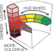
Perceived lightness, called luminance, should be consistent across color palettes. The HCL (hue-chroma-luminance) color model pursues even perceptual distance across its color volume. It arrives by way of more than a century of color science innovation, which included incorporating more computing power and running more experiments where people perform color differentiating tasks, such as determining the “just noticeable difference” between shades and adjusting colored light to make differently painted swatches match.
The eyes we design with are not the eyes of the reader. Designing for human vision reminds me of old graphic design handbooks. They warned: Expect your work to be mangled by photocopiers. As you work with color, simulate how design appears to different color deficiencies and on different devices. No colors, even reds and greens, have to be abandoned. They often just need to be tweaked.
Paint by Numbers
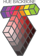
Quantitative color palettes map a change in numerical value to a change in color value. Many palettes vary only one dimension of color. An increase in number, as we saw, can correspond to an increase in darkness. Color models are often represented by a perfect cube, cylinder, or other tidy volume. Digital tools often have us navigate 3-D color space by using the hue dimension as a conceptual backbone and presenting us with the remaining 2-D slice of color fixed to that part of the backbone. Each of these perfect volumes reflect the computer-centric regularity of machines and their controlling mathematics. Some creative palettes map data across a spline that cuts through a color volume, varying color in all three dimensions as values change. Through experiments of how people actually see, we have learned that the actual shape of our perceptual field is quite irregular. Human color space is lumpy.
The color wheel's full circle, with no beginning and no end, is a strange friend for data. Indeed, quantitative rainbow palettes introduce a conceptual paradox. Data minimum and maximum values should be visually distant because they are numerically distant. Rainbow max and min, however, are colorfully right next to each other. Using the full rainbow is like exiting a tunnel and finding yourself back at its entrance.

Color transition points can help indicate meaningful thresholds within a data range. Diverging scales direct attention toward extremes by using a neutral color for the hinge value. The color legend at left emphasizes height above and depth below sea level. Quantitative colors do not always need to be evenly distributed. The example below allocates a warm palette strategically. The only data of interest, the top 10 percent, is highlighted, while the bottom 50 percent is colorfully weakened. This intentional palette stretching blends the benefits of qualitative and quantitative approaches.

Sometimes, a fluid color spectrum is created by interpolating hundreds of color variations along a color ramp. Our ability to actually differentiate between noncontiguous colors is poor. It hovers somewhere around three or four shades of saturation or luminance. Paradoxically, dividing a rich spectrum of hundreds of colors into a few discrete bins can help people discern more colors. Go ahead and use a color ramp for aesthetic reasons, but know that it is at the expense of decoding information. Instead, bucket (or step) quantitative palettes into discrete (or quantized) bins.
Total Color Challenge
Color can be defined numerically at so many different stages: wavelength of light emission, absorption and reflection, design mapping, red-green-blue pixel encoding, our eye's reception, and our mind's perception, which takes into account complex factors such as how nearby colors interact and the relative size of each area of color. Numerical systems help us produce color, but none of them perfectly match how we think about color.
How colors are perceived, not how they are generated, is what matters most. Successful color decoding happens when we account for the reader's eyes, mind, and experience. We want color to support a successful encoding-to-decoding chain, but we also want color to help make our design look good. These two goals can create tension. A group of six distinct colors will differentiate data well, but may look garish. Color palettes often shoulder even more responsibility, such as advancing a corporate identity. Everyone associates certain colors with their experience of the world. This is why it is so much easier to make intuitive color palettes for maps, as we saw in the blues and greens of my hometown.
As we age, our eyes change. Our eyeball lens hardens, making fine print harder to see without reading glasses. Early onset of conditions like cataracts or glaucoma can also make it harder to see. Consider how color contrasts across your visual. A thin grey font on a white background might look slick, but it might also slow down readers.
At minimum, an effective color palette does not turn the viewer away. Ideally, it helps attract and hold attention while also informing effectively. You must balance many demands across color pursuits. The technical best practices—not too many categorical colors, bucketed palettes, steady luminance, meaningful associations, and sensitivity to impairments—are all good guardrails against making color mistakes. Some programmed default color palettes clear these best-practice hurdles, but risk leaving too much value on the table. All defaults are uninteresting because they are overused. Defaults are often poorly linked to the semantics of the data because defaults are not designed for the information your data might convey.
Your human consideration is needed to color data. Begin by referencing inspirational sources, including existing visualization and other graphic design. Then prototyping, demonstrating, and technical guardrails can help the palette be refined into something that is technically, semantically, and emotionally superb. Superior colors encourage readers to engage and help data soar.
Color is one of the most powerful channels we have. It can convey categories, quantities, and emotions. Color is also one of our most unwieldy tools. It requires more navigation of the encoding-to-decoding process than position or size. Remember, the same single data dimension can be mapped to multiple channels to reinforce the message. Do not choose between circle size or circle color to represent a quantity if both can be used in harmony.
Together, position, size, and color give us the tools necessary to humanize data and see information. Next, we are going to take these tools and use them to probe data for better and better forms.
