Chapter 5: Inferring and Estimating
Don’t leave inferences to be drawn when evidence can be presented.
Richard Wright
Introduction
Inferential Estimation
Confidence Intervals
There Are Error Bars, and Then There Are Error Bars
So, You Want to Put Error Bars on Your JMP Graphs…
Graph Platform
Graph Builder Platform
Introduction
Most of what we consider to be “statistics” falls into the category of inferential statistics. These are methods that allow us to infer something about populations from samples. Now, don’t you just love definitions that use the word that you’re trying to define in the first place?! What does it mean “to infer?” According to Dictionary.com, to infer is “to derive by reasoning; conclude or judge from premises or evidence.”1 This definition gives us considerably more help in understanding what we are talking about. The reasoning involved will be the application of induction and deduction as we apply our premises, or assumptions, and evaluate the evidence, or data.
But what are the “somethings” we are supposed to be inferring? These are the various objectives for the analysis of the data, and they depend on the purpose of your experiment. Generally, we are looking for differences between populations, the presence or absence of relationships between variables, the existence of patterns in the data, or some expanded description of our data, often in the form of a model that explains a response in quantitative terms of one or more variables. In this chapter, we will look at the estimation of parameters that describe populations and what they allow us to infer about the data. In the following chapter, we will look at a second, more extensive use as well as explore null hypothesis significance testing (NHST) as a tool to decide if our results were obtained by chance alone.
Inferential Estimation
In biology, most of the populations that we might want to study are so large that it would be impossible to obtain results from every member of the population. Consequently, the biologist must resort to taking samples of the population that are, hopefully, a representative subset of that population. Successfully achieving this is a function of good experimental design, which is outside the scope of this work.2 Therefore, we will be assuming, in most cases, that the data collected for the examples that are given in this work were, in fact, collected appropriately. The analyst should always consider that the fallibility of human endeavor in this realm is still very much a possibility that might need to be taken into account when interpreting our results and the results of our analysis.
Confidence Intervals
We have already seen that when we describe a population, we want a measure of the central tendency (a mean or median value) and some measure of the variation present in the population. Confidence intervals (CIs) associated with those metrics give us a range in which we have a certain confidence that the true value for the metric lies. So, for example, if we have a mean with a 95% CI of 36.75 to 36.89, then we can say that we are 95% confident that the true unknown mean falls somewhere between these two values. Put another way, if we were to measure with the same sample size the same population 100 times, 95 of the CIs would contain the true mean. Conversely, we are not saying there is a 95% chance that the mean falls within this range (in other words, it is not a probability). An important distinction to remember is that confidence intervals do not quantify variation (the spread of the data) in the population, only the location of the metric for which it is being calculated. The variation does go into the calculation of the CI in the form of the standard deviation, but it is only one factor determining this metric. The importance of this fact will be noted again later.
Confidence intervals are calculated from four values (with a formula that we will studiously avoid because our software will do the calculations for us). The CI for a mean requires:
● The sample mean. The CI will always be centered around the sample mean
● The standard deviation (SD). Our confidence will be influenced by the amount of scatter or noise in our data. Consequently, the width of the CI will be directly proportional to the sample SD.
● The sample size. The more data you have, the greater your ability to assess where the mean truly lies. The range of the CI will be larger for smaller sample sizes. (Technically, the width of the CI is inversely proportional to the square root of the sample size, but did you really want that much detail? See Figure 5.1.)
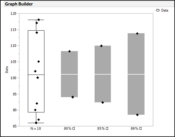
● The degree of confidence. The traditional level is 95%, but that is not set in stone and can be changed as needed. For greater confidence, you can go to 99%, or if you don’t need that much confidence, 90% has been used. Regardless, the size of the CI increases with the increasing degree of confidence chosen (Figure 5.2).
Figure 5.1: Confidence Intervals Change with Sample Size
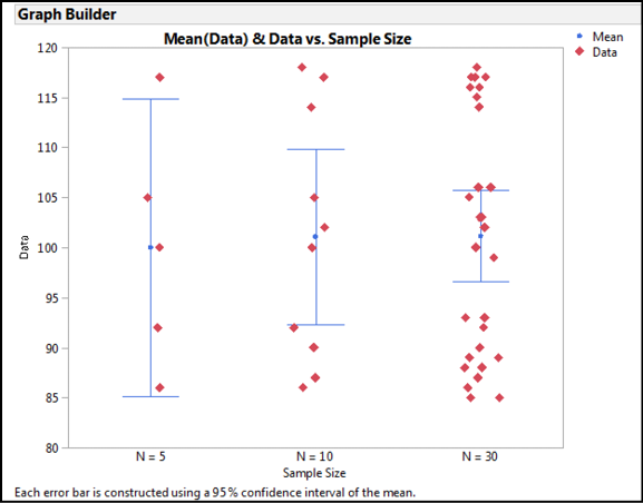
Figure 5.2: Confidence Intervals Change with the Degree of Confidence
Confidence intervals have a very helpful characteristic for inferential estimation: when comparing populations, the extent of the overlap of the CIs indicates how likely the samples are from the same population. Figure 5.3 shows an example where the CIs almost completely overlap, so we can conclude that these two samples are not going to be statistically different.3 Figure 5.4 is an example where there is no overlap, so we can conclude that these two samples are most likely not from the same population (that is, they are statistically different). Lastly, Figure 5.5 is a case where we have partial overlap, and this is why we really need statistics!
Figure 5.3: Overlapping Confidence Intervals: Statistically Equivalent
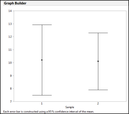
Figure 5.4: Non-overlapping Confidence Intervals: Statistically Different
Figure 5.5: And Now We Need Statistics!
There Are Error Bars, and Then There Are Error Bars
When reading the biological and medical literature, graphs frequently have error bars incorporated into their presentation, and it is critical to understand what those error bars are representing because confidence intervals are not the only metric that could be displayed using error bars. At least two other metrics are commonly shown as error bars, and all good graphs should indicate which one the error bars represent because the concepts behind each are different.
As we have seen, the CI indicates the range in which we are x percent confident that our metric can be found, where x is typically 95%. When sufficient data is present (n ≥ 30) for a standard deviation to be a reasonable measure of the amount of variation in the data, error bars can be used to show that SD graphically. When the metric in question is the mean, dividing the SD by the square root of the sample size gives the Standard Error of the Mean (SEM), which is a measure of how precisely you know the population mean.4 Because of the math, the SEM is always smaller than the SD, but again, it is important to note that they are metrics of two totally different things. The SD is the variation present in your sample. The SEM is how well you know the true location of the mean for the entire population. (It is the same concept as a confidence interval, but using a different calculation to try to measure the same thing.) The larger the sample size, the smaller the SEM, because you have a better idea of that location with the increasing amount of data. So again, it is critical to specify which one you are plotting when you put error bars on your graph. (JMP does it automatically for you in Graph Builder, so you have to intentionally remove that label if you want to put it elsewhere.)
So, which one should you plot? That depends on your goal. If you want to have a visual cue supporting your conclusion comparing samples and their similarity or difference, then the CI is probably the best. If you want to show how much variation is present in the values that you have collected in each sample, then the SD can be used. One caution when using the SD is that the ability to accurately measure the variation in the sample increases with increasing sample size, so for small sample sizes (n ≤ 10-30) it is probably better to just plot the data, or failing that, the SEM. The SEM can be used in any case to show how precisely you have determined the mean of your sample(s).
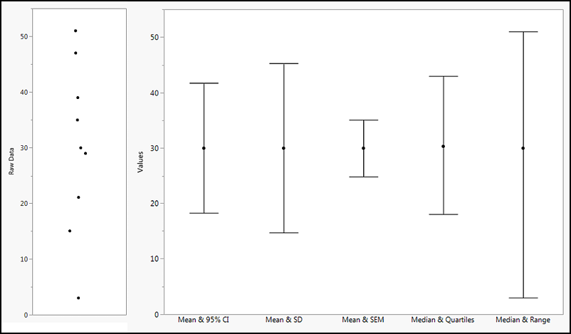
Figure 5.6 shows the possible error bars for the same set of data so that you can visualize the differences summarized in this discussion.
Figure 5.6: Types of Error Bars Compared
So, You Want to Put Error Bars on Your JMP Graphs…
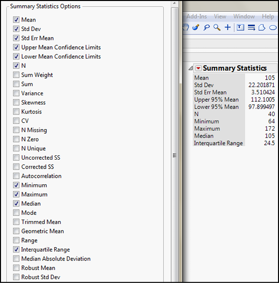
Error bars are very helpful tools to accurately portray various characteristics of your data on your graphs. But where in JMP do we find these values, and how do we put them on our graphs? Go ahead and open Big Class.jmp as the sample data to answer these questions. Create a distribution analysis of the weight variable and look carefully at the numbers in the Summary Statistics box. The standard deviation and the standard error of the mean are just below the mean (arrows in Figure 5.7) and the 95% confidence limits are just below that (boxed in Figure 5.7).
Figure 5.7: Confidence Intervals in the Summary Statistics
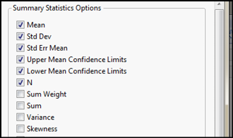
Of course, remembering that the Little Red Triangle Is Your Friend, we can modify the number of metrics shown in the Summary Statistics to include such things as the minimum and maximum (to calculate the range, or you can just check the box to show the range) or the interquartile range. (See Figure 5.8.)
Figure 5.8: Summary Statistics Options
The Summary Statistics is where you can find the actual numbers associated with these metrics, but how do you put error bars on your graphs? There are at least two places where you can apply error bars to your graph, and both are found under the Graph platform.
Graph Platform
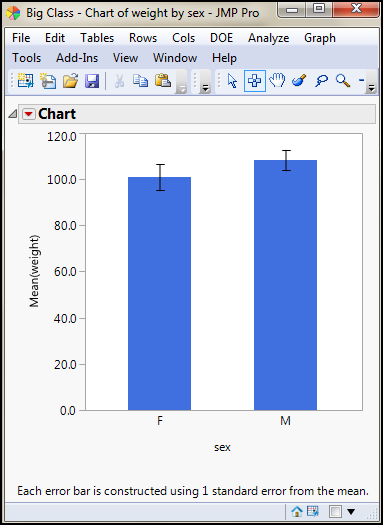
The first we will look at here is the oldest and will most likely be going the way of the dinosaur in future versions. It is presented here for the sake of completeness, and to aid in the appreciation of the other method that we will stress is the “better” way. This is the Chart method found by going to Graph Legacy Chart. Select weight again and add the Mean into the Statistics box, and add sex to the Categories, X, Levels box. Then check the Add Error Bars to Mean box and look at the options in the drop-down menu (Figure 5.9). There you can see the most common options available to you for a chart of the mean weights for these two categories. Figure 5.10 shows the results of the selected options in Figure 5.9: a bar chart with error bars representing the SEM.
Figure 5.9: Charting Confidence Intervals
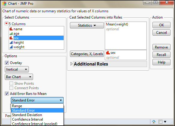
Figure 5.10: A Chart with Error Bars
If you choose to show the Confidence Interval, you can then choose the confidence level (it defaults to the 95% confidence limit).
Graph Builder Platform
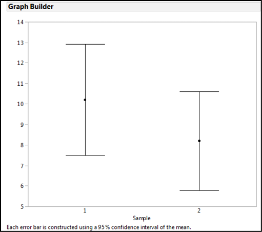
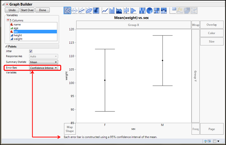
The other place in JMP where you can add error bars to your graph is in the Graph Builder platform, and this is the extremely versatile tool for creating all sorts of graphs and figures in JMP – it’s the best thing since sliced bread! Figure 5.11 shows the setup and results for replicating the chart data in Figure 5.10 as a point graph rather than a bar chart and with the 95% confidence interval. (Of course, if you really wanted the bar chart, you can do that with Graph Builder as well.)
Figure 5.11: Graph Builder Setup for Error Bars
Endnotes
1 Most dictionaries will have some variation of these concepts in defining the word, but I like this one because it falls in nicely with the concepts that we are exploring here in this chapter.
2 However, I have already cited Ruxton and Colegrave’s work, Experimental Design for the Life Sciences, in a previous chapter as an excellent starting point for this important topic.
3 Technically we say that the means are not significantly different, but we will get into that in the next chapter.
4 We have not made a distinction between the sample mean and the population mean, but statisticians do, and not without good cause.