Chapter 13: Modeling Trends: Multiple Regression
A theory is just a mathematical model to describe the observations.
Karl Popper
The Fit Model Platform Is Your Friend!
Introduction
In our earlier chapters, we covered some basics of statistical terminology and strategy, and we have realized that, at the basic level, there are two primary objectives for data analysis. The first is a comparison of different samples, and we have covered the more common tests for those. We are now in the realm of the second objective, which is to determine if there is a relationship between variables, and if so, to quantitatively define that relationship as closely as possible.
The simplest situation that we have already described (in the previous chapter) is when there are only two variables, an independent variable and a dependent variable, which are modeled by a straight line. The familiar equation is:
where b is the y intercept and m is the slope. These two values are also known as the coefficients in the equation. Determining their values allows us to define the relationship between y and x to such an extent that we can predict one from the other. But what if there are multiple x variables that define y, such that:
![]()
It is to this situation that we now turn our attention. While we would prefer to apply Occam’s razor1 to avoid the complexities of the math such equations will require, biology all too frequently will not oblige our desire to do so, and fortunately for us, JMP handles the mathematics behind the scene so that we don’t have to.
What Is Multiple Regression?
We saw in the previous chapter that the process of regression was simply seeking to reduce the differences between the actual data and the line being drawn through the data. The same process is in play with multiple regression, but because there are two or more independent variables involved, it becomes harder, or impossible, to visualize the process as we did in that chapter. The ability of the human mind to visualize in multidimensional space is a challenge that remains unmet. Fortunately, computers don’t worry about visualization. The underlying math becomes more “interesting” as well, but we can let JMP worry about that. The primary point to remember about multiple regression is that there are multiple possible variables impacting the response of interest. Multiple regression allows the analyst to determine which variables, if any, contribute significantly to the response, and to quantitate how much of an influence each variable has.
For example, consider a response y that is impacted by two variables, x1 and x2. If we hold x2 constant and change x1, what is the change in the mean response y? Now, hold x1 constant and change x2. What is the change in the mean response y? The magnitude and direction of those changes will be indicated and quantitated by the coefficients for each x variable, and this is what we are seeking to determine: the values of the coefficients (or parameters per JMP terminology) for each x variable and accordingly, how significantly are they contributing to the value of y? Life, of course, gets more interesting when additional variables are called upon to explain the response, but that is yet another reason to love software that does the heavy lifting for us!
The Fit Model Platform Is Your Friend!
The best way to “get into” this method is to begin doing it in JMP with the Fit Model platform. We will use the Lipid Data.jmp file provided with JMP in the Sample Data Library. This file has 95 data points and 25 columns of different variables. (See Figure 13.1.)
Figure 13.1: The Lipid Data
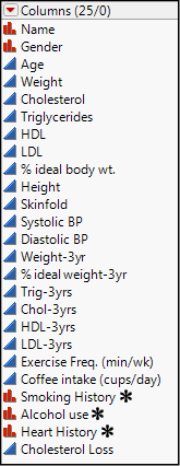
The data show multiple variables for 95 individuals, including continuous variables for various blood analytes as well as some nominal variables describing, for example, smoking history. Multiple regression can handle both types of variables. Some of the data are “initial” values, and some have the results for the same variables three years later. Now we must set aside our statistician’s hat and think with our biological/medical hat on. What are we going to analyze?
A response of interest, medically speaking (and for this example), is the Cholesterol Loss. Which of the variables in Figure 13.1 will be best at modeling the amount of cholesterol lost over the three-year period in which this data was collected? Your Objective is to determine whether there is an association between cholesterol loss and any of the variables other than the obvious initial cholesterol combined with the 3-year cholesterol. Cholesterol Loss is the difference between these two variables, so their inclusion in the model will, of course, be significant, and not a particularly insightful result of the research.
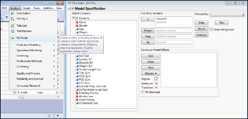
The Fit Model Platform is found under the Analyze Fit Model menu as shown in Figure 13.2.
Figure 13.2: The Fit Model Platform...Your Friend!
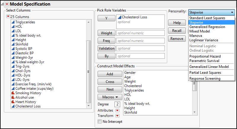
Highlight the Cholesterol Loss variable in the list of columns and transfer it to the Y under the Pick Role Variables box. This is where you put the variable that you are trying to model (and frequently to predict with that model). When you do this, you will notice that the Personality drop-down is filled with the Standard Least Squares option, and something called Emphasis appears with Effect Leverage selected (Figure 13.3). The Personality is just the analysis method to be used. We will eventually look at several of the options under here, but for now, standard least squares method is appropriate. JMP chose this because the y variable that we want to model is a continuous variable. In later chapters we will see what happens if a different variable type is chosen as the y variable.
The Emphasis is just the level of detail in the output report. Effect Leverage has the most output, including the leverage graphs. Effect Screening eliminates the leverage graphs but contains the rest of the analysis found in the Effect Leverage output. The Minimal Report option reduces that output further to what JMP considers the critical values of the analysis. For now, let’s leave it at the Effect Leverage emphasis.
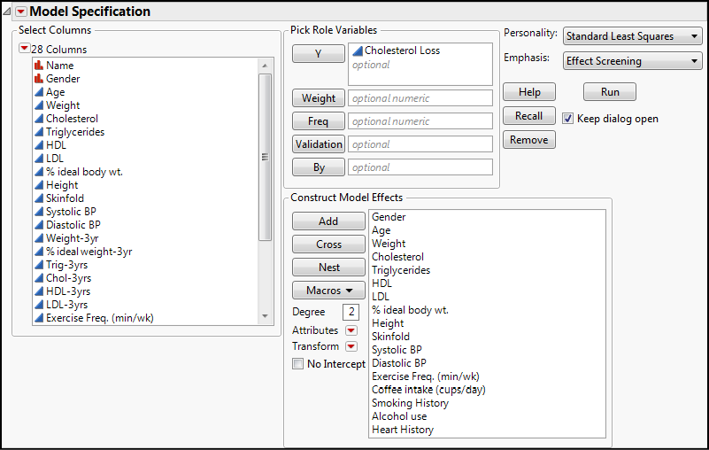
The Construct Model Effects box is where we put the x variables that we want to consider. For our first example, let’s consider if the frequency of exercise (min/wk) and coffee intake (cups/day) are associated with the cholesterol loss. After all, we have all heard how beneficial exercise is for us, and maybe accelerating our metabolism with caffeine will help burn off that cholesterol?
Highlight those two variables in the Columns list and click the Add button to transfer them to make them model effects for the analysis. Your dialog box should now look like Figure 13.3, and you are ready to click the Run button:
Figure 13.3: The Completed Fit Model Dialog Box
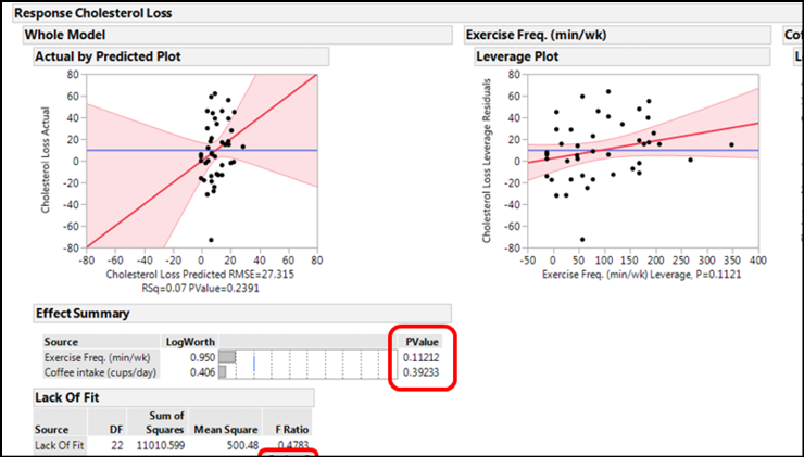
The first output from clicking on the Run button is shown in Figure 13.4.
Figure 13.4: First Output
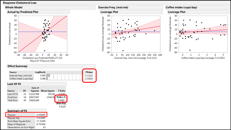
The Actual by Predicted Plot under the Whole Model shows you how well the entire model works by comparing the actual values to the values predicted by the model just created. In this case, it does not look good. The shaded area indicating the 95% confidence limits of the model is so wide that the line could fit in anywhere, including as a flat line with a slope of zero. The p-value of 0.2391 in the X-axis label confirms that this model as a whole is not telling us anything about cholesterol loss because the slope is not significantly different from zero.
The p-values under the Effect Summary confirm this by showing that each individual x variable does not contribute significantly to the response of interest. This is also confirmed graphically by looking at the leverage plots, both of which show that the line with a slope of zero fits quite well into the 95% confidence range of the plotted data, so we can conclude that neither variable individually, nor the two together, are contributing to the cholesterol loss (sorry, Starbucks!).
The only good news so far is that the Lack of Fit is not a matter of concern, with a p-value of 0.9492.
The pessimistic view of this model continues, however, with an RSquare value of only 0.069, indicating only 7% of the variation in the cholesterol loss is accounted for with this particular model, that is, by these two variables. Figure 13.5 shows two additional outputs of this analysis. The Analysis of Variance is again of the whole model and indicates an insignificant model with the p-value we have seen previously. For the Parameter Estimates, right click on the table headings to add the columns for the Lower and Upper 95% confidence limits of the parameters.
Figure 13.5: Analysis of Variance & Parameter Estimates for This Model
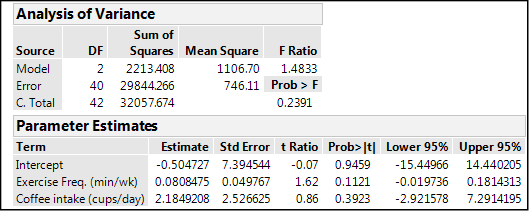
The parameter estimates allow us to construct the actual equation that is the “best fit” to the data:
Cholesterol loss = -0.505 + (0.081*exercise) + (2.18*coffee)
However, the 95% confidence limits of these coefficients all include zero in their range, so an equally likely equation would be:
Cholesterol loss = 0 + (0*exercise) + (0*coffee) = 0 + 0 + 0 = 0 (!!!)
The bottom line is that these two variables are not associated with cholesterol loss in any significant way, despite what we would like to believe. At least not in this set of data.
A word about negative results: we have an instinctive dislike for results that appear to show us nothing, but this is actually not the case. Negative results do tell you something. They let you know, and provide objective evidence to this end, that you can stop looking at these variables as vectors impacting the response of interest and that you can (and should) turn your attention elsewhere (hopefully with greater profit eventually when you are successful). This is incredibly helpful in industrial settings where time and resources are money that you don’t want to squander by repeatedly ramming into a brick wall to no avail. This is so important that I will be repeating it in later chapters, particularly our chapter on DOE (Chapter 16).
Let’s Throw All of Them in…
If multiple regression allows us to simultaneously evaluate the impact of multiple variables on a response, what if we throw all of them into the model effects and see what JMP tells us (Figure 13.6)?
Figure 13.6: Adding All the Appropriate Variables to the Analysis
Notice that with this many variables, JMP automatically changes the emphasis to Effect Screening for a more manageable output. For this attempt, we have to think about which variables we do not need to include using our knowledge of the biology and the overall context. Not included are the Name, since this is just an identifier and is unique to each record, and the variables at the end of the three-year interval. The initial variables have been left in to determine whether they influence how much cholesterol will be lost. Note again that this platform can handle both continuous and nominal variables as x variables. We click Run and…oh, dear!...we get some very “interesting” results (using a definition of “interesting” to which we are unaccustomed!) See Figure 13.7.
Figure 13.7: “Interesting” Results in the Effect Summary Output
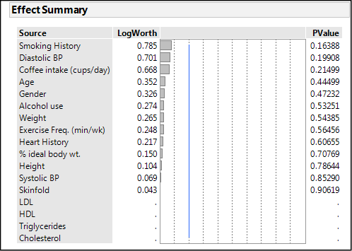
This is decidedly unhelpful. Not only is nothing significant, we have some variables with no output whatsoever. What is going on here? The Parameter Estimates gives us some clue (Figure 13.8).
Figure 13.8: Clues in the Parameter Estimates
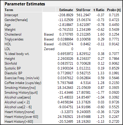
Several variables are labeled as biased and one is zeroed. All of this points to a significant problem with this attempt: insufficient data to model this many terms. The Summary of Fit output also gives two interesting clues (Figure 13.9).
Figure 13.9: Summary of Fit Clues
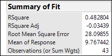
The RSquare value indicates 48% of the variation is being explained by this conglomeration of variables, but the RSquare Adj drops dramatically to a nonsensical (squared values should not be negative) negative 3%, a huge clue that this model has problems! The adjustment to the RSquare value takes into account the number of variables in the equation, and this is what one would use to compare different models (equations) in the effort to determine which fits the response best. Notice also that the number of observations is only 43, whereas we have 95 rows of data. When you scroll down the original data table, we find we are missing some of the data for the Cholesterol Loss, so we do not have as much data as we thought we did. This confirms our conclusion that we have insufficient data to model this many variables simultaneously.
Stepwise
Does this mean we have to manually evaluate each individual variable for its impact on the cholesterol loss one at a time? However tedious this might appear at first glance, even a casual review of the history of statistics in the twentieth century, most of which occurred before the advent of computers, let alone personal computers (and JMP!), and you will see that such a task is really a piece of cake comparatively speaking with the aid of software such as JMP. Historical perspective can be helpful at times!
Fortunately, the answer is no, we do not have to manually evaluate each individual variable. JMP has provided a tool under the Personality options that can be helpful here called Stepwise (Figure 13.10).
Figure 13.10: No Need to Fear! Stepwise is Here!
Clicking Run brings up the dialog box shown in Figure 13.11.
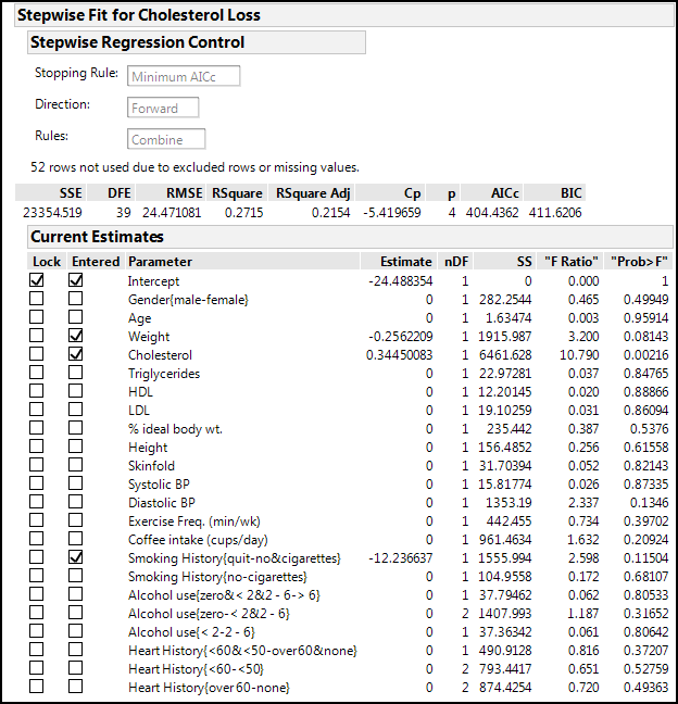
Figure 13.11: The Stepwise Dialog Box
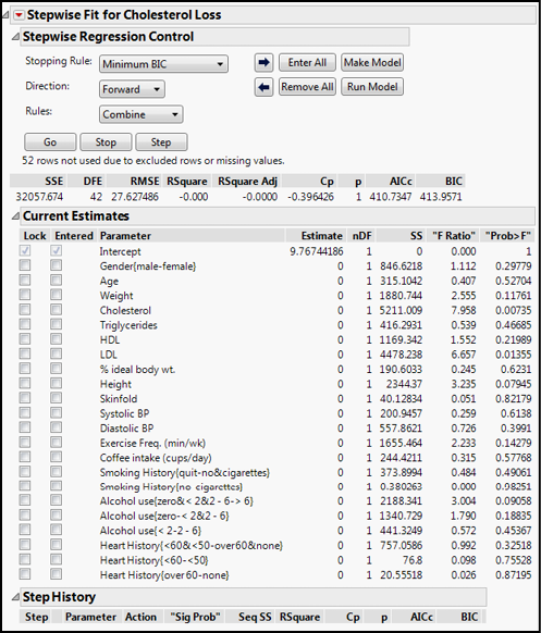
The default Stopping Rule is to minimize the BIC value. This should lead the discerning reader to ask, “What exactly is the BIC (I thought it was a brand of pen!) and why should I use it compared to the other options? And…um, what are the other options?” Well, I am glad you asked those questions. The BIC is the Bayesian Information Criterion, and it is used to compare models by assessing their fit. The lower the BIC, the better the fit. A similar criterion that can be used is the AICc, which is the one we will use in this case. The AICc is the corrected (for smaller sample sizes) Akaike’s Information Criterion, and we would similarly want to minimize its value (that is, smaller AICc values indicate models that fit the data better). Both procedures are seeking to balance model fit with model simplicity by containing penalties for making the model more complicated than necessary. Because of the way they are calculated, the BIC tends to favor models with fewer parameters by penalizing model complexity more heavily. The third option which we will ignore here is the p-value Threshold in which p-values are used to enter and remove variables into the model.
Adjust the Stopping Rule to Minimum AICc and click Go. When JMP is done, three variables end up being in the model (Figure 13.12).
Figure 13.12: Stepwise Executed
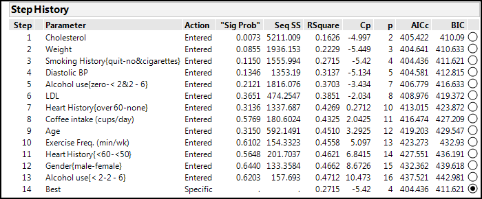
You can see what JMP actually did by looking at the Step History output at the bottom (Figure 13.13).
Figure 13.13: Stepwise Detailed Steps
In Figure 13.11, there are two buttons of interest now that we have variables selected by Stepwise. At the top right, there are Make Model and Run Model buttons. The Make Model button opens a new instance of the Fit Model platform with the variables just selected by Stepwise already put into the appropriate boxes. All you have to do is click the Run button, and you get the analysis so that you can evaluate the model based on the output. The Run Model button just skips the intermediate step and immediately executes the analysis so that you can go directly to evaluation. Choosing the latter option yields the results in Figure 13.14.
Figure 13.14: The “Best” Model Output
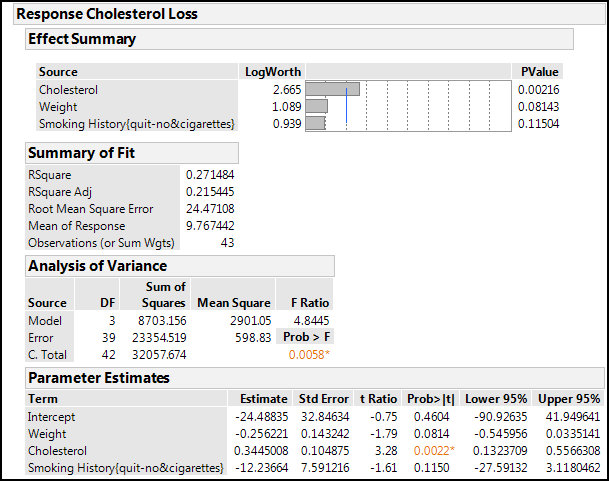
With this data set and these three variables, we are still only accounting for about 27% of the variation in the cholesterol loss, with the initial cholesterol levels being the only significant contributor with a p-value of 0.0022 (which might not be too surprising from a medical point of view). The whole model is significant with a p-value of 0.0058, so the slope of the predicted versus actual differs from zero. For the parameter estimates, the lower and upper 95% confidence limits columns were “turned on” to demonstrate how zero is within that range for all but the cholesterol variable. Thus, our model really devolves to:
Cholesterol loss = 0.344*cholesterol (with 95% confidence range of (0.132-0.557)*cholesterol)
One can, of course, go the manual route for variables of particular interest to determine whether they have any effect on cholesterol loss as we did at the outset. And cholesterol loss might not necessarily be the most relevant of the variables to address with this data. The final, three-year cholesterol level might be more important as a medical indicator of cardiovascular health in the long run, so you, dear reader, may want to consider analyzing this data with that variable as the response.
Endnotes
1 Occam’s Razor would assert that when presented with competing hypotheses, as in our case, mathematical equations, that make the same predictions, one should select the solution with the fewest assumptions, or in our case, the fewest x variables. The Wikipedia discussion of Occam’s razor is quite enlightening.