
Chapter 17: Survival Analysis
A weed is a plant that has mastered every survival skill except for learning how to grow in rows.
Doug Larson
A Primary Problem or Consideration
Comparing Survival with Kaplan-Meier Curves
Quantitating Survival: Hazard Ratios
Introduction
In our last chapter (Chapter 16) we exhausted our exploration of the master flowchart of Figure 2.2. But we are not done yet, of course. That flowchart provides only the basics of the simpler forms of statistical analysis. As with most disciplines, there are further depths into which to plunge to access additional information or to address specific problems that require different approaches. Regardless, our Y.O.D.A. strategy still holds. You should always ask what Your Objective really is. You should always determine what type of Data you have and how it was collected. And you should always make sure you are aware of the Assumptions of your analysis method and assess whether those assumptions have been met.
The topic of this chapter, survival analysis, is a frequent and powerful tool used in the biomedical field to evaluate the effects of different drugs and/or treatments in the search for cures of various maladies plaguing mankind. That said, one can find the same analyses applied in other areas where survival can be translated into metrics such as mean time to failure. Our concern here is obviously the biological application.
First, let me issue this disclaimer regarding this chapter. While we will be talking about survival, we are not talking about surviving the coming zombie apocalypse. There are plenty of websites that do that, as evidenced by the fact that one gets “about 4,500,000 hits” when googling that phrase. Instead, we will address another topic to which entire books have been devoted, and will once again only scratch the surface of what could be covered. However, it will provide a brief introduction to the arena that will allow further study with some understanding of the more commonly published products of such analyses.
So, What Is It?
The survival analysis with which we are concerned is a collection of statistical procedures for data analysis for which the outcome variable of interest is time until an event occurs. Here we define “time” as any measure of time from the beginning of follow-up of an individual until an event occurs. Alternatively, it can be the age at which an event occurs.
The event is any designated experience of interest that might happen to an individual. This could be death, disease recurrence, relapse from remission, recovery (for example, returning to work).
A Primary Problem or Consideration
This type of data analysis must deal with a problem that is unique to this type of data. Specifically, what if you don’t know the survival time is exactly? This could happen in a number of different ways, for example, when:
● The subject does not experience the event before the study ends
● The subject is lost to follow-up during the study period (for example, moves out of the area)
● The subject withdraws from the study (for example, has an adverse drug reaction)
So, do we weep, wail, gnash our teeth, and cover ourselves in sackcloth and ashes? There is information in such data even if we do not have the exact start time or endpoint, and we do not want to lose that in our analysis. Fortunately, statisticians much smarter than this author have devised a solution.
The Solution: Censoring
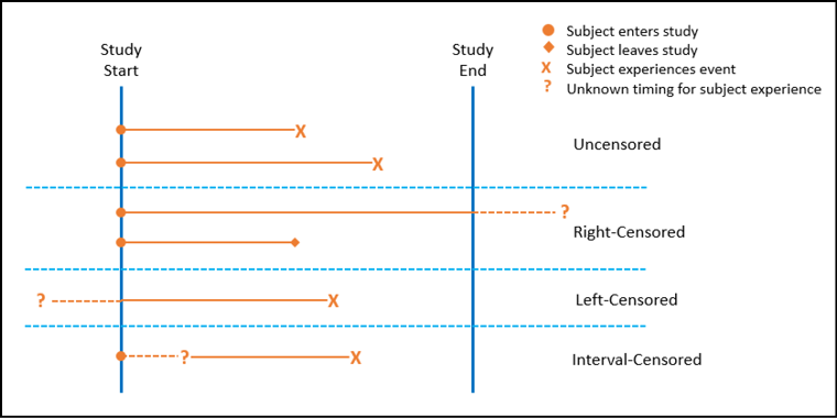
Censoring is the term used to describe data points for which this problem occurs. There are three primary types of censoring as illustrated in Figure 17.1 and described below:
1. Right-censoring: this is probably the most common and is the only one we will use in this book. It occurs when you know the start time but not the end time (for possible reasons enumerated above). In this case, the true survival time is greater than or equal to the observed survival time.
2. Left-censoring: sometimes we know the start time of a study but do not sufficiently monitor the subject to verify their status relative to the event of interest until the actual event occurs. For example, we follow a set of subjects until they become HIV-positive, but we are not testing them regularly so that we know exactly when they were exposed to the HIV relative to testing positive. In this case, the true survival time is less than or equal to the observed survival time. (Remember, survival in this context is simply time until an event occurs.)
3. Interval-censoring: in this case, the time of first exposure to the putative cause is unknown but you know the time before and after. To clarify with an example, define the event of interest again as testing positive for the HIV virus. In contrast to the left censored data, we confirm the subjects’ negative HIV infection status when they first join the sample population. They are then periodically retested to see if and when they test positive. For those who test positive, we have time points for before infection and after infection, but we don’t know the actual time of infection. Consequently, the true survival time is within a known time interval but less than the observed time between tests.
Figure 17.1: Censoring Options Illustrated
Censored data is usually indicated in a data table with a 1 for censored and a 0 for uncensored results, but this is not a universal rule.
As we move forward in this chapter, there are only three basic topics that we will investigate. These topics correspond to the objectives of the analysis. First, how to graph and compare survival curves. Secondly, how to model survival curves to make predictions. Lastly, how to quantitate the likelihood of survival.
Comparing Survival with Kaplan-Meier Curves
For the rest of the chapter, we will use the survival data shown in Figure 17.2.
Figure 17.2: Sample Survival Data
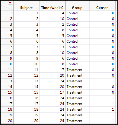
In this data set we have two groups, a control group and a treatment group. The treatment group looks like it has a longer survival time, but do the statistics and graphics of the data support this? Notice also that there are six subjects in the treatment group that have survival times of 24 weeks and are censored. This is indicative of subjects who survived the entire 24-week time period of the study and were no longer followed because of the termination of the study. Thus, we do not know the true survival time of these subjects, but we do know they represent right-censored data. There is still information there, so we don’t want to discard these subjects. To do so would truly bias the results (as we shall see in a moment).
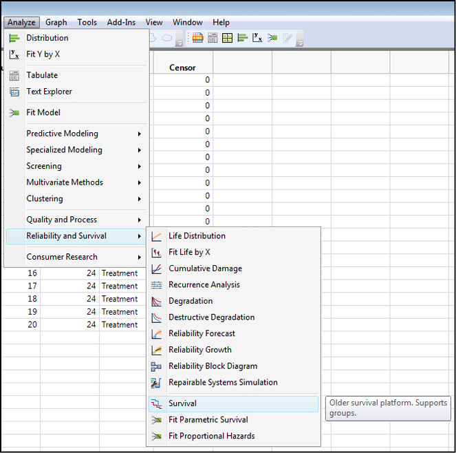
To graph with what is known at a Kaplan-Meier curve and compare the two groups, open the Survival platform by going to Analyze Reliability and Survival Survival (notice the icon next to this option that looks like a Kaplan-Meier graph) as shown in Figure 17.3.
Figure 17.3: Survival Curve Comparison
This will bring up the dialog box shown in Figure 17.4.
Figure 17.4: The Survival Dialog Box
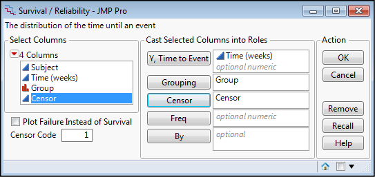
The dialog box has been correctly filled out by putting the Time (weeks) in the Y, Time to Event box, the Group into the Grouping box, and the Censor column into the Censor box. Note that you also have the option to specify the censor code in the box in the lower left side of the dialog box. Clicking OK gives the output in Figure 17.5.
Figure 17.5: Correct Kaplan-Meier Curve Comparison
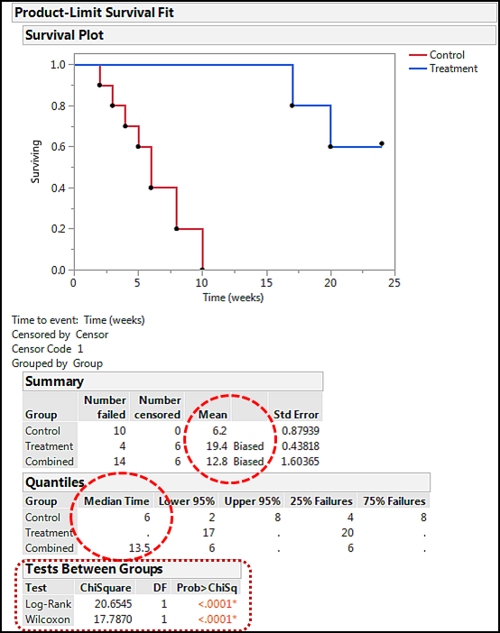
The step curve in this output is the Kaplan-Meier method of visualizing survival data. The step character reflects the fact that the population is constant across the time variable until an event of interest (for example, a subject dies) occurs. Note that the treatment group is clearly different from the control group, and it does not reach zero because the censored subjects are still alive at the end of the study. In the Summary table, we can see the mean survival times with their standard errors as well as the “Biased” indicating that the results are based on censored data and therefore are not necessarily the true survival time. Median times can be found in the Quantiles table. The most interesting result is the Tests Between Groups where we find p-values testing the null hypothesis that there is no difference between the survival times of the two groups. The p-values here are very low, so we can confidently reject the null hypothesis with this data and conclude in agreement with our graph that the survival times of the two groups are significantly different. In cases where the two curves are closer together, this is the primary way to assess the presence or absence of differences between survival curves and thus whether whatever distinguishes the two groups had an effect.
Let’s pause for a moment and evaluate what would happen if we had not censored the data. Filling out the dialog box the same way but not putting the censor column into the Censor box gives the output in Figure 17.6.
Figure 17.6: Incorrect Kaplan-Meier Output: No Censoring
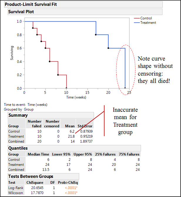
Notice how the curve for the treatment group now drops to zero at the end of the study, incorrectly indicating that the entire population of subjects died by that time. Comparing the mean survival times here to the previous figure, the mean for the Treatment group is inaccurate, but there is nothing to warn the analyst that something is wrong. The curves are still far enough apart that we would draw a correct conclusion in our comparison of the curves.
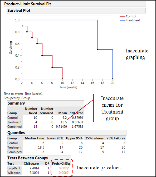
Finally, before we move on, what would happen if we decided not to use the censored data at all because the subjects did not experience the event of interest in the time frame of our study? Figure 17.7 shows the incorrect output with inaccurate graphing, an inaccurate mean, and now inaccurate p-values (although, as noted previously, in this instance the curves are sufficiently far enough apart that they are still significantly different).
Figure 17.7: Really Messed Up Kaplan-Meier Output
Modeling Survival
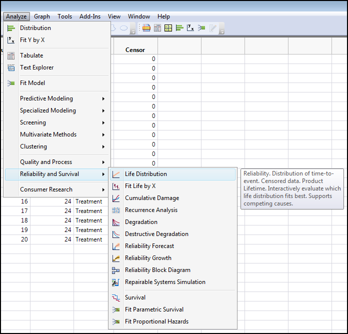
Modeling survival curves to predict the likelihood of survival at different times based on the data in hand is accomplished in the Life Distribution platform. Open this platform by going to Analyze / Reliability and Survival Life Distribution (Figure 17.8).
Figure 17.8: Opening the Life Distribution Platform
This brings up the dialog box shown in Figure 17.9 where the Y, Time to Event, Censor, and By boxes have been populated with the appropriate data columns.
Figure 17.9: Life Distribution Dialog Box
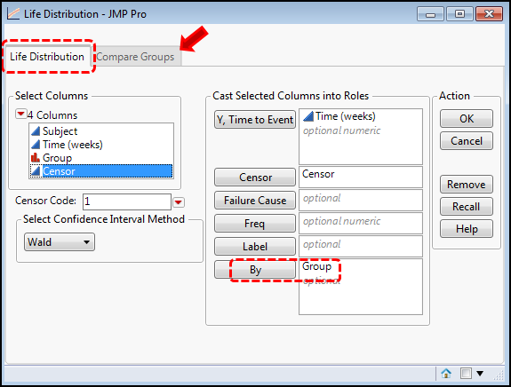
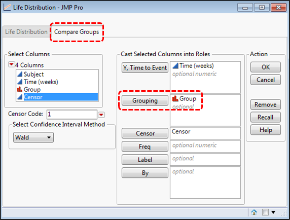
Notice that there are two tabs to this dialog box. The default is the Life Distribution tab, and to analyze each curve separately, we need to use the By box to separate the groups (dashed rectangles). The input on the Compare Groups tab looks slightly different (Figure 17.10), but in both cases, each group will be modeled separately, allowing for predictions for each group.
Figure 17.10: Life Distribution on Compare Groups Tab
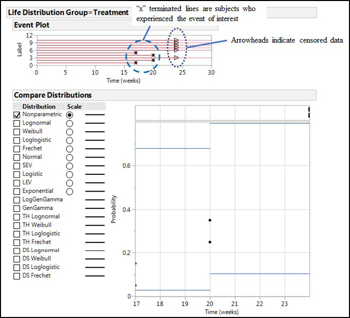
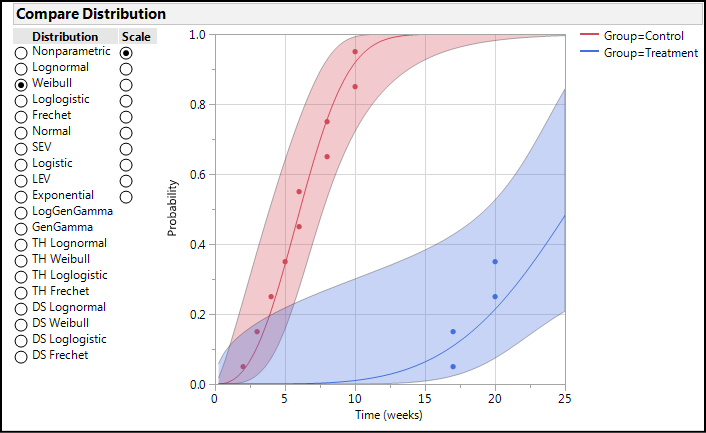
Clicking on OK on the Life Distribution tab yields the type of output seen in Figure 17.11 for each group. Since there is no censored data in the Control group, the Treatment group is shown to illustrate the difference between the censored and uncensored data in the Event Plot at the top of the output. In the Compare Distributions node, there is now a list of possible curve fits that can be applied to the data. Any number can be turned on simultaneously in an effort to determine the best fit to the data for model creation that will allow prediction of survival times.
Figure 17.11: Output from the Life Distribution Tab
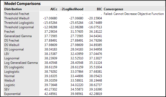
“Turning on” each curve fit by clicking in the boxes on the left side adds the curves with the 95% confidence limits of the fit to the graph and nodes for each curve fit that contain all sorts of statistics about that curve fit, most of which are irrelevant to our present purposes (which is not to say they are not important or relevant for some purpose). In another example of the excellence of JMP design, and of the fact that The Little Red Triangle is Your Friend, clicking on said triangle for the Life Distribution output has Fit All Distributions as the first option, so you don’t have to go crazy clicking on all the individual distribution fits to create your table. JMP also displays the best fit as a result of this operation. Of more interest for our purposes is the table of AICc and BIC values under the Model Comparisons (Figure 17.12) that allow us to narrow down the best curve fit, remembering that we want to minimize both these metrics.
Figure 17.12: Model Comparisons Output
For this particular example, we run into the problem that our data is presenting only two real data points, so fitting a model is problematic. This is another way of saying that we really need more data on the treatment in order to model it. Attempting to model the control group will be more illustrative, so if we repeat the model comparison analysis shown in Figure 17.12 for the control group, we get the output in Figure 17.13.
Figure 17.13: Model Comparisons Output – Control Group
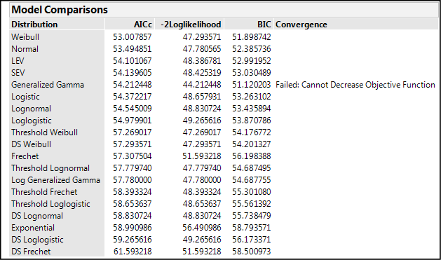
Remembering that AICc and BIC values within 10 units of one another are essentially still equivalent, Figure 17.13 shows us many equivalent curve fits at least by those statistics. For now, activate the “best” curve fit, the Weibull, to visualize this attempt to fit the data along with a Profiler graph that will allow the prediction of mortality as a function of time (Figure 17.14).
Figure 17.14: Predicting with a Specific Curve Fit
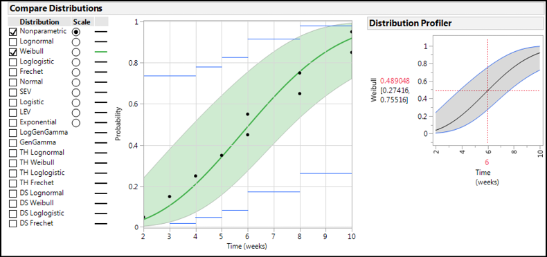
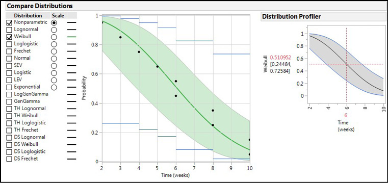
The Profiler defaults to the average time and tells us that at 6 weeks we can expect 48.9% of the control group to be dead, with a 95% confidence range of that prediction at 27.4–75.5% (a rather large range, but this is not a large study). Note that if you want to model survival instead of mortality (or failure), the Little Red Triangle is once more Your Friend (Figure 17.15). This will allow the modeling and prediction of survival probabilities instead of mortality probabilities as seen in Figure 17.16.
Figure 17.15: Turning on Survival Curve
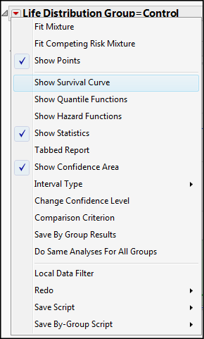
Figure 17.16: Modeling Survival Instead of Mortality
If we go to the Compare Groups tab output instead of the Life Distribution tab output, the same individual graphs are provided for separate analysis, but the two groups can also be compared side by side (with the same curve fit methodology; Figure 17.17).
Figure 17.17: Compare Groups Tab Output Comparing Distributions
Quantitating Survival: Hazard Ratios
Having seen that the survival curves are different and having modeled those differences, the researcher often wants to share the results with a simple metric that reflects the difference between treatments or conditions quantitatively without the graphics. The medical literature is replete with references to the hazard ratio, which really looks a lot like the odds ratio, but with a different name. The hazard ratio is the hazard or risk of, or resulting from, the treatment or condition in the numerator relative to that in the denominator. It is interpreted similar to odds ratio. If there is no difference in the risk between the two treatments/conditions, then the value is one. Or in other words, a value of one for the hazard ratio represents the outcome of failing to reject the null hypothesis of no effect. If the 95% confidence limits include the value of one, then the hazard ratio is not significantly different from one, and there is no hazard or risk between the two things being compared.
HR = 1= no relationship between groups; no effect of treatment versus control
HR > 1 = the exposed group has x times the hazard/risk of the unexposed group
HR < 1 = the exposed group has x times less of a hazard/risk of than the unexposed group
So, let’s calculate the hazard ratio for our example data. This is accomplished in the Fit Model platform using the Proportional Hazards personality, and there are two ways to get there. One can just open the Fit Model platform and manually select that personality, or, staying with the Reliability and Survival menu, the Fit Proportional Hazards option can be selected to let JMP do the work for you (Figure 17.18).
Figure 17.18: Selecting the Proportional Hazards Fit Model under Reliability and Survival
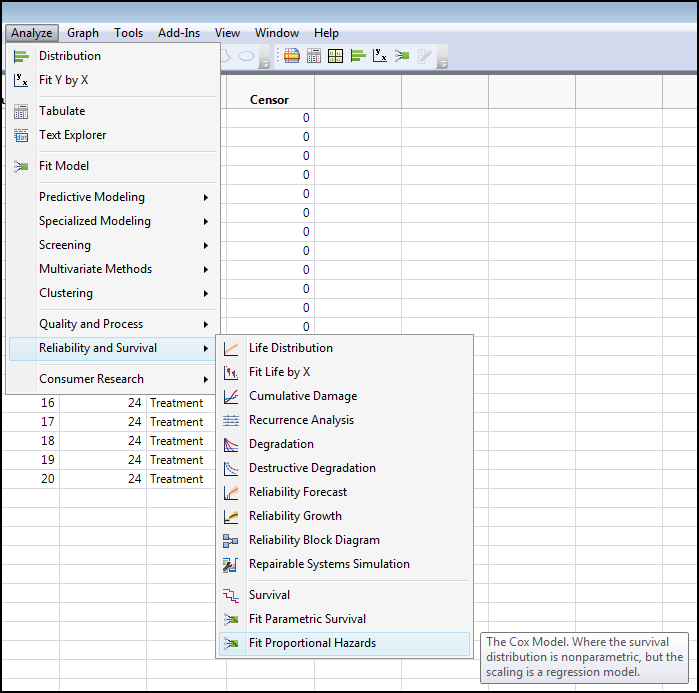
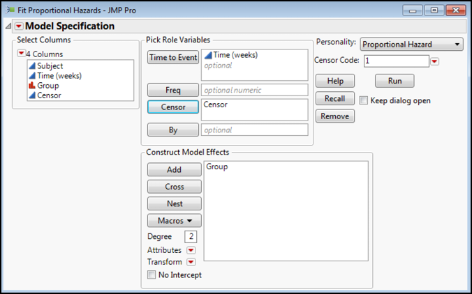
Figure 17.19 shows the Fit Model dialog box with the variables dropped into the appropriate locations for the analysis. Note that the Group does not go into the By box. We are seeking to determine whether the Group affects the Time to Event, making the Group the model effect of interest.
Figure 17.19: Proportional Hazards Dialog Box
Clicking OK brings up results, most of which are beyond the scope of this book, and it does not bring up the Hazard Ratio, which JMP calls the Risk Ratio. To get the Risk Ratio, select it from the menu under the Little Red Triangle for the Proportional Hazards Fit (Figure 17.20).
Figure 17.20: Finding the Risk Ratios
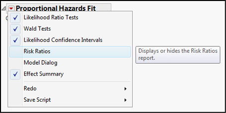
Figure 17.21 shows the Risk Ratios for this data along with the only other information that we would like to glean from this analysis, the p-value for the whole model (which tells us by a different method whether the survival curves are statistically different).
Figure 17.21: Proportional Hazard Output of Interest
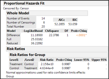
In this instance, since the curves are so far apart (refer to Figure 17.5), the risk ratios are ridiculously small or large, depending on your perspective. For example, the risk associated with the treatment group is 2.2 x 10⁻¹⁰ times less than the control group. Or, the control group has a 4.6 x 10⁹ times greater risk than the treatment group. We would definitely want to be in that treatment group!
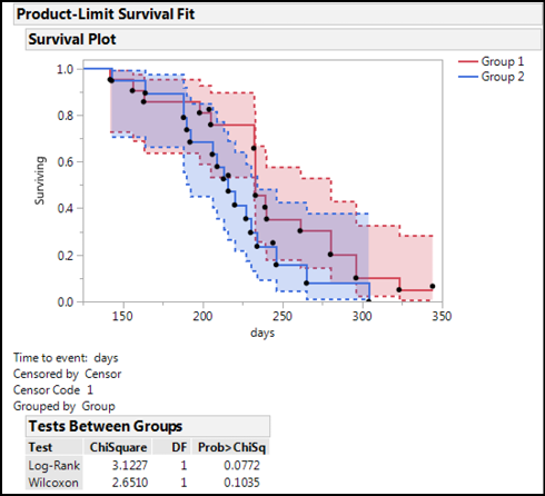
Since our data was simulated (a fancy word for “made up out of thin air”), let’s look at the data in the Rats.jmp sample data file in the JMP Sample Data Library. In Figure 17.22, we can see the confidence intervals for the two curves overlap significantly, and, in fact, the p-values for the Tests Between Groups are both above 0.05, allowing us to draw the conclusion that these two are not significantly different even though it appears that Group 1 outlasts Group 2:
Figure 17.22: Kaplan-Meier Curves from Rats.jmp
Calculating the hazard (risk) ratio for this experiment, Group 2 has a 1.8 times greater risk than Group 1, or conversely, Group 1 has a 0.55 less risk (or 45% less risk) than Group 2 (Figure 17.23).
Figure 17.23: Risk Ratios for Rats.jmp
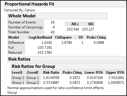
But even though we have those values, notice that the 95% confidence limits for those values include the value of one, so they are not significantly different from the null hypothesis. This is confirmed by the p-value for the whole model, which is also above 0.05.