Chapter 11: Tests of Association: Regression
You can lead a horse to water but you can’t make him enter regional distribution codes in data field 97 to facilitate regression analysis on the back end.
John Cleese
What Is Bivariate Linear Regression?
What Does Linear Regression Tell Us?
What Are the Assumptions of Linear Regression?
Is Your Weight Related to Your Fat?
How Do You Identify Independent and Dependent Variables?
It Is Difficult to Make Predictions, Especially About the Future
Introduction
At this point, we have worked our way through the entire left branch of our master flowchart (Figure 2.2) and looked at the basic tests for comparing population samples to infer whether they are from the same population or different populations, at least probabilistically speaking. The second basic primary objective an analyst might have is to determine the presence and nature of any associations between two or more variables under study. This now is the right branch of our master flowchart. Whereas our first primary objective can be accomplished with relatively definitive answers, this area is one where students often have difficulties because the answers are not always black and white, but are frequently more “wibbly-wobbly” in nature. This is similar to that famous quote by the 10th Doctor1 about time:
“People assume that time is a strict progression of cause to effect, but actually, from a non-linear, non-subjective viewpoint, it’s more like a big ball of wibbly-wobbly…timey-wimey…stuff.”
The basic concepts are best understood in the context of the simplest situation – two different variables, typically a dependent/independent variable pair in a linear relationship to one another – known as bivariate linear regression. As we progress through the remaining chapters, it will be helpful to fully master the concepts in the strict progression in which we will march, but remember that those concepts are then to be used in the big ball of wibbly-wobbly, staty-waty2 stuff of our conclusions.
What Is Bivariate Linear Regression?
In bivariate linear regression, we are going to draw a standard x-y plot where x and y represent the two variables of interest. The X axis is the independent variable and the Y, the dependent variable. The statistical null hypothesis of no relationship between the variables will be evaluated by looking at the slope of the best line drawn between the data points. A slope of zero indicates no relationship, so statistically, we will want to know if the slope differs significantly from zero. The alternative hypothesis, that a relationship exists between the variables, simply means that as one variable changes, so does the other, yielding a positive or negative slope that differs from zero.
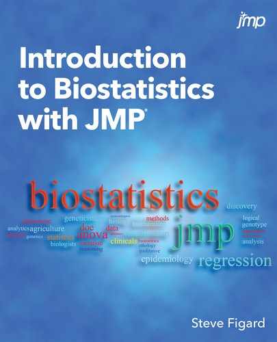
The data is paired continuous data, but this is different from the paired t test situation. For a paired t test, the same variable is measured twice on the same subject under different conditions. Here, two different variables are measured once under the same conditions. (See Figure 11.1.) This data type (continuous) also distinguishes the analysis from the two-way chi-square test where you are also looking for the presence or absence of a relationship, but with count or frequency data typically presented in a contingency table.
Figure 11.1: Paired Data for Different Analyses
What Is Regression?
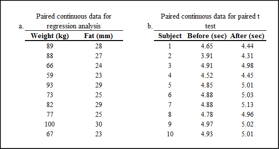
So, does regression mean a reversion to an earlier or less advanced state, like reverting to the caveman era? Fortunately, we are not what is regressing. To regress simply means to move backward, and that is what happens when we minimize something. We are moving to a smaller form, in this case, smaller total residuals. In linear regression, we are trying to draw a line through our plotted data with the goal being to minimize the sum of the residuals squared. Figure 11.2 illustrates the process, remembering that “residuals” here refers to the vertical distance between the data point and the line.
Figure 11.2: Linear Regression Process
On the extreme left of Figure 11.2, we see the large residuals for a line that clearly does not fit the data well. However, it shows why we sum the squares of the residuals instead of just the residuals. There are obviously both positive and negative distances there, and if we just summed the residuals, the negative distances would at least partially, if not totally cancel the positive distances, and we are not minimizing the residuals. By squaring the number, we algebraically eliminate the negative values, allowing us to sum the total to get a better idea of how far the line really is from the data. Determining the minimum sum of squares by adjusting the slope and position of the line is what is being done behind the scenes of linear regression.
What Does Linear Regression Tell Us?
Regression analysis allows us to answer four questions, two of which are really one question but are expressed slightly differently.
1. Is there a relationship between these two variables?
2. Is the slope significantly different from zero?
3. How much variation does the model explain?
4. What is the best linear model?
Obviously, the primary question is, is there a relationship between these two variables? This relates to the biological null hypothesis. The second question, which is used to answer the first, is, is the slope significantly different from zero? This relates to the statistical null hypothesis. This second question is answered directly by looking at the p-value associated with the slope in the Parameter Estimates output table. It is also answered indirectly by the p-value from the F statistic in the ANOVA output of the Fit Line analysis. That analysis determines if the fit line does a better job of matching the data than a horizontal line at the mean. Since such a horizontal line has a slope of zero by definition, if this p-value indicates rejection of the null hypothesis, then the fit line slope is going to be significantly different from zero.
The third question is, how much variation does the model explain? If the model is statistically significant, then we would expect it to do a fairly good job of explaining the variation in y. This is answered by the value of R squared, which we normally will multiply by 100 to get a % variation being explained.
Lastly, what is the best linear model? This will be the coefficients computed for the slope and the intercept, which appear under the graph (discussed later in the chapter). The slope is interpreted in algebra as the change in y as x changes, sometimes referred to as “rise over run.” This is an essential component in describing the relationship between the two variables. For example, if a drug administered in mg dosages is used to raise the blood pressure in mm Hg, a slope of 3.7 is simply interpreted as a 3.7 mm Hg increase in blood pressure for every mg of the drug administered.
Of less significance, but still there, is the intercept, or more fully, the y-intercept. This is the value of y at a value of zero for x. Sometimes this can be interpreted biologically, but sometimes not. The line will not always go through zero, but that is not time to weep, wail, and put on sackcloth and ashes. There is no law that says the intercept must be interpretable. Now go make another cup of coffee (or tea, if that is your preference) and relax in front of a nice sunrise!
What Are the Assumptions of Linear Regression?
There is a parametric criterion for regression, but it is not that the data be normally distributed. It is that the residuals must be normally distributed. JMP provides a normal quantile plot of the residuals so that this assumption can be evaluated. In our example, we will see how to find this plot. If this assumption is not met, most likely you will need to turn to nonlinear regression.
There is a second assumption that is often ignored in practice, but of which the analyst should at least be aware. The variance of the dependent variable should be similar for all values of the independent variable. This is usually ignored because there is no good way to objectively evaluate it.
Is Your Weight Related to Your Fat?
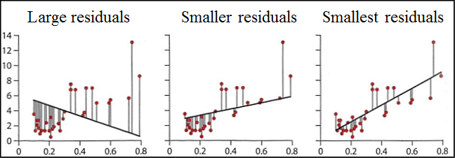
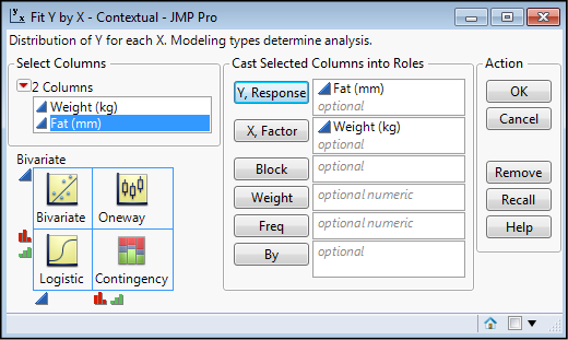
As an example of this analysis, let’s look at the data in Figure 11.1a with weight in kilogram and body fat in mm measured. We find the bivariate linear regression in the Analyze Fit Y by X platform (Figure 11.3).
Figure 11.3: Bivariate Linear Regression
This is a case where we can ask, biologically does fat amount increase with weight, or does weight increase with more fat? In other words, which variable is the dependent variable and which the independent variable? The simple answer in this case is, we don’t know! So, let’s call weight the independent variable (x) and fat the dependent variable for the sake of our analysis. In this case, we will just ask the question whether there is a relationship between the two variables. Put Weight into the X, Factor box, and Fat into the Y, Response box, and click OK (Figure 11.4).
Figure 11.4: Setting Up the Analysis
This gives us the x-y plot in Figure 11.5.
Figure 11.5: Basic Bivariate Fit Output
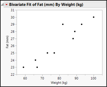
Well, this is suggestive, but there is no linear fit here. (Hang on, we will set preferences in a little bit.) But never fear, the Little Red Triangle is here! Clicking the one next to the Bivariate Fit title reveals multiple fits that can be done. Select the Fit Line and you will get the output shown in Figure 11.6.
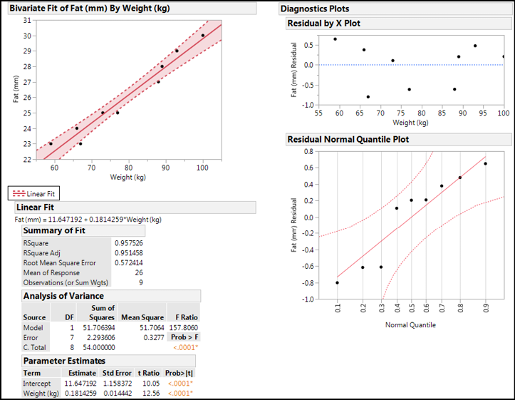
Figure 11. 6 Linear Regression Output
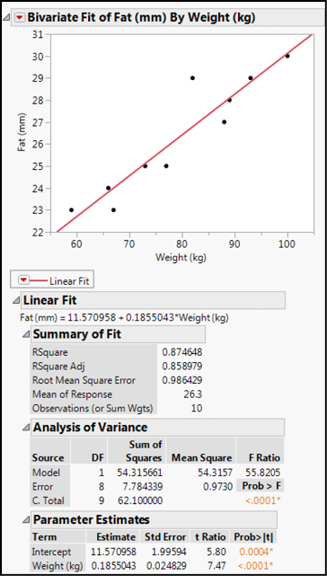
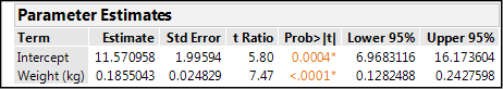
With this output, we can now answer our questions about these variables. In the Analysis of Variance output, the p-value for the F statistic is <0.0001, so our linear model is a better statistical fit for the data than a horizontal line at the response mean. (It is on this basis we can say that the slope is significantly different from zero, although technically that is not what is being assessed here.) We can conclude that there is a relationship between these two variables. The RSquare value indicates this line accounts for 87.5% of the variation in the Fat with the Weight variable, which biologically speaking, is a relatively good accounting. The equation for the line is given just below the Linear Fit bar, or you can look at the Parameter Estimates to see that the slope is 0.186, and the intercept is 11.6. Both values are significantly different from zero as shown by the p-value for the t statistic in this table. Thus, we can conclude that the slope is statistically different from zero and, again, there is a relationship between the two variables. (Quantitatively, for every 1 kg of weight gain, we can expect an approximately 0.186 mm increase in the fat measurement.) Right clicking the table column headings brings up a menu that enables you to add a few more columns, of which the 95% confidence limits of the slope and intercept can be of interest (Figures 11.7 and 11.8). Looking at the values in these columns, you can confirm that zero does not appear in them, which is what the p-values are telling you.
Figure 11.7: Adding Columns to the Table Output
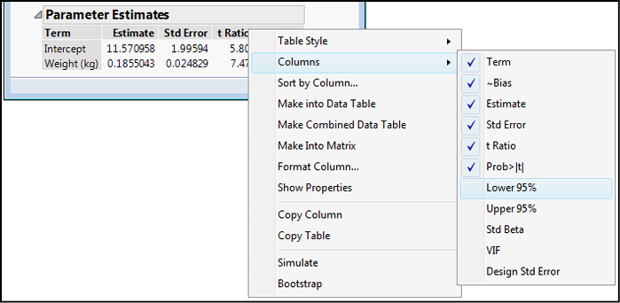
Figure 11.8: Modified Table Output
The last thing we should do is check the assumption of the normality of the residuals. Under the Little Red Triangle for the Linear Fit, you will find Plot Residuals (Figure 11.9). Clicking on that option gives several residual plots, and the very bottom one is the normal quantile plot (Figure 11.10).
Figure 11.9: Little Red Triangle Menu for Linear Fit
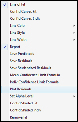
Figure 11.10: Normal Quantile Plot of Residuals
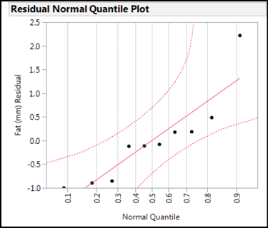
In interpreting the normal quantile plot, we want to see the points falling along the central line, but more importantly, within the 95% confidence limits of the line (dotted lines). These data fit the assumption of the linear regression analysis, so we can be confident in the validity of our conclusions.
One additional graphic that can be created in this analysis to show how the slope relates to a slope of zero is to go up to the Bivariate Fit Little Red Triangle and activate the Fit Mean option. This places a line in the middle of the data (the mean, obviously) that has a slope of zero. Your Analysis of Variance is essentially comparing this line to the fit line to determine which fits better. Then go to the Linear Fit Little Red Triangle and click on both Confid Curves Fit and Confid Shaded Fit. This will produce the graphic in Figure 11.11.
Figure 11.11: Fun with Graphics
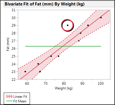
The graph in Figure 11.11 enables you to visualize how different the slope of the line is from zero. If the ends of the Fit Mean line are outside of the 95% confidence limits of the curve fit, then your slope differs from zero statistically.
What about the one point that is outside the confidence limits of the curve fit (circled in Figure 11.11)? It has the largest, by far, residual value as is easily seen on the residual plots (for example, Figure 11.12).
Figure 11.12: Residual Plot with Largest Residual Circled
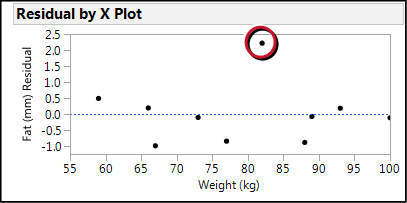
And it is the only point not in the confidence limits of the curve fit (Figure 11.11). As nice as it might be to just remove that data point because it does not seem to fit, without an assignable cause, in other words, a valid reason to identify that datum as not belonging to this population (for example, an error in measurement), such a practice leads to the charge of falsifying one’s data, which falls into the category of “Not a good idea!” Since this is not an enormous sample size, it is probably well within the range of the biological variation that we would see with a larger population.
Nonetheless, it will be instructive for purely educational purposes to see what happens when that datum is hidden and excluded from the analysis, which JMP lets you do easily. How much is that datum influencing our model? Before we go there, however, let’s set a few preferences so that we do not have to rely so heavily on our friendship with the Little Red Triangle and we can give it a break.
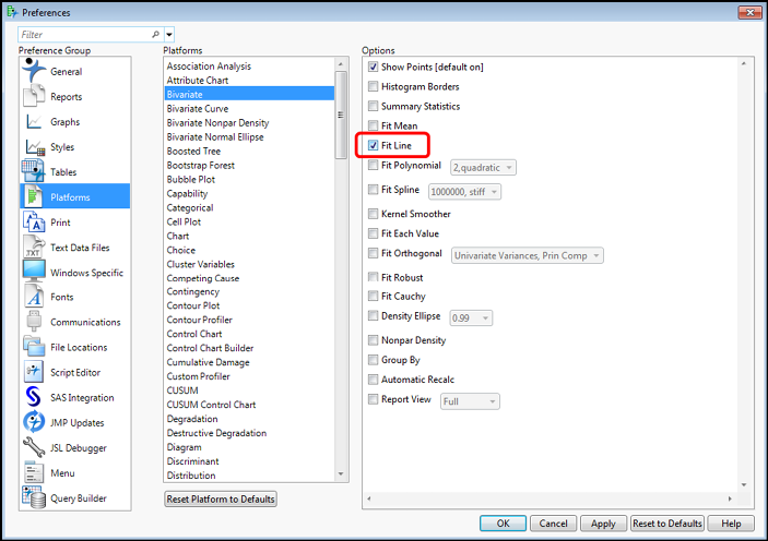
First, go to File Preferences Platforms and highlight the Bivariate platform. Show Points is default on, but click Fit Line to always get the linear regression analysis when you do the bivariate regression in Fit Y by X (Figure 11.13).
Figure 11.13: Setting Fit Y by X Preferences – Part A
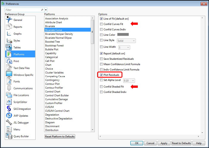
Next, go to the platform just below, the Bivariate Curve, and check the Plot Residuals option. If you regularly want the confidence limits of the curve shown, you can also turn on the Confid Curves Fit and the Confid Shaded Fit (arrows), but for now I am going to leave those off (Figure 11.14).
Figure 11.14: Setting Fit Y by X Preferences – Part B
We are now ready to Hide and Exclude our allegedly errant datum. Highlight the row in the original data table (row 7 with a weight of 82 and a fat of 29), and then go to the Rows menu item and select Hide and Exclude to execute this function (Figure 11.15). Note how the JMP data table now has symbols for this row indicating this new row state (Figure 11.16). Redoing our analysis as above, including turning on the confidence limits for the curve fit, gives the output in Figure 11.17.
Figure 11.15: Hiding and Excluding Data
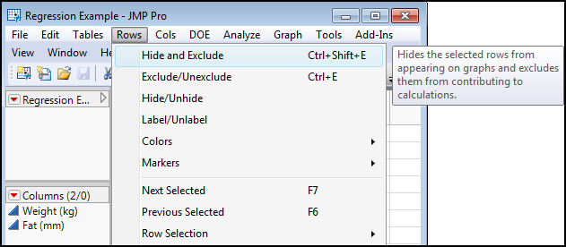
Figure 11.16: Datum Hidden and Excluded
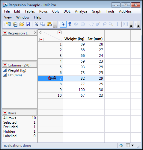
Figure 11.17: Full Output Without “Odd” Datum
So, what has changed? Since it was only one data point, not much. The slope has dropped slightly from 0.186 to 0.181. The model remains statistically significant, the slope and intercept are still significantly different from zero, and the normal quantile plot of the residuals indicates the residuals are normally distributed, validating the analysis. The confidence limits of the fit have gotten tighter (the shaded area is narrower), but the most significant change is in the RSquare value, which has jumped from 0.875 to 0.957. In other words, without that one point, we are now able to account for 95.7% of the variation in the fat measurements made by just the weight of the individual. This is unusually good for a biological phenomenon, and is probably an artifact of the small sample size, which we have just made smaller by removing a datum that we did not like. Clearly the analyst must be careful in the data cleaning and compilation (see Chapter 18) prior to the analysis to ensure that the right data are included and any aberrant data identified and excluded (with assignable cause!). An instructive exercise made possible by software…you wouldn’t want to try this without it!
How Do You Identify Independent and Dependent Variables?
Regression allows the analyst to determine if a relationship exists between two variables, along with some quantitative information about that relationship. However, it, by itself, cannot determine which variable is the cause and which is the effect, so independent and dependent both become dependent on the design of the experiment. How the data is collected, how the experiment is designed and run, combine to determine this totally apart from statistics. Thus, the analyst must depend on the scientist giving her the data with the correct identifications, or the scientist herself must do the analysis correctly. The latter option is what this book is all about.
It Is Difficult to Make Predictions, Especially About the Future
This expression in the heading of this section has been attributed to variety of individuals (variation, anyone?), including Niels Bohr, Samuel Goldwyn, Robert Petersen, and Yogi Berra. Although this author would prefer Yogi Berra as the one who uttered this truism, as a scientist, I must remain objective and inform you that it remains shrouded in a mystery that even statistics cannot unravel. However, it serves to introduce one of the more practical applications of modeling biological phenomena, and that is the ability to predict a variable value under conditions of the other variable (or variables, as we shall see in later chapters).
To put it in terms of the example used in this chapter, once we have the equation defining the relationship between weight and fat, we can predict the fat thickness at any given weight, or the weight at any given fat thickness. Algebraically, this is expressed as predicting y at any given value of x, or vice versa.
For simple bivariate linear regression, the computations are straightforward and could be done by hand. But what is the good of having software that can do the same thing faster and easier if you don’t use it? The Little Red Triangle for the Linear Fit provides two options that allow the computation of y from any x: Save Predicteds and Indiv Confidence Limit Formula (Figure 11.18).
Figure 11.18: Predicting Y from X
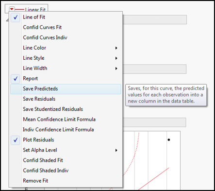
The Save Predicteds option creates a new column back in the original data table that calculates all the y values at the given x values. One can then enter new values for x, and JMP adds a new row with the computed values supplied. Since there is, of course, a certain degree of uncertainty, the Indiv Confidence Limit Formula option creates new columns for the lower and upper 95% confidence limits of those predictions (Figure 11.19).
Figure 11.19: Predictions Tabulated
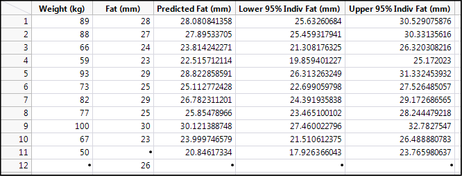
Note row 11 where the weight of 50 kg has been entered. Using the regression line for this data, we can predict that at this weight, the fat thickness will be 20.8 mm, with a 95% confidence range of 17.9 to 23.8 mm. Given that the data has been collected with only two significant figures, we should probably round this to 21 with a range of 18–24. JMP does provide an overabundance of significant figures that all too often go beyond what is justified by the accuracy of the measurements in the data. You can change the column properties to address this, or you can do what we have done and rounded in our data summary. This is yet another example where the analyst must use common sense and the ancillary knowledge about the experiment and the nature of the data to avoid leaving false impressions of the analysis.
Row 12 shows what happens when you try to do the inverse prediction and plug in a value of y (fat). You do not get anything else in that row. Since there is a relationship between these two variables, this can be addressed by simply doing the same analysis but reversing the identity of the x and y variables, that is, make weight the y response and fat the x factor. In later chapters with more than one x, we will see other tools JMP provides to do inverse predictions when there are multiple x’s or nonlinear curve fits.
Endnotes
1 That would be David Tennant playing the BBC science fiction character of Dr. Who in the episode entitled “Blink.” As a helpful hint for future reference, when someone asks you why you are late, you can tell them “Wibbly wobbly timey wimey…stuff” got in the way.
2 Yes, I just made that “word” up to match the quote about time but to reference statistics instead.