Chapter 7: Tests on Frequencies: Analyzing Rates and Proportions
Pick up a sunflower and count the florets running into its center, or count the spiral scales of a pine cone or a pineapple, running from its bottom up its sides to the top, and you will find an extraordinary truth: recurring numbers, ratios and proportions.
Charles Jencks (1939– ), American landscape architect
One-way Chi-Square Tests and Mendel’s Peas
Interpretation and Statistical Conclusions
Two-way Chi-Square Tests and Piscine Brain Worms
Interpretation and Statistical Conclusions
Introduction
Having equipped the reader with the basics of terminology and statistical strategy in the first six chapters, we now turn to pontificating upon the details of specific statistical tests and how to execute them in JMP. This will be our first instance of applying our Y.O.D.A. strategy up close and personal. Remember that to do so, we need to ask and answer the following questions: What is Your Objective? What type of Data do you have? And what are the Assumptions of the test chosen to analyze that type of data with that objective in mind?
Y.O.D.A. Assessment
The first set of tests is used when the information needed by biological and medical scientists comes in the form of the number of subjects1 in different categories. In this case, the analyst is confronted with count Data that translates into rates or proportions, or, in other words, frequency data. The initial observations collected can be made using nominal, ordinal, discrete scale or continuous scale measurements. But these are then tabulated as frequencies (not percentages),2 and it is the frequency data that is evaluated. This type of analysis is done with a group of nonparametric inferential statistics tests known as chi-square tests.
Your Objective and the Data type integrate with one another to determine which of the two chi-square tests you will perform, and just to make things more fun, they are found in two different locations in the JMP menus due to the nature of the objectives.
The simplest situation is when you have collected data with only one category but two or more possible values within that category, and you have some hypothesis or theory that would predict a certain specific ratio of those subcategories if the hypothesis is correct. Your Objective in this case is inferential, that is, to compare the observed frequency distribution to the frequency distribution expected based on these theoretical considerations. This situation is evaluated with a one-way classification chi-square test, which is usually shortened to just a one-way chi-square test. Since this is a nonparametric test, the primary Assumption is that each item sampled can only fall into one subcategory, something that results from experimental design and not statistical evaluation.
A second frequently encountered situation is when the biologist has two variable categories with two or more subcategories in each and wants to know if the two categories are related to one another. Your Objective is to infer if there is an association between the two variables by comparing the observed frequencies with the expected frequencies calculated assuming no association between the two. This is a two-way classification chi-square test, or just two-way chi-square test. The primary Assumption for the two-way chi-square test is the same as that of the one-way. An additional concern that is not so much an assumption as it is a caution: chi-square tests become unreliable if some expected values are small. As a general rule, if 20% or more of the expected counts are less than 5, the reliability of the results is questionable enough to require extreme caution in using them as a basis for any critical conclusions or decision. JMP has a handy warning to that effect in the output of this test, so analysts do not have to worry about their eyeballs crossing from searching the resulting output table to check this out.
In the pattern that we will follow for the rest of the book, let’s now look at specific examples both to address additional associated issues and to see how to do the analysis in JMP and interpret the output.
One-way Chi-Square Tests and Mendel’s Peas
Background and Data
Over 100 years before the genetically modified food controversy popped up into the public eye, an obscure (at the time) Austrian Augustinian monk by the name of Gregor Mendel was happily at work genetically modifying his pea crop in an effort to try to detect the principles of inheritance involved in the hybridization process of these plants. Following artificial fertilization, Mendel collected frequency data on the physical characteristics of the pea plants, such as seed color and seed form. We will look at one set of data from this experiment with its outcomes and refer the reader to the data source for more details should they be interested.3
Table 7.1 shows some of the “raw data” Mendel collected along with the category he created that combined the two characteristics in which he was interested (the seed form and seed color). As is obvious from this table, the raw data is nominal. Since Mendel’s hypothesis had to do with the inheritance of these two characteristics, to create a frequency table, the two variables had to be combined into a category that combined the seed form and color, as seen in the third column of the table. Counting the total number of seeds in each category yields Table 7.2, and this is what will be analyzed in JMP.
Table 7.1: Mendel’s Raw Data
|
Seed Number |
Seed Form |
Seed Color |
Category |
|
1 |
Round |
Green |
Round.Green |
|
2 |
Round |
Yellow |
Round.Yellow |
|
3 |
Wrinkled |
Yellow |
Wrinkled.Yellow |
|
4 |
Round |
Yellow |
Round.Yellow |
|
5 |
Wrinkled |
Green |
Wrinkled.Green |
|
6 |
Wrinkled |
Green |
Wrinkled.Green |
|
7 |
Round |
Green |
Round.Green |
|
8 |
Wrinkled |
Yellow |
Wrinkled.Yellow |
|
9 |
Round |
Yellow |
Round.Yellow |
|
… |
… |
… |
… |
Table 7.2: Restructured Version of Mendel’s Raw Data
|
Seed Category |
Number of Seeds |
|
Round Green |
25 |
|
Round Yellow |
24 |
|
Wrinkled Green |
27 |
|
Wrinkled Yellow |
22 |
|
Total |
98 |
The predicted frequency distribution based on the number and types of chromosomes and genes being hypothesized is 1:1:1:1, that is, equal ratios. That is not what the data reveals, at least not exactly. But is the observed frequency distribution close enough to the predicted distribution to be within the “noise cloud” of chance so that we can say the predicted and observed are not statistically different and that the observed differences are only due to biological variation and possible measurement error? The statistical null hypothesis is that of no difference between the observed and predicted frequency ratios, and this is one of the few instances that we would want to fail to reject the null hypothesis. The null hypothesis is, in this case, what we want to prove because the biological hypothesis that we are trying to support is the basis for the predicted frequency distribution. Therefore, showing no difference between the observed and predicted would provide evidence for the mechanism being proposed by the biological hypothesis under investigation.
Data Entry into JMP
There are two ways to handle data entry of this type, and they conform to the way the data is tabulated as shown in Tables 7.1 and 7.2. In other words, you can enter the data as in Table 7.1 and let JMP do the counting for you, or you can do the counting yourself and enter the data as in Table 7.2. If you opt for letting JMP do the counting for you, you will still have to enter the characteristics of each seed one at a time (Figure 7.1). However, you can use the JMP Formula function to create the combination designation by concatenating the Form and Color columns together (Figure 7.2).
Figure 7.1: Data Entry for Table 7.1
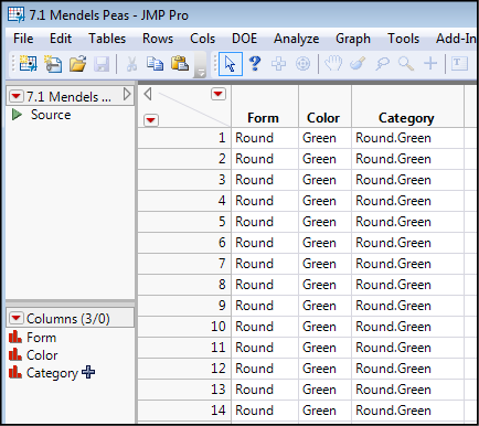
Figure 7.2: Formula Editor Setting up Third Column
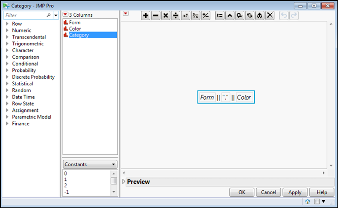
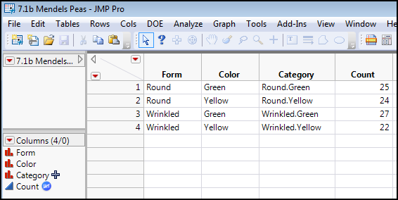
Figure 7.3 shows the data table modeled after Table 7.2 data entry. Note that the Count column has had the Frequency role pre-assigned (right-click the Count column and select Preselect Role ► Freq).
Figure 7.3: Data Entry for Table 7.2
Analysis
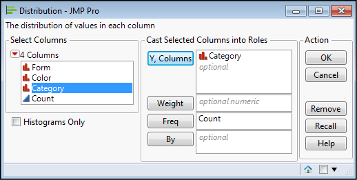
We are comparing frequency distributions, but we have only one set of observations, so the Distribution platform is where we will find the one-way chi-square test. With either data entry method, select Analyze ► Distribution, and move the Category variable to the Y, Columns box, then click OK for the distribution (Figure 7.4).
Figure 7.4: Setting up the Analysis in the Distribution Platform
The results are best ordered by the frequencies using the Little Red Triangle as shown in Figure 7.5.
Figure 7.5: Ordering the Output
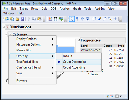
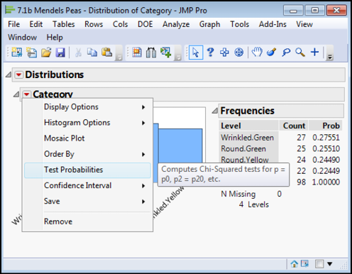
The observant reader will have seen that in this menu, there is also the option to Test Probabilities. (Note the pop-up that JMP helpfully provides to identify the test to which this links in Figure 7.6.).
Figure 7.6: Finding the One-Way Chi-Square Tests
This brings up this dialog box into which the predicted frequencies can be input for comparison to the observed (Figure 7.7).
Figure 7.7: Analysis Dialog Box for One-Way Chi-Square Test
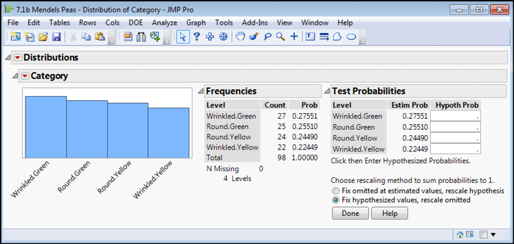
While the hypothesized probabilities to enter should sum to a value of 1, as do the estimated probabilities (see Estim Prob column), JMP is smart enough to rescale the values that you enter if you want to supply the actual values your hypothesis predicts. So, for this example, we can enter a value of 1 into each cell of the Hypoth Prob column, and JMP will automatically rescale each to a value of 0.25 (=1/4). This might seem obvious, but when the predicted frequency distribution becomes more complex, letting JMP do the math avoids another opportunity to enter information incorrectly.
Entering the necessary numbers and clicking Done yields the output in Figure 7.8.
Figure 7.8: One-way Chi Square Analysis Output
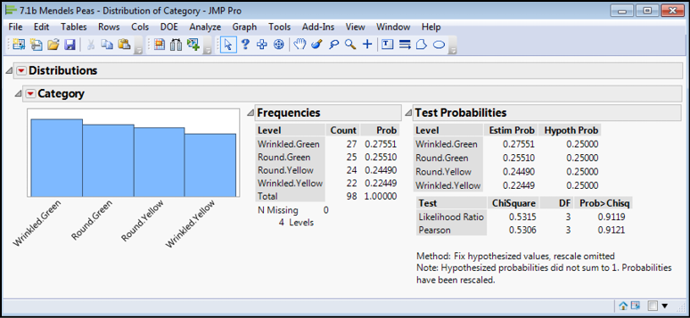
Interpretation and Statistical Conclusions
JMP has calculated two versions of the chi-square value for us, but both are very close, and the p-values are both well above the critical value of 0.05 and thus yield the same conclusion: the null hypothesis cannot be rejected, and we cannot discern statistically a difference between our observed frequencies and the expected frequencies. The variation between the two could plausibly be due to chance alone. We can conclude that at least with this data set, the ratio is, in fact, 1:1:1:1 and the underlying hypothesis predicting this has another datum to support it. Dancing in the hall(s) can commence!
Two-way Chi-Square Tests and Piscine Brain Worms
Background and Data
Parasites often have multiple hosts through which they must pass in order to complete their life cycle. Trematodes of the species Euhaplorchis californiensis pass through three different species: birds, snails, and fish. The mature state of this parasite reaches that maturity in birds and lays eggs that are excreted in the avian feces. The horn snail (Cerithidea californica) consumes those parasite eggs (which makes one wonder about the culinary propensities of these and other snails and adds yet another reason to eschew escargot), which hatch within this host into an intermediate life stage. Enter the California killifish (Fundulus parvipinnis). Horn snails form a staple of the fish’s diet, so the parasite passes into the next stage of development that includes encysting itself into the fish’s braincase. The last stage of the journey completes the cycle when the fish gets eaten by a bird, where the worm can mature to begin the cycle anew.
Biologists have observed that infected fish seem to exhibit a suicidal death wish by spending more time near the water’s surface where they can be more readily spotted and consumed by avian predators. It is almost as if the worm has taken over control of the fish brain to guide the fish to the parasite’s next host. Is this really an example of worm control, or is this just a subjective impression by some researchers who have read too much science fiction?
To test the hypothesis that the worm had turned the fish into suicidal zombies, Lafferty and Morris4 stocked a large outdoor tank with killifish that were either uninfected, lightly infected, or highly infected with this worm. A natural fishing contest was then held by letting the local predaceous waterfowl (primarily great egrets, great blue herons, and snowy egrets) have full access to this tank and monitoring the number of the different categories of fish actually eaten. The data from the experiment is shown in Table 7.3.
Table 7.3: Raw Data to Analyze
|
Uninfected |
Lightly Infected |
Highly Infected |
|
|
Eaten by birds |
1 |
10 |
37 |
|
Not eaten by birds |
49 |
35 |
9 |
Data Entry into JMP
What we have in Table 7.3 is a classic contingency table in which two categorical variables, bird predation and infection level, are being shown together. The biological question is whether these two are associated, so the biological null and alternative hypotheses are as follows:
Ho: Bird predation and parasitic infection are not associated with one another.
HA: Bird predation and parasitic infection are associated with one another.
Notice that the biological hypotheses, the questions in which we are really interested, are formulated in terms of the specific biological question. Compare these now to the statistical null and alternative hypotheses, which are formulated in terms of the metric we are comparing, the frequency distributions:
Ho: There is no difference between the observed frequencies of bird predation versus parasitic infection and the frequencies predicted if the two are, indeed, not associated.
HA: There is a significant difference between the observed frequencies of bird predation versus parasitic infection and the frequencies predicted if the two are not associated. Therefore, there is an association between these two variables.
The alternative hypothesis is the one the investigators were really interested in, so in this case, disproving the null hypothesis would be the most interesting outcome. (Not disproving it might also have some interest, depending on your ultimate goal for the experiment.)
To enter this data into JMP, the contingency table in Table 7.3 will need to be rearranged a little so that the two categorical variables under consideration are each in their own column. The resulting rearrangement looks like Figure 7.9.
Figure 7.9: Data Table of This Raw Data
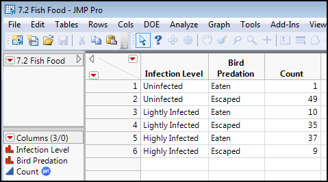
Note that we have again pre-assigned the frequency role to the Count column. With two variables like this, data entry in this format is the most logical.
Analysis
Because we have two variables and we are interested in whether they are associated, we need to use the Fit Y by X platform for the analysis. Go to the Analyze ► Fit Y by X dialog box and note the set of figures in the lower left corner (Figure 7.10).
Figure 7.10: Fit Y by X Dialog Box Filled Out for the Analysis
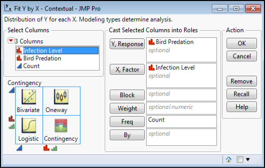
In the lower left corner of Figure 7.10, we see the types of analysis available to us depending on the nature of the data. For the two nominal data sets in this example, a contingency analysis is expected, and that is what we want. Based on the experimental design, the independent variable is the Infection Level, so it can be entered as the X, Factor. The Bird Predation then is the Y, Response. Having pre-assigned the frequency role to Count, it automatically appears in the Freq box, but could be entered here manually if it was not pre-assigned. It is critical to ensure that the Count column does get placed here, because otherwise, JMP finds a count of one for each category rather than the actual data, and the output is meaningless. If the resulting contingency table in the JMP output has a value of one in every cell, you should realize that you made this mistake!
Clicking OK yields the analysis shown in Figures 7.11 and 7.12.
Figure 7.11: Analysis Output – Mosaic Plot
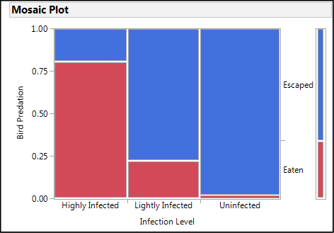
Figure 7.12: Analysis Output – Contingency Table and Chi-Square Results
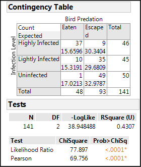
Interpretation and Statistical Conclusions
The Mosaic Plot gives a nice graphic display of the data, and the fact that there is such a different distribution of the Bird Predation for each Infection Level strongly suggests that there is a relationship between the two variables in question. Turning then to the Contingency Table5 itself, we see that there is a big difference between the observed Count and the count Expected,6 assuming no association between the two variables. This is confirmed by the p-values for the chi-square test, both of which are < 0.0001, which means that there is only a really, really itsy-bitsy7 small chance that there is no association between these two variables. The null hypothesis can be rejected and we can conclude that yes, the brain worms are creating suicidal zombies out of the infected fish! Isn’t science fun?!
Endnotes
1 The term “subject” is being used very loosely here. It does not refer to human individuals only. It can be the equally infamous “widgets” or elephants or tumor cells, and so on.
2 Percentages are frequently used to present and compare proportional data, but they do so by essentially normalizing the data to a standard range of 0–100. As such, chi-square tests should not be used with percentages, but with the data underlying the percentages.
3 The data for this example can be found on the web at http://www.mendelweb.org/Mendel.html. (Be sure you capitalize the M of the html file or you will get an error message saying the file is not found on this server!). (Be sure you capitalize the M of the html file or you will get an error message saying the file is not found on this server!)
4 Lafferty, K.D. and A.K. Morris (1996) “Altered behavior of parasitized killifish increases susceptibility to predation by bird final hosts.” Ecology 77: 1390–1397.
5 Using the Little Red Triangle of the Contingency Table, the default values showing column and row percentages have been deselected, and only the count and expected count selected. This simplifies the table by having only the two most relevant (for this discussion) numbers to compare.
6 The formula for the Expected values is simple: (row total * column total)/n), where n is the total number of observations in the table. Remember, the Expected values are assuming no association between the two variables. In other words, the numbers are based on probabilistic chance only.
7 Technical term for “teeny-tiny.” For ESL readers, that means really, really, really small!