Chapter 10: Tests of Differences Between More Than Two Groups
Data do not give up their secrets easily. They must be tortured to confess.
Jeff Hopper, Bell Labs
Introduction
In the previous chapter, we first looked at comparing two groups of independent, that is, unrelated data, by comparing their means. Remember from Chapter 3, unrelated means we are talking about the experimental design and how the data was collected. The unrelated data from the previous chapter was collected from two populations whose members were totally different, in other words, unrelated. This is compared to the second data set we looked at in the last chapter where the two populations being compared were the same, but measured at two different times. Thus, that data is related. This distinction is an important one to keep in mind when selecting the test to use (as seen in the last chapter).
Having seen how to handle a comparison of two groups, we now turn our attention to how to compare three or more groups.
Comparing Unrelated Data
Why not…?
Having set the stage in the previous chapter in which we compared the means of two groups of data, we now progress to the question of what to do if you have more than two groups of data. Based on the previous chapter, we might think that an easy solution would be to do a series of t tests on all the possible pairs of data to see if and where significant differences lie. (Alas, this approach is found all too frequently in the published peer-reviewed literature.) The problem with this approach is that when the number of groups being compared increases, the chance of observing one or more significant p-values by chance alone likewise increases.
Consider the situation where, instead of one comparison, you want to make two comparisons. Using the traditional 0.05 cutoff for statistical significance, the probability that you correctly fail to reject the null hypothesis (that is, determine that there is not a significant difference) is 0.95. But this is true for your second comparison as well. Assuming that both null hypotheses are true, the probability that you will not find a significant difference when combining both cases is the product of 0.95 times 0.95, or 0.9025. In other words, you now have a 10% chance of finding a statistically significant difference by chance alone where none exists. One can create a formula to track how quickly this can escalate: the chance of finding a statistically significant difference by chance alone = 1.0 - 0.95n, where n = a positive integer representing the number of independent comparisons that you want to do. Hopefully you can see that this can rapidly degrade the analyst’s ability to draw any significant conclusions with confidence. As J. L. Mills has observed, “If you torture your data long enough, they will tell you whatever you want to hear.”1 This approach comes very close to an illegitimate persecution of the data.
So how…?
OK, so if multiple comparisons do not work, what method can we use to compare more than two groups of data? The basic test is a method called one-way ANOVA, often referred to as just “ANOVA,” where ANOVA is an abbreviation for ANalysis Of VAriance. This test allows us to answer the question, Are the means the same for three or more groups or populations of data?
Just to be clear, despite the method’s name, it does not compare the variances themselves. In fact, one of the assumptions is equal variances of the groups (within-group variances). You would never be able to detect a difference if the method is comparing variances, since to be valid, the variances have to be equivalent to have valid conclusions!
What the method is doing is comparing the between-group variation to the within-group variation to calculate the F statistic. Each group will have a certain variation associated with that population (within-group). But there will also be variation in the sample means that is the between-group variation. If the groups are from different sample populations, that is, their means are different, then the between-group variation will tend to exceed the within-group variation, allowing the probabilistic determination of whether the means differ.2
Can you…?
Just a quick interlude here. Can you do one-way ANOVA on only two groups instead of the t test? The answer is, of course! The reason we don’t normally do that is due more to the history of the tests than the ability of the test to do the job. When these tests were first developed, there were no computers or electronic calculators. In fact, you were lucky if you knew how to use a slide rule! (And yes, dinosaurs roamed the earth eating unwary statisticians.) The computations for ANOVA are much more tedious than those for the t test, so if you have only two groups, and you don’t have handy-dandy software like JMP to do the work for you, why opt for more work than you have to in order to evaluate two groups? Thus, the t test was born and is the preferred method for comparing two groups even though we now do have JMP to do either job in milliseconds (or perhaps nanoseconds?).
Our Strategy Applied
Your Objective is still that of comparison, and our Data type is continuous data, although you can also use ordinal data. The primary Assumptions of one-way ANOVA are normality of the data in each group and equal within-group variances. As with t tests, the assumptions can be evaluated graphically with the normal quantile plots (see Figure 10.2), where straight lines indicate data normality, and parallel lines indicate equal variance. Normality can also be assessed directly with the Shapiro-Wilk test in the Distribution platform. (See Chapter 4 and Figure 4.13 in particular.) Let’s do an example to clarify.
How Do You Read the Reeds?
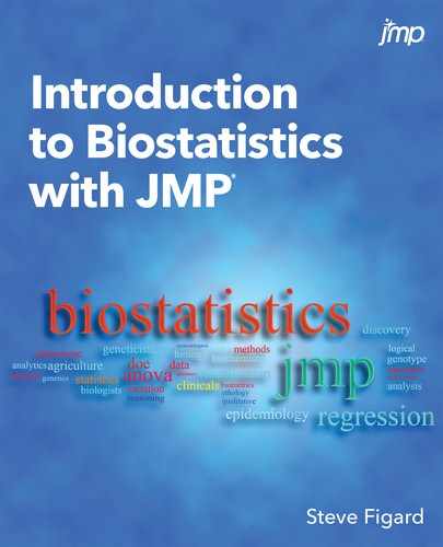
The data in Figure 10.1 shows the % dry weight nitrogen content of five determinations for each of three sites of reedbeds in Fowlmere, England.3 This format is how you would typically collect the data and place it into an Excel spreadsheet. As a plant biologist, you are interested in whether the nitrogen content differs between these three sites. (No, I am a protein biochemist, not a plant biologist, so I don’t know why anyone would be interested in this question, but I’m sure my plant biology colleagues would be happy to tell me if I were motivated to ask.)
Figure 10.1: Fowlmere Reed Raw Data
We will be able to test the normality assumption shortly by looking at the normal quantile plots, but in this configuration of the data table, we can also check the normality in the Distribution platform using the Shapiro-Wilk test. When we do so, we find that all three sites are happily normal by Shapiro-Wilk (p-values all above 0.05, so we cannot reject the null hypothesis that the data are from a normal distribution).
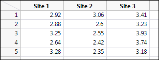
In order to do our analysis, we must now stack our data so that one column contains the categorical variable of Collection Site, and the other column our continuous data of Nitrogen Level (Figure 10.2).
Figure 10.2: Stacking the Raw Reed Data
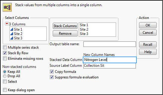
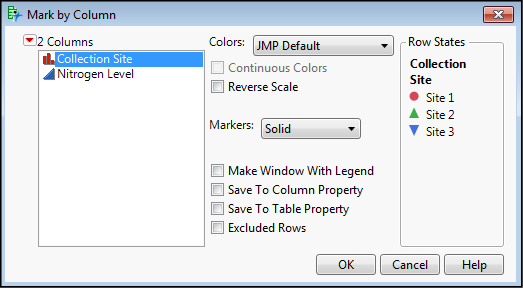
The new data is seen in Figure 10.3, where I have added colors and symbols to the data based on the Collection Site (Figure 10.4) to distinguish the categorical variable of sites more clearly in the output.
Figure 10.3: Stacked Data Ready for ANOVA
Figure 10.4: Making the Graphs “Pretty”
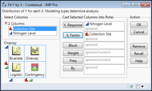
We do the analysis by going to Analyze Fit Y by X, and filling out the dialog box by putting Collection Site in the X, Factor box and Nitrogen Level in the Y, Response box as in Figure 10.5 and then clicking OK.
Figure 10.5: Setting Up the Analysis
The results of this analysis with the options turned on that we turned on back in Chapter 10 (see Figure 10.3) give us a wealth of information to decipher. Let’s start with the graphs in Figure 10.6.
Figure 10.6: Graphs in Analysis Output of Fowlmere Reed Data
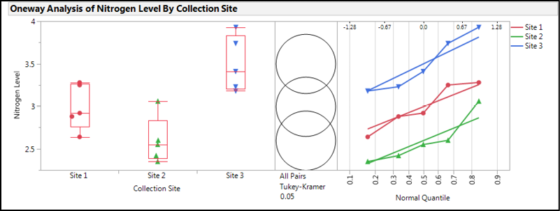
The box plots on the left indicate that Sites 1 and 2 are not too dissimilar, with Site 2 having the lowest median value. Given the spread of the data that is visible by plotting all the data, and the relatively small sample size, the median shows its worth as the best measure of central tendency since Site 2 does appear to have one point higher than all the rest that would pull the average higher and present a small distortion in the data visualization if we were to rely upon means to visually compare the groups.
Jumping over to the normal quantile plots on the right, we can see that the points do appear to be reasonably linear, confirming what we saw in the Shapiro-Wilk results for data normality. The lines also appear parallel to the eye, so most likely the variances are equal enough to go with the parametric one-way ANOVA results to determine whether there is a statistically significant difference in the nitrogen content at these three sites. We will verify this with the results in the Tests that the Variances are Equal output.
The Comparison Circles in the middle are a graphic unique to JMP. Their interpretation is fairly straightforward, but the explanation from the JMP documentation reproduced in Figures 9.8 and 10.7 provides a more technical description. Basically, the more the circles overlap, the less likely there is a statistically significant difference between the groups. The size of the circle reflects sample size and thus the confidence in the location of the group mean, so the larger the circle, the less data available to locate the mean, and thus the less confidence in its location.
Figure 10.7: The JMP Explanation of Comparison Circles
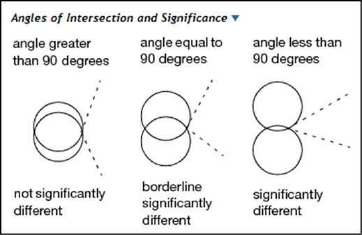
Figure 10.8: Output in One-way ANOVA node
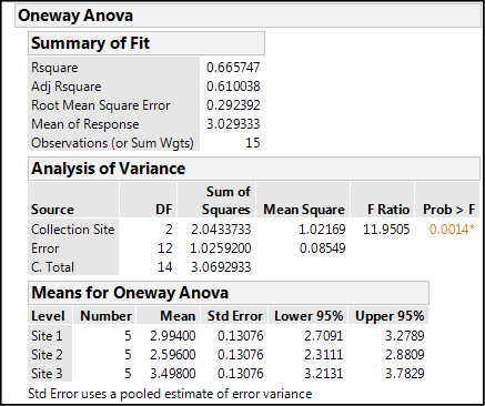
In all the numbers in the One-way Anova node presented in Figure 10.8, there are three items of information that we want. First, the Rsquare value tells us that, in this case, 66.6% of the variation in the nitrogen content data is accounted for by the difference in the site of the data collection. The fact that the majority of the variation seems to come from collecting the data from different sites suggests that there will be a significant difference between the sites. The p-value for the ANOVA analysis, Prob > F, is 0.0014, well below 0.05. JMP highlights this as a statistically significant p-value by changing the color and placing as asterisk to the right of the value, effectively drawing the eye to say, “Yo! I’m significant at the 95% confidence level! Look at me!” This tells us that there is a difference somewhere between at least two of the groups that is statistically significant, but it does not tell us where those statistically significant differences are. We will get to that in a minute.
Before we do, we should, however, digress into the fuller explanation of this p-value. Remember that what has been done in the background is a calculation of the F statistic, or F ratio as it’s called in the above table, comparing the between-group variation to the within-group variation. This p-value is now telling us the chance of getting an F ratio this large by chance alone. The fact that the probability is so low is indicative of a significant difference.
The third item that we can glean from this output is the means with their 95% confidence limits. Looking at these, we can begin to determine where the significant differences lie, but later output that we will look at in a moment will make this easier to see. Nonetheless, the information is there in the numbers for those wanting to look at it in this format.
Figure 10.9: Means Comparisons Node Output
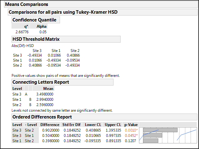
The Means Comparison node output in Figure 10.9 shows us where our significant differences are using Tukey’s HSD4 test, which we selected in the preferences in the previous chapter. Other options for such comparisons can be found under the Compare Means selection in the Little Red Triangle at the top of the One-way Analysis.
The results can be viewed in three different ways, any of which can be turned on or off with preference settings. JMP tells you how to interpret the output in a single sentence below the output of the first two. For the HSD Threshold Matrix, “Positive values show pairs of means that are significantly different.”
In my opinion, differences are a little easier to see in the next level, the Connecting Letters Report. Now JMP points out that “Levels not connected by same letter are significantly different.” Looking at the provided means, it is now obvious that Site 3 is a good bit higher than the other two sites and in a class all by itself.
Lastly, the Ordered Differences Report, which might arguably be the most informative, allows us to see both qualitatively and quantitatively the site comparisons, even including the lower and upper confidence levels for the observed differences. When those limits bracket a value of zero, we cannot say that the difference is significantly different from zero, and that is confirmed by the associated p-values. Based on this table, we can conclude that, at least with this data set, Site 3 is most statistically different from Site 2, but also statistically different from Site 1 to a lesser degree. And, Sites 1 and 2 are statistically equivalent.
Our last immediate consideration is to check the assumption of equal variances. The results of that analysis are in Figure 10.10 below.
Figure 10.10: Testing the Equal Variance Assumption
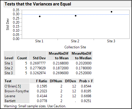
We can see graphically that there will probably not be a significant difference, and yea, verily, the p-values for all four tests show p-values very much larger than 0.05, indicating no difference between the variances. We are warned, however, that the sample sizes are small, so we should “Use Caution” in our use of this outcome. It does, however, confirm what we saw in the normal quantile plot lines, so we are most likely on solid ground saying that this assumption has been met, and thus the use of the parametric one-way ANOVA is substantiated. (Welch’s ANOVA p-values are provided in this analysis [but not shown since we don’t need them] had the variances not been equal.)
But what if the data had not been normally distributed? Well, I am glad you asked that question; it shows you have been thinking! Figure 10.11 shows that once again, the Little Red Triangle is your friend. There are nonparametric options to use in this case, along with nonparametric multiple comparisons tests to determine where differences are should a significant difference be found.
Figure 10.11: Nonparametric ANOVA Options
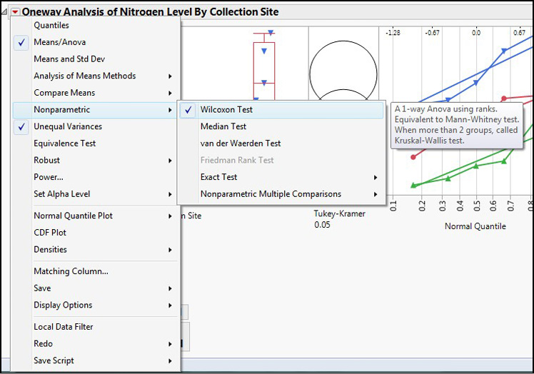
Figure 10.12 shows the nonparametric output for this data.
Figure 10.12: Nonparametric Output for the Fowlmere Reed Data
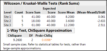
In this case, a significant difference is identified, but notice the p-value has shifted closer to the 0.05 cutoff from the 0.0014 value seen with the parametric calculations. This is a reflection of the loss of power by moving to a nonparametric method. An even more dramatic result is visible when we look at the Nonparametric Comparisons For Each Pair Using Wilcoxon Method output (Figure 10.13).
Figure 10.13: Nonparametric Comparisons Output for the Fowlmere Reed Data
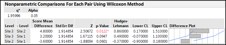
Switching to a nonparametric method has lost the ability to detect a difference between Site 3 and Site 1, at least at the 95% confidence level. It is always better to use a parametric method when possible due to the increased statistical power given by such methods.
Comparing Related Data
Related data in the situation under consideration would be when the experimenter makes the same measurement on the same subjects multiple times, usually with time as a variable so that there are now three or more groups of data to compare depending on the number of time points, an experimental design frequently encountered in biological and medical research. This is comparable to the paired t test described in the previous chapter. While logically this topic would fit in here, and it is certainly an important method, it would require several concepts beyond the scope of this text to explain, and there appear to be at least two, if not three, methods of accomplishing this analysis in JMP. (See the JMP YouTube video channel for examples). The method is called repeated measures ANOVA.
Endnotes
1 Mills, J.L. (1993) “Data torturing.” New England Journal of Medicine, 329, 1196-1199.
2 This is not to say you can’t have different populations with the same means, just that you would not detect that difference with this test. Most likely making that distinction would lie in the realm of the design of the experiment.
3 Hawkins, D. (2014) Biomeasurement: A Student’s Guide to Biostatistics, 3rd Edition, Oxford University Press, Great Britain, page 164–165.
4 File under points to ponder: HSD stands for “Honestly Significant Difference,” which leads me to wonder, “Does that mean there’s a Dishonestly Significant Difference out there?!?”