
Now, let's analyze the StatArb signal using the following steps:
- Let's visualize a few more details about the signals in this trading strategy, starting with the correlations between CAD/USD and the other currency pairs as it evolves over time:
# Plot correlations between TRADING_INSTRUMENT and other currency pairs
correlation_data = pd.DataFrame()
for symbol in SYMBOLS:
  if symbol == TRADING_INSTRUMENT:
    continue

  correlation_label = TRADING_INSTRUMENT + '<-' + symbol
  correlation_data = correlation_data.assign(label=pd.Series(correlation_history[correlation_label], index=symbols_data[symbol].index))
  ax = correlation_data['label'].plot(color=next(cycol), lw=2., label='Correlation ' + correlation_label)

for i in np.arange(-1, 1, 0.25):
  plt.axhline(y=i, lw=0.5, color='k')
plt.legend()
plt.show()
This plot shows the correlation between CADUSD and other currency pairs as it evolves over the course of this trading strategy. Correlations close to -1 or +1 signify strongly correlated pairs, and correlations that hold steady are the stable correlated pairs. Currency pairs where correlations swing around between negative and positive values indicate extremely uncorrelated or unstable currency pairs, which are unlikely to yield good predictions in the long run. However, we do not know how the correlation would evolve ahead of time, so we have no choice but to use all currency pairs available to us in our StatArb trading strategy:
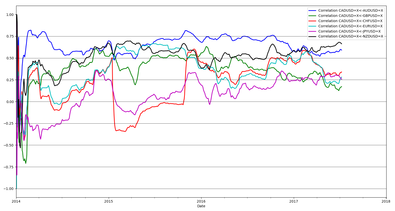
As we suspected, the currency pairs that are most strongly correlated to CAD/USD price deviations are AUD/USD and NZD/USD. JPY/USD is the least correlated to CAD/USD price deviations.
- Now, let's inspect the delta between projected and actual price deviations in CAD/USD as projected by each individual currency pair individually:
# Plot StatArb signal provided by each currency pair
delta_projected_actual_data = pd.DataFrame()
for symbol in SYMBOLS:
  if symbol == TRADING_INSTRUMENT:
    continue

  projection_label = TRADING_INSTRUMENT + '<-' + symbol
  delta_projected_actual_data = delta_projected_actual_data.assign(StatArbTradingSignal=pd.Series(delta_projected_actual_history[projection_label], index=symbols_data[TRADING_INSTRUMENT].index))
  ax = delta_projected_actual_data['StatArbTradingSignal'].plot(color=next(cycol), lw=1., label='StatArbTradingSignal ' + projection_label)
plt.legend()
plt.show()
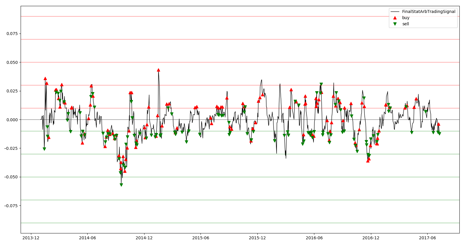
This is what the StatArb signal values would look like if we used any of the currency pairs alone to project CAD/USD price deviations:

Here, the plot seems to suggest that JPYUSD and CHFUSD have very large predictions, but as we saw before those pairs do not have good correlations with CADUSD, so these are likely to be bad predictions due to poor predictive relationships between CADUSD - JPYUSD and CADUSD - CHFUSD. One lesson to take away from this is that StatArb benefits from having multiple leading trading instruments, because when relationships break down between specific pairs, the other strongly correlated pairs can help offset bad predictions, which we discussed earlier.
- Now, let's set up our data frames to plot the close price, trades, positions, and PnLs we will observe:
delta_projected_actual_data = delta_projected_actual_data.assign(ClosePrice=pd.Series(symbols_data[TRADING_INSTRUMENT]['Close'], index=symbols_data[TRADING_INSTRUMENT].index))
delta_projected_actual_data = delta_projected_actual_data.assign(FinalStatArbTradingSignal=pd.Series(final_delta_projected_history, index=symbols_data[TRADING_INSTRUMENT].index))
delta_projected_actual_data = delta_projected_actual_data.assign(Trades=pd.Series(orders, index=symbols_data[TRADING_INSTRUMENT].index))
delta_projected_actual_data = delta_projected_actual_data.assign(Position=pd.Series(positions, index=symbols_data[TRADING_INSTRUMENT].index))
delta_projected_actual_data = delta_projected_actual_data.assign(Pnl=pd.Series(pnls, index=symbols_data[TRADING_INSTRUMENT].index))

plt.plot(delta_projected_actual_data.index, delta_projected_actual_data.ClosePrice, color='k', lw=1., label='ClosePrice')
plt.plot(delta_projected_actual_data.loc[delta_projected_actual_data.Trades == 1].index, delta_projected_actual_data.ClosePrice[delta_projected_actual_data.Trades == 1], color='r', lw=0, marker='^', markersize=7, label='buy')
plt.plot(delta_projected_actual_data.loc[delta_projected_actual_data.Trades == -1].index, delta_projected_actual_data.ClosePrice[delta_projected_actual_data.Trades == -1], color='g', lw=0, marker='v', markersize=7, label='sell')
plt.legend()
plt.show()
The following plot tells us at what prices the buy and sell trades are made in CADUSD. We will need to inspect the final trading signal in addition to this plot to fully understand the behavior of this StatArb signal and strategy:

Now, let's look at the actual code to build visualization for the final StatArb trading signal, and overlay buy and sell trades over the lifetime of the signal evolution. This will help us understand for what signal values buy and sell trades are made and if that is in line with our expectations:
plt.plot(delta_projected_actual_data.index, delta_projected_actual_data.FinalStatArbTradingSignal, color='k', lw=1., label='FinalStatArbTradingSignal')
plt.plot(delta_projected_actual_data.loc[delta_projected_actual_data.Trades == 1].index, delta_projected_actual_data.FinalStatArbTradingSignal[delta_projected_actual_data.Trades == 1], color='r', lw=0, marker='^', markersize=7, label='buy')
plt.plot(delta_projected_actual_data.loc[delta_projected_actual_data.Trades == -1].index, delta_projected_actual_data.FinalStatArbTradingSignal[delta_projected_actual_data.Trades == -1], color='g', lw=0, marker='v', markersize=7, label='sell')
plt.axhline(y=0, lw=0.5, color='k')
for i in np.arange(StatArb_VALUE_FOR_BUY_ENTRY, StatArb_VALUE_FOR_BUY_ENTRY * 10, StatArb_VALUE_FOR_BUY_ENTRY * 2):
  plt.axhline(y=i, lw=0.5, color='r')
for i in np.arange(StatArb_VALUE_FOR_SELL_ENTRY, StatArb_VALUE_FOR_SELL_ENTRY * 10, StatArb_VALUE_FOR_SELL_ENTRY * 2):
  plt.axhline(y=i, lw=0.5, color='g')
plt.legend()
plt.show()
Since we adopted the trend-following approach in our StatArb trading strategy, we expect to buy when the signal value is positive and sell when the signal value is negative. Let's see whether that's the case in the plot:
Based on this plot and our understanding of trend-following strategies in addition to the StatArb signal we built, we do indeed see many buy trades when the signal value is positive and sell trades when the signal values are negative. The buy trades made when signal values are negative and sell trades made when signal values are positive can be attributed to the trades that close profitable positions, as we saw in our previous mean reversion and trend-following trading strategies.
- Let's wrap up our analysis of StatArb trading strategies by visualizing the positions and PnLs:
plt.plot(delta_projected_actual_data.index, delta_projected_actual_data.Position, color='k', lw=1., label='Position')
plt.plot(delta_projected_actual_data.loc[delta_projected_actual_data.Position == 0].index, delta_projected_actual_data.Position[delta_projected_actual_data.Position == 0], color='k', lw=0, marker='.', label='flat')
plt.plot(delta_projected_actual_data.loc[delta_projected_actual_data.Position > 0].index, delta_projected_actual_data.Position[delta_projected_actual_data.Position > 0], color='r', lw=0, marker='+', label='long')
plt.plot(delta_projected_actual_data.loc[delta_projected_actual_data.Position < 0].index, delta_projected_actual_data.Position[delta_projected_actual_data.Position < 0], color='g', lw=0, marker='_', label='short')
plt.axhline(y=0, lw=0.5, color='k')
for i in range(NUM_SHARES_PER_TRADE, NUM_SHARES_PER_TRADE * 5, NUM_SHARES_PER_TRADE):
  plt.axhline(y=i, lw=0.5, color='r')
for i in range(-NUM_SHARES_PER_TRADE, -NUM_SHARES_PER_TRADE * 5, -NUM_SHARES_PER_TRADE):
  plt.axhline(y=i, lw=0.5, color='g')
plt.legend()
plt.show()
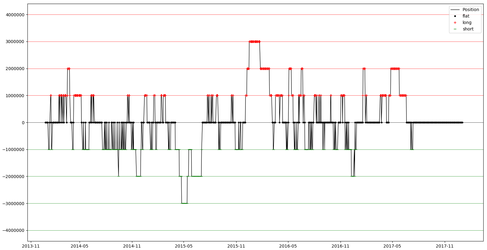
The position plot shows the evolution of the StatArb trading strategy's position over the course of its lifetime. Remember that these positions are in dollar notional terms, so a position of 100K is equivalent to roughly 1 future contract, which we mention to make it clear that a position of 100K does not mean a position of 100K contracts!
- Finally, let's have a look at the code for the PnL plot, identical to what we've been using before:
plt.plot(delta_projected_actual_data.index, delta_projected_actual_data.Pnl, color='k', lw=1., label='Pnl')
plt.plot(delta_projected_actual_data.loc[delta_projected_actual_data.Pnl > 0].index, delta_projected_actual_data.Pnl[delta_projected_actual_data.Pnl > 0], color='g', lw=0, marker='.')
plt.plot(delta_projected_actual_data.loc[delta_projected_actual_data.Pnl < 0].index, delta_projected_actual_data.Pnl[delta_projected_actual_data.Pnl < 0], color='r', lw=0, marker='.')
plt.legend()
plt.show()
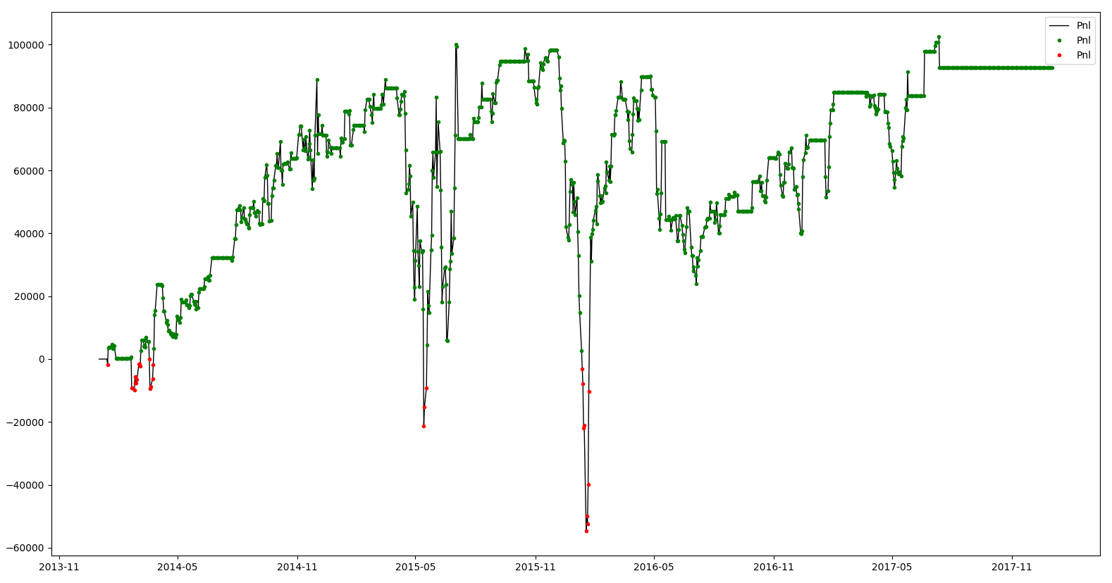
We expect to see better performance here than in our previously built trading strategies because it relies on a fundamental relationship between different currency pairs and should be able to perform better during different market conditions because of its use of multiple currency pairs as lead trading instruments:
And that's it, now you have a working example of a profitable statistical arbitrage strategy and should be able to improve and extend it to other trading instruments!