
Working with projections and base maps can be fiddly and prone to errors. While there are Java libraries that can help us with this, let's use the major software package in this domain, ArcGIS, for the purposes of this demonstration. While it's awesome to be able to program solutions in a powerful, flexible language like Clojure, sometimes, it's nicer to get pretty pictures quickly.
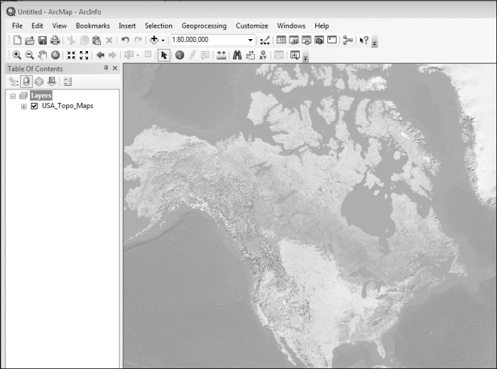
We're going to start this by getting the base layer. ESRI maintains a set of topological maps, and this map of the United States is perfect for this:
- Navigate to http://www.arcgis.com/home/item.html?id=99cd5fbd98934028802b4f797c4b1732 to view ESRI's page on the US Topo Maps.
- Click on the Open dropdown.
- Select the option that allows you to get ArcGIS Desktop to open the layer.
Now we'll add our data. This was created using the functions that we defined earlier as well as a few more that are available in this chapter's code download:
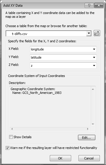
- The data is available at http://www.ericrochester.com/clj-data-master/temp-diffs.csv. Point your web browser there and download the file. Don't forget where you put it!
- In ArcGIS, navigate to File | Add Data | Add XY Data.
- Select the
temp-diffs.csvfile, and specifyzfor the z field. - We'll also need to change the projection of the input data. To do this, click on Edit... to edit the projection.
- In the new dialog box, Select a predefined coordinate system. Navigate to Coordinate Systems | Geographic Coordinate Systems | North America | NAD 1983.
- When the file is ready to load, the dialog should look like what is shown in the following screenshot:
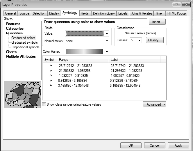
- Once the data is in place, we need to set the color scheme for the z field. Right-click on the new layer and select Properties. Select the Symbology tab and get the graduated colors the way you like them.
- After I was done playing, the dialog box looked like what is shown in the following screenshot:
- Now we get to the good part. Open up Catalog and select IDW tool. It is done by navigating to System Toolboxes | Geostatistical Analyst Tools | Interpolation. Generate the heat map into a new layer.
- Once ArcGIS is done, the heat map will be too opaque to see the underlying geography. Right-click on the heat map layer and select Properties. In the Display tab, change the opacity to something reasonable. I used
0.40.
The final results are shown as follows:
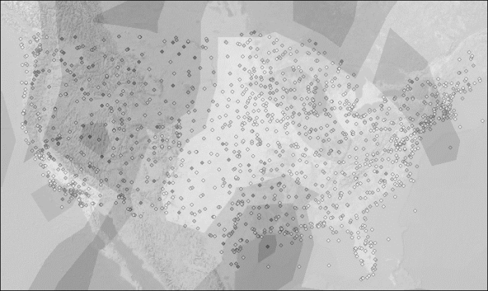
We can see that for a large part of the nation, things have heated up. The west part of the great lakes have cooled a bit, but the Rocky Mountains have especially gotten warmer.