
One common way of structuring and processing these tests is to use null hypothesis testing. This represents a frequentist approach to statistical inference. This draws inferences based upon the frequencies or proportions in the data, paying attention to confidence intervals and error rates. Another approach is Bayesian inference, which focuses on degrees of belief, but we won't go into that in this chapter.
Frequentist inference has been very successful. Its use is assumed in many fields, such as the social sciences and biology. Its techniques are widely implemented in many libraries and software packages, and it's relatively easy to start using it. It's the approach we'll use in this chapter.
To use the null hypothesis process, we should understand what we'll be doing at each step of the way. The following is the basic process that we'll work through in this chapter:
- Formulate an initial hypothesis.
- State the null (H0) and alternative (H1) hypotheses.
- Identify the statistical assumptions in the sample.
- Determine which tests (T) are appropriate.
- Select the significance level (a), such as p<0.05 or p<0.01.
- Determine the critical region, that is, the region of the distribution in which the null hypothesis will be rejected.
- Calculate the test statistic and the probability of the observation under the null hypothesis (p).
- Either reject the null hypothesis or fail to reject it.
We'll go into these step-by-step, and we'll walk through this process twice to get a good feel for how it works. Most of this is pretty simple, really.
Before we can start testing a theory about our data, we need to have something to test. This is generally something that might be true or false, and we want to determine which of the two it is. Some examples of initial hypotheses might be height correlating to diet, speed limit correlating to accident mortality, or a Super Bowl win for an old American Football League team (AFC division) correlating to a declining stock market (the so-called Super Bowl indicator).
Now we have to reformulate the initial hypothesis into the statistical phrases that we'll use more directly the rest of the time. This is a useful point that helps to clarify the rest of the process.
In this case, the null hypothesis is the control, or what we're trying to disprove. It's the opposite of the alternative hypothesis, which is what we want to prove.
For example, in the last example from the previous section, the Super Bowl indicator, the re-cast hypotheses might be as follows:
For the rest of the process, we will concern ourselves with rejecting the null hypothesis. That can only happen when we've determined two things: first, that the data we have supports the alternative hypothesis, and second, that this is very unlikely to be a mistake; that is, the results we see probably are not a sample that misrepresents the underlying population.
This is going to keep coming up, so let's unpack it a little.
You're interested in making an observation about a population—all men; all women; all people; all statisticians; or past, present, and future stock market trends—but obviously you can't make an observation for every person or aspect in the population. So instead, you select a sample. It should be random. The question then becomes: does the sample accurately represent the population? Say you're interested in people's heights. How close is the sample's average height to the population's average height?
Let's assume that what we're interested in falls on a normal distribution, as height generally does. What would this look like? For the following chart, I generated some random height data. The blue bars (appearing as dark gray in physical books) represent the histogram for the population, and the red bars (appearing as light gray in physical books) are the histogram for the sample.
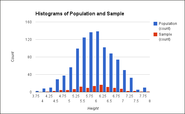
We can see from the preceding graph that the distributions are similar, but certainly not the same. And in fact, the mean for the population is 6.01, while the mean for the sample is 5.94. They're not too far apart in this case, but some samples would be much further off.
It has been proven theoretically that the difference between the population mean and the possible sample means will fall on a normal distribution. The following is the plot for the difference in the means from 500 sets of samples drawn from the same population:
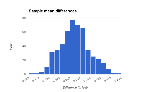
This histogram makes it clear that large differences between the population mean and the sample mean are unlikely, and the larger the difference, the more improbable it is. This is important for several reasons. First, if we know the distribution of the differences of means, it allows us to set constraints on results. If we are working with sample data, we know that the same values for the population will fall within a set bound.
Also, if we know the distribution of differences, then we know if our results are significant. This means that we can reject the null hypothesis that the averages are the same. Any two sample means should fall within the same boundaries. Large differences between any two sets of sample means are similarly improbable.
For example, one sample would be the control data, and one would be the test data. If the difference between the two samples is large enough to be improbable, then we can infer that the test behavior produced a significant difference (assuming the rest of the experiment is well designed and other things aren't complicating the experiment). If it's unlikely enough, then we say that it's significant, and we reject the null hypothesis.
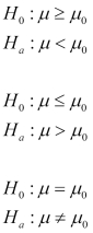
Depending on what we're testing, we may be interested in results that are on the left-hand side of the graph, the right-hand side, or either. That is, the test statistic for the alternative hypothesis may be significantly less than, significantly greater than, or equal to the null hypothesis. We express this in notation using one of the following three forms. (These use the character mu, μ, using the sample mean as the test statistic.) In each of these notations, the first line states the null hypothesis, and the second states the alternative hypothesis. For instance, the first pair in the following notation says that the null hypothesis is that the test sample's mean should be greater than or equal to the control sample's mean, and the alternative hypothesis is that the test sample's mean should be less than the control sample's mean:
We've taken our time to understand this more thoroughly because it's fundamental to the rest of the process. However, if you don't understand it at this point, throughout the rest of the chapter, we'll keep going over this. By the end, you should have a good understanding of this graph of sample mean differences and what it implies.
Another aspect of your data that you'll need to pay attention to is the shape of the data. This can often be easily visualized using a histogram. For example, the following screenshot shows a normal distribution and two distributions that are skewed:
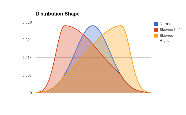
The red curve is skewed left (appearing as dark gray), and the yellow curve is skewed right (appearing as white). The blue curve (appearing as light gray) is a normal distribution with no skew.
Many statistical tests are designed for normal data, and they won't give good results for skewed data. For example, t-test and regression analysis both give good results only for normally distributed data.
Next, we need to select the significance level that we want to achieve for our test. This is the level of certainty that we'll need to have before we can reject the null hypothesis. More to the point, this is the maximum chance that the results could be an outlying sample from the population, which would cause you to incorrectly reject the null hypothesis.
Often, the significance level, usually given as the p-value, is given as p<0.05 or p<0.01. This means that the results have a less than 5 percent or 1 percent chance of being caused by a sample with an outlying mean.
If we look at the graph of sample mean differences given earlier, we can see that we're looking at differences of about 2.4 inches to be significant. In other words, based on this population, the average difference in height would need to be more than 2 inches for it to be considered statistically significant.
Say we wanted to see if men and women were on average, of different heights. If the average height difference were only 1 inch, that could likely be the result of the samples that we picked. However, if the average height difference were 2.4 inches or more, that would be unlikely to have come from the sample.
Now we have determined two important pieces of information: we've expressed our null and alternative hypotheses, and we've decided on a needed level of significance. We can use these two to determine the critical region for the test results, that is, the region for which we can reject the null hypothesis.
Remember that our hypotheses can take one of three forms. The following conditions determine where our critical region is:
- For the alternative hypothesis that the two samples' means are not equal, we'll perform a two-tailed test.
- For the alternative hypothesis that the test sample's mean is less than the control sample's, we'll perform a one-tailed test with the critical region on the left-hand side of the graph.
- And for the alternative hypothesis that the test sample's mean is greater than the control sample's, we'll perform a one-tailed test with the critical region on the right-hand side of the graph.
The following hypothetical graph highlights the part of the curve in which the critical regions occur. The curve represents the distribution of the test statistic for the sample, and the shaded parts will be the areas that the critical region(s) might come from.
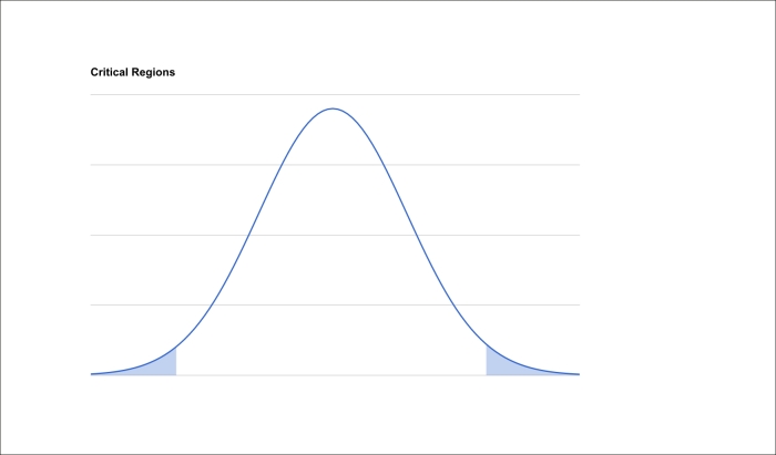
The exact size of the critical regions is determined by the p value that we decided upon. In all cases, the area of the critical regions is the p percentage of the entire curve. That is, if we've decided that we're trying for p<0.05, and the area under the whole curve is 100, the area in the critical region will be 5.
If we are performing a two-tailed test, then that area will be divided into two, so in the example we just outlined, each side will have an area of 2.5. However, for one-tailed tests, the entire critical region will fall on one side.
Now we have to calculate the test statistic. Depending on the nature of the data, the sample, and on what you're trying to answer, this could involve comparing means, a student's t-test, X2 test, or any number of other tests.
These tests will give you a number, but interpreting it directly is often not helpful. Instead, you then need to calculate the value of p for that test's distribution. If you're doing things by hand, this can involve either looking up the value in tables or if you're using a software program, this is often done for you and returned as a part of the results.
We'll use Incanter in several sections later in this chapter, starting with calculating the test statistic and its probability. Its functions generally return both the test value and the p value.
Now we can find the value of p in relation to the critical regions and determine whether we can reject the null hypothesis or not.
For instance, say that we've decided that the level of significance that we want to achieve is p<0.05 and the actual value of p is 0.001. This will allow us to reject the null hypothesis.
However, if the value of p is 0.055, we would fail to reject the null hypothesis. We would have to assume that the alternative hypothesis is incorrect, at least until more information is available.
Now that we've been over the process of null hypothesis testing, let's walk through the process one more time with an example. This should be simple and straightforward enough that we can focus on the process, and not on the test itself.
For that purpose, we'll test whether a dice is loaded or not. If it is balanced, then the expected probability of any given side should be 1/6, or about 16 percent. However, if the die is loaded, then the probability for rolling one side should be greater than 16 percent, and the probabilities for rolling the other sides would be less than 16 percent.
Of course, generally this isn't something that you would worry about. But before you agree to play craps with the dice that your friend 3D printed, you may want to test them.
For this test, I've rolled one die 1,000 times. The following is the table of how many times each side came up:
|
Side |
Frequency |
|---|---|
|
1 |
157 |
|
2 |
151 |
|
3 |
175 |
|
4 |
187 |
|
5 |
143 |
|
6 |
187 |
So we can see that the frequencies are relatively close, within a range of 44, but they aren't exactly the same. This is what we'd expect. The question is whether they're different enough that we can say with some certainty that the die is loaded.
So we suspect that our test die is fair, but we don't know that. We'll frame our hypothesis this way: on any roll, all sides have an equal chance of appearing.
Our initial hypothesis can act as our null hypothesis. And in this case, we expect to fail to reject it. Let's state both hypotheses explicitly:
- H0: All sides have an equal chance of appearing on any roll.
- H1: One side has a greater chance of appearing on any roll.
In this case, we let H0 be such that the two sides are equal because we want there to be more latitude in what counts as fair, and we want to enforce a high burden of proof before we declare a die loaded.
For our sample, we'll roll the die in question 1,000 times. We'll assume that each roll is identical: that it's being done with approximately the same arm and hand movements, and that the die is landing on a flat surface. We'll also assume that before being thrown, the die is being shaken enough to be appropriately random.
This way, no biases are introduced because of the mechanics of how the die is being thrown.
For this, we'll use a Pearson's Χ2 goodness-of-fit test. This is used to test whether an observed frequency distribution matches a theoretical distribution. It works by calculating a normalized sum of squared deviations. We're trying to test whether some observations match an expected distribution, so this test is a great fit.
We'll see exactly how to apply this test in a minute.
Proving that a die is loaded does require a higher burden of proof than assuming that it's fair, but we don't want the bar to be too high. Because of that, we'll use p<0.05 for this.
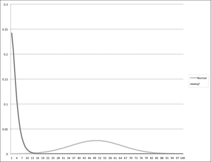
The output of the Χ2 test fits an Χ2 distribution, not a normal distribution, so the graph won't look the same. Also, Χ2 tests are intrinsically one sided. When the number is too far out on the right, then it indicates that the data fits the theoretical values poorly. A value to the left on the Χ2 distribution just indicates that the fit is very good, which isn't really a problem.
The following is a graph comparing the normal distribution, centered on 50, with the X2 distribution, with 3 degrees of freedom:
Either way, the statistics library that we're going to use (Incanter) will take care of this for us.
So let's fire up the Leiningen REPL and see what we can do. For this project, we're going to use the following project.clj file:
(defproject nullh "0.1.0-snapshot"
  :dependencies [[org.clojure/clojure "1.5.1"]
                 [enlive "1.1.4"]
                 [http.async.client "0.5.2"]
                 [org.clojure/data.csv "0.1.2"]
                 [org.clojure/data.json "0.2.3"]
                 [me.raynes/fs "1.4.5"]
                 [incanter "1.5.4"]
                 [geocoder-clj "0.2.2"]
                 [geo-clj "0.3.5"]
                 [congomongo "0.4.1"]
                 [org.apache.poi/poi-ooxml "3.9"]]
  :profiles {:dev {:dependencies
                   [[org.clojure/tools.namespace "0.2.4"]]
                   :source-paths ["dev"]}})
First, we'll load Incanter, then we'll create a matrix containing our data, and finally we'll run an Χ2 test over it with the following code:
user=> (require '[incanter.core :as i] '[incanter.stats :as s])
nil
user=> (def table (i/matrix [157 151 175 187 143 187]))
#'user/table
user=> (def r (s/chisq-test :table table))
#'user/r
user=> (pprint (select-keys r [:p-value :df :X-sq]))
{:X-sq 10.771999999999998, :df 5, :p-value 0.05609271590058857}
Let's look at this code in more detail:
- The function
incanter.stats/chisq-testreturns a lot of information, including its own input. So, before displaying it at the end, I filtered out most of the data and only returned the three keys that we're particularly interested in. The following are those keys and the values that they returned.:X-sq: This is the Χ2 statistic. Higher values of this indicate that the data does not fit their expected values.:df: This is the degrees of freedom. This represents the number of parameters that are free to vary. For nominal data (data without natural ordering), such as rolls of dice, this is the number of values that the data can take, minus one. In this case, since it's a six-sided die, the degree of freedom is five.:p-value: This is the value of p that we've been talking about. This is the probability that we'd see these results from the Χ2 test if the null hypothesis were true.
Now that we have these numbers, how do we apply them to our hypotheses?
In this case, since p>0.05, we fail to reject the null hypothesis. We can't really rule it out, but we don't have enough evidence to support it either. In this case, we can assume that the die is fair.
Hopefully, this example gives you a better understanding of the null hypothesis testing process and how it works. With that under our belts, let's turn our attention to a bigger, more meaningful problem than the fairness of imaginary dice.