
Let's explore a little and try to get a feel for the data. First, let's try to get some summary statistics for the various datasets. Afterward, we'll generate some graphs to get a more intuitive sense for what's in the data and how they're related.
Incanter makes generating summary statistics easy. You can pass a dataset to the incanter.stats/summary function. It returns a sequence of maps. Each map represents the summary data for each column in the original dataset. This includes whether the data is numeric or not. For nominal data, it returns some sample items and their counts. For numeric data, it returns the mean, median, minimum, and maximum.
If we load the data and filter it for the crime of "burglary", we can get the summary statistics for those fields as follows:
(s/summary
  (i/$where {:crime {:$eq "CTS 2012 Burglary"}} by-ag-lnd))
And if we pick apart the data structures that it outputs, the following are the summary statistics for the primary data fields:
|
Column |
Minimum |
Maximum |
Mean |
Median |
|---|---|---|---|---|
|
Rate |
0.1 |
1939.23 |
376.4 |
292.67 |
|
Count |
11 |
443010 |
60380 |
17184 |
So, from the preceding table, we see that both fields have wide variance and are skewed somewhat, based on the differences between the means and the medians. These two having similar distributions is to be expected, since the rate is derived from the count.
Charts and graphs can also help to understand our data better. Incanter makes generating charts quite simple. Let's see how to do that.
First, we'll load the data and pivot it, since that will make it easier to pull the data out of the graph. For this example, we'll load the UNODC crime data joined to the World Bank land area data as follows:
(def by-ag-lnd
  (d/load-join-pivot
    "unodc-data"
    "ag.lnd/ag.lnd.totl.k2_Indicator_en_csv_v2.csv"))
Next, we'll filter the dataset to contain only the burglary data as shown in the following code:
(def burglary
  (i/$where {:crime {:$eq "CTS 2012 Burglary"}} by-ag-lnd))
Finally, we use the incanter.charts/histogram function to create the graph, and the incanter.core/view function to display it to the screen with the following code:
(def h
  (c/histogram (i/sel burglary :cols :count)
                :nbins 30
                :title "Burglary Counts"
                :x-label "Burglaries"))
(i/view h)
The following is the histogram of the :count field:
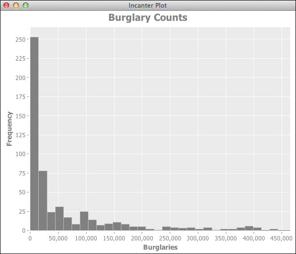
From this graph, we can see that this data does not follow a normal distribution. How does the other data correspond?
We can use the same function, incanter.stats/summary, to generate the same statistics for the land area data that is given in the following table:
|
Column |
Minimum |
Maximum |
Mean |
Median |
|---|---|---|---|---|
|
Land area |
300 |
16381390 |
822324 |
100250 |
|
GNI |
240 |
88500 |
17170 |
8140 |
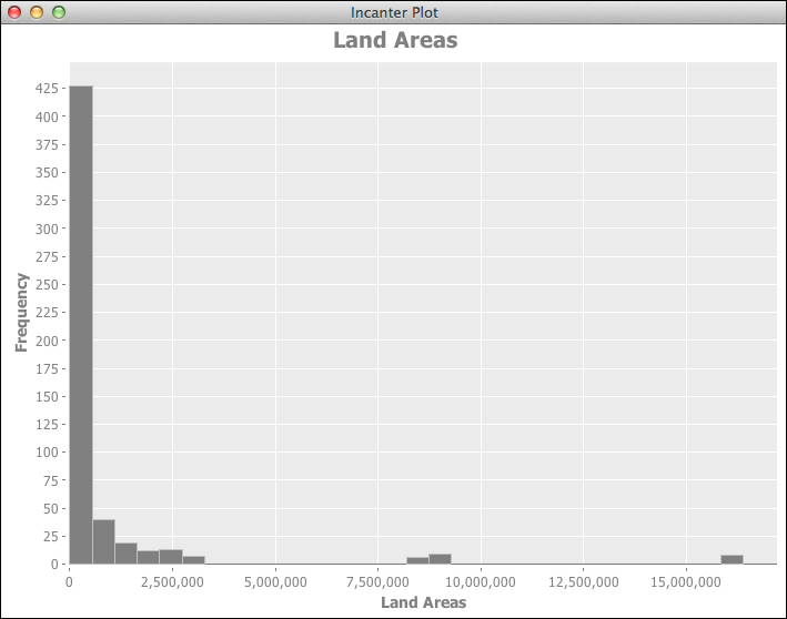
The World Bank land area data has a distribution that is similar to the crime data. Smaller, less wealthy countries are, of course, more numerous. The distribution of the land area values is given as follows:
The following is the distribution of the GNI values:
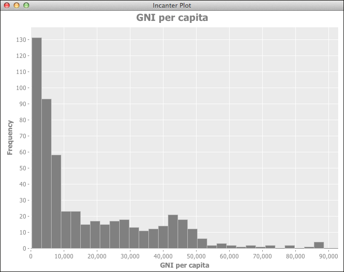
This gives us some feel for the data. All of these follow an exponential distribution, as we can see in the next graph:

This makes it clear that all graphs with exponential distribution start with a steep drop and quickly flatten out into a near-flat line.
Some more charts can help us begin to understand the relationship between some of these variables. We'll write a function to plot any crime against the World Bank indicator data joined into the current dataset.
First, however, we'll need a utility function to filter the data rows by the crime. This is a data-oriented function, so we'll store it in nullh.data, as shown in the following code:
(defn by-crime [dset crime-label]
  (i/$where {:crime {:$eq crime-label}} dset))
The next function, plot-crime, pulls out the data points and then passes everything to the incanter.charts/scatter-plot function to generate the graph:
(defn plot-crime [dset indicator-label crime-label]
  (let [x (i/sel dset :cols :indicator-value)
        y (i/sel dset :cols :rate)
        title (str indicator-label " and " crime-label)]
    (c/scatter-plot x y
                    :title title
                    :x-label indicator-label
                    :y-label crime-label)))
This makes it easy to get a quick, visual comparison of data about different types of crimes and how they relate to the World Bank indicator data.
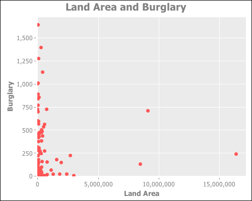
For example, the following code shows us how the burglary ("CTS 2012 Burglary") relates to the land area data (the plot-crime function is in the nullh.charts namespace, which is aliased as n-ch):
(def by-ag-lnd
  (d/load-join-pivot
    "unodc-data"
    "ag.lnd/ag.lnd.totl.k2_Indicator_en_csv_v2.csv"))
(def ag-plot
  (n-ch/plot-crime (d/by-crime by-ag-lnd "CTS 2012 Burglary")
                   "Land Area" "Burglary"))
(i/view ag-plot)
The preceding code produces the following graph:
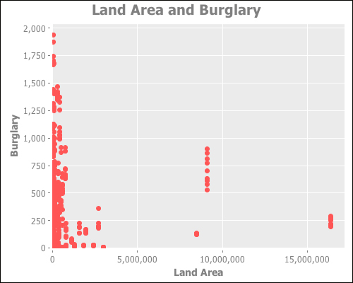
This data appears to have some strange artifacts. Look at the line of data points where the land area is around 9,000,000, stretching from about 500 burglaries per year to almost 1,000 burglaries. What is that about?
Well, when we think about it, the land area of a country rarely changes, but if a country has burglary data for several years, we'll have the land area represented those many times. We could simplify the data by getting the average of the data.
In order to do this, we aggregate all of the year data for each country. To do that, we'll use the following function:
(defn aggregate-years-by-country
  ([dset] (aggregate-years-by-country dset :mean))
  ([dset by]
   (let [data-cols [:count :rate :indicator-value]]
     (->> [:count :rate :indicator-value]
       (map #(i/$rollup by % :country dset))
       (reduce #(i/$join [:country :country] %1 %2))))))
The preceding code uses the incanter.core/$rollup function to get each country's average for each data column. It then uses reduce and incanter.core/$join to fold the data back into one dataset.
When we graph aggregated data, we get the following graph:
This makes it clearer that there is probably no relationship between these two variables.
The following graph compares the burglary data to the GNI per capita. Since that indicator doesn't typically vary much over the time span represented in the data (China and a few other countries not withstanding), we have again aggregated each country's data.
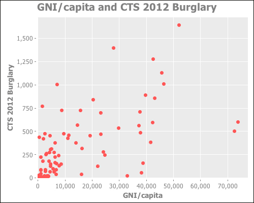
This data appears to possibly have a correlation between these two variables, although it may not be very strong. This is something we can test.