
We'll spend a good bit of time visualizing the data, and we'll use the same system that we have in the previous chapters: a bit of HTML, a splash of CSS, and a lot of JavaScript, which we'll generate from ClojureScript.
We've already taken care of the configuration for using ClojureScript in the project.clj file that I mentioned earlier. The rest of it involves a couple of more parts:
- The code to generate the JSON data for the graph. This will be in the
src/ufo_data/analysis.cljfile. We'll write this code first. - An HTML page that loads the JavaScript libraries that we'll use—jQuery (https://jquery.org/) and D3 (http://d3js.org/)—and creates a
divcontainer in which to put the graph itself. - The source code for the graph. This will include a namespace for utilities in
src-cljs/ufo-data/utils.cljsand the main namespace atsrc-cljs/ufo-data/viz.cljs.
With these prerequisites in place, we can start creating the graph of the frequencies of the different shapes.
First, we need to make sure we have what we need for this namespace. This will be in the src/ufo_data/analysis.clj file. The following code gives the ns declaration. Most of these dependencies won't be needed immediately, but we will use them at some point in this chapter:
(ns ufo-data.analysis
  (:require [ufo-data.text :as t]
            [clj-time.core :as time]
            [clj-time.coerce :as coerce]
            [clojure.string :as str]
            [incanter.core :as i]
            [incanter.stats :as s]))
Now, we'll define a rather long function that takes the input data. It will pull out the shape field, remove blanks, break it into words, and count their frequencies. A few of the functions that this function uses aren't listed here, but they're available in the code download for this chapter. Then, the following function will remove any shapes that don't occur at least once, reverse-sort them by their frequencies, and finally turn them into map structures in a vector:
(defn get-shape-freqs
  "This computes the :shape field's frequencies. This also
  removes any items with a frequency less than min-freq."
  [coll min-freq]
  (->> coll
    (map :shape)
    (remove str/blank?)
    (map normalize)
    (mapcat tokenize)
    frequencies
    (remove #(< (second %) min-freq))
    (sort-by second)
    reverse
    (map #(zipmap [:shape :count] %))
    (into [])))
We can then use the clojure.data.json package (https://github.com/clojure/data.json) to save it to disk. I saved it to www/term-freqs.json. The following is a small sample of the first two records:
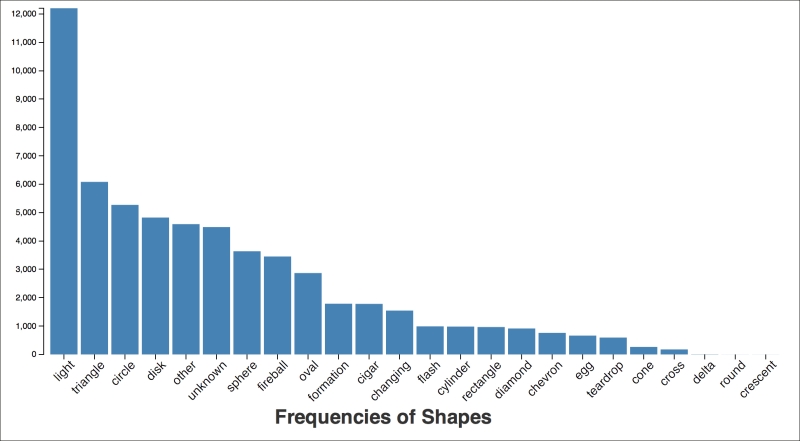
[{"count":12202,"shape":"light"},
 {"count":6082,"shape":"triangle"},
 …]
Now we need a web page in which to draw the graph. I downloaded a template from the HTML 5 Boilerplate project (http://html5boilerplate.com/) and saved it as www/term-freqs.html. I removed almost everything inside the body tag. I left only the following div tag and a string of script tags:
<div class="container"></div>
This takes care of the HTML page, so we can move on to the ClojureScript that will create the graph.
All of the ClojureScript files for this chapter will be in the src-cljs directory. Under this directory is a tree of Clojure namespaces, similar to how the code in src is organized for Clojure. Most of the ClojureScript for this chapter will be in the src-cljs/ufo-data/viz.cljs file. There are a number of utility functions in another namespace, but those are primarily boilerplate, and you can find them in the code download for this chapter. The following function loads the data and creates the graph. We'll walk through it step-by-step.
(defn ^:export term-freqs []
  (let [{:keys [x y]} (u/get-bar-scales)
        {:keys [x-axis y-axis]} (u/axes x y)
        svg (u/get-svg)]
    (u/caption "Frequencies of Shapes" 300)
    (.json js/d3 "term-freqs.json"
      (fn [err json-data]
        (u/set-domains json-data [x get-shape] [y get-count])
        (u/setup-x-axis svg x-axis)
           (u/setup-y-axis svg y-axis "")
        (.. svg
          (selectAll ".bar") (data json-data)
          (enter)
          (append "rect")
          (attr "id" #(str "id" (get-shape %)))
          (attr "class" "bar")
          (attr "x" (comp x get-shape))
          (attr "width" (.rangeBand x))
          (attr "y" (comp y get-count))
          (attr "height"
                #(- u/height (y (get-count %))))))))))
The part of the function before the highlighting sets up the axes, the scales, and the parent SVG element. Then, we load the data from the server. Once it's loaded, we set the domains on the axes and draw the axes themselves.
The main part of the function is highlighted. This creates the bars in the SVG element. All these tasks take place in the following manner:
(selectAll ".bar") (data data): This command selects all elements with thebarclass. Currently, there aren't any elements to select because we haven't created any, but that's all right. Then it joins those elements with the data.(enter): This command starts processing any data rows that don't have previously created.barelements.(append "rect"): For each row of data with no.barelements, this command appends arecttag to the element.(attr "id" #(str "id" (get-shape %))) (attr "class" "bar"): This line of code adds theIDandclassattributes to the rectangle.(attr "x" (comp x get-shape)) (attr "y" (comp y get-count)): This line of code populates the x and y attributes with values from each data row, projected onto the graph's pixel grid.(attr "width" (.rangeBand x)) (attr "height" #(- u/height (y (get-count %))))): This line of code finally sets the height and width for each rectangle.
These commands together create the graph. There's a little bit of CSS involved, also. Refer to the code download for all the details. But in the end, the graph looks as follows:
This set of files acts as a framework for all of the visualizations and charts that we'll see in this chapter. Although bar charts are simple, once in place, this framework can be used for much more complex and sophisticated types of graphs.
This graph shows us more clearly what the quick frequency dump at the REPL also showed us: most of the people listed the shape as light. More than twice as many people listed the shape of light as listed the runner-up, triangle. In fact, almost one in five observations listed that as the shape.
Now let's try to get a feel for some other facts about this data.
First, when have UFOs been observed? To find this out, we have to group the observations by the year from the sighted-at field. We group the items under each year, and then we save that to graph it. The following are the functions in ufo-data.analysis that will take care of getting the right data for us:
(defn group-by-year [coll]
  (group-by #(timestamp->year (:sighted-at %)) coll))
(defn get-year-counts [by-year]
  (map #(zipmap [:year :count] %)
       (map (on-second count)
            by-year)))
Once we've created the graph from this data, the following is the output:
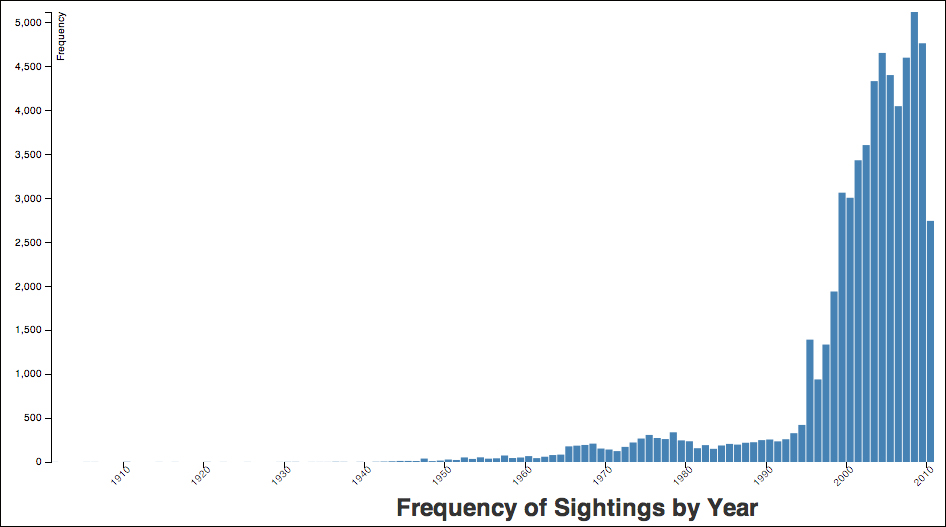
This graph suggests that the number of observations in the dataset increased dramatically in the mid-1990s, and that they have continued to increase. NUFORC, the organization that collects the data, was established in 1974. I was unable to discover when they began collecting data online, but the increased widespread use of the Internet could also be a factor in the increase in reported sightings. Also, wider cultural trends, such as the popularity of X-Files, may have contributed to a greater awareness of UFOs during this time period.
As we continue to get to know our data, another interesting distribution is looking at the number of sightings each month. The process for getting this data is very similar to the process for getting the number of sightings by year, so we won't go into that now.
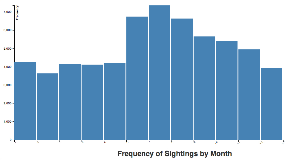
The preceding graph shows that the summer, starting in June, is a good time to see a UFO. One explanation for this is that during these months, people are outside more in the evenings.