
Chapter 34. Introduction to Windows Forms 2.0
IN THIS CHAPTER
- Windows Forms Basics
- Creating a Windows Forms Application
- Using the Windows Forms Designer
- Elements of Good User Interface Design
Windows Forms is one of the core components of the .NET Framework. It allows developers to create extremely powerful and interactive applications that run on any Windows platform on which the .NET Framework v2.0 has been installed. Windows Forms represents a radical increase in time to market, ease of maintenance, and ease of deployment over other unmanaged development environments such as Visual Basic 6 and unmanaged Visual C++. This is the first of several chapters that will help turn you into an effective Windows Forms developer. This chapter provides an introduction to Windows Forms, how it works, and how you can start creating Windows Forms applications using Visual Studio 2005.
Windows Forms Basics
At its core, Windows Forms is a collection of classes all created in the .NET Framework. These classes provide a completely object-oriented encapsulation of creating and manipulating user interface elements such as forms, dialog boxes, user input, enhanced graphical output, and much more.
Although you can create virtually any type of application using the .NET Framework SDK and Notepad, Visual Studio includes a plethora of tools and designers that make creating Windows Forms applications a smooth and efficient process that has become even faster and more powerful with the current version of Visual Studio.
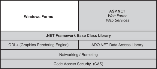
Figure 34.1 illustrates how Windows Forms fits in with the rest of the .NET Framework, including ASP.NET applications, Windows Service applications, and console applications.
Figure 34.1 Windows Forms within the .NET Framework.
Because of the object-oriented nature of the .NET Framework and of Windows Forms, you can accomplish a lot of things with Windows Forms that are virtually impossible without it. For example, you can use inheritance to create forms that inherit from other forms and you can also use inheritance to create your own custom controls that derive from existing controls. For example, with only a few lines of code you could create a text box with your own custom behavior added to it while reusing all of the existing behavior inherent in a text box control.
Windows Forms Versus Web Forms
One of the most common tasks when designing a new application is deciding whether to use Windows Forms or Web Forms. The incredible power, flexibility, and scalability of applications developed using the .NET Framework blurs the line between traditional Windows applications and web applications.
There are many arguments for and against Windows Forms applications. Most of the positives for Windows Forms include the fact that a Windows Forms application can have a far more interactive and graphically rich interface, whereas Web Forms applications tend to take less time to build. Table 34.1 takes a look at the various concerns for building applications and indicates whether Web Forms or Windows Forms (or both) support such features.
Table 34.1 Decision Support Table: Windows Forms Versus Web Forms
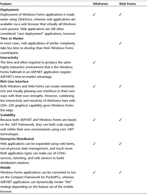
The bottom line is that although the two platforms are radically different in their purpose, they have very few technical differences that would sway a developer in one direction over the other. In most cases, the decision of Windows versus web comes down to the type of application being created and the environment in which it must be deployed. Time to market and interactivity are the only two major categories in which ASP.NET and Windows Forms evince a large difference in ability. The rest of this chapter should get you started building Windows Forms applications.
Creating a Windows Forms Application
Creating a Windows Forms application is a fairly simple process. You start off by opening Visual Studio 2005 and choosing to create a new project. After selecting the appropriate language from the left side of the project creation dialog (assuming you have more than one language installed), click the Windows tree node. The following project types will appear:
- Windows Application—Creates an empty Windows application with an empty form.
- Class Library—Creates an assembly that contains a library of classes. You have created many of these throughout the course of this book.
- Windows Control Library—Creates an assembly that is designed to contain a library of custom Windows Forms controls.
- Windows Service—Creates an executable application without any user interface with the appropriate code and hooks to run as a service within the Services Control Panel.
- Console Application—You have created countless console applications if you have been following along throughout this book; creates an executable application that utilizes the Windows Command Prompt console for input and output.
You also might see some additional project types depending on your Visual Studio installation, but the ones listed here are the ones that apply to Windows Forms programming.
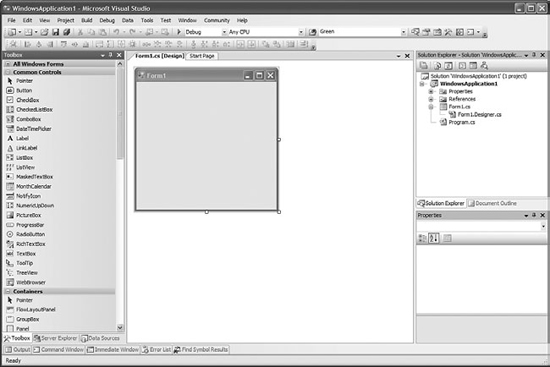
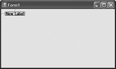
To create your first Windows Forms application, click on the “Windows Application” template, provide a name for the application and a location for your code, and click OK to continue. Most of what is presented to you should seem quite familiar. Rather than having the Web Forms Designer window allowing you to build your web application, you have an image of an empty form and a Toolbox full of Windows Forms tools that looks something like the image shown in Figure 34.2.
The next section will teach you the basics of building a powerful user interface using the Windows Forms Designer.
Figure 34.2 An empty Windows Forms application.
Using the Windows Forms Designer
The Windows Forms Designer is the interactive tool used to graphically lay out and configure the elements of your user interface. You use this designer to create and manipulate forms as well as to design and lay out the controls on those forms.
To get started using the Windows Forms Designer, drag a control (any simple control should do) onto a form. As you are dragging you’ll see a small outline that indicates the point at which the control will be inserted. When you let go of the control, it will appear completely at the designated insertion point.
When a control is on the surface of a form, you can configure all of the control’s properties using the Properties window. By default, this window shows up in the bottom right of the Visual Studio screen below the Solution Explorer window. If the window is not visible, you can make it visible by selecting View, Properties Window. You can also use the hotkey Ctrl+W, P. This will open the Properties window if it has been closed and will then set the focus to that window. Inside the Properties window you can configure virtually every aspect of a control. If you click the lightning-bolt icon from within the Properties window, you can also see a list of all the events exposed by a given control (such as an event for when the control is clicked, double-clicked, and so on). If you double-click an empty space next to an event, you can create an event handler for that event on that control.
The list of properties that belong to a given control is specific to that control, and many control properties will be covered in Chapter 35, “The Windows Forms Control Library.” The most important things that you will use the forms designer for are navigating control structures, which can be made significantly easier by the Document Outline window; aligning and justifying controls using the new SnapLines feature; and finally, you will be using the designer to make sure that as the host form grows and shrinks, the size and layout of the controls on the form adjust accordingly. You can perform all of these tasks using the designer and without having to write a single line of code.
Using the Document Outline Window
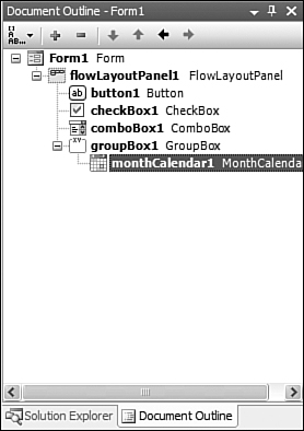
The Document Outline window is an extremely powerful tool that allows a developer to rapidly locate an individual control that might be nested deep within other controls on a form. Despite its power, this window is often overlooked or even forgotten by many developers.
Tip
Even if you don’t use it all the time, you should get in the habit of making sure that the Document Outline window has been opened at the beginning of a project. That way it will appear as a tab next to Solution Explorer. With it sitting in a visible location in your workstation, you are more likely to notice it and make use of it. With simple interfaces it may be completely unnecessary, but when you start creating complex interfaces with many levels of nested controls, you may wonder how you managed to survive without it.
This window, shown in Figure 34.3, displays controls in a tree so that you can get a quick list of all controls on the form as well as a reference of where those controls all are in relation to each other. When you have many levels of nesting, it can become extremely difficult or even impossible to properly click on and select child controls using just the visual designer. If you run into that situation, you can use the Document Outline window to quickly find and select the control you need.
Figure 34.3 The Document Outline window.
Lining Up Controls with SnapLines
One of the most helpful and powerful new features of the Visual Studio 2005 Forms Designer is the use of SnapLines. SnapLines are a new feature that allow you to visually align controls while maneuvering them around the design surface.
With previous versions of Visual Studio, one of the most annoying and tedious tasks involved in Windows Forms development was lining up controls. Previous versions of Visual Studio supported control alignment by littering a containing surface with little grid points. You could move a set of controls so that it looked as if they would all start at the same point, but more often than not there would be discrepancies. Sometimes it would be so difficult to line up the controls that developers would have to go into the control properties and manually modify a control’s X and Y coordinates within a container.
This kind of tedium is no longer required when working with Windows Forms 2.0. To see a quick example of SnapLines in action, drag a Label control from the Toolbox onto a blank form. Now click the label and hold to drag and move the label around the outside edge of the form. As you approach an edge of the form, a blue SnapLine appears that visually shows you the recommended distance between the current control and the form’s edge. If you move the Label control to the top left corner of the form, you will see that both a vertical and horizontal SnapLine appear to guide the control’s placement, as shown in Figure 34.4.
Figure 34.4 SnapLines used to recommend margins.
You can also use SnapLines to align controls relative to each other. One of the most common tasks in creating Windows Forms user interfaces is aligning a text label with an input control such as a TextBox. This alignment task used to be time-consuming and frustrating. To see how easy it is with SnapLines, drag a TextBox control onto the form and move it near the right edge of the label. As you do so, a set of SnapLines appears. When the TextBox control is in a position near the right of the label, a pair of SnapLines appears and the TextBox control snaps into a position that puts it at the exact same level as the label. You can experiment with this by dragging more controls onto the form and seeing where the SnapLines appear. When you align a TextBox near a Label, you can see a pink SnapLine that indicates that even though the outside edges of the controls might not be aligned, the text contained within them will appear at the same level.
As you learn more about Windows Forms and you start experimenting more with the designer and creating sample applications in the upcoming chapters, you will grow to love the SnapLines feature; it will quickly become a feature that you can’t live without.
Creating Resizable Forms
As you will see in the next section, creating forms that respond properly to different environments and being shrunk or expanded can go a long way toward creating a compelling user interface.
Thankfully, you can accomplish a great deal toward making your form and its contained controls resizable using a few control properties and some features of the designer.
Dock
All controls have a Dock property. This property indicates the docking mode of the control. It essentially indicates which borders of the control are bound to the container. A little graphical tool pops up when you select the Dock property of a control, which helps you determine what docking mode you want for the control. That pop-up is shown in Figure 34.5.
Figure 34.5 Dock selection pop-up.
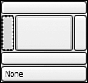
As you can see from the image, you have the following docking mode options:
- Left—Docks the control so that its left border is “stuck” to the left border of the container.
- Right—Docks the control so that its right border is “stuck” to the right border of the container.
- Fill—Docks the control so that it fills the entire container.
- Top—Docks the control so that its top border is “stuck” to the top border of the container.
- Bottom—Docks the control so that its bottom border is “stuck” to the bottom border of the container.
Experiment with the various docking modes by picking a random control and putting it on a form and then setting the Dock property. With a single control and just a form, it might not look like a very powerful property. However, when you start working with nested controls and nested docks, things can get interesting quickly.
Anchor
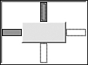
As you saw when experimenting with the Dock property, the control moves from wherever it was before so that it can attach itself to the designated container border, or it expands to fill the entire container. Sometimes that is the desired behavior, but other times you may want more finely grained control over your interface. This is where the Anchor property comes in.
Rather than defining the border to which the control is attached, the Anchor property defines the border with which the control will resize. For example, you can have a control that will automatically grow and shrink horizontally as the form grows and shrinks but remains in its original vertical position. You can also accomplish the opposite and have a control that sizes vertically as the form is sized, but it remains in its original horizontal location. You can even have a control that expands horizontally and vertically but still doesn’t consume the entire container as a Dock property would if it was set to Fill.
When you define an anchor, the anchor selection pop-up shown in Figure 34.6 appears. This pop-up is a handy visual indicator as to which control borders will stretch or shrink when the container stretches or shrinks.
Figure 34.6 The anchor selection pop-up.
Using the Dock and Anchor properties combined with control nesting (controls that contain other controls), the developer can easily create extremely powerful user interfaces that respond appropriately when a form is resized. Before these properties existed, developers had to manually write code to resize and adjust every control on a form in response to a window resize event. Such tedious coding is no longer required.
Elements of Good User Interface Design
Some people believe that that developers don’t need to know anything about what constitutes good design. This author couldn’t disagree more. Most developers have a fairly firm grasp of what works and what doesn’t as far as user interfaces are concerned: Developers spend more time consuming user interfaces than almost all other computer users. This section provides a quick reference for some simple rules that can help produce friendly and powerful user interfaces.
Design with Colors
Everyone likes a colorful interface. The problem is that too much color, especially colors that don’t go well together, can turn a user off quickly. When deciding on colors it is generally a good idea to use a theme of colors: varying shades of the same color and complementary colors. Keep in mind how long a user will be spending looking at your application and keep the flashy colors for things like splash screens and the subtle colors for screens where the users will be spending a lot of their time.
Size Awareness in Design
A lot of really ugly user interfaces are the result of bad proportions. The adage “bigger is better” doesn’t always apply to user interface design. When using icons for buttons that will be on the screen a lot and clicked quite often, use smaller icons. For launch panel icons that might only appear once per application use, you can use bigger and more elaborate images. Also make sure that your choice of font family and style are ones that are visually pleasing. Again, keep in mind how long the users will be looking at a screen and how much work and clicking they will be doing: When a user’s eye has to frequently switch from large text to small text, large images to small images, or even bright colors to dim colors, that causes eyestrain. If your application is hurting your users’ eyes, it might not last very long.
Complexity in Design
Although you might be tempted to cram as much information on a screen as possible in order to reduce the user’s click count (see the next subsection), a crowded interface screen is usually a screen no one wants to look at. When building a user interface you always need to balance the amount of information being presented to the user with the tasks the user needs to accomplish. If the user only needs a portion of the information at a time, you can probably reduce the complexity of the screen and make the interface more appealing as a result.
Click Count Awareness in Design
When reducing the complexity of each screen, you can often fall into the trap of creating too many screens or forms. When this happens, it can often take the user an excessive number of clicks or keystrokes to get to the information they want. If the complexity of reaching the information is greater than the complexity of the information itself, the user will definitely not enjoy the experience.
Design Intuitiveness
Last but not least, your user interface should be intuitive. If the users cannot figure out how to accomplish their task without reading a lengthy manual or opening some online help, the interface itself might be too complex or structured poorly. Obviously there are some applications where reading the manual is required, but the vast majority of individual user tasks should be fairly obvious. If you find that a lot of users are stopping their workflow to continually refer to documentation, you might want to consider changing the layout of the screen to be more intuitive.
Summary
This chapter has provided you with a brief introduction to the realm of Windows Forms development. It contained an introduction to Windows Forms that included an overview of the technology, how it works, and where it fits within the overall .NET Framework. Next, this chapter walked you through creating a Windows Forms application and gave you a quick tour of some of the highlights of using the Windows Forms Designer to build your user interfaces. Finally, the chapter was rounded out by a brief discussion on some of the concepts involved in building powerful, interactive, and appealing user interfaces. You should now be ready to move on to learning about the Windows Forms control library, data access using Windows Forms, Smart Clients, and much more in the upcoming chapters.