
Chapter 35. The Windows Forms Control Library
IN THIS CHAPTER
- The Common Controls Toolbox
- Containers
- Menus and Toolbars
- The Data-Related Controls
- The Components Toolbox Group
- Components and Controls for Printing
- Dialog Components
When full-featured IDEs (Integrated Development Environments) were just becoming the standard for rapid application development for Windows applications, the size of the IDE’s control toolbox determined whether the language was the best tool for the job. For example, when comparing Delphi and Visual Basic, Delphi’s library of reusable UI controls was not only larger, but many developers considered the VCL (Visual Control Library) to be faster and easier to use. Visual Basic users often had to resort to third-party ActiveX controls to obtain rich user interface programmability.
With the advent of Windows Forms, the library of controls is written for the .NET Framework. As a result, any .NET language has complete access to the base library of Windows Forms controls, whether that language is C#, VB.NET, or even Delphi for .NET.
With Visual Studio 2005, the toolbox of Windows Forms controls has grown significantly. New controls have been added and old controls have been modified and improved. This chapter takes you through a whirlwind tour of every single control available in the Visual Studio 2005 Windows Forms control Toolbox. As you progress through the book to other Windows Forms chapters, many of these controls will be used again with more detailed explanations and code samples.
The Common Controls Toolbox
The Common Controls Toolbox category is essentially a “Miscellaneous” category. It contains the controls that you will typically find in every single Windows Forms application such as buttons, text boxes, check boxes, radio buttons, and so on. This section provides an overview of each of these controls and what they do, as well as how and when they should be used.
The Button Control
The button is the de facto standard for user interactivity. If a user wants to confirm changes, open a new window, start or complete a task, or virtually any other major task, that task is often represented by a Button of some kind. Buttons can be standard buttons or they can have a flat appearance or even be made up of images. Most of the work done by buttons is accomplished through the Click event.
The CheckBox Control
A check box is a graphical expression of a Boolean value. If the box is checked, the underlying value is true. If the box is not checked, the underlying value is false. You can respond to events such as when the checked status of the box changes, and so on. Check boxes can be data-bound directly to any Boolean value.
The CheckedListBox Control
The CheckedListBox control is an extremely powerful and handy tool. It displays a list of items in much the same way as a ListBox control, and when an item is selected, the CheckBox control associated with that item becomes checked. You can obtain the list of items currently selected in the control with the SelectedItems property. If you need to present the user with several checkboxes and you want those to be formatted in an organized list, this control will help.
The ComboBox Control
The ComboBox is another control that you will see in just about every Windows Forms application somewhere. Its responsibility is to present the user with a list of options and allow her to select one. You can set the ComboBox’s DropDownStyle to control its behavior. The Simple mode allows the user to manually type in the text portion with the list portion of the ComboBox remaining visible. The DropDown mode is the same as Simple, except that the user must click the down-arrow to reveal the item list. Finally, the DropDownList mode is one of the most common modes and doesn’t allow the user to manually type anything; she must select an item from the list. If a user needs to select a single value (or provide his own) from a list of values, the ComboBox control is the right tool for the job.
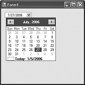
The DateTimePicker Control
The DateTimePicker is a handy control that looks similar to a ComboBox on the surface, but when you click the down arrow on this control, a calendar appears. This calendar allows you to navigate month by month or advance or reverse years. When the user clicks on a specific date, that date becomes the Value property of the control, which is of type DateTime. Today’s date shows up highlighted with a box around it. The programmer can also choose the format in which the selected date appears for maximum flexibility. Figure 35.1 shows a DateTimePicker in action.
Figure 35.1 A DateTimePicker control.
The Label Control
Labels are pretty simple controls. If you want to include some text on a form that is just there for decoration and doesn’t do much beyond that, the Label is the control you need. Just put it where you want, set the margins, padding, justification, foreground color, background color, and the Text property, and you’re ready to go.
The LinkLabel Control
The LinkLabel control works very much like the standard Label control, except that it renders like an HTML hyperlink. The default foreground color is the same blue that most browsers use as the default hyperlink color. The LinkLabel has a LinkClicked event that you can use to respond to when a user clicks on the active text of the label. The following few lines of code are used as an event handler for a LinkLabel with the Text property of “Go to SAMS Publishing”:
private void linkLabel1_LinkClicked(object sender, LinkLabelLinkClickedEventArgs e)
{
Process p = new Process();
p.StartInfo =
new ProcessStartInfo("http://www.samspublishing.com");
p.Start();
}
In three simple lines of code, you can have a user click a link and use the current default browser to open a link to any URL. You don’t have to use the LinkLabel for opening web pages, however. It is ideally suited for supplying pop-ups of help information and launching small subforms.
The ListBox Control
The ListBox is pretty self-explanatory. It is a box that holds a list of items. You can load the list of items programmatically, at design time, or through any of the data-binding features of Windows Forms. You can access the list of items through the Items property, and you can get the selected item or items with the SelectedItem and SelectedItems properties respectively. You can also obtain the numerical indices of selected items using the SelectedIndices property. You typically use this control if you need to present the user with a list of options and allow them to select one or more of those items.
The ListView Control
The ListView takes the concept of a ListBox and adds quite a bit of additional functionality. There is so much power in this control that in previous versions of Windows Forms, developers often preferred this control over the DataGrid for displaying grids of data. The ListView supports multiple display modes that the developer can switch programmatically or the user can select them (if the developer provides that ability). These modes are: LargeIcon, Details, SmallIcon, List, and Tile. The LargeIcon and SmallIcon modes are graphical display modes that display an icon as well as the text of the list item. The Details mode displays the list in a set of rows and columns in tabular fashion. The first column contains the list item’s Text property, while each additional column represents one of that item’s subitems. List mode just displays the list items in a simple list format with no additional information. You can specify the images used for the ListView using the SmallImageList, StateImageList, and LargeImageList properties.
One of the new features of the ListView that was added for the 2.0 version of Windows Forms is the use of groups. The ListView control will now allow you to group list items and display group headers in the list. The LargeIcon, SmallIcon, Tile, and Details modes support the display of list item groups.
The MaskedTextBox Control
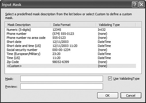
The MaskedTextBox control is another new addition with the 2005 set of controls. This TextBox allows the programmer to define a mask that indicates the allowed input. When a user starts typing in a masked text box, the input will simply be rejected if it doesn’t match the mask. This means that developers can use the MaskedTextBox to allow only numeric data or only phone numbers that match a specified format.
When you set the Mask property of the MaskedTextBox control, you will see the Input Mask dialog shown in Figure 35.2. This dialog lets you select from a number of useful pre-created masks (such as phone number, e-mail address, and so on), or you can pick the <Custom> mask and define your own pattern using mask rules.
The MonthCalendar Control
The MonthCalendar control is essentially like a DateTimePicker except that there is no text-entry portion. The calendar is always visible and users can use the controls on the calendar to navigate forward and backward in time. Today’s date is highlighted just as it is with the DateTimePicker control.
Figure 35.2 The Input Mask dialog for a MaskedTextBox control.
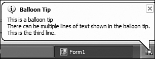
The NotifyIcon Control
The NotifyIcon control is extremely powerful and has even received a bit of a boost in Windows Forms 2.0. This component, when you drag it onto your form, allows you to display an icon in the Windows system tray where you typically see icons for your virus scanner, instant message system, and any other background applications you might be running.
You can set the Icon property of the control at design time or programmatically at runtime to have the icon change depending on the state of your application. You can even create a timer to swap the icon every few milliseconds to create a blinking or flashing icon.
Something new with 2.0 is the ability to work with the Windows XP notification balloons. These balloons should be familiar to anyone who uses Windows XP—Windows Update displays them when updates are ready to download. Using the ShowBalloonTip method, you can quickly create a compelling notification from the system tray like the one shown in Figure 35.3.
Figure 35.3 Using balloon tips with the NotifyIcon component.
The NumericUpDown Control
The NumericUpDown is a simple text control that allows users to enter a number or use a combination of up and down arrows to increase and decrease the number. You can set the amount that is incremented by the arrows using the Increment property and you can set the current number using the Value property. When users need to enter numeric data into a text box, this control is often more appropriate than a standard TextBox control or even a MaskedTextBox control.
The PictureBox Control
The PictureBox control is responsible for displaying an image. Wherever you place the control you can have an image displayed. This image can be set dynamically at runtime or it can be loaded from any number of file formats such as bitmap, JPG, PNG, and so on. The developer has control over the alignment, scale/stretch, position, and much more. Images can even be loaded at design time from project resources using just the designer— this task used to require additional coding in previous versions of Windows Forms.
The ProgressBar Control
The ProgressBar is a fairly simple control that graphically displays progress. After you set the Maximum, Minimum, and Value properties, the progress bar will graphically display the percentage of completion. Progress bars are used primarily to provide the user with a graphical indication that something is taking place in the background and could potentially be a long-running task. The new 2.0 ProgressBar uses the familiar Windows XP-style progress bar. As each new item appears within the bar, it animates itself into the bar by spreading out vertically. You can see this if you increase the MarqueeAnimationSpeed property and then slowly change the Value property of the ProgressBar.
The RadioButton Control
A RadioButton is a control that works in a way that is similar to a CheckBox. Radio buttons are small circles that have a dot in them if they are selected and are hollow otherwise. Radio buttons are typically used in groups to allow a user to select only one option from a list of options.
The TextBox Control
The TextBox control is a simple input control that allows users to enter free-form text in either single or multiline input modes. As with all stock .NET controls, the TextBox control supports Unicode input, so users typing in languages that have more than 255 characters, such as Chinese or Hindi, will be able to use all of the .NET controls without the developer having to do any additional work.
The RichTextBox Control
The RichTextBox control works in a way that is very similar to the TextBox control, but allows the text to have additional properties such as varying fonts, colors, sizes, and styles such as bold, italic, or underlined. The RichTextBox control is often underestimated. It is actually a small word processor bundled into a single control. In addition to standard formatting, this control also supports bulleted lists and other more advanced word processing features. You can also save and load the contents of a RichTextBox control. The only real work the developer needs to do is provide the interface that changes the properties of the selection. This is the same method Microsoft Word uses to change text attributes. The RichTextBox control has properties such as SelectionFont and SelectionColor to change the current font and color properties. When you examine the Text property of the control, you will get the raw text without the formatting.
The ToolTip Control
The ToolTip control is a powerful new addition to the set of controls available in Windows Forms. The ToolTip control is one of the “provider” types of components. When you place it on a form, you are defining a template for how tooltips should be displayed, not the tooltip itself. When the ToolTip is on the form, all other controls on that form will gain an additional property that looks like ToolTip on ToolTip1. Using the ToolTip control, you can specify the animation speed of the pop-up tip, you can specify the icon that will be displayed, and you can even customize the foreground and background colors used to display the tooltip. These tooltips are much better looking than the ones that were possible using previous versions of Windows Forms. A tooltip with an icon is displayed in Figure 35.4.
Figure 35.4 The ToolTip control in action.
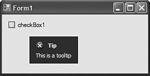
You can also set tooltips programmatically using the following syntax:
toolTip1.SetToolTip(checkBox1, "This is the tool tip for check box 1");
The TreeView Control
The TreeView control is a control that is designed to display a hierarchical list of items. There are top-level (referred to as root) nodes and each node can have its own list of child nodes, and so on. TreeViews are exceptionally well suited for allowing browsing and navigating through large amounts of data if that data is hierarchical in nature. The ability to expand and collapse nodes allows the user to see only the information important to them at the time. You can bind the nodes of a TreeView at runtime to a data source, you can edit the nodes at design time, and you can manually modify the nodes at runtime by accessing the TreeView’s Nodes property. You also have control over where lines are drawn on the tree, which icons appear next to nodes, and much more. You can even have check boxes appear next to each node, giving you a Boolean value that you can use to allow the user to select multiple nodes within the control.
The WebBrowser Control
The WebBrowser is a new control that allows your application to open local or remote web pages in a powerful and easy-to-use control. The control supports clicking hyperlinks to open other pages, and will even display Flash animations if you have the Flash player installed. All you need to do is set the Url property and the control does the rest of the work for you. It is an extremely powerful control and not only allows your application to view remote websites, but can be used to further blur the line between Windows Forms and Web Forms applications by rendering dynamically generated HTML directly within a Windows Form.
Containers
Containers are used to create extremely powerful and visually appealing user interfaces. A container, as its name implies, is a container for other controls. Each container has a unique purpose and it handles its child controls in a very different way. This section provides you with an overview of the containers available in Visual Studio 2005, what they do, and how you can use them in your applications.
The FlowLayoutPanel Control
The FlowLayoutPanel and the TableLayoutPanel are quite possibly two of the most powerful controls to be added to Windows Forms in version 2.0. When working with HTML and ASP.NET, you create markup elements that contain yet more markup elements. These elements are then rendered to the user according to the options specified by the markup. This compositional style of rendering allows HTML designers to create extremely fluid user interfaces that can display a variety of data to the user in ways that you could never really accomplish using Windows... until now.
When you add ASP.NET controls to a form, those controls (assuming the page is in Flow Layout mode) “flow” one after the other to the user. If there are more controls than there is room horizontally in the container, those controls can then automatically wrap.
Using the FlowLayoutPanel in Windows Forms, you can simply add controls to the panel and it will deal with adjusting the relative positions of all child controls. You can specify the flow direction using the FlowDirection property and can control the automatic wrapping feature using the WrapContents property. The control can even be configured to expand itself dynamically as more controls are added to it. Another extremely handy feature is that you can specify a BackgroundImage for the control and the layout of that image. If you have ever needed to dynamically add controls to a form and found the task of manually computing the X and Y coordinates of each new control to be tedious and time-consuming, the FlowLayoutPanel will probably be your favorite new control. You can experiment with this control at design time by randomly dragging controls into it and modifying the flow direction, wrap, and autosize settings to see how they affect the relative positions of the child controls.
The GroupBox Control
The GroupBox provides a container for child controls. It has a caption or title. This box can have varying types of borders, background colors, background images, and more to create a very appealing UI element. It is often used to group related controls on a single form, such as a list of radio buttons, related check boxes, and so on.
The Panel Control
The Panel is the basic container. Although containers provide things like background colors and borders, one of their most important uses is to play host to docking controls. When you dock a control, it “sticks” to the border of its parent container. If the parent container is a fixed-size panel, you have a lot of control over the appearance and functionality of the docked control.
The SplitContainer Control
The SplitContainer replaces the splitter found in previous versions of Windows Forms. This container control contains two separate panels. The user can drag the middle bar (referred to as the split) to size each of the panels. You can even change the Orientation property so that the SplitContainer will split a region vertically or horizontally. Probably the most recognizable use of splitters in an application is in Microsoft Outlook. In Outlook, the tree containing things like your Inbox, Outbox, Sent Items, and so on is separated from the panel in which your messages are displayed, using a splitter control.
The TabControl Control
The TabControl is a control that makes it easy to segment large or complex user interfaces into something more manageable. If you place controls in “tabs,” the user can switch between tabs and enter information. Tabs are often used for spitting a user interface into multiple categories. You can access individual tab pages programmatically using the TabPages property. The designer allows you to change the active tab and then you can simply drag controls from the Toolbox into each page.
The TableLayoutPanel Control
The TableLayoutPanel works in a way very similar to the FlowLayoutPanel. The difference is in how child controls are handled. Instead of flowing controls either vertically or horizontally, controls in a TableLayoutPanel reside in specific table cells. You can define the rows and columns and even use HTML-like column span and row spans to create complex table structures. When you add controls to the TableLayoutPanel, you can drag them into specific cells. At runtime, you can set the cell in which a control resides by using the following syntax:
tableLayoutPanel1.SetCellPosition(label1,
new TableLayoutPanelCellPosition(col, row));
Using code like this, you can dynamically size a TableLayoutPanel at runtime as well as dynamically add and maneuver controls within the layout panel.
Menus and Toolbars
The “Menus and Toolbars” category in the Toolbox contains controls that are responsible for providing pop-up contextual menus, main form-wide menus, strips that contain buttons and other interactive content, and the status bar strip. This section provides you with an overview of the controls in this category.
The ContextMenuStrip Control
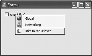
The ContextMenuStrip control is a menu strip that appears when the user right-clicks on a control to bring up a list of options that relate to the context at hand. For example, when a user right-clicks the name of a contact in a contact list, a context menu could appear providing options relating specifically to that contact. Figure 35.5 shows a ContextMenuStrip in action. As you can see from this figure, the menus in Windows Forms 2.0 are all upgraded from previous versions, and adding iconic treatment to the menus is now only a few clicks away.
Figure 35.5 The ContextMenuStrip control.
The MenuStrip Control
The MenuStrip control is very much like the ContextMenuStrip. Menus created using this control are used to provide a menu that is typically docked on the top of a form.
The StatusStrip Control
The StatusStrip control allows you to display a wide variety of content that is docked to the bottom of a form. This area is usually used to display status messages to keep the user informed about tasks that may be going on in the background or the task most recently performed. You can also use this area to display the current time, currently logged-in user, status icons, and more.
The ToolStrip Control
The ToolStrip is a strip that contains interactive content such as buttons, dividers, text, icons, and so on. These ToolStrips function exactly the same way the toolbars in Microsoft Office function. In fact, the look and feel is almost the same as that of Microsoft Office. The ToolStrip provides more enhanced functionality and a much more professional look than the toolbar controls provided in previous versions of Windows Forms.
The ToolStripContainer Control
The ToolStripContainer provides a way of storing ToolStrips such that they can be moved around and dragged along the top, left, right, and bottom of the container. You can dynamically add and remove ToolStrips from a container at runtime, giving you a lot of the functionality that required significant development time in the past at your fingertips for free. Again, the ToolStripContainer can add a lot of power to an application and a lot of functionality that resembles Microsoft Office.
The Data-Related Controls
As you will see as you learn more about Windows Forms, working with data is one of the most common tasks for any Windows Forms developer. This section walks you through the controls in the Toolbox that are in the “Data” category including what they do and how you use them. You’ll see a lot more of these controls in Chapter 37, “Data Binding with Windows Forms 2.0.”
The DataSet Control
When you drag a DataSet from the Toolbox onto a form, you are prompted for whether you want the DataSet to be based on a typed DataSet or a standard DataSet with no schema. If you select Typed DataSet, you can pick one from the current project or from any referenced assembly. After you select the type of DataSet you want, a new component will appear at the bottom of the designer that can then be used in conjunction with other data controls as an instance of a DataSet or typed DataSet.
The DataGridView Control
As you will see in Chapter 37, the DataGridView is an extremely powerful replacement for the old DataGrid control that came with previous versions of Windows Forms. This new grid is far easier to customize and control and has a lot of powerful new features, including a “virtual” mode that allows for extremely memory-efficient grids that can contain large numbers of records.
The BindingSource Control
The BindingSource control is a kind of “middle man” for data binding. When you have any type of data that can be bound, you can drag a BindingSource onto the form and select that BindingSource control’s DataSource property. The BindingSource control can then be used as the target for any other control’s DataSource property, and all BindingSource instances show up in the browse boxes for locating sources of data in the designer.
The BindingNavigator Control
The BindingNavigator control is a customized ToolStrip that contains buttons and actions appropriate to navigating through a list of data-bound items. It comes with buttons for navigating to the first, last, next, and previous records, as well as buttons for creating new records and deleting the current record. You can respond to events from this control for further customization and you can even add your own additional buttons to the navigator’s ToolStrip.
The ReportViewer Control
The ReportViewer control should not be underestimated. A lot of people leave it out when discussing the new features in Windows Forms 2.0, but it’s one of the controls used most often in the author’s Windows Forms applications in commercial applications. This control has a ServerReport property that allows the developer to point to the location of a report hosted on the web such as a SQL 2005 Reporting Services report, and it has a LocalReport property that allows it to run a report using a .rdlc file that was designed within Visual Studio 2005. Directly in Visual Studio 2005, you can create a report, configure data sources within that report, and then bind the data sources in the report to live runtime data sources programmatically or even at design time. The power of this single control is incredible.
The Components Toolbox Group
Components are controls that can be dragged into the designer and manipulated at design time but have no actual user interface. These components are used for things like performing tasks in the background, setting up timed events, providing error and help text to other controls on a form, and even things like monitoring the file system, searching Active Directory, storing images, and much more. This section walks you through the “Components” category of the Toolbox and illustrates what the components are and how they should be used.
The BackgroundWorker Component
The BackgroundWorker component facilitates multithreaded programming by providing methods that notify the foreground (the main UI) thread when progress has occurred and has been completed. All you really need to do is define the method that will perform the background task and periodically call ReportProgress from within your background thread, and the complexities previously required of Windows Forms multithreaded programming are all handled.
The DirectoryEntry Component
The DirectoryEntry component is used to represent a single information entry within an LDAP directory source such as Active Directory or ADAM (Active Directory Application Mode).
The DirectorySearcher Component
The DirectorySearcher component provides the ability to search through an LDAP directory source for information and return results in the form of DirectoryEntry lists.
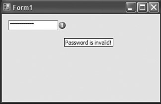
The ErrorProvider Component
As you saw with the ToolTip control, provider-type controls extend existing controls by adding properties to the designer view and allowing you to set those extended properties programmatically at runtime. The ErrorProvider allows your user interface to bring up icons next to input fields that have invalid data in them. You basically tell the provider where the error icon should appear in relation to the control with the error and indicate the error text, as shown in Figure 35.6.
Figure 35.6 The ErrorProvider component in action.
The EventLog Component
The EventLog component provides a componentized wrapper around a specific event log. Using the Log and Source properties, you can indicate which log the component will use and the application name that will be given as the event source. You can use this component to write new entries to the event log or even monitor changes to that event log so that your code can respond when new entries are written to the specified log.
The FileSystemWatcher Component
The FileSystemWatcher is a monitoring component that allows your code to “listen” for specific changes to the file system. For example, you can monitor a directory and respond using an event handler when a new file is added to that directory. Although the FileSystemWatcher is an extremely powerful tool for monitoring disk-level activity, you should not use it when precise timing is required. In order to keep the overhead of this component low, it may not always inform your code immediately when a change occurs. In situations with very high load, it is possible that this component can be several seconds behind the actual activity.
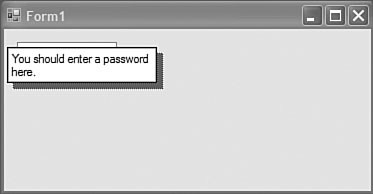
The HelpProvider Component
The HelpProvider control is an extremely useful component that allows you to provide contextual help for individual controls by extending those controls in the same manner as the ToolTip and ErrorProvider controls. With a HelpProvider control present on your form, all controls on the form will have a Help on helpProvider1 (or whatever the name of your help provider is) property that you can use to provide contextual help. You will also see additional properties such as ShowHelp on xx, HelpKeyWord on xx, HelpNavigator on xx, and HelpString on xx where xx is the name of the help provider component. Figure 35.7 shows an example of a simple help provider in action.
Figure 35.7 The HelpProvider component.
The ImageList Component
This component is responsible for storing a list of images. ImageList components are used by other components for supplying a list of images such as the list of icons used in a ListView or a TreeView control. The designer is very easy to use and allows you to browse and preview images contained in the ImageList.
The MessageQueue Component
This component provides an encapsulation around interaction with a specific Microsoft Message Queues (MSMQ) Queue.
The PerformanceCounter Component
This component provides an interface to the Windows Management layer by allowing you access to a performance counter. You can both read existing values from the performance counter or write new ones or even create your own custom counter.
The Process Component
The process component provides access to process-level information and methods concerning a specific process. It is most often used to launch subapplications from within the main application.
The SerialPort Component
The .NET Framework 2.0 is the first version of the framework to have native support for serial communications, making the lives of a lot of developers working with embedded software and hardware developers much happier. This component provides access to a specific serial port, allowing you to read and write data to/from the port as well as respond to port-specific events.
The ServiceController Component
The ServiceController component provides access to a specific Windows Service, allowing you to start and stop that service. You can even control services on other machines provided the infrastructure and security environment supports such actions.
The Timer Component
The Timer component sets up an event that will fire at a specific time interval, allowing your code to execute on that time interval.
Components and Controls for Printing
Windows Forms 2.0 has full support for utilizing the rich printing infrastructure that is part of Windows. This section gives you an overview of the components and controls that belong to the “Printing” category in the designer Toolbox.
The PageSetupDialog Component
The PageSetupDialog is used to present the user with the familiar Page Setup preferences dialog. The results of this dialog are made available as properties on the component after the user confirms his or her selections.
The PrintDialog Component
The PrintDialog component is used to present the user with a dialog that prompts him to select a printer and other printing options such as page orientation, color, and so on.
The PrintDocument Component
The PrintDocument component provides a set of properties and methods that allow developers to send data directly to a printer without having to know the specifics of the printer. This component is used quite often by developers to print lists of data contained on currently displayed forms.
The PrintPreviewControl Component
The PrintPreviewControl is a trimmed-down version of the PrintPreviewDialog. This control displays only a preview of the document that is about to be printed as indicated by the Document property, which is of type PrintDocument.
The PrintPreviewDialog Component
The PrintPreviewDialog component is used to present the user with the full print preview dialog, including confirmation buttons that will print the preview, and so on.
Dialog Components
Windows has many dialogs that are part of the basic operating system. These dialogs prompt the user for extremely common information such as a choice of color, a file folder, a font, and so on. This section provides you with an overview of the stock dialog components available in Windows Forms 2.0. Dialogs are typically used when your application requires some explicit input from the user before it can continue.
The ColorDialog Component
The ColorDialog presents the user with a list of available colors. The user’s color choice is then made available as the Color property. This dialog also allows the user to define custom colors.
The FolderBrowserDialog Component
This dialog presents the user with an interface that prompts the user to select a folder. The browser in this dialog allows the user to navigate throughout all configured partitions just as in the standard file explorer.
The FontDialog Component
This dialog prompts the user to select a font from the list of all installed fonts.
The OpenFileDialog Component
This dialog prompts the user to select a file using a browser interface. The file selected is available through the FileName property or the FileNames property if more than one file was selected.
The SaveFileDialog Component
This dialog prompts the user to select a path and a filename that will be used to save data within the current application.
Summary
This chapter provided a quick tour through all of the controls available in the Windows Forms 2.0 Toolbox. This tour included a description of what each control does and when you would normally use that control in a practical situation. In addition, controls that are new to Windows Forms 2.0 or have been greatly enhanced were highlighted.
This chapter didn’t provide you with much in the way of code samples, but it did give you an idea of the tools that you now have available at your disposal. As you progress through the rest of the Windows Forms section of this book, you will see how the various tools and techniques you encounter can be applied to the controls discussed in this chapter. As an exercise, you might want to come back to this chapter after you learn new techniques and see how those techniques can be applied to the wide variety of controls discussed here.