
Chapter 14 OpenOffice.org Calc (Tables You Can Count On)
A spreadsheet, for those who might be curious, allows an individual to organize data onto a table comprised of rows and columns. The intersection of a row and a column is called a cell, and each cell can be given specific attributes, such as a value or a formula. In the case of a formula, changes in the data of other cells can automatically update the results. This makes a spreadsheet ideal for financial applications. Take a mortgage payment calculation, for example: change the interest rate in the appropriate cell, and the monthly payment changes without you having to do anything else.
The idea of a computerized spreadsheet probably existed before 1978, but it was that year that Daniel Bricklin, a Harvard Business School student, came up with the first real spreadsheet program. He called his program a visible calculator, then later enlisted Bob Frankston of MIT (Bricklin names him as co-creator) to help him develop the program further. This program came to be known as VisiCalc. Some argue that with VisiCalc, the first so-called killer app was born.
Now that we have the definitions and history out of the way, let’s get back to your Linux system and have a look at OpenOffice.org’s very own spreadsheet program. It is called Calc—an appropriate name, given what spreadsheets tend to be used for.
There are a few ways to start a new spreadsheet using OpenOffice.org on your Ubuntu Linux system. If you are already working in OpenOffice.org Writer (as I am right now), you can click File on the menu bar, move your mouse to the New submenu, and select Spreadsheet from the drop-down list. Another way is to click the Applications menu on the top panel, navigate to the Office submenu, and select OpenOffice.org2 Calc. When Calc starts up, you see a blank sheet of cells, as in Figure 14-1.
Directly below the menu bar is the Standard bar. As with Writer, the icons here give you access to the common functions found throughout OpenOffice.org, such as cut, paste, open, save, and so on. Below the Standard bar is the Formatting bar. Some features here are similar to those in Writer, such as font style and size, but others are specific to formatting content in a spreadsheet (percentage, decimal places, frame border, and so on).
Finally, below the Formatting bar, you find the Formula bar. The first field here displays the current cell but you can also enter a cell number to jump to that cell. You can move around from cell to cell by using your cursor keys, using the <Tab> key (and <Shift+Tab>), or simply clicking a particular cell. The current cell you are working on has a bold black outline around it.
Let’s try something simple, shall we? If you haven’t already done so, open a new spreadsheet. In cell A1, type Course Average. Select the text in the field, change the font style or size (by clicking the font selector in the Formatting bar), and then press <Enter>. As you can see, the text is larger than the field. No problem. Place your mouse cursor on the line between the A and B cells (directly below the Formula bar). Click and hold, then stretch the A cell to fit the text. You can do the same for the height of any given row of cells by clicking the line between the row numbers (over to the left) and stretching these to an appropriate size.
Now move to cell A3 and type in a hypothetical number somewhere in the range of 1 to 100 to represent a course mark. Press <Enter> or cursor down to move to the next cell. Enter seven course marks so that cells A3 through A9 are filled. In my example, I entered 95, 67, 100, 89, 84, 79, and 93. (In my opinion, the 67 score is an aberration.)
Now, we are going to enter a formula in cell A11 to provide an average of all seven course scores. In cell A11, enter the following text:
=(A3+A4+A5+A6+A7+A8+A9)/7
When you press <Enter>, the text you entered disappears and instead, you see an average for your course scores (see Figure 14-2).
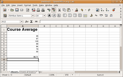
An average of 86.71 isn’t a bad score (it is an A, after all), but if that 67 really was an aberration, you can easily go back to that cell, type in a different number, and press <Enter>. When you do so, the average automagically changes for you.
Calculating an average is a simple enough formula but if I were to add seventy rows instead of seven, the resulting formula could get ugly. The beauty of spreadsheets is that they include formulas to make this whole process somewhat cleaner. For instance, I can specify a range of cells by putting a colon in between the first and last cells (A3:A9) and using a built-in function to return the average of that range. My new, improved, and cleaner formula looks like this:
=AVERAGE (A3:A9)
Incidentally, you can also select the cell and enter the information in the input line on the Formula bar. I mention the Formula bar for a couple of reasons. One is that you can obviously enter the information in the field, as well as in the cell itself.
The second reason has to do with those little icons to the left of the input field. If you click that input field, notice that a little green check mark appears (to accept any changes you make to the formula); and to its left, there is a red X (to cancel the changes). Now look to the icon furthest on the left. If you hold your mouse over it, a tooltip pops up that says Function Wizard. Try it. Go back to cell A11, and then click your mouse into the input field on the Formula bar. Now click the Function Wizard icon (you can also click Insert on the menu bar and select Function).
On the left side, you see a list of functions. Click on a function and a description appears to the right. For the function called AVERAGE, the description is Returns the average of a sample. Because this is what we want, click the Next button at the bottom of the window, after which you see a window much like the one in Figure 14-3. This is where the wizard starts to do its real work.

Look at the Formula window at the bottom of the screen. You’ll see that the formula is starting to be built. At this point, it says =AVERAGE() and nothing else. Near the middle of the screen on the right side are four data fields labeled Number 1 through Number 4. The first field is required, whereas the others are optional. You could enter A3:A9, click Next, and be done. (Notice, while you are here, that the result of the formula is already displayed just above the Formula field.) Alternatively, you could click the button to the right of the number field (the tooltip says Shrink), and the Function Wizard shrinks to a small bar floating above your spreadsheet (see Figure 14-4).
On your spreadsheet, select a group of fields by clicking the first field and dragging the mouse to include all seven fields. When you let go of the mouse, the field range is entered for you. On the left-hand side of the shrunken Function Wizard, there is a maximize button (move your mouse over it to activate the tooltip). Click it, and your wizard returns to its original size. Unless you have an additional set of fields (or you want to create a more complex formula), click OK to complete this operation. The window disappears, and the spreadsheet updates.
Before we move on to something else, you should save your work. Click File on the menu bar and select Save (or Save As). When the Save As window appears (see Figure 14-5), select a folder, type in a filename, and click Save. When you save, you can also specify the File Type to be OpenOffice.org’s default format, OpenDocument, DIF, DBASE, Microsoft Excel, and other formats.

Should you decide to close OpenOffice.org Calc at this point, you can always go back to the document by clicking File on the menu bar and selecting Open.
This time, I’ll show you how you can take the data that you enter into your spreadsheets and transform it into a slick little chart. These charts can be linear, pie, bar, and a number of other choices. They can also be two- or three-dimensional, with various effects applied for that professional look.
To start, create another spreadsheet. We’ll call this one Quarterly Sales Reports. With it, we will track the performance of a hypothetical company (see Figure 14-6).

In cell A1, write the title (Quarterly Sales Reports) and in cell A2, write the description of the data (in thousands of dollars). In cell A4, enter the heading Period; then enter Q1 in cell A6, Q2 in cell A7, Q3 in cell A8, and Q4 in cell A9. Finally, enter some headings for the years. In cell B4, enter 2001, then enter 2002 in cell C4, and continue on through 2005. You should have five years running across row 4, with four quarters listed.
Time to have some virtual fun. For each period, enter a fictitious sales figure (or a real one if you are serious about this). For example, for the data for 2002, Q2 would be entered in cell C7, and for the sales figure for 2004, Q3 would be in cell E8. If you are still with me, finish entering the data, and we’ll do a few things.
Let’s start with a quick and easy total of each column.
If you used the same layout I did, you should have a 2001 column that ends at B9. Click cell B11. Now look at the icon in the middle of the sheet area and the input line on the Formula bar. It looks like the Greek letter Epsilon. Hold your mouse pointer over it, and you see a tooltip that says Sum. Are you excited yet? Click the sum icon, and the formula to sum up the totals of that line, =SUM(B6:B10 ), automatically appears (see Figure 14-6). All you need to do to finalize the totals is click the green check mark that appears next to the input line (or just press <Enter>).
Because a sum calculation is the most common function used, it is kept handy. You can now do the same thing for each of the other yearly columns to get your totals. Click the sum icon, then click your beginning column and drag the mouse to include the cells you want. Click the green check mark, and move on to the next yearly column.
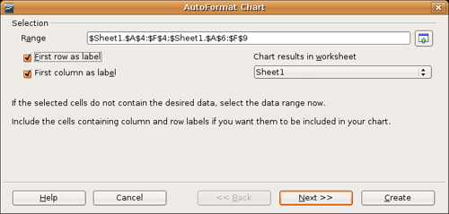
Creating a chart from the data you have just entered is really pretty easy. Start by selecting the cells that represent the information you want to see on your finished chart, including the headings. You can start with one corner of the chart and simply drag your mouse across to select all that you want. Using the spreadsheet we created, select the area that includes cell A4 through to F9. Note that I did not include row 11, the totals line.
![]() Warning If there are some empty cells in your table (in my example, row 5), you need to deselect them. You can do this by holding down the <Ctrl> key and clicking those cells with the mouse.
Warning If there are some empty cells in your table (in my example, row 5), you need to deselect them. You can do this by holding down the <Ctrl> key and clicking those cells with the mouse.
After you have all the cells you want selected, click Insert on the menu bar, and select Chart. This window gives you the opportunity of assigning certain rows and columns as labels (see Figure 14-7). This is perfect because we have the quarter numbers running down the left side and the year labels running across the top. Check these on.
Before you move on, notice the Chart Results in Worksheet drop-down list. By default, Calc creates three tabbed pages for every new worksheet, even though you are working on only one at this time. If you leave things as they are, your chart is embedded into your current page, though you can always move it to different locations. At this point, you have a choice to have the chart appear on a separate page (see those tabs at the bottom of your worksheet). For my example, I’m going to leave the chart on the first page. Make your selection, and then click Next.
![]() Note There is also an Insert Chart icon on the Standard bar. If you click that icon (instead of clicking Insert and then Chart from the menu bar), the software automatically assumes that you want the chart in the worksheet. Furthermore, your cursor changes to a small chart icon. Click a location on the document where you want the chart to appear and the AutoFormat Chart dialog appears.
Note There is also an Insert Chart icon on the Standard bar. If you click that icon (instead of clicking Insert and then Chart from the menu bar), the software automatically assumes that you want the chart in the worksheet. Furthermore, your cursor changes to a small chart icon. Click a location on the document where you want the chart to appear and the AutoFormat Chart dialog appears.
The next window lets you choose from chart types (bar, pie, and so on) and provides a preview window to the left (see Figure 14-8). That way, you can try the various chart options to see what best shows off your data. If you want to see the labels in your preview window, click the check box for Show Text Elements in Preview.

You can continue to click Next for some additional fine-tuning on formatting (the last screen lets you change the title), but this is all the data you need to create your chart. When you are done, click the Create button, and your chart appears on your page (see Figure 14-9).

To lock the chart in place, click anywhere else on the worksheet. You may want to change the chart’s title, as well; double-click the chart, then click the title to make your changes. I’m going to call mine Sales Over 5 Years. If the chart is in the wrong place, click it, then drag it to where you want it to be. If it is too big, grab one of the corners and resize it.
What’s cool about this chart is that it is dynamically linked to the data on the page. Change the data in a cell, press <Enter>, and the chart automatically updates!
If you select (highlight) the title text in cell A1 and click the Center icon (the one for centering text), the text position doesn’t change. That’s because A1 is already filled to capacity, and the text is already centered. To get the effect you want, click cell A1, hold the mouse button down, and drag to select all the cells up to F1. Now click Format on the menu bar and select Merge Cells. All six cells merge into one, after which you can select the text and center it.
For more extensive formatting of cells, including borders, color, and so on, right-click the cell, and select Format. (Try this with your title cell.) A Cell Attribute window appears, from which you can add a variety of formatting effects (see Figure 14-10).

When you are through with your worksheet, it is time to print. Click File on the menu bar and select Print. Select your printer, click OK, and you have a product to impress even the most jaded bean counter. While you are busy impressing people, keep in mind that you can also export this spreadsheet to PDF with a single click, just as you did with Writer in the last chapter.
Because OpenOffice.org is such an obvious and excellent replacement for Microsoft Office (including Word, Excel, and PowerPoint), it’s easy to forget that there are other alternatives. One of the great things I keep coming back to when I talk and write about Linux is the fact that we do have alternatives, some costing no more than the time it takes to download and install them via Synaptic.
When it comes to spreadsheet programs, it’s time to fire up Synaptic and do a search using the word spreadsheet or one of the following programs. The primary candidates are Gnumeric and KSpread.
Both Gnumeric and KSpread are certainly worth a look, but I’ve found Gnumeric to be particularly good when it comes to working with Excel spreadsheets.
Gnumeric
http://www.gnome.org/projects/gnumeric/
KSpread
http://www.koffice.org/kspread/
OpenOffice.org’s Calc