Chapter 17 Digital Art with the GIMP
Oddly enough, Linux applications that allow users to work with graphics are among some of the most highly developed in the world. To see the truth in this rather bold statement, turn your eyes to Hollywood. Blockbusters such as Titanic, Star Trek: Nemesis, Shrek, and others use Linux and Linux clusters to create the complex special effects.
In terms of graphical design and photo editing, your Linux system comes with one of the most powerful, flexible, and easy-to-use packages there is, regardless of what OS you are running. It’s called the GIMP. Allow me to introduce you to some of its many features.
The GIMP is one of those programs that has helped create an identity for Linux. Of course, there are plenty of programs out there, as I’m sure I have demonstrated in the book, but the GIMP is special in some ways. The Linux community has used it to create images, buttons, desktop themes, window decorations, and more. Even the Linux mascot, Tux the Penguin, as created by Larry Ewing (the mascot’s best-known incarnation), was a product of the GIMP.
The GIMP is an amazingly powerful piece of software, yet its basic functions are easy-to-use as well. With a little bit of work, a lot of fun, and a hint of experimentation, anyone can use the GIMP to turn out a fantastic piece of professional quality art. You doubt my words? Then follow along with me, and in just a few minutes, you’ll create a slick-looking logo for your Web page or your desktop. With time and practice, you may learn to wield the GIMP with the power of a Hollywood special effects master.
Play. Experiment. And don’t be afraid.
Click the Application menu on the top panel and select GIMP Image Editor from the Graphics submenu. You can also use your program quick-start by pressing <Alt+F2> and entering gimp into the command field.
When you run the GIMP for the first time, you will get a couple panels, aside from the GIMP’s main screen. You will also likely get the GIMP Tip of the Day. As with all such tips, you can elect not to have them appear each time the program starts—just uncheck the Show Tip Next Time GIMP Starts button before you hit Close, and you aren’t bothered with them again. What you are likely to see (minus that tip of the day) should look a bit like Figure 17-1.

The long window on the right is split into two main areas. At the top is the Layers, Channels, Paths dialog. The dialog below has three tabs, one for brushes, another for patterns, and another for gradients. If you choose to close this window, there is no harm done; you end up calling up dialogs as you need them. We’ll visit this again when I cover brushes later on.
The most important of those windows is the GIMP toolbox. That’s the window to the left in Figure 17-1. The toolbox itself is the top half of the window (see the closeup in Figure 17-2). The bottom half of the window represents the options available to the currently selected tool. If you are using the text tool, you have a choice of fonts, styles, and sizes at your disposal.

Along the top, directly below the title bar, is a familiar looking menu bar labeled File, Xtns, and Help. Clicking these shows you additional submenus. Below the menu bar is a grid of icons, each with an image representing one of the GIMP’s tools. Incidentally, my GIMP toolbox is arranged with six tools per row, but it could just as easily be five—just drag the side of the main toolbox window to increase or decrease the number of tools per row. I will cover all of these things shortly, but first let’s take the GIMP out for a spin.
![]() Note The GIMP Help files are not installed on your Ubuntu system, but you can use Synaptic to search for and install them. Search using the term
Note The GIMP Help files are not installed on your Ubuntu system, but you can use Synaptic to search for and install them. Search using the term gimp-help and you will find the manual in several different languages. You don’t actually need to install the help files, however, because the GIMP lets you search the help files online using Firefox.
You may also want to search for grokking-the-gimp in Synaptic. This is a book by Carey Bunks, and it is distributed in HTML format.
The nitty-gritty can wait. I think we should do something fun with the GIMP right now. I’m going to show you how to create a very cool looking corporate or personal logo with just a few keystrokes. If you don’t have the GIMP open yet, start the program now. From the main toolbox menu bar, select Xtns, scroll down to Script-Fu, and another menu cascades from it.
![]() Quick Tip Notice that the menus have a dashed line at the top. These are menu tear-offs. By clicking the dashed line, you can detach the menu and put it somewhere on your desktop for convenient access to functions you use all the time. In fact, all the menus, including submenus, can be detached.
Quick Tip Notice that the menus have a dashed line at the top. These are menu tear-offs. By clicking the dashed line, you can detach the menu and put it somewhere on your desktop for convenient access to functions you use all the time. In fact, all the menus, including submenus, can be detached.
From the Script-Fu menu, move your mouse to Logos. You should see a whole list of logo types, from 3D Outline to Cool Metal to Starscape and more. For this exercise, choose Cool Metal.
Every logo has different settings, so the one you see in Figure 17-3 is specific to Cool Metal. Particle Trace has a completely different set of parameters. To create your Cool Metal logo, start by changing the Text field to something other than the logo style’s name. I’ll change mine to read Ubuntu Rocks! The font size is set to 100 pixels, and we can leave it at that for now.
In many of these, a default font has been selected for you. You can override the current choice (written on the button itself) and pick something else by clicking the Font button. The Font Selection window shows you the various fonts available on your system and lets you try different font types, styles, and sizes. A preview window gives you an idea of what the font looks like (see Figure 17-4).
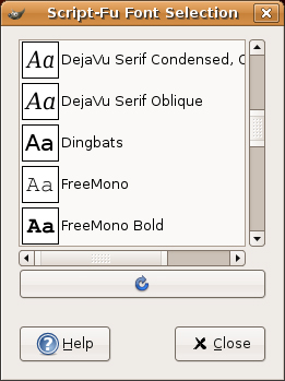
To create my logo, I’m going to choose a font on my system called Kalimati (not sure why, but suddenly I have a taste for Greek salad). You may choose whatever you like. When you have decided on a font, click Close. Then click OK, this time in the Script-Fu:Logos/Cool Metal window. The result should be something similar to my own logo in Figure 17-5.

If you don’t like the results, close the image by clicking the Close button in the corner (usually an X unless you have changed your desktop theme or style). A warning box pops up, telling you that changes have been made and you might want to save your work (more on that in a moment). Your options are Save, Don’t Save, and Cancel. Click Don’t Save and it goes away. Then start over with another logo. You might try changing the background color or the gradient this time. You might even want to try a different type of logo altogether.
It is time to preserve your masterpiece. It’s also a good time to have another look at the image window—in this case, your logo. Every image created in the GIMP has a menu bar across the top labeled File, Edit, Select, View, and so on. These menus can also be called up by right-clicking anywhere on the image. To save your work, click the File menu, and then select Save As. The Save Image dialog appears (see Figure 17-6).
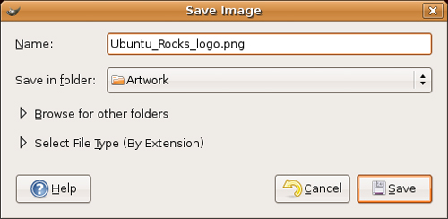
Notice the small arrow beside the words Select File Type (By Extension). If you already know that you want to save your image as a .jpg or a .tif file (or any number of formats), you can simply add it to the filename. The GIMP can figure it out for you. If you prefer to see a list of available formats, click the arrow and the Save Image dialog changes to display the various formats supported by the GIMP. There’s also an arrow beside the Browse for Other Folders label. By default, the GIMP uses the current folder to save your work. To choose another directory, click the arrow and a more comprehensive navigation dialog appears (see Figure 17-7).

When you have entered your filename and selected a file type, click Save, and you are done. Opening a file is similar. From the GIMP toolbox menu bar, select Open (or use the <Ctrl+O> shortcut) to bring up the Load Image dialog. The difference between this and the Save Image dialog is that when you click on a filename, you can also click Generate Preview to display a small thumbnail preview in the Open Image dialog.
You’ve created a masterpiece. You are infinitely proud of it, and you want to share it with your friends, who, alas, are not connected to the Internet. It’s time to print your image and send it to them the old-fashioned, snail-mail way.
Okay, perhaps you aren’t feeling quite that sharing, but there are times when you want to print the results of your work. Simply click File on the image menu bar, and select Print (again, you can right-click your image if you prefer). A printing dialog appears (see Figure 17-8), from which you can specify a number of print options including, of course, which printer you would like to use.

![]() Quick GIKP Trick Want to take a screenshot and open it up to edit in the GIMP? It’s easy. Click File on the GIMP toolbox menu bar, move to Acquire, and click Screen Shot. The image size is the same as your screen (for example, 1024x768). Because the GIMP is in the screen shot you take, you may want to minimize it before capturing the image. To make that possible, select an appropriate time delay (for example, five seconds) from the Screen Shot dialog that appears. Minimize the windows you don’t want to see, and then wait. After the capture completes, a GIMP image window appears where you can make your modifications.
Quick GIKP Trick Want to take a screenshot and open it up to edit in the GIMP? It’s easy. Click File on the GIMP toolbox menu bar, move to Acquire, and click Screen Shot. The image size is the same as your screen (for example, 1024x768). Because the GIMP is in the screen shot you take, you may want to minimize it before capturing the image. To make that possible, select an appropriate time delay (for example, five seconds) from the Screen Shot dialog that appears. Minimize the windows you don’t want to see, and then wait. After the capture completes, a GIMP image window appears where you can make your modifications.
The Acquire function doesn’t limit you to the whole screen. When the Screen Shot dialog appears, you have the option of capturing the entire screen or a single window. Just click the appropriate radio button. The window capture includes the borders for that window and all its decorations.
Now that we’ve had some fun and created some true art, it’s time to find out what all those icons in the GIMP toolbox do. Before we do this, however, we should look at those two boxes at the bottom of the toolbox, because what they offer affects what the icons do.
The block on the right is the color menu (see Figure 17-9). It gives you quick and easy access to foreground and background colors. The black and white squares on the left can be changed to other colors by double-clicking one or the other. If you click the arrow between the two, you switch between foreground and background colors.

The box to the right is a quick dialog menu and consists of three different tools: a brush selector, a pattern selector, and a gradient selector. Click any of them to bring up the list of choices each provides. Figure 17-10 shows the Brushes dialog. You may recall that there was a layers and channels dialog in addition to the main GIMP toolbox. At the bottom of that window was the Brushes dialog (as well as gradients and patterns). If you left that window open, the brushes selection will still be there.

If you select a different gradient, pattern, or brush from the resulting menus, you see them change on the dialog menu at the bottom of the GIMP toolbox, as well. This gives you a quick visual feedback on what brush, pattern, or gradient is active at the moment.
In the next few pages, I’m going to cover the GIMP’s tools one by one, a row at a time. Each row has six tools, except for the last, which has five. I mention this because this is the default layout. If you decide to resize the GIMP toolbox by dragging one of the sides out, the toolbox widens but the number of tools per row increases as well, so you could have seven tools if you want. The reverse is true should you decide to shrink the width of the GIMP toolbox.
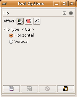
Start by moving your mouse over the various icons, pausing over each one. Tooltips appear, telling you what tool each of the icons represents. (I’ll go over these in a moment.) If you click any of these icons, the window below the toolbox changes to present you with that tool’s options. For instance, Figure 17-11 shows the tool options for the flip tool.
What are all those icons for? An excellent question. Let’s look at them again, one row at a time, starting with—you guessed it—the first row (see Figure 17-12).
The first icon, represented by a dotted rectangle, lets you select a rectangular area. Just hold down the left mouse button at whatever point you choose for a starting corner, and drag it across your image. A dotted line indicates the area you’ve selected. If you hold down the <Shift> key at the same time as the left mouse button, your selections are always perfect squares.
The dotted circle icon next to the dotted rectangle is much the same except that it selects a circular or elliptical area. Similar to the rectangular area you selected, you can hold down the <Shift> key along with the left mouse button to select only perfect circles.
Next, we have the lasso tool. This is another selection tool, but this one lets you select irregular or hand-drawn regions. Hold down the left mouse button and draw your selection around the object.
![]() Quick Tip When you have selected an area on an image, you can right-click, move your mouse cursor over the Edit menu, and select Cut or Copy. You can then Paste your selection back to another part of the image.
Quick Tip When you have selected an area on an image, you can right-click, move your mouse cursor over the Edit menu, and select Cut or Copy. You can then Paste your selection back to another part of the image.
Next comes the magic wand. This is a strange tool at first glance. It selects an area by analyzing the colored pixels wherever you click. Holding down the <Shift> key lets you select multiple areas. This is a very useful tool but also a little tricky. Double-click the icon to change the sensitivity.
Next, it’s over to the color selection tool. Using the color selector feels a bit like the magic wand but the functionality is based on color rather than a single area at a time. Select the color picker, click any colored area, and all areas matching this color are selected.
Finally, we wrap up this row with another selection tool, the so-called intelligentscissors. You select an area by clicking around it. This tool follows curved lines around an object. It does so by concentrating on areas of similar contrast or color. Simply click around the perimeter of the area you want to select and watch the lines magically draw themselves. When you join the last dot, click inside the area to select it.
That wraps it up for the first row of tools. It’s time to look at the next set (see Figure 17-13).
The first icon in this row is the Bezier tool (also known as the path tool), which takes some getting used to. After you get used to it, however, you’ll be impressed with the flexibility it affords you in selecting both straight and curved areas. Click a point outside the area you want to select, and it creates an anchor point. Click again a little further along your outline, and you get new anchor points with a straight line connecting to the original. Click and drag an existing anchor point, and a bar appears with control boxes on either end. You can then grab those control points and drag or rotate them to modify the straight line between the points. After you have joined the final point, look at your tool options (the pane below the GIMP toolbox) and click the button labeled Create Selection from Path. You see an animated dotted line, as with the other selection tools.
The second icon looks like an eyedropper. This is the color picker. Choosing an exact color can be difficult (if you need to get the tone just right), but if the color you want is on your existing image, click that spot, and you’ve got it (your default active color changes).
The magnifying glass does exactly what you expect it to. Click an area of the screen to zoom in. Double-click the icon to reverse the zoom. This doesn’t actually scale the image; it just changes your view of things. Zoom is used to make it easier to work on a small area of the image.
Next in line: the calipers, or measuring tool. This doesn’t actually change anything on your image. It simple provides information. Click a starting point on the image, then drag the mouse pointer to another part of the image. Now look at the bottom of your image window. You see the distance in pixels from your starting location to where you let go of the mouse pointer. The angle of the line is also displayed.
The fifth icon on the second row looks like a cross with arrows pointing in all directions. This is the move tool. It is really quite simple. Click the tool, grab the selected area on the screen, and move it to where you want. If you haven’t selected an area, you can move the entire image in the window.
The knife icon is the crop tool. If you start working with digital photography in a big way, this is one you will want to know. I use the crop tool all the time when I am trying to get a small part of a larger image. It is what I used to separate the rows of icons from the GIMP toolbox image I captured earlier (refer to Figure 17-2). Click a part of the screen, and drag it to encompass the area you want to select. The space around your selection darkens (see Figure 17-14).
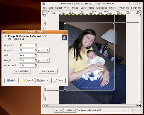
Click the Crop button when you are satisfied with your selection. You can also fine-tune the settings (X and Y position, and so on) at this time.
And just like that, it’s time to look at row three (see Figure 17-15).
On the left, in the first position, we have the rotate tool. Click an image (or a selection), and small square handles appear at the corners of your selection. Grab one of these handles (or points), drag the mouse, and the selection rotates. When you have it in a position you like, click Rotate on the pop-up window that appears. The image locks into place.
The second icon, the scale tool, is very similar to the rotate tool. Instead of rotating the selected area, you drag the points to resize the selected area. As previously, a pop-up window appears so that you can lock your changes. It’s also the place to manually enter your changes if dragging the mouse doesn’t offer the control you like.
The shear tool is the third on this row and once again, it acts on a previously selected area. This one looks a lot like the last two in terms of functionality, but the effect is more like taking two sides of an object and stretching it diagonally in opposite directions. A square becomes a parallelogram, which gets longer and thinner as you continue to stretch the image. When you’re happy with the changes, click the Shear button on the pop-up .
In the fourth position, we have the perspective tool. This is one of those that you almost have to try out to understand, but let me try to describe it. Remember your grade school art classes when you first learned about perspective? A road leading off into the distance compresses to a single point in the distance. With the perspective tool, you can take a selected area and pull the points in whatever direction you want to create the perspective effect. Do that with a person’s head and the top of his head becomes a sharp little point. As with the last three tools, there’s a pop-up where you lock in your changes. Just click Transform.
Next in line is the flip tool. By default, it flips the image horizontally. The tool option, in the lower half of the GIMP toolbox, has a check box if you want to flip vertically instead.
![]() Tip Remember that if you close the tool options below the GIMP toolbox, you can always double-click a tool to bring up its options dialog.
Tip Remember that if you close the tool options below the GIMP toolbox, you can always double-click a tool to bring up its options dialog.
The next icon is the text tool—that’s what the big T signifies. Click your image, and the GIMP Text Editor appears. This is where you enter your text. In your tools option is the font selector; the same one that you used for your logo appears. Select a font style, size, and color, and the changes are visible in the image. This makes it easy to change the look and feel on-the-fly, type your text in the preview section, and click OK. Where the text appears on the screen, the move tool is activated, allowing you to place the text accurately. The color of the text is your current foreground color.
The fourth row is next (see Figure 17-16).
The paint can represents the fill tool. It can fill a selected area not only with a chosen color but with a pattern, as well. To choose between color and pattern fill, double-click the icon to bring up its menu.
The second item on this line is the gradient fill tool. Start by selecting an area on your image, and then switch to this tool. Now click a spot inside your selected area and drag with the tool. The current gradient style fills that area. This is one of those tools that you have to use to understand.
![]() Tip Would you like a blank canvas right about now? Click File on the GIMP toolbox menu bar and select New. Those who like using the keyboard can just press <Ctrl+N>.
Tip Would you like a blank canvas right about now? Click File on the GIMP toolbox menu bar and select New. Those who like using the keyboard can just press <Ctrl+N>.
The third icon of this group looks like a pencil. In fact, this and the next three buttons all work with a brush selection (the bottom-right box). This pencil, as with a real pencil, is used to draw lines with sharply defined edges. Try drawing on your image with the different types to get an idea of what each brush type offers.
The next tool icon is the paintbrush. The difference between it and the pencil is that the brush has softer, less starkly defined edges to the strokes. Double-click the icon to bring up the paintbrush’s menu and try both the Fade Out and Gradient options for something different.
If the next icon looks like an eraser, that’s no accident. The shape of the eraser is also controlled by the current brush type, size, and style. Here’s something kind of fun to try. Double-click the icon to bring up its menu, and then change the Opacity to something like 50 percent. Then start erasing again.
Now it’s on to the airbrush tool. Just like a real airbrush, you can change the pressure to achieve different results. Hold it down longer in one spot, and you get a darker application of color.
Next is the fifth and final row of icons (see Figure 17-17).
The first tool on this line is another drawing tool, the pen, or ink tool. Double-clicking the icon brings up a menu that lets you select the tip style and shape, as well as the virtual tilt of the pen. The idea is to mimic the effect of writing with a fountain pen.
Next to the pen is the clone tool (the icon looks a bit like a rubber stamp). Sheep? No problem! We can even clone humans. Okay, that’s a bit over the top. Where the clone tool comes in handy is during touch-ups of photographs. Open an image, hold down the <Ctrl> key, and press the left mouse button over a portion of the image—the tool changes to a crosshair. Let go of both the mouse button and the <Ctrl> key. This is your starting area for cloning. Now move to another part of the screen, click, and start moving your mouse button (the shape of the area uncovered is controlled by the brush type). As you paint at this new location, notice that you are recreating that portion of the image you indicated with the <Ctrl+mouse-click> combination. Start with someone’s head or body, and you can have twins on the screen.
The droplet you see in the third position represents the convolver tool. Use it to blur or sharpen parts of an image. You switch between the two operations by selecting the mode in the tool options below the toolbox, or by double-clicking the icon. Change the rate to make the effect more pronounced.
![]() Quick GIMp Trick When you need to zoom in on an image to get some fine work done, press the plus sign on your keyboard. Keep in mind, though: If you zoom in enough, it can get difficult to navigate the larger image. You wind up trying to adjust the scrollbars to locate the area you want. Instead, click the little crosshair icon in the bottom right side of the image editor window. A smaller version of your image window appears with a target area outline that you can move to where you want it.
Quick GIMp Trick When you need to zoom in on an image to get some fine work done, press the plus sign on your keyboard. Keep in mind, though: If you zoom in enough, it can get difficult to navigate the larger image. You wind up trying to adjust the scrollbars to locate the area you want. Instead, click the little crosshair icon in the bottom right side of the image editor window. A smaller version of your image window appears with a target area outline that you can move to where you want it.
On to the finger, or the smudge tool.... Pretend that you are painting. You press your finger on the wet paint and move it around. The smudge tool has exactly the same effect on your virtual canvas or, at the very least, a similar effect.
Finally, the dodge and burn tool looks like a stick-pin, but those who have worked in a darkroom might recognize it for something different—a stick with an opaque circle on the end of it. It is used to adjust the brightness or shade of various parts of an image (a photograph might have been partly overexposed).
I’ve mentioned the idea of touching up photographs. The GIMP is a wonderful tool for this and more than just a little fun. One of the most common functions I use is changing the light levels on photographs, automagically and instantly. After all, light levels are rarely perfect unless you are a professional photographer and paying attention to every shot. Here’s what I do.
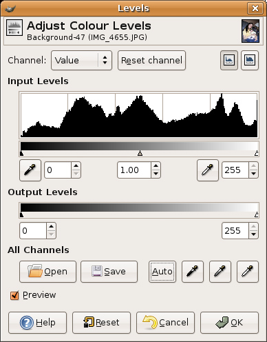
Click Image on the Layers menu bar (or right-click the image to bring up the menu), move to the Colors submenu, then select Levels. You should see a window like the one in Figure 17-18. Notice the Auto button? That’s where the magic is. I’ve found that more often than not, you can get a nice, dependable reset of levels just by clicking this one button.
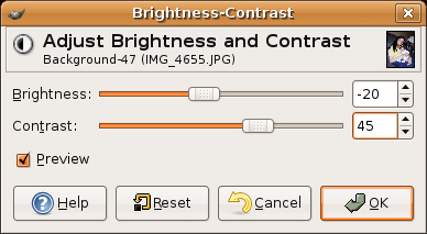
Another very common adjustment you make to your photos, particularly scanned images, is contrast and brightness. You find this dialog in much the same place as Levels (above). Click Layers on the menu bar, then Colors, and finally Brightness-Contrast. To change one or the other, just pull the appropriate slider to the left or right (see Figure 17-19).
There are also those things that are just plain fun to do. For instance, open an image in the GIMP, perhaps one you scanned in earlier. If you don’t have something handy, grab an image from a Web site. This is just something to play with. Now choose Filters from the image menu bar. A submenu opens with even more options. You might want to detach this menu—you’ll certainly want to play with what is there.
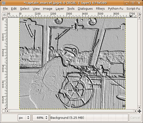
Try FlareFX under the Light Effects menu. If you’ve ever taken a flash picture through a window, you recognize this effect. Then try Emboss under the Distorts submenu. The effect is that of a metal-embossed picture (see Figure 17-20).
Take some time to try the various filter options. When you are finished, right-click a fresh image and select the Script-Fu menu. There are other interesting effects available here, such as Clothify under the Alchemy submenu. Your image look as though it had been transferred to a piece of cloth.
Although it sounds like a strange form of martial arts, Script-Fu is in fact a scripting language that is part of the GIMP. With it, you can create scripts that automate a number of repetitive tasks to create desirable effects. When you created your logo, you might have noticed that a number of things were happening as it was being created. Try another logo and watch carefully what is happening. These steps are part of a Script-Fu script.
The GIMP comes with a number of Script-Fu scripts, and these are used for much more than just creating logos. Click Xtns on the GIMP toolbox, and scroll down to the Script-Fu menu. In addition to logos, you see options for creating buttons (for Web pages), custom brushes, patterns, and more. Play. Experiment. Don’t be afraid.
Open an image. Then right-click on that image and scroll down to the Script-Fu part of the menu. Another menu drops down with selections such as Alchemy, Decore, Render, and so on. These are all pre-created effects that ordinarily require many repetitious steps. Script-Fu is very much like a command script, where one command follows another. In this case, the commands just happen to be graphical transformations.