
Chapter 10: Reporting
In this chapter, you will learn how to read system graphs, which is an essential part of managing a firewall. We will explore each available graph and use it to identify possible unexpected behaviors in the network or to check our firewall's health.
By the end of this chapter, you will have learned about the reporting tools that are available on OPNsense's webGUI and how to use each one to get the most out of OPNsense.
In this chapter, we will cover the following topics:
- System health graphs
- Understanding Netflow and how to use it
- Exploring real-time traffic
- Troubleshooting common problems in the network using Netflow and graphs
Technical requirements
For this chapter, you may wish to have a running version of OPNsense to follow along, though this isn't mandatory. All the concepts presented in this book will be enough for you to follow this chapter's steps and examples. No additional knowledge will be necessary.
System health graphs
Like a pilot that keeps monitoring an airplane's instruments so that it continues flying safely, a firewall administrator (or a firewall pilot, if you like) must monitor each aspect of its firewall to keep the network secure. Instead of flight instruments, in OPNsense, we have graphics that help us know how the system is working so that we can make decisions based on each graph that's read. Add logs to this, and you will know everything about your firewall, especially during troubleshooting. If you want to be known as someone who solves issues fast, my advice is this: pay attention to the logs and graphs and always read the documentation!
OPNsense provides several graphs that you can use to monitor a firewall system. Let's explore each graph and learn how to use them to help us keep our firewall flying.
Our quest begins with accessing the Reporting | Health menu. After accessing this menu, the following page will open:
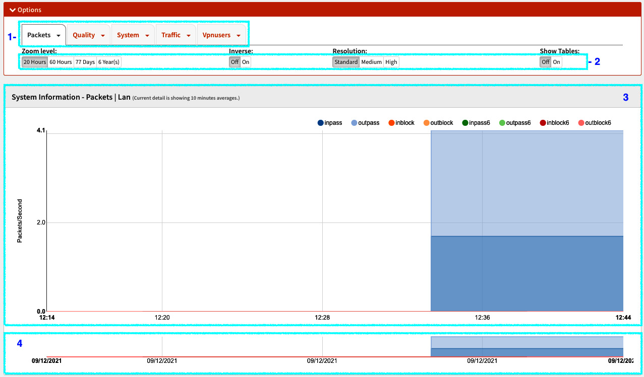
Figure 10.1 – Accessing the Reporting | Health menu
Referencing the numbers specified in the preceding screenshot, we can see the main parts of this page:
- Graphs menu: This shows the available graphs in the following order: Packets, Quality, System, Traffic, and Vpnusers.
- Graphs options: These options will change each graphic's visualization. The available options are as follows:
- Zoom level: With this option, you can select how much time the graph will show data, from 20 Hours to 6 Year(s).
- Inverse: This option is helpful while you're using graphs that have incoming and outgoing flows where each direction will be plotted in a positive/negative manner.
- Resolution: This will change the graph's resolution. There are three options: Standard, Medium, and High. Each resolution will change the graph's data points, increase or decrease them, and change the average values.
- Show Tables: This turns the detailed tables On or Off:
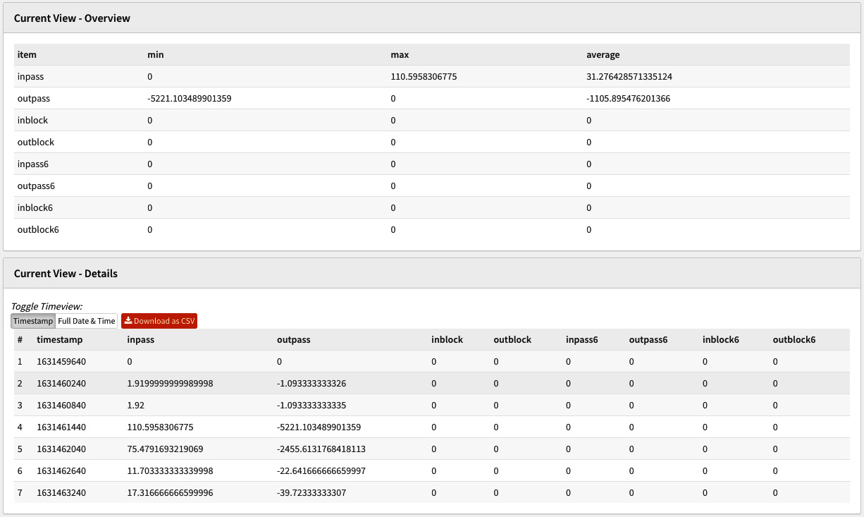
Figure 10.2 – Detailed tables turned on
As you can see, the Show Tables option shows a table and its graph data (shown below the graph). With this table, you can export data in CSV format to create a more complex datasheet that includes graph data, for example.
- Main graph area: This is where the graph will be plotted. Passing your mouse cursor over it will give you more details.
- Graph zoom area: Selecting the graph in this area will allow you to zoom into it.
With the page layout explained, let's explore each available graph, starting with the Packets menu.
Clicking on the Packets menu will open a submenu containing various graphs. Each graph is a configured network interface in OPNsense:
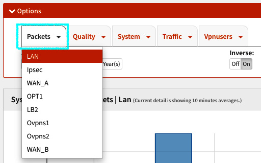
Figure 10.3 – The Packets menu
In the preceding screenshot, you can see the network interfaces that have been configured in my lab for OPNsense. By clicking on each interface, you can see the corresponding graph in the main graph area.
The following is an example of the WAN packets graph:
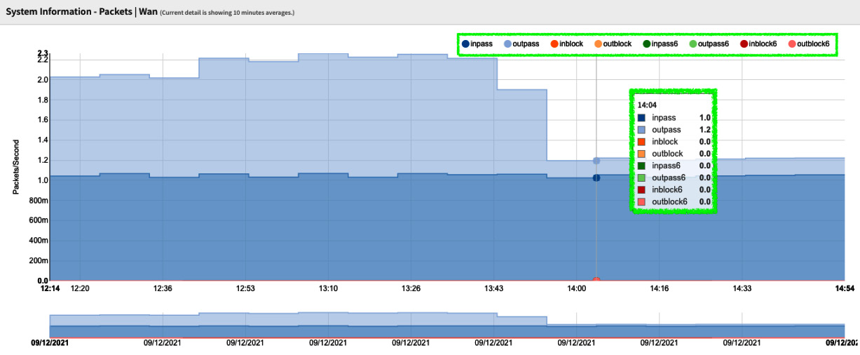
Figure 10.4 – Packets graph
In the preceding screenshot, the graph's labels are highlighted. In the packets graph, the available labels are related to passed packets (allowed by firewall filtering) and blocked packets. They are classified by IP protocol version – that is, versions 4 and 6; the last one has a 6 added to each related label and the flow direction, which is either incoming or outgoing. The labels in a vertical layout are shown when you pass your mouse cursor over the graph.
Important Note
You can select the label you want to be enabled in the graph by clicking on it in all the graphs.
The packets graph helps measure how many packets OPNsense is processing, classified by IP protocol version, and how much is allowed/blocked by the firewall rules. Here, you can find, for example, possible bottlenecks related to packets processing.
The next menu is Quality. It will only be available if you have added a gateway by ensuring the Disable Gateway Monitoring option is unchecked on the System | Gateways | Single page (for each added gateway).
Important Note
Sometimes, it can be confusing that webGUI has options that must be checked to disable some features and others that must be checked to enable them. Maybe soon, with the legacy webGUI being redesigned, this will be changed to a standard.
The submenus that are available in the Quality graph will depend on the number of gateways that have been added to the system. The quality graphs are generated using the ICMP packets from the dpinger monitoring daemon. As we learned in the previous chapter, this daemon does IP monitoring – that is, measuring the time it takes to get replies from the ICMP. Using quality graphs helps determine WAN link conditions, for example.
The next menu is the System menu. Here, you will find the following submenus:
- Processor: This graph will measure the CPU usage by user, nice, system, interrupt, and the number of processes. When you need to read the processor's utilization precisely, I recommend that you turn processes [#] off to generate a clear graph. The labels that are available in this graph are based on the top command.
- Mbuf: The memory buffer (mbuf) is a common concept in networking stacks. It is used to hold packet data as it traverses the stack. It also generally stores header information or other networking stack information that is carried around with the packet. More information can be found at https://mynewt.apache.org/latest/os/core_os/mbuf/mbuf.html:
- The mbuf is automatically calculated by FreeBSD. Its max limit will be around 50% of the physically installed RAM on the system. You can check the percentage that's being used in the System Information widget by going to Lobby | Dashboard. This will give you a good idea of its usage.
- States: This graph plots the number of firewall connection states. The available labels are pfrate (states rate), pfstates (number of concurrent states), pfnat (NAT rules related states), and srcip/dstip, which show the number of active sources and destination IPs, respectively.
- Cputemp: This shows the CPU temperature over time, when available. Sometimes, it is necessary to enable it by going to the System | Settings | Miscellaneous page and selecting your CPU architecture by choosing the Hardware option (the Thermal Sensors section).
- Memory: This graph will plot the system's memory usage. The available labels are active, inactive, free, cache, and wire. As in the case of the CPU graphs, these labels are also based on the top command.
Important Note
For more information about FreeBSD's memory classes, please refer to https://wiki.freebsd.org/Memory.
The next menu is where we can check the network interface traffic graphs. Click on the Traffic menu to list all the configured interfaces as a submenu, as shown in the following screenshot:

Figure 10.5 – LAN traffic graph example
As we can see, the Traffic graph uses the same labels as the Packets graphs – incoming and outgoing traffic (IPv4 and IPv6), both passing or blocked.
Important Note
The traffic graph uses Bytes/Second, not Bits/Second as usual. Pay attention to that to avoid interpreting this graph incorrectly.
The traffic graph helps check how high the network interface's usage is.
The last available graph menu is Vpnusers. Each configured OpenVPN server will be listed as a submenu in it. The graph is depicted as follows:
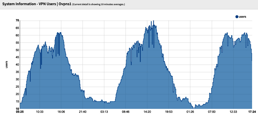
Figure 10.6 – VPN Users graph example
As shown in the preceding screenshot, the Vpnusers graph plots the number of connected users in the respective OpenVPN server graph. But how do we know which graph corresponds to an OpenVPN server? This is the limitation of this graph. It doesn't display the tunnel's description; instead, it only shows its virtual network interfaces. In the following steps, I'll show you how to link the graph to the respective OpenVPN server easily:
- Go to System | Routes | Status and type the OpenVPN interface's name in the search bar (as shown in the VPNusers' graph). For example, type ovpns1 and look for the line that contains UH flags:

Figure 10.7 – The Routes: Status page – filtering by the OpenVPN graph's interface name
- In the results, note the Destination network, as in the preceding screenshot (for example, 10.10.10.2).
- Go to VPN | OpenVPN | Servers and search for the network you noted in the previous step:
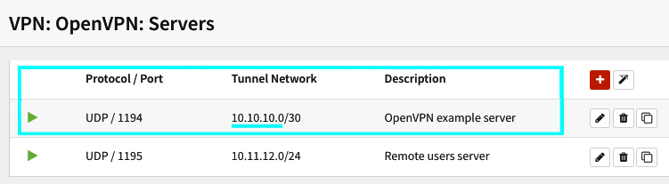
Figure 10.8 – The VPN: OpenVPN: Servers page
Here, 10.10.10.2 refers to the tunnel using the ovpns1 network interface. Now, you know which tunnel the graph corresponds to in the Vpnusers graph.
Maybe in future versions, the developers of OPNsense will implement an easy way to do this, but for now, I hope the preceding steps can help you with this task.
RRDtool and health graphs
OPNsense makes use of the round-robin database tool known as RRDTool to generate its health graphs. It is a very popular and helpful tool for generating network and system graphs. It saves a .rrd file (to the /var/db/rrd path) that will be used to create the graphs. RRD graphing is enabled by default, but if for some reason you need to disable it, or maybe reset or remove RRD data, you can go to the Reporting | Settings page. Here, you can find the options to execute the aforementioned actions. Besides this, you can also remove RRD data for each graph individually and deal with Netflow data.
Talking about Netflow, let's look at this reporting feature.
Understanding Netflow and how to use it
Introduced by Cisco back in 1996, Netflow is a protocol that's used to help analyze network traffic. Netflow has three main components: flow exporter, flow collector, and analyzer. An advantage of using Netflow is that it captures the packet flow, including information about the source and destination IP and port number. As OPNsense's official documentation claims, it is the only open source solution that integrates all this in a web GUI. In other words, with OPNsense, you don't need another application to collect and analyze network flows. The exception is when you have OPNsense as a firewall in a large network with a lot of traffic – here, you will need an external analyzer with a dedicated database engine.
Important Note
OPNsense's embedded Netflow analyzer has a local cache with a 100 MB limit (wispy for larger networks). Therefore, in large or high-throughput networks, it is highly recommended to use an external Netflow analyzer.
Next, we will learn how to configure and use Netflow in OPNsense.
Configuring Netflow in OPNsense
To enable Netflow in OPNsense, go to the Reporting | NetFlow page and configure the following options:
- Listening interfaces: Select the interfaces that you want to collect network flows.
- WAN interfaces: Select only the WAN interfaces here. Selecting interfaces here will prevent double network flow counting.
- Capture local: This option will enable the OPNsense embedded analyzer (known as Insight).
- Version: OPNsense supports Netflow versions 5 and 9. If you need IPv6 support, you need to select version 9.
- Destinations: If you use an external analyzer, specify the IP address and port here; for example, 192.168.0.10:2550. If you intend to use Insight, leave this option blank; the webGUI will automatically fill it with the localhost address (after you click on Apply button).
To finish the configuration, click the Apply button. After saving and applying, OPNsense will start the Netflow capture. To look at Netflow's cache statistics, click the Cache tab. On this page, you can see network flow statistics for the configured interfaces.
If Insight analyzer is enabled, you can check the graphs it will plot by going to the Reporting | Insight page:
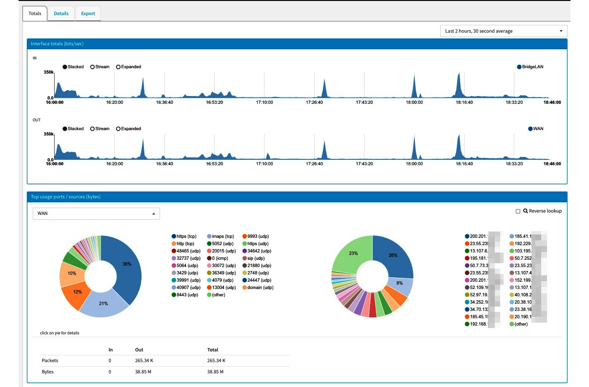
Figure 10.9 – Insight – the Graphs page
As you can see, Insight plots per-interface graphs and shows the most-used ports and sources:
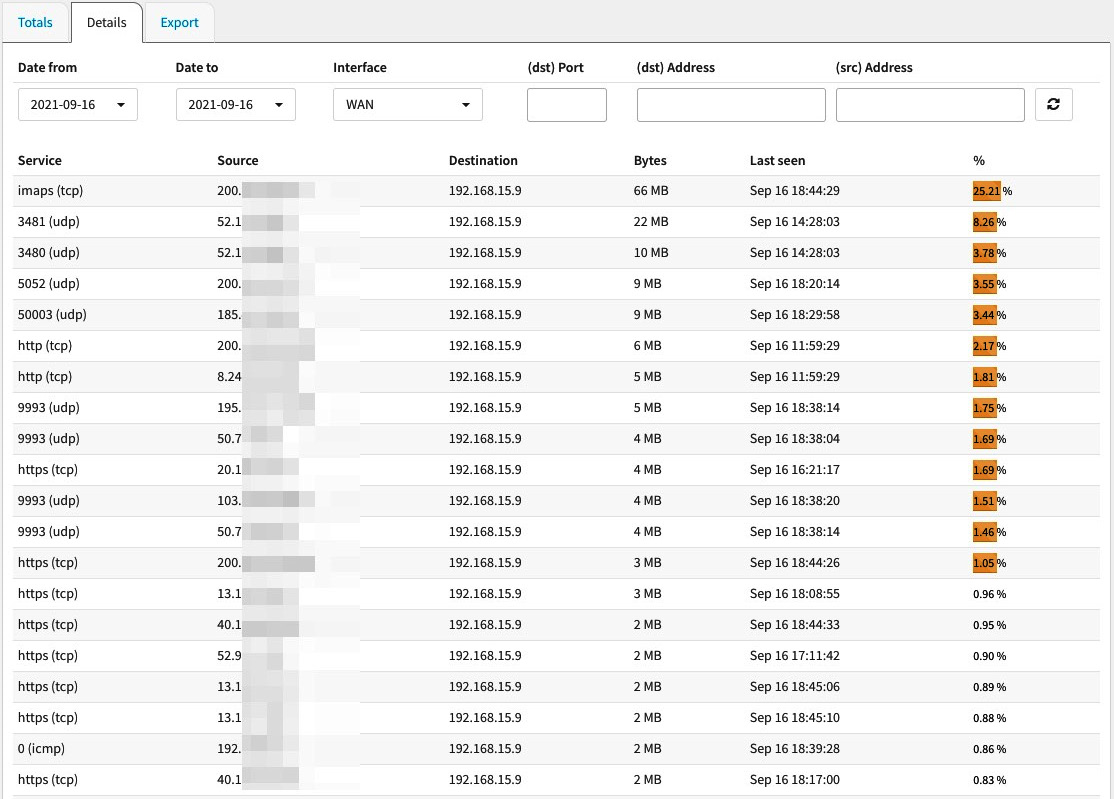
Figure 10.10 – Insight – the Details page
By clicking on the Details tab, you can access the details page, which will list the following data in columns:
- Service: This column lists the top ports.
- Source: This column lists the source IP addresses.
- Destination: This column lists the destination IP addresses.
- Bytes: This column lists the bytes count.
- Last seen: This column shows the time when the traffic was seen last.
- %: This column shows the percentage of the respective traffic.
If you need to create a custom report from the network flow data to work in a spreadsheet, you can click on the Export tab and select the desired options to export.
Exploring real-time traffic
So far, we've explored traffic graphs with historical data that helps us analyze an extended time frame. But sometimes, we need to see the traffic in real time. To do so, OPNsense has a real-time traffic page on its webGUI. To access it, go to Reporting | Traffic:

Figure 10.11 – The Reporting: Traffic page
The traffic graphs show the input and output for the selected interfaces and the top hosts (in bits per second). Each circle in the top host graph represents a host. If you pass your mouse cursor over it, it will display a legend (as shown in the preceding screenshot), along with information about the respective host.
By going to the Top talkers tab, you will find a table listing traffic information per address (in the selected interfaces):

Figure 10.12 – The Top talkers page
As you can see, the selected interface (shown in the top-right corner) will be shown in front of each line, followed by the other fields. So far, we have explored the reporting resources that are available in OPNsense's webGUI, but we need to discuss how they can help us when issues come up. Let's check this out.
Troubleshooting common problems in the network using Netflow and graphs
The available OPNsense reporting tools can help us solve some problems related to performance. Based on my experience, I will give some examples of when these reporting tools can help a lot while solving issues:
- Network Connectivity Issues: Sometimes, you can face connectivity issues related to packet loss, latency, or both. When this kind of issue occurs – commonly on WAN interfaces, depending on the number of services enabled on OPNsense, such as VPN and Proxy, to name a few – you will receive a lot of complaints. A good starting point is checking the WAN links and quality graphs, as these are helpful resources. Even if you watch the gateway's status closely while running pings and other known network tools, the traffic and quality graphs will show a historical view of this data, which gives you a better analytical point of view.
- Slow System/System Crashes: When the whole system becomes slow or even crashes for no apparent reason and you don't know what's happening even after checking the logs, it might be a good idea to start looking at system graphs. The system graphs will show you historical data that will help you find the possible reasons for a slow system. Sometimes, the system slows down due to high CPU or memory usage, network throughput, and more. I have even experienced systems crashing due to a CPU's fan malfunctioning, which results in the system overheating and thus crashing or even damaging it. The CPU temperature graph helps a lot in cases like this.
Of course, the system graphs are not the only resources you need to rely on to solve problems related to OPNsense, but they can help you find auxiliary issues.
Summary
In this chapter, we dived into OPNsense's reporting resources. We learned about each available graph, the Netflow protocol, and how to use different graphs to monitor the system's health and performance. We also explored some scenarios in which various reporting tools can help solve problems in OPNsense. In the next chapter, we will discuss DHCP.