
Generating Creative and UX Discovery Briefs
You can document all of the requirements and specifications that were provided during the visual-design requirements and design-direction sessions through the creative brief and the UX discovery brief.
 Benefits Documenting the visual requirements helps with the creation of the design. It also helps additional resources get up to speed on the overall approach.
Creative Brief
The creative brief is used to outline general creative visual and tonal interface requirements. It describes visual/tonal design constraints and other factors necessary to provide a complete and comprehensive description of the graphic design/digital branding and user interface requirements for the system. It however should not be used as the basis for content needs, audience-specific functional requirements, and/or related business requirements. In most cases, an actual sign-off of this document is required before any design work is started. The creative brief will include the following sections.
- Purpose: This is a brief summary defining the reason for creating the document and its benefits to the project.
- Scope: This section is used to identify what portal this document applies to. The organization may have many SharePoint or portal sites, so it is important to define the precise target of the document.
- Process: This part describes the basic UX process to educate all team members assigned to the project. It can be as simple as bullet points, or you can provide more detailed descriptions if needed.
- Definitions, Acronyms, and Abbreviations: As with any documentation, you'll want to use abbreviations for items such as:
- Creative brief (CRB)
- User interface (UI)
- User experience (UX)
- Cascading Style Sheets (CSS)
- Out of the box (OOTB)
- Existing brand/creative: Referencing existing brands helps the designer identify current designs that will coexist with or be replaced by the new design. It is important to identify the preferred design characteristics and the design elements that shouldn't be carried forward into the new design. Some existing sites might be very outdated and have no relevance to the new design direction. However, some recently designed sites might be used as the basis for the new design.
- Vision and approach: The vision is not intended as the overall vision of the system but is specific to the visual look and feel. It describes the impetus for the new design and where the design direction is coming from.
- Example: The eXtreme Portal will have a custom design that uses some aspects of the referenced public-facing site's look and feel. The eXtreme portal site will include an updated design with custom elements to bring a more modern look and feel to the design.
- Brand/identity: Any corporate logos, portal names, and secondary logos are identified in this section, and specifications are provided for the approved usage of these logos. In most cases, the specifications that you will find are for print purposes and don't clearly indicate how the logos should be represented on the Web. Make sure to work with the marketing team to identify any gaps so that you are not just making stuff up as you go.
- Colors: The color palette should be included to show the colors that will be used throughout the site. Make sure the colors are converted to hex or RGB. Some style guides for print only include a PMS, Pantone, or CMYK color code, which might not translate well when converted to the Web. Communicate any color issues early on to avoid hurdles later in the process.
- Fonts: For basic designs, you don't typically change the fonts in SharePoint. But as the demand for more custom designs grows, fonts are starting to be changed more often. Some clients might want to change all content-based fonts and headers to a standard font, like Arial San-Serif. The issue with some predefined company fonts is that they are not system fonts and are used primarily in print media. It's a good idea to check to see if the specified font is a base PC/Mac system font; if it isn't, identify any close alternatives that can be used.
- Structural elements: This section of the document is really focused around any particular design element—like a fixed-width design or a unique left- or right-hand navigation. You can also use this section for specifying any hover states or visited styles.
- Shapes/patterns/imagery: It is recommended that you identify if there will be an image repository available with purchased media.
- User personalization information: Within this section you identify any part of the portal where users or site owners will be able to choose their own themes, banners, icons, and other elements.
- Iconography: SharePoint comes with well over 2,000 images and icons that support the default branding. You should state up front if there will be any updates to these icons. In most designs, icons such as the search button, list bullets, and drop-down arrows can be customized and changed quite easily using CSS.
- Browser requirements/resolution: This section defines how the design will interact with any specified browser and operating system.
- Optimized for 1024 x 768 or higher resolutions
- The site width will be 980px (centered within the browser)
- Browsers supported: IE 7.x or higher, Firefox, Safari, Chrome
- Minimal testing will be performed on any browsers not mentioned above
- Accessibility features: This section identifies any special features that you need to include when building out your site. This goes back to knowing your users and making sure you provide them with the right tools to meet their needs.
UX Discovery Brief
The UX discovery brief is created to summarize all the vision, strategy, requirements, and preliminary design thinking that has been generated prior to starting the user-experience design work. Developing this document provides the following benefits:
- Ramps up new team members quickly
- Organizes learning already known about the users or business
- Uncovers new insights important to designing the user experience
- Raises key issues about the project
- Suggests areas for additional learning
- Contributes to the creative design
- Allows for all team members to have a clear understanding of the UX direction
In this brief you describe the project background, vision, goals, audience, and UX strategy. Within the strategy you describe success criteria for all of the roles and phases. It is important to also cover the top business and system requirements. This gives you a solid base on which to define the UX strategy. If any personas have been defined, make sure to identify those user types.
A big part of this document involves identifying either functional concepts or any unique interface-design considerations. For example, you might talk about user personalization and customization that allows users to add, remove, or change the web parts on the page. The last component to a UX discovery brief is to identify any existing branding guidelines that need to be met. This includes fonts, colors, logos, and design treatments.
Estimating Effort Level and Time Required
This section is intended to teach you how to estimate the length of time it might take to define, create, and build a SharePoint visual design. It is really important to identify ahead of time what level is appropriate for your project. The different types of projects are organized into these four main levels.
L1: Basic Theme
A basic theme takes a company's predefined color palette and applies the colors to background colors, icons, lines, and text. You can also specify what font types to be used in themes. An alternative way of creating SharePoint 2010 themes is to create a theme in PowerPoint, export it, and then import it into SharePoint 2010. If you modify the theme for a site, you can use the picker shown in Figure 3-6, selecting an OOTB or custom theme. You also have the option to choose your own color scheme using the following elements.

Figure 3-6. SharePoint 2010 theme creator
You can create themes quite quickly if you just want to change the colors and basic font types. Themes can also be small updates to a custom CSS file that you can centrally manage. This gives you the flexibility to enhance the design later and not be limited by the OOTB theme engine. An example of this type of design treatment is shown in Figure 3-7.
- Details: Looks like SharePoint but with different colors and images
- Design from existing site/reference
- Use existing logo
- Update some colors within defined palette
- Use existing SharePoint fonts
- Verdana (body text)
- Tahoma (navigation)
- Basic CSS changes
- No master page or page layout edits
- Level of effort: ~1–2 weeks
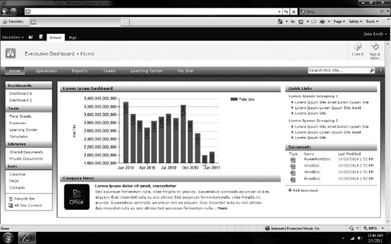
Figure 3-7. Example SharePoint theme
L2: Brand Adaptation
A brand adaption is a little bit more complex than a theme as you might make slight changes to a custom master page. This is more of an advanced theme where you might move an element like the search box or create a custom header. Overall, it might still look like SharePoint, but the inclusion of colors and design elements allows you to match an existing design like a company's public web site. This would be a great entry-level project for someone just starting out with creating and building a SharePoint design. An example of this type of design treatment is shown in Figure 3-8.
- Details: Incorporates corporate colors and fonts with slight modifications to the master page
- Minimal customizations to master page
- No custom page layouts
- Level of effort: ~3–4 Weeks
- Gather branding requirements (4–6 hours)
- Create design comp: (24–40 hours)
- Create optimized images (8–16 hours)
- Create CSS (24–40 hours)
- Create master page (8–16 hours)
- Testing/bug fixes (24–40 hours)

Figure 3-8. Example SharePoint brand adaptation design
L3: Custom Brand Adaptation
For this level of branding you take an existing design and make SharePoint not look like SharePoint. The process involves creating custom CSS, master pages and page layouts. Since there is a current design direction, you can save time defining the design. But the time to actually build the site can take up more of your time since you have to do a lot more testing. This type of branding is handled by front-end developers, who have created multiple designs in the past and are experienced with SharePoint Designer and master pages. This type of design treatment is shown in Figure 3-9.
- Details: Uses an existing design as a model and requires custom modifications to master pages and page layouts.
- Custom design from existing site/reference
- Use existing logo
- Update most colors within defined palette
- Update base fonts to defined types
- Minimal customizations to master page
- 1 to 2 custom age layouts
- Level of effort: 3–4 weeks
- Gather branding requirements (8–16 hours)
- Create design comp: (32–48 hours)
- Create optimized images (8–16 hours)
- Create CSS (32–48 hours)
- Create master page(s) (16–24 hours)
- Create custom page layout(s) (16–24 hours)
- Testing/bug fixes (32–48 hours)

Figure 3-9. Example SharePoint custom brand adaptation design
L4: Custom Design
This level of customization does not come from any existing design but is created by translating tone, treatments, moods, and colors. This unique design requires more development time because you don't have anything to base the structure on. You'll probably go through more review cycles to further define the design. In most cases this custom design will use heavy gradients, iconography, and large and bold fonts. These types of designs are more suited for public-facing sites where the content is more controlled for heights and widths. This will allow for design treatments like a centered fixed width and rounded corners. Figure 3-10 shows an example of this type of design treatment.
- Details: Uses an existing design as a model and requires custom modifications to master pages and page layouts.
- Level of effort: ~6–8 Weeks
- Gather branding requirements (16–24 hours)
- Create design comps: (40–80 hours)
- Create optimized images (16–24 hours)
- Create CSS (40–60 hours)
- Create master pages (20–40 hours)
- Create custom page layouts (20–40 hours)
- Testing/bug fixes (40–80)
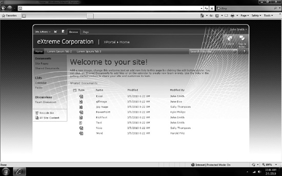
Figure 3-10. Example SharePoint custom design