
Build Approach
When it comes to building a production-based visual design in SharePoint 2010 requires time and patience, so you’ll to be organized and fully dedicated to the process. I would recommend that you refrain from jumping in and hacking away at the v4.master master page or the corev4.css style sheet. You need to plan your build carefully, so that all of the pieces fall into place. With simple designs, you don’t need to worry about managing a bunch of moving parts. A simple build might consist of CSS and images or a slightly modified master page based off of the v4.master that references your CSS and images. But as your design becomes more complex, with multiple master pages based on site templates and a variety of unique page layouts, you might find yourself lost in a web of confusion. You’ll have many moving parts with dependencies that make your head spin. To guard against this, I usually create a diagram that maps out what master pages, page layouts, and CSS goes to what site collection, site template, or functional area. This way I don’t have to keep it all in my head. Plus, everything is documented, giving anyone who might need to make modifications down the road something to reference.
The first part of building out the visual design is to convert any gradient, icon, or background image into web-ready files. The second part is to create a .CSS style sheet for storing all of your custom styles. The third part is to create custom master pages if you need to move any controls around within the page. The last part is to create custom page layouts if you need to have unique layouts within your site. This next section guides you through the first task: optimizing images.
Optimizing Images
A flat visual design needs to be sliced up and broken out into multiple images. Background images or icons that are not a solid color or that cannot be replicated easily with CSS should be spliced out of the design and optimized for web viewing. The reason for optimizing background images instead of just saving them as full-fledged files is to reduce the time it takes for them to load. Given today’s download speeds of 40-50MB per second, time is not as much of an issue as it was 10 years ago when some people were still using dialup modems. However, there are still many cases where your users might be accessing your site using a connection from a hotel, mobile phone tether, or even VPN. These speeds could range from .5MB to 5MB and up, which would be a reason to be cautious about the sizes of your image files. Be sure to keep your images under 100–150Kb. You have to make a choice between having high-quality images and fast loading speeds.
The more you compress and limit the amount of color in your image, the smaller it will be. For example, looking at the images in Figure 6-2, you see that the JPG versions provide image clarity. However, to get the GIF file to the same small file size as the 0% JPG, you would have to reduce the amount of colors to just 2. As you can see, this drastically affects the way your image looks. If you are optimizing an image with lots of gradients or lots of colors, use the JPG file format. The image is around 480 pixels in width and 400 pixels in height.

Figure 6-2. Comparison of image quality and file types
The rule of thumb is to preserve as much of the quality of the image as possible while taking into consideration the size of the image. For example, the image in Figure 6-2 was medium to large in size and would probably be acceptable at a size of 40–50Kb. The final JPG quality might be somewhere around 60%. Looking at the image, it might be hard to see any major difference in the quality of the picture, but you can clearly see in the tree line in the back that the image quality degrades as the JPG number gets lower. Traditionally, GIF and JPG files were the only major supported files types that were used for the Web. But as technology grows, PNG files are becoming the new trend for Web-based image files. PNG files are far superior to GIF and JPG files. There are also 2 types of PNG files. The first is the PNG-8 format, which has indexed colors similar to a GIF. The second is the PNG-24 format, which is more like a JPG with millions of colors available, but with the addition of multiple levels of alpha transparencies.
Working with Basic Images
When working with more simplistic images such as icons or images with a limited set of colors, you might be better off using a GIF file. Depending on the image dimensions, GIFs are usually less than 1Kb in size, and you can have pixels that are completely transparent, which allows you to position, overlay, and create unique patterns. The image shown in Figure 6-3 is a very basic icon that consists of about 64 colors. The image is 80 pixels wide and 38 pixels high. The checkered pattern is not part of the image; it is a setting in Photoshop that allows you to see what in the image is going to be transparent.

Figure 6-3. Image to be optimized as a GIF file
To save this image as an optimized GIF file in Photoshop, simply crop the image to fit within your full canvas area, and then press Ctrl+Shift+Alt+S, or click File  Save for Web & Devices. This action brings up a screen (similar to the one shown in Figure 6-4) that allows you to choose a different optimizing format for each preview panel. This way, you can easily see differences in image quality as well as differences in size. With this particular image being so small, the choice of file type would not have been an issue except for the transparent background. For transparencies, use either a GIF or PNG file format. As stated earlier, the benefit of using a PNG is that it can handle more than 256 colors, and it also gives you a range of transparency percentages for each pixel.
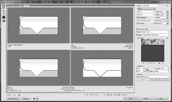
Figure 6-4. Image to be optimized as a GIF file
Choosing the Right Format
It may be confusing at times knowing when to choose a particular format over another. The following is a list of the most frequently used image files.
- Joint Photographic Experts Group (JPG)
- Images with lots of colors
- Images with gradients
- Graphical Interchange Format (GIF)
- Images with not a lot of colors (Less than 256)
- Images that have full transparent backgrounds
- Portable Network Graphic (PNG)
- Images that have multiple percentages of transparent pixels
As you start to save your image files, stick to a standard file-naming convention. You might want to try something like “portalname_imagename.gif.” I would recommend that you use all lowercase in your file names; in some browsers the file name is case-sensitive, so accidently typing a reference to an image in your CSS with all lowercase when the image file name has uppercase and lower case might prevent the image from rendering. You can also create a “sprite” image, which includes multiple icons and images within a single file. You would then use CSS to target the specific area where the icon or background image is located within the sprite. For example, SharePoint 2010 uses sprites to display icons, social tags images, Site Actions arrow, and multiple other icons within the page. The benefit of sprite images is that you only have to load the image once on a page refresh and, with multiple elements using this image for display. The page load times will be slightly quicker than if you had them all as separate images.
The next step in preparing yourself to build your design is creating the base custom CSS files.
Cascading Style Sheets (CSS)
As you learned in Chapter 1, CSS is the method used to centrally manage all of the styles attributes in SharePoint. For basic branding projects you might need only one CSS file. On larger projects you might consider breaking up the CSS classes into separate style-sheet files based on the function or template that uses those styles. By doing this you are limiting the amount of CSS that has to be compiled on specific sites. Here is an example of how you might want to break down your style sheets.
- Main Style Sheet: PortalName_Main.CSS
- Global ribbon styles
- Global header styles that include logo, site title, and search styles
- Global navigation styles
- Global web-part header styles
- Global footer styles
- My Site Style Sheet: PortalName_MySite.CSS
- My Profile pages styles
- My Content site styles
- Community Based Site Style Sheet: PortalName_Communties.CSS
- Unique styles for community-based sites
- Search Style Sheet: PortalName_Search.CSS
- Search center styles
- Search results styles
 Note You can use a variety of different approaches to add a CSS reference to your custom style sheet from your master page. Choosing the approach depends on where you plan to store your style-sheet files. These approaches are covered within this chapter, in a section called “Connecting the Pieces.”
Master Pages
SharePoint 2010 master pages play a very important role in your SharePoint branded site. They act as the backbone of the overall structure of the site. Depending on your design and approach, you might be able to just use the OOTB master pages without any customizations. One of the most common changes you would make to a master page is to reference your custom CSS, and possibly put in a footer that included your copyright and legal information. Some more advanced changes would be to move around controls and add your own custom HTML.
Part of the planning process is staying consistent with how you apply and name your custom CSS classes within the master page. As with the CSS style-sheet names, you want to stay consistent on how you name the classes or IDs that you are using. For example, if you wanted to add a class to a custom global navigation container, you might use this class name: portalname-globalnavcontainer. Another example of a good name for a custom footer link would be: “portalname-footerlink”. You really don’t have to use anything long and descriptive; as long as you choose a name with enough flexibility, you should be ok.
There are a handful of master pages that come standard with SharePoint 2010. I find that by creating the base master page first you will then be able to reuse some of the global components for the other master pages. This list includes some of the common OOTB SharePoint 2010 master pages.
- v4.master: The base master page used for both publishing and team collaboration sites. This is the most common master page that you copy and customize to make it your own.
- mwsdefaultv4.master: Specific to meeting workspace sites templates. This master page includes some unique code applied to the Site Actions to allow the user to create and manage pages specific to a meeting workspace.
- minimal.master: Used for the search center, search results, and also for the My Newsfeed page within My Site. The code within the master page basically consolidates a bunch of controls into mini headers and content areas. It also moves the breadcrumb feature control right above the content area that is directly tied to the search results.
- mysite.master: Used mainly for the profile pages within My Site. It has unique references to CSS style sheets to represent the unique look and feel for the OOTB profile pages.
If you are new to customizing master pages, you should start out by creating a copy of the v4.master. Give the new master page a new name, and apply it to your site through the user interface or with SharePoint Designer.
The next step is to make small changes like creating a reference to your custom CSS file within the header section of your custom master page. Once you’ve made all of your changes and tested them, you need to extend your custom master page to some of the other OOTB site master pages described above.
The next section takes a look at the process of copying your custom master page and making it work for meeting workspace sites.
Creating a Meeting Workspace Master Page
Use the process described in this section only if you have a heavily customized base master page and you don’t want to copy every piece into a copied mwsdefaultv4.master master page. For simple master page changes like CSS references and footers, you can save time by using a copy of the OOTB mwsdefaultv4.master and adding your changes directly to that file.
Duplicating Your Custom Master Page
To convert your custom master page so that it works with all meeting workspaces, first you need to duplicate your customized master page and rename it something like this: “portalname_mwsv4.master.” Then open the newly created master page and add the following registration tag to the very top of your master page, as shown in Listing 6-1:
Listing 6-1. Meeting Workspace Registration.
<%@ Register Tagprefix="Meetings" Namespace="Microsoft.SharePoint.Meetings"

Assembly="Microsoft.SharePoint, Version=14.0.0.0, Culture=neutral,

PublicKeyToken=71e9bce111e9429c" %>
There is a CSS registration called mws.css, which provides a little bit of styling to the meeting workspace sites. You can copy this registration but it is not mandatory. To include this registration, add the code in Listing 6-2 after the theme CSS reference in the header.
Listing 6-2. Meeting Workspace CSS Reference.
<SharePoint:CssRegistration Name="mws.css" runat="server"/>
To add in the “add and manage pages” functionality to the Site Actions within the meeting workspace master page, search within your master page for “MenuItem_CommitNewUI.” This is the last menu item template within the Site Actions menu control. Copy the code from Listing 6-3 and paste it directly below the commitNewUI template, as shown in Figure 6-5.
Listing 6-3. Meeting Workspace Add and Manage Page Site Actions Code.
<SharePoint:MenuItemTemplate runat="server" id="MenuItem_AddPages"

        Text="<%$Resources:wss,siteactions_addpages%>"

        Description="<%$Resources:wss,siteactions_addpagesdescription%>"

        MenuGroupId="400"

        Sequence="410"

        UseShortId="true"

        ClientOnClickScript = "javascript:MtgTlPart_ShowToolPane('1'),"

        PermissionsString="AddAndCustomizePages"

        PermissionMode="Any" />

<SharePoint:MenuItemTemplate runat="server" id="MenuItem_ManagePages"

        Text="<%$Resources:wss,siteactions_managepages%>"

        Description="<%$Resources:wss,siteactions_managepagesdescription%>"

        MenuGroupId="400"

        Sequence="420"

        UseShortId="true"

        ClientOnClickScript = "javascript:MtgTlPart_ShowToolPane('2'),"

        PermissionsString="AddAndCustomizePages"

        PermissionMode="Any" />
Note The OOTB meeting workspace template does not come standard with the create site menu item in the Site Actions like it does with the v4.master. It is up to you to keep it in or not.

Figure 6-5. Adding the “add and manage pages” to the site actions menu
Adding the Tool Pane Manager
The next step is to search for “s4-rp” in your custom master page. This brings you to an empty div that you want to populate with the code from Listing 6-4. This code places the pages Tool Pane Manager to the right of the page as shown in Figure 6-6 when you click on Site Actions Manage Pages.
Listing 6-4. Meeting Workspace Add and Manage Page Site Actions Code.
<Meetings:CustomToolPaneManager runat="server" __MarkupType="vsattributemarkup" WebPart="true"

Height="" Width="" __WebPartId="{FB6ACB46-6C56-4562-AEF3-964203B651AE}"

id="g_fb6acb46_6c56_4562_aef3_964203b651ae"/>

<Meetings:PropertyBag runat="server"/>

Figure 6-6. Meeting workspace page manager
After you have added those three main code elements, you have a perfectly working meeting workspace site within your custom master page. If you chose not to add those code elements to your meeting workspace site, you would receive this not very helpful message in the left navigation area: “There are no more meeting occurrences to select from,” as shown in Figure 6-7. You would also notice that clicking on the Site Actions menu does not display options for adding or managing your meeting workspace pages.

Figure 6-7. Error on meeting workspace when v4.master is applied
This next section covers the steps needed to convert your custom master page so that it works with the SharePoint 2010 Search Center and result pages.
Creating a Search Master Page
Like the meeting workspace process, you only want to create a search master page if you have a heavily customized base master page and you don’t want to copy every piece of your custom code into a copied version of the minimal.master master page. If you aren’t using a search center site to display your search results, SharePoint defaults all search results to a common search results page, called “osssearchresults.aspx”, located on the server in the layouts directory. This page renders your search results within your custom master page.
If you are using the search center as your main search results page, then you only need to make a few changes to get search results to work correctly. If you apply your custom master page directly to the search center, you get a result like that shown in Figure 6-8. The search results are actually being displayed in the breadcrumb folder drop-down, and the positioning of the search results is pushed over to the right.

Figure 6-8. Display issue with search center results page when v4.master is applied
To fix this problem you need to duplicate your customized master page and rename it something like “portalname_search.master.” Then open up the newly created master page and at the end of the header simply add the code from Listing 6-5 to create a new CSS class reference. You should specify the “After” property to make sure your custom style sheet is being referenced after the main corev4.css or any other style sheet that you are using. This task is described in detail in the “Connecting the Pieces” section later in this chapter.
Listing 6-5. Search CSS Style Sheet Reference.
<SharePoint:CssRegistration name="PortalName_Search.CSS" After="corev4.css" runat="server"/>
Within this new style sheet you want to use the CSS in Listing 6-6 to hide the left navigation and also to remove the left margins from the content area.
Listing 6-6. Search CSS Properties to Hide Left Navigation and Remove Left Margin.
#s4-leftpanel{

display: none;

}

.s4-ca{

margin-left: 0px;

}
The next step is doing a search within the custom search master page for “PlaceHolderTitleBreadcrumb.” In your custom search master page, remove the whole “SharePoint:PopoutMenu” control, as shown in Figure 6-9.
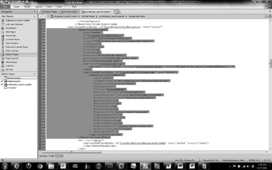
Figure 6-9. Removing all of the pop-out menu control code from the custom search master page
The search results are basically tied to this content placeholder control. I would recommend that you add a custom class to the div in case you need to make any specific style changes to the custom search results. After you have deleted this pop-out menu code, search within the file for “MSO_ContentDiv.” Within this DIV tag, add the code from Listing 6-7.
Listing 6-7. Code To Display Search Results.
<div class="portalname-searchresults">

        <asp:ContentPlaceHolder id="PlaceHolderTitleBreadcrumb" runat="server" />

</div>
Now the search results are rendered directly above the main content placeholder. Your search results page should display your custom branding, as shown in Figure 6-10. The search results are centered on the page with no marginal space on the left.
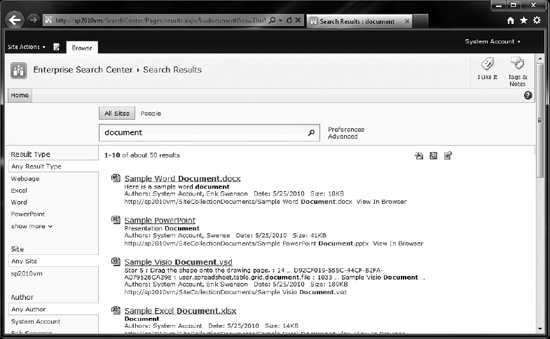
Figure 6-10. Correct display of search results with customized v4.master base master page
The next step in the process is to create custom page layouts for publishing sites.
Custom Page Layouts
SharePoint Publishing Page Layouts are available only with SharePoint Server Standard or Enterprise. Publishing cannot be enabled in SharePoint Foundation 2010. To create publishing pages, you need to enable the Publishing Infrastructure Site Collection Feature and the SharePoint Publishing Site Feature.
There are two main types of Page Layout Content Types: article pages and welcome pages. There are four unique page layouts within the Article Page Content type:
- Body only: This page layout includes a title, page content field control, and a roll-up image field control. You would use this for articles that are straight content and do not need additional images or links.
- Image on left: This type of page layout includes a title, page image, and caption on the left, article date, byline, page content, and rollup image. You would use this type of page layout for most news articles or announcements.
- Image on left: This type of page layout includes a title, article date, byline, page image and caption on the right, page content, and rollup image. You would use this type of page layout just like the image on the left page layout.
- Summary links: This type of page layout includes a title, article date, byline, summary links on the right, page content, and rollup image. You would use this type of page layout for articles that need additional links to support the content. The summary links might be useful for showing related news articles or links to documents for that particular news article.
The second type of Publishing Page Layout, the welcome page, includes nine different layouts. The first four listed below are used for landing pages or content pages with multiple web parts:
- Blank Web-Part Page: This type of Page Layout includes a title, Page Content field control, and eight web-part zones. This page layout would be used to add a variety of web parts on the page in many different layout configurations.
- Splash: This type of page layout includes a title, page image, two summary links web parts embedded in the page, and three empty web-part zones on the bottom. This page is unique as it includes some custom CSS within the page layout to hide the left navigation and remove the left margin in the content area. This page layout is useful on landing pages where you really need to use the horizontal space.
- Summary Links: This type of page layout includes a title, page image that is floating on the left side of the page content area, two summary links web parts embedded in the page, and three empty web-part zones at the bottom. Like the splash page, the left navigation has been hidden. This type of page layout is used for a more advanced type of landing page.
- Table of contents: This type of page layout includes a title, page image that is floating on the left side of the page content area, a top web-part zone that includes a table of contents web part, and two empty web-part zones at the bottom. This page layout could be used as a landing page to summarize content within its own site collection. However, in my opinion the OOTB table of contents web part does a poor job of summarizing the type of content that lives below this top landing page. It mixes in site content and site navigation, instead of using one or the other. This standard web part does not allow you to just show sites; it basically uses the content of the left navigation settings for the sub-sites below it.
These five welcome pages are used for custom search pages and results.
- Advanced search: Includes two top-left and right empty web-part zones and a bottom zone pre-filled with an advanced search web part.
- People search results: Includes the standard results page layout configuration with the people refinement web part in the left zone area and the people search core results web part within the bottom zone.
- Search box: One of the most basic page layouts. It includes only one web-part zone with nothing in it. You would use this page layout to add a search web part within this zone, to create something similar to the base search center page.
- Search results: The standard search center results page layout. This page includes a refinement web part in the left zone, a search statistics web part in the middle lower left zone, a search action link in the middle lower right zone, a related queries and people matches web part in the right zone, and in the bottom zone it includes a search core results, search best bets, top federated results, and search paging web part. You would use this search results page layout if you wanted to create a custom search results page with additional web parts and configurations.
- Site directory home: A bit unique page layout as it includes a multilined rich text comments field in the upper left, a contact details web part in the header zone, and three empty web-part zones on the bottom. A message is included on the page in edit mode that says, “This control depends on a Tabs list for its configuration, and is designed to work within an appropriate site template. To remove this control, edit the layout page.” This page could be used for migrated SharePoint 2007 sites that do not have the visual upgrade enabled. SharePoint 2007 included a site template called Site Directory that used a tabs list for the top navigation of the page. After some investigation, it only seems like you can create a tabs list within the search center site templates. The problem with this is that even when you create this page layout in your search center it will produce a page error, if you have the new v4 visual upgrade enabled. I would recommend that you simply hide this page layout as it doesn’t offer significant value to any new SharePoint 2010 sites.
As we saw in Chapter 4, page layouts can include a variety of different configurations. The OOTB blank web-part page layout provides a pretty good variety of zone configuration options, as shown in Figure 6-11. The nice thing about these web-part zones is that they have some custom JavaScript built in to them that prevents zone without web parts or content from taking up space on the page.

Figure 6-11. Web-part page layout zones
Note The page content control on the page is normally a lot taller, but to include the whole web-part page layout zone items in Figure 6-11, I had to reduce the height of it. There is an inline style being applied that sets the height to a min-height of 400px. This min-height is used only in edit mode.
Creating Your Own Page Layout
Now that you are familiar with the OOTB page layouts, it is time to create your own. The first step is to identify the OOTB page layout that most closely matches your needs. For a custom page layout that has just web-part zones and no embedded field controls, I normally start out with the basic blank web-part page layout.
Selecting a Layout to Work With
The first step in creating your own custom page layout is to open up your site in SharePoint Designer 2010 and click on the page layouts tab in the left navigation, as shown in Figure 6-12. Then click on one of the existing page layouts to activate the options menu (also shown in Figure 6-12), and choose Copy. Once you have copied the file, you right-click within the page layout panel, and choose Paste.
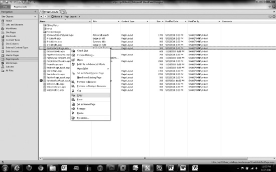
Figure 6-12. Copying a page layout within SharePoint Designer 2010
Renaming the Page Layout
Now rename the newly copied page layout to something like: “portalname_communitylayout.aspx”. To rename the file directly within SharePoint Designer, simply click on the arrow next to the file name, and choose Rename. After you have changed the name, press the Enter key on your keyboard. You’ll want to change the metadata within your new page layout so that when you create a new page based off of it, the title and details will be unique. To change these properties, click on the page layout name in SharePoint Designer. This brings you to the summary page. Then click on Manage all file properties in the browser link within the Customization panel. This links you directly to the SharePoint page layout metadata properties page. Depending on your versioning settings within the master page gallery, you might need to click on the Check Out button first, and then click on the Edit Item button in the top left. Change the title and description to be specific about the type of page that you are creating. When you have finished, click the Save button, and check in your page layout as a major version.
Customizing the Page Layout
To customize this page, go back into SharePoint Designer and click on the arrow next to the page title. If you have checked it back in, choose Check Out. If you have successfully checked out the document, a little green check mark appears next to the page, as shown in Figure 6-13.

Figure 6-13. Newly copied page layout showing checked-out status.
Editing Your Document
The trick to editing a document is to avoid clicking on the document title that would navigate you to the summary screen and clicking on the text that says Edit File, as shown in Figure 6-14. This will open the file but will not allow you to make any changes. All of the code will be highlighted in a light orange color.
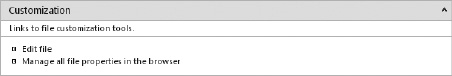
Figure 6-14. Page layout summary page with edit file link
The only way to customize the page layout is to go back to the list of page layouts in SharePoint designer, click on the document arrow next to the page layout title, and then click on Edit File in Advanced Mode, as shown in Figure 6-15.
Note If versioning is enabled and you have not checked out the file, you will be prompted to check it out. Clicking “Yes” will both check out the document and open the file for editing in SharePoint Designer.

Figure 6-15. Edit page layout in advanced mode
Now that you have the file open in advanced mode, you should be able to modify anything within the page layout. As an example, we will use the community wireframe in Figure 6-16 as our page layout model.
Figure 6-16. Example community wireframe with layout specifications in right panel
This page layout has six different web-part zones. Each one of these zones can have more than one web part within it. Figure 6-17 shows this layout configuration in more detail.
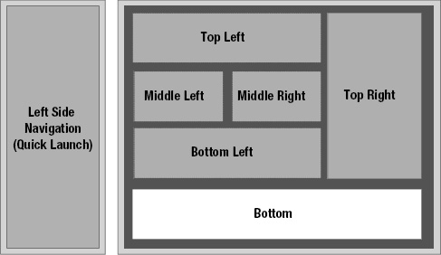
Figure 6-17. Community base page layout configuration details
To transform your custom page layout into this configuration, it is helpful to first create a sample page and select your custom page layout that you created earlier. To create a new page, click on Site Actions View All Site Content, and then click on the Pages library. In the ribbon, within Library Tools, click on Documents New Document. On this page you will be able to supply a title, description, and URL (which automatically populates based on title), and choose a page layout. Hopefully, you will have your newly created page layout as an option to choose from in the list, as shown in Figure 6-18. If you don’t see your custom page layout in the list, make sure that you have checked it in once as a major version. Once the page is created, simply click on the page title and it will navigate you to the page.
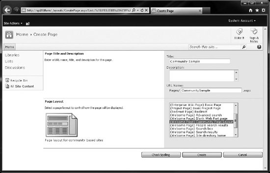
Figure 6-18. Create a new page
This is where the fun begins. To keep the process simple, you are going to use web-part zones and no field controls within the page. The first thing that you do is remove the rich text HTML field control from the page. Just search for “welcome” within the page layout. The first result should be a DIV tag with a class name of welcome. Select the whole content template and delete it. This will remove the tile field control from the page. Then delete the second content template within the first table to remove all rich text field controls within the page layout. The HTML for laying out these web-part zones is pretty simple. See Listing 6-8 for the basic layout.
Listing 6-8. Community layout HTML.
<table cellpadding="4" cellspacing="0" border="0" width="100%">

<tr>

<td valign="top" style="padding:0">

<table cellpadding="4" cellspacing="0" border="0" width="100%" height="100%">

<tr>

<td id="_invisibleIfEmpty" name="_invisibleIfEmpty" colspan="3" valign="top">

<WebPartPages:WebPartZone runat="server" Title="Top Left"

ID="TopLeft"><ZoneTemplate></ZoneTemplate></WebPartPages:WebPartZone>

</td>

</tr>

<tr>

<td width="100%" colspan="3" valign="top" style="padding:0">

<table cellpadding="4" cellspacing="0" width="100%" height="100%">

<tr>

<td id="_invisibleIfEmpty" name="_invisibleIfEmpty" valign="top">

<WebPartPages:WebPartZone runat="server" Title="Middle Left"

ID="MiddleLeft"><ZoneTemplate></ZoneTemplate></WebPartPages:WebPartZone>

</td>

<td id="_invisibleIfEmpty" name="_invisibleIfEmpty" valign="top">

<WebPartPages:WebPartZone runat="server" Title="Middle Right"

ID="MiddleRight"><ZoneTemplate></ZoneTemplate></WebPartPages:WebPartZone>

</td>

</tr>

</table>

</td>

</tr>

<tr>

<td id="_invisibleIfEmpty" name="_invisibleIfEmpty" colspan="3" valign="top">

<WebPartPages:WebPartZone runat="server" Title="Bottom Left"

ID="BottomLeft"><ZoneTemplate></ZoneTemplate></WebPartPages:WebPartZone>

</td>

</tr>

</table>

</td>

<td id="_invisibleIfEmpty" name="_invisibleIfEmpty" valign="top" height="100%">

<WebPartPages:WebPartZone runat="server" Title="Top Right" ID="TopRight"

Orientation="Vertical"><ZoneTemplate></ZoneTemplate></WebPartPages:WebPartZone>

</td>

</tr>

<tr>

<td id="_invisibleIfEmpty" name="_invisibleIfEmpty" colspan="3" valign="top" height="100%">

<WebPartPages:WebPartZone runat="server" Title="Bottom" ID="Bottom"

Orientation="Vertical"><ZoneTemplate></ZoneTemplate></WebPartPages:WebPartZone>

</td>

</tr>

<script language="javascript">if(typeof(MSOLayout_MakeInvisibleIfEmpty) == "function")

{MSOLayout_MakeInvisibleIfEmpty();}</script>

</table>
When you have added some sample content, the end result looks something like Figure 6-19. I would recommend that you change all of the web-part zone titles from the dynamic “<%$Resources:cms,WebPartZoneTitle_TopLeft%>” to plain text, like “Top Left.” That way you are not restricted to using a particular zone title.
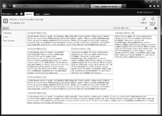
Figure 6-19. Custom page layout with modified web-part zones
The next step in the process of creating a custom page layout is to learn about content placeholders and how they are connected between the master page and page layouts.
Working with Content Placeholders
Content placeholders are used throughout SharePoint as a way to simplify the amount of HTML that is included in the master page. A content placeholder is basically a control with a unique ID that is specified in your custom master page and then can be referenced in a custom page layout. This referenced content placeholder in the page layout can then include any HTML that you want. To create a content placeholder, just add the code in Listing 6-9 within your master page.
Listing 6-9. Basic Content Place Holder Specified in Master Page.
<asp:ContentPlaceHolder id="PortalNamePlaceHolderName" runat="server" />
You then use the code in Listing 6-10 to call the content placeholder name and render the HTML or web part specified in the unique content placeholder element. Notice that the content placeholder ID matches the name that is used within the master page.
Listing 6-10. Basic Content Place Holder Specified in Master Page.
<asp:Content ContentPlaceHolderId="PortalNamePlaceHolderName" runat="server">

<div class="portalname-communitylinkedimage">

<a href="/communities">

<img src="/_layouts/images/portalname/communityimage.png" width="155" height="80” />

</a>

</div>

</asp:Content>
You can put anything you want in the content placeholder within the page layout. The only rule is that you cannot specify a content placeholder in a page layout if the master page that is being used does not include that placeholder. It will give an error and will not render the page. In addition, if you remove some content placeholders from within your custom master page, you will get errors as they are required to render the page correctly. Some of these required placeholders are described below.
- Page Title: Specifies the title of the page within the master page header and displays it on the top of the browser window. id="PlaceHolderPageTitle”
- Page Title in title area: Displays the page title on the page. id="PlaceHolderPageTitleInTitleArea”
- Page Description: Displays the description of the page. id=“PlaceHolderPageDescription”
- Search Control: Displays the search input control on the page. id=“PlaceHolderSearchArea”
- Main Content: One of the most important placeholders as it is used to display all of the content within the center of the page. id=“PlaceHolderMain”
Now that you have the basics on optimizing images, CSS, master pages, and page layouts, you now need to connect all of these elements.