
#3: Site Breadcrumb
The site breadcrumb shown in Figure A-19 includes the following CSS elements. To display the breadcrumb in a more traditional way, similar to how it was done in SharePoint 2007, follow the steps within this blog post: http://erikswenson.blogspot.com/2010/11/convert-folder-breadcrumb-to.html.
- Site Breadcrumb Container
- Site Breadcrumb Icon
- Site Breadcrumb Pop-Out Menu Container
- Site Breadcrumb Pop-Out Menu Header
- Site Breadcrumb Pop-Out Menu Item
- Site Breadcrumb Pop-Out Menu Arrow

Figure A-19. SharePoint 2010 site breadcrumb
Site Breadcrumb Container
This class is used to add margins and spacing around the breadcrumb image and also vertically align it to the bottom, as shown in Figure A-20. Listing A-20 shows the standard CSS properties.

Figure A-20. SharePoint 2010 site breadcrumb container
- Style Sheet: COREV4.CSS
- Class: s4-breadcrumb-anchor
Listing A-20. Site Breadcrumb Container CSS
.s4-breadcrumb-anchor,.ms-qatbutton{

margin:0px 3px 0px 0px;

padding:2px 5px 0px;

display:inline-block;

text-align:center;

border:1px solid transparent;

vertical-align:bottom;

}
Site Breadcrumb Icon
This icon is displayed by using the “fgimg.png” sprite image and having inline CSS set the position of it, as shown in Figure A-21. Listing A-21 shows the inline CSS properties.

Figure A-21. SharePoint 2010 site breadcrumb icon
- Style Sheet: Inline CSS
Listing A-21. Site Breadcrumb Icon Inline CSS
left: 0px !important;

top: -112px !important;

border: none;

position: absolute;
Site Breadcrumb Pop-Out Menu Container
The following classes are used to set the minimum and maximum width, padding, word wrap, horizontal overflow, border size, font size, background image, and background color. The inline CSS is used to set the positioning and z-index of the menu, as shown in Figure A-22. Listing A-22 shows the class and inline CSS properties.

Figure A-22. SharePoint 2010 site breadcrumb pop-out menu container
- Style Sheet: COREV4.CSS & Inline CSS
- ID: GlobalBreadCrumbNavPopout-menu
- Class: ms-popoutMenu s4-breadcrumb-menu
Listing A-22. Site Breadcrumb Pop-Out Menu Container CSS
.s4-breadcrumb-menu{

max-width:400px;

min-width:142px;
padding:1px 15px 5px 1px;

word-wrap:break-word;

-ms-word-wrap:break-word;

overflow-x:hidden;

border:1px solid;

font-size:8pt;

}

.v4master .s4-breadcrumb-menu{

background:url("/_layouts/images/selbg.png") repeat-x left top;

-color:#f8f8f8;

border-color:#94989f;

}

/* Inline CSS on DIV */

left: 89px;

top: 40px;

display: none;

visibility: visible;

position: absolute;

z-index: 1002;
Site Breadcrumb Pop-Out Menu Header
The following classes within the container set the margins, padding, and dashed border on the bottom. The header class sets the text to be displayed inline and also sets the color, as shown in Figure A-23. Listing A-23 shows the standard CSS properties that are used for both elements.
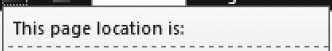
Figure A-23. SharePoint 2010 site breadcrumb pop-out menu header
- Style Sheet: COREV4.CSS
- Container Class: s4-breadcrumb-top
- Header Class: s4-breadcrumb-header
Listing A-23. Site Breadcrumb Pop-Out Menu Header CSS
.s4-breadcrumb-top{

display:block;

margin-bottom:5px;

margin-right:-15px;

padding:5px;

border-bottom:1px dashed;

}
.v4master .s4-breadcrumb-top{

border-bottom-color:#a7b0ba;

}

.s4-breadcrumb-header{

display:inline;

}

.v4master .s4-breadcrumb-header{

color:#3b4f65;

}
Site Breadcrumb Pop-Out Menu Item
The following classes are used to set the padding and margins of the item to zero, sets the color, and adds in a margin to the left, as shown in Figure A-24. Listing A-24 shows the standard CSS properties.
Figure A-24. SharePoint 2010 site breadcrumb pop-out menu item
- Style Sheet: COREV4.CSS
- Class: s4-breadcrumbNode
Listing A-24. Site Breadcrumb Pop-Out Menu Item CSS
.s4-breadcrumbNode,.s4-breadcrumbCurrentNode,.s4-breadcrumbRootNode{

list-style-type:none;

padding:0px;

margin:0px;

}

.v4master .s4-breadcrumbNode,

.v4master .s4-breadcrumbCurrentNode,

.v4master .s4-breadcrumbRootNode{

color:#3b4f65;

}

ul.s4-breadcrumbNode{

margin-left:21px;

}
Site Breadcrumb Pop-Out Menu Arrow
This icon is displayed by using the “fgimg.png” sprite image and having inline CSS set the position of it, as shown in Figure A-25. Listing A-25 shows the inline CSS properties.

Figure A-25. SharePoint 2010 site breadcrumb pop-out menu arrow
- Style Sheet: Inline CSS
Listing A-25. Site Breadcrumb Pop-Out Menu Arrow Inline CSS
left: 0px !important;

top: -353px !important;

border: none;

position: absolute;
The next section that I will cover is the text that displays the logged-in user's name in the top right of the Ribbon.