
#2: Site Actions
The site actions shown in Figure A-8 include the following CSS elements:
- Site Actions Menu Container
- Site Actions Menu Inner
- Site Actions Menu Text
- Site Actions Menu White Arrow Icon
- Site Actions Menu Hover
- Site Actions Menu Drop-Down Container
- Site Actions Menu Drop-Down Icon
- Site Actions Menu Drop-Down Icon IMG
- Site Actions Menu Drop-Down Title
- Site Actions Menu Drop-Down Description

Figure A-8. SharePoint 2010 site actions
Site Actions Menu Container
This class is used to vertically align the elements within it to the top and set the font size of its child elements, as shown in Figure A-9. Listing A-9 shows the standard CSS properties.

Figure A-9. SharePoint 2010 Site Actions menu container
- Style Sheet: COREV4.CSS
- ID: siteactiontd
- Class: ms-siteactionsmenu
Listing A-9. Site Actions Menu Container CSS
.ms-siteactionsmenu{

display:inline-block;

vertical-align:top;

font-size:8pt;

}
Site Actions Menu Inner
This class is within a SPAN tag that is used to display a placeholder border spacing and background color for when the item is hovered over, as shown in Figure A-10. Listing A-10 shows the standard CSS properties.
Figure A-10. SharePoint 2010 Site Actions menu inner
- Style Sheet: COREV4.CSS
- ID: zz9_SiteActionsMenu_t
- Class: ms-siteactionsmenuinner
Listing A-10. Site Actions Menu Inner CSS
.ms-siteactionsmenuinner,.ms-siteactionsmenuhover{

border-width:1px;

border-style:solid;

margin-right:3px;
padding:3px 4px 0px 2px;

height:18px;

display:inline-block;

font-family:"Segoe UI",Tahoma,Verdana,sans-serif;

}

.ms-siteactionsmenuinner{

border-color:#21374C;

border-top-color:#394f63;

background:url("/_layouts/images/bgximg.png") repeat-x -0px -467px;

background-color:#21374c;

}

.v4master .ms-siteactionsmenuinner{

border-color:transparent;

background:transparent none no-repeat;

}
 Note When you see the class
 .v4master in a style sheet, it will work only if you have the v4master class applied to the body tag of your master page. If you create a custom master page from scratch, you may need to either alter your CSS to use your own class applied to the body in your master page or add this class to the body in your master page.
Site Actions Menu Text
This class is used to stylize the site actions hyperlink text. This “A” tag includes inline CSS that forces it to not wrap and also have the cursor set to Pointer. The Site Actions menu “A” element font color is set to white with a margin on the right of 4px and its child SPAN tag includes some margins. Figure A-11 shows just the site actions text. Listing A-11 shows the standard CSS properties.
Figure A-11. SharePoint 2010 Site Actions menu text
- Style Sheet: COREV4.CSS
- ID: zz9_SiteActionsMenu
- Class: ms-menu-a
Listing A-11. Site Actions Menu Text CSS
.ms-siteactionsmenu > span > a{

color:#fff;
}

.ms-siteactionsmenu > span > a > span{

display:inline-block;

margin:1px 0px 0px 2px;

}

.ms-siteactionsmenuinner .ms-menu-a,.ms-siteactionsmenuhover .ms-menu-a{

margin-right:4px;

}
Site Actions Menu White Arrow Icon
This class is used to include the white arrow next to the site actions text. There is some inline CSS used to give it a width of 5px and height of 3px. The class contains styles that give it some margins and vertically aligns its image element to the middle, as shown in Figure A-12. Listing A-12 shows the standard CSS properties.
Figure A-12. SharePoint 2010 Site Actions menu icon
- Style Sheet: COREV4.CSS
- Class: s4-clust ms-viewselector-arrow
Listing A-12. Site Actions Menu Icon CSS
.ms-siteactionsmenu .ms-viewselector-arrow{

display:inline-block;

margin:7px 0px 1px 0px;

vertical-align:top;

}

.ms-viewselector-arrow{

vertical-align:middle;

}
Site Actions Menu Drop-Down Icon IMG
Listing A-13 shows the inline CSS properties used to position the sprite image in the correct position to be viewed. If you change the background color for the Ribbon container to a lighter color, you might want to add in the CSS from Listing A-14. You cannot simply change the top position of the FGIMG.PNG image since the inline CSS has the !important tag within the code. So, you have to hide the IMG with CSS, and then use the same sprite PNG file as a background image and position it differently to make the image a dark arrow, as shown in Figure A-13.
- Style Sheet: Inline CSS
Listing A-13. Site Actions Menu Icon Image Inline CSS
.ms-siteactionsmenu .ms-viewselector-arrow IMG{

position: absolute;

left: 0px !important;

top: -491px !important;

border: none;

}
Listing A-14. Site Actions Menu Icon Image CSS for Light Ribbon Backgrounds
.ms-viewselector-arrow{

background-image: url(/_layouts/images/fgimg.png) !important;

background-position: -1px 381px;

}

.ms-viewselector-arrow img{

visibility: hidden;

}

Figure A-13. SharePoint 2010 Site Actions menu icon on light Ribbon colored background
Site Actions Menu Hover
This class is used to add a style to the site actions once you hover over the control. The CSS adds the border color, repeating background image, and a background color, as shown in Figure A-14. Listing A-15 shows the standard CSS properties.

Figure A-14. SharePoint 2010 Site Actions menu hover
- Style Sheet: COREV4.CSS
- Class: ms-siteactionsmenuhover
Listing A-15. Site Actions Menu Hover CSS
.ms-siteactionsmenuhover{

border-color:#8b929a;

background:url("/_layouts/images/bgximg.png") repeat-x -0px -489px;

background-color:#21374c;

}
Site Actions Menu Drop-Down Container
The following classes are used to specify the outer drop-down borders, background color, and the background image that repeats vertically and displays that light line between the image and the label, as shown in Figure A-15. Listing A-16 shows the standard CSS properties.

Figure A-15. SharePoint 2010 Site Actions menu drop-down container
- Style Sheet: COREV4.CSS
- Container Class: ms-MenuUIPopupBody ms-MenuUIPopupScreen
- Inner Class: ms-MenuUIPopupInner
- Large Menu Class: ms-MenuUILarge
Listing A-16. Site Actions Menu Drop-Down CSS
.ms-MenuUIPopupBody{

border:1px solid;

border-top-color:#a4aab4;

border-left-color:#a4aab4;

border-right-color:#7895ac;

border-bottom-color:#7895ac;

margin:0px;

padding:0px;

}

.ms-MenuUIPopupInner{

border:1px solid;

border-color:#ececec;

border-top-color:transparent;

border-left-color:transparent;

}

.ms-MenuUI,.ms-MenuUILarge,.ms-MenuUIRtL,.ms-MenuUILargeRtL

{

background-color:#fff;

background-repeat:repeat-y;

cursor:pointer;

}

.ms-MenuUI,.ms-MenuUILarge{

background-position:left;

}

.ms-MenuUILarge{

background-image:url("/_layouts/images/MGradLarge.png");

width:250px;

}
Site Actions Menu Drop-Down Icon
The following classes are used to set the width and height to 40 pixels and also add some padding, as shown in Figure A-16. Listing A-17 shows the standard CSS properties.
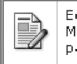
Figure A-16. SharePoint 2010 Site Actions menu drop-down icon
- Style Sheet: COREV4.CSS
- Container Class: ms-MenuUIIconLarge
- Image Class: ms-MenuUIULImg
Listing A-17. Site Actions Menu Drop-Down Icon CSS
div.ms-MenuUIPopupScreen div.ms-MenuUIPopupInner ul.ms-MenuUIUL a span.ms-MenuUIIconLarge{

height:40px;

width:40px;

}

.ms-MenuUIIcon,.ms-MenuUIIconLarge{

padding:0px 6px 0px 2px;

}

div.ms-MenuUIPopupScreen div.ms-MenuUIPopupInner ul.ms-MenuUIUL a img.ms-MenuUIULImg{

border-style:none;

}
Site Actions Menu Drop-Down Title
The following classes are used to set the font size, width, and padding of the Site Actions menu title, as shown in Figure A-17. Listing A-18 shows the standard CSS properties.

Figure A-17. SharePoint 2010 Site Actions menu drop-down title
- Style Sheet: COREV4.CSS
- Class: ms-MenuUILabel
Listing A-18. Site Actions Menu Drop-Down Title CSS
.ms-MenuUILabel,.ms-MenuUILabelRtL,.ms-menuuilabelcompact,.ms-menuuilabelcompactRtl{

font-size:8pt;

width:100%;

}

.ms-MenuUILabel{

padding:2px 0px 3px 6px;

}
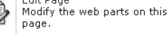
Site Actions Menu Drop-Down Description
The following classes are used to set the width and height to 40 pixels and also add some padding, as shown in Figure A-18. Listing A-19 shows the standard CSS properties.
Figure A-18. SharePoint 2010 Site Actions menu drop-down description
- Style Sheet: COREV4.CSS
- Class: ms-menuitemdescription
Listing A-19. Site Actions Menu Drop-Down Description CSS
.ms-menuitemdescription{

color:#545454;

}

div.ms-MenuUIPopupScreen div.ms-MenuUIPopupInner ul.ms-MenuUIUL a span.ms-menuitemdescription{

color:#4c535c;

font-weight:normal;

white-space:normal !important;

}
The next section that I will cover is the little site breadcrumb that allows you to navigate back up to a higher parent site.