
#13: Quick Launch (Left Panel)
The Quick Launch (left panel) shown in Figure A-60 includes the following CSS elements.
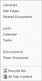
Figure A-60. SharePoint 2010 Quick Launch (left panel)
- Left Panel
- Left Panel Content
- Quick Launch Outer
- Quick Launch
- Quick Launch Menu
- Quick Launch Link Headers
- Quick Launch Link Items
- Special Navigation Links Container
- Recycle Bin
- All Site Content
Left Panel
The following ID is used to float the Quick Launch panel to the left and provide it a set width. The class is used within the same DIV so that it does not get displayed within dialog windows. Listing A-67 shows the standard CSS properties.
- Style Sheet: COREV4.CSS
- ID: s4-leftpanel
- Class: s4-notdlg
Left Panel Content
The following ID is used to set the padding, background color, and right and bottom border color. Listing A-68 shows the standard CSS properties.
- Style Sheet: COREV4.CSS
- ID: s4-leftpanel-content
Listing A-68. Left Panel Content CSS
body #s4-leftpanel-content{

padding:0px 0px 5px;

background-color:#fcfcfc;

border:1px solid #dbddde;

border-top-width:0px;

border-right-width:1px;

border-bottom-width:1px;

border-left-width:0px;

}
Quick Launch Outer
The following class is used to set the margin of this DIV to zero. Listing A-69 shows the standard CSS properties.
- Style Sheet: COREV4.CSS
- Class: ms-quicklaunchouter
Listing A-69. Quick Launch Outer CSS
.ms-quicklaunchouter{

margin:0px;

}
Quick Launch
The following class is used to apply 5px of padding to the top of the Quick Launch area Listing A-70 shows the standard CSS properties.
Listing A-70. Quick Launch CSS
.ms-quickLaunch{

padding-top:5px;

}
Quick Launch Menu
The following class is used to apply a bottom margin of 20px to the Quick Launch. Listing A-71 shows the standard CSS properties.
- Style Sheet: COREV4.CSS
- ID: zz18_V4QuickLaunchMenu
- Class: s4-ql
Listing A-71. Quick Launch Menu CSS
.s4-ql,.s4-specialNavLinkList{

list-style-type:none;

margin:0px 0px 20px 0px;

padding:0px;

}
Quick Launch Link Headers
The following class is used to set the font size, font color, and padding for the Quick Launch header text, as shown in Figure A-61. Listing A-72 shows the standard CSS properties.

Figure A-61. SharePoint 2010 Quick Launch link headers
- Style Sheet: COREV4.CSS
- Class: static menu-item
Listing A-72. Quick Launch Link Headers CSS
.s4-ql ul.root > li > .menu-item,.s4-qlheader,.s4-qlheader:visited{

font-size:1.2em;

color:#0072bc;

margin:0px;
padding:3px 4px 3px 10px;

border-width:1px 0px;

border-style:solid;

border-color:transparent;

word-wrap:break-word;

overflow-x:hidden;

}
Quick Launch Link Items
The following class is used to set the padding, font color, and horizontal overflow for the Quick Launch link items shown in Figure A-62. Listing A-73 shows the standard CSS properties.
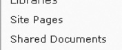
Figure A-62. SharePoint 2010 Quick Launch link items
- Style Sheet: COREV4.CSS
- Class: static menu-item
Listing A-73. Quick Launch Link Items CSS
.s4-ql ul.root ul > li > a{

padding:3px 4px 4px 10px;

border-width:1px 0px;

border-style:solid;

border-color:transparent;

color:#3b4f65;

overflow-x:hidden;

display:block;

zoom:1;

}
Special Navigation Links Container
The following class is used to apply a 20px bottom margin, top border, and top padding, as shown in Figure A-63. Listing A-74 shows the standard CSS properties.

Figure A-63. SharePoint 2010 special navigation links container
- Style Sheet: COREV4.CSS
- Class: s4-specialNavLinkList
Listing A-74. Special Navigation Links Container CSS
.s4-ql,.s4-specialNavLinkList{

list-style-type:none;

margin:0px 0px 20px 0px;

padding:0px;

}

.s4-specialNavLinkList{

margin:0px;

border-top:1px solid #dbddde;

padding-top:5px;

}
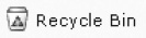
Recycle Bin
The following class is used to apply padding and font color for the recycle bin link as shown in Figure A-64. Listing A-75 shows the standard CSS for the text and inline CSS to position the IMG element.
Figure A-64. SharePoint 2010 Recycle Bin
- Style Sheet: COREV4.CSS
- Class: s4-rcycl
Listing A-75. Recycle Bin CSS
.s4-specialNavLinkList a{

display:block;

padding:3px 4px 3px 10px;

color:#3b4f65;

}
/* Inline CSS on fgimg.png IMG */

left: 0px !important;

top: -428px !important;

border: none;

position: absolute;
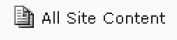
All Site Content
The following inline CSS is used to show the All Site Content icon, as shown in Figure A-65. Listing A-76 shows the standard CSS for the text and inline CSS to position the IMG element.
Figure A-65. SharePoint 2010 All Site Content icon
- Style Sheet: Inline CSS
Listing A-76. All Site Content Inline CSS
/* Inline CSS on fgimg.png IMG */

left: 0px !important;

top: 0px !important;

border: none;

position: absolute;
This next section will cover the main content areas within a site or a page.