Throughout the previous chapters, you learned a lot about the main concepts behind supervised learning and trained many different models for classification tasks to predict group memberships or categorical variables. In this chapter, we will dive into another subcategory of supervised learning: regression analysis.
Regression models are used to predict target variables on a continuous scale, which makes them attractive for addressing many questions in science. They also have applications in industry, such as understanding relationships between variables, evaluating trends, or making forecasts. One example is predicting the sales of a company in future months.
In this chapter, we will discuss the main concepts of regression models and cover the following topics:
- Exploring and visualizing datasets
- Looking at different approaches to implement linear regression models
- Training regression models that are robust to outliers
- Evaluating regression models and diagnosing common problems
- Fitting regression models to nonlinear data
Introducing linear regression
The goal of linear regression is to model the relationship between one or multiple features and a continuous target variable. In contrast to classification—a different subcategory of supervised learning—regression analysis aims to predict outputs on a continuous scale rather than categorical class labels.
In the following subsections, you will be introduced to the most basic type of linear regression, simple linear regression, and understand how to relate it to the more general, multivariate case (linear regression with multiple features).
Simple linear regression
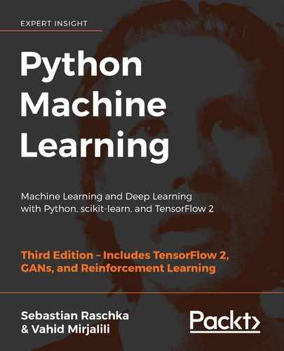
The goal of simple (univariate) linear regression is to model the relationship between a single feature (explanatory variable, x) and a continuous-valued target (response variable, y). The equation of a linear model with one explanatory variable is defined as follows:

Here, the weight, ![]() , represents the y axis intercept and
, represents the y axis intercept and ![]() is the weight coefficient of the explanatory variable. Our goal is to learn the weights of the linear equation to describe the relationship between the explanatory variable and the target variable, which can then be used to predict the responses of new explanatory variables that were not part of the training dataset.
is the weight coefficient of the explanatory variable. Our goal is to learn the weights of the linear equation to describe the relationship between the explanatory variable and the target variable, which can then be used to predict the responses of new explanatory variables that were not part of the training dataset.
Based on the linear equation that we defined previously, linear regression can be understood as finding the best-fitting straight line through the training examples, as shown in the following figure:
This best-fitting line is also called the regression line, and the vertical lines from the regression line to the training examples are the so-called offsets or residuals—the errors of our prediction.
Multiple linear regression
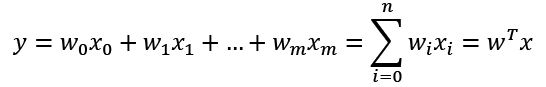
The previous section introduced simple linear regression, a special case of linear regression with one explanatory variable. Of course, we can also generalize the linear regression model to multiple explanatory variables; this process is called multiple linear regression:
Here, ![]() is the y axis intercept with
is the y axis intercept with ![]() .
.
The following figure shows how the two-dimensional, fitted hyperplane of a multiple linear regression model with two features could look:
As you can see, visualizations of multiple linear regression hyperplanes in a three-dimensional scatterplot are already challenging to interpret when looking at static figures. Since we have no good means of visualizing hyperplanes with two dimensions in a scatterplot (multiple linear regression models fit to datasets with three or more features), the examples and visualizations in this chapter will mainly focus on the univariate case, using simple linear regression. However, simple and multiple linear regression are based on the same concepts and the same evaluation techniques; the code implementations that we will discuss in this chapter are also compatible with both types of regression model.
Exploring the Housing dataset
Before we implement the first linear regression model, we will discuss a new dataset, the Housing dataset, which contains information about houses in the suburbs of Boston collected by D. Harrison and D.L. Rubinfeld in 1978. The Housing dataset has been made freely available and is included in the code bundle of this book. The dataset has recently been removed from the UCI Machine Learning Repository but is available online at https://raw.githubusercontent.com/rasbt/python-machine-learning-book-3rd-edition/master/ch10/housing.data.txt or scikit-learn (https://github.com/scikit-learn/scikit-learn/blob/master/sklearn/datasets/data/boston_house_prices.csv). As with each new dataset, it is always helpful to explore the data through a simple visualization, to get a better feeling of what we are working with.
Loading the Housing dataset into a data frame
In this section, we will load the Housing dataset using the pandas read_csv function, which is fast and versatile and a recommended tool for working with tabular data stored in a plaintext format.
The features of the 506 examples in the Housing dataset have been taken from the original source that was previously shared on https://archive.ics.uci.edu/ml/datasets/Housing and summarized here:
CRIM: Per capita crime rate by townZN: Proportion of residential land zoned for lots over 25,000 sq. ft.INDUS: Proportion of non-retail business acres per townCHAS: Charles River dummy variable (= 1 if tract bounds river and 0 otherwise)NOX: Nitric oxide concentration (parts per 10 million)RM: Average number of rooms per dwellingAGE: Proportion of owner-occupied units built prior to 1940DIS: Weighted distances to five Boston employment centersRAD: Index of accessibility to radial highwaysTAX: Full-value property tax rate per $10,000PTRATIO: Pupil-teacher ratio by townB: 1000(Bk – 0.63)2, where Bk is the proportion of [people of African American descent] by townLSTAT: Percentage of lower status of the populationMEDV: Median value of owner-occupied homes in $1000s
For the rest of this chapter, we will regard the house prices (MEDV) as our target variable—the variable that we want to predict using one or more of the 13 explanatory variables. Before we explore this dataset further, let's load it into a pandas DataFrame:
>>> import pandas as pd
>>> df = pd.read_csv('https://raw.githubusercontent.com/rasbt/'
...                  'python-machine-learning-book-3rd-edition'
...                  '/master/ch10/housing.data.txt',
...                  header=None,
...                  sep='s+')
>>> df.columns = ['CRIM', 'ZN', 'INDUS', 'CHAS',
...               'NOX', 'RM', 'AGE', 'DIS', 'RAD',
...               'TAX', 'PTRATIO', 'B', 'LSTAT', 'MEDV']
>>> df.head()
To confirm that the dataset was loaded successfully, we can display the first five lines of the dataset, as shown in the following figure:

Obtaining the Housing dataset
You can find a copy of the Housing dataset (and all other datasets used in this book) in the code bundle of this book, which you can use if you are working offline or the web link https://raw.githubusercontent.com/rasbt/python-machine-learning-book-3rd-edition/master/code/ch10/housing.data.txt is temporarily unavailable. For instance, to load the Housing dataset from a local directory, you can replace these lines:
df = pd.read_csv(
    'https://raw.githubusercontent.com/rasbt/'
    'python-machine-learning-book-3rd-edition/'
    'master/ch10/housing.data.txt',
    header=None,
    sep='s+')
in the preceding code example with this line:
df = pd.read_csv('./housing.data.txt',
    sep='s+')
Visualizing the important characteristics of a dataset
Exploratory data analysis (EDA) is an important and recommended first step prior to the training of a machine learning model. In the rest of this section, we will use some simple yet useful techniques from the graphical EDA toolbox that may help us to visually detect the presence of outliers, the distribution of the data, and the relationships between features.
First, we will create a scatterplot matrix that allows us to visualize the pair-wise correlations between the different features in this dataset in one place. To plot the scatterplot matrix, we will use the scatterplotmatrix function from the MLxtend library (http://rasbt.github.io/mlxtend/), which is a Python library that contains various convenience functions for machine learning and data science applications in Python.
You can install the mlxtend package via conda install mlxtend or pip install mlxtend. After the installation is complete, you can import the package and create the scatterplot matrix as follows:
>>> import matplotlib.pyplot as plt
>>> from mlxtend.plotting import scatterplotmatrix
>>> cols = ['LSTAT', 'INDUS', 'NOX', 'RM', 'MEDV']
>>> scatterplotmatrix(df[cols].values, figsize=(10, 8),
...                   names=cols, alpha=0.5)
>>> plt.tight_layout()
>>> plt.show()
As you can see in the following figure, the scatterplot matrix provides us with a useful graphical summary of the relationships in a dataset:
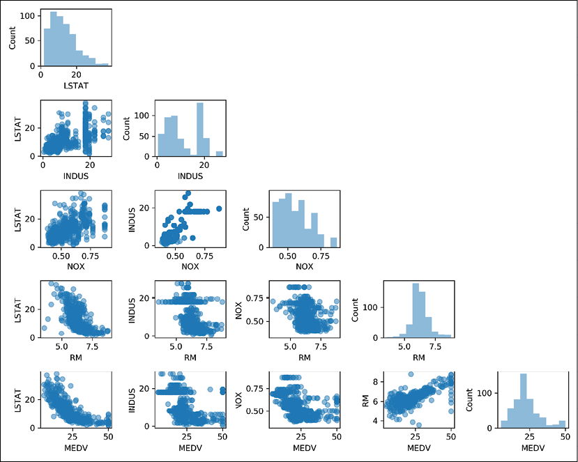
Due to space constraints and in the interest of readability, we have only plotted five columns from the dataset: LSTAT, INDUS, NOX, RM, and MEDV. However, you are encouraged to create a scatterplot matrix of the whole DataFrame to explore the dataset further by choosing different column names in the previous scatterplotmatrix function call, or including all variables in the scatterplot matrix by omitting the column selector.
Using this scatterplot matrix, we can now quickly eyeball how the data is distributed and whether it contains outliers. For example, we can see that there is a linear relationship between RM and house prices, MEDV (the fifth column of the fourth row). Furthermore, we can see in the histogram—the lower-right subplot in the scatterplot matrix—that the MEDV variable seems to be normally distributed but contains several outliers.
Normality assumption of linear regression
Note that in contrast to common belief, training a linear regression model does not require that the explanatory or target variables are normally distributed. The normality assumption is only a requirement for certain statistics and hypothesis tests that are beyond the scope of this book (for more information on this topic, please refer to Introduction to Linear Regression Analysis, Montgomery, Douglas C. Montgomery, Elizabeth A. Peck, and G. Geoffrey Vining, Wiley, 2012, pages: 318-319).
Looking at relationships using a correlation matrix
In the previous section, we visualized the data distributions of the Housing dataset variables in the form of histograms and scatterplots. Next, we will create a correlation matrix to quantify and summarize linear relationships between variables. A correlation matrix is closely related to the covariance matrix that we covered in the section Unsupervised dimensionality reduction via principal component analysis in Chapter 5, Compressing Data via Dimensionality Reduction. We can interpret the correlation matrix as being a rescaled version of the covariance matrix. In fact, the correlation matrix is identical to a covariance matrix computed from standardized features.
The correlation matrix is a square matrix that contains the Pearson product-moment correlation coefficient (often abbreviated as Pearson's r), which measures the linear dependence between pairs of features. The correlation coefficients are in the range –1 to 1. Two features have a perfect positive correlation if r = 1, no correlation if r = 0, and a perfect negative correlation if r = –1. As mentioned previously, Pearson's correlation coefficient can simply be calculated as the covariance between two features, x and y (numerator), divided by the product of their standard deviations (denominator):
Here, ![]() denotes the mean of the corresponding feature,
denotes the mean of the corresponding feature, ![]() is the covariance between the features x and y, and
is the covariance between the features x and y, and ![]() and
and ![]() are the features' standard deviations.
are the features' standard deviations.
Covariance versus correlation for standardized features
We can show that the covariance between a pair of standardized features is, in fact, equal to their linear correlation coefficient. To show this, let's first standardize the features x and y to obtain their z-scores, which we will denote as ![]() and
and ![]() , respectively:
, respectively:
Remember that we compute the (population) covariance between two features as follows:
Since standardization centers a feature variable at mean zero, we can now calculate the covariance between the scaled features as follows:

Through resubstitution, we then get the following result:
Finally, we can simplify this equation as follows:

In the following code example, we will use NumPy's corrcoef function on the five feature columns that we previously visualized in the scatterplot matrix, and we will use MLxtend's heatmap function to plot the correlation matrix array as a heat map:
>>> from mlxtend.plotting import heatmap
>>> import numpy as np
>>> cm = np.corrcoef(df[cols].values.T)
>>> hm = heatmap(cm,
...              row_names=cols,
...              column_names=cols)
>>> plt.show()
As you can see in the resulting figure, the correlation matrix provides us with another useful summary graphic that can help us to select features based on their respective linear correlations:

To fit a linear regression model, we are interested in those features that have a high correlation with our target variable, MEDV. Looking at the previous correlation matrix, we can see that our target variable, MEDV, shows the largest correlation with the LSTAT variable (-0.74); however, as you might remember from inspecting the scatterplot matrix, there is a clear nonlinear relationship between LSTAT and MEDV. On the other hand, the correlation between RM and MEDV is also relatively high (0.70). Given the linear relationship between these two variables that we observed in the scatterplot, RM seems to be a good choice for an exploratory variable to introduce the concepts of a simple linear regression model in the following section.
Implementing an ordinary least squares linear regression model
At the beginning of this chapter, it was mentioned that linear regression can be understood as obtaining the best-fitting straight line through the examples of our training data. However, we have neither defined the term best-fitting nor have we discussed the different techniques of fitting such a model. In the following subsections, we will fill in the missing pieces of this puzzle using the ordinary least squares (OLS) method (sometimes also called linear least squares) to estimate the parameters of the linear regression line that minimizes the sum of the squared vertical distances (residuals or errors) to the training examples.
Solving regression for regression parameters with gradient descent
Consider our implementation of the Adaptive Linear Neuron (Adaline) from Chapter 2, Training Simple Machine Learning Algorithms for Classification. You will remember that the artificial neuron uses a linear activation function. Also, we defined a cost function, J(w), which we minimized to learn the weights via optimization algorithms, such as gradient descent (GD) and stochastic gradient descent (SGD). This cost function in Adaline is the sum of squared errors (SSE), which is identical to the cost function that we use for OLS:

Here, ![]() is the predicted value
is the predicted value ![]() (note that the term
(note that the term ![]() is just used for convenience to derive the update rule of GD). Essentially, OLS regression can be understood as Adaline without the unit step function so that we obtain continuous target values instead of the class labels
is just used for convenience to derive the update rule of GD). Essentially, OLS regression can be understood as Adaline without the unit step function so that we obtain continuous target values instead of the class labels -1 and 1. To demonstrate this, let's take the GD implementation of Adaline from Chapter 2, Training Simple Machine Learning Algorithms for Classification, and remove the unit step function to implement our first linear regression model:
class LinearRegressionGD(object):

    def __init__(self, eta=0.001, n_iter=20):
        self.eta = eta
        self.n_iter = n_iter

    def fit(self, X, y):
        self.w_ = np.zeros(1 + X.shape[1])
        self.cost_ = []

        for i in range(self.n_iter):
            output = self.net_input(X)
            errors = (y - output)
            self.w_[1:] += self.eta * X.T.dot(errors)
            self.w_[0] += self.eta * errors.sum()
            cost = (errors**2).sum() / 2.0
            self.cost_.append(cost)
        return self

    def net_input(self, X):
        return np.dot(X, self.w_[1:]) + self.w_[0]

    def predict(self, X):
        return self.net_input(X)
Weight updates with gradient descent
If you need a refresher about how the weights are updated—taking a step in the opposite direction of the gradient—please revisit the Adaptive linear neurons and the convergence of learning section in Chapter 2, Training Simple Machine Learning Algorithms for Classification.
To see our LinearRegressionGD regressor in action, let's use the RM (number of rooms) variable from the Housing dataset as the explanatory variable and train a model that can predict MEDV (house prices). Furthermore, we will standardize the variables for better convergence of the GD algorithm. The code is as follows:
>>> X = df[['RM']].values
>>> y = df['MEDV'].values
>>> from sklearn.preprocessing import StandardScaler
>>> sc_x = StandardScaler()
>>> sc_y = StandardScaler()
>>> X_std = sc_x.fit_transform(X)
>>> y_std = sc_y.fit_transform(y[:, np.newaxis]).flatten()
>>> lr = LinearRegressionGD()
>>> lr.fit(X_std, y_std)
Notice the workaround regarding y_std, using np.newaxis and flatten. Most transformers in scikit-learn expect data to be stored in two-dimensional arrays. In the previous code example, the use of np.newaxis in y[:, np.newaxis] added a new dimension to the array. Then, after StandardScaler returned the scaled variable, we converted it back to the original one-dimensional array representation using the flatten() method for our convenience.
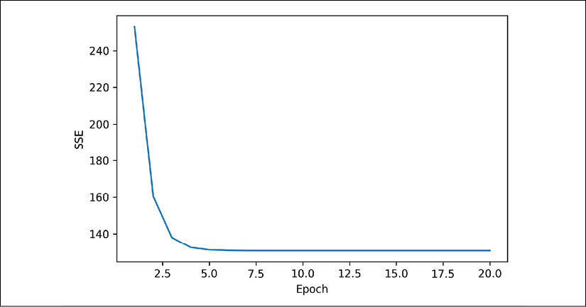
We discussed in Chapter 2, Training Simple Machine Learning Algorithms for Classification, that it is always a good idea to plot the cost as a function of the number of epochs (complete iterations) over the training dataset when we are using optimization algorithms, such as GD, to check that the algorithm converged to a cost minimum (here, a global cost minimum):
>>> plt.plot(range(1, lr.n_iter+1), lr.cost_)
>>> plt.ylabel('SSE')
>>> plt.xlabel('Epoch')
>>> plt.show()
As you can see in the following plot, the GD algorithm converged after the fifth epoch:
Next, let's visualize how well the linear regression line fits the training data. To do so, we will define a simple helper function that will plot a scatterplot of the training examples and add the regression line:
>>> def lin_regplot(X, y, model):
...     plt.scatter(X, y, c='steelblue', edgecolor='white', s=70)
...     plt.plot(X, model.predict(X), color='black', lw=2)
...     return None
Now, we will use this lin_regplot function to plot the number of rooms against the house price:
>>> lin_regplot(X_std, y_std, lr)
>>> plt.xlabel('Average number of rooms [RM] (standardized)')
>>> plt.ylabel('Price in $1000s [MEDV] (standardized)')
>>> plt.show()
As you can see in the following plot, the linear regression line reflects the general trend that house prices tend to increase with the number of rooms:
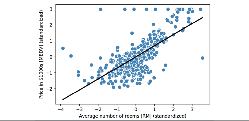
Although this observation makes sense, the data also tells us that the number of rooms does not explain house prices very well in many cases. Later in this chapter, we will discuss how to quantify the performance of a regression model. Interestingly, we can also observe that several data points lined up at y = 3, which suggests that the prices may have been clipped. In certain applications, it may also be important to report the predicted outcome variables on their original scale. To scale the predicted price outcome back onto the Price in $1000s axis, we can simply apply the inverse_transform method of the StandardScaler:
>>> num_rooms_std = sc_x.transform(np.array([[5.0]]))
>>> price_std = lr.predict(num_rooms_std)
>>> print("Price in $1000s: %.3f" %
...       sc_y.inverse_transform(price_std))
Price in $1000s: 10.840
In this code example, we used the previously trained linear regression model to predict the price of a house with five rooms. According to our model, such a house will be worth $10,840.
As a side note, it is also worth mentioning that we technically don't have to update the weights of the intercept if we are working with standardized variables, since the y axis intercept is always 0 in those cases. We can quickly confirm this by printing the weights:
>>> print('Slope: %.3f' % lr.w_[1])
Slope: 0.695
>>> print('Intercept: %.3f' % lr.w_[0])
Intercept: -0.000
Estimating the coefficient of a regression model via scikit-learn
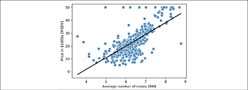
In the previous section, we implemented a working model for regression analysis; however, in a real-world application, we may be interested in more efficient implementations. For example, many of scikit-learn's estimators for regression make use of the least squares implementation in SciPy (scipy.linalg.lstsq), which in turn uses highly optimized code optimizations based on the Linear Algebra Package (LAPACK). The linear regression implementation in scikit-learn also works (better) with unstandardized variables, since it does not use (S)GD-based optimization, so we can skip the standardization step:
>>> from sklearn.linear_model import LinearRegression
>>> slr = LinearRegression()
>>> slr.fit(X, y)
>>> y_pred = slr.predict(X)
>>> print('Slope: %.3f' % slr.coef_[0])
Slope: 9.102
>>> print('Intercept: %.3f' % slr.intercept_)
Intercept: -34.671
As you can see from executing this code, scikit-learn's LinearRegression model, fitted with the unstandardized RM and MEDV variables, yielded different model coefficients, since the features have not been standardized. However, when we compare it to our GD implementation by plotting MEDV against RM, we can qualitatively see that it fits the data similarly well:
>>> lin_regplot(X, y, slr)
>>> plt.xlabel('Average number of rooms [RM]')
>>> plt.ylabel('Price in $1000s [MEDV]')
>>> plt.show()
For instance, we can see that the overall result looks identical to our GD implementation:
Analytical solutions of linear regression
As an alternative to using machine learning libraries, there is also a closed-form solution for solving OLS involving a system of linear equations that can be found in most introductory statistics textbooks:
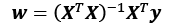
We can implement it in Python as follows:
# adding a column vector of "ones"
>>> Xb = np.hstack((np.ones((X.shape[0], 1)), X))
>>> w = np.zeros(X.shape[1])
>>> z = np.linalg.inv(np.dot(Xb.T, Xb))
>>> w = np.dot(z, np.dot(Xb.T, y))
>>> print('Slope: %.3f' % w[1])
Slope: 9.102
>>> print('Intercept: %.3f' % w[0])
Intercept: -34.671
The advantage of this method is that it is guaranteed to find the optimal solution analytically. However, if we are working with very large datasets, it can be computationally too expensive to invert the matrix in this formula (sometimes also called the normal equation), or the matrix containing the training examples may be singular (non-invertible), which is why we may prefer iterative methods in certain cases.
If you are interested in more information on how to obtain normal equations, take a look at Dr. Stephen Pollock's chapter The Classical Linear Regression Model from his lectures at the University of Leicester, which is available for free at: http://www.le.ac.uk/users/dsgp1/COURSES/MESOMET/ECMETXT/06mesmet.pdf.
Also, if you want to compare linear regression solutions obtained via GD, SGD, the closed-form solution, QR factorization, and singular vector decomposition, you can use the LinearRegression class implemented in MLxtend (http://rasbt.github.io/mlxtend/user_guide/regressor/LinearRegression/), which lets users toggle between these options. Another great library to recommend for regression modeling in Python is Statsmodels, which implements more advanced linear regression models, as illustrated at https://www.statsmodels.org/stable/examples/index.html#regression.
Fitting a robust regression model using RANSAC
Linear regression models can be heavily impacted by the presence of outliers. In certain situations, a very small subset of our data can have a big effect on the estimated model coefficients. There are many statistical tests that can be used to detect outliers, which are beyond the scope of the book. However, removing outliers always requires our own judgment as data scientists as well as our domain knowledge.
As an alternative to throwing out outliers, we will look at a robust method of regression using the RANdom SAmple Consensus (RANSAC) algorithm, which fits a regression model to a subset of the data, the so-called inliers.
We can summarize the iterative RANSAC algorithm as follows:
- Select a random number of examples to be inliers and fit the model.
- Test all other data points against the fitted model and add those points that fall within a user-given tolerance to the inliers.
- Refit the model using all inliers.
- Estimate the error of the fitted model versus the inliers.
- Terminate the algorithm if the performance meets a certain user-defined threshold or if a fixed number of iterations were reached; go back to step 1 otherwise.
Let's now use a linear model in combination with the RANSAC algorithm as implemented in scikit-learn's RANSACRegressor class:
>>> from sklearn.linear_model import RANSACRegressor
>>> ransac = RANSACRegressor(LinearRegression(),
...                          max_trials=100,
...                          min_samples=50,
...                          loss='absolute_loss',
...                          residual_threshold=5.0,
...                          random_state=0)
>>> ransac.fit(X, y)
We set the maximum number of iterations of the RANSACRegressor to 100, and using min_samples=50, we set the minimum number of the randomly chosen training examples to be at least 50. Using 'absolute_loss' as an argument for the loss parameter, the algorithm computes absolute vertical distances between the fitted line and the training examples. By setting the residual_threshold parameter to 5.0, we only allow training examples to be included in the inlier set if their vertical distance to the fitted line is within 5 distance units, which works well on this particular dataset.
By default, scikit-learn uses the MAD estimate to select the inlier threshold, where MAD stands for the median absolute deviation of the target values, y. However, the choice of an appropriate value for the inlier threshold is problem-specific, which is one disadvantage of RANSAC. Many different approaches have been developed in recent years to select a good inlier threshold automatically. You can find a detailed discussion in Automatic Estimation of the Inlier Threshold in Robust Multiple Structures Fitting, R. Toldo, A. Fusiello's, Springer, 2009 (in Image Analysis and Processing–ICIAP 2009, pages: 123-131).
Once we have fitted the RANSAC model, let's obtain the inliers and outliers from the fitted RANSAC-linear regression model and plot them together with the linear fit:
>>> inlier_mask = ransac.inlier_mask_
>>> outlier_mask = np.logical_not(inlier_mask)
>>> line_X = np.arange(3, 10, 1)
>>> line_y_ransac = ransac.predict(line_X[:, np.newaxis])
>>> plt.scatter(X[inlier_mask], y[inlier_mask],
...             c='steelblue', edgecolor='white',
...             marker='o', label='Inliers')
>>> plt.scatter(X[outlier_mask], y[outlier_mask],
...             c='limegreen', edgecolor='white',
...             marker='s', label='Outliers')
>>> plt.plot(line_X, line_y_ransac, color='black', lw=2)
>>> plt.xlabel('Average number of rooms [RM]')
>>> plt.ylabel('Price in $1000s [MEDV]')
>>> plt.legend(loc='upper left')
>>> plt.show()
As you can see in the following scatterplot, the linear regression model was fitted on the detected set of inliers, which are shown as circles:

When we print the slope and intercept of the model by executing the following code, the linear regression line will be slightly different from the fit that we obtained in the previous section without using RANSAC:
>>> print('Slope: %.3f' % ransac.estimator_.coef_[0])
Slope: 10.735
>>> print('Intercept: %.3f' % ransac.estimator_.intercept_)
Intercept: -44.089
Using RANSAC, we reduced the potential effect of the outliers in this dataset, but we don't know whether this approach will have a positive effect on the predictive performance for unseen data or not. Thus, in the next section, we will look at different approaches for evaluating a regression model, which is a crucial part of building systems for predictive modeling.
Evaluating the performance of linear regression models
In the previous section, you learned how to fit a regression model on training data. However, you discovered in previous chapters that it is crucial to test the model on data that it hasn't seen during training to obtain a more unbiased estimate of its generalization performance.
As you will remember from Chapter 6, Learning Best Practices for Model Evaluation and Hyperparameter Tuning, we want to split our dataset into separate training and test datasets, where we will use the former to fit the model and the latter to evaluate its performance on unseen data to estimate the generalization performance. Instead of proceeding with the simple regression model, we will now use all variables in the dataset and train a multiple regression model:
>>> from sklearn.model_selection import train_test_split
>>> X = df.iloc[:, :-1].values
>>> y = df['MEDV'].values
>>> X_train, X_test, y_train, y_test = train_test_split(
...       X, y, test_size=0.3, random_state=0)
>>> slr = LinearRegression()
>>> slr.fit(X_train, y_train)
>>> y_train_pred = slr.predict(X_train)
>>> y_test_pred = slr.predict(X_test)
Since our model uses multiple explanatory variables, we can't visualize the linear regression line (or hyperplane, to be precise) in a two-dimensional plot, but we can plot the residuals (the differences or vertical distances between the actual and predicted values) versus the predicted values to diagnose our regression model. Residual plots are a commonly used graphical tool for diagnosing regression models. They can help to detect nonlinearity and outliers, and check whether the errors are randomly distributed.
Using the following code, we will now plot a residual plot where we simply subtract the true target variables from our predicted responses:
>>> plt.scatter(y_train_pred, y_train_pred - y_train,
...             c='steelblue', marker='o', edgecolor='white',
...             label='Training data')
>>> plt.scatter(y_test_pred, y_test_pred - y_test,
...             c='limegreen', marker='s', edgecolor='white',
...             label='Test data')
>>> plt.xlabel('Predicted values')
>>> plt.ylabel('Residuals')
>>> plt.legend(loc='upper left')
>>> plt.hlines(y=0, xmin=-10, xmax=50, color='black', lw=2)
>>> plt.xlim([-10, 50])
>>> plt.show()
After executing the code, we should see a residual plot with a line passing through the x axis origin, as shown here:
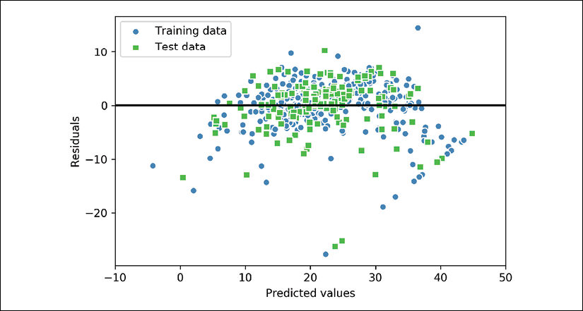
In the case of a perfect prediction, the residuals would be exactly zero, which we will probably never encounter in realistic and practical applications. However, for a good regression model, we would expect the errors to be randomly distributed and the residuals to be randomly scattered around the centerline. If we see patterns in a residual plot, it means that our model is unable to capture some explanatory information, which has leaked into the residuals, as you can slightly see in our previous residual plot. Furthermore, we can also use residual plots to detect outliers, which are represented by the points with a large deviation from the centerline.
Another useful quantitative measure of a model's performance is the so-called mean squared error (MSE), which is simply the averaged value of the SSE cost that we minimized to fit the linear regression model. The MSE is useful for comparing different regression models or for tuning their parameters via grid search and cross-validation, as it normalizes the SSE by the sample size:

Let's compute the MSE of our training and test predictions:
>>> from sklearn.metrics import mean_squared_error
>>> print('MSE train: %.3f, test: %.3f' % (
...        mean_squared_error(y_train, y_train_pred),
...        mean_squared_error(y_test, y_test_pred)))
MSE train: 19.958, test: 27.196
You can see that the MSE on the training dataset is 19.96, and the MSE on the test dataset is much larger, with a value of 27.20, which is an indicator that our model is overfitting the training data in this case. However, please be aware that the MSE is unbounded in contrast to the classification accuracy, for example. In other words, the interpretation of the MSE depends on the dataset and feature scaling. For example, if the house prices were presented as multiples of 1,000 (with the K suffix), the same model would yield a lower MSE compared to a model that worked with unscaled features. To further illustrate this point, ![]() .
.
Thus, it may sometimes be more useful to report the coefficient of determination (![]() ), which can be understood as a standardized version of the MSE, for better interpretability of the model's performance. Or, in other words,
), which can be understood as a standardized version of the MSE, for better interpretability of the model's performance. Or, in other words, ![]() is the fraction of response variance that is captured by the model. The
is the fraction of response variance that is captured by the model. The ![]() value is defined as:
value is defined as:
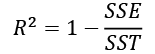
Here, SSE is the sum of squared errors and SST is the total sum of squares:
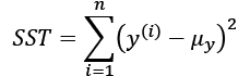
In other words, SST is simply the variance of the response.
Let's quickly show that ![]() is indeed just a rescaled version of the MSE:
is indeed just a rescaled version of the MSE:
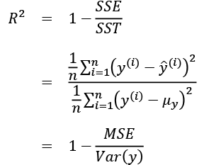
For the training dataset, the ![]() is bounded between 0 and 1, but it can become negative for the test dataset. If
is bounded between 0 and 1, but it can become negative for the test dataset. If ![]() , the model fits the data perfectly with a corresponding MSE = 0.
, the model fits the data perfectly with a corresponding MSE = 0.
Evaluated on the training data, the ![]() of our model is 0.765, which doesn't sound too bad. However, the
of our model is 0.765, which doesn't sound too bad. However, the ![]() on the test dataset is only 0.673, which we can compute by executing the following code:
on the test dataset is only 0.673, which we can compute by executing the following code:
>>> from sklearn.metrics import r2_score
>>> print('R^2 train: %.3f, test: %.3f' %
...       (r2_score(y_train, y_train_pred),
...        r2_score(y_test, y_test_pred)))
R^2 train: 0.765, test: 0.673
Using regularized methods for regression
As we discussed in Chapter 3, A Tour of Machine Learning Classifiers Using scikit-learn, regularization is one approach to tackling the problem of overfitting by adding additional information, and thereby shrinking the parameter values of the model to induce a penalty against complexity. The most popular approaches to regularized linear regression are the so-called Ridge Regression, least absolute shrinkage and selection operator (LASSO), and elastic Net.
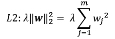
Ridge Regression is an L2 penalized model where we simply add the squared sum of the weights to our least-squares cost function:
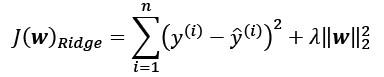
Here:
By increasing the value of hyperparameter ![]() , we increase the regularization strength and thereby shrink the weights of our model. Please note that we don't regularize the intercept term,
, we increase the regularization strength and thereby shrink the weights of our model. Please note that we don't regularize the intercept term, ![]() .
.
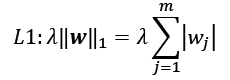
An alternative approach that can lead to sparse models is LASSO. Depending on the regularization strength, certain weights can become zero, which also makes LASSO useful as a supervised feature selection technique:
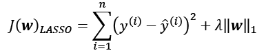
Here, the L1 penalty for LASSO is defined as the sum of the absolute magnitudes of the model weights, as follows:
However, a limitation of LASSO is that it selects at most n features if m > n, where n is the number of training examples. This may be undesirable in certain applications of feature selection. In practice, however, this property of LASSO is often an advantage because it avoids saturated models. Saturation of a model occurs if the number of training examples is equal to the number of features, which is a form of overparameterization. As a consequence, a saturated model can always fit the training data perfectly but is merely a form of interpolation and thus is not expected to generalize well.
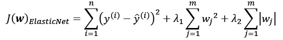
A compromise between Ridge Regression and LASSO is elastic net, which has an L1 penalty to generate sparsity and an L2 penalty such that it can be used for selecting more than n features if m > n:
Those regularized regression models are all available via scikit-learn, and their usage is similar to the regular regression model except that we have to specify the regularization strength via the parameter ![]() , for example, optimized via k-fold cross-validation.
, for example, optimized via k-fold cross-validation.
A Ridge Regression model can be initialized via:
>>> from sklearn.linear_model import Ridge
>>> ridge = Ridge(alpha=1.0)
Note that the regularization strength is regulated by the parameter alpha, which is similar to the parameter ![]() . Likewise, we can initialize a LASSO regressor from the
. Likewise, we can initialize a LASSO regressor from the linear_model submodule:
>>> from sklearn.linear_model import Lasso
>>> lasso = Lasso(alpha=1.0)
Lastly, the ElasticNet implementation allows us to vary the L1 to L2 ratio:
>>> from sklearn.linear_model import ElasticNet
>>> elanet = ElasticNet(alpha=1.0, l1_ratio=0.5)
For example, if we set the l1_ratio to 1.0, the ElasticNet regressor would be equal to LASSO regression. For more detailed information about the different implementations of linear regression, please see the documentation at http://scikit-learn.org/stable/modules/linear_model.html.
Turning a linear regression model into a curve – polynomial regression
In the previous sections, we assumed a linear relationship between explanatory and response variables. One way to account for the violation of linearity assumption is to use a polynomial regression model by adding polynomial terms:

Here, d denotes the degree of the polynomial. Although we can use polynomial regression to model a nonlinear relationship, it is still considered a multiple linear regression model because of the linear regression coefficients, w. In the following subsections, we will see how we can add such polynomial terms to an existing dataset conveniently and fit a polynomial regression model.
Adding polynomial terms using scikit-learn
We will now learn how to use the PolynomialFeatures transformer class from scikit-learn to add a quadratic term (d = 2) to a simple regression problem with one explanatory variable. Then, we will compare the polynomial to the linear fit by following these steps:
- Add a second-degree polynomial term:
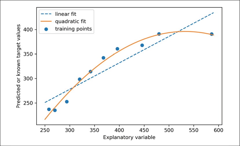
>>> from sklearn.preprocessing import PolynomialFeatures >>> X = np.array([ 258.0, 270.0, 294.0, 320.0, 342.0, ... 368.0, 396.0, 446.0, 480.0, 586.0]) ... [:, np.newaxis] >>> y = np.array([ 236.4, 234.4, 252.8, 298.6, 314.2, ... 342.2, 360.8, 368.0, 391.2, 390.8]) >>> lr = LinearRegression() >>> pr = LinearRegression() >>> quadratic = PolynomialFeatures(degree=2) >>> X_quad = quadratic.fit_transform(X) - Fit a simple linear regression model for comparison:
>>> lr.fit(X, y) >>> X_fit = np.arange(250, 600, 10)[:, np.newaxis] >>> y_lin_fit = lr.predict(X_fit) - Fit a multiple regression model on the transformed features for polynomial regression:
>>> pr.fit(X_quad, y) >>> y_quad_fit = pr.predict(quadratic.fit_transform(X_fit)) - Plot the results:
>>> plt.scatter(X, y, label='Training points')
>>> plt.plot(X_fit, y_lin_fit,
...          label='Linear fit', linestyle='--')
>>> plt.plot(X_fit, y_quad_fit,
...          label='Quadratic fit')
>>> plt.xlabel('Explanatory variable')
>>> plt.ylabel('Predicted or known target values')
>>> plt.legend(loc='upper left')
>>> plt.tight_layout()
>>> plt.show()
In the resulting plot, you can see that the polynomial fit captures the relationship between the response and explanatory variables much better than the linear fit:
Next, we will compute the MSE and ![]() evaluation metrics:
evaluation metrics:
>>> y_lin_pred = lr.predict(X)
>>> y_quad_pred = pr.predict(X_quad)
>>> print('Training MSE linear: %.3f, quadratic: %.3f' % (
...       mean_squared_error(y, y_lin_pred),
...       mean_squared_error(y, y_quad_pred)))
Training MSE linear: 569.780, quadratic: 61.330
>>> print('Training R^2 linear: %.3f, quadratic: %.3f' % (
...       r2_score(y, y_lin_pred),
...       r2_score(y, y_quad_pred)))
Training R^2 linear: 0.832, quadratic: 0.982
As you can see after executing the code, the MSE decreased from 570 (linear fit) to 61 (quadratic fit); also, the coefficient of determination reflects a closer fit of the quadratic model (![]() ) as opposed to the linear fit (
) as opposed to the linear fit (![]() ) in this particular toy problem.
) in this particular toy problem.
Modeling nonlinear relationships in the Housing dataset
In the preceding subsection, you learned how to construct polynomial features to fit nonlinear relationships in a toy problem; let's now take a look at a more concrete example and apply those concepts to the data in the Housing dataset. By executing the following code, we will model the relationship between house prices and LSTAT (percentage of lower status of the population) using second-degree (quadratic) and third-degree (cubic) polynomials and compare that to a linear fit:
>>> X = df[['LSTAT']].values
>>> y = df['MEDV'].values
>>> regr = LinearRegression()
# create quadratic features
>>> quadratic = PolynomialFeatures(degree=2)
>>> cubic = PolynomialFeatures(degree=3)
>>> X_quad = quadratic.fit_transform(X)
>>> X_cubic = cubic.fit_transform(X)
# fit features
>>> X_fit = np.arange(X.min(), X.max(), 1)[:, np.newaxis]
>>> regr = regr.fit(X, y)
>>> y_lin_fit = regr.predict(X_fit)
>>> linear_r2 = r2_score(y, regr.predict(X))
>>> regr = regr.fit(X_quad, y)
>>> y_quad_fit = regr.predict(quadratic.fit_transform(X_fit))
>>> quadratic_r2 = r2_score(y, regr.predict(X_quad))
>>> regr = regr.fit(X_cubic, y)
>>> y_cubic_fit = regr.predict(cubic.fit_transform(X_fit))
>>> cubic_r2 = r2_score(y, regr.predict(X_cubic))
# plot results
>>> plt.scatter(X, y, label='Training points', color='lightgray')
>>> plt.plot(X_fit, y_lin_fit,
...          label='Linear (d=1), $R^2=%.2f$' % linear_r2,
...          color='blue',
...          lw=2,
...          linestyle=':')
>>> plt.plot(X_fit, y_quad_fit,
...          label='Quadratic (d=2), $R^2=%.2f$' % quadratic_r2,
...          color='red',
...          lw=2,
...          linestyle='-')
>>> plt.plot(X_fit, y_cubic_fit,
...          label='Cubic (d=3), $R^2=%.2f$' % cubic_r2,
...          color='green',
...          lw=2,
...          linestyle='--')
>>> plt.xlabel('% lower status of the population [LSTAT]')
>>> plt.ylabel('Price in $1000s [MEDV]')
>>> plt.legend(loc='upper right')
>>> plt.show()
The resulting plot is as follows:
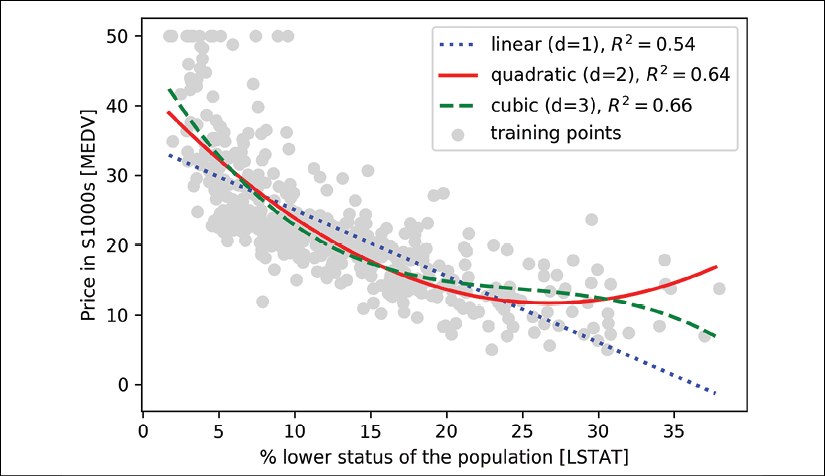
As you can see, the cubic fit captures the relationship between house prices and LSTAT better than the linear and quadratic fit. However, you should be aware that adding more and more polynomial features increases the complexity of a model and therefore increases the chance of overfitting. Thus, in practice, it is always recommended to evaluate the performance of the model on a separate test dataset to estimate the generalization performance.
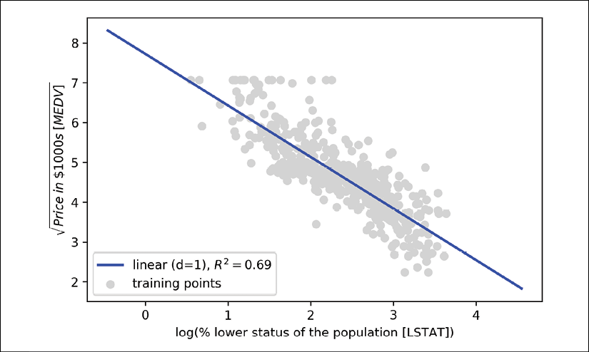
In addition, polynomial features are not always the best choice for modeling nonlinear relationships. For example, with some experience or intuition, just looking at the MEDV-LSTAT scatterplot may lead to the hypothesis that a log-transformation of the LSTAT feature variable and the square root of MEDV may project the data onto a linear feature space suitable for a linear regression fit. For instance, my perception is that this relationship between the two variables looks quite similar to an exponential function:
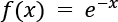
Since the natural logarithm of an exponential function is a straight line, I assume that such a log-transformation can be usefully applied here:

Let's test this hypothesis by executing the following code:
>>> # transform features
>>> X_log = np.log(X)
>>> y_sqrt = np.sqrt(y)
>>>
>>> # fit features
>>> X_fit = np.arange(X_log.min()-1,
...                   X_log.max()+1, 1)[:, np.newaxis]
>>> regr = regr.fit(X_log, y_sqrt)
>>> y_lin_fit = regr.predict(X_fit)
>>> linear_r2 = r2_score(y_sqrt, regr.predict(X_log))
>>> # plot results
>>> plt.scatter(X_log, y_sqrt,
...             label='Training points',
...             color='lightgray')
>>> plt.plot(X_fit, y_lin_fit,
...          label='Linear (d=1), $R^2=%.2f$' % linear_r2,
...          color='blue',
...          lw=2)
>>> plt.xlabel('log(% lower status of the population [LSTAT])')
>>> plt.ylabel('$sqrt{Price ; in ; $1000s ; [MEDV]}$')
>>> plt.legend(loc='lower left')
>>> plt.tight_layout()
>>> plt.show()
After transforming the explanatory onto the log space and taking the square root of the target variables, we were able to capture the relationship between the two variables with a linear regression line that seems to fit the data better (![]() ) than any of the previous polynomial feature transformations:
) than any of the previous polynomial feature transformations:
Dealing with nonlinear relationships using random forests
In this section, we are going to take a look at random forest regression, which is conceptually different from the previous regression models in this chapter. A random forest, which is an ensemble of multiple decision trees, can be understood as the sum of piecewise linear functions, in contrast to the global linear and polynomial regression models that we discussed previously. In other words, via the decision tree algorithm, we subdivide the input space into smaller regions that become more manageable.
Decision tree regression
An advantage of the decision tree algorithm is that it does not require any transformation of the features if we are dealing with nonlinear data, because decision trees analyze one feature at a time, rather than taking weighted combinations into account. (Likewise, normalizing or standardizing features is not required for decision trees.) You will remember from Chapter 3, A Tour of Machine Learning Classifiers Using scikit-learn, that we grow a decision tree by iteratively splitting its nodes until the leaves are pure or a stopping criterion is satisfied. When we used decision trees for classification, we defined entropy as a measure of impurity to determine which feature split maximizes the information gain (IG), which can be defined as follows for a binary split:

Here, ![]() is the feature to perform the split,
is the feature to perform the split, ![]() is the number of training examples in the parent node, I is the impurity function,
is the number of training examples in the parent node, I is the impurity function, ![]() is the subset of training examples at the parent node, and
is the subset of training examples at the parent node, and ![]() and
and ![]() are the subsets of training examples at the left and right child nodes after the split. Remember that our goal is to find the feature split that maximizes the information gain; in other words, we want to find the feature split that reduces the impurities in the child nodes most. In Chapter 3, A Tour of Machine Learning Classifiers Using scikit-learn, we discussed Gini impurity and entropy as measures of impurity, which are both useful criteria for classification. To use a decision tree for regression, however, we need an impurity metric that is suitable for continuous variables, so we define the impurity measure of a node, t, as the MSE instead:
are the subsets of training examples at the left and right child nodes after the split. Remember that our goal is to find the feature split that maximizes the information gain; in other words, we want to find the feature split that reduces the impurities in the child nodes most. In Chapter 3, A Tour of Machine Learning Classifiers Using scikit-learn, we discussed Gini impurity and entropy as measures of impurity, which are both useful criteria for classification. To use a decision tree for regression, however, we need an impurity metric that is suitable for continuous variables, so we define the impurity measure of a node, t, as the MSE instead:
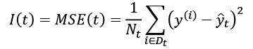
Here, ![]() is the number of training examples at node t,
is the number of training examples at node t, ![]() is the training subset at node t,
is the training subset at node t, ![]() is the true target value, and
is the true target value, and ![]() is the predicted target value (sample mean):
is the predicted target value (sample mean):

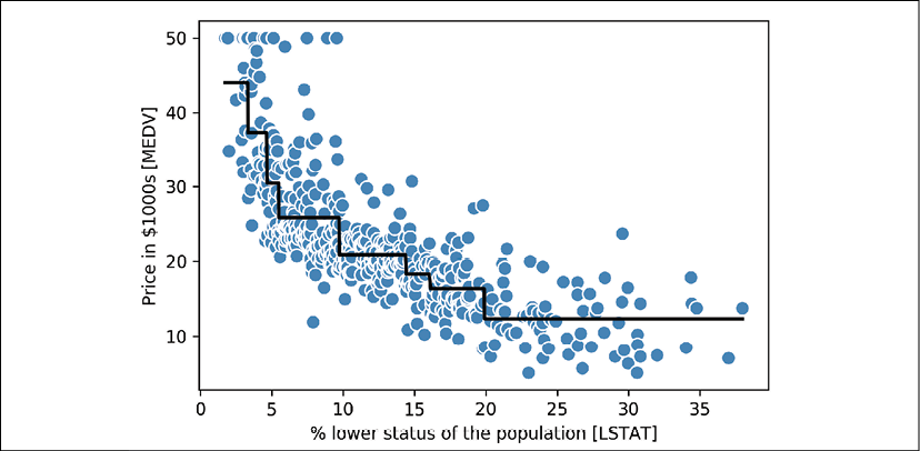
In the context of decision tree regression, the MSE is often referred to as within-node variance, which is why the splitting criterion is also better known as variance reduction. To see what the line fit of a decision tree looks like, let's use the DecisionTreeRegressor implemented in scikit-learn to model the nonlinear relationship between the MEDV and LSTAT variables:
>>> from sklearn.tree import DecisionTreeRegressor
>>> X = df[['LSTAT']].values
>>> y = df['MEDV'].values
>>> tree = DecisionTreeRegressor(max_depth=3)
>>> tree.fit(X, y)
>>> sort_idx = X.flatten().argsort()
>>> lin_regplot(X[sort_idx], y[sort_idx], tree)
>>> plt.xlabel('% lower status of the population [LSTAT]')
>>> plt.ylabel('Price in $1000s [MEDV]')
>>> plt.show()
As you can see in the resulting plot, the decision tree captures the general trend in the data. However, a limitation of this model is that it does not capture the continuity and differentiability of the desired prediction. In addition, we need to be careful about choosing an appropriate value for the depth of the tree so as to not overfit or underfit the data; here, a depth of three seemed to be a good choice:
In the next section, we will take a look at a more robust way of fitting regression trees: random forests.
Random forest regression
As you learned in Chapter 3, A Tour of Machine Learning Classifiers Using scikit-learn, the random forest algorithm is an ensemble technique that combines multiple decision trees. A random forest usually has a better generalization performance than an individual decision tree due to randomness, which helps to decrease the model's variance. Other advantages of random forests are that they are less sensitive to outliers in the dataset and don't require much parameter tuning. The only parameter in random forests that we typically need to experiment with is the number of trees in the ensemble. The basic random forest algorithm for regression is almost identical to the random forest algorithm for classification that we discussed in Chapter 3, A Tour of Machine Learning Classifiers Using scikit-learn. The only difference is that we use the MSE criterion to grow the individual decision trees, and the predicted target variable is calculated as the average prediction over all decision trees.
Now, let's use all the features in the Housing dataset to fit a random forest regression model on 60 percent of the examples and evaluate its performance on the remaining 40 percent. The code is as follows:
>>> X = df.iloc[:, :-1].values
>>> y = df['MEDV'].values
>>> X_train, X_test, y_train, y_test =
...     train_test_split(X, y,
...                      test_size=0.4,
...                      random_state=1)
>>>
>>> from sklearn.ensemble import RandomForestRegressor
>>> forest = RandomForestRegressor(n_estimators=1000,
...                                criterion='mse',
...                                random_state=1,
...                                n_jobs=-1)
>>> forest.fit(X_train, y_train)
>>> y_train_pred = forest.predict(X_train)
>>> y_test_pred = forest.predict(X_test)
>>> print('MSE train: %.3f, test: %.3f' % (
...       mean_squared_error(y_train, y_train_pred),
...       mean_squared_error(y_test, y_test_pred)))
MSE train: 1.642, test: 11.052
>>> print('R^2 train: %.3f, test: %.3f' % (
...       r2_score(y_train, y_train_pred),
...       r2_score(y_test, y_test_pred)))
R^2 train: 0.979, test: 0.878
Unfortunately, you can see that the random forest tends to overfit the training data. However, it's still able to explain the relationship between the target and explanatory variables relatively well (![]() on the test dataset).
on the test dataset).
Lastly, let's also take a look at the residuals of the prediction:
>>> plt.scatter(y_train_pred,
...             y_train_pred - y_train,
...             c='steelblue',
...             edgecolor='white',
...             marker='o',
...             s=35,
...             alpha=0.9,
...             label='Training data')
>>> plt.scatter(y_test_pred,
...             y_test_pred - y_test,
...             c='limegreen',
...             edgecolor='white',
...             marker='s',
...             s=35,
...             alpha=0.9,
...             label='Test data')
>>> plt.xlabel('Predicted values')
>>> plt.ylabel('Residuals')
>>> plt.legend(loc='upper left')
>>> plt.hlines(y=0, xmin=-10, xmax=50, lw=2, color='black')
>>> plt.xlim([-10, 50])
>>> plt.tight_layout()
>>> plt.show()
As it was already summarized by the ![]() coefficient, you can see that the model fits the training data better than the test data, as indicated by the outliers in the y axis direction. Also, the distribution of the residuals does not seem to be completely random around the zero center point, indicating that the model is not able to capture all the exploratory information. However, the residual plot indicates a large improvement over the residual plot of the linear model that we plotted earlier in this chapter:
coefficient, you can see that the model fits the training data better than the test data, as indicated by the outliers in the y axis direction. Also, the distribution of the residuals does not seem to be completely random around the zero center point, indicating that the model is not able to capture all the exploratory information. However, the residual plot indicates a large improvement over the residual plot of the linear model that we plotted earlier in this chapter:

Ideally, our model error should be random or unpredictable. In other words, the error of the predictions should not be related to any of the information contained in the explanatory variables; rather, it should reflect the randomness of the real-world distributions or patterns. If we find patterns in the prediction errors, for example, by inspecting the residual plot, it means that the residual plots contain predictive information. A common reason for this could be that explanatory information is leaking into those residuals.
Unfortunately, there is not a universal approach for dealing with non-randomness in residual plots, and it requires experimentation. Depending on the data that is available to us, we may be able to improve the model by transforming variables, tuning the hyperparameters of the learning algorithm, choosing simpler or more complex models, removing outliers, or including additional variables.
Regression with support vector machines
In Chapter 3, A Tour of Machine Learning Classifiers Using scikit-learn, we also learned about the kernel trick, which can be used in combination with a support vector machine (SVM) for classification, and is useful if we are dealing with nonlinear problems. Although a discussion is beyond the scope of this book, SVMs can also be used in nonlinear regression tasks. The interested reader can find more information about SVMs for regression in an excellent report: Support Vector Machines for Classification and Regression, S. R. Gunn and others, University of Southampton technical report, 14, 1998 (http://citeseerx.ist.psu.edu/viewdoc/download?doi=10.1.1.579.6867&rep=rep1&type=pdf). An SVM regressor is also implemented in scikit-learn, and more information about its usage can be found at http://scikit-learn.org/stable/modules/generated/sklearn.svm.SVR.html#sklearn.svm.SVR.
Summary
At the beginning of this chapter, you learned about simple linear regression analysis to model the relationship between a single explanatory variable and a continuous response variable. We then discussed a useful explanatory data analysis technique to look at patterns and anomalies in data, which is an important first step in predictive modeling tasks.
We built our first model by implementing linear regression using a gradient-based optimization approach. You then saw how to utilize scikit-learn's linear models for regression and also implement a robust regression technique (RANSAC) as an approach for dealing with outliers. To assess the predictive performance of regression models, we computed the mean sum of squared errors and the related ![]() metric. Furthermore, we also discussed a useful graphical approach to diagnose the problems of regression models: the residual plot.
metric. Furthermore, we also discussed a useful graphical approach to diagnose the problems of regression models: the residual plot.
After we explored how regularization can be applied to regression models to reduce the model complexity and avoid overfitting, we also covered several approaches to model nonlinear relationships, including polynomial feature transformation and random forest regressors.
We discussed supervised learning, classification, and regression analysis in great detail in the previous chapters. In the next chapter, we are going to learn about another interesting subfield of machine learning, unsupervised learning, and also how to use cluster analysis to find hidden structures in data in the absence of target variables.