
Chapter 21. SAP Reporting with Microsoft Excel
In this chapter
Using SAP Reporting with Microsoft Office 256
Maximizing SAP Reports by Using Microsoft Excel 256
The Fictional SAP Report for a Basic Microsoft Excel Columnar Chart 257
The Fictional SAP Report for a Basic Microsoft Excel Pie Chart 263
Making Microsoft Excel Pivot Tables Using SAP Report Data 265
This chapter describes how to maximize the use of the Microsoft Excel application in query reporting. This chapter is designed for those who are currently using some form of reporting that they wish to transmit and share with Microsoft Excel for further charting or pivot table analysis. You can use this chapter even if you do not create any SAP reports but can execute reports in SAP and have access to Microsoft Excel.
Using SAP Reporting with Microsoft Office
In SAP versions 4.6 and later, the integration between SAP and Microsoft Office gives you the capability to make a report’s output look like a Microsoft Office document, in either Excel or Word. The Microsoft Office application runs as a control within the SAP R/3 environment. Virtually all R/3 functions are available on the worksheet of the Office application. If you are running a PC that has Microsoft Office applications and SAP R/3 installed, you can view report output via Microsoft. If Microsoft Office applications are not installed on your PC, the default report format, a normal list format, is used.
Project Duet is a revolutionary enterprise software collaboration between SAP and Microsoft that was announced in 2005. Duet is the first joint product created by Microsoft and SAP, and it revolutionizes how information workers access enterprise applications. SAP and Microsoft claim that by using Duet, companies will be able to enjoy time and cost savings, increases in process compliance, improvements in decision making, and decreases in redundancy and data errors. Company employees will also have improved and more flexible SAP access and greater productivity and efficiency. Duet is to be sold and supported by both SAP and Microsoft. To learn more about this unique partnership and what will be available in Duet, visit http://www.duet.com,www.sap.com/duet, and www.microsoft.com/office/sap.
Maximizing SAP Reports by Using Microsoft Excel
Microsoft Excel is a popular software solution used for all kinds of reporting. Microsoft Excel, like other Microsoft products, including Word, Access, and Outlook, serves as a great complement to SAP R/3 reporting solutions. Chapter 7, “Creating Advanced Reports with the SAP Query Tool,” explains how you can use the SAP Query tool to create graphical reports such as polar diagrams, bar charts, pie charts, and so on. It also mentions that although you can create these graphical reports using SAP’s Business Graphics, it is sometimes preferable to use Excel to produce colorful charts, graphs, and diagrams. This chapter explains how to use Excel in conjunction with SAP.
The Fictional SAP Report for a Basic Microsoft Excel Columnar Chart
This chapter uses simple data sources based on SAP reports. It uses a fictional company that sells dog treats, called MyDoggieTreats.com. The company wants to analyze some SAP report data pictorially (in graphic form).
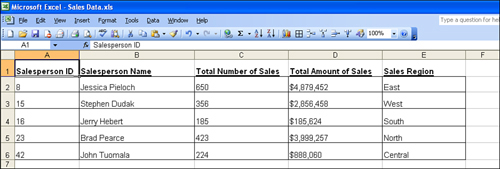
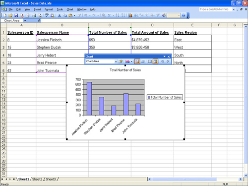
The sample data source used for the first example in this chapter is a list of sales orders for the company. The assumption is that MyDoggieTreats.com uses SAP and that this sample data (in any form, whether a SAP query, a custom ABAP report, or something else) is from an SAP report that has been executed and is shown in Figure 21.1. The fictional report data in this example contains basic information about the sales made by each salesperson. To follow along in your own SAP system, you can use any report that contains any data. However, it will be most meaningful if your report output has a single line for each record you want to include in the chart.
Figure 21.1. The fictional data source to be used in the example is a list of sales volume by salesperson.
Creating a Basic Columnar Chart with Microsoft Excel
To create a basic columnar Excel chart from SAP data, you follow these steps:
1. Open any report output screen that displays an SAP report. It can be an SAP query, a custom ABAP report, an SAP standard-delivered report, or any other format.
2. You have multiple options for how to get your SAP data into Excel, each of which varies depending on your installation version of SAP R/3 and your installation version of Excel. Because there are multiple options for different versions, the menu path and buttons vary for each. It is a good idea to save your SAP report output into an Excel worksheet, which you will use as your mail merge data file. The most popular way to do this is to click the Excel button on your report output toolbar. Excel launches and displays the SAP report in an Excel worksheet. Next, save the report in Excel (for example, as c:Sales Data.xls). Close and exit SAP and Excel.
It is not required that you exit Excel to continue, but it is recommended that you do so from a resource perspective (how much memory your PC is using to run SAP and Excel simultaneously) and because, depending on your versions of SAP and Microsoft Office, it may be easier.
3. Launch Excel and open your saved data source file (for example, c:Sales Data.xls). For this example, create a graph that lists the number of sales by salesperson. Use your mouse to highlight the appropriate columns (for example, Salesperson and Number of Sales). With the columns selected, click the Chart Wizard button on the Application toolbar. A Chart Wizard dialog box appears, enabling you to create pictorial graphs of your SAP data.
Note
If you are unable to locate the Chart Wizard button, you can search for it in SAP Help, which then provides the menu path specific to your version of Excel. A popular menu path is Insert, Chart.
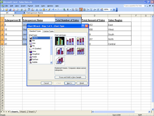
4. On the Chart Wizard - Step 1 of 4 dialog, select the Standard Types tab, which lists all of the different types of charts you can select (see Figure 21.2). From the Chart Type list, select Column and then click the Next button.
Figure 21.2. The Chart Wizard dialog box helps you create a chart by allowing you to simply pick and choose the information required in the wizard.
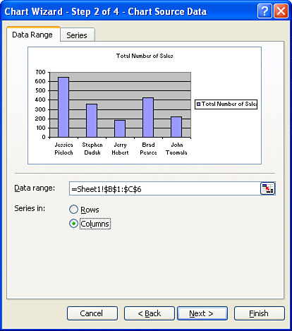
5. On the Chart Wizard - Step 2 of 4 dialog, select the Data Range tab, which displays a list of the columns and rows you highlighted in step 3 (see Figure 21.3). It allows you to decide which series you want to chart—the columns or the rows—and it gives you the option to use radio buttons to toggle between the two to see the differences. For this example, select the Columns radio button and then click the Next button.
Figure 21.3. The popular option is to chart your data in columns, although charting in rows is sometimes meaningful, depending on the report type.
6. On the Chart Wizard - Step 2 of 4 dialog, select the Series tab, which shows how the options you select will affect your chart. The box on the left, labeled Series, lists your existing data series name(s). You can make data modifications here on the data series from the chart without affecting the data on your worksheet. For basic charts, no activity is required on this tab. Click the Next button to continue.
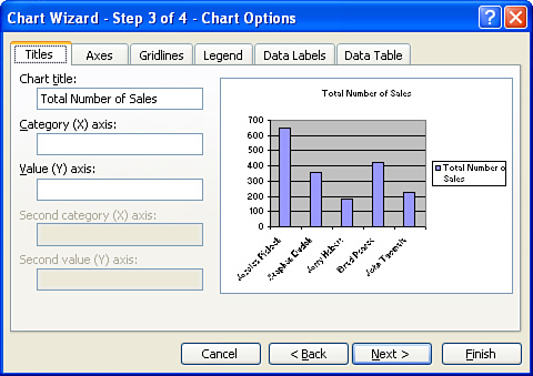
7. Examine the Chart Wizard - Step 3 of 4 dialog, which displays a sample preview of your chart on the right side of each tab. You can make changes on the left side of each tab and preview them on the right. This dialog box contains the following tabs:
• Titles—On this tab, shown in Figure 21.4, you click in a box and then type the text you want for a chart or axis title. To insert a line break in a chart or axis title, you click the text in the chart, click where you want to insert the line break, and then press Enter.
Figure 21.4. You can use the Titles tab to customize the chart title and axis labels for a chart.
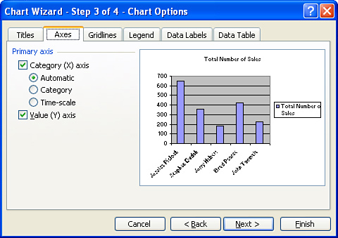
• Axes—This tab, shown in Figure 21.5, displays or hides the chart’s primary axes. The Category (X) Axis option displays or hides the category (X) axis, and the Category (Y) Axis option displays or hides the category (Y) axis.
Figure 21.5. You can use the Axes tab to customize the axis label formats for a chart.
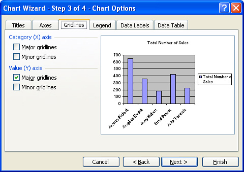
• Gridlines—This tab, shown in Figure 21.6, allows you to select whether to display gridlines for each of the different categories and axes.
Figure 21.6. On the Gridlines tab you indicate whether to include gridline markers in a graph.
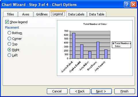
• Legend—This tab, shown in Figure 21.7, allows you to include or omit the report’s legend and allows you to alter where it is placed within the graph.
Figure 21.7. On the Legend tab you indicate the desired placement of the graph’s legend within the graph output.
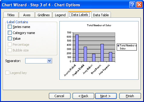
• Data Labels—A handful of options are available on this tab (see Figure 21.8). The Label Contains options display data on the selected axis as the default category (X) axis, even if data is date-formatted. The Series Name option displays data on the selected axis as the default category (X) axis, even if data is date-formatted. The Category Name option displays the category name assigned to all data points (for scatter and bubble charts, the X value is displayed). The Value option displays the value represented for all data points. The Percentage option, available for pie- and doughnut-style charts, displays the percentage of the whole for all data points. The Bubble Size option displays the sizes for each bubble in a bubble chart, based on the values of the third data series. The Separator drop-down allows you to choose how the contents of the data label are separated. Legend Key places the legend keys with the assigned format and color next to the data labels in the chart.
Figure 21.8. The Data Labels tab provides multiple options for formatted output of a graph.
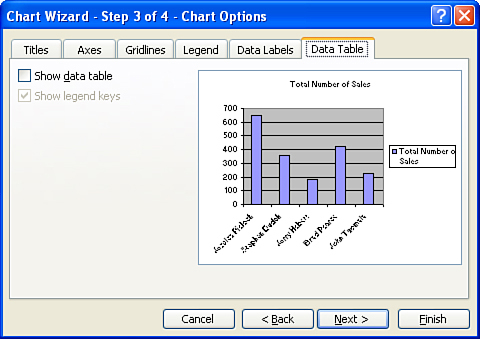
• Data Table—Only two options are available on this final tab, shown in Figure 21.9. The first is Show Data Table, which displays the values for each data series in a grid below the chart. This option is not available for pie, scatter, doughnut, bubble, radar, or surface charts. The second option, Show Legend Keys, displays legend keys, with the assigned format and color for each plotted series next to the series label in the data table.
Figure 21.9. The Data Table tab allows you to indicate that you would like to include a data table or legend key in a graph.
No data input is required in any of these tabs for this example. When you are finished examining them, click the Next button to proceed to the final step.
8. The Chart Wizard - Step 4 of 4 dialog asks if you want to create a new worksheet with the chart or if you want to include it in your current worksheet. For this example, leave the default selected and click the Finish button to see your chart inserted into the Microsoft Excel document (see Figure 21.10).
Figure 21.10. The chart is embedded as a graphic into a Microsoft Excel workbook, and you can edit its size and placement by using your mouse.
Helpful Hint
You do not need to select any data on any of the fields or tabs in the Chart Wizard for it to work. You can simply click the Next button to create a chart of your report data.
When you complete your Excel chart, you can edit or print it. To learn more about these operations, visit www.support.microsoft.com and search for “Microsoft Excel Chart Wizard.”
The Fictional SAP Report for a Basic Microsoft Excel Pie Chart
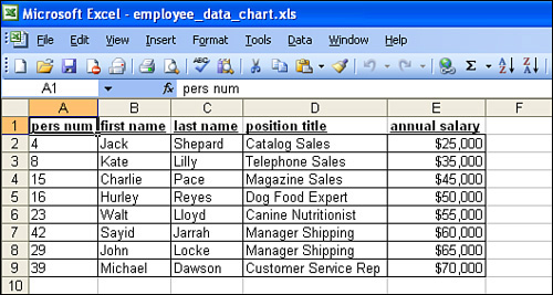
This example uses a simple data source based on a Human Capital Management (HCM) module employee list report. The fictional company uses SAP, and this sample report (in any form, whether a SAP query, a custom ABAP report, or something else) from SAP has been executed and is shown in Figure 21.11. The fictional report in this example contains basic information about associates and their annual pay. To follow along in your own SAP system, you can use any report that contains any data. However, it will be most meaningful if your report output has a single line for each record you want to include in the chart.
Figure 21.11. The fictional data source to be used in the example is a list of associate names, titles, and salaries.
Creating a Basic Graphical Pie Chart with Microsoft Excel
To create a basic Excel pie chart from SAP data, you follow these steps:
1. Open any report output screen that displays an SAP report. It can be an SAP query, a custom ABAP report, an SAP standard-delivered report, or any other format.
2. You have multiple options for how to get your SAP data into Excel, each of which varies depending on your installation version of SAP R/3 and your installation version of Excel. Because there are multiple options for different versions, the menu path and buttons vary for each. It is a good idea to save your SAP report output into an Excel worksheet, which you will use as your mail merge data file. The most popular way to do this is to click the Excel button on your report output toolbar. Excel launches and displays the SAP report in an Excel worksheet. Next, save the report in Excel (for example, as c:employee_data_chart.xls). Close and exit SAP and Excel.
Note
It is not required that you exit Excel to continue, but it is recommended that you do so from a resource perspective (how much memory your PC is using to run SAP and Excel simultaneously) and because, depending on your versions of SAP and Microsoft Office, it may be easier.
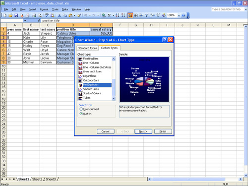
3. Launch Excel and open your saved data source file (for example, c:employee_data_chart.xls). For this example, create a custom pie chart that charts each position and the annual salary associated with it. Use your mouse to highlight the appropriate columns (for example, Position and Annual Salary). With the columns selected, click the Chart Wizard button on the Application toolbar. A Chart Wizard dialog box appears, enabling you to create pictorial graphs of your SAP data.
4. On the Chart Wizard - Step 1 of 4 dialog, select the Custom Types tab, and then select Pie Explosion from the Chart Type list (see Figure 21.12). Click Next.
Figure 21.12. This tab displays the user-defined and built-in custom chart types that Microsoft Excel provides.
5. Click the Next button on each of the next two wizard dialogs without making any changes.
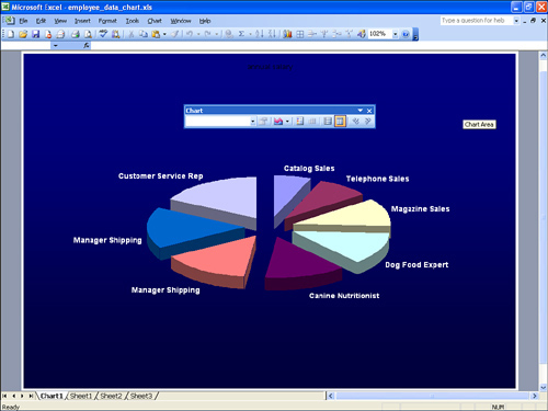
6. In the Chart Wizard - Step 4 of 4 dialog, select the In a New Sheet option, and then click the Finish button. A new Microsoft worksheet is created, with your pie chart inserted in it (see Figure 21.13).
Figure 21.13. The chart is as large as the worksheet, and you can save it as a separate workbook.
When you finish your Excel chart, you can edit or print it. To learn more about these operations, visit www.support.microsoft.com and search for “Microsoft Excel Chart Wizard.”
Making Microsoft Excel Pivot Tables Using SAP Report Data
One of the best options in SAP reporting is the ability to have your SAP data automatically converted to an Excel pivot table report. A pivot table report allows you to slice and dice your data and analyze it multiple ways, without having to use a database or code logic. As Microsoft likes to say, using a pivot table can help you see the big picture by summarizing and analyzing your data in a simple table format.
You have the option of downloading any relevant report to a pivot table via any basic report output screen in SAP. That is, the ability to download to Excel pivot tables is not specific to a particular SAP reporting tool; it can be done via any of them, including custom ABAP reports.
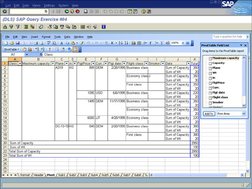
You have multiple options for how to get your SAP data into Excel, each of which varies depending on your installation version of SAP R/3 and your installation version of Excel. Because there are multiple options for different versions, the menu path and buttons vary for each. A popular way to do so is to click the Excel button on your Report Output toolbar (see Figure 21.14). Microsoft Excel launches, displaying your SAP report in a Microsoft Excel worksheet that has multiple tabs, one of which is labeled Pivot (see Figure 21.15). Working with your SAP report data in a pivot table gives you additional options in analyzing your report output. To learn more, visit www.support.microsoft.com and search for “PivotTable reports 101.”
Figure 21.14. This sample SAP report contains data from the SAP Flight Scheduling Test system.
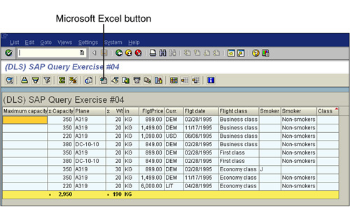
Figure 21.15. When a report is converted to a pivot table in Excel, the column headings change to drop-down boxes to make it easier to work with the data.
Things to Remember
• Microsoft Excel complements your existing reporting solutions.
• The menu paths within SAP vary based on your graphical user interface and installation versions. However, the ability to download an SAP report from SAP to an Excel file is available in all versions.
• Creating basic charts and graphs in Microsoft Excel is easy using the Chart Wizard.
• The Chart Wizard has several options, including a tab that allows you to select from built-in and custom charts.
• Working with your SAP report data in pivot table form is an ideal way to analyze complicated data.