
In this chapter
In developing Dreamweaver 8, Macromedia has worked hard to integrate more tools that allow web developers to work smarter in Dreamweaver. New toolbar additions, the capability to paste structure and formatting as well as content, and a broader range of support for more dynamic platforms enable you to develop your applications more efficiently. Some of the most prominent features in Dreamweaver 8 include
Enhanced CSS Support—. Features such as a newly reorganized CSS panel and enhanced functionality for elements such as border styles, inline boxes, horizontal rules, and CSS positioning make the use of style sheets even easier and more effective in your pages.
New Paste Special Command—. When pasting text into a document, the Edit, Paste Special command now enables you to decide whether you want to paste just the text or the text and certain structural elements.
Zoom Tool—. Dreamweaver’s new Zoom tool enables developers to zoom in on specific areas of their sites to analyze images and design pages of varying sizes.
Flash Video Integration—. This feature enables you to easily add Flash Video files to your web pages.
New Code View Toolbar—. When working in the Code view, the new Code View toolbar provides quick access to common tasks such as indenting/outdenting code, adding and removing comments, and expanding or collapsing code blocks.
Improved Site Synchronization and WebDAV functionality—. The enhanced functionality improves the reliability of the site synchronization feature to ensure that the comparison between local and remote files is correct. In addition, WebDAV support has been enhanced to support the latest versions of the application.
File Comparison Integration—. Offers the capability to compare local and remote files to determine differences in the documents.
Capability to Save Panel Configurations—. When adjusting the position and visibility of the various panels with Dreamweaver, you can now save your custom layouts and restore them when necessary.
Dreamweaver has so many tools and features it’s unlikely that you’ll use all of them for every site. However, knowing what’s available in Dreamweaver will help you customize your workspace to put frequently used tools within easy reach and hide toolbars and panels that may not be as frequently used. After you know what features are available and how they work, you can customize your workspace and begin adding content to pages by putting those tools to work for you.
If you’re using Windows, your first decision in setting up your workspace is choosing a layout. When you installed Dreamweaver, you were prompted to select an initial Workspace Setup (see Figure 22.1). Regardless of whether you chose the Designer or Coder workspace, Dreamweaver enables you to change your workspace at any time to meet the development style of the project you are working on.
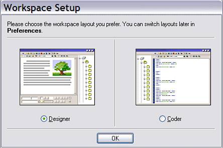
Figure 22.1. The Workspace Setup dialog box appears when you first install Dreamweaver on a Windows system. You can also access Workspace Setup from the Preferences dialog box.
You can change your workspace by selecting Window, Workspace Layout from the menu bar and selecting the layout you’d like. In addition, you can save specific layouts and restore them whenever necessary.
The workspace layouts that Dreamweaver 8 offers are
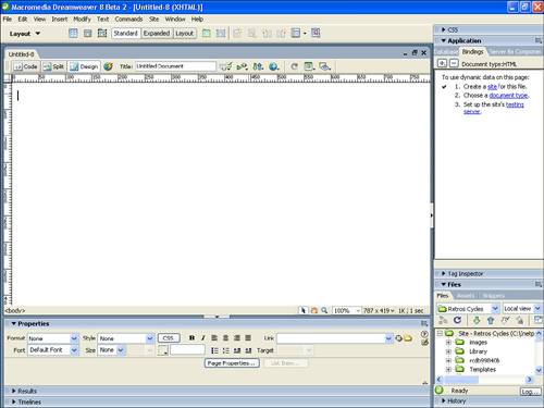
Designer Workspace—. All windows, panels, and inspectors are contained within one application window, in the same manner as in Fireworks and other Macromedia applications (see Figure 22.2). All panels are docked on the right side of the application window. Documents are opened in Design view by default, and multiple documents are tabbed at the top of the Document window.
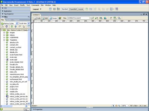
Coder Workspace—. All panels are docked on the left in the same manner as in HomeSite and ColdFusion Studio (see Figure 22.3). This workspace opens all documents in Code view by default.
Dual Screen Left/Right—. The workspace can be stretched onto dual screens with the document window stretched to fill either the full left or full right screen.
Regardless of which workspace you choose, you can customize it beyond the standard layout by moving and changing Dreamweaver’s various panels. Panels that are regrouped or undocked from the panel group remain in that new state even in future Dreamweaver sessions. The Property inspector is initially collapsed, showing only the most common options. If you expand the Property inspector, it remains expanded in future sessions unless you manually collapse it.
The Document window represents the development view of the document that you are working on and is where you’ll be adding content and applying the tools offered with Dreamweaver’s various panels and inspectors. The Document window contains a title bar, menus, toolbars, and a status bar. All the other panels, inspectors, and toolbars exist to add to or modify the contents of the Document window. The Document window is capable of displaying a visual representation of the site in Design view (see Figure 22.4), the HTML and scripting code for the site in Code view (see Figure 22.5), or a split window containing both the design and the code (see Figure 22.6).
Figure 22.4. Design view enables you to work in a what-you-see-is-what-you-get (WYSIWYG) atmosphere.
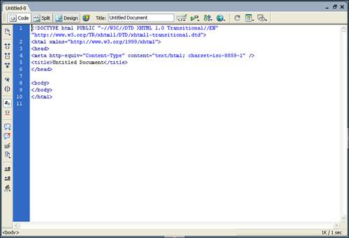
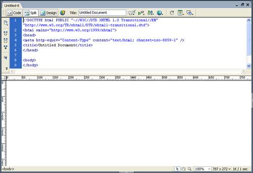
Figure 22.6. Split view enables you to make changes to either pane and see how changes in one affect the other.
Regardless of your preference, it’s likely that you will use all three views at some point in development. Even with the advancements of WYSIWYG development environments, it’s still good to understand and be able to modify and write code by hand.
Tip
In Code and Design view, changes you make to the code aren’t reflected in the Design pane unless you refresh the view. You can do this by clicking the Refresh button on either the Property inspector or the Document toolbar, or simply by pressing F5.
The Title bar displays the title and filename of the open document. Aside from being a reminder of the name of the page on which you’re currently working, it can also serve as a reminder of the path to which you have saved the file and whether or not you have given the page a title. If the title bar shows the page to be unnamed, you need to save the page for any changes to be preserved. As you work in the document, an asterisk is appended to the filename, signifying that you’ve made unsaved changes to the document. Use the Save keyboard shortcut (Command+S) [Ctrl+S] or select File, Save to save your file.
The Menu bar contains nearly all the commands and features of Dreamweaver. Most of these commands are also accessible from panels or the Property inspector, as well as context menus that pop up when you (Control-click) [right-click] your mouse.
Four toolbars are available from within the Document window. To toggle these toolbars from view, select View, Toolbars, and select from the three options. All the toolbars can be visible at the same time, but they cut down on your workspace.
The Standard toolbar contains the usual File, Save, Copy/Cut, and Paste commands (see Figure 22.7). If you already know the keyboard shortcuts for these common commands, they’re the same as those for most Windows or Mac applications.
Figure 22.7. The Standard toolbar is useful for novices, but it takes up valuable development real estate.
The Document toolbar, shown in Figure 22.8, also contains options available elsewhere in Dreamweaver, such as switching views or titling the document. In addition, this toolbar enables you to easily monitor potential browser and markup errors as well as toggle visual aids on and off.
Figure 22.8. The Document toolbar makes it easy to switch views, title the page, and preview the document in a browser.
The Insert toolbar, shown in Figure 22.9, enables you to easily insert elements into your pages such as images, code snippets, and hyperlinks. The available elements are divided into logical categories, which can be selected from the drop-down menu at the far left of the Insert bar. When selected, each category displays a unique set of buttons that enable you to add any specific element to your page with the click of your mouse.
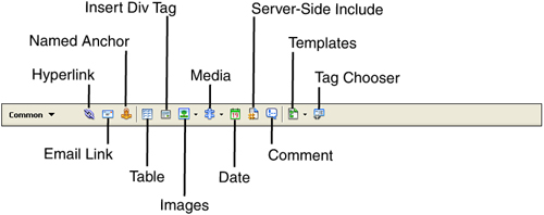
The Insert bar contains eight categories, each containing icons for the most frequently used options in that category (see Table 22.1).
Table 22.1. Insert Bar Categories
To insert an element from one of the Insert bar categories, position the cursor in the page where you want the object to be inserted and then click the Object button in the Insert bar (or drag the Object button to the insertion point). In the case of inserting images or creating links, among others, a dialog box appears to help you complete the insertion, in which you can perform such actions as selecting an image file or defining the link parameters. To insert placeholders for these elements, when available (such as for images), press the (Option) [Ctrl] key while clicking the Object button. You can then select a final image or fill in other required attributes later in the development process.
The Status bar is located at the bottom of the Document window (see Figure 22.10). It provides information about the file size and estimated download time for the document. Dreamweaver calculates an approximate download time based on the Connection Speed setting in the Status Bar category of the Preferences dialog box (Edit, Preferences). By default, Dreamweaver calculates page load times at 56 kilobits per second, but you can change these settings to calculate download time for faster or slower connections.
Figure 22.10. The Status bar displays the Tag selector, Window Size selector, and Download Size/Speed indicator.
You can change the dimensions of your default screen size to match those of your typical site visitor. This enables you to design for a wide range of browser dimensions or to test the general appearance of the document in a specific configuration.
The Tag Selector combines the best of working in Design view with the need to occasionally make changes to the underlying code by hand. The Tag Selector shows the HTML tags (see Figure 22.11) relative to the position of the cursor in Design view.
This feature is often overlooked because there are so many methods for accessing and editing code. But when you’re working on nested tables or have multiple layers on the page, the Tag Selector can help you find your place in the code. Just click a tag in the Tag Selector to highlight the contents of the tag in Design view. You can then make modifications to that element in the Property inspector or by using the menus and panels. You can also select a tag from the Tag Selector, switch to Code view, and the element and its contents will be highlighted.
The Tag Selector also makes deleting blocks of content easy. You can delete tables or blocks of text easily by right-clicking on the container tag in the Tag Selector and then pressing the Backspace or Delete key on the keyboard.
In addition, the Tag Selector also can be used to edit existing tags. To edit a tag, (Control-click) [right-click] on the tag in the Tag Selector, which activates the context menu. The context menu provides one of many methods for setting the class of a tag, used extensively with Cascading Style Sheets. You can also use the context menu to access the Quick Tag Editor by choosing Edit Tag.
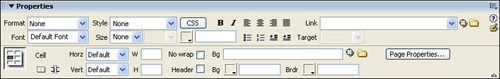
The Property inspector (see Figure 22.12) is one of the most important tools in Dreamweaver because it enables you to adjust the editable properties of any text or objects located within your pages. The context of the Property inspector and the elements that are visible within it change depending on the element that is selected within the Document window. As with all panels, the Property inspector can be moved. It can be docked either above or below the Document window or undocked to become a floating panel.
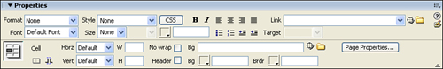
The Property inspector is initially in a maximized state, displaying all the editable properties for the selected object. If you want to maximize your workspace, you can minimize the Property inspector by clicking the arrow in the bottom-right corner. The minimized view then displays only the most commonly edited attributes for the object.
In addition to the standard text fields and buttons, the Property inspector also contains several other features. Color pickers are used to select a color for text, table borders, and other objects. The Point-to-File and Folder icons are used to locate files to insert images or links; the Quick Tag Editor, signified by a pencil-and-paper icon on the right side of the Property inspector, enables you to add element attributes not found on the Inspector. Selecting the question mark icon launches the Using Dreamweaver help system. In addition, the Property inspector in Dreamweaver 8 now contains a CSS button that opens the CSS Styles pane, which enables you to easily format text based on styles embedded within the document or available from an attached style sheet.
Unless you’ve already started to change the default workspace by removing from view or resizing the panels and inspectors, you’ll see that the Document window is surrounded by groupings of additional options and site information. Some of these panels are critical to Dreamweaver’s ease of use, whereas others can be minimized or hidden without worry.
Panels are grouped by default in logical panel groups. Of course, this logic might or might not be applicable to your style of work, so the arrangement of panels and their groupings can be modified to meet your working style.
To expand a panel group, click the arrow to the left of the panel group name or click the panel group name itself (see Figure 22.13).
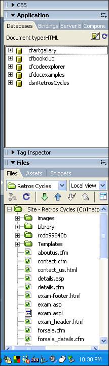
Figure 22.13. Click the arrow next to panel groups to open and close panels. Here, you see the Databases, Bindings, Server Behaviors, Components, Files, Assets, and Snippets panels, with the Application and Files panel groups open.
Each panel group has several controls (see Figure 22.14). The icon to the right of the panel group name activates a drop-down options menu containing several commands within the context of the panels contained in the group. The menu for each panel group is unique and contains commands that apply to that panel group.
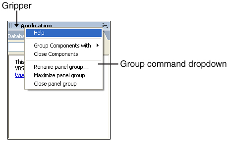
To the left of the group name is an area called the gripper. Clicking and dragging the gripper for a group enables you to undock that panel group. These floating panels can then be moved around the workspace. To dock a floating panel group, drag it by its gripper until the insert indicator is positioned where you want in the panel dock.
If you would like to move an existing panel into another panel group, you can do this by opening the panel group where the panel is located and clicking the options menu. From the options menu, choose the Group [panel name] With command and select the target group.
The moved panel immediately appears in its new group. If you choose to create a new panel group, open the Options menu in the new group and select Rename Panel Group to give it an appropriate name. You can then add other panels to the new group.
Panel groups can also be resized to take up more or less space in the panel dock. When you position the mouse between panel groups, the cursor changes into a double-headed arrow, which can be clicked and dragged up or down to modify the size of expanded panel groups. To maximize a panel group to take up as much space in the panel dock as possible, select Maximize Panel Group from the Panel menu. This minimizes other open panel groups to give the select group full use of the vertical space.
Some panels, such as those located in the Results panel group, benefit from the additional horizontal space they get when they are placed below the Property inspector. Position the mouse cursor between the panel dock and the Document window until it becomes a double-headed arrow; then click and drag horizontally to give additional space to the panel dock. Keep in mind, however, that this decreases the size of the Document window.
If you’re not using a panel group at all, you can close it by selecting Close Panel Group from the Options menu for that group. To reopen a closed panel group, select it from the Window menu on the menu bar.
The CSS panel group contains panels that control the styles and layers of the elements on the page. The two panels in this group are CSS Styles (see Figure 22.15) and Layers (see Figure 22.16).
When you’re using databases and advanced server technologies to generate content for your pages, the tools used most frequently are found in the Application panel. Initially, each of the panels in this group prompts you to configure the site, document type, and testing server (if you haven’t already done so in the Site Definition).
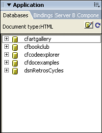
Using the Databases panel (see Figure 22.17), you can then create a connection to a database containing content for your site.
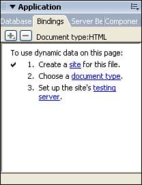
The Bindings panel, shown in Figure 22.18, is used to create recordsets or datasets (depending on your platform) and displays the field names stored in those recordsets. After you have created the recordsets you need, the Bindings panel enables you to drag and drop dynamic content into your pages and select formatting options for the dynamic data placeholders.
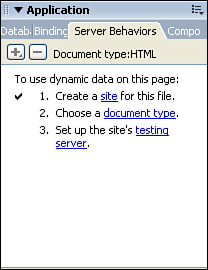
The Server Behaviors panel (see Figure 22.19) gives you access to a broad range of dynamic server behaviors ranging from restricting access to your pages to repeating regions.
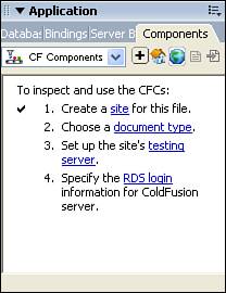
Finally, the Components panel (see Figure 22.20) enables you to easily add web services or ColdFusion components to your page.
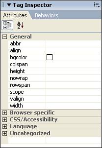
The Tag panel enables you to visualize how tags are nested within other tags within your document and what attributes are associated with each tag. By selecting an element within the page or choosing a tag from the Tag Selector and then choosing the Attributes panel (see Figure 22.21), you can view information about the tag, such general attributes, any styles that are associated with it, the language in which the code is styled, and any uncategorized attributes associated with the tag.
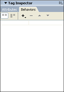
The Behaviors panel, shown in Figure 22.22, provides you with access to commonly used JavaScript behaviors that can be associated with tags within your document. For instance, after you create a hyperlink from text and select the <a> tag, the Behaviors panel provides access to numerous behaviors that are unavailable to nonlinked text.
The Files panel, shown in Figure 22.23, enables you to view and manipulate the files and folders located within your local site. The Files panel also enables you to create, edit, and delete Dreamweaver sites.
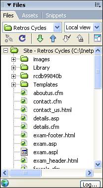
Figure 22.23. The Files panel enables you to manage the files and folders contained within your site.
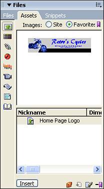
With the Assets panel you can easily organize elements located within your site, such as images, movies, rich content, and hyperlinks. It can save you time because you simply drag and drop elements right into your page (see Figure 22.24).
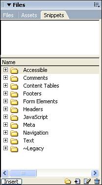
The Snippets panel (see Figure 22.25) provides a place for you to organize and manage predefined blocks of code known as “snippets.” These reusable code snippets can easily be dragged into your code and customized for the individual application.
The Frames panel is used to design and manage any frames used within your page layout. From within the Frames panel, you can also select a specific frame.
The History panel maintains a list of the steps you take in creating the current document (see Figure 22.26). You can then use this list to create new commands for repetitive, time-consuming actions. You can also use the History panel to undo multiple steps at once or to replay steps to see their effect on the page design.
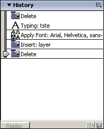
When you look at the items in the History panel, the last item on the list is the most recent, and the panel scrolls upward. To undo the last several actions, drag the slider that’s to the left of the steps upward to select the steps you want to undo. After you’ve made your selection, continue editing. The selected steps are not undone until you take another action that overwrites those steps in the history.
To repeat steps, use the slider to select them and then click the Copy Steps button.
Note
After you’ve undone multiple items and overwritten them with other steps, you cannot redo the original steps.
To create a command that completes multiple steps, select a series of steps with the slider and then click the Save Selected Steps As a Command button. You are prompted to give the command a name, and the new command appears on the Commands menu.
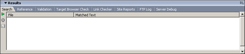
The Results panel automatically appears to display the results of searches, validation checks, and various reports. It’s one of two panels that are docked horizontally below the Property inspector because the content displayed in the various panels is much easier to read and review horizontally.
The Search panel is displayed at the bottom of the workspace whenever you issue a Find command (see Figure 22.27) that reaches beyond the active document (such as if you’re conducting a site-wide search). This panel displays the results of your search and enables you to click the results to edit them in the Document window. Buttons on the left side of the panel enable you to initiate, cancel, or save Find commands.
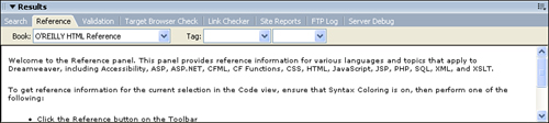
The Reference panel, shown in Figure 22.28, provides access to reference material for HTML, CSS, JavaScript, and quite a few of the dynamic platforms and scripting languages.
The Validation panel, shown in Figure 22.29, lists any coding errors in the site or document when you validate the site (by selecting File, Check Page, Validate Markup/Validate As XML). This validation can also be initiated directly from the panel, and corrections can be located from it.
The Target Browser Check panel, shown in Figure 22.30, lists browser compatibility issues that have emerged in a running of the Check Target Browsers report (File, Check Page, Check Target Browsers, or use the Target Browser Check button on the left side of the Target Browser Check panel). The panel also provides options to save the report for future reference. By highlighting an item in the report and clicking the More Info button, you can view a dialog box explaining exactly why an item is marked. If you double-click an entry, it opens in the Document window in Code and Design view with the offending code highlighted.
The Link Checker panel, shown in Figure 22.31, lists the results of the Check Links report (File, Check Page, Check Links, or run from within the Link Checker panel). This report lists broken links, orphaned files within the site, and all external links.
The Site Reports panel, shown in Figure 22.32, displays the results of the Site Report (activated by choosing Site, Reports from the menu bar or by clicking the Reports button on the Site Report panel). The Site Report can be quite extensive, depending on the options you choose when initiating the report. As with the other Results panels, you can use this report to get more information on the items listed and use the items to locate the specific code in question to make modifications.
The FTP Log tracks communication with the remote server. You can also enter commands directly to the server from this panel, which is useful to experienced developers.
The Server Debug panel is used with dynamic pages to locate errors in the code. To use this feature, select View, Server Debug from the menu. The Server Debug panel displays the results of this command, including the server variables and values, execution time, and SQL queries on the page. If you didn’t configure your testing server correctly, this panel prompts you through the required steps.
After being removed from Dreamweaver MX 2004, the Timelines panel has now returned to Dreamweaver 8 (see Figure 22.33). This panel enables you to time interactions on your site such as the moving of layers or the hiding/displaying of objects.
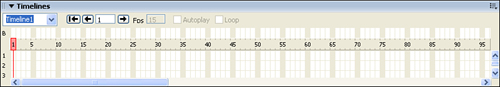
Figure 22.33. The Timelines panel enables you to relocate images and other objects over a period of time.
By dragging an image into the timeline frame, you can control the image’s source URL and, if the image is stored in a layer, its location.
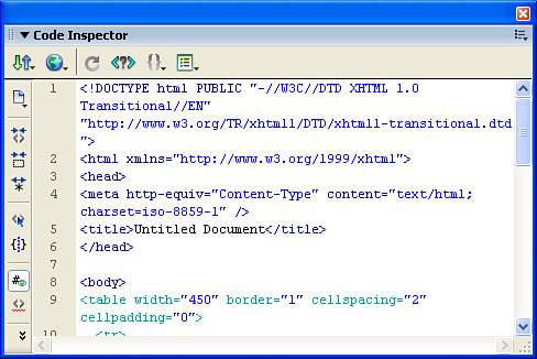
The Code Inspector contains all the same features as the Code view, but is located on a floating panel (see Figure 22.34). The Code view is where you generally want to work if you plan on doing major code review or revisions. If, however, you’re interested in taking a quick look at your code, you can activate the Code Inspector either by choosing Window, Code Inspector or by pressing the F10 key. If you’re using dual screens, the Code Inspector is especially handy because you can keep the Design view open and move the floating Code Inspector window to your other screen.
Now that you know what tools are available for your use, it’s time to start putting them to use. Probably the most common element of all web pages is text that conveys information. You enter text into Dreamweaver by either typing directly in the Document window or cutting/copying and pasting text from another source. You can select text for editing or cut and paste within the document, using many of the same menu commands and keyboard shortcuts available in most word processors.
After the text is entered into the Document window, you have many options for formatting it. Because text itself may not necessarily convey emphasis or emotion, a variety of styles, fonts, sizes, and colors can be used to tailor the message to the audience.
Most of the text you’ll be adding to your web pages is probably going to be formatted into standard paragraphs. To create a paragraph break, simply press (Return) [Enter] and a blank line of whitespace is inserted below the paragraph. You can then begin typing your new paragraph and the two blocks of text will be separated by whitespace.
Whitespace is important for control of design and readability. In most HTML editors, including Dreamweaver 8, when you press the (Return) [Enter] key, a new <p> tag is inserted. Dreamweaver also automatically inserts a new HTML paragraph with a nonbreaking space entity between the opening and closing tags. If you then type on this new line, the nonbreaking space is replaced with your content. If you leave the paragraph blank, however, the paragraph tags remain with a non-breaking space. Because the tag is not empty, browsers correctly interpret this paragraph as a blank line.
Conversely, you might want to start a new line of text without that blank line inserted by the paragraph tags. To do this, use a line break. A line break inserts a carriage return in the text without closing the paragraph tags and, thus, without inserting extra space between the two lines. If you view the line break in the code view, you’ll see that a single <br> tag is inserted instead of the <p> </p> tags.
To add a line break to your text, place the cursor in the appropriate location and press the Shift+Enter key combination. You can also insert a line break from the menu bar by choosing Insert, HTML, Special Characters, Line Break.
With the line break inserted, the text is forced to a new line without additional whitespace between lines. Line breaks can also be used to force more whitespace within a paragraph if you add multiple breaks consecutively.
Styling the text used to present your content is usually one of the easiest ways to personalize the presentation of your information. Until the last few years, however, the use of the font element as the preferred method of styling left web developers with a very limited selection of “safe” fonts and attributes from which to choose. With the announcement of new HTML 4.0 standards, the font element has now been deprecated (meaning it’s not recommended anymore) by the World Wide Web Consortium (W3C) and Macromedia has shifted the way that Dreamweaver 8 applies font styling to pages from the use of <font> tags to Cascading Style Sheets (CSS).
Note
Dreamweaver 8 has not abandoned the use of the font element completely. If you have existing projects that already use the font element, you can continue applying font styling in that manner by choosing Edit, Preferences, and in the General category remove the check in the box next to Use CSS Instead of HTML Tags.
The nice thing about using CSSs in Dreamweaver is you can have as much or as little control over them as you wish. If you’re accustomed to using the standard fonts that have traditionally been “safe” for web use, the Font drop-down in the Property inspector enables you to apply a font and never have to touch a style sheet. Instead, Dreamweaver embeds the style into your document and you are able to reuse it over and over.
If, however, you would like to work with new fonts and styles that are available with the adoption of CSS, you can create custom style sheets that can easily be applied on a page-by-page basis or linked throughout your entire site. CSS is covered in depth a little later.
When applying a style to your text, you can modify several attributes easily via the Property inspector (see Figure 22.35).
In Dreamweaver, fonts are chosen from one of the predefined font groups available in the Font drop-down in the Property inspector. To apply a font to a block of text, simply select a range of text, and then choose from one of the six fonts.
When you apply the font, Dreamweaver automatically creates a style based on the font face, font size, and any other formatting and embeds it in the page. This makes the style available from the Style drop-down in the Property inspector and you can reapply it throughout your pages.
Prior to the adoption of CSS as the preferred styling method, the font element used a set of arbitrary font sizes ranging from 1 to 7. The worst part about these sizes is that different browsers interpreted their sizes differently. This meant that text would appear differently in different browsers. Through the use of CSS, however, you can now control the exact pixel size of your fonts, ensuring that they are displayed consistently across every browser. To set the font size for a block of text, select the text and then choose the appropriate size from the Size drop-down in the Property inspector.
Just as it does with font styling, Dreamweaver creates a style for size changes that you make to a block of text. If the selected text already has a style applied to it, Dreamweaver updates that style to include the font size as well.
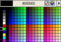
The default text color for the page is set in the Page Properties dialog box. Unless you modified the page properties, the default color for text is black (#000000). To change the color of text from the default, select the text and then use the Color Picker in the Property inspector to select a new color (see Figure 22.36). The Text Color field uses the same Dreamweaver color picker as the Page Properties and other color tools. Alternatively, you can type the hexadecimal code in the text box to the right of the Color Picker.
A font style is formatting such as bold or italic applied to a font. Styles can be used to show emphasis, provide editorial marks, or even differentiate between standard text and computer code.
Although the Property inspector enables you to apply bold and italic to a text block, you can also choose additional font styles by selecting Text, Style from the menu bar (see Table 22.2). If appropriate, you can also apply more than one style for the same text selection, such as when creating bold, italicized text.
Table 22.2. Font Faces and Their Uses
Font Style | HTML Element | Used For |
|---|---|---|
Bold |
| Adding bold emphasis |
Italic |
| Adding emphasis with italicization |
Underline |
| Adding emphasis with underline |
Strikethrough |
| Editorial purposes |
|
| Monospaced font |
Emphasis |
| Usually displayed as italic |
Strong |
| Stronger emphasis than just using the emphasis style; usually displays as bold |
|
| Text that represents a computer program listing |
Variable |
| Text that represents a program variable |
Sample |
| Text that represents sample output from a program |
Keyboard |
| Text that represents user input |
Citation |
| Source of a quote |
Definition |
| Text that is a definition |
Deleted |
| Text that has been deleted from the page |
Insert |
|
If you select a style before typing, the style is applied to all subsequent text.
Paragraph alignment is used to position text relative to its confining margins, whether those margins are the page margins, a table cell, or a layer. To change the alignment of text, select the appropriate text and then click the Align Left, Align Center, Align Right, or Justify buttons on the Property inspector.
You can also align text by selecting Alignment from the Text menu or by using the appropriate keyboard shortcut.
Text can be indented or outdented in several ways. Select the desired text and use one of the following methods to indent or outdent the text:
Indents and outdents can be applied multiple times until the text is positioned where you want. Although this is easy to do, it’s not the preferred method for positioning text. A better solution is to use a table or CSS.
Lists bring order and structure to text on the web. Large blocks of text are difficult to read onscreen, so lists tend to break things into manageable blocks of text that are much easier to read.
In HTML, you create list items by placing each item inside the <li>...</li> tag pairs. The list in its entirety also needs to be defined. The manner in which this is done depends on the type of list.
An unordered list is used when the sequence of the items isn’t important. Bulleted lists can be created from text you’ve already entered, or the list can be created as you type the text. To create a list, select the text you want to include in the list and click the Unordered List button on the Property inspector. If you want to create a new list, place your cursor in the appropriate place in the page and then click the Unordered List button. Any text you type after that is preceded by a bullet. To end a list, either press (Return) [Enter] twice or click the Unordered List button again.
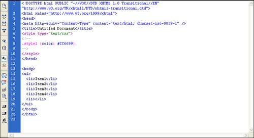
List items are spaced more closely together than paragraphs (see Figure 22.37). If you look at the Code view, the unordered list is contained within a <ul>...</ul> tag pair.
Font faces, colors, sizes, and styles can be applied to lists. Paragraph formatting, however, is likely to destroy the list layout, so it should be avoided. To remove list formatting, select the entire list and then click the Unordered List button in the Property inspector. The text itself remains, but the formatting of the list is deleted, as is the markup that created the list.
Ordered lists are used when items follow one another sequentially. Create these lists in the same manner as unordered lists, but click the Ordered List button instead. Examining the code, you can see that ordered lists are defined by the <ol>...</ol> tag pair.
One of the best features of an ordered list is its capability to renumber itself as items are added, deleted, or moved. To add an item to the list, position the insertion point at the end of the list item above which you want the addition to appear. Press (Return) [Enter] to add a new line; then type in the new item. To move an item in the list, either use the cut-and-paste method or highlight the list item and then drag it to its new location.
Although Dreamweaver makes it extremely easy to create and format new content with the Design view, you can also use the Code view to easily manipulate your exiting code or create new code. In addition, Dreamweaver incorporates some nice features that make it easy to work in the Code view.
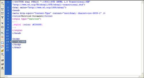
A new feature in Dreamweaver 8 that definitely makes coding a bit easier is the capability to hide blocks of code that you may not be working on. That way, you can focus on a specific section of code without having to wade through the entire document’s code. To hide a code block, select the code that you want to hide and click the minus sign next to the line number. With the code block hidden, the line numbering jumps and a code block placeholder is displayed (shown in Figure 22.38).
When developing complex code, proper indenting can make a tremendous difference in understanding the workflow of what is happening in the code. Statements such as if/then or While loops tend to be much easier to read and understand if they are indented properly. Rather than making you go through your code line by line and set up your indention, Dreamweaver makes it easy for you to follow an indention convention by selecting entire blocks of code and allowing you to indent the entire block.
To set the indention for a block of code, select the code and press the Tab key to indent to the right or the Shift+Tab key combination to indent to the left.
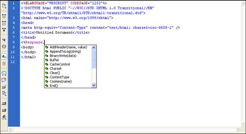
As you type code in Dreamweaver, the application works to help you. One handy feature is the code hint drop-down that appears when you type code that Dreamweaver recognizes. For instance, if you type <%Response. in the Code view, Dreamweaver recognizes that you are going to use one of the VBScript Response functions and displays a drop-down with the available functions. From there you can click the down arrow to move through the list (see Figure 22.39) and select the appropriate function, or use the mouse to click on the correct one.
Many HTML tags require both an opening and a closing tag. To save you time and typing, Dreamweaver includes an auto tag completion feature that automatically adds the closing tag after the opening tag has been completed and the closing tag has been started. For instance, if you place your cursor in the code view, and type <div> and then type </, Dreamweaver automatically closes the tag for you by adding the div> to the end of the tag.
If you would prefer to have Dreamweaver create the entire close tag after you type the opening tag, you can set this preference by choosing Edit, Preferences from the menu bar and clicking the Code Hints category. You can also turn off the auto completion feature in this category.
Another Dreamweaver feature that comes in handy when authoring code is Code Coloring. This feature modifies the color of the code depending on what type of code Dreamweaver perceives it to be. Depending on what type of document you are working in, you can customize the colors of the various types of code you are working with.
For instance, if you are developing an ASP page that contains HTML, VBScript, and JavaScript, you can adjust the colors of each type of code (and their subtypes). To adjust the default code coloring, open the Code Color category in the Preferences dialog box (Edit, Preferences) and double-click on any document type. From there you can adjust the various subtypes within that document and their code colors.
I selected a tag and deleted it, only to find that all my content had disappeared. What happened?
You likely selected the body tag and pressed Delete while attempting to delete another tag or some portion of your content. When you use the Tag Selector for deletion, select the body tag, and then press Delete, the head content remains but the body tag returns to a completely empty state. Of course, this also means you should use this feature with care when selecting the body or other large containers on a page. If you do make a mistake, remember that you can use the Undo command (Edit, Undo) to fix the error.
I want to use the font element and still have valid documents. Is that possible?
HTML 4.0 transitional
HTML 4.01 transitional
XHTML 1.0
You can’t use the font element in any strict HTML or XHTML document or with the XHTML 1.1 public DTD. As you are already aware, the use of the font element is highly discouraged in favor of CSS.
If you are new to web development or have been working with HTML for a while, you probably haven’t had to delve into the world of custom-generated code too much. However, as you progress in your web development skills, you will be required to create more complex web applications that will, in turn, require more complex code. This means that down the road, you’ll have to get your hands a bit more dirty when it comes to writing custom code.
One of the best practices you can get into when you start writing code is to add the appropriate comments and indentation to your code. Appropriate comments will help you, and others who review your code, understand what the code is doing. In addition, by adding comments that document the purpose of a code block, you help yourself when it comes time to troubleshoot issues with the code.
On the same note, proper indentation makes code much easier to read. With properly indented code, you can follow the workflow much more easily by seeing that certain indented lines of code are dependent on those that are outdented.
So, before you are called on to write that next web application that uses a ton of custom code, consider developing a coding style of your own that includes proper documentation through comments and correct indentation.