In addition to page templates, the TemplaVoila Framework includes a few built-in FCES, or what it calls Utility FCEs, for laying out our content inside content blocks. Using the Utility FCEs, we can add multiple columns, custom HTML tags, and other necessary elements to our page design. If there are any FCEs that we are not going to need for our website, we can move them to the Unused Templates folder with our unnecessary page templates to keep them out of the way without permanently deleting them.
There are five Utility FCEs that we will look at:
- Column groups
- Module groups
- HTML wrapper
- Plain image
- Module feature image
Column groups are available to display multiple columns inside a page template content block. The TemplaVoila Framework includes column groups of 2, 3, and 4 columns for us to use in our design. Compared to the basic column groups we built ourselves earlier in the book, the column groups in the TemplaVoila Framework have a few key advantages in how they adjust to the content area in which they are placed.
- All column groups are self-adjusting to the content they are placed in, so they correctly fill up the content area using pixel calculations for their maximum width and gutters (the visual space between columns).
- In addition, column groups can be nested one-level deep; we can nest a three-column group inside of a two-column group if we needed to match a particular design. This can be especially handy if we are emulating grid-based newspaper layouts within our designs.
- The gutter width is set in pixels as part of the TypoScript file for the skin for consistency and flexibility and then output to the browser as part of the
styleattribute for each column. By using TypoScript for this, the framework will be able to use calculations to output fixed-width columns that still have the flexibility of being moved around and changed in the backend. - Column groups have options to define the column distribution (Half / Half, Third / Two Third, and so on) and whether there should be a separating line at the bottom of the column group when they are created on each page. This makes it easy to adjust the look and feel of a column group without remapping the template or making major content changes.
Of course, if we want our own multi-column element with different sizes of columns than the framework has available, we can look back at Chapter 8 to make our own FCEs as well.
Module groups can be used to show distinct "modules" of content on our pages with up to four modules in a row and customizable borders. You can see an example in the following screenshot of a module group from our TemplaVoila Framework installation, but it's important to remember that the look of our modules can be changed a lot through our skin and by which options we choose:
Like column groups, module groups come in groups of 1, 2, 3, or 4 modules and are self-adjusting to fill the content block they are in perfectly. Columns can be nested one-level deep inside of modules, but modules cannot be nested inside each other. With one level of nesting though, we can create a module with two columns of content, for example, easily without worrying about defining widths or redefining our gutters. Module groups also use options to define the module distribution (Half / Half, Third / Two Third, and so on).
Module groups also include options that can be set per module in the backend editing screens like shown in the following screenshot for each group:
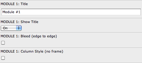
Using these options, we can change the look of each module in a group:
- Show Title: We can choose whether or not to show the module title for each module. This is what a module looks like with the title shown:

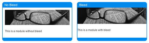
- Bleed: We can set each module to bleed to the edges or keep its margins with the Bleed option. In the example below, the module on the left does not have bleed turned on, so we can see the margin of white space around the image and the text. The module on the right has bleed turned on, so there is no margin anymore:
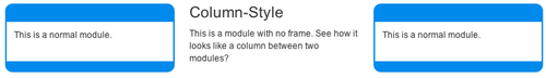
- Column Style (unframed): We can also set individual modules to appear unframed so they look like columns. This is helpful if we want a content block to look like it has a column between two modules like shown in the following screenshot.
Note
You may notice that the modules have a lot of HTML markup. This is done so that they can be styled in as many ways as possible (rounded corners, stylized border treatments, drop shadows, and so on) completely in CSS. In order to allow all of these designs, the HTML markup is written to be able to use the CSS sliding doors technique (http://www.alistapart.com/articles/slidingdoors/).
Like the HTML wrapper FCE that we built in Chapter 8, this Utility FCE allows us to wrap a content element or set of content elements in custom HTML tags. Unlike the one we built before, which was hardcoded to be a div tag, this FCE allows us to use any HTML we want before and after the content elements inside of it.
Normally, we can display images using TYPO3's built-in content elements Text with Image or Image without any tweaking or special programming. Occasionally, we might need more control over the display of our images. The Plain Image FCE in the TemplaVoila Framework core lets us manually set any of these options:
- Link
- Alternate image text
- Image width
- Margin-Top
- Margin-Bottom
- Margin-Right
- Margin-Left
- Z-Index (to determine stacking order)
- Display (inline, float left, float right, display block)
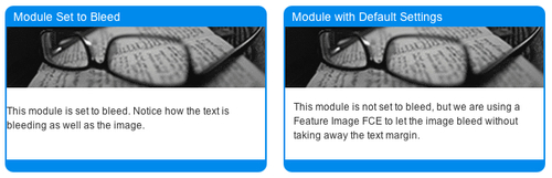
We've seen that we can set the module to bleed when we want edge-to-edge coverage by the image and the text. In many circumstances, we may only want the image to bleed while the text keeps its margins inside the module. In these situations, we can use the Module Feature Image FCE. We can set the module itself not to bleed (so the words have spacing between them and the sides), and then we can add the Module Feature Image FCE into the module with an image. The image defined in the Module Feature Image will automatically stretch edge-to-edge inside the module without affecting the rest of the content. In the example (as shown in the following screenshot), the module on the left has bleed turned on so the text has no space around it; the module on the right has bleed disabled so the text has space around it, but it is using a Module Feature Image FCE at the top for the banner.