
As helpful as a wrapping div tag can be, we should start getting a little bigger with our goals. One thing that we run into all the time in the real world of site development is the need to have multi-column elements. With the rise of grid-based design and content-heavy sites, it's getting more popular to start adding two columns into the main content area under a single column article or something similar. Unfortunately, there are a lot of variations on this idea of mixing and nesting multi-column layouts, and it's not always possible or smart to create a template for every possible variation in a limited amount of time. You can easily waste all your time creating templates with a two-column element over a three-column element over a two-column element over a single-column element. I know that sounded confusing, and that's the problem. Instead, we can create a handful of useful multi-column flexible content elements that our editors can use anywhere they need to and in any order they need to. They can even nest them inside of each other if we do this right.
Right now, we're going to make a quick FCE with two columns that take up roughly half of the current content area. We're just going to start by adding some basic styling to our main stylesheet, fileadmin/templates/style.css:
.multi_column_element {
display: inline-block;
width: 100%;
}
#nested_column_1 {
float: left;
clear: left;
}
#nested_column_2 {
float: right;
clear: right;
}
.half {
width: 49%;
}
As you can see above, we are using inline-block as the display setting for the entire element. If we don't set that, then the elements below it can creep up when we start using floats. For more information on CSS values like inline-block, I recommend the tutorials from w3schools.com (http://www.w3schools.com/css/).
In addition, our style floats the first column, nested_column_1, to the left and clears anything to its left. The second column, nested_column_2, floats to the right and clears anything to the right of it. If we assign the class half to both columns, then they will both take up a little under 50% of the total width with a little whitespace in the middle.
After we've modified the CSS, we need to update our HTML file. Once again, we'll add our new HTML code with identifying comments into our HTML template, /fileadmin/templates/template_fce_snippets.html. Go ahead and add some basic code to the main FCE HTML file to create two divs for columns:
<!-- BEGIN 1/2 + 1/2 Element --><div class="multi_column_element">
<div class="nested_column half" id="nested_column_1">Column 1</div>
<div class="nested_column half" id="nested_column_2">Column 2</div>
</div>
<!-- END 1/2 + 1/2 Element -->
Now we're going to follow most of the same steps from the previous examples starting with the creation of a new data structure:
- From the Template Files tab in the TemplaVoila Control Center, click on Create... next to the file
fileadmin/templates/template_fce_snippets.htmllabel. - Choose the main
divtag that wraps around the entire HTML template as the root field. Again, we need to make sure we set the mapping mode to OUTER (Include tag). - Create a new field for the first column named
field_column_1. As the float is set completely in CSS, we will not refer to the columns as left or right columns here. This means we could swap the columns in CSS or assign different identifiers in the HTML without breaking our data structure. Go ahead and create our new field with these values:- Field:
field_column_1 - Element
- Title:
Column 1 - Sample Data:
[Column #1 goes here] - Element Preset: Page-Content Elements
- Field:
- Save the first field and map
field_column_1to thedivtag with the IDnested_column_1. Make sure that you select inner mapping so that the classes and identifiers are left in thedivtag. - Create a new field for the second column with almost the same values as the first column:
- Field:
field_column_2 - Element
- Title:
Column 2 - Sample Data:
[Column #2 goes here] - Element Preset: Page-Content Elements
- Field:
- Save the second column field and map it to the
divtag with the IDnested_column_2in the HTML. - Click on the Save as button to save our new data structure and template object. Set the title as something memorable,
Two-Column Element, before choosing Content Element as the Template Type and clicking CREATE DS / TO.
As easy as that, we've just created another FCE. We can test this one on the main page of our test site by creating a new content element with our new FCE, Two-Column Element, and dragging our current blocks into either side:
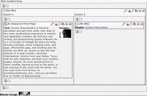
With two even columns, our front page should look something like this:
