
8
Customizing Your User Interface
User Interface (UI) is a software development term that means all the buttons and menus and stuff on the screen that allow you to interact with a computer program. As with most software, you can customize some of the UI in SketchUp to suit your modeling workflows.
In this chapter, we will look at what can (and cannot) be customized and try to figure out what changes to the UI will be most beneficial in helping you to level up your SketchUp skills. This means diving deep and learning exactly what UI elements are available to you in SketchUp as well as what elements can and cannot be customized. Specifically, we will be covering the following:
- Reviewing screen layout
- Deciding how many toolbars are needed
- Setting up trays and dialogs
- Organizing a custom UI
- Creating a next-level workspace
Let’s start by looking at the different elements and seeing how they can be customized. Once we have a firm understanding of what we can use, we’ll figure out how to set it all up to make a custom workspace specifically designed for your workflows.
Technical requirements
In this chapter, you will just need access to SketchUp Pro.
Reviewing screen layout
Before diving into the fun stuff (the actual UI elements: toolbars, trays, icons, and more), we need to take a look at what you are working with and figure out where to ideally place your UI. One of the nice things about SketchUp is that it can run with fairly minimal screen real estate. Many users run SketchUp all day on a single laptop screen.
At the same time, other users prefer to spread SketchUp across multiple displays. Some users, like myself, end up using SketchUp in different configurations, depending on the day. The first step in coming up with the perfect workspace starts with taking inventory of your hardware.
Operating system
The first thing to consider when thinking about your workspace is how SketchUp works and can be customized based on the operating system you are running. Of course, you have two options (Windows or macOS), and you should, at this point, know which you are using.
As we continue through this chapter, some sections will be split into two sections, the first showing Windows and the second showing macOS. If you are dedicated to one and only one operating system, feel free to skip the portions that do not apply to you. If you are a rare user with access to both operating systems (or if you really like reading), then please feel free to read everything!
So…Which Is Better?
It is a rare occasion where Windows and macOS are listed side by side and the question of preference is not raised. Does SketchUp run smoother on one operating system? What operating system does the development team use? Which operating system is best? Most users start using SketchUp on the operating system that they are already using. Occasionally, when it is time for a new computer, a user may switch operating systems to take advantage of SketchUp on Windows or macOS. This chapter will run through all of the UI options of both operating systems, so you can decide.
Monitor(s)
When fine-tuning your UI, you have to be conscious of the space that you are working on. If the icons and windows in SketchUp are the tools you work with, then your monitor is your workbench. One monitor is essential (obviously). Whether this is a laptop screen, a 19” LCD, or some huge curved 8K mini-movie screen, you need to have at least one monitor to run SketchUp.
Many users take advantage of multiple monitors to get even more out of their UI. While SketchUp was not necessarily designed for multiple-monitor use, there are advantages to adding an extra screen to your setup.
When running SketchUp, the main modeling window must be on one screen. Whether you have two, three, or six monitors connected to your computer, the modeling window can get as big as one display will allow. Additional monitors, however, can be used to store additional UI or for displaying reference materials.
Using additional displays with Windows
If you are running SketchUp on Windows, you can take advantage of the docking toolbars and trays within the main modeling window (more on that in the Deciding how many toolbars are needed and the Setting up trays and dialogs sections of this chapter); additional monitors can be used to store floating trays and toolbars. You cannot snap them to the side of a secondary monitor, but you can move them out of your primary display, giving you more room to work on your model.
Using additional displays with macOS
Unlike Windows, SketchUp running on a Mac will not allow you to dock toolbars or dialogs. Whether you are running a single-display setup or have multiple additional monitors, your UI will be floating over the top of your modeling window. Moving it to a secondary monitor will just get those floating tools off your modeling screen, making more of it visible.
Why Do I Need a UI?
I know, we just spent the previous chapter talking about how shortcuts should be used in place of toolbars because it is quicker to tap a key than to hunt down an icon on a toolbar. The fact is, even if you get all of your commonly used commands tied to shortcut keys, there will still be some that you don’t use often enough to justify a shortcut. Plus, trays and dialogs need to be used to display information about selected entities or let you set properties of items as you model. Shortcuts are great, but do not eliminate the need for all UI.
Using additional displays for reference
Putting aside the potential need to see other programs while in SketchUp (it’s okay to have your messenger and music app up while you model, right?), you may want to use additional displays to show you some information about what you are modeling. SketchUp will allow you to import reference images or import images as watermarks so you can see them, but there are plenty of times when you may want a dimensioned drawing of a plot of land or a PDF of a part you are modeling available to look at.
When I start modeling something from reference information, I will try to import data first and reference that. There are, however, plenty of times that I am modeling from a series of photos or a plan with lots of little, tiny dimensions. In these cases, I will open the images or PDF files on my second monitor so I can get the information I need when I need it. Yes, in some cases it is worth it to import an image into SketchUp and lay it on the ground next to my modeling space, but then I have to zoom out or pan over to the image each time I need to reference it. With the image sitting on my second monitor, all I have to do is turn my head a few degrees to the right and I can see everything that I need.
The fact is, if you have a decent-sized second display, it is pretty easy to get everything (toolbars, trays/dialogs, reference imagery, and even your music player) up on your secondary display, thus reserving your entire primary display just for your modeling screen!
Let’s take a look at two different ways that I have my displays configured. I do most of my work on a MacBook. My main setup uses just the display of the MacBook for everything. My primary way of using SketchUp looks like this:
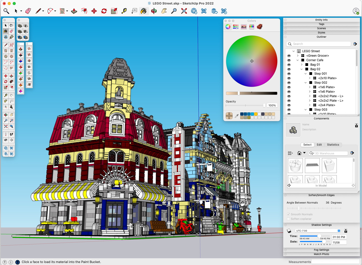
Figure 8.1 – Everything needed to run SketchUp on one display
This setup works and would be totally usable if I were traveling or did not have access to a second monitor, but it is not ideal. Running a single display like this, I can only have a few dialogs open at any given time and I lose way too much screen space to the Colors window and the floating toolbars. Plus, if I wanted to open a reference image, I would have to switch back and forth between the image and SketchUp as I model.
Alternatively, I could set up two displays, my MacBook display and a secondary monitor. I would have something like this on my MacBook display:

Figure 8.2 – Primary display with just the modeling screen
The primary monitor would be reserved for modeling. The secondary (or any additional monitor) would be used to display additional content and the UI. Here is the secondary monitor display:

Figure 8.3 – Secondary monitor with reference imagery, dialogs, and toolbars
With these two displays, I can have all of my dialogs open and expanded, plus have plenty of space for other applications. I can display reference images or have up my messaging app and music player without sacrificing any of my modeling screen or having to switch between apps.
This setup will appeal to some more than others. There are those who want to see everything open at once, while others prefer to only display what they need when they need it. Neither of these scenarios is the right one, and it really comes down to personal preference. What you need to take away from this section is that you have options to set up SketchUp to work across multiple displays or on a single display.
Now that we have discussed how we can use displays to present our UI, let’s dive into what UI we actually need to have visible.
Deciding how many toolbars are needed
I love toolbars. I love icons. I think that having a single button to launch a command is great UI. Plus, a well-designed icon stands on its own and tells you what it does, regardless of what language you speak. Does this mean that I turn on every single toolbar when I run SketchUp? It does not. After reading Chapter 7, Creating Custom Shortcuts, do I keep all toolbars turned off and rely solely on keyboard shortcuts? No, this is not ideal either. I believe that the ideal use of toolbars lies somewhere between these two setups.
In order to level up your SketchUp skills, you do have to rely on shortcuts as much as possible. Tapping a key to bring up a command will always be faster than clicking a button on a toolbar. There are commands, however, that may not be everyday commands and so do not get a shortcut. You may have commands that you only use in every fourth model, so learning shortcuts for them will be a challenge because you don’t get a chance to practice using them. For these sorts of commands, it is a good idea to lean on toolbars.
Before we decide which toolbars are the ones you need, let’s take a look at how toolbars work. Because SketchUp relies on the operating system to display and control the toolbars, this is different for Windows and macOS.
Using Windows toolbars
To edit your toolbars in SketchUp for Windows, click on the View menu, then Toolbars…. This will bring up the Toolbars window. From here, you simply have to check the box next to a toolbar to enable that toolbar.

Figure 8.4 – Toolbars window in SketchUp for Windows
By default, the Toolbars window shows all of the toolbars that can be enabled in SketchUp. If you have extensions installed, and those extensions have toolbars, they can be turned on or off here as well (more on that in the Organizing a custom UI section). When you first turn on a toolbar, it will be displayed at the last location it was used (if you have never used a toolbar before, it will show up at its default location). The previous or default locations are not always very useful, but you do have the ability to move toolbars anywhere you want.
In SketchUp for Windows, you can click and drag any toolbar anywhere you want. Dragging a toolbar toward the top, bottom, left, or right edge of your modeling screen will automatically dock the toolbar to that edge. Dragging a toolbar and dropping it anywhere away from an edge will create a floating toolbar that can be moved anywhere on any of your displays. It is important to note that you can only move toolbars if the Toolbars window is closed.
A Single Exception
OK, I lied, just a little! Every toolbar can be docked to any side of the drawing screen, except one. The Large Tool Set toolbar will only dock to the left or right side. Due to its unique layout (two buttons wide), it will not automatically reorient to a horizontal toolbar.
Customizing toolbars on Windows
The default toolbars are logical groupings of commands based on their function or the menu in which they reside. That works for most people, but what if you don’t want to show all of the commands from a certain menu? What if you want access to buttons for the Tape Measure and 3D Text tools, but don’t want to see the rest of the commands on the Construction toolbar?
Fortunately, SketchUp for Windows makes customizing your toolbars extremely easy. Let’s create a custom toolbar. Let’s say that I want to create a toolbar that has my most commonly used commands. These commands are as follows:
- Line
- Eraser
- Rectangle
- Push/Pull
- Follow Me
- Make Group
- Zoom Extents
These commands can all be found on other toolbars, but by placing them on one custom toolbar, I can save space on my display. Plus, I can change the order of the buttons on my custom toolbar to mimic the order of operations when I model. Let’s create this toolbar:
- Click on the View | Toolbars… options.
- Click on the New… button.
- Type My Toolbar, then click OK.
This will create a brand-new empty toolbar. Now we need to add some buttons. This is done by dragging buttons off other toolbars onto our custom toolbar. To do that, we need to have a toolbar to drag buttons from. Many of the commands we will be placing in our custom toolbar are on Large Tool Set, while Make Group is found on the Principal toolset.
- Turn on Large Tool Set and the Principal toolbar.
All that is left to do is drag the buttons we need into our custom toolbar. This is as simple as clicking and dragging the buttons you need. This function only works while the Toolbars window is open.
- Drag the Line icon (the red pencil) from Large Tool Set to our custom toolbar and drop it.
- Do the same for Eraser, Rectangle, Push/Pull, Follow Me, and Zoom Extents.
- Drag Make Group from the Principal toolbar.
With that, we have a custom toolbar! Now, let’s take advantage of toolbar customizability and rearrange the buttons in the following order:
- Make Group
- Line
- Eraser
- Rectangle
- Push/Pull
- Follow Me
- Zoom Extents
- With the Toolbars window still open, click and drag the buttons on the custom toolbar until it looks like this:
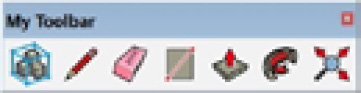
Figure 8.5 – Your custom toolbar
You can see the advantage of creating custom toolbars, toolbars that only have the tools you need. With the right custom toolbars, you could turn off the stock toolbars and have the commands that you need on the screen and nothing more.
What if we want our custom toolbars and we want access to the stock toolbars? If you look at the stock toolbars (Large Tool Set and Principal), you can see that they are missing the buttons that we put onto the custom toolbar. Let’s get those buttons back before we wrap up this process.
- In the Toolbars window, select Large Tool Set from the list, then click the Reset button and click Yes.
All of the buttons are back on the Large Tool Set toolbar! This works great for resetting a single toolbar at a time, but there is a way to set all toolbars back to the default.
- Click on the Reset All button, then click Yes to put all buttons back on all stock toolbars.
Notice that it will put back the stock buttons but not mess with your custom toolbar.
Finally, since we only turned on the Principal toolbar to get access to the Make Group button, let’s go ahead and turn that off, then exit the Toolbars window.
Shortcut to the Toolbars Window
Next time, rather than pulling down the View menu to get to the Toolbars window, right-click on any toolbar. This will display a flyout menu listing all the toolbars. At the very bottom is a Customize… option, which will open the Toolbars window.
With that, we have turned on some extra toolbars and created our own custom toolbar in SketchUp for Windows. Now, for macOS users, let’s create something similar.
Using macOS toolbars
Unlike SketchUp for Windows, SketchUp for macOS has very few stock toolbars. In fact, it really only has two: the toolbar at the top of your drawing screen and Large Tool Set. The rest of the toolbars that you can turn on are a result of extensions (toolbars such as Solid Tools or Sandbox tools are native extensions).
To turn on Large Tool Set in SketchUp for macOS, click on the View menu, then hover over Tool Palettes. This will bring up a flyout menu listing all of the toolbars you have available to you. The toolbars that are currently active have a checkmark next to them. Turn a toolbar on or off by selecting it from the list.
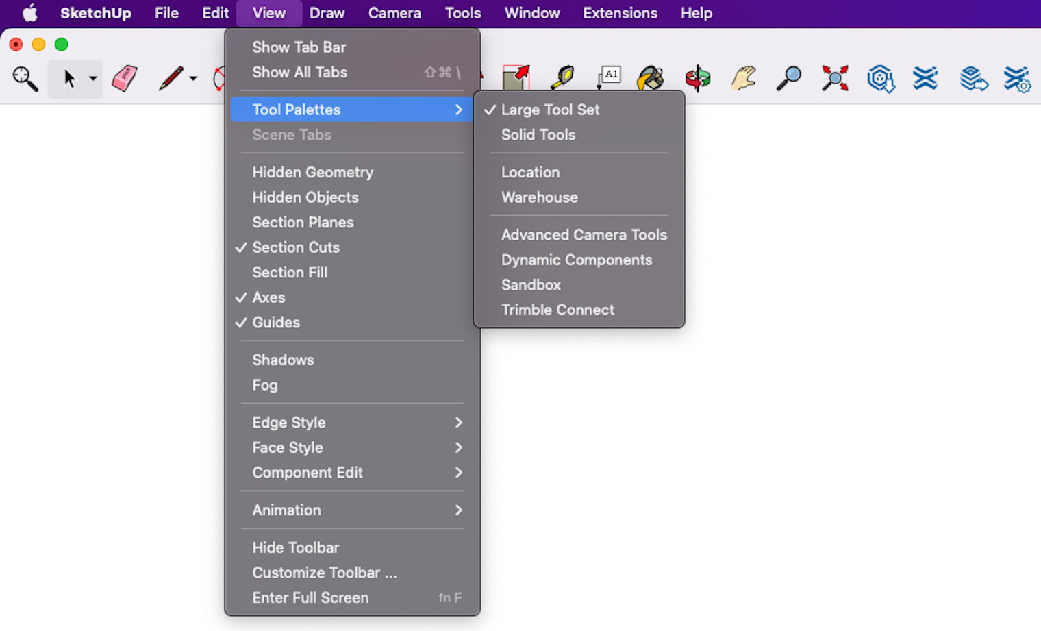
Figure 8.6 – Tool Palettes flyout in SketchUp for macOS
This list will show all of the toolbars that can be enabled in SketchUp. If you have extensions installed, and those extensions have toolbars, they can be turned on or off here as well (more on that in the Organizing a custom UI section). When you first turn on a toolbar, it will be displayed at the last location it was used (if you have never used a toolbar before, it will show up at its default location). The previous or default locations are not always very useful, but you do have the ability to move toolbars anywhere you want.
In SketchUp for macOS, all toolbars are floating toolbars. Any toolbar can be placed anywhere on any display.
The Main Toolbar Is Always There
The toolbar at the top of the main drawing screen is always on. There are no controls to turn it on or off. It also cannot be moved and will always reside across the top of your screen. It can, however, be customized to display the tools that you want.
Customizing the top toolbar on macOS
Unlike SketchUp for Windows, there is only one customizable toolbar. Fortunately, you can add any buttons to it in any order you like, and it can be as big as your display will allow. Additionally, you can add any buttons from any toolbar directly to it without having to move buttons from one toolbar to another.
Let’s customize the top toolbar. Since the top toolbar has many of the most commonly used commands already, for this example, we will add additional buttons for commands we may want to add to our workflow. Let’s say that I want to add a group of buttons to the custom toolbar. These commands are as follows:
- Dimensions
- From Scratch
- 3D Text
- Section Plane
- Smoove
- Outer Shell
- Position Camera
What we will do is add a divider (an empty space) between the default buttons and our own custom tools in the top toolbar. Let’s get in there and edit the toolbar:
- Right-click on the top toolbar and click on Customize Toolbar….
This will display the toolbar customization window. This window will display icons for all commands that can be placed on the toolbar, including those from extensions (which we will discuss more in the Organizing a custom UI section). To add a button to the toolbar, you just drag it from the window and drop it onto the toolbar at the top of your screen (or in the preview of the toolbar at the bottom of the window).
- Drag the Dimensions icon from the window to the toolbar and drop it in the empty space to the right of the existing icons.
- Do the same for From Scratch, 3D Text, Section Plane, Smoove, Outer Shell, and Position Camera.
Now that we have the buttons we want, let’s get them a little better organized. Let’s start by separating them from the default buttons. Let’s place an empty space between the stock buttons and our custom commands. Notice that one of the options in the button list is something called Space. This is just an empty space that you can use to separate groups of buttons from each other.
Now, let’s take advantage of toolbar customizability and rearrange the buttons in the following order:
- From Scratch
- Smoove
- Outer Shell
- 3D Text
- Section Plane
- Dimensions
- Position Camera
- Click and drag the buttons on the custom toolbar until it looks like this:

Figure 8.7 – Your custom toolbar buttons
You can see the advantage of customizing this toolbar is getting access to the tools you need. There is a limit, however. You can only add enough buttons to the toolbar to fill the width of the screen. Once the width of the screen is full of icons, you cannot add any more.
For this reason, depending on your display, you may want to turn on Use Small Size (at the bottom of the toolbar customization window). This will display smaller icons and allow more space for customization.
If you ever want to remove a button from the toolbar (including the ones that are there by default), you can simply drag them off and drop them on the modeling screen. Let’s get rid of that Dimensions button.
- Click and drag the Dimensions icon from the toolbar to anywhere on the modeling screen and release it. It will disappear in a small puff of white smoke.
At this point, you can remove any of the icons you do not think you will be using and add some that you think you will be using more in the future. Once you are done, you can save the edits to the toolbar by closing the customization window.
With that, you have learned how to customize the top toolbar in SketchUp for macOS. Now that we have seen how to organize toolbars, let’s think for just a second about what we want to use the toolbars for.
Picking your toolbars
The next step in leveling up is speeding up your modeling process by displaying the toolbars or buttons for the commands that you don’t access with shortcuts. What commands are those?
Looking back at the lists of commands you are using and are planning to start using from Chapter 6, Knowing What You Need Out of SketchUp, and knowing the shortcuts you created after reading Chapter 7, Creating Custom Shortcuts, what commands remain that do not have shortcuts? What commands are you using that have you going to menus each time you use them?
As you work through your next model, keep an eye out for the times that you hunt through a menu to find a command, especially those that are two levels deep. The time it takes for you to navigate through menus is time that could be used to create geometry! When you identify those commands from menus, you need to decide whether they deserve shortcuts or they should be in buttons on the screen. The commands that you are using that don’t make the cut for shortcuts (that don’t make the shortcut?) should be considered for toolbar status.
If you are on Windows, you will need to decide whether you want to show an entire toolbar to get to that one command, or whether it makes sense to create a custom toolbar to just get to the commands that you need. There is no point in displaying the entire Drawing toolbar just to get the 2 Point Arc button on your screen.
If you are a macOS user, the decision is a little easier. Commands that need an onscreen button just need to get added to the toolbar.
Deciding what toolbars or buttons to have onscreen can be an evolving process. As you work more in SketchUp with an eye toward improving your workflow, you may come back and change your UI many times. The important takeaway here is that commands you use regularly should get keyboard shortcuts, while commands that are used less often should go into toolbars. Once you figure out what those commands are, you will find that you can model faster when you are spending less time hunting for the commands you need to use.
Another way to have information available to you as you model is by setting up your trays or dialogs, which is exactly what we will cover in the next section.
Setting up trays and dialogs
Let’s start by quickly defining some terms. Trays are the stacking windows that snap to the side of your display and present information such as entity information, or shadows if you are running SketchUp on Windows. Dialogs are the floating, stackable windows that serve the same function in SketchUp for macOS.
Regardless of the operating system, there are 11 items that can be displayed:
- Entity Info
- Components
- Styles
- Tags
- Outliner
- Scenes
- Shadow Settings
- Fog Settings
- Match Photo
- Soften/Smooth Edges
- Instructor
If you are running SketchUp on Windows, you will also have a Materials panel available while SketchUp for macOS will have a separate, non-stackable, floating Colors window.
Since the terminology and function of these tools are so different on different operating systems, we will dive into each one separately, starting with trays in SketchUp for Windows.
SketchUp for Windows trays
Trays are containers that allow you to organize panels. In SketchUp for Windows, a panel is the name of the groups of controls listed in the previous section. Trays give you control over how and where these panels are displayed. The following screenshot shows a custom tray with four panels:

Figure 8.8 – A custom tray with four panels
Regardless of how you use your trays, you can rearrange your panels within the tray. Each panel can be individually collapsed or expanded by simply clicking on its title bar. Likewise, you can rearrange panels by clicking and dragging them into whatever order you need.
Now that we understand how panels work, let’s look at how you can control the trays. When you first install SketchUp, you get a single tray (called the Default Tray) docked to the right side of the screen.
Many users just leave the Default Tray where it is without realizing the options they have to change where the tray can be. A tray can float or dock to any side of the screen. Docking a tray is as simple as dragging its title bar to the side of the screen where you want it docked and dropping it on the docking icon. You can create a floating tray by dropping the title bar into the middle of the screen. In the following screenshot, the workspace includes both a floating tray and a docked tray:
Figure 8.9 – The tray on the left is floating while the tray on the right is docked to the screen
You Will Probably Never Do This
Trays can also be docked to the top or bottom of the screen. Since the information displayed in the panels was originally designed to be displayed in a vertical bar shape, docking to the top or bottom and creating horizontal panels looks odd and wastes a lot of space. The option to dock anywhere is there, but I would recommend against using it to dock to the top or bottom.
Clicking the small pin icon at the top of a docked tray will cause it to collapse into a small tab on the side of the screen. To display a collapsed tray, just move your mouse on the tab. Clicking the pin of a collapsed tray will permanently display the tray again.
That’s quite a bit of flexibility for displaying a tray! Plus, you have even more options once you have more than one tray. Let’s create a few custom trays, then take a look at how multiple trays can be displayed:
- Click on the Windows menu.
From here, you have the option to explore current trays, manage trays, or create a new tray. Let’s start by looking at what is in a default tray. The top part of the menu will list all the trays we have created. By default, there is only one tray in the list: Default Tray.
- Click on Default Tray.
This will display a flyout menu that gives you commands to hide or rename the tray, as well as displaying what panels are in the tray, currently. Panels with a checkmark next to them are displayed in the tray. From here, you can turn panels on or off and change what is included in the tray. All we want to do right now is make sure that the Default Tray is not visible.
- If Default Tray is visible on your screen, click on Hide Tray.
Now let’s create a new tray that will display just a few of the panels we want to be displayed.
- Click on Manage Trays….
- Click on the New button.
This new tray will include the panels that display information about the model, so let’s name it Information.
- Type Information into the Name field.
- Turn on the following panels:
- Entity Info
- Styles
- Tags
- Scenes
- Outliner
- Click on the Add button.
Notice that when you turn on a tray, it automatically shows up in the default location; that is, docked to the right side of your primary display.
Now let’s create a second tray that will contain the panels that we use to set properties as we model. We will call this tray Properties.
Turn on the following panels:
- Components
- Shadows
- Fog
- Soften Edges
- Click on the Add button.
Notice that the new tray shows up at the same place that the previous tray did, but now there is a small tab bar at the bottom of the tray displaying the names of our two trays. Clicking either tab will allow us to switch between trays, displaying all of the panels within.
Panels Can Only Be Displayed Once
As you create trays, you will find that you can only have one panel active in one tray. If you were to go into our new Properties tray and turn on Entity Info, it would turn off in our Information tray.
So, why bother splitting the panels into two groups? Having your panels split between trays means you can display more of them at the same time. Since there is a limit to how much you can show in a tray (it can only display a stack of panels as tall as your display), you can only see so many panels at any given time. You can have more panels than you can display, but then you must scroll through the panels to see the one you need. With the panels in two trays, you can display more than one tray and see twice as many panels.
Right now, we have two trays, both docked onto the same side of the screen. This is nice if you are okay with clicking the little tabs to switch between trays. Let’s see how we could actually display both trays at the same time:
- Click and drag the Properties tab at the bottom of the tray into the middle of the screen.
This will create a floating Properties tray. Now we need to dock the tray next to the Information tray. To do this, we will drag the floating tray into the docking widget in the middle of the screen. In this case, we will drag it and drop it onto the right side of the docking widget.

Figure 8.10 – Floating docking widget
- Drag the floating Properties tray (by the title bar) onto the right icon of the docking widget.
We now have stacked trays on the right side of the screen! I know, doing this on many displays means sacrificing a whole lot of your drawing area, but the important thing to know is that you can display more than just the Default Tray, docked to the right side of the screen.
Since this current setup will not work well unless you have a super-wide 40” monitor, let’s go ahead and collapse these trays and reclaim some drawing area.
With that, you have seen how you can customize the trays in SketchUp for Windows. Trays are incredibly flexible and give you a lot of options for displaying information.
SketchUp for macOS dialogs
The floating dialogs in SketchUp for macOS display the same information as the trays in SketchUp for Windows, but with less control. Using the dialogs is extremely straightforward. Toggle the visibility of each dialog by clicking on its name in the Windows menu.
When a dialog is toggled on, it will appear as a floating dialog. These dialogs (with the exception of the Materials dialog) can be stacked together in whatever order you like. This stack can be positioned anywhere you like on any display. Each dialog can be individually expanded or collapsed as you need it, as well.
Stack and Restack
Dialogs can be reordered at any point. To change the order of a stack of dialogs, pull them apart from the bottom. Dialogs can be disconnected from the dialog above them by clicking and dragging. They will also reattach by dragging a selected dialog below another.
Since the dialogs do not dock and will float anywhere you like, you have complete control over their placement. If you like, you can keep them all collapsed in a single stack on your primary display, as shown here:
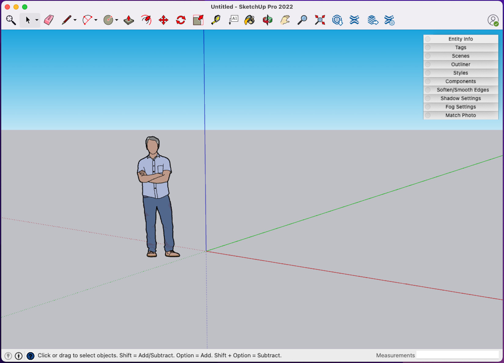
Figure 8.11 – Collapsed dialogs floating over modeling area
Or, if you prefer to see what is going on in them at all times, you could expand them into two or three stacks and let them float on a secondary monitor.

Figure 8.12 – Expanded dialogs in two stacks floating on a second display
Dialogs are simple to use, move, and rearrange. Take advantage of these elements by putting them wherever you need them, whenever you need them.
The ideal tray/dialog setup
As with other UI elements, the ideal setup of the trays or dialogs will be different for everyone. Try out different configurations and order of the elements as you model. See which dialogs or panels you need onscreen and which you like to have open versus which ones you open only when you need them. Do you like having them on the left or right? Since changing this UI is so easy, try a few different layouts and see what works best for you.
At this point, we have reviewed the default UI options. Up next, let’s take a look at the UI elements that are made available with the installation of extensions.
Organizing a custom UI
Now that we have seen the options for organizing the default UI, we should probably touch on how the UI works for extensions. We will be spending plenty of time on extensions in Chapter 13, Must-Have Extensions for Any Workflow, but right now, let’s discuss how we can add an extensions UI to our workspace.
In addition to adding menu options to the context menu or the Extensions or Tools menu, extensions creators have the option to add toolbars that can be accessed alongside the default toolbars or buttons or create brand-new custom UIs. Since we have already discussed how toolbars work, let’s start by looking at how to work with toolbars for extensions. As with the other UI elements, this is different for SketchUp for Windows and SketchUp for macOS. We will start by exploring the options available in SketchUp for Windows.
Extension toolbars in SketchUp for Windows
Many extensions will make their own toolbar available for use via the Toolbars… option in the View menu. They will function very similarly to standard toolbars. They can be toggled on and off and docked to the sides of your modeling screen or can be allowed to float on any of your displays.
You cannot, however, drag buttons from the Extension toolbars, nor can you drop other buttons into them. This means if you want access to the Extension toolbars, you will have to display the whole toolbar.
Shortcuts Work for Extensions
If you dislike the idea of showing an entire toolbar just to get access to one or two commands from an extension, remember that you can assign shortcut keys to extension commands, just like native commands.
Extension toolbars in SketchUp for macOS
On SketchUp for macOS, you can activate toolbars for extensions, just like in other toolbars. They will, just like other toolbars, float wherever you like on any display. Additionally, most commands from extensions can also be added to the toolbar at the top of the screen.
When you install an extension, your buttons from the extension will automatically show up in the toolbar customization window. You can drag these buttons and drop them into your toolbar, just like the buttons for native commands!
Custom extensions UI
In addition to the toolbars and menu entries added to SketchUp by extensions, many extensions will display a custom UI as you use them. These UIs are generally displayed onscreen without many options for customization, regardless of the operating system. For the most part, extensions will display their custom UI in the same place, or honor where you have moved them. So, while you cannot control exactly how this UI works, you can plan on where it will show up when the extension is used.
Each extension developer has the option to create the UI that is appropriate for the function of their extension. In some cases, extension developers have a standard UI that they will use across all of their extensions, such as Fredo6’s colorful information bar that pops up when using one of his incredible extensions, as shown here:
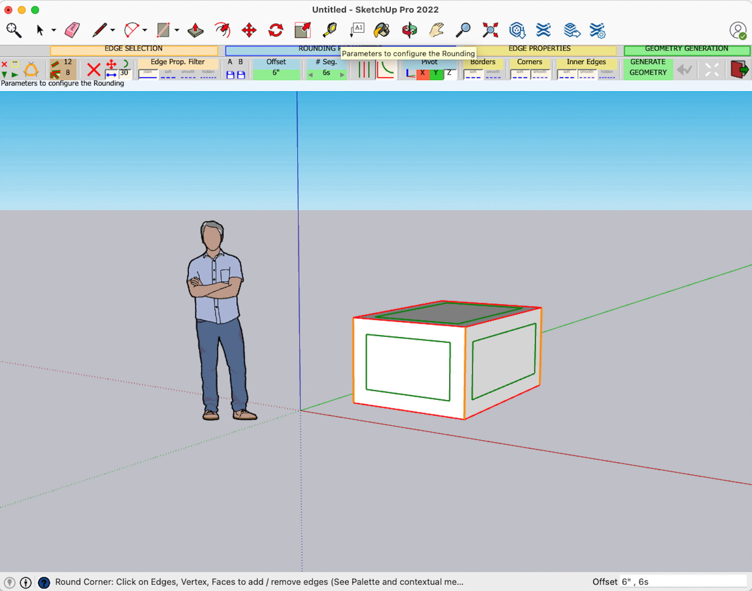
Figure 8.13 – Fredo6’s RoundCorner extension shows Fredo6’s standard information bar at the top of the screen
While Fredo6’s UI always shows up at the top of the screen, some UI can be customized. Thomthom’s Vertex Tools UI appears as a custom tray-like element docked to the left side of the screen. The panels of the UI can be toggled on and off and the extension remembers the state of the UI after you close and reopen it. The Vertex Tools UI is shown here on the left side of the screen:
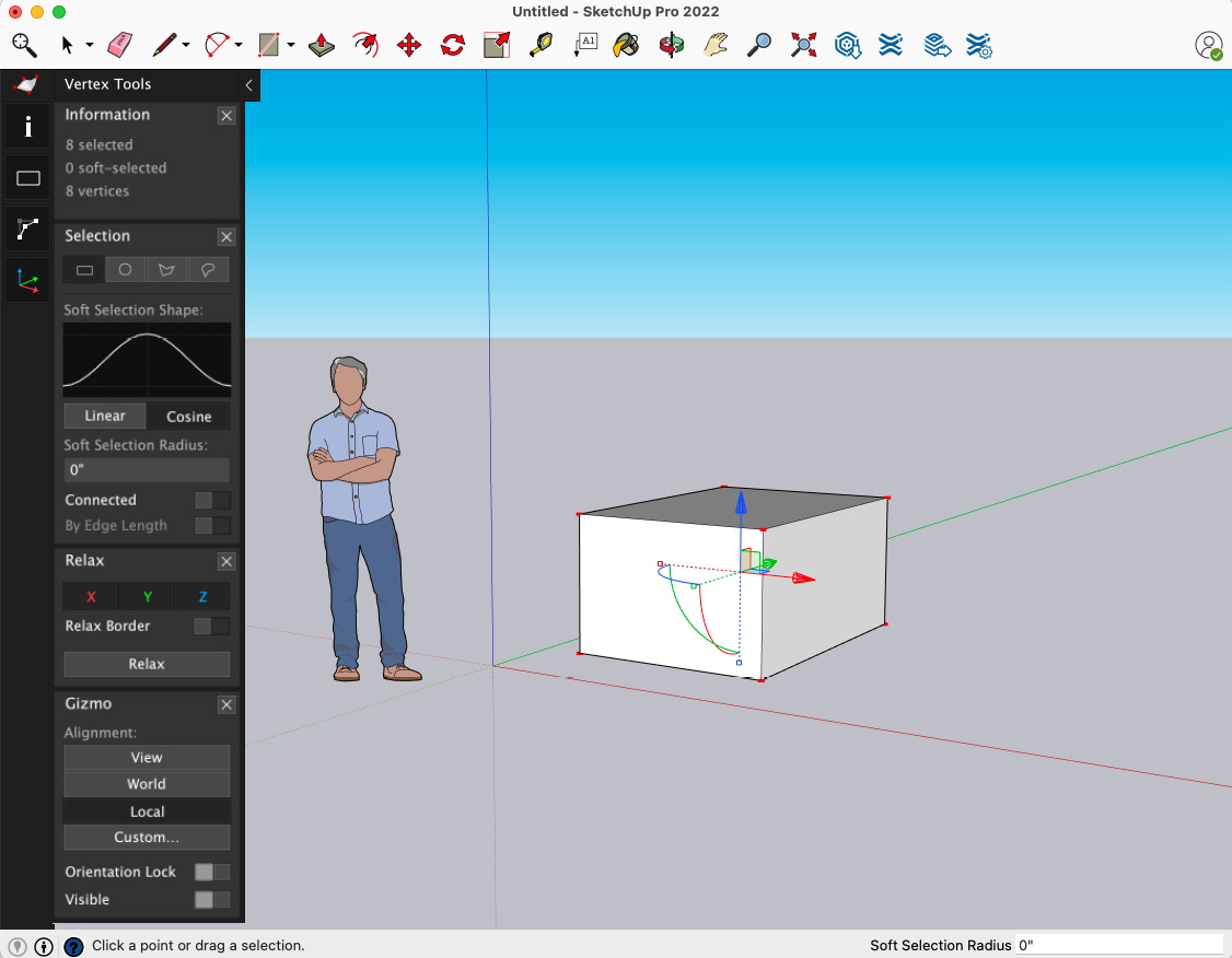
Figure 8.14 – Thomthom’s Vertex tool UI
In both of these examples (and many other extensions), the UI only shows up onscreen while you are using the extension. This can make it a little tricky to tie the extension UI into your standard workspace. The best solution is to be conscious of the UI that will appear for the extensions that you are using. If you are using a Fredo6 extension and you know that the bar will be showing up at the top of the screen, don’t put any floating toolbars up there. If you are using Vertex Tools from Thomthom, put your floating toolbars somewhere other than the left side of the screen. You cannot stop the custom UI elements from showing up; you can, however, make room for them when they appear.
Extensions are great for adding to your capability in SketchUp, but they can add a whole lot of UI to your screen if you are not careful. The key to working with an extensions UI, or any UI, for that matter, is figuring out exactly what you need onscreen and when, which is exactly what we will cover in the final section of this chapter.
Creating a next-level workspace
At this point, we have looked at all of the parts that make up your workspace: displays, toolbars, trays/dialogs, and the extensions UI. The looming question is, what is the best way to set this all up so that you have a workspace that will help you level up your SketchUp skills?
You have probably already guessed that there is no one answer to this question. Everyone will have a slightly different workspace that is best for them. Let’s walk through some of the big factors in creating your ideal workspace. The first thing we can think about is where you will be working.
Where is your workspace?
Do you sit at the same desk every time you use SketchUp and have access to multiple monitors? Do you design on the go or out in your shop and rely on just your single laptop screen? Do you switch back and forth? I know we discussed single versus multiple-monitor setups earlier in this chapter, but it is time to think about the practical application of your setup. No theory, no dream setup, no ideal situation. Right now, where do you use SketchUp? This is the place where we will build your workspace.
What is the most important UI for your workflow?
This is a question that you should be asking yourself every time you model. What commands are you using on a daily basis? Which commands are used occasionally? What information are you referring to regularly? The easier these items are for you to get to, the quicker you can create 3D models. Let’s do a quick math experiment and see what we are looking at, as far as time savings go.
Let’s say you need to move your mouse from the middle of the screen to the Draw menu, then click on the Line command every time you need to draw an edge. Let’s say that on average, it takes you about 3 seconds to do so. Now, let’s say you grab the Line command 20 times or so every hour of modeling. That is a full minute spent every hour, just starting up the Line command!
I know, it may not seem like a whole lot of time, but it is a full minute of time that does not need to be spent. To get the full weight of how long a minute is, think about stopping in the middle of your productive modeling time and just sitting there, doing nothing for 60 seconds. That is what going up and clicking on menus is doing to your modeling time.
“But it is just 1 minute!”, you say. One minute, for the Line command. But you are using more than just the Line command, right? Every time you run off to the menu instead of tapping a shortcut key or clicking on a button, you are adding to the time that you are not modeling. With this in mind, think about what items you have onscreen and how they help you be a better modeler.
Time to refer back to your lists from Chapter 6, Knowing What You Need Out of SketchUp, again. Look through the list of new workflows that you are developing. Look at the commands that you have identified as tools you need to start using. We talked about assigning keyboard shortcuts to many of these commands in Chapter 7, Creating Custom Shortcuts, but what about the commands that are part of your workflow that you did not assign shortcuts to? Should you be adding buttons for those to a custom toolbar?
To level up, you need to have the tools you need immediately at hand. Turn on or create toolbars that put your tools right where you need them and not stuck in a menu.
One workspace or two? Or three?
I honestly do not believe that there is one be-all and end-all solution for your workspace. I would guess that, for most of you, there are two or three. When you were looking at the kinds of models you currently use or the ones you want to start working on, back in Chapter 6, Knowing What You Need Out of SketchUp, you probably had more than one kind of 3D model. In most cases, different 3D models require different tools. This may mean modifying your workspace to display different tools for different models. Let me show you a couple of the workspaces that I use when I model.
I spend a lot of my time at work creating learning content for SketchUp users. When I do this, I try to keep the UI as simple as possible. I try not to have any extra toolbars onscreen and collapse the dialogs down, as shown in the following screenshot:
Figure 8.15 – My stripped-down “simple” workspace
Sometimes, I end up doing some organic or subdivision modeling using a handful of extensions. In this case, I turn on a handful of toolbars and make space for the extensions UI that I know will come up when I use the Vertex Tools extension from Thomthom. The following screenshot exemplifies this:
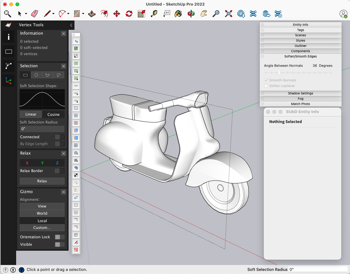
Figure 8.16 – My organic modeling workspace with the Vertex Tools UI visible on the left
Still, other times, when I am doing a live model on the SketchUp YouTube channel, I will create a multipurpose workspace. In this, I will often open one or more dialogs that I will be using regularly and turn on a couple of different extension toolbars with tools that I plan to use. This is a great general-purpose modeling workspace, and likely the one I would use most often if it were not too much UI for the teaching modeling that I do so often. My workspace for one of these sessions might look something like this:
Figure 8.17 – Multipurpose modeling workspace
Why Not Show It All at Once?
There are plenty out there who would prefer to take advantage of multiple monitors or be willing to dedicate a good portion of their modeling screen to toolbars/trays/dialogs. In my case, because I do so much modeling intended to help beginners learn SketchUp, I cannot load up the UI. This does not, however, mean that it is a bad idea, or that you should not try it!
The downside to the multiple-workspace approach is, of course, that you have to spend time preparing your workspace for the type of modeling that you will be doing. Before you hop in and start modeling, you need to think about the tools that you want to use and get them onscreen.
Does that seem like it is, in itself, time-consuming? Does this defeat the purpose of having a time-saving workspace setup? Think about it this way. It takes the same amount of time to click into a menu to activate a toolbar as it does to click into a menu to activate a command. If you are going to use commands on the toolbar more than once in your modeling process, you come out ahead by turning on the toolbar.
Summary
The hope of this chapter was to give you the tools that you need to create a workspace that will help you to level up your 3D modeling skills in SketchUp. We have seen what UI elements you have access to as well as how to use and customize them. We have looked at the advantages of multiple-monitor setups and how to work with extension UIs.
Additionally, this chapter should have left you thinking about how you use the tools and how you can use them better. I am sorry if I suggested that there was one perfect way to organize your screen in SketchUp that would make you a better, faster modeler. There probably is a better workspace for you, but it is a one-of-a-kind solution that only you can build.
Now that you have the tools to create your perfect workspace, don’t be afraid to dive in, make changes, and try out new screen layouts. Remember, the worst thing that can happen when you turn on a toolbar or move a tray is that you don’t like it, and you can change it or go back to how it was. You literally cannot hurt yourself or SketchUp with anything we covered in this chapter, so do not be afraid to make changes to your workspace!
At this point on the leveling-up journey, we have talked about a lot of tools that can give you a leg up on the modeling process. Up next, in the next chapter, we will talk about how to take a huge step ahead at the start of any model you work on. We will also be looking at templates.