Chapter 2. Raw and Un-Kutt
the essentials of camera raw

Okay, just a friendly heads up: I wouldn’t even attempt to read this chapter intro until you read #5 of the “Nine Things You’ll Wish You Had Known...” right before Chapter 1. If you skipped it (and we both know you did), jump back to page xv, read it, then come right back. I’ll hold your place—go ahead [gently taps fingers on desk]. That was pretty quick. Did you just skim it? You did, didn’t you? Hey, this is imperceptibly important stuff, so please go back and read it again carefully. I’ll wait. (No worries, I’m still on hold with Verizon tech support.) Well, if you’re back here, you know what you’re in for, so now the onus is on you (ewwww, you have an onus!). This chapter on the essentials of Camera Raw is named after the album Raw and Un-Kutt by rapper Kutt Calhoun. I wasn’t familiar with his work, so I played a preview of one of his tracks (I think it was called “Naked [Boom, Boom, Boom],” which coincidentally was almost the name of this chapter before I even heard of that song). Anyway, whoa Nelly! He certainly seems very upset about something. But I digress. Before we get too deep into this, I’m going to call Adobe out on something. You know that little knobby thing on the Camera Raw sliders that you click on and drag? Some folks call it a “nub” or “knob” or whatever, but it has no official name, and personally, I feel this is a travesty. Everything, and I mean everything, in Elements has an official name that a group of perpendicular engineers literally argued to death blows over, except this one nebulous nubby thing. That’s when it hit me, this nubby thing’s name is up for grabs! Like an undiscovered planet or a new perfume (Splendifiquois, the new fragrance from L’Oréal). But I knew I would have to come up with a name that isn’t already used for anything, and that’s not as easy as it sounds, because a lot of things in life already have names. Then it hit me: there is one totally made-up word that has no actual meaning, yet is an important part of the American rock vernacular—pompitous. Check this out: “Click on the Highlights pompitous and drag it over to +0.25.” It sounds so legit! Yes, it shall be pompitous from now on. So let it be known; so let it be done. And remember, it was I, “Maurice,” who came up with this. (Well…”some people call me Maurice. ‘Cause I speak of the pompitous of love.”) Dang, this word works for anything! (Stop bragging, you sound so pompitous).
Opening Your Photos into Camera Raw
Although Adobe Camera Raw was created to process photos taken in your camera’s RAW format, it’s not just for RAW photos, because you can process your JPEG, TIFF, and PSD photos in Camera Raw, as well. So even though your JPEG, TIFF, and PSD photos won’t have all of the advantages of RAW photos, at least you’ll have all of the intuitive controls Camera Raw brings to the table.
Step One:
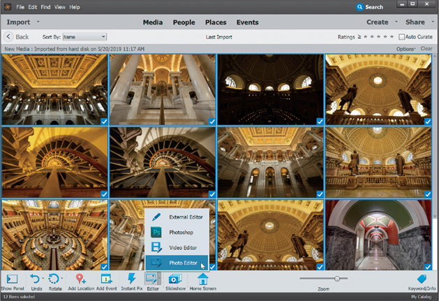
We’ll start with the simplest thing first: opening a RAW photo from the Organizer. If you click on a RAW photo to select it in the Organizer, then click on the down-facing arrow to the right of the Editor icon (on the taskbar at the bottom of the window) and choose Photo Editor from the pop-up menu, it automatically takes the photo over to the Elements Editor and opens it in Camera Raw.

Step Two:
To open more than one RAW photo at a time, go to the Organizer, Ctrl-click (Mac: Command-click) on all the photos you want to open, then choose an option from the Editor icon’s pop-up menu (as shown here, or just press Ctrl-I [Mac: Command-I]). It follows the same scheme—it takes them over to the Editor and opens them in Camera Raw. On the left side of the Camera Raw dialog, you can see a filmstrip with all of the photos you selected. (Note: By default, you’ll also see the filmstrip appear on the left when you open a single image. I prefer to close it, though, when working on a single image, so that my image takes up more of the window. You can close it by double-clicking on the right edge of the filmstrip.)
Step Three:
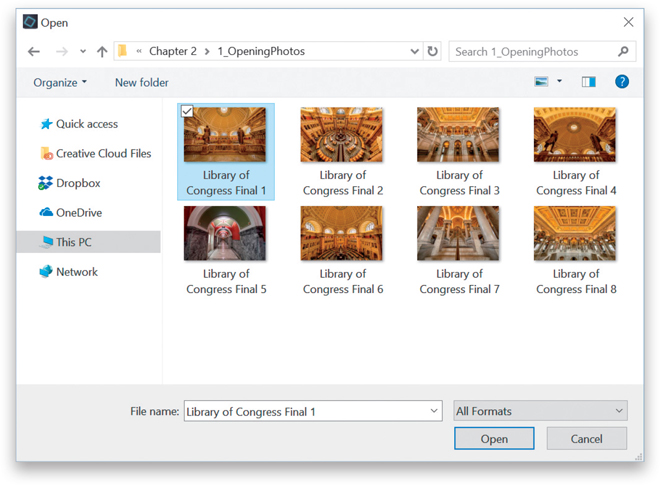
Okay, so opening RAW photos is pretty much a no-brainer, but what if you want to open a JPEG, TIFF, or PSD in Camera Raw? Go under the Editor’s File menu and choose Open in Camera Raw. In the Open dialog, navigate to the photo you want to open, click on it, and click Open.
Step Four:
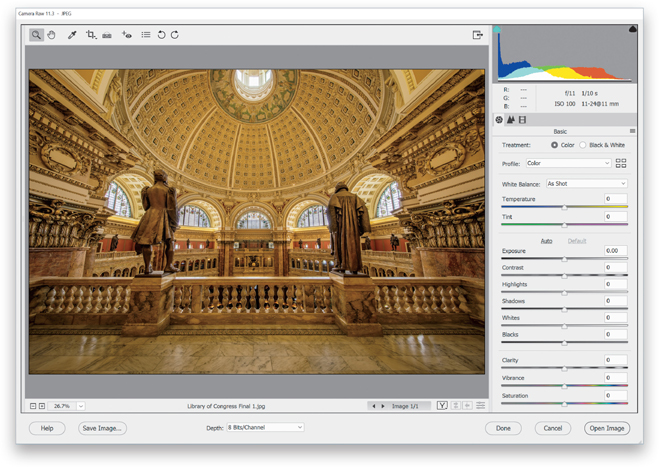
When you click the Open button, that JPEG, TIFF, or PSD is opened in the Camera Raw interface, as shown here (notice how JPEG appears up in the title bar, just to the right of Camera Raw 11.3?). Note: When you make adjustments to a JPEG, TIFF, or PSD in Camera Raw and you click either the Open Image button (to open the adjusted photo in Elements) or the Done button (to save the edits you made in Camera Raw), unlike when editing RAW photos, you are now actually affecting the pixels of the original photo. Of course, there is a Cancel button in Camera Raw and even if you open the photo in Elements, if you don’t save your changes, the original photo remains untouched. Also, if you have a layered PSD file open in Camera Raw and you click the Open Image button, Elements will flatten your layers as it opens the photo.
My Camera Raw Editing Cheat Sheet
Here’s a quick look at the sliders in Camera Raw’s Basic panel (this isn’t “official”—it’s just how I think of them). By the way, although Adobe named this the “Basic” panel, I think it may be the most misnamed feature in all of Camera Raw. It should have been called the “Essentials” panel, since this is precisely where you’ll spend most of your time editing images. Also, something handy to know: dragging any of the sliders to the right brightens or increases its effect; dragging to the left darkens or decreases its effect.


If You Shoot in RAW, You Need to Start Here
In the spring of 2018, Adobe changed the way we process our RAW images (for the better), but it’s important to understand what they did (and why they did it), so you can add it to your RAW editing workflow. On these first two pages, I’m going to explain something that will help you really understand why Camera Raw does things a certain way, but to do that we have to start in your camera. If you’re shooting in JPEG, you can skip these five pages altogether, and instead, your workflow starts on page 57 (shooting in JPEG is not a bad thing, but what I’m teaching here doesn’t apply to JPEG images, so I don’t want to waste your time or create confusion).
Step One:
Note: Again, this only applies to you, if you shoot in RAW. If you shoot in JPEG, skip these five pages.
When you shoot in JPEG, your camera automatically applies all sorts of processing adjustments to your JPEG images in-camera—like contrast, vibrance, sharpening, noise reduction, and so on—to make your JPEG image look really good straight out of the camera. That’s why JPEG images look so much better out of the camera than RAW images—RAW images don’t have any of that stuff applied to them.
Step Two:
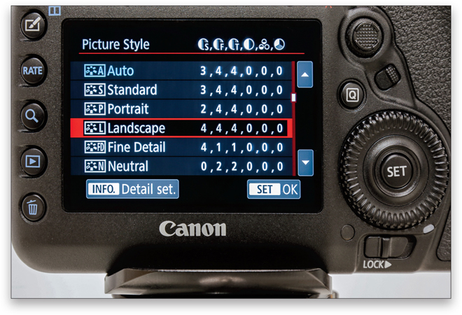
Besides JPEGs looking better by default, most cameras allow you to further tweak them by applying camera profiles right in your camera to make even better looking JPEGs. These profiles are named by the subject you’re shooting, so for example, if you’re shooting a landscape, you’d apply the Landscape camera profile to get more saturated colors, more sharpness, and more contrast. You can take it a step further by choosing Vivid, so your image looks even more colorful. If you’re shooting portraits, you can choose the Portrait camera profile and it provides flatter, less contrasty looks and tones that should be more pleasing for skin.
Step Three:
When you switch your camera to shoot in RAW mode, you’re telling it, “Turn off the sharpening, the contrast, the vibrance, the noise reduction—turn off all that stuff that’s added to make the image look great, and just give me the untouched RAW image, straight out of the camera, so I can add my own sharpening, contrast, and so on, in Camera Raw.” This “turn all that in-camera stuff off” for RAW photos also applies to those camera profiles you just learned about. If you applied a Landscape or Portrait camera profile to your RAW photo, since it’s RAW, Camera Raw just ignores it (in short, they really only work for JPEG images). The good news is, you can apply these same types of camera profiles in Camera Raw to RAW images. But, the news gets even better (well, not yet, in the step after the next step).

Step Four:
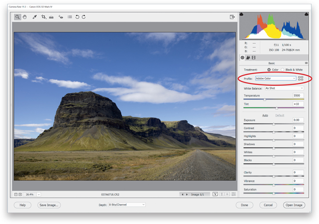
Now, the built-in default Camera Profile that was used to interpret your RAW photo (it was found in the Camera Calibration panel, as seen here) was “Adobe Standard.” But, Adobe recommended that you start by choosing Camera Standard to see how that looked.

Step Five:
So, for 12+ years, I’ve been telling photographers that they could have a better starting place than Adobe Standard by applying one of Adobe’s camera profiles hidden in the Camera Calibration panel (well, they were there in earlier versions of Camera Raw anyway). They could choose Camera Standard or Camera Landscape or Camera Vivid (depending on their camera), and their RAW image would then look more like the JPEG preview—with more contrast, more color, and a more JPEG-looking starting place for processing their RAW images. Well, in the spring of 2018, Adobe released a replacement for Adobe Standard, called “Adobe Color” (which is the new default RAW image look for Camera Raw). This is such a better starting place, as Adobe Color gives your RAW image a more pleasing overall color with added warmth, contrast, and vibrance. Plus, Adobe moved the Profile options to the top of the Basic panel (as seen here). You don’t have to do anything to use the Adobe Color profile—it’s added by default. But, the even better news is you now have more choices—more potential starting places that you might want to consider.
Step Six:
For example, from the Profile pop-up menu, choose the Adobe Landscape profile and it will look better for most landscape images (I think it looks even better than the in-camera profiles), and some images will look even better with Adobe Vivid applied. You won’t know until you try ‘em out. While Adobe added the Adobe RAW profiles as Favorites in the Profile pop-up menu, you can find others by choosing Browse (as shown here). You can also click the little icon with four squares just to the right of the Profile pop-up menu—either one will bring up the Profile Browser (seen in the next step).

Step Seven:
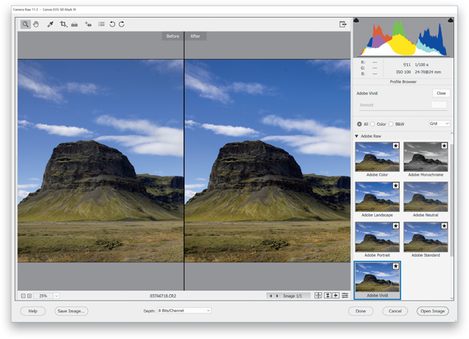
In the Profile Browser, under Adobe Raw, you’ll find the new RAW profiles. The thumbnails here give you a preview of how your image would look if you chose one of those profiles. Even better, if you hover your cursor over one of them, you get a full-size preview of how that profile would look on your image. Incredibly helpful. Here, I chose the Adobe Vivid profile, and look at how much better the After image on the right looks already (you can see a split-screen before and after like this by pressing the letter Q. More about this on page 61). It made my starting place that much better!
Step Eight:
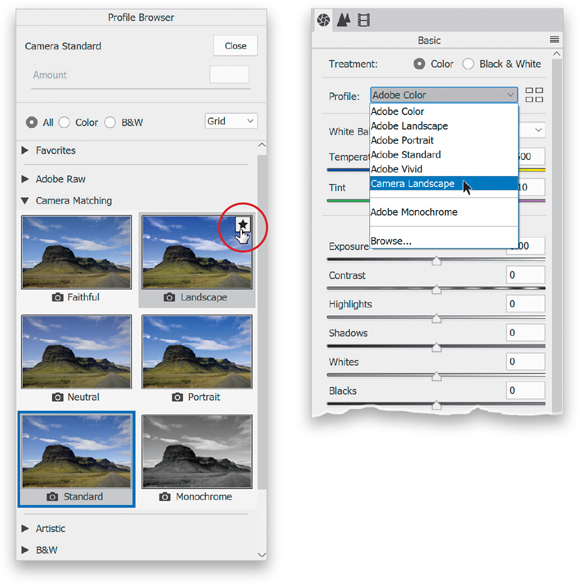
Besides Adobe’s new and improved RAW camera profiles, you still have access to the camera profile choices from earlier versions of Camera Raw, found under Camera Matching. They’re named Camera Matching because these are the same profiles you could have applied in your camera if you were shooting in JPEG mode (the list will look somewhat different depending on your camera make). These old camera profiles are there in case you wanted to work on a RAW image you previously edited in an older version of Camera Raw where you had applied one of those older profiles without it being automatically changed to a new profile. That being said, I wouldn’t recommend applying these old Camera Matching profiles to new photos you’re editing in Camera Raw—they’re not nearly as good as the new ones—but if you have bad taste in editing, at least you know they’re there.

Step Nine:
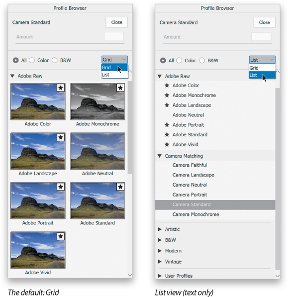
If you want, you can change the thumbnail options in the Profile Browser. The standard view is called “Grid,” which is what you see here on the left. Or, you can choose List from the pop-up menu near the top right (as shown here, on the right) to see just a text-only list.
Step 10:
To save a profile as a Favorite (so it appears in the Profile pop-up menu—no more scrolling through panels, digging for profiles), move your cursor over the profile thumbnail you want to save and click the star icon that appears in the upper-right corner (as shown here, left). Now that profile will appear in the Profile pop-up menu (as seen here, at right) when the Profile Browser is hidden, and also under Favorites when it’s open (just click on the star icon again to remove it from the Favorites). There is a Monochrome choice in both the Adobe Raw and Camera Matching profile sets, and we’ll cover that when we look at converting to black and white in Camera Raw in Chapter 3. Lastly, you’ll notice that below the Camera Matching profiles there are even more profiles. Those are actually creative effects you can apply to get certain “looks” (kind of like presets, but better). They’re pretty awesome (and you can also add these to your Favorites if you find you use some of them often).
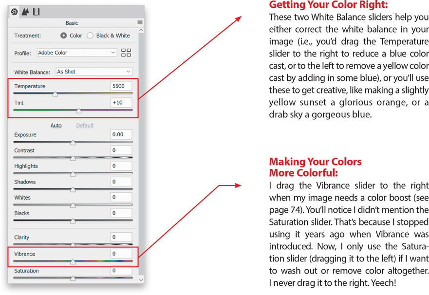
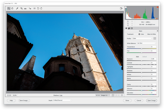
Setting the White Balance
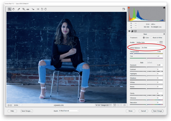
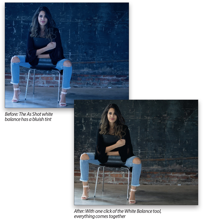
I start editing my photos by setting the white balance first. I do this for two reasons: (1) Changing the white balance affects the overall exposure of your image big time (take a look at the histogram while you drag the Temperture slider back and fourth a few times, and you’ll see what a huge effect white balance has on your exposure). And, (2) I find it hard to make reasonable decisions about my exposure if the color is so off it’s distracting. I find that when the color looks right, my exposure decisions are better. But hey, that’s just me. Or is it?
Step One:
The White Balance controls are found near the top of Camera Raw’s Basic panel. Your photo reflects whichever white balance you had selected in your camera, so that’s why the White Balance pop-up menu is set to “As Shot”—you’re seeing the white balance “as it was shot,” which in this case, is way too blue (I had been shooting under fluorescent lights earlier, then wound up shooting in this natural light setting and forgot to change my white balance to match the lighting conditions). There are three ways to set the white balance in Camera Raw, and I’m going to show all three, but I use the third way most of the time because it’s just so fast and easy. Still, it’s important to know all three methods because you might prefer one of the other methods for certain types of photos.
Step Two:
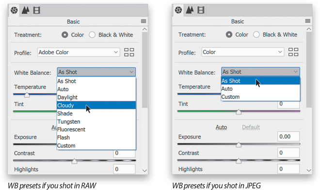
First, you can try the built-in White Balance presets. If you shot in RAW, you can choose the same white balance presets (seen here on the left) you could have chosen in your camera from the White Balance pop-up menu. If you shot in JPEG mode, you only get one preset, Auto (seen here on the right), because your white balance choice was already embedded in the file by your camera. You can still change the white balance for JPEG images, but you’ll have to use the next two methods instead. Note: If your list looks different than mine here on the left, it’s because you’re using a different make/model of camera. The White Balance pop-up menu is based on which camera brand you shot with.
Step Three:
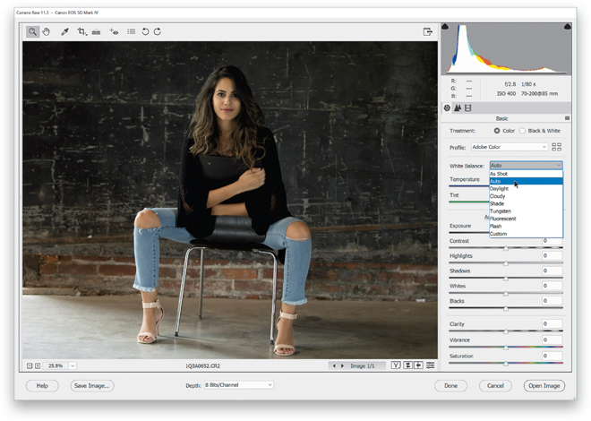
In our photo in Step One, the overall tone is really blue, so it definitely needs a white balance adjustment. (Note: If you want to follow along using this same image, you’re welcome to download it from the book’s companion webpage, mentioned in the book’s introduction.) I usually start by choosing Auto from the White Balance pop-up menu to see how that looks (as you can see here, it’s much better all around. In person, her skin has a warmer tone, but the Auto preset is actually a little too warm [yellow]). Go ahead and try the next three presets, but—spoiler alert—Daylight will be a bit warmer, with Cloudy and Shade being progressively warmer still (you’ll see how much warmer Cloudy and Shade make her skin tone, as well as the whole photo). You can skip Tungsten and Fluorescent—they’re going to be way crazy blue (I accidentally had my white balance set to Fluorescent). By the way, the last preset isn’t really a preset—Custom just means you’re going to set the white balance manually instead of using a preset.
Step Four:
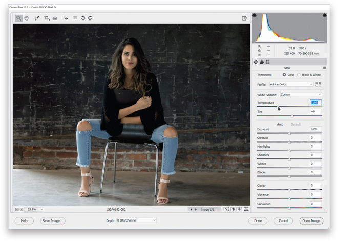
If you go through the White Balance presets and none look right to you (or if you shot in JPEG, so your only choice was Auto, and it didn’t look right), then move on to Method #2: choose a preset that is the closest to being right (in this case, it was Auto), then drag the Temperture and Tint sliders (found right below the pop-up menu) to tweak the color to your liking. Take a look at those two sliders. If I wanted more blue in this photo, which way would I drag the Temperture slider? Right—those color bars behind the sliders are a huge help. In this case, I think her skin is too yellow, so I dragged the Temperture slider away from the yellow side and more toward blue, looking at the image while I dragged. I didn’t have to drag it very far and now it looks pretty good overall.
Step Five:
Method #3 is my favorite way to set white balance and is the one I use the most: the White Balance tool (it’s that huge eyedropper on the left side of the toolbar at the top of the window, or just press I on your keyboard to get to it). It couldn’t be easier to use—simply take the tool and click on an area in your image that should be a light-to-medium gray. Not white (that’s for setting the white balance for video cameras)—gray! If there’s no gray in the photo, look for an area that’s kind of a neutral color, like a tan, ivory, taupe, or beige. Boom. Done. Now, the nice thing about this tool is this: if you don’t like how the white balance looks where you clicked, just click somewhere else until it looks good to you. So, go back to the White Balance preset pop-up menu, choose As Shot, then get the White Balance tool and click it on an area that is supposed to be either gray or neutral (the floor or the lighter areas of that background should do).

Step Six:
What happens if you click in the wrong spot? Trust me, you’ll know. If it happens (and it will), don’t sweat it—just click somewhere else, even trying a place you wouldn’t think would give you an accurate white balance. Now, although this can give you a perfectly accurate white balance, it doesn’t mean that it will look good (for example, people usually look better with a slightly warm white balance). White balance is a creative decision, and the most important thing is that your photo looks good to you. So don’t get caught up in that “I don’t like the way the white balance looks, but I know it’s accurate” thing that sucks some people in—set your white balance so it looks right to you. It’s your photo, so make it look its best. Accurate is not another word for good. Okay, I’m off the soapbox, and it’s time for a tip: Want to quickly reset your white balance to the As Shot setting? Just double-click on the White Balance tool up in the toolbar (as shown here).

Step Seven:
One last thing: once you have the White Balance tool, if you Right-click within your photo, a White Balance preset pop-up menu appears under your cursor (as shown here), so you can quickly choose a preset.

TIP: For Creative White Balance, Use the Temp/Tint Sliders
Here we learned how to get an accurate white balance because our subject is a person and we want their skin tone to look normal. However, there are times, like when we’re doing landscape photos, when we might want to get creative and choose a white balance that makes the image look awesome, rather than accurate. In those cases, I drag the Temperture and Tint sliders until I see something I like.
Step Eight:
Here’s a before/after so you can see what a difference setting a proper white balance makes (by the way, you can see a quick before/after of your white balance edit by pressing P on your keyboard to toggle the Preview on/off).
TIP: Using a Gray Card
To help you find that neutral light gray color in your images, we’ve included an 18% gray card for you in the back of this book (it’s perforated so you can tear it out). Just put this card into your scene (or have your subject hold it), take the shot, and when you open the image in Camera Raw, click the White Balance tool on the card to instantly set your white balance. Now, apply that same white balance to all the other shots taken under that same light (more on how to do that coming up in the next chapter).
Seeing a Before/After in Camera Raw
In earlier versions of Camera Raw, its ability to show you a before/after preview of your changes was clunky at best, and totally confusing at worst, mostly because toggling on/off the Preview checkbox didn’t show you a full before/after of your image, it only turned on/off the changes you made in the current panel. Luckily, they borrowed a feature from Lightroom and gave us before/after previews that have a lot of options and make sense.
Step One:
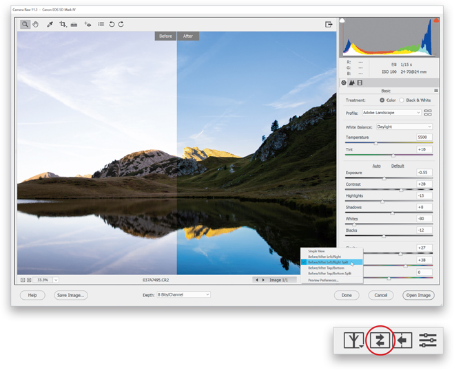
If you‘ve made some adjustments, and want to see what your image looked like before you made them (the “before” image), just press the P key on your keyboard. This is probably the Before view I use the most in my own workflow. To return to your After image, press P again. If you’d like to see a side-by-side Before/After view, either click on the Before/After preview icon (circled here in red) or press the Q key to get the view you see here, with the Before image on the left, and the After image, with the tweaks you applied (here, I made some basic adjustments), on the right. Note: Each time you press Q, it toggles to a different preview view.

Step Two:
One thing I don’t like about this side-by-side view is that while it works great on tall, vertical images, for wide orientation images like this, the previews are really small. Luckily, you can fix that: once you’re in this view, just press Ctrl-+ (plus sign; Mac: Command-+) to zoom in on your image like you see here. Each time you press that shortcut, it zooms in tighter. Once you’re zoomed in tight, you can reposition your image by simply clicking on either image (your cursor changes to the Hand tool) and dragging the image any way you want. To zoom back out, press Ctrl-– (minus sign; Mac: Command-–) until you’re zoomed out enough.

Step Three:
Another preview option is a split-screen that shows the left half of the image as the Before and the right half as the After (as seen here). Once you’re in this mode, you can literally swap sides, so the After is on the left and the Before is on the right (so instead of a Before/After, you have an After/Before). To do that, click on the icon to the right of the Before/After icon (it’s shown circled in red here, at the bottom) below the bottom-right corner of your image preview, and it swaps the two. If you click the next icon to the right of it, it copies the current settings to the Before image. The final icon (on the far right), lets you toggle on/off the changes made in just the current panel (like the old way previews worked in Camera Raw). By the way, if you click-and-hold on the first icon (the one that looks like the letter “Y”), a pop-up menu appears (seen here) that lets you choose the different before/after previews by name.
Step Four:
If you press Q again, it toggles you to the Before/After Top/Bottom preview (as seen here). If you press Q one last time, you get a top/bottom split view. Anyway, besides all this, you have a reasonable amount of control over how all this is displayed by going to that pop-up menu we saw back in Step Three and choosing Preview Preferences to bring up the dialog you see here below. The first column lets you hide (by turning off the checkboxes of) any of the preview modes you don’t care about (I only use the left/right side-by-side myself). In the second column, you get to choose whether you want to see a solid line divider between your before/after previews, and if you want to see the words Before and After onscreen.

Letting Camera Raw Auto-Correct Your Photos
If you’re not quite comfortable with manually adjusting each image, Camera Raw does come with a one-click Auto function, which takes a stab at correcting the overall exposure of your image (including contrast, highlights, shadows, etc.), and at this point in Camera Raw’s evolution, it’s really not that bad. If you like the results, you can set up Camera Raw’s preferences so every photo, upon opening in Camera Raw, will be auto-adjusted using that same feature. You also have the option to add individual Auto corrections, and we’ll take a look at how to do that, too.
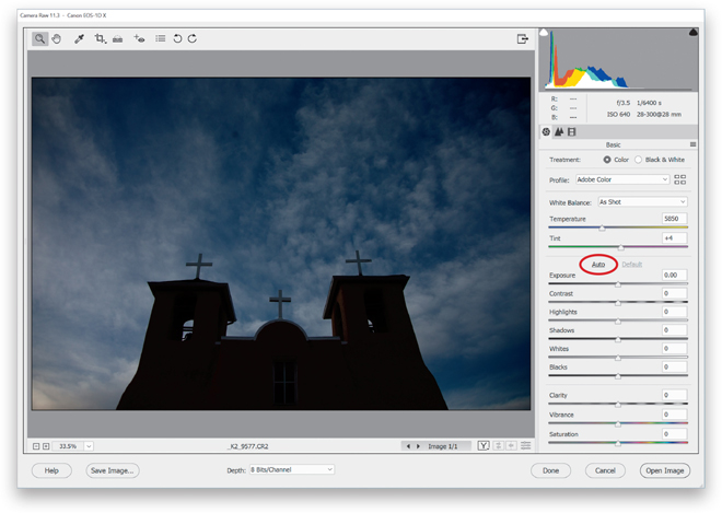
Step One:
The Auto function is a one-click fix (or at least, a good starting place) and the worse your photo looks at the start, the better job it seems to do. It uses this AI and machine learning, called “Adobe Sensei,” and by golly, it ain’t bad! Here’s an under-exposed, dull, flat-looking original RAW image. Click the Auto button once (it’s in the Basic panel, right above Expsoure), and Camera Raw quickly analyzes the image and applies what it thinks is the proper correction for this photo. It only moves the sliders it thinks are needed to make the image look decent (the obvious ones, like Exposure, Contrast, Shadows, and the other stuff in this section of the Basic panel, but it’ll also adjust Vibrance and Saturation. At this point, though, it does not adjust the Clarity amount).
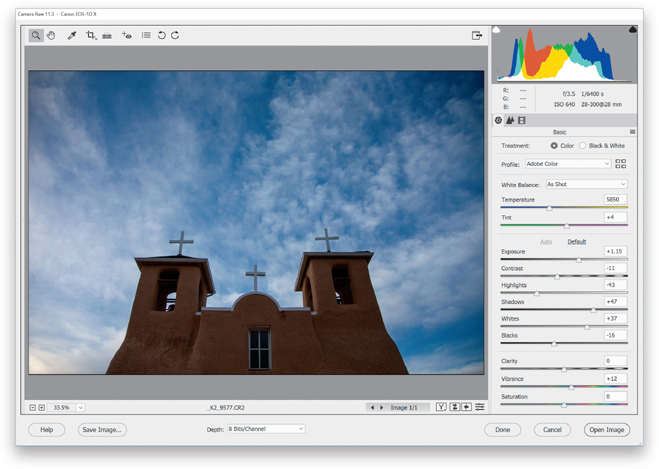
Step Two:
Just one click and look at how much better the image looks. Compare the slider settings now versus the previous step. Also, I find that if you apply the Auto correction and it looks a little funky, it’s because sometimes it applies too much of the Shadows slider and lowers the Contrast too much. So, just lower the Shadows amount a bit, and increase the Contrast amount a bit, and then see how that looks (but, again, only do this if the Auto results look funky). By the way, if you don’t like the results from the Auto correction button, no harm done, just press Ctrl-Z (Mac: Command-Z) to undo it.
Step Three:
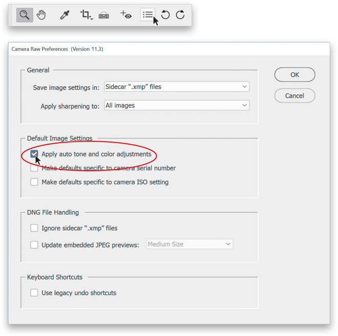
You can set up Camera Raw so it automatically performs Auto adjustments each time you open a photo—just click on the Preferences icon up in Camera Raw’s toolbar (it’s the third icon from the right, and when the dialog appears, turn on the Apply Auto Tone and Color Adjustments checkbox (shown circled here), then click OK. Now Camera Raw will evaluate each image and try to correct it. If you don’t like its auto corrections, then you can just click on the Default button, which appears to the right of the Auto button (the Auto button will be grayed out because it has already been applied).
Expanding Your Tonal Range by Setting Your White and Black Points
One way to get the most out of your image editing is to expand the tonal range of your photo by setting your white point and black point (this is something regular Photoshop users have done for many years using Photoshop’s Levels control). We do this using the Whites and Blacks sliders or you can have Camera Raw do it for you automatically (you just need to know the secret handshake). We increase the whites as far as we can without clipping the highlights, and increase the blacks as far as we can without clipping the deepest shadows too much (although I personally don’t mind a little shadow clipping), which expands the tonal range big time.
Step One:
Here’s the original image and you can see it looks pretty flat. I use the technique you’re about to learn (which expands the image’s tonal range) on pretty much every image, but this is another technique where the worse the original looks, the more dramatic the results. There are two ways to do it: Camera Raw can do this for you by expanding the amount of whites in the image to as bright as they can get without damaging your highlights, and increasing the amount of blacks until the dark areas are nearly solid black, but it stops short so you still have some detail. Yup, it’ll do all that automatically. Or, you can do it yourself (I never do it the manual way—I always let Camera Raw set it for me).

Step Two:
Here’s how to have Camera Raw automatically set your white and black points, expanding your tonal range, near the start of your editing process (it’s simple): Just press-and-hold the Shift key, then double-click directly on the Whites slider knob in the Basic panel. That sets your white point. Now, Shift-double-click on the Blacks slider knob (as shown here), and it automatically sets your black point. That’s it. It’s that easy, and that’s how I do it in my own workflow (but I add one extra thing, which you’ll learn after the next page). By the way, if you Shift-double-click on either one and it barely moves or doesn’t move at all, that means your original capture already pretty much has its tonal range expanded.

Step Three:
If, instead, you want to do this process manually, you’ll want to make sure you don’t “clip” any of your highlights (making them so bright you lose data in the brightest areas of your image, or so dark that parts of the image turn solid black and thus have no detail). Luckily, Camera Raw can warn you using an onscreen clipping warning. Here’s how: Press-and-hold the Alt (Mac: Option) key before you drag the Whites slider. This turns the screen solid black (as seen here, at top). As you drag to the right, any areas that start to clip will become visible. If you see red, blue, or yellow, it means you’re clipping in just that individual channel (not as big a worry). However, if you see solid white areas, you’re clipping in all three channels, and you’ve gone too far. So, pull it back to the left until those white areas go away. Now, do the same thing with the Blacks slider: press-and-hold the Alt key as you drag to the left, and stop when you see black areas appear, then pull back to the right (as seen here, below, where I backed off, so I’m only really clipping in the blues. I can live with that little bit of clipping).

Step Four:
Here’s a before and after where I used the automatic “Shift-double-click the Whites/Shift-double-click the Blacks” method to expand the image’s tonal range. There’s still work to be done (including what I do on the next page in conjunction with this), which will give me my overall exposure. So, what you’re seeing here is not the final product—that’s just a double-click on two different sliders. Not bad for a couple of double-clicks, though.
Controlling Overall Brightness (Exposure)
The next thing I fix (after the white balance and setting the white and black points) is the photo’s exposure. But, because we’ve already expanded the image’s tonal range, adjusting the Exposure slider is usually just a small tweak—moving it one way or the other to make the midtones a little bit brighter or a little bit darker. If you set the white and black points first, this is almost like fine-tuning the exposure. If you didn’t already set them, then this becomes your main exposure adjustment since it controls such a large part of the midtones, including the upper shadow areas and lower highlight areas.
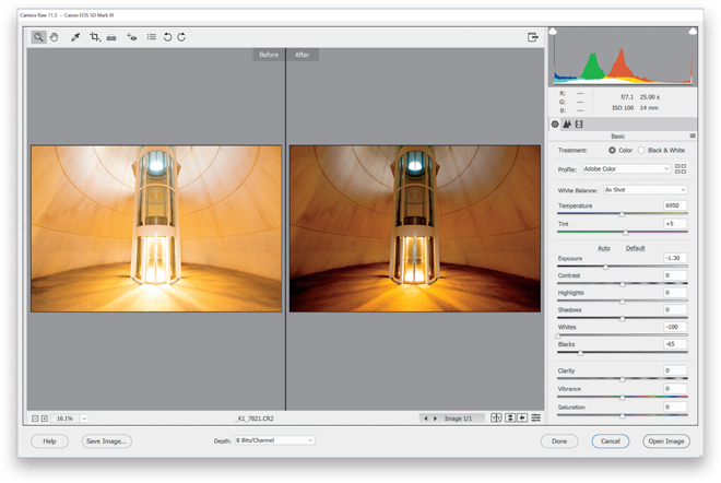
Step One:
Here’s our image, and you can see it’s way overexposed (there are no lights here, except for those inside the elevator car and the natural light coming in from above—it looks dark and futuristic inside this “cone,” in the City of Arts and Sciences complex in Valencia, Spain). To lower the overall brightness of an image, I reach for the Exposure slider in the Basic panel. This is one powerful slider, and it covers a wide range of midtones, lower highlights, and upper shadow areas. So, when I need something a little brighter or darker overall, this is the slider I reach for.

TIP: Get a Larger Image Window
To hide the filmstrip on the left side of the window, just double-click on its right edge to tuck it away and give you a larger image window (as seen below).
Step Two:
To darken the overall brightness of the image, drag the Exposure slider to the left until the exposure looks good to you. Here, I dragged it to the left quite a bit (down to –1.35, so it was nearly a stop-and-a-half overexposed). While I do grab this slider to make the overall image brighter or darker, I think you get better results if you use it in conjunction with setting the white and black points (see the next page).

My Power Trio: Combining Whites + Blacks + Exposure
In my own daily workflow, I combine setting the Whites slider, the Blacks slider, and the Exposure slider to give me my overall exposure, and I think the results are far better. I start by setting the white and black points (well, I let Camera Raw do this for me automatically; see page 65) to expand my tonal range, and then if the image still looks too dark or too bright, I only have to tweak the Exposure amount a little bit, dragging it left (if I think the overall image is still too bright) or right to brighten it.
Step One:
I’m using the same image we used on the previous page, and I did the same thing here that I did there—I saw the image was overexposed (too bright), so I dragged the Exposure slider to the left until the exposure looked right to me (as seen here in the After photo). So, now the baseline exposure is correct, but we can make this image look better (and this is what I do in my own workflow) if instead of grabbing the Exposure slider first, we use it after we have Camera Raw set the Whites and Blacks sliders for us (again, see page 65). That way, those sliders expand the tonal range first, then we can make the final adjustment with the Exposure slider, tweaking it to be darker or lighter with just a small move. I think the result looks much better overall doing it this way.

Step Two:
Here, I used my “Power Trio” technique by first Shift-double-clicking on Whites, and then Shift-double-clicking on Blacks. Then, I took a look at how the overall brightness of the image looked. I felt it needed to be a bit darker overall, so I dragged the Exposure slider to the left. The difference will look more subtle here in a printed version of a screen capture, but when you try it yourself (try it on one of your images, or download this same one), you’ll see quite a difference. (By the way, the name “Power Trio” is actually used to describe rock bands that only have drums, bass, and one guitar [no second rhythm guitar or keyboards]. Think bands like ZZ Top, Rush, or Motörhead.)
Adding Contrast (Important Stuff!)
If I had to point to the biggest problem I see in most people’s images (we get hundreds sent to us each month for “Blind Photo Critiques” on our weekly photography talk show, The Grid), it’s not white balance or exposure problems, it’s that their images look flat (they lack contrast, big time). It’s the single biggest problem, and yet it’s about the easiest to fix (or it can be a bit complex, depending on how far you want to take this). I’ll cover a simple method here and a more advanced method in the next chapter.
Step One:
Here’s our flat, lifeless image. Before we actually apply any contrast (which makes the brightest parts of the image brighter and the darkest parts darker), here’s why contrast is so important: when you add contrast, it (a) makes the colors more vibrant, (b) expands the tonal range, and (c) makes the image appear sharper and crisper. That’s a lot for just one slider, but that’s how powerful it is (in my opinion, perhaps the most underrated slider in Camera Raw).

Step Two:
Here, all I did was drag the Contrast slider to the right (to +85), and look at the difference. It now has all the things I mentioned above: the colors are more vibrant, the tonal range is greater, and the whole image looks sharper and snappier. This is such an important tweak, especially if you shoot in RAW mode, which turns off any contrast settings in your camera (the ones that are applied when you shoot in JPEG mode), so RAW images look less contrasty right out of the camera. Adding that missing contrast back in is pretty important, and it’s just one slider. By the way, I never drag it to the left to reduce contrast— I only drag it to the right to increase it.
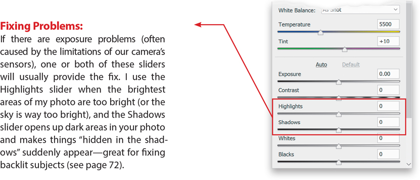
Dealing with Highlight Problems (Clipping)
One potential problem we have to keep an eye out for is highlight clipping. That’s when some of the highlights in an image got so bright (either when you took the shot, or here in Camera Raw when you made it brighter) that there’s actually no detail in those parts of the image at all. No pixels whatsoever. Just blank nothingness. This clipping happens in photos of nice cloudy skies, white jerseys on athletes, bright, cloudless skies, and a dozen other places. It happens, and it’s our job to fix it so we keep detail throughout our image. Don’t worry, the fix is easy.
Step One:
Here’s a shot of one of the spiral staircases in the wonderful Tate Britain museum in London. Not only is the staircase fairly white, but I overexposed the image a bit when I shot it. That doesn’t necessarily mean we have clipping (see the intro above for what clipping means), but Camera Raw will warn us if we do. Take a look at the triangle up in the top-right corner of the histogram (seen here). That triangle is normally gray, which means everything’s okay—no clipping. If you see a color inside that triangle (red, yellow, or blue), that mean the highlights are clipping in just that color channel, which isn’t the end of the world. However, if you see that triangle filled with white, then it’s clipping the highlights in all your channels, and you’ll need to deal with it if it’s an area where there’s supposed to be detail.

Step Two:
Okay, now we know we have a highlight clipping problem somewhere in our image, but exactly where? To find out, go up to that white triangle and click directly on it (or press the letter O on your keyboard). Now, any areas that are clipping in the highlights will appear in bright red (as seen here, where big parts of the stairs and railings are clipping badly). Those areas will have no detail whatsoever (no pixels, no nuthin’) if we don’t do something about it.

Step Three:
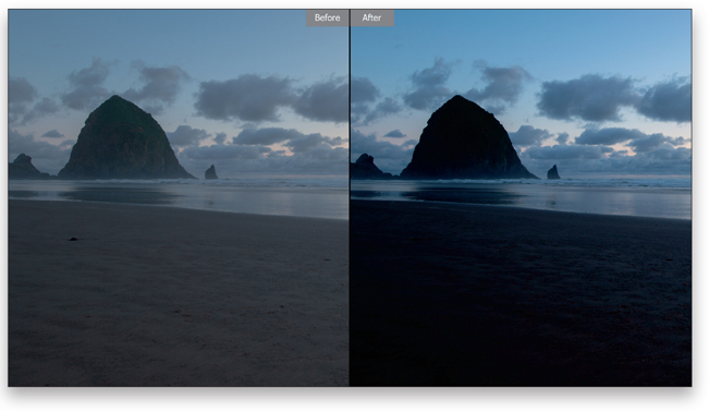
Technically, you could just drag the Exposure slider over to the left until all those red clipped warning areas go away (as shown here, where I dragged it to +1.25), but that will affect the overall exposure of the image, making the entire image underexposed (and, in this case, a bit dingy, too). It’s like you fixed one problem, but then created another. That’s why the Highlights slider is so awesome—it lets you leave the exposure right where it is and it addresses those super-bright clipped areas itself because it just affects the highlights and not the entire exposure. So, reset your Exposure slider to 0 by double-clicking on it.

Step Four:
Let’s put the Highlights slider to work. Just drag it to the left until you see the red onscreen clipping warning go away (as shown here, where I dragged it to –36). The warning is still turned on, but dragging the Highlights slider to the left fixed the clipping problem and brought back the missing detail, so now there are no areas that are clipping (expect for that tiny bit in the railing, which is fine).

TIP: This Rocks for Landscapes
The next time you have a blah sky in a landscape or travel shot, drag the Highlights slider all the way to the left to –100. It usually does wonders with skies and clouds, bringing back lots of detail and definition. I use this trick fairly often.
Fixing Backlit Photos and Opening Up Dark Areas
Why do we take so many backlit photos? It’s because our eyes are so darn amazing and adjust for such huge differences in tonal range automatically. So, our subject could be totally backlit, but our eyes automatically adjust and everything looks fine to us. The problem is that even the best camera sensors today don’t have nearly the range of our eyes, so even though, when we look through our viewfinder, it looks fine to us, when we press the shutter button, the sensor can’t handle that much range and we wind up with a backlit photo. Luckily for us, help is just one slider away.
Step One:
Here’s the original image and you can see the subject is backlit. While our eyes do an amazing job of adjusting for scenes like this with such a wide range of tones, as soon as we press the shutter button and take the shot, we wind up with a backlit image where our subject is in the shadows (like you see here). As good as today’s cameras are (and they are the most amazing they’ve ever been), they still can’t compete with the incredible tonal range of what our eyes can see. So, don’t feel bad if you create some backlit shots like this, especially since you’re about to learn how easy it is to fix them. (Note: You can also fix this problem using the Editor’s Shadows/Highlights enhancement [under the Enhance menu], but it’s much easier to do it here in Camera Raw.)
Step Two:
Go to the Shadows slider, drag it to the right (I dragged it to +81 here), and as you do, just the shadow areas of your photo are affected. As you can see here, the Shadows slider does an amazing job of opening up those shadows and bringing out detail in the image that was just hidden in the shadows. Note: Sometimes, if you really have to drag this slider way over to the right, the image can start to look a little flat. If that happens, just increase the Contrast amount (dragging to the right), until the contrast comes back into the photo. You won’t have to do this very often, but at least when it happens, you’ll know to add that contrast right back in to balance things out.

Clarity: Camera Raw’s Detail Enhancer
If you’re looking for the nerdy technical explanation, the Clarity slider adjusts the amount of midtone contrast, but since that’s of little help (well, I guess it is to nerds), then here’s how I look at it: I drag this slider to the right when I want to enhance any texture or detail in my image. When you apply a lot of Clarity, it almost looks like you’ve sharpened the image (but, be careful, you can over-apply Clarity—if you start to see halos around objects in your image or your clouds have drop shadows, that’s a warning sign you’ve gone too far).
Step One:
Which kinds of shots work best with Clarity? Usually anything with wood (from churches to old country barns), landscape shots (because they generally have so much detail), cityscapes (buildings love clarity, so does anything glass or metal), or basically anything with lots of intricate detail (even an old man’s craggy face looks great with some Clarity). Here’s our original image and there’s lots of detail we can enhance—everything from the wood grain in the pews to the ornate adornments throughout the tiny chapel. Note: I don’t add Clarity to photos where you wouldn’t want to accentuate detail or texture (like a portrait of a woman, or a mother and baby, or just a newborn).

Step Two:
To add more punch and bring out the texture and detail in our image here, drag the Clarity slider quite a bit to the right. Here, I dragged it to +74, so you can really see the effect—look at the added detail in the wood and the altar. If you start seeing a black glow appear on the edges of objects, you know you’ve dragged too far. If that happens, just back it off a bit until the glow goes away.

Note: The Clarity slider does have one side effect—it can affect the brightness of the photo; sometimes making it look darker, and other times making parts look too bright. That’s easily fixed with the Exposure slider, but I just wanted you to keep an eye out in case that happens.
Making Your Colors More Vibrant
Photos that have rich, vibrant colors definitely have their appeal (that’s why professional landscape photographers back in the film days got hooked on Fuji Velvia film and its trademark saturated color). Camera Raw has a Saturation slider for increasing your photo’s color saturation, but the problem is it increases all the colors in your photo equally, and…well…let’s just say it’s not awesome (and that’s being kind). That’s why I love Camera Raw’s Vibrance slider (a great name for it would have been “Smart Saturation”). It lets you boost colors without trashing your photo, and it does it in a very smart way.
Step One:
At the bottom of the Basic panel are two controls that affect the color saturation—one is brilliant; one is…well…crappy. There, I said it. It’s crappy. I only use the Saturation slider to reduce color (desaturating), never to boost it because the results are pretty awful (it’s a very coarse adjustment where every color in your image gets saturated at the same intensity). This is why I use Vibrance instead— it boosts the vibrance of any dull colors in the image quite a bit. If there are already saturated colors in the image, it tries not to boost them very much at all. Lastly, if your photo has people in it, it uses a special mathematical algorithm to avoid affecting flesh tones, so your people don’t look sunburned or weird.

Step Two:
Here’s a perfect example. Take a look at our tennis player back in Step One. She’s wearing a vibrant red visor and red tennis outfit, but the blue service court areas and the green back court behind the baseline are kind of washed out in the direct sun. If I drag the Vibrance slider over to +67 (like I did here), you can see how much it affected the dull blue and green areas—they’re now nice and vibrant. But look at her hat and outfit—they’ve only been boosted a little because they were already pretty vibrant. Most importantly, compare her skin tone in both image—it’s only boosted the tiniest amount because Vibrance protects skin tones wonderfully. It truly is “smart saturation.”

Putting It All Together (Here’s the Order I Use for My Own Editing)
Now that you’ve learned all that, I wanted to share the order in which I use all those Basic panel sliders (and yes, I pretty much do the same thing every time, in the same order). While there are still things yet to learn, including some other Camera Raw features and special effects and lots of other fun stuff, this is the fundamental image editing I do, and it’s often the only editing I do to my image (it just depends on the image). Almost everything else I apply to an image (special effects, or looks) will happen after I’m done with this phase here. I hope you find this helpful.
1) I choose my RAW Profile
Adobe Color is pretty good, but if I decide I want more pop, I usually go with Landscape or Vivid as my starting place.
2) I set my white balance
If your color isn’t right…it’s wrong. I use the White Balance tool (found in the toolbar) most of the time.
3) I have Camera Raw automatically set my white and black points
I expand my overall tonal range by Shift-double-clicking on the Whites slider knob, then on the Blacks slider knob.
4) I tweak the overall brightness
After setting the white and black points, if I feel the image is too dark or too bright, I drag the Exposure slider a bit, until it looks right.
5) I add contrast and clarity
I always add contrast. As for clarity, I only use it if I want to enhance detail.
6) If I have highlight clipping or detail lost in shadows, I fix it now
This is when I would fix any clipping problems or open up the shadows (dragging the Shadows slider to the right) to reveal hidden detail.
7) Boost colors
Between setting my whites and blacks, and adding contrast, my color is usually pretty vibrant, but if for some reason I think it needs more, I increase the Vibrance amount.
