Chapter 12. Print
printing, color management, and my elements 2020 workflow

Oh sure, Scott, you want me to believe you found a song, TV show, or movie title simply named, Print. That’s awfully convenient, dontcha think? Well, my cynical compatriot, it so happens it actually is a movie (one with an 8/10 star rating no less), released in 2008, starring Gabrielle Carteris and Will Rothhaar (just because you haven’t heard of them, it doesn’t make them any less real). While it is just the most perfect chapter name you could possibly come up with for a chapter on printing, the actual description of the film (from IMDb.com) is kinda creepy to say the least. Here’s their description: “A psychological thriller about a troubled young man who decides to kill the best-selling author he is convinced stole his life story, only the author may not actually exist.” Creepy, right? Now, I just want to say this to any of you out there reading this book: This book is absolutely not (I repeat, not) the story of your life, so there’s no way I could have stolen it from you, and thus there’s no reason for you to be troubled (especially if you’re a young man), and decide to kill me. I know when you were reading some of the previous chapter openers the thought may have crossed your mind, but I assure you, this is not an awesome idea. Here’s why: I rented Print (which, by the way, was more a 6-star movie at best), and in the movie, the best-selling author (played by a devastatingly handsome photographer from Florida, who teaches people how to use Photoshop Elements 2020) actually winds up convincing the troubled young man to buy his new Elements book, and the young man is so elated at the magic in this book that unfolds for him, that instead of plotting to kill the author, he takes a second job as a master sommelier and sends every penny he earns directly to the author (118 Douglas Road E., Oldsmar, FL 34677) as his way of showing his undying gratitude for opening his eyes to a world of post-processing secrets that dare not speak their name. See? This is the kind of movie you can really get behind—one with life lessons that inspire people...well...like yourself who were once thinking of killing me, but then suddenly decided to send me all their money instead. Hey, now that I think of it, this movie easily should have won the Best Picture Oscar in 2008. They were robbed, I tell ya. Robbed!
Setting Up Your Color Management
Most of the color management decisions in Elements come in the printing process (well, if you actually print your photos), but even if you’re not printing, there is one color management decision you need to make now. Luckily, it’s a really easy one.
Step One:
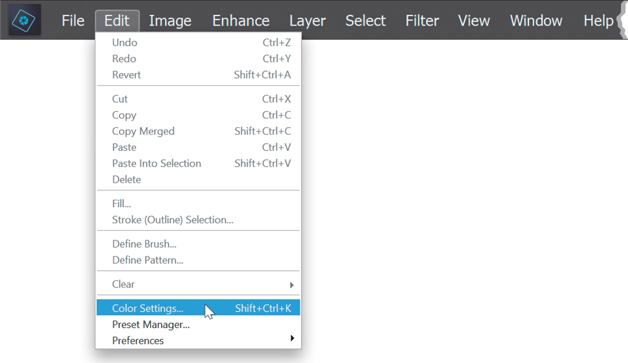
In the Elements Editor, go under the Edit menu and choose Color Settings (or just press Ctrl-Shift-K [Mac: Command-Shift-K]).
Step Two:
This brings up the Color Settings dialog. By default, Elements is set to Always Optimize Colors for Computer Screens, which uses the sRGB color space. However, if you’re going to be printing to your own color inkjet printer (like an Epson, HP, Canon, etc.), you’ll want to choose Always Optimize for Printing, which sets your color space to the Adobe RGB color space (the most popular color space for photographers), and gives you the best printed results. Now just click OK, and you’ve done it—you’ve configured Elements’ color space for the best results for printing. Note: You only want to make this change if your final prints will be output to your own color inkjet printer. If you’re sending your images out to an outside lab for prints (or your final images will only be viewed onscreen), you should probably stay in sRGB, because most labs are set up to handle sRGB files. Your best bet: ask your lab which color space they prefer.

You Have to Calibrate Your Monitor Before You Go Any Further
To get what comes out of your color inkjet printer to match what you see onscreen, you have to calibrate your monitor in one of two ways: (1) buy a hardware calibration sensor that calibrates your monitor precisely; or (2) use free software calibration, which is better than nothing, but not by much since you’re just “eyeing” it. Hardware calibration is definitely the preferred method (in fact, I don’t know of a single pro using freebie software). With hardware calibration, it’s measuring your actual monitor and building an accurate profile for the exact monitor you’re using, and yes—it makes that big a difference.
Step One:
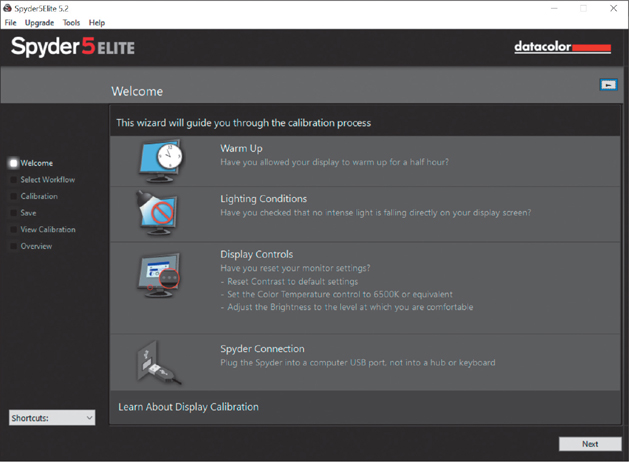
To find the free software that comes with Windows 10, in the Settings panel click on System, then click on Display, and go to the Advanced Display Settings. Click on the Display Adapter Properties for Display 1 link (the number may be different if you have multiple monitors set up), then click on the Color Management tab, and then click Color Management. Now, click on the Advanced tab, and then, finally, click on Calibrate Display. In Mac OS X, in the System Preferences dialog, click on Displays, then click on the Color tab to find it. I use Datacolor’s Spyder5ELITE hardware color calibrator (around $200 street price), because it’s simple, affordable, and a lot of the pros I know have moved over to it. So, I’m going to use it as an example here, but it’s not necessary to get this same one, because they all work fairly similarly. You start by installing the software that comes with the Spyder5ELITE. Then, plug the Spyder5ELITE sensor into your computer’s USB port and launch the software, which brings up the main window (seen here). You follow the “wizard,” which asks you a couple of simple questions, and then it does the rest.
Step Two:
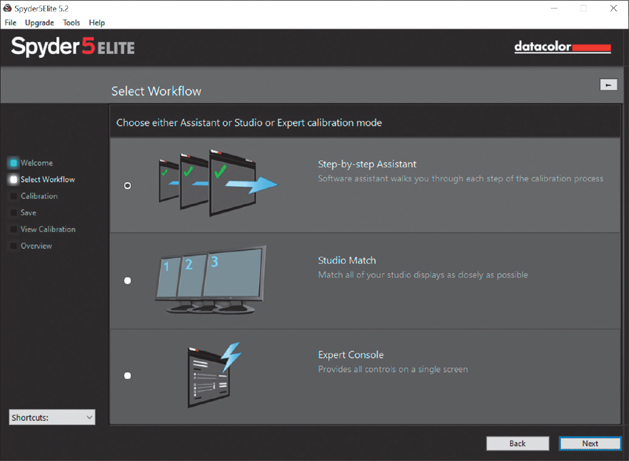
Start by clicking the Next button in the bottom right, and the window you see here will appear. If you’re new to calibrating your monitor, I recommend using the Step-by-Step Assistant (which is already selected by default), so at this point just click the Next button again.
Step Three:
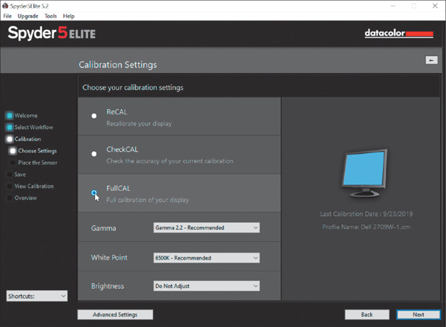
The next screen asks you which type of calibration you want to do. Are you going to update an older calibration you did previously with the Spyder5ELITE (then you would click the ReCAL radio button), or do you just want to check to see how accurate your current calibration is (Check-CAL), or are you doing this for the first time (which you are, so you’d click the FullCAL radio button, as shown here)? Then, just click the Next button, because you’re going to leave all the pop-up menus here at their default recommended settings.
Step Four:
The next screen asks you to put the Spyder unit on your monitor, which means you drape the sensor over your monitor so it sits flat against it and the cord hangs over the back. It shows you exactly where to place it (the two blue arrows you see beside its outline actually flash on/off, so you can’t possibly miss where it goes). The sensor comes with a counterweight you can attach to the cord, so you can position the sensor approximately in the center of your screen without it slipping down. Once the sensor is in position over your screen, click the Next button, sit back, and relax. You’ll see the software conduct a series of onscreen tests, using gray, white, and various color swatches, as shown here.

Step Five:
This testing only goes on for a few minutes (at least, that’s all it took for my desktop), and then it’s done. It asks you to name your profile (it puts a default name in place for you), so enter a name, and then click the Save button. Below that is a pop-up menu where you can choose when you want an automatic reminder to “Recalibrate your monitor” to pop up on your screen. The default choice is 2 Weeks (so please don’t tell anyone that I actually set mine to 1 Month). Make your choice and then click the Next button.

Step Six:
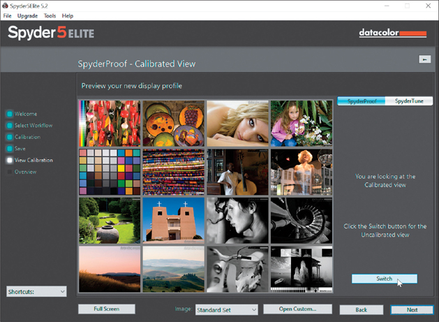
Now you get to see the usually shocking before/after. Click on the Switch button at the bottom right and you can switch back and forth between your now fully calibrated monitor and your uncalibrated monitor. It’s at that moment you say, ”Ohhhhhh…that’s why my prints never match my screen.” Well, it’s certainly one part of the puzzle, but without this one critical piece in place, you don’t have a chance with the rest, so you did the right thing. Click Next one last time, and then click the Quit button in the Profile Overview screen.
Getting Pro-Quality Prints That Match Your Screen
When you buy a color inkjet printer and install the printer driver that comes with it, it basically lets Elements know what kind of printer is being used, and that’s about it. But to get pro-quality results, you need a profile for your printer based on the exact type of paper you’ll be printing on. Most inkjet paper manufacturers now create custom profiles for their papers, and you can usually download them free from their websites. Does this really make that big a difference? Ask any pro. Here’s how to find and install your custom profiles:
Step One:
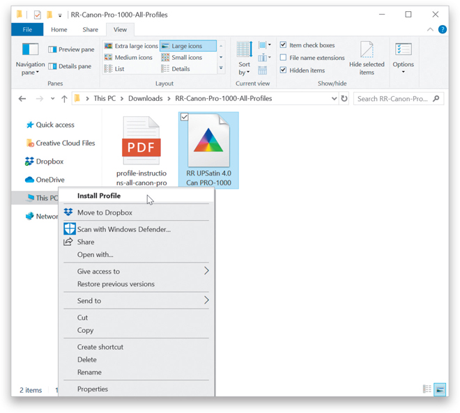
Your first step is to go to the website of the company that makes the paper you’re going to be printing on and search for their downloadable color profiles for your printer. I use the term “search” because they’re usually not in a really obvious place. I use a Canon imagePROGRAF PRO-1000 printer and I generally print on Canon paper. When I installed the PRO-1000’s printer driver, I was tickled to find that it also installed custom color profiles for all Canon papers, but some printers don’t. So, if I needed to download them, the first stop would be Canon’s website, where you’d click on the Drivers & Downloads link (as shown here). Note: Even if you’re not a Canon user, still follow along (you’ll see why).
Step Two:
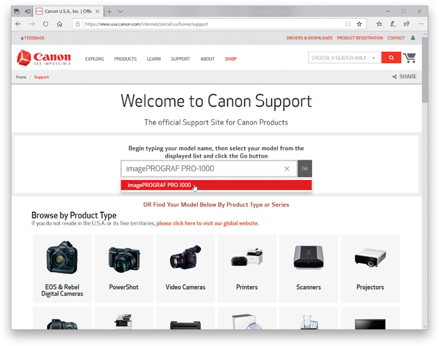
Once you get to the support page, enter your printer model name/number, then click the Go button.
Step Three:
On the Drivers & Downloads page, click on the Software tab, then click on the Select button for imagePROGRAF PRO- 1000 series ICC Profile for Supporting the Other Companies’ Media (Windows), then click on Download. After they download onto your computer, just Right-click on the profile(s) for the paper(s) you use, choose Install Profile, and they’re added to your list of profiles in Elements (I’ll show how to choose them in the Print dialog a little later). On a Mac, go to your hard disk, in your Library folder, and in your ColorSync folder, to the Profiles folder. Just drag the file in there and you’re set. You don’t even have to restart Elements—it automatically updates. That’s it—you download them, install them, and they’ll be waiting for you in Elements’ print dialog. Easy enough. But what if you’re not using Canon paper? Or if you have a different printer, like an Epson or an HP?

Step Four:
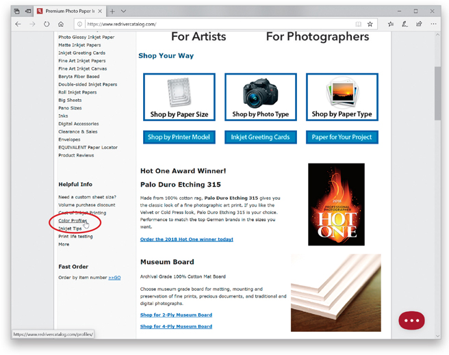
We’ll tackle the different paper issue first (because they’re tied together). Say I wanted to print from my PRO-1000 using a different brand of paper other than Canon. For example, say I wanted to use Red River Paper’s UltraPro Satin instead. So, even though I’m printing on a Canon printer, now I’d go to Red River Paper’s site (www.redriverpaper.com) to find their color profiles for my PRO-1000. (Remember, profiles come from the company that makes the paper.) On the Red River Paper homepage, click on the Color Profiles link under Helpful Info on the left side of the page.
Step Five:
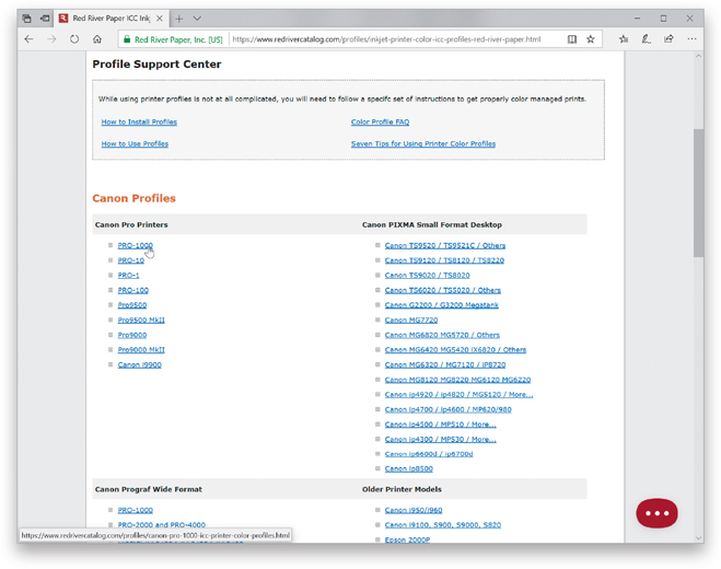
Under the section named Canon Pro Printers, there’s a direct link to the ICC profiles for the PRO-1000 (as seen here), but did you also notice that there are ICC Color profiles for Epson and HP printers? The process is the same for other printers, but although HP and Canon now both make pro-quality photo printers, Epson had the pro market to itself for a while, so while Epson profiles are created by most major paper manufacturers, you may not always find paper profiles for HP and Canon printers. At Red River, they widely support Epson, and have a number of Canon profiles now, but there are only a few for HP. That doesn’t mean this won’t change, but as of the writing of this book, that’s the reality.
Step Six:
Just like when you download Canon profiles, Red River (and many other paper manufacturers) provides the profile (shown here; some paper manufacturers provide an installer) and instructions, so you install it yourself. Again, on a PC, just Right-click on the profile and choose Install Profile. On a Mac, go to your hard disk, in your Library folder, and in your ColorSync folder, to the Profiles folder. Just drag the file in there and you’re set.
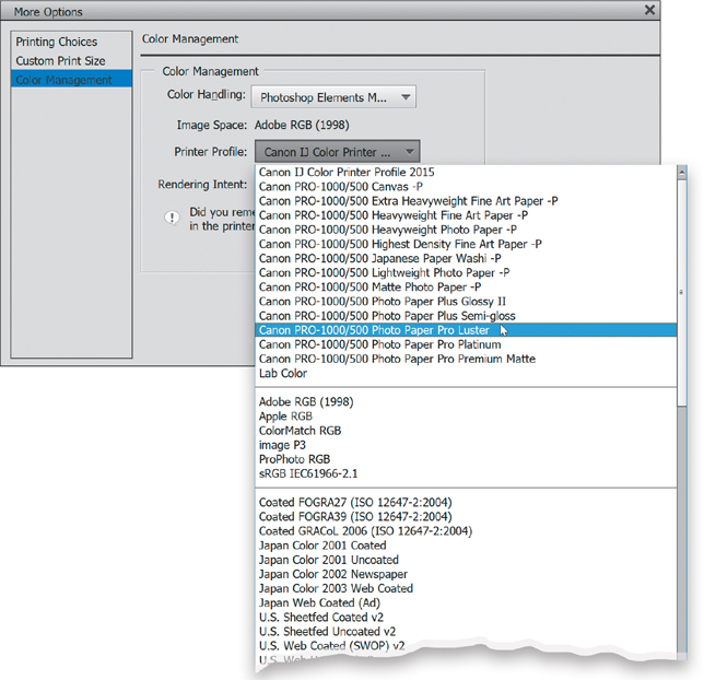
Step Seven:
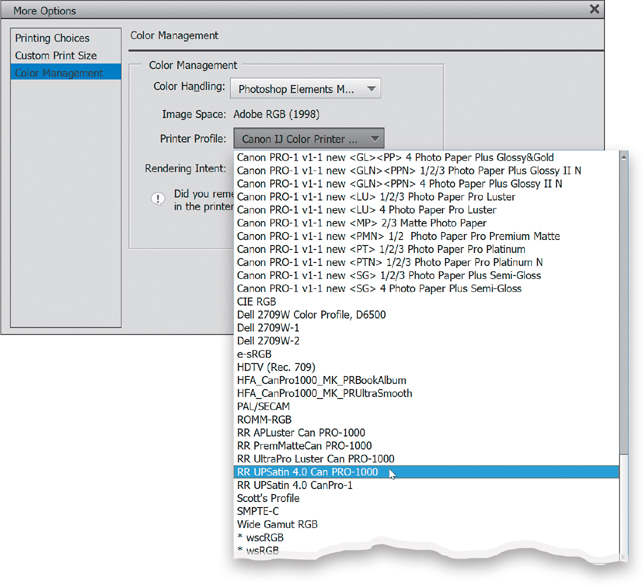
You’ll access your profile by choosing Print from Elements’ File menu. In the Print dialog, click on the More Options button in the bottom left, then click on Color Management on the left of the dialog. Change the Color Handling pop-up menu to Photoshop Elements Manages Color, then click on the Printer Profile pop-up menu, and your new color profile(s) will appear. Here, I’m printing to a Canon PRO-1000 using Red River’s UltraPro Satin paper, so that’s what I’m choosing as my printer profile (it’s named RR UPSatin 4.0 Can Pro-1000). That’s it, but there’s more on using these color profiles next in this chapter.
TIP: Custom Profiles for Your Printer
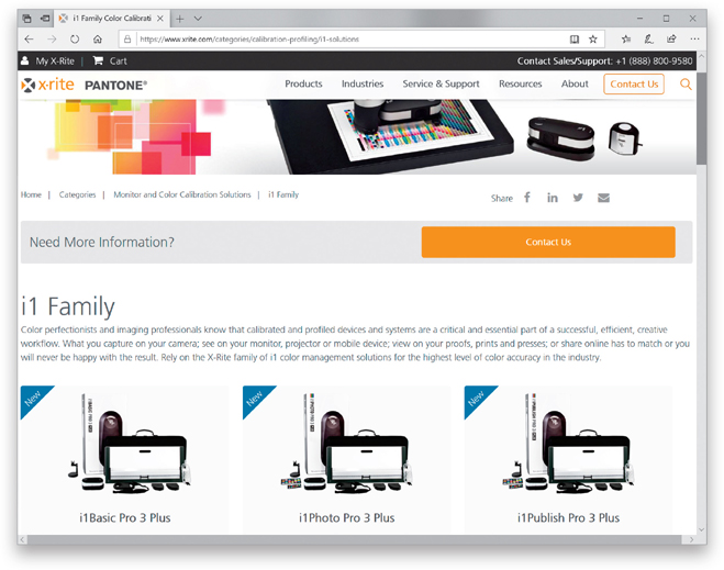
You can also pay an outside service to create a custom profile for your printer. You print a provided test sheet, overnight it to them, and they’ll use an expensive colorimeter to measure your test print and create a custom profile, but it’s only good for that printer, on that paper, with that ink. If anything changes, your profile is worthless. You could do your own personal printer profiling (using something like one of X-Rite’s i1 Pro packages), so you can re-profile each time you change paper or inks. It’s really just up to you.
Sharpening for Printing
When we apply sharpening, we apply it so it looks good on our computer screen, right? But when you actually make a print, a lot of that sharpening that looks fine on a 72- or 96-dpi computer screen gets lost on a high-resolution print at 240 ppi. Because the sharpening gets reduced when we make a print, we have to sharpen so our photo looks a bit too sharp onscreen, but then looks perfect when it prints. Here’s how I apply sharpening for images I’m going to print:
Step One:
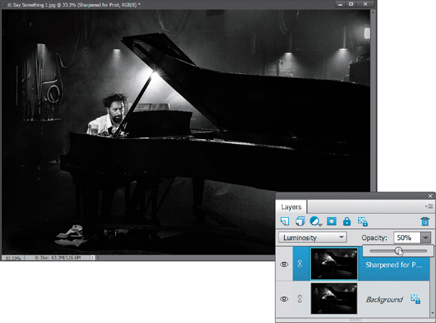
Start by doing a trick my buddy Shelly Katz shared with me: duplicate the Background layer (by pressing Ctrl-J [Mac: Command-J]) and do your print sharpening on this duplicate layer (that way, you don’t mess with the already sharpened original image on the Background layer). Double-click on the new layer’s name and rename it “Sharpened for Print,” then go under the Enhance menu, and choose Unsharp Mask. For most 240 ppi images, I apply these settings: Amount 120; Radius 1; Threshold 3. Click OK.

Step Two:
Next, reapply the Unsharp Mask filter with the same settings by pressing Ctrl-F (Mac: Command-F). Then, at the top of the Layers palette, change the layer blend mode to Luminosity (so the sharpening is only applied to the detail of the photo, and not the color), and use the Opacity slider to control how much sharpening is applied. Start at 50% and see if it looks a little bit oversharpened. If it looks like a little bit too much, stop—you want it to look a little oversharpened. If you think it’s way too much, lower the opacity to around 35% and re-evaluate. When it looks right (a little too sharp), make a test print. My guess is that you’ll want to raise the opacity up a little higher, because it won’t be as sharp as you thought.
Making the Print
Okay, you’ve hardware calibrated your monitor (or at the very least—you “eyed it”) and you’ve set up Elements’ Color Management to use Adobe RGB (1998). You’ve even downloaded a printer profile for the exact printer model and type of paper you’re printing on. In short, you’re there. Luckily, you only have to do all that stuff once—now we can just sit back and print. Well, pretty much.
Step One:
Once you have an image all ready to go, just go under the Editor’s File menu and choose Print (as shown here), or just press Ctrl-P (Mac: Command-P).

Step Two:
When the Print dialog appears, let’s choose your printer and paper size first. At the top right of the dialog, choose the exact printer you want to print to from the Select Printer pop-up menu (I’m printing to a Canon PRO-1000). Next, choose your paper size from the Select Paper Size pop-up menu (in this case, a 13x19" sheet), choose your page orientation beneath that menu, and then from the Select Print Size pop-up menu (on the bottom right), be sure that Actual Size is selected. In the middle of the Print dialog, you’ll see a preview of how your photo will fit on the printed page, and at the bottom of the column on the right, there’s an option for how many copies you want to print. If you want to print more than one photo, just click the Add button below the filmstrip on the left side of the dialog. This brings up the Add Photos dialog (similar to the one you get when using the Create Slide Show feature), where you can choose from your photos in the Organizer. Select the one(s) you want and click the Add Selected Photos button. To remove a photo from the filmstrip, click on it, then click the Remove button.
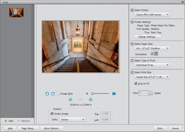
Step Three:
Click on the More Options button (at the bottom left) and then click on Custom Print Size on the left. Here you can choose how large the photo will appear on the page (if it’s a photo that’s too large to fit on the paper, just turn on the Scale to Fit Media checkbox, as I did here, and it will do the math for you, and scale the image down to fit).

Step Four:
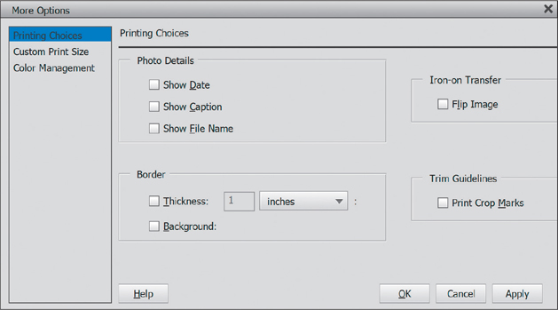
Now click on Printing Choices at the top left of the More Options dialog. Here you can choose if you want to have your photo’s filename appear on the page, or change the background color of the paper, or add a border, or have crop marks print, or other stuff like that—you have but only to turn the checkboxes on (you like that “you have but only to” phrase? I never use that in normal conversation, but somehow it sounded good here. Ya know, come to think of it—maybe not). Anyway, I don’t use these Printing Choices at all, ever, but don’t let that stop you—feel free to add distracting junk to your heart’s content. Now, on to the meat of this process.
Step Five:
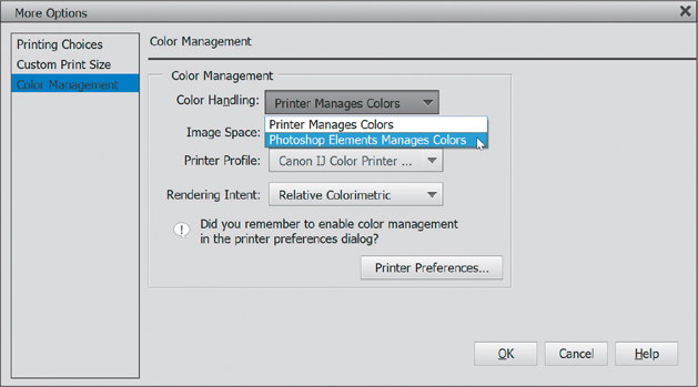
Click on Color Management on the left to get the all-important Color Management options. Here’s the thing: by default, the Color Handling is set up to have your printer manage colors. You really only want to choose this if you weren’t able to download the printer/paper profile for your printer. So, basically, this is your backup plan. It’s not your first choice, but today’s printers have gotten to the point that if you have to go with this, it still does a decent job. However, if you were able to download your printer/paper profile and you want pro-quality prints (and I imagine you do), then do this instead: choose Photoshop Elements Manages Colors from the Color Handling pop-up menu (as shown here), so you can make use of the color profile, which will give you the best possible color match.
Step Six:
Below Rendering Intent, you’ll see a warning asking if you remembered to disable your printer’s color management. You haven’t, so let’s do that now. Click the Printer Preferences button that appears right below the warning (as shown here). (Note: On a Mac, once you click the Print button in the Elements Print dialog, the Mac OS X Print dialog will appear, where you can go under Printer Color Management and set it to Off [No Color Adjustment].)

Step Seven:
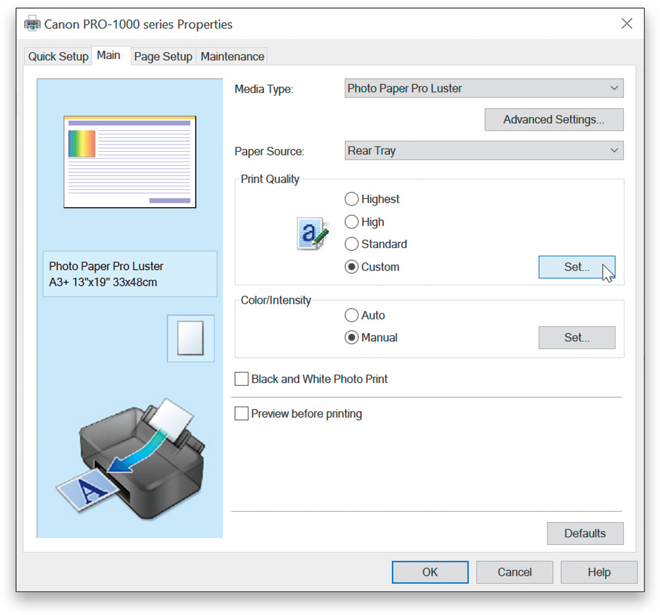
In your printer’s Properties dialog (which may be different depending on your printer), you will turn off your printer’s color management, but you have other stuff to do here, as well (on a Mac, you will do this in the OS X Print dialog, as mentioned in the previous step). First, choose the type of paper you’ll be printing to (I’m printing to Canon Photo Paper Pro Luster). Find the Print Quality setting, choose Custom, click the Set button, then in the resulting dialog, drag the Quality slider at the top to the quality setting you want and click OK. If you have the option (usually found under Advanced Settings), be sure to set your printer options to Off (No Color Adjustment). Here, under Color/Intensity, I chose Manual, then clicked the Set button, and chose None. Click OK to save your changes and return to the More Options dialog.
Step Eight:
After you’ve turned off your printer’s color management (and chosen photo quality paper), you’ll need to choose your color profile. Again, I’m going to be printing to a Canon PRO-1000 printer, using Canon’s Photo Paper Pro Luster paper, so I’d choose that profile from the Printer Profile pop-up menu in the Color Management section. Doing this optimizes the color to give the best possible color print on that particular printer using that particular paper.
Step Nine:
Lastly, you’ll need to choose the Rendering Intent. There are four choices here, but only two that I recommend—either Relative Colorimetric (which is the default setting) or Perceptual. Here’s the thing: I’ve had printers where I got the best looking prints with my Rendering Intent set to Perceptual, but currently, on my Canon PRO-1000, I get better results when it’s set to Relative Colorimetric. So, which one gives the best results for your printer? I recommend printing a photo once using Perceptual, then printing the same photo using Relative Colorimetric, and when you compare the two, you’ll know. Just remember to add some text below the photo that tells you which one is which or you’ll get the two confused. I learned this the hard way.

Step 10:
Now click the OK button, then click the Print button at the bottom of the Print dialog (this is where, on a Mac, you’ll choose the options we talked about in Step Six and Step Seven).

What to Do If the Print Still Doesn’t Match Your Screen
Okay, what do you do if you followed all these steps—you’ve hardware calibrated your monitor, you’ve got the right paper profiles, and color profiles, and profiles of profiles, and so on, and you’ve carefully turned on every checkbox, chosen all the right color profiles, and you’ve done everything right—but the print still doesn’t match what you see onscreen? You know what we do? We fix it in Elements. That’s right—we make some simple tweaks that get the image looking right fast.
Your Print Is Too Dark
This is one of the most common problems, and it’s mostly because today’s monitors are so much brighter (either that, or you’re literally viewing your images in a room that’s too dark). Luckily, this is an easy fix and here’s what I do: Press Ctrl-J (Mac: Command-J) to duplicate the Background layer, then at the top of the Layers palette, change the layer blend mode to Screen to make everything much brighter. Now, lower the Opacity of this layer to 25% and (this is key here) make a test print. Next, look at the print, and see if it’s a perfect match, or if it’s still too dark. If it’s still too dark, set the Opacity to 35% and make another test print. It’ll probably take a few test prints to nail it, but once you do, your problem is solved.

Your Print Is Too Light
This is less likely, but just as easy to fix. Duplicate the Background layer, then change the layer blend mode to Multiply to make everything darker. Now, lower the Opacity of this layer to 20% and make a test print. Again, you may have to make a few test prints to get the right amount, but once you’ve got it, you’ve got it.

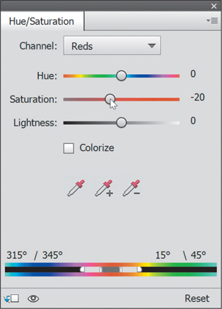
Your Print Is Too Red (Blue, etc.)
This is one you might run into if your print has some sort of color cast. First, before you mess with the image, press the Tab key on your keyboard to hide the Toolbox, palettes, and Tool Options Bar, and put a solid gray background behind your photo. Then, just look to see if the image onscreen actually has too much red. If it does, then click on the Create New Adjustment Layer icon (the half-white/half-blue circle) at the top of the palette, and choose Hue/Saturation. In the Hue/Saturation adjustment palette, from the Channel pop-up menu, choose Reds (or Blues, etc.), then lower the Saturation amount to –20, and then (you knew this was coming, right?) make a test print. You’ll then know if –20 was too much, too little, or just right. You may have to make a few test prints before you nail it.
Your Print Has Visible Banding
The more you’ve tweaked an image, the more likely it is you’ll run into this (where the colors have visible bands, rather than just smoothly graduating from color to color. It’s most often seen in blue skies). Here’s how to deal with this: Go under the Filter menu, under Noise, and choose Add Noise. In the dialog, set the Amount to 4%, click on the Gaussian radio button, and turn on the Monochromatic checkbox. You’ll see the noise onscreen, but it disappears when you print the image (and usually, the banding disappears right along with it).

My Elements 2020 Photography Workflow
One of the questions I get asked the most is “What is your suggested digital workflow?” (Which actually means, “What order are you supposed to do all this in?” That’s all “digital workflow” means.) I wrote this book in kind of a digital workflow order, starting with importing and organizing your photos, correcting them, sharpening them, and then at the end, printing. But I thought that seeing it all laid out in one place (well, in these six pages) might be really helpful, so here ya go.
Step One:
You start your workflow by importing your photos into the Organizer (we learned this in Chapter 1). While you’re in the Photo Downloader (shown here), I recommend adding your metadata (your name and copyright info) during this import process. Also, while you’re in the Photo Downloader, go ahead and rename your photos now, so if you ever have to search for them, you have a hope of finding them (searching for photos from your trip to Hawaii is pretty tough if you leave the files named the way your camera named them, which is something along the lines of “SK2_1751.JPG”). So give them a descriptive name while you import them. You’ll thank me later.
Step Two:
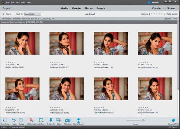
Once your photos appear in the Organizer, first take a quick look through them and go ahead and delete any photos that are hopelessly out of focus, were taken accidentally (like shots taken with the lens cap still on), or you can see with a quick glance are so messed up they’re beyond repair. Get rid of these now, because there’s no sense wasting time (tagging, sorting, etc.) and disk space on photos that you’re going to wind up deleting later anyway, so make your job easier—do it now.
Step Three:
Once you’ve deleted the obviously bad ones, here’s what I would do next: go through the photos one more time and then create an album of just your best images (see Chapter 1 for how to create an album). That way, you’re now just one click away from the best photos from your shoot.
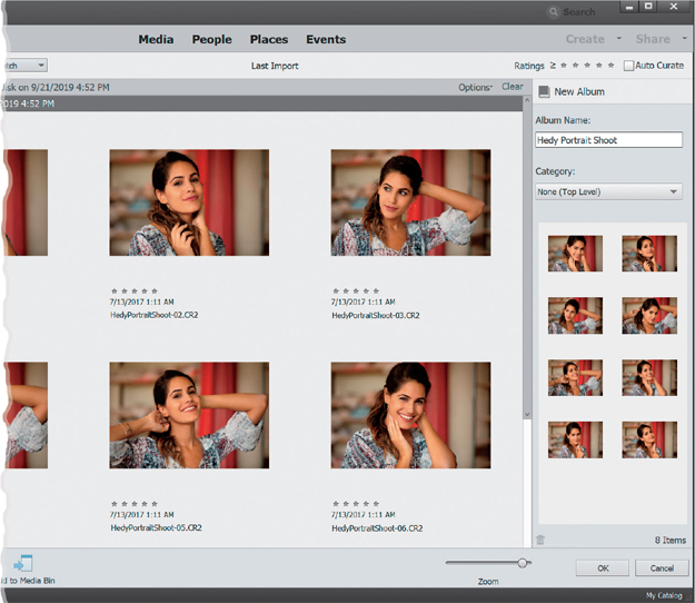
Step Four:
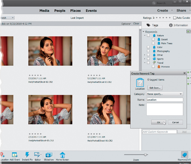
There’s another big advantage to separating out your best images into their own separate album: now you’re only going to tag and worry about color correcting and editing these photos—the best of your shoot. You’re not going to waste time and energy on photos no one’s going to see. So, click on the album, then go ahead and assign your keyword tags now (if you forgot how to tag, it’s back in Chapter 1). If you take a few minutes to tag the images in your album now, it will save you literally hours down the road. This is a very important step in your workflow (even though it’s not a fun step), so don’t skip it—tag those images now!
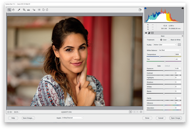
Step Five:
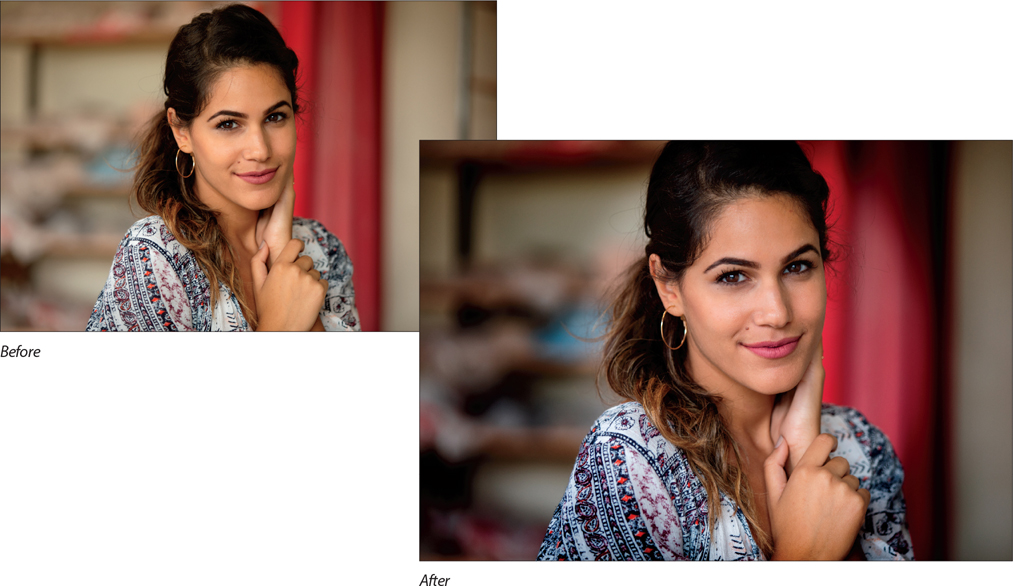
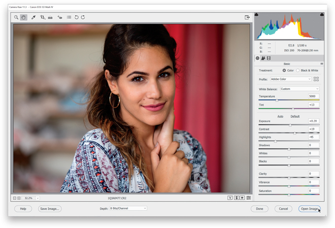
Now it’s time to start editing our location portrait shot. My workflow always begins in Camera Raw (whether I shot in JPEG, TIFF, or RAW. See Chapter 2 for more on working in Camera Raw), and the first thing I do at this point is figure out what needs to be done to get the image where I want it, so the question I ask myself is simple: “What do I wish were different?” Well, I wish I had composed the portrait a little tighter, cropping off the top 1/3 of her head to create a more intimate feel. I also don’t like how bright the background is, so I’ll need to pull that back. I need a bit more light on her face overall, and in particular her eyes. This was taken late in the day, but I might add a little cooler white balance, too.
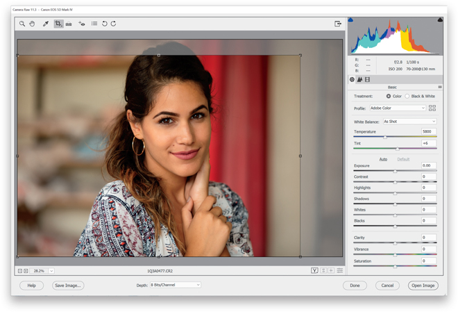
Step Six:
Let’s start with cropping the image while we’re here in Camera Raw. Get the Crop tool (C) from the Toolbox and let’s crop in quite a bit tighter, bringing the subject forward in the frame a bit. (We looked at cropping in Camera Raw in Chapter 3, as well as cropping in the Editor in Chapter 4.)
Step Seven:
To deal with that bright background, let’s drag the Highlights slider to the left to lower the overall brightness. In this case, I dragged it over to –45, which was far enough for now (plus, sometimes if you go too far, really bright areas may turn gray). Next, the whole image looks a little dark, so I raised the overall exposure a bit by dragging the Exposure slider to the right to +0.20, and then I increased the Contrast to +19.

Step Eight:
Let’s wrap things up here in Camera Raw by making the whole image just a tad cooler by dragging the Temperature slider over to +5000 (to add just a little more blue into the image). I also increased the Tint just a tiny bit to +13. Now, click the Open Image button to open the image in the Editor.
Step Nine:
Let’s zoom in a bit (using the Zoom tool or by pressing Ctrl-+ [plus sign; Mac: Command-+]), and then get the Spot Healing Brush tool (J) to remove a few little blemishes and stray hairs on her face. Make your brush size a little larger than the blemishes you want to remove, then move your cursor over each blemish and just click once to remove them. (See Chapter 9 for more on the Spot Healing Brush.) Remember, this is just a tweak, not an in-depth retouch, so don’t spend too long on this step—a minute or two, tops.

Step 10:
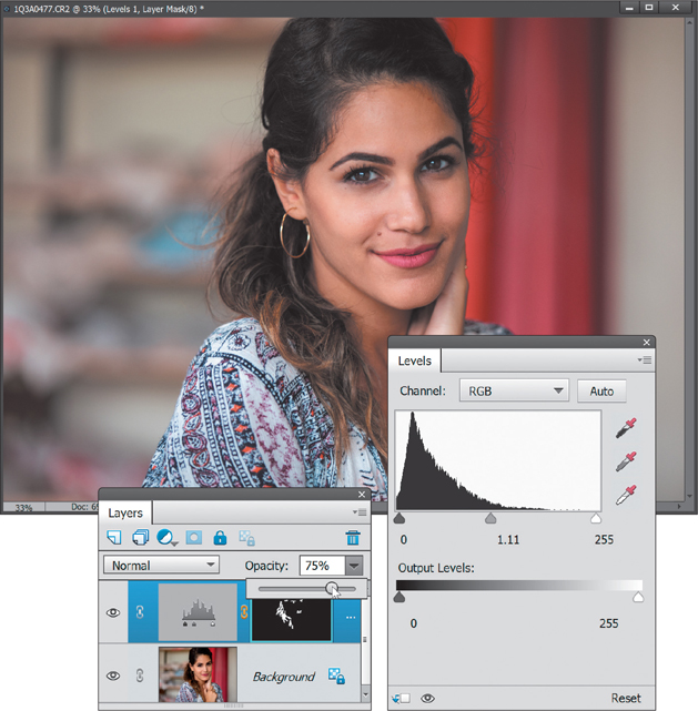
Next, let’s create an adjustment layer to add some highlights to her hair, eyes, and lips. So, click on the Create New Adjustment Layer icon, at the top of the Layers palette, and choose Levels (see Chapter 6 for more on Levels adjustment layers). In the Levels palette, drag the middle gray Input Levels slider (beneath the histogram) to the left to brighten the midtones, and then drag the far-right (white) Input Levels slider to the left just a bit to brighten the highlights. Now, press Ctrl-I (Mac: Command-I) to Invert the layer mask attached to this adjustment layer and hide those adjustments behind a black mask—that way, we can paint in the highlights where we want them. Get the Brush tool (B), and with your Foreground color set to white, paint over the highlight areas in her hair, her eyes, and her lips to bring them out. Once you’ve painted them all in, at the top of the Layers palette, lower the Opacity of this adjustment layer until it looks realistic (here, I lowered it to 75%).
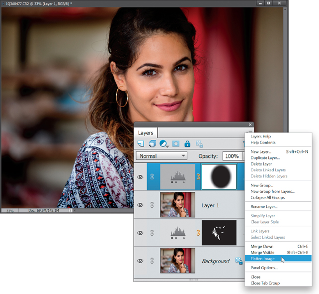
Step 11:
Our overall exposure is pretty good, but I’d like to add a soft spotlight to her to separate her from the background a bit. So, create a new merged layer at the top of the layer stack by pressing Ctrl-Alt-Shift-E (Mac: Command-Option-Shift-E). Then, using the Elliptical Marquee tool, create a selection around her, invert and feather it, and add another Levels adjustment layer to add the spotlight effect (we learned how to do this back in Chapter 8). Now, choose Flatten Image from the Layers palette’s flyout menu to merge all those layers down with the Background layer. That should wrap this up!. :)