Chapter 7. Problem Child
fixing common problems
This was kind of an obvious title, and I could have gone with “Modern Problems” instead, but I’m pretty sure I used that one in my Lightroom book, so “Problem Child” it is (the title is based on the 1990 movie from Universal Pictures, starring John Ritter, Amy Yasbeck, and Jack Warden). Now, why do we have so many problems with our photos? Well, it’s not our fault. It’s our camera’s fault. You see, the camera doesn’t really capture what it is we’re seeing in front of us, and that’s because as sophisticated as today’s digital cameras are at capturing light, they are still way, way, way behind the tonal range of the human eye, so what we’re seeing with our eyes is much better than what even the best crazy-high-megapixel camera can capture by a long shot. The human eye definitely is an amazing thing, but you might find it surprising to know that there is an animal species that can more accurately capture color and tonal changes, far beyond what the human eye can capture. And, as you might expect, the camera companies themselves have spent millions of dollars researching the eye structure of the Hispaniolan solenodon, which is only found on the island of Hispaniola. It is said that H. solenodon’s eye will soon be the key to creating ultra-high-definition sensors that would completely negate ever having to shoot bracketed frames or create HDR images, because their tonal range perfectly exposes for indoors and outdoors at the same time, like the human eye does, but in a much more advanced way. Sony spent considerable time mapping H. solenodon’s trabecular meshwork canal, but as Sony’s own scientists were putting the finishing touches on a sensor that not only surpasses anything currently available, but that even surpasses the human eye, a group of researchers at Leica in Wetzlar, Germany, had a startling discovery. They revealed a working sensor prototype based on the anterior chamber of the eye of the tufted deer, found in damp forest areas of China. Then, and only then, a magical leprechaun appeared. You can take it from here, since I just made the whole thing up, so start with “...then, a magical leprechaun appeared” and throw in some fancy terms from an eye chart you can find on Google.
Adjusting Flesh Tones
So what do you do if someone in your photo has a red face? This is one of the most common people-photo problems out there. You can try this quick trick for getting your flesh tones in line by removing the excess red. This one small adjustment can make a world of difference.
Step One:
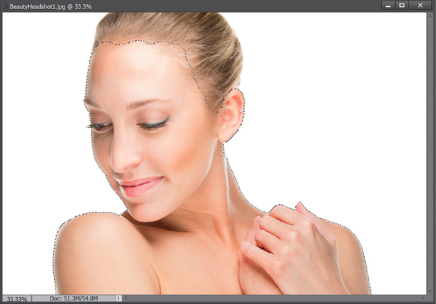
Open a photo that needs red removed from the flesh tones. If the whole image appears too red, skip this step and move on to Step Three. However, if just the flesh-tone areas appear too red, get the Quick Selection tool (A) and click on all the flesh-tone areas in your photo (press-and-hold the Alt [Mac: Option] key to remove any areas that were selected that shouldn’t have been). Here, I selected her face, shoulders, ear, and hands.
Step Two:
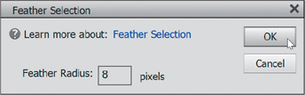
Go under the Select menu and choose Feather. Enter a Feather Radius of about 8 pixels, then click OK. By adding this feather, you’re softening the edges of your selection, preventing a hard, visible edge from appearing around your adjustments.
Step Three:
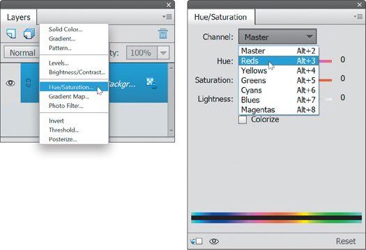
Click on the Create New Adjustment Layer icon at the top of the Layers palette, and choose Hue/Saturation from the pop-up menu. Then, in the Hue/Saturation adjustment palette, click on the Channel pop-up menu near the top and choose Reds, so you’re only adjusting the reds in your photo (or in your selected areas if you put a selection around the flesh tones).
Step Four:
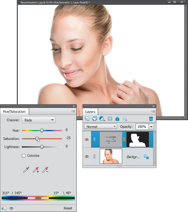
The rest is easy—you’re simply going to reduce the amount of saturation, so the flesh tones appear more natural. Drag the Saturation slider to the left to reduce the amount of red (I moved mine to –25, but you may have to go farther to the left, or not as far, depending on how red your skin color is). The changes are live, so you’ll be able to see the effect of reducing the red as you lower the Saturation slider. Also, if you made a selection of the flesh tone areas, once you create the adjustment layer, it will hide the selection border from view and create a layer mask with your selection. When the flesh tones look right, you’re done.

Smoothing Skin Like a Pro
Smoothing skin has always been tricky because not only has it traditionally been kind of complex, taking a lot of steps, but one of the biggest issues we’ve had is that the result of the smoothing often winds up making your subject’s skin look plastic. Traditional smoothing techniques blurred the skin so much that you could often barely see any skin pores at all, but that’s what’s so great about this new type of skin smoothing in Elements—it maintains a lot of the skin pores and delivers a much more natural, realistic retouch, which is a great thing.
Step One:
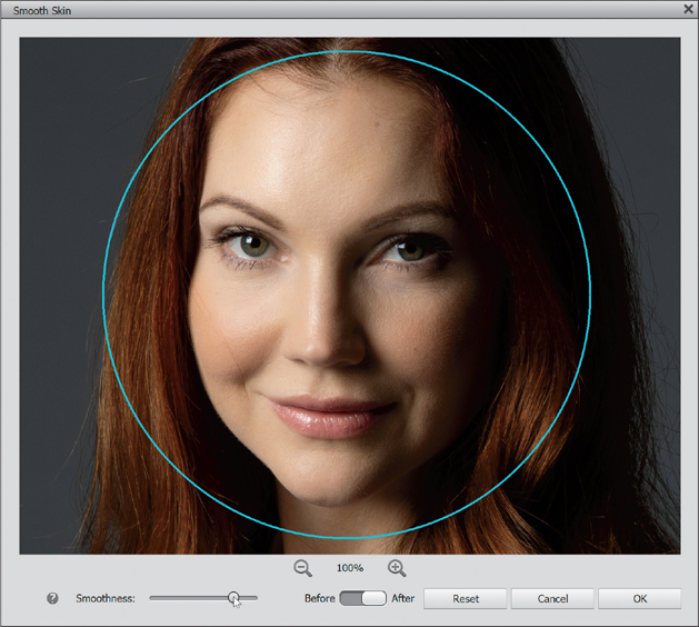
In the Editor, open the photo where you want to retouch your subject’s skin. Then, go under the Enhance menu and choose Smooth Skin (as shown here).

Step Two:
When the Smooth Skin dialog appears, I recommended zooming in to a 100% view (click the magnifying glass icon with the plus sign below your image a few times until it says 100%, as seen here). The blue circle around your subject’s face lets you know that Elements is using facial recognition and that it recognizes your subject’s face, so when you zoom in on the image, it automatically zooms right in on their face.

Step Three:
This retouch couldn’t be simpler, because there’s only one slider—the Smoothness slider. The farther you drag it to the right, the smoother it makes your subject’s skin. It does a nice job of not totally obliterating your subject’s pores, so the result doesn’t make your subject’s skin look plastic (which has been a pretty common issue in retouching skin over the years). There’s a Before/After toggle switch below your image that lets you see a quick before/after. That’s it—when you’ve got the amount of smoothing you want, click the OK button and you’re done.
Step Four:
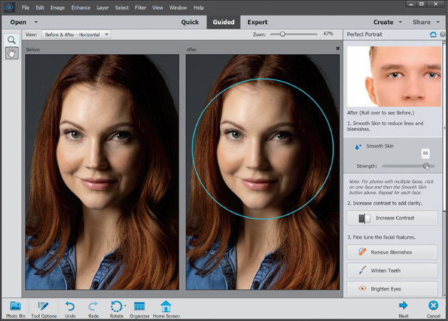
This really isn’t a fourth step, but this same smoothing technology is built into the Perfect Portrait guided edit, as well. Click on Guided at the top of the window, then under Special Edits, click on Perfect Portrait. On the right, you’ll see a Smooth Skin button. When you click it, it applies the Smooth Skin effect at a full 100% (that’s different than the Expert version, where it doesn’t apply any smoothing by default—you have to apply the amount). In this case, I felt full strength was too much, so I backed it off a bit by dragging the Strength slider to the left. Here’s a before/after (I chose Before & After – Horizontal from the View pop-up menu at the top left of the window, then I used the Zoom slider to get it close enough to see the effects of the smoothing).
Using the Smart Brush Tool to Select and Enhance Skies at the Same Time
Photoshop Elements includes a brush tool that lets you fix problem areas (as well as create some pretty cool effects) with just a brush stroke. It’s called the Smart Brush tool, and it helps keep you from making complicated selections and then having to fix them in a separate step. Instead, you choose which effect you want to apply and just brush away. Let’s check it out.
Step One:
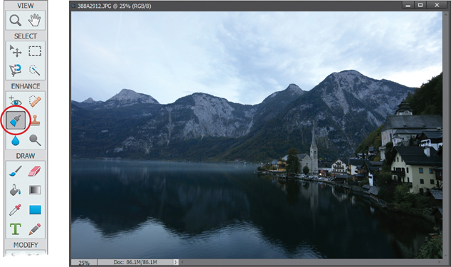
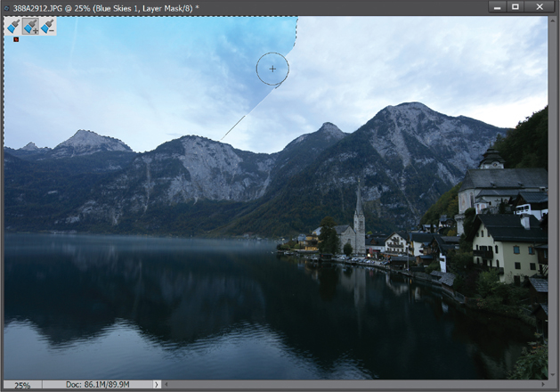
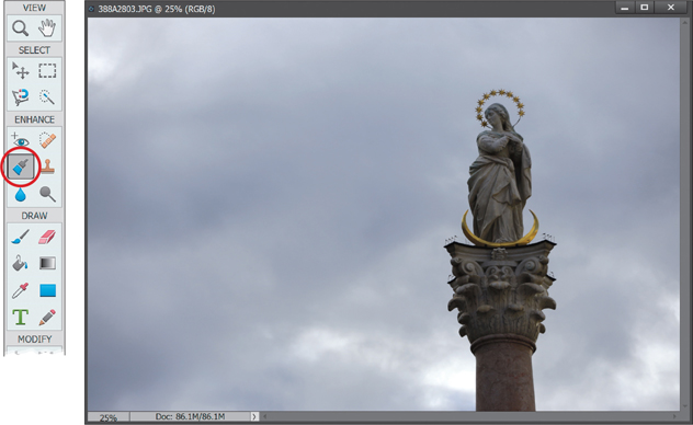
Open a photo that has an area you want to enhance or fix. There’s actually a huge list of things you can do with this brush, but let’s concentrate on one area for now—the sky. A big digital image problem is that the sky never seems to look as vibrant and dramatic as it does when we’re there photographing it. Well, the Smart Brush tool has an option to help fix this, so go ahead and select it from the Toolbox (it’s the large paint brush icon in the Enhance section) or just press the F key.
Step Two:
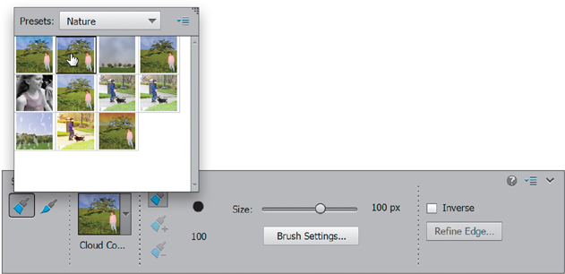
Once you select the tool, click on the thumbnail near the left side of the Tool Options Bar to open the Preset Picker. As you change the Presets pop-up menu and scroll through the Preset Picker, you’ll see what I meant in Step One—there are indeed a bunch of things you can do here. Let’s go ahead and choose Nature from the pop-up menu, though, to narrow it down. Then click on the thumbnail in the top left, which makes dull skies bluer.

Step Three:
Now the main thing to remember about this tool is that it is still a brush, which means it has settings just like all other brushes (size, hardness, spacing, etc.). So, using the Size slider in the Tool Options Bar, choose a size that’ll help you paint over the area fairly quickly. In this example, I’m using a 400-pixel brush for the sky.

Step Four:
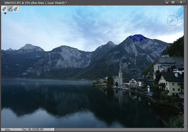
The rest is pretty simple—just click-and-drag on the sky to paint the effect on the photo. By the way, notice how Elements automatically started adding the Blue Skies effect to parts of the sky that you haven’t even painted over yet? That’s where the “smart” part of this brush comes into play. It automatically examines your photo for areas similar to what you have painted on and adds them to the selection.
Step Five:
Now, keep brushing on the sky to get the rest of it. Each time you click, you’re adding to the selection, so there’s no need to press-and-hold any keys or change tools to widen the effect to other parts of the photo.
Step Six:
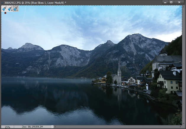
Okay, this brush is pretty cool, right? But it’s not perfect. There will inevitably come a time (probably sooner than later) where the “smartness” of the brush isn’t as smart as it thinks it is, and it bleeds into a part of the photo you didn’t want it to (like some of the mountain on the right, as seen in Step Five). When that happens, press-and-hold the Alt (Mac: Option) key to put the brush into subtract mode. Then paint over the areas you didn’t want to apply the effect to (as shown here). Again, Elements will do a lot of the work for you and wipe away the areas, even if you don’t paint directly on them. Note: Decrease the size of your brush and zoom in on the area, if needed, to help remove it from the selection.
Step Seven:
Here’s another really cool thing about the Smart Brush tool: it’s non-destructive to your photo. This means you can always go back and change (or even delete) the effects. You’ll see this in two ways: First, you’ll notice that the Smart Brush tool automatically adds a new adjustment layer to the Layers palette. If you ever find the effect is too harsh, you can always reduce the opacity of the layer to reduce the effect.
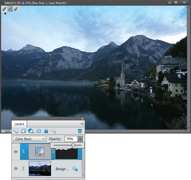
Step Eight:
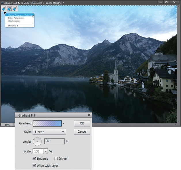
Also, you may have noticed a tiny red box on your photo where you started to paint with the Smart Brush tool. This is the adjustment marker, letting you know you’ve applied a Smart Brush adjustment to the photo. If you Right-click on it, you’ll see you can delete it if you want or you can change the adjustment settings. Choosing Delete Adjustment does just what you think it does—the adjustment will be removed totally. But try choosing Change Adjustment Settings instead. It brings up the adjustment palette or dialog with the controls for whatever adjustment Elements used to achieve your effect. If you’re familiar with that adjustment palette or dialog, you can always try tweaking the settings. In this case, Gradient was used, so the Gradient Fill dialog appeared.
Step Nine:
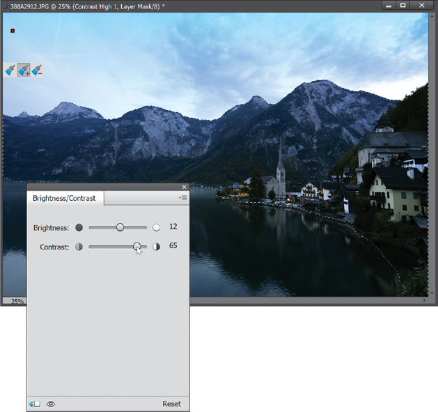
You can also add multiple Smart Brush adjustments to different parts of the photo. If you notice, the sky looks a lot better, but now the mountains and town look a little flat in comparison. Press Ctrl-D (Mac: Command-D) to Deselect the current Smart Brush adjustment in the sky. Then, go to the Preset Picker in the Tool Options Bar and, under the Lighting presets in the pop-up menu, click on the second thumbnail in the top row, which intensifies contrast. Now, paint over the mountains and town to add some contrast to them. To bring some more color out in them, I Right-clicked on the adjustment marker for them and chose Change Adjustment Settings to get to the adjustment palette options that were used for the effect. It brought up the Brightness/Contrast controls, where I increased the Brightness to 12 and the Contrast to 65.
Step 10:
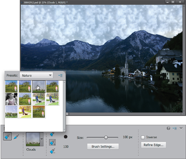
One more thing: the Smart Brush tool is so smart that you can not only change the adjustment settings, but you can also totally change the Smart Brush adjustment you’ve applied. For example, let’s say we want to see what the Clouds adjustment looks like. Just click back on your Blue Skies layer in the Layers palette, then in the Preset Picker, click on the third thumbnail in the top row of the Nature presets and Elements will swap out the Blue Skies adjustment with the Clouds one. If you like it, then keep it (you can adjust the settings for the size of the clouds if needed); if not, then just click back on the first preset you chose or try a new one altogether. Once you’re finished, just choose Flatten Image from the Layers palette’s flyout menu.

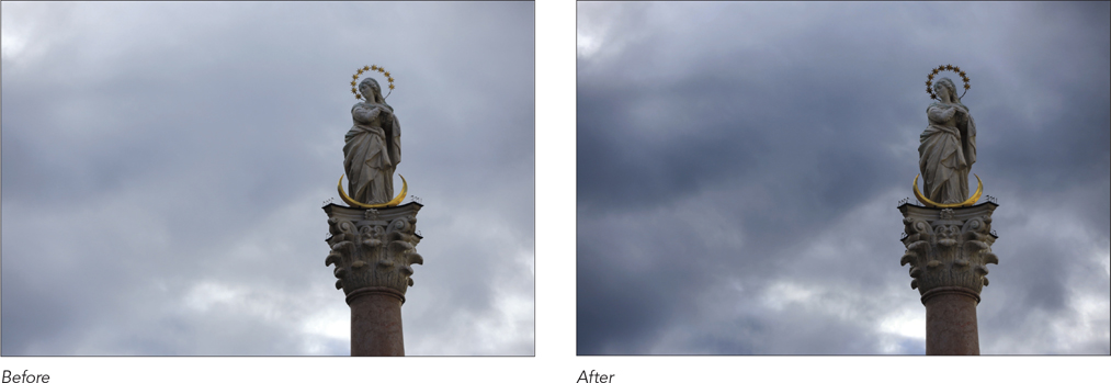
Adding Contrast and Drama to Cloudy Skies
Sometimes we don’t get to shoot in perfect weather. Especially when you’re traveling—you don’t get to pick the day, time, or weather forecast. It has happened to me a hundred times. I get somewhere cool and I’ve got gray skies. Well, there’s a sweet little adjustment in Elements that can take those gray skies and make them look pretty darn cool and dramatic. And more often than not, when you apply this and show it to people, they’ll comment on how good the sky looks.
Step One:
Open a photo where you’ve got some cloudy gray skies. Then, select the Smart Brush tool from the Toolbox (it’s the large paint brush icon in the Enhance section) or just press the F key. (Note: For more on the Smart Brush tool, see the previous tutorial.)
Step Two:
Once you have the tool selected, click on the thumbnail on the left side of the Tool Options Bar to open the Preset Picker. From the Presets pop-up menu, choose Nature, and then click on the second thumbnail in the top row, which adds contrast to cloudy skies.
Step Three:
Now, choose a brush size using the Size slider (also in the Tool Options Bar), paint over the sky, and you’ll start to see all the details that you knew were there when you took the photo start to come out.
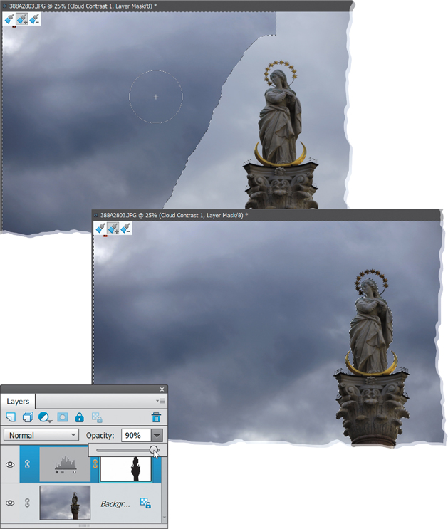
Step Four:
Like most of the Smart Brush tool adjustments, sometimes the default adjustment is too strong. If that’s the case, just go to the Layers palette and reduce the Opacity setting, depending on how strong you want it to look. Not bad, eh? It does a great job of taking an ordinary photo and turning it into something way more dramatic.
Removing Digital Noise
Before you go any further, this is one of those circumstances mentioned in the beginning of the book, in the introduction on page xv. Remember the whole topic about how Elements has changed over the years, and the way we work on our photos is very different today than it was say, five years ago? This is a perfect example. Elements includes the hands-down best way to remove noise in your photos, but it’s in Camera Raw (see Chapter 3). So, if you’re thinking about using this filter, just know that there’s a much better way to remove noise in Camera Raw. If you already have the photo open in the Editor and you’re not in the mood to reopen it in Camera Raw, then this filter is an alternative (but not really a good one).
Step One:
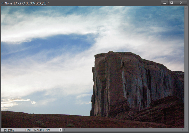
Open the photo that was taken in low lighting (or using a high ISO setting) and has visible digital noise. This noise will be most obvious when viewed at a magnification of 100% or higher (noise appears on the side of the rock in this photo, although it’s hard to see at the small size of the image here). Note: If you view your photos at smaller sizes, you may not notice the noise until you make your prints.
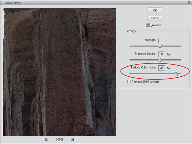
Step Two:
Go under the Filter menu, under Noise, and choose Reduce Noise. The default settings usually aren’t too bad, but if you’re having a lot of color aliasing (dots or splotchy areas of red, green, and blue), like we have here, drag the Reduce Color Noise slider to the right. If it still looks splotchy, try dragging the Preserve Details slider to the left.
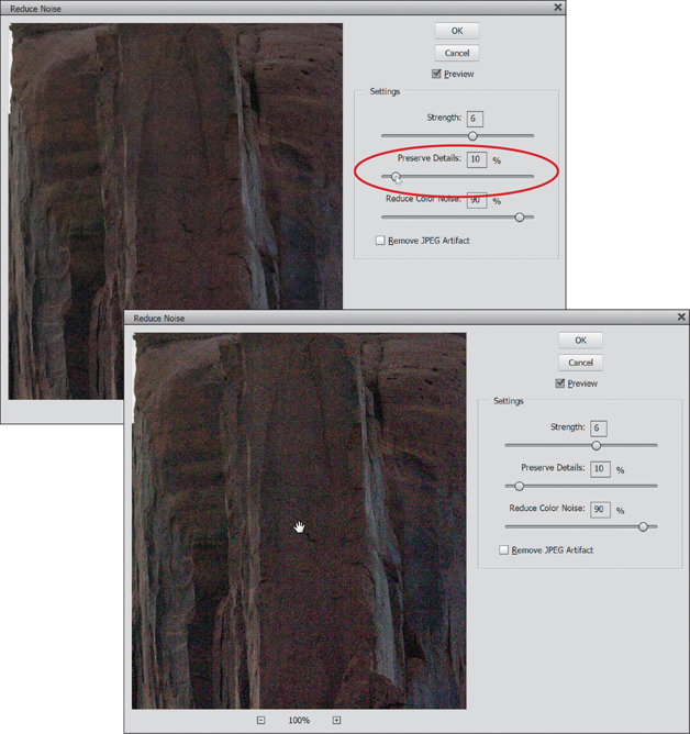
Step Three:
One thing to watch out for when using this filter is that, although it can reduce noise, it can also make your photo a bit blurry, and the higher the Strength setting and amount of Reduce Color Noise, the blurrier your photo will become. If the noise is really bad, you may prefer a bit of blur to an incredibly noisy photo, so you’ll have to make the call as to how much blurring is acceptable, but to reduce the amount of blur a bit, drag the Preserve Details slider to the right. Here, I thought it looked best set to 10%.
TIP: See a Before/After
To see an instant before/after of the Reduce Noise filter’s effect on your photo without clicking the OK button or using the Preview checkbox, click your cursor within the Reduce Noise dialog’s preview window. When you click-and-hold within that window, you’ll see the before version without the filter (zoom in if you need to). When you release the mouse button, you’ll see how the photo will look if you click the OK button.

Focusing Light with Dodging and Burning
I’ve got some bad news and some good news (don’t you hate it when people start a conversation like that?). The bad news first (yeah, I like it that way, too): Elements’ Dodge and Burn tools are kind of lame. The pros don’t use them and, after you read this tutorial, I hope you won’t either. The good news...there is a great method the pros do use to dodge and burn and it’s totally non-destructive. It’s flexible and really quite easy to use. See, isn’t it better to end on a good note (with the good news, that is)?
Step One:
In this tutorial, we’re going to dodge areas to add some highlights, then we’re going to burn in some areas a bit to darken them. Start by opening the photo you want to dodge and burn.
Step Two:
Go to the Layers palette, click on the down-facing arrow at the top right, and from the flyout menu, choose New Layer (or just Alt-click [Mac: Option-click] on the Create a New Layer icon at the top of the palette). This accesses the New Layer dialog, which is needed for this technique to work.

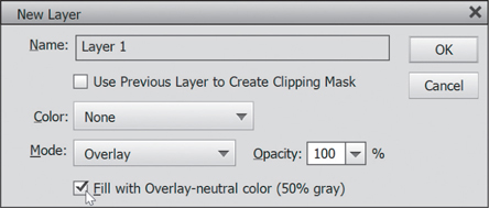
Step Three:
In the New Layer dialog, change the Mode to Overlay, then right below that, turn on the checkbox for Fill with Overlay-Neutral Color (50% Gray). This is normally grayed out, but when you switch to Overlay mode, this choice becomes available. Click the checkbox to turn it on, then click OK.
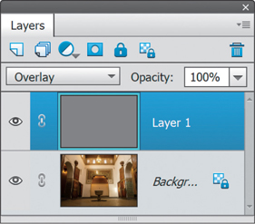
Step Four:
This creates a new layer, filled with 50% gray, above your Background layer. (When you fill a layer with 50% gray and change the Mode to Overlay, Elements ignores the color. You’ll see a gray thumbnail in the Layers palette, but the layer will appear transparent in your image window.)
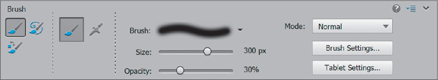
Step Five:
Press B to switch to the Brush tool, and choose a medium, soft-edged brush from the Brush Picker (which opens when you click on the Brush thumbnail in the Tool Options Bar). While in the Tool Options Bar, lower the Opacity to approximately 30%.
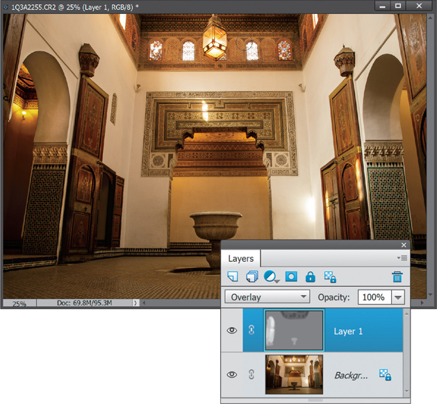
Step Six:
Press D, then X to set your Foreground color to white and begin painting over the areas that you want to highlight (dodge). As you paint (here, I’m painting the archway on the left), you’ll see light gray strokes appear in the thumbnail of your gray transparent layer, and in the image window, you’ll see soft highlights.

Step Seven:
If your first stab at dodging isn’t as intense as you’d like, just release the mouse button, click again, and paint over the same area. Since you’re dodging at a low opacity, the highlights will “build up” as you paint over previous strokes. If the highlights appear too intense, just go to the Layers palette and lower the Opacity setting of your gray layer until they blend in.

Step Eight:
If there are areas you want to darken (burn) so they’re less prominent (such as the center ceiling area with the windows), just press D to switch your Foreground color to black and begin painting in those areas. Okay, ready for another dodging-and-burning method? Good, ’cause I’ve got a great one.
Alternate Technique:
Open the photo that you want to dodge and burn, then just click on the Create a New Layer icon in the Layers palette and change the blend mode to Soft Light. Now, set white as your Foreground color and you can dodge right on this layer using the Brush tool set to 30% Opacity. To burn, just as before, switch to black. The dodging and burning using this Soft Light layer appears a bit softer and milder than the previous technique, so you should definitely try both to see which one you prefer.

Step Nine:
Let’s add some contrast to the image to finish things off here. Click on the Create New Adjustment Layer icon at the top of the Layers palette, and choose Levels. This will add a Levels adjustment layer to the top of the layer stack and open the Levels adjustment palette. Drag the far-left (dark gray) Input Levels slider (beneath the histogram) to the right a bit to bring out some detail in the shadows, and then drag the far-right (white) Input slider to the left to brighten the highlights. A before/after is shown below.


Removing Haze from Your Photos
Here’s a feature that’s actually pretty darn slick. Anyone who shoots underwater photography, or takes a shot at an aquarium, or just shoots on foggy or hazy days will so love this. It cuts through haze amazingly well (and it doesn’t just add the same ol’ contrast, it’s its own brand of contrast that works particularly well for this type of stuff).
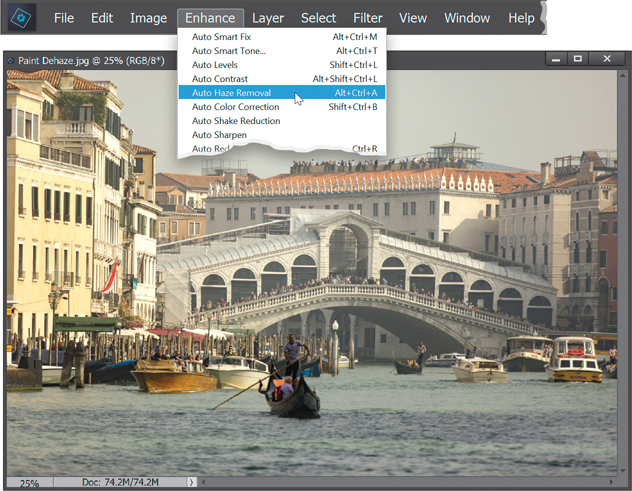
Step One:
There are two ways to remove haze from your photos: automatically and manually. We’ll start with the automatic way. Here, I’ve opened a photo I took in Venice on a hazy day. Instead of trying to add contrast ourselves to remove the haze, go under the Enhance menu and choose Auto Haze Removal.
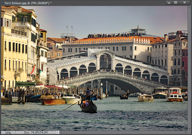
Step Two:
Elements then analyzes your photo and applies the amount of haze removal it thinks your photo needs. In this case, it did a pretty good job, but if you think it is not enough or is too much, press Ctrl-Z (Mac: Command-Z) to Undo and try it manually (we’ll cover that next).
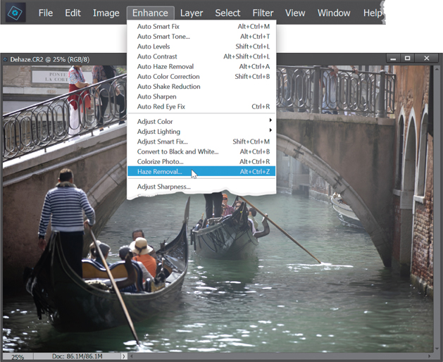
Step Three:
Open another hazy photo, like this one, where you want to manually apply haze removal. This time, go under the Enhance menu and choose Haze Removal (or press Ctrl-Alt-Z [Mac: Command-Option-Z]).
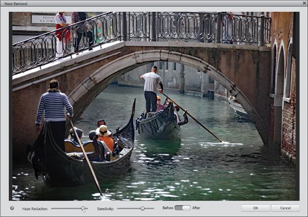
Step Four:
This opens the Haze Removal dialog. Elements will try to remove the haze, but you can click-and-drag the Haze Reduction and Sensitivity sliders back and forth until it looks good to you. To see the difference, simply click on the Before/After button at the bottom center of the dialog. Click OK when you’re done.
Opening Up Shadow Areas That Are Too Dark
One of the most common problems you’ll run into with your digital photos is that the shadow areas are too dark. Fortunately for you, since it is the most common problem, digital photo software like Elements has gotten really good at fixing this problem. Here’s how it’s done:
Step One:
Open the photo that needs to have its shadow areas opened up to reveal detail that was “lost in the shadows.”

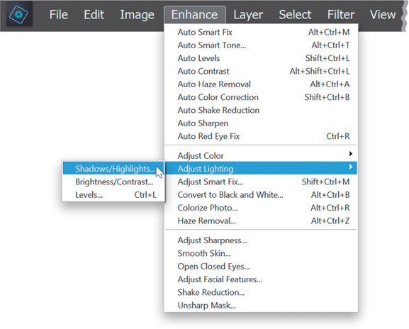
Step Two:
Once the photo is open, go under the Enhance menu, under Adjust Lighting, and choose Shadows/Highlights.

Step Three:
When the dialog appears, it already assumes you have a shadow problem (sadly, most people do but never admit it), so it automatically opens up the shadow areas in your document by 35% (you’ll see that the Lighten Shadows slider is at 35% by default [0% is no lightening of the shadows]). If you want to open up the shadow areas even more, drag the Lighten Shadows slider to the right. If the shadows appear to be opened too much with the default 35% increase, drag the slider to the left to a setting below 35%. If your image begins to look flat, drag the Midtone Contrast slider to the right. When the shadows look right, click OK. Your repair is complete. Here, I dragged the Lighten Shadows slider to 61% and the Midtone Contrast slider to +39%.


Fixing Areas That Are Too Bright
Although most of the lighting problems you’ll encounter are in the shadow areas of your photos, you’ll be surprised how many times there’s an area that is too bright (perhaps an area that’s lit with harsh, direct sunlight, or you exposed for the foreground but the background is now overexposed). Luckily, this is now an easy fix, too!
Step One:
Open the photo that has highlights that you want to tone down a bit. Note: If it’s an individual area (like the sun shining directly on your subject’s hair), you’ll want to press the L key to switch to the Lasso tool and put a loose selection around that area. Then go under the Select menu and choose Feather. For low-res, 72-ppi images, enter 2 pixels and click OK. For high-res, 300-ppi images, try 8 pixels.

Step Two:
With the photo open, go under the Enhance menu, under Adjust Lighting, and choose Shadows/Highlights.
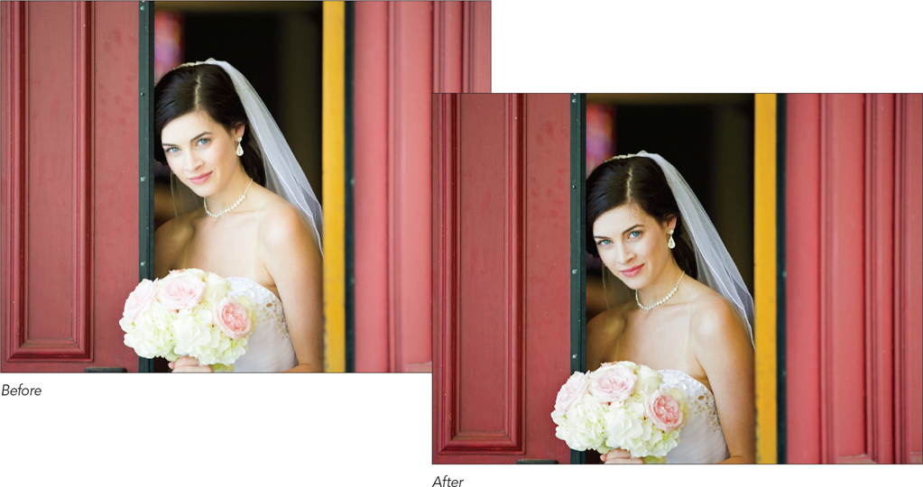
Step Three:
When the dialog appears, drag the Lighten Shadows slider to 0% and drag the Darken Highlights slider to the right, and as you do, the highlights will decrease, bringing back detail and balancing the overall tone of your (selected) highlights with the rest of your photo. (You’ll mainly see it in the dress, veil, and flowers here. They have more detail now.) Sometimes, when you make adjustments to the highlights (or shadows), you can lose some of the contrast in the midtone areas (they can become muddy or flat looking, or they can become over-saturated). If that happens, drag the Midtone Contrast slider (at the bottom of the dialog) to the right to increase the amount of midtone contrast, or drag to the left to reduce it. Then click OK. Note: If you made a selection, you’ll need to press Ctrl-D (Mac: Command-D) to Deselect when you’re finished.

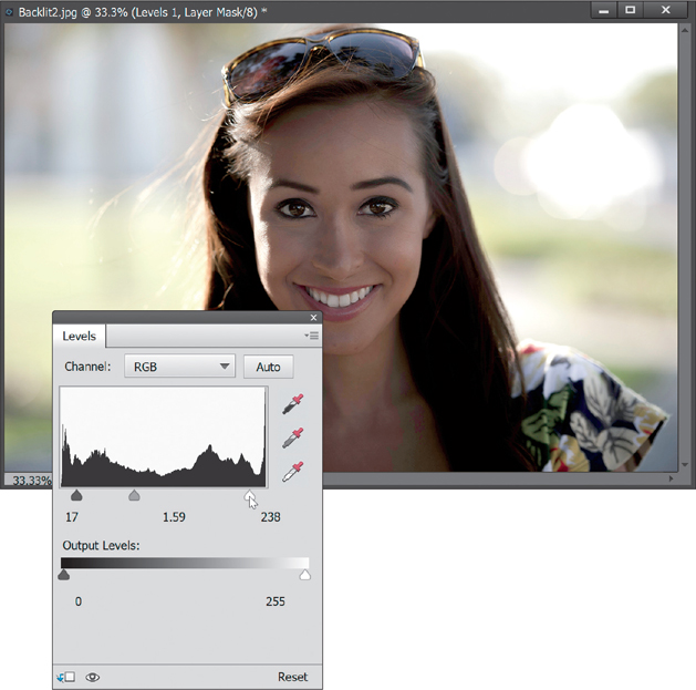
When Your Subject Is Too Dark
Sometimes your subject is too dark and blends into the background—maybe there just wasn’t enough light, or you forgot to use fill flash, or a host of other reasons that could have caused this. You could go and retake the photo if you realize it right away. However, you don’t always realize it immediately, so you’ll need to get Elements to help out. For those times, there’s a really clever way in Elements to essentially paint your light onto the subject after the fact.
Step One:
Open a photo where the subject(s) of the image appears too dark.
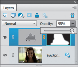
Step Two:
Click on the Create New Adjustment Layer icon at the top of the Layers palette (shown circled here), and choose Levels. This will add a Levels adjustment layer above your Background layer, and open the Levels adjustment palette.
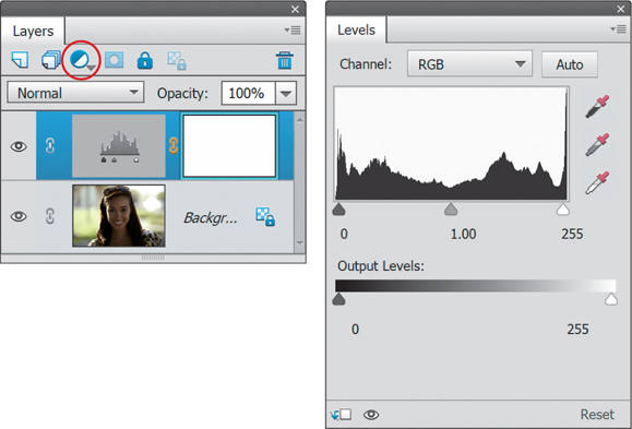
Step Three:
Drag the middle gray Input Levels slider (under the histogram) to the left until your subject(s) looks properly exposed. (Note: Don’t worry about how the background looks—it will probably become completely blown out, but you’ll fix that next—for now, just focus on making your subject look right.) If the midtones slider doesn’t bring out the subject enough, you may have to increase the highlights as well, so drag the far-right (white) Input Levels slider to the left to increase the highlights (as shown here). She was looking kinda washed out, so I also dragged the far-left (dark gray) Input Levels slider to the right just a bit to increase the shadows.
Step Four:
When your subject looks properly exposed, press D to set your Foreground color to white and your Background color to black. Then press Ctrl-Backspace (Mac: Command-Delete) to fill the layer mask with black and remove the brightening of the photo. Press B to switch to the Brush tool and click on the Brush thumbnail in the Tool Options Bar to open the Brush Picker, where you’ll choose a soft-edged brush. Now, you’ll paint (on the layer mask) over the areas of the image that need a fill flash with your newly created “Fill Flash” brush. The areas you paint over will appear lighter, because you’re “painting in” the lightening of your image on this layer.

Step Five:
Continue painting until it looks as if you had used a fill flash. If the effect appears too intense, just lower the opacity of the adjustment layer by dragging the Opacity slider to the left in the Layers palette (as shown here).
TIP: Try the Smart Brush Tool Instead
The Smart Brush tool (covered earlier in this chapter) has a Portrait preset called Lighten Skin Tones that also works pretty well in cases like this.

Automatic Red-Eye Removal
If you just finished shooting an indoor event with lots of flash and low light, chances are you’re going to have a ton of photos with red eyes. If you know this ahead of time, then the feature you’re about to see comes in very handy. You can set up Elements to automatically remove red eye as your photos are being imported into the Organizer. No interaction by you is needed. Just let Elements do its work and by the time you see your photos onscreen, you’ll never even know red eye existed.
Step One:
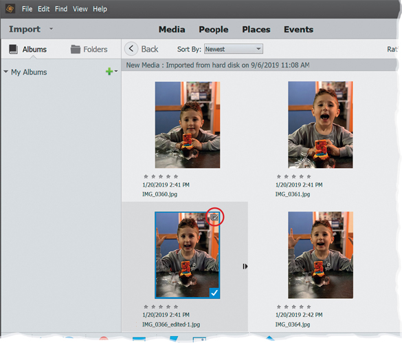
First, we’ll start with the fully automatic version, which you can use when you’re importing photos into the Organizer. Here’s how it works: When importing photos from your camera, the Elements Organizer – Photo Downloader dialog appears. On the right side of the dialog, in the Advanced Options section, there’s a checkbox for Automatically Fix Red Eyes (if your dialog doesn’t look like this, click on the Advanced Dialog button at the bottom). If you think some of the photos you’re about to import will have red eye, just turn on this checkbox (shown circled here), and then click the Get Media button to start the importing and the red-eye correction. If you’re importing photos already on your computer, you’ll have the same option in the Get Photos and Videos from Files and Folders dialog.
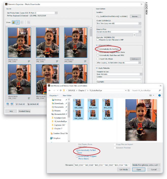
KIM DOTY
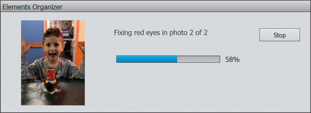
Step Two:
Once you click the Get Media button, the Elements Organizer dialog will appear. In this dialog, there’s a status bar indicating how many photos are being fixed. It also shows you a preview of each photo it’s importing.
Step Three:
Once the process is complete, it automatically groups the original with the fixed version in a Version Set (you’ll see an icon at the top right of the image thumbnail), so if you don’t like the fix (for whatever reason), you still have the original. You can see both versions of the file by Right-clicking on the photo (in the Organizer) and in the pop-up menu, under Version Set, choosing Expand Items in Version Set (or by just clicking on the right-facing arrow to the right of the image thumbnail). Note: To expand your version sets, your thumbnail view must be set to Details (found on the View menu).
Step Four:
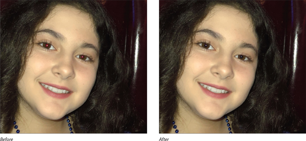
Here is one of the photos with red eye and with it automatically removed.

Step Five:
This really isn’t a step; it’s another way to get an auto red eye fix, and that’s by opening an image in the Editor, in Expert mode or Quick mode, and then going under the Enhance menu and choosing Auto Red Eye Fix. You can also use the keyboard shortcut Ctrl-R (Mac: Command-R). Either way, it senses where the red eye(s) is, removes it automatically, and life is good.

Instant Red-Eye Removal
When you use the flash on your digital point-and-shoot camera (or even the on-camera flash on a digital SLR), do you know what you’re holding? It’s called an A.R.E.M. (short for automated red-eye machine). Yep, that produces red eye like it’s going out of style. Studios typically don’t have this problem because of the equipment and positioning of the flashes, but sometimes you don’t have a choice—it’s either an on-camera flash or a really dark and blurry photo. In those cases, just accept the red eye. Become one with it and know that you can painlessly remove it with a couple of clicks in Elements.
Step One:
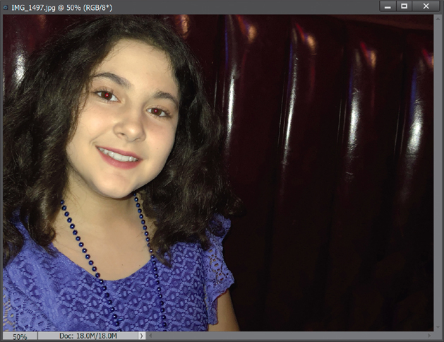
Open a photo where the subject has red eye.
KIM DOTY
Step Two:
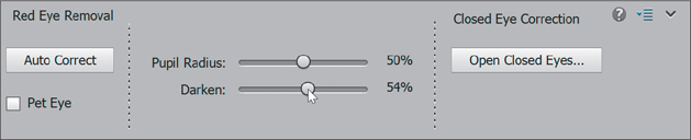
Press Z to switch to the Zoom tool (it looks like a magnifying glass in the Toolbox) and drag out a selection around the eyes (this zooms you in on the eyes). Now, press the letter Y to switch to the Eye tool (its Toolbox icon looks like an eye with a tiny crosshair cursor in the left corner). There are two different ways to use this tool: click or click-and-drag. We’ll start with the most precise, which is click. Take the Eye tool and click it once directly on the red area of the pupil. It will isolate the red in the pupil and replace it with a neutral color. Instead, you may now have “gray” eye, which doesn’t look spectacular, but it’s a heck of a lot better than red eye.

Step Three:
If the gray color that replaces the red seems too “gray,” you can adjust the darkness of the replacement color by adjusting the Darken amount in the Tool Options Bar. To get better results, try adjusting the Pupil Radius setting so that the area affected by the tool matches the size of the pupil. Now, on to two other ways to use this tool (for really quick red-eye fixes).
Step Four:
If you have a lot of photos to fix, you may opt for this quicker red-eye fix—just click-and-drag the Eye tool over the eye area (putting a square selection around the entire eye). The tool will determine where the red eye is within your selected area (your cursor will change to a timer), and it removes the red. Use this “drag” method on one eye at a time for the best results. Or, you can just try clicking the Auto Correct button in the Tool Options Bar. This works pretty good, too.

Fixing Problems Caused by Your Camera’s Lens
Elements has a feature called Correct Camera Distortion that’s made for problems that happen when we shoot with wide-angle lenses. We’ve all probably seen those super-wide photos that make it look like the buildings in a city are leaning over, or architecture where those perfect lines don’t look like they do in real life. Well, that’s exactly what this filter is for.
Step One:
Open your photo, and then go under the Filter menu and choose Correct Camera Distortion. There are a few problems that this filter fixes, like distortion if you have curved surfaces in the photo. It’s not quite as common as some of the other lens problems, and usually only rears its head if you’re shooting with a fisheye lens or a lens that is really wide. But if you do have any distortion, like maybe a curved horizon line, you can use the Remove Distortion slider to fix it (as shown here). The little icons at either end of the slider show you which way you need to drag.

TIP: Use the Grid as Your Guide
If you need extra help lining things up, there is a Show Grid checkbox at the bottom of the dialog, as seen in the image above. It really helps you see whether or not crooked lines exist in your photo. It does get annoying, though, so you may want to turn it off if you don’t need it.
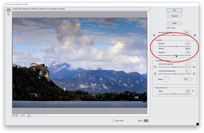
Step Two:
The two sliders in the Vignette section remove any edge darkening in the photo. Again, this doesn’t always happen and a lot of people actually like edge vignetting (it’s an effect we often add to a photo). But, if it bugs you, you can remove it here by dragging the Amount slider toward the right (toward Lighten), and then adjusting the Midpoint slider so it is removed farther toward the middle or closer to the edges.
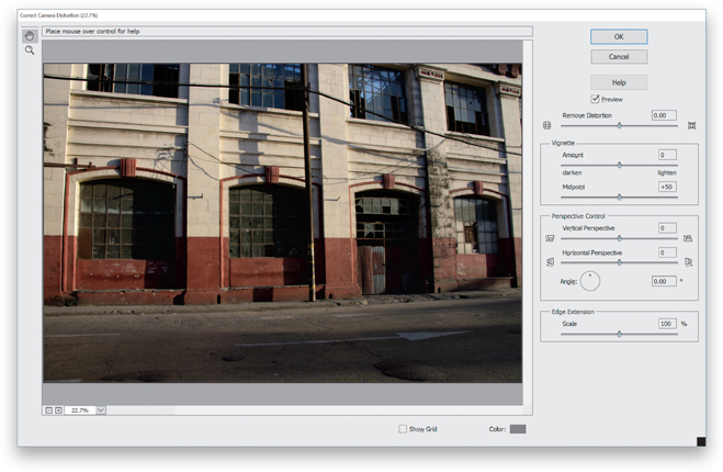
Step Three:
The next section is really where you’ll probably spend most of your time—Perspective Control. And, usually, it will be lens distortion issues, like we have in this image. See how the building is bulging outward and is squashed on its right side?
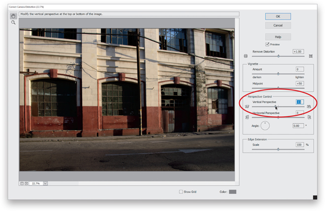
Step Four:
Start by dragging the Remove Distortion slider to the right to get rid of the bulging. Then, drag the Vertical Perspective slider to the left to help straighten it. Depending on what lens you used, you may have to drag pretty far. Keep in mind, though, that when you do this, you’re actually cropping away areas on the sides of your photo (Elements does this automatically). So if you go too far, you may cut out a key part of the photo. Personally, I always back off a little. If you’re not an architectural photographer selling your images to clients, then nobody who sees your photos will care about the slightly leaning buildings. Why? Because the same problem happens to the rest of the world and they’re used to it. :-)
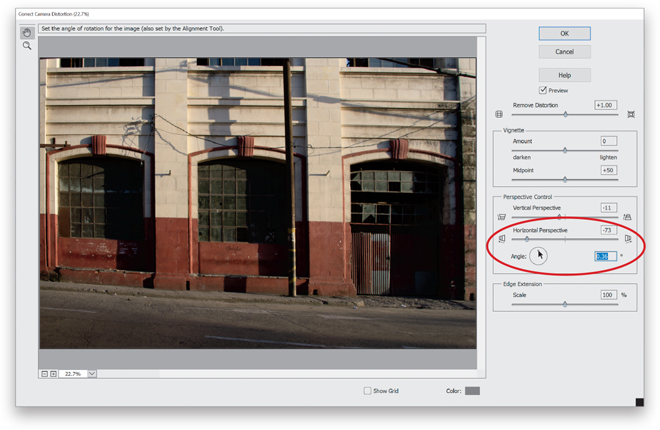
Step Five:
If you see any horizontal lines that aren’t straight, then you can tweak a couple more settings. First, there is a Horizontal Perspective slider that may work. Usually, though, I try to get the vertical lines straight, and then I go to the Angle setting and rotate the image slightly to fix things (you can turn the Show Grid checkbox back on to help line things up). Also, if the Angle control moves in too-large increments, then click-and-drag directly on the word Angle. Keep in mind that when you do this, you may have to go back and fix the vertical setting a little, too. You’ll find it’s a constant push-and-pull here, but I don’t mind a little bit of a tilt to the building so I’ll leave it. When you’re done, just click OK. You can see the before/after below.

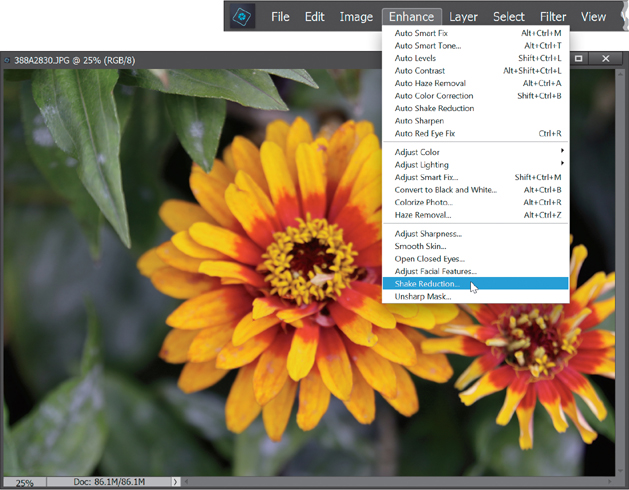
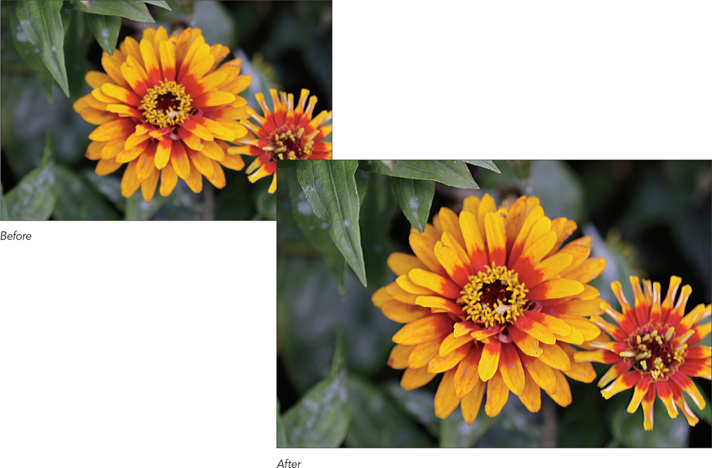
Saving Blurry Photos Using the Shake Reduction Filter
If you have a shot you took handheld in low light (so the blurriness was caused by shooting with a slow shutter speed), or if your blurry shot came from a long lens, you may be in luck using a filter called Shake Reduction. It can greatly reduce the blur caused by shots where your camera moved a bit (it’s not for shots where your subject is moving). This filter works best on images that don’t have a lot of noise, have a pretty decent overall exposure, and where you didn’t use flash. It doesn’t work on every image, but when it does, it’s pretty jaw-dropping.
Step One:
Here’s a shot I took handheld in low light; it’s a blurry mess, and this is exactly when you’d reach for the Shake Reduction filter (it’s found under the Enhance menu).
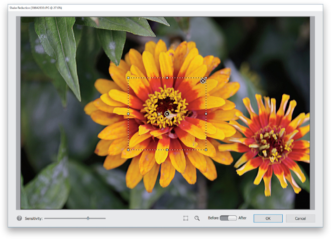
Step Two:
When the filter opens, it immediately starts analyzing the image, starting in the middle of that box (called a Shake Region) in the bottom-center of the preview area, and searching outward from there. You’ll see a little progress bar appear (as it’s thinking) inside that Shake Region. If you want to cancel the analyzing process, just click the little X in the top right of it. Once it’s done doing the math, it shows you its automated blur correction (seen here), where I have to say, on this image, it did a pretty good job. It’s not perfectly sharp, but the original was completely unusable. At least now, if I wanted to put it on Facebook or Twitter at web resolution, it would be totally passable, which I think is saying a lot. For most users, this is all you’ll need to do: open the filter, let it do its thing, and you’re done. However, if you’re a “tweaker,” then read on.

Step Three:
The filter automatically calculates what it thinks is the amount of camera shake based on how many pixels it thinks have moved, but if the auto method doesn’t look good, it may be that it either needs to affect more or fewer pixels. That’s what the Sensitivity slider is for. This slider controls how many pixels the filter affects (kind of like how the Tolerance slider for the Magic Wand tool determines how far out the tool selects). Dragging the slider to the left affects fewer pixels (so, if there’s just a little blurring, it may need to affect fewer pixels) and dragging to the right affects more pixels. Its own estimation is pretty darn good but, again, you can override it (in this case, I only moved it a little).

Step Four:
Now, what if you don’t like where it placed the Shake Region, and think there’s a better area for it to base its fix on? Just click on the dot in the center of the Shake Region and drag it where you want it. You can also click on one of the corner or side handles and resize the Shake Region (just like you would a Free Transform bounding box). Here, I made it into a larger square to include more of the flower.
Step Five:
So far, we’ve only used one area for Shake Reduction’s calculations, but what if there’s more than one place where you want the emphasis on camera shake reduction placed? Well, luckily, you can have multiple Shake Regions. To add a new Shake Region, either click-and-drag over the area you also want to emphasize, or click on the Add Another Shake Region icon below the center of the preview area, then move and resize it. Here, I added another Shake Region over the other flower.

Step Six:
To see a zoomed-in view of your image (if you want a better idea of how well Elements is fixing an area), click on the Show Magnifier Window icon (it looks like a magnifying glass) below the preview area or press the letter Q on your keyboard. A floating magnifier window appears on your image that you can click-and-drag wherever you like. You can zoom in tighter by clicking the zoom amount buttons at the top right of the window. Press Q again to close it. If you click-and-hold inside the magnifier window, it gives you a quick “before” view of your image (before you removed the camera shake). When you release your mouse button, it brings you back to the edited “after” image.

Step Seven:
If you’ve added a Shake Region and don’t like the effect or want to see how the image would look without it, just click on the dot in the center of the Shake Region and it will turn solid gray (as shown here, in the Shake Region on the right). This means you’ve turned off that Shake Region. If you decide you want to keep it, click on the dot again. If you want to delete the Shake Region, click the X in the top-right corner. You can see the changes to the entire image by clicking on the Before/After toggle button to the left of the OK button.

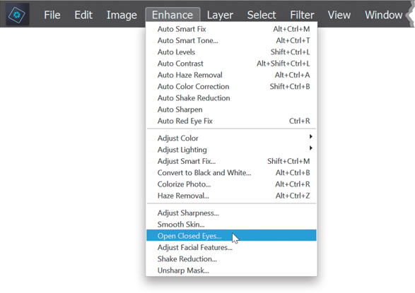
Opening Closed Eyes
I don’t know why it is, but when you’re shooting a portrait, you can almost bank on the fact that when your subject has just the right pose, in just the right light, with just the right expression, they blink at just the wrong time and now their eyes are closed. This is such a common problem that I’ve banned blinking at my portrait shoots altogether. However, even with this strict ban in place, they somehow seem to slip one past the goalie every so often and I wind up with an eyes-closed shot. Luckily, since Elements can fix this problem for you automatically, I’m now thinking of lifting my blinking ban.
Step One:
In the Editor, open a photo where your subject’s eyes are closed (as seen here, where my subject is clearly bored with our portrait shoot and may be fully asleep). Note: We used to fix this problem in Guided mode, using Photomerge Group Shot, but now that this feature has been added in Expert mode, we can do it right here much quicker and easier.

Step Two:
Go under the Enhance menu and choose Open Closed Eyes (as shown here).
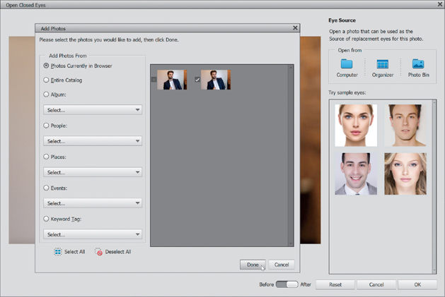
Step Three:
This brings up the Open Closed Eyes dialog, and in the Eye Source section in the top right, you can find an image from that same shoot (or perhaps even a different shoot of that same person, or in a worst-case scenario, find somebody else’s open eyes that look similar, but again, that’s a worst-case-scenario type of thing. Adobe knows it might happen, so they put four sample portraits in the Try Sample Eyes section to choose from if you’re really stuck). In my case, I was able to find another image from the same portrait session where my subject’s eyes were open (it was actually just the next photo after the one where his eyes were closed). I clicked on the Organizer button, which opened the Add Photos dialog, and kept the Photos Currently in Browser radio button selected to see the images I already had open. But, you can choose another Open From option to help you search through your image files to find a suitable set of eyes. You can also choose to open more than just one image, in case you want to try out a few different sets of eyes. When you find one, turn on the checkbox to its left in the dialog’s preview area (as seen here) and then click the Done button.
Step Four:
Now, any images you chose in the previous step will appear as thumbnails in the Click to Apply section. Here you can see the image I opened from the Organizer in there, and you can see my original closed-eyes image in the preview area. The blue circle around his face is letting you know that Elements is using facial recognition and it has recognized the area to be edited (the eyes) automatically. Now, click on one of those open-eyes images (well, in my case here, I only have one image to choose from) to apply the eyes from that image to the main image.

Step Five:
Once you click on that open-eyes thumbnail, you can see it’s already working its magic, and the opened eyes from that image have been applied to your closed-eyes image. It does a pretty amazing job at it, I might add. If you have other images you had opened in the Click to Apply section, you can click on them to see if any of them look better to you.

Step Six:
When you’re happy with how your open-eyes image looks, click the OK button and your final image appears in the Editor (as seen here). That’s all there is to it. Pretty sweet, eh?

Step Seven:
If you have a group shot, no problem. You’ll see a circle around each face that Elements recognizes using its built-in facial recognition. Just click on the person’s face whose eyes are closed, and the circle around their face will turn blue to let you know that’s the face you’ll be editing. Now, open another image to use where your subject’s eyes are open (I clicked on the Computer button this time and opened another group shot from that same shoot). It automatically recognizes that there are multiple faces in the image and it puts thumbnails of each person in the Click to Apply section (seen here).
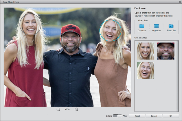
Step Eight:
Click on the thumbnail of the same person to use their open eyes in the shot (I guess you could choose someone else in the group shot and use their eyes instead, but ya know…that ain’t right!) and it fixes the eyes (as seen here). She’s laughing in the shot, so her eyes aren’t as fully open as when she would not be laughing, but if you look closely and compare it to the image in Step Seven, you’ll see that her eyes are at least open now.
