Chapter 6. Layers of Light
working with layers
I only found one movie that would work here, Layer Cake, and I used that one already in a previous edition of this book, so I can’t go to that well again, so I’m going with the wellnamed album Layers of Light by Nils Landgren and Esbjörn Svensson. I don’t always do this, but I took a few minutes to listen to some of their album. It’s rare that I find an album that doesn’t have the Explicit Lyrics warning on every single song, so that was a good start. I listened to the first few tracks in the iTunes Store, which included “Song from the Valley,” “Calling the Goats,” and “Kauk” (don’t pronounce that last one out loud), but by far their most popular song (according to iTunes anyway) is the first one. I gave it a listen, and I thought, as a fellow musician and piano player myself, that I might offer my own brief review here in the book, rather than on iTunes. It’s because I want to speak from the heart, and to the artists directly, which I feel is much more meaningful than speaking to the general public, who are simply wondering if they should plunk down the $8.99 for the album. I think it’s more personal to address the artists themselves. I picture us meeting at sunset in a small cafe in Sweden, where we would share a nice glass of 2010 Francois LeClerc Gevrey Chambertin Burgundy. With the crackling from a roaring fire, and the muted chatter from the other guests enjoying the sunset on a crisp fall night as our background, I would let Nils and Esbjörn know how much I feel they need to sell their gear. All of it. Immediately. The instruments, all their recording gear, that piano—every lick of it—and never play another note again. It was that bad. I want to let them know it sounded like a cat was walking across their piano, playing random notes, while someone boiled a live lobster nearby, as plates came crashing off the walls. I would tell them to destroy any tapes, copies of the albums, and any trace that might lead anyone back to their “music” because... well...okay, I can’t keep this up. Their album was actually pretty great. Really great, in fact, but you have to admit, I had you going there for a second. Rest assured, in reality, their songs are beautiful. Now, come and join me as I raise a glass to Nils and Esbjörn, as I toast the name of their third track so loudly in the cafe that the manager comes over and asks me to leave.
Layer Basics
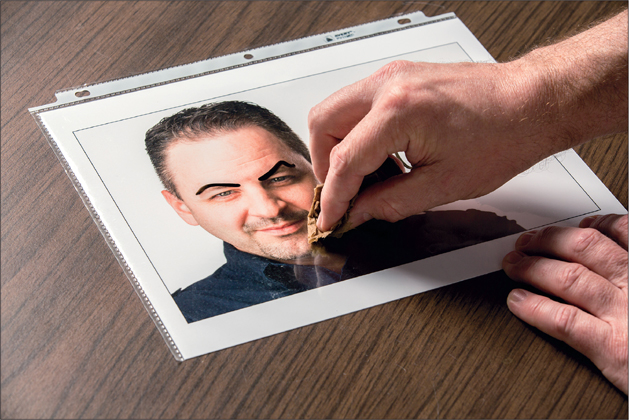
This tutorial is only meant for those of you who don’t really understand why you would use layers. If you already know why layers are important, then skip this and go straight to the next one, where we dive right into building things with layers. So, let’s talk a little bit about layers and how they’re the foundation of everything you do in Elements. Think of it this way: you’d never dream of drawing on a printed photograph with a black marker and then expect to go back and erase that drawing, would you? Well, that’s exactly what you’re doing if you don’t use layers in Elements and you work on the original image.
Step One:
Picture this: you’re holding a printed photo (we’re using one of Corey here, but it can be any printed photo). The point is, imagine you set that photo down on the desk, grabbed a black marker, and started drawing on it—fake eyebrows, a mustache, and maybe even a funny beard.

BRAD MOORE
Step Two:
Now, what would happen if you grabbed a damp towel and tried to erase what you just drew? One of two things would most likely happen: (a) you would start to erase the drawing marks, but you’d probably start to ruin the photo under them, as well, or (b) you wouldn’t be able to erase anything (if you used a permanent marker) and you’d be stuck with a pretty funny-looking photo.

BRAD MOORE
Step Three:
Let’s take this example one step further. Back up to the point where you have a photo that you want to draw over. This time, though, you also have a sheet of transparent plastic.

BRAD MOORE
Step Four:
Now when you place the photo down on the desk and get ready to draw, you place the transparent sheet of plastic over it. Just like before, imagine taking a black marker and drawing over the photo. However, unlike before, you’re not drawing directly on the photo itself—instead, you’re drawing on the transparent plastic. It looks the same, though, right?

BRAD MOORE
Step Five:
After you see the final result, you’ll probably decide that Corey looks much better without a mustache and beard. Once again, try erasing what you just drew with that damp cloth. Now it’s a breeze. Or, if you’re unhappy with the entire project, then just toss the transparent sheet of plastic into the garbage and start over again. By using that transparent sheet of plastic, you’ve gained a tremendous amount of flexibility.
BRAD MOORE
Step Six:
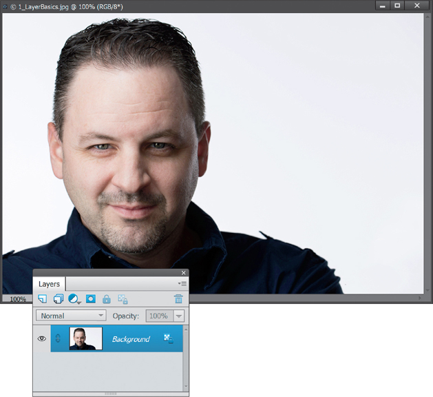
Okay, enough imagining. I promise we’ll actually be using Elements for the rest of the chapter. Go ahead and open a photo in the Editor by clicking on the File menu and choosing Open (or just press Ctrl-O [Mac: Command-O]). Navigate to the photo you want (or just use the photo of Corey), click on it, and click Open. Now you’ll see the photo, but more importantly, notice the Layers palette (if you don’t see it, just go under the Window menu and choose Layers). You should notice that there’s only one layer in the Layers palette—it’s called Background.
PETER HURLEY
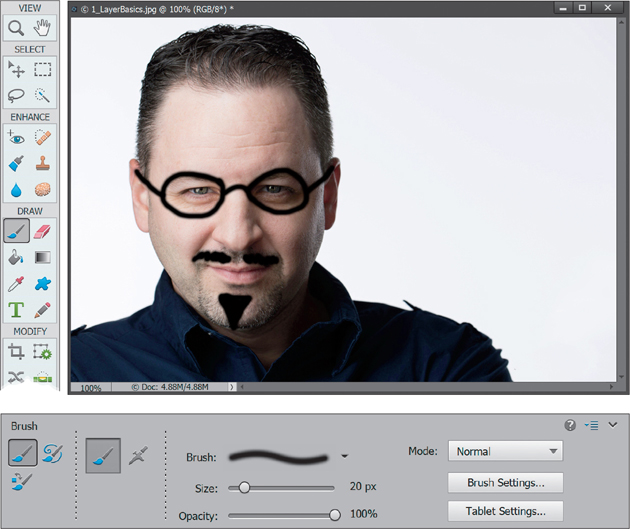
Step Seven:
Select the Brush tool from the Toolbox (or just press B), then click on the Brush thumbnail down in the Tool Options Bar to open the Brush Picker, and select a small, hard-edged brush. Press the letter D to set your Foreground color to black and start painting on the photo. Have at it—a funny face with glasses, a mustache, whatever you want!
Step Eight:
After you’re done painting on the photo, you’ll inevitably think it looked much better before the vandalism (sorry, I meant to say artwork). So, select the Eraser tool (E) from the Toolbox and try to erase those brush strokes away. See what happens? Not only do you erase away the black brush strokes, but the underlying photo is erased, as well (you see white here because my Background color is set to white). Not good, but as you can imagine, there’s a better way to do this. Go ahead and close this image, but make sure you don’t save the changes.

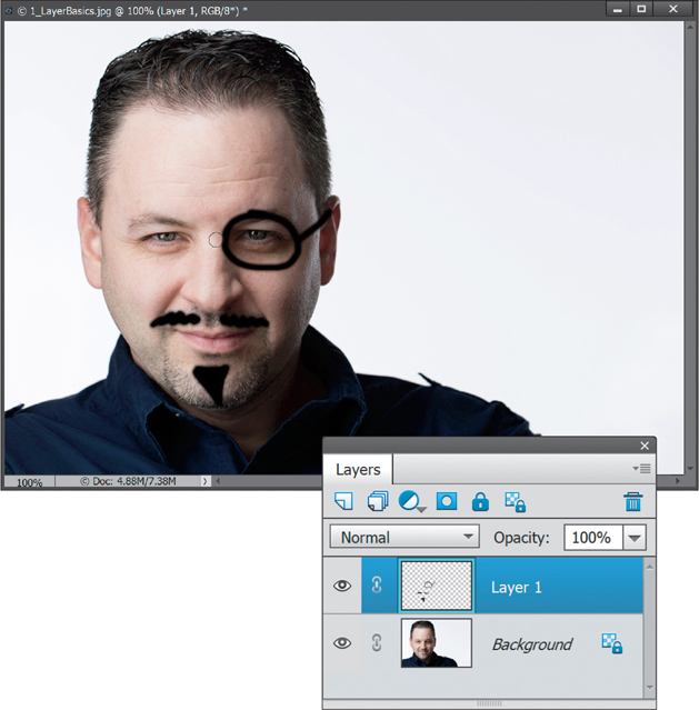
Step Nine:
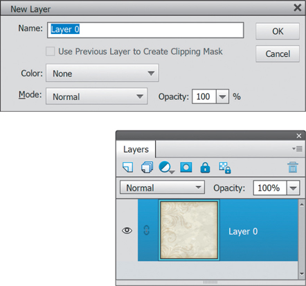
Let’s bring this example back around to the photo with the transparent sheet of plastic. Remember how well it worked to isolate our drawing on the transparent sheet of plastic? Well, layers give us the same benefit. Open a new image (or use the same one of Corey) and click on the Create a New Layer icon at the top of the Layers palette (circled in red here). You’ll see a new layer, named Layer 1, now appears on top of the Background layer. This new layer is just like that transparent sheet of plastic.

Step 10:
Press B to select the Brush tool again, and then click once on Layer 1 in the Layers palette to make sure it’s selected. (Note: You’ve got to click on a layer to select it in the Layers palette. If you don’t, then you may be working on the wrong layer. Always look for the layer that is highlighted in color. That is the current or active layer and the one that you’ll be editing.) Now, start painting on it just like before. Everything should look and act exactly the same.

Step 11:
Finally, to bring this example back around full circle, select the Eraser tool again and erase away any of those brush strokes. You’ll see that you can easily erase them without affecting the original photo. That’s because you created your changes on a separate, blank layer on top of the photo. You never touched the original photo, just the layer on top of it.
There you have it my friends—the totally basic introduction to layers. Don’t forget to stop by the website (mentioned in the book’s introduction) to download the images to follow along with. Now, roll your sleeves up and get ready—we’ve got some really cool stuff ahead.
Using Multiple Layers
The main idea behind this tutorial is to use multiple images and get used to the way layer stacking works. Working with one image is great, but you’ll get an even better understanding of layers when you start bringing multiple images into one Elements document. There are going to be plenty of times where you want to take a layer from one image and add it into another image you’re working on. A great example would be blending multiple photos together to create some type of collage.
Step One:
First off, open the photos that you’d like to combine into one image. Click on the File menu and choose Open. Then navigate to each photo and click Open. Here, we’re going to combine three images, so I’ve opened all three and can see them in my workspace. Note: To float all three image windows, press Ctrl-K (Mac: Command-K) to open the General Preferences, and turn on the Allow Floating Documents in Expert Mode checkbox. Then, in the Window menu, go under Images, and choose Float All in Windows.

©ADOBE STOCK/DETAUFIG
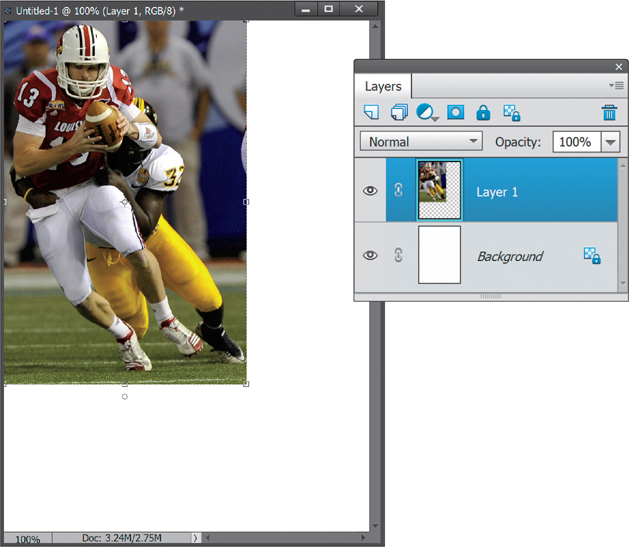
Step Two:
Now let’s create a brand new document to hold what we’re about to create. Go under the File menu, under New, and choose Blank File. For this example, we’re going to create a small football flyer. I want my new document to be 7" tall by 5" wide, so from the Document Type pop-up menu, choose Photo, then from the Size pop-up menu, choose Portrait, 5x7. Since we’re just displaying this onscreen, change the resolution to 180 ppi. If we were going to print this, we’d probably use something like 240 ppi. Click OK to create the new blank document.

Step Three:
We need to get the photos into the new blank document now. There are a couple ways to do this and each have their place. First, let’s try the one I use the most—copy-and-paste: Click on the photo of the football players to bring it to the front and make it the active document. Go under the Select menu and choose All to select the entire image. Copy this selection by going under the Edit menu and choosing Copy. Now, click over to the blank document and paste the copied photo into it by going under the Edit menu and choosing Paste. By the way, we’re not going to use the Edit menu for these anymore. The keyboard shortcuts for Copy and Paste are Ctrl-C (Mac: Command-C) and Ctrl-V (Mac: Command-V), respectively, and they work a lot faster.

Step Four:
Right after you paste the image, you should see a new layer called Layer 1 appear in the Layers palette right above the Background layer. By default, Elements automatically creates a new layer whenever you paste something into an image. This is a good thing, because it forces us to work on multiple layers. Now, select the Move tool from the Toolbox (or just press V), click on the pasted image, and drag it so the football players are in the top left of the document.
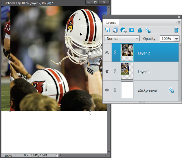
Step Five:
Let’s bring another photo into the new document. Before, we used copy-and-paste, but there’s another way: you can also click-and-drag images into other documents. Position the new document window and the other photo of the helmet so you can see both of them. Click once on the new photo to make it the active document, and with the Move tool, click-and-hold on the helmet photo, and drag it over into the new document (that’s why you need to be able to see both of them).

Step Six:
Once your cursor is over the new document, release the mouse button and this photo will appear as a new layer at the top of the layer stack. Use the Move tool to drag it so the helmet is toward the right side of the document. Close the original photos of the football players and the helmet. We don’t need them open anymore because we’ve copied their contents into layers in our new document. (The layers in our new image are not connected to their originals. No matter what you do here, you won’t affect the originals.)
TIP: Hide a Layer
You can hide a layer altogether by clicking on the little Eye icon to the left of the layer’s thumbnail in the Layers palette.
Step Seven:
Now we’re going to blend these layers together, so press-and-hold the Alt (Mac: Option) key and click on the Add Layer Mask icon at the top of the Layers palette. This hides the top helmet layer behind a black layer mask. (Note: We’re going to look at layer masks more later in this chapter.) Get the Brush tool (B) from the Toolbox, then in the Tool Options Bar, click on the Brush thumbnail to open the Brush Picker, and choose a soft-edged brush. Set the Size to something large (like 175 pixels).
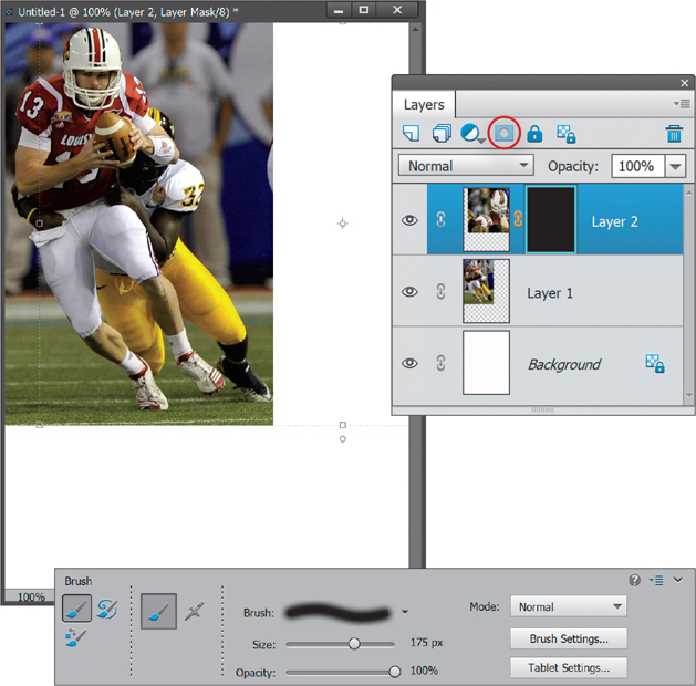
Step Eight:
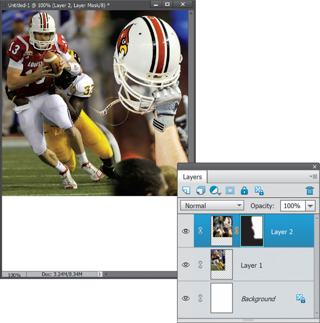
With your Foreground color set to white, and Layer 2’s layer mask active, start painting on the right side of the photo to reveal the image hidden by the mask (as shown here). This makes the two photos blend together. Press the Left Bracket key to decrease the size of your brush if you need to reveal a smaller area. And, if you make a mistake and reveal too much of the top layer, just press the X key to switch your Foreground color to black and paint away those areas to hide them again.
Step Nine:
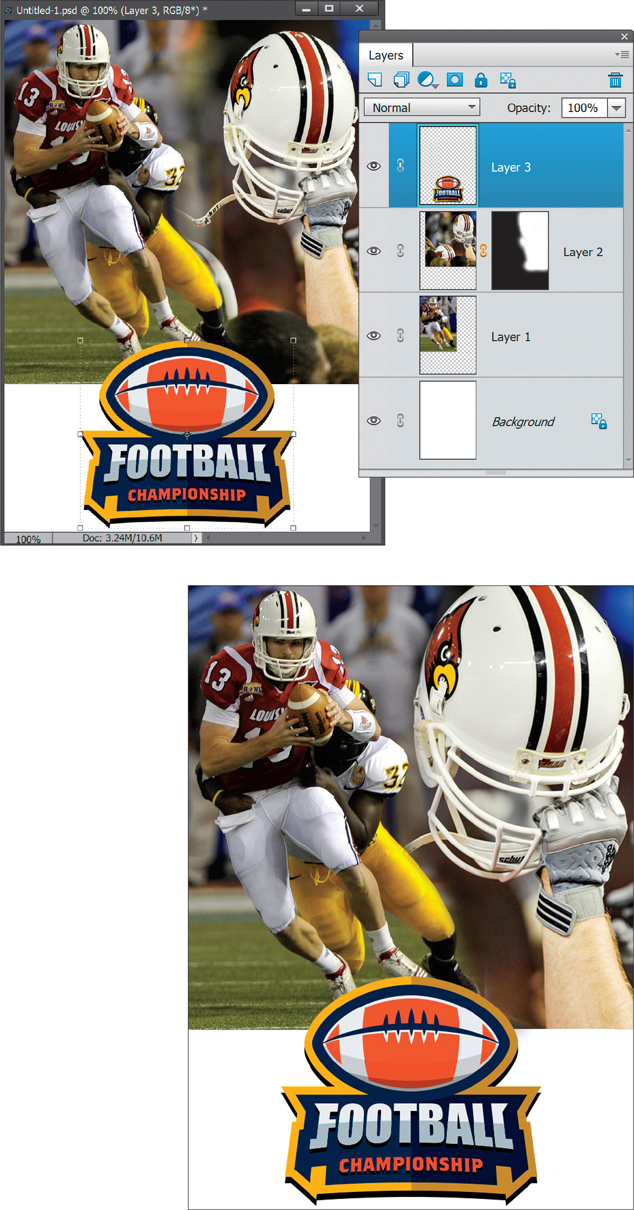
Finally, let’s bring in a finishing logo. Open the image that has the graphics and logo that you want to add. So far, we’ve been opening JPEG images and dragging them in, but you can just as easily open other types of files, too, including Photoshop (PSD) files. Here, I’ve got a PSD file that has a logo on its own layer.
Step 10:
Go back to your new image and make sure the top layer in your Layers palette (Layer 2) is active (this is important, because when you bring the logo over to this document, it will appear above whichever layer is active in your Layers palette. So, save time by clicking on the layer you want it to appear above). Now, click-and-drag (or copy-and-paste) the logo from the other image into your new image. It’ll appear at the very top of the layer stack, ready to be positioned where you need it. Here, I moved it to the bottom of the image. In the final image below, I ended up making the helmet image larger by using Free Transform (Ctrl-T [Mac: Command-T]). We’ll look at resizing layers this way more in this chapter.
Everything Else About Layers
If you think you know layers pretty well now, this tutorial will show you more. Trust me. We’re going to build a project—a big project, I know—and along the way, we’re going to see all the things in the Layers palette that help you work better. We’ll look at moving multiple layers at the same time, linking layers, resizing layers, aligning layers, merging and flattening, and even which features in the Layers palette are worth using and which ones actually hold you up. We’ll also see how to get around that dreaded locked Background layer, so you can actually do something with it. By the time you’re done with this one, you will be a layers pro.
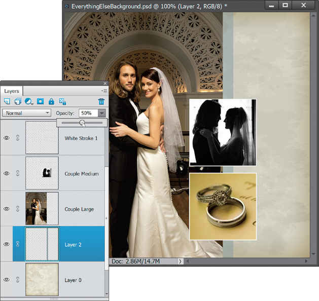
Step One:
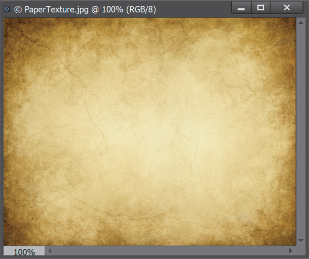
In this tutorial, we’re going to create a wedding album page. Start by opening the main image that will be the background of the page. Here, I’m using a texture I downloaded from Fotolia.com (which is now Adobe Stock). You can find a ton of them just by searching for the word “texture.”

©FOTOLIA/ARTSPACE
Step Two:
Before we move on, I’ve got to share this tip with you (you’re seriously going to love me for this one): Ever thought the thumbnails in the Layers palette were too small? Well, you can change them. Every palette has a flyout menu associated with it, and the Layers palette is no different. Click on the little icon with the down-facing arrow and four lines next to it at the top right of the palette. Choose Panel Options from this flyout menu, select the largest thumbnail option by clicking on its radio button in the dialog, and then click OK. Now, just sit back and revel in the seemingly inhuman-sized (not really) Layers palette thumbnails.

Step Three:
Notice how the name of the bottom layer in the Layers palette is always “Background”? If you haven’t already, you will undoubtedly come to hate that Background layer, because you simply can’t do certain things to it. You can’t move it with the Move tool and you can’t change its position in the layer stacking order, either. Well I’m here to tell you that you can change all that. Make the Background layer a regular layer by just double-clicking on the word Background and clicking OK in the New Layer dialog. Now it’s a regular layer. Sweet, huh?
Step Four:
Next, we’re going to spice up the background texture a little by adding some depth to it. Since the texture layer isn’t the Background layer anymore, we can actually add a layer below it. You could always click on the Create a New Layer icon at the top of the palette to create a new layer on top of the texture layer and then click-and-drag it beneath it, but there’s a shortcut: press-and-hold the Ctrl (Mac: Command) key and click on the Create a New Layer icon, and the new layer will automatically be added below the currently selected layer.
Step Five:
Click on the small Eye icon to the left of the texture layer’s thumbnail to hide that layer and, with the new blank layer you just added at the bottom active (highlighted), add a white-to-black radial gradient. To do this, select the Gradient tool from the Toolbox (G), click on the down-facing arrow to the right of the Gradient thumbnail in the Tool Options Bar, and choose the Black, White gradient from the Gradient Picker (the third gradient from the left in the top row). Now, click on the Radial Gradient icon (it’s the second icon to the right of the Mode pop-up menu), turn on the Reverse checkbox (also in the Tool Options Bar), then starting in the center of your document, just drag from left to right to add a gradient to the bottom layer.

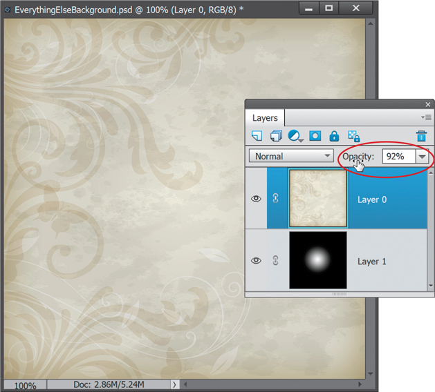
Step Six:
Next, we’re going to use the gradient to give our background texture some depth and dimension. Click on the texture layer’s Eye icon again to make it visible. We just added a gradient, but we don’t see it anymore because the texture layer now hides it. The Opacity setting, though, will let us blend the two together. So, click on the top texture layer to make it active and then move your cursor over the word “Opacity” in the top right of the Layers palette. You’ll see two little arrows appear on either side of the hand cursor. If you click-and-drag your cursor to the left, you’ll decrease the Opacity setting, allowing you to see through the texture to the gradient below. Here, I set the Opacity to 92%.
Step Seven:
Open the photos that are going to be included on the album page. (Note: This is easiest if you turn on the Allow Floating Documents in Expert Mode checkbox in Elements’ General Preferences. Then, you can click on the Layout icon at the bottom of the window and choose All Floating.) Here, I’m going to use three wedding photos. Let’s start with the vertical photo of the bride and groom. Position the photo so you can see both it and the texture (album) image. With the Move tool (V), click-and-hold on the photo, then drag it into your album image, and place it toward the left. As you can see, it happens to pretty much fit right in and is a good size for what we’re looking for. That’s not always the case, though, so read on to the next step.

Step Eight:
Let’s move on to the next photo. I know that I want two small square photos toward the right of this layout, and just by looking at this image of the bride and groom, you can tell it’s not going to work, because it’s not square. So, instead of bringing the entire photo in, let’s just take a selection. Grab the Rectangular Marquee tool (M), press-and-hold the Shift key (which keeps your selection square), and make a square selection over the area you want (if it’s not in the right place at first, simply click-and-drag inside the selection to move it). Now, press Ctrl-C (Mac: Command-C) to Copy and then click on the album image and press Ctrl-V (Mac: Command-V) to Paste that selected area into the album layout. You’ll see only the selected part of the photo is placed and it’s on its own layer.

Step Nine:
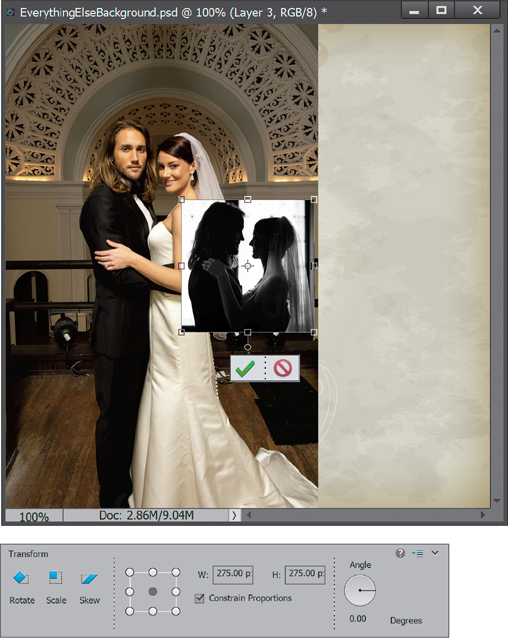
We got lucky with the first photo of the bride and groom—it was the exact size we wanted. But, I’ll be the first to tell you that it will never happen again. More often than not, you’ll have to resize the images you add. In this case, the second photo of the couple is still too big. The best way to resize precisely is to press Ctrl-T (Mac: Command-T) to go into Free Transform, click on the Scale icon near the left end of the Tool Options Bar, and then enter the exact width and height settings you want. In this case, enter 275 px for the W(idth) setting and 275 px for the H(eight) setting. Don’t forget to actually type the “px” (for pixels) after 275 or bad things will happen. Press Enter (Mac: Return) when you’re done.
Step 10:
Now we need to bring the third photo into the wedding album image. Make a square selection of only the part of the photo where you can see the couple’s rings, then copy-and-paste the selection into the wedding album image, just like we did with the last one. Resize it just like in the previous step, so it’s exactly 275x275 px in size. Finally, use the Move tool to position it somewhere below the other one (no need to be exact, because we’ll take care of aligning them in the next step).

Step 11:
As you can see, the two small photos we just added to the album image probably aren’t perfectly aligned. We could try to precisely align each one of them with the Move tool, but it’s way too hard to really be exact when you’re just eyeballing it. Instead, let’s use the Align Layers options. First, we need to select the layers we want to align in the Layers palette. So, click on one of the small photo layers in the Layers palette and then Ctrl-click (Mac: Command-click) on the other small photo layer to select multiple layers. You’ll be able to tell that both are selected because they’ll be highlighted with a color (the layers not selected will not be highlighted).

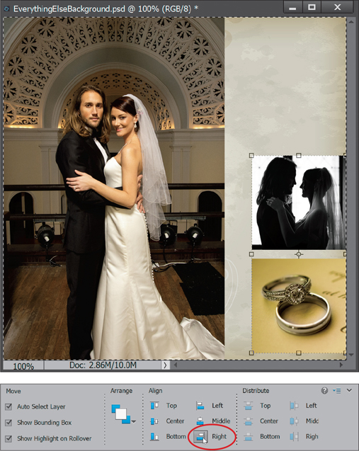
Step 12:
Now, you need to tell Elements where to align the layers. First, press Ctrl-A (Mac: Command-A) to select the whole canvas, so Elements sees a selection edge around the entire album image. Then, with the Move tool still selected, you’ll see some Align choices in the middle of the Tool Options Bar. Click on the Right icon to align the selected layers to the right side of the selection. This pushes the two photos up against the right edge of the album image. It’s automatic, so there’s no manual effort required on your part.
Step 13:
Remember how you selected the two photo layers back in Step 11? Let’s say you decide you want to move those two smaller photos somewhere else in the album image. Since they’re both still selected, there’s a temporary link between the two layers and any moves you make will affect both at the same time. Press Ctrl-D (Mac: Command-D) to remove your selection from the entire image, and then, using the Move tool, click-and-drag one of the photos toward the left, so it’s not right up against the right edge of the image (I like this placement better actually). The other photo will follow right along. When you’re done, just click on one of the layers in the Layers palette to deselect the other.

Step 14:
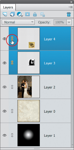
If you want to create a more permanent connection between the two layers, so that every time you move one of them, the other follows, Elements lets you create a link between them that lasts even after you click on another layer to do something else. To create this link, select both of the smaller photo layers, just like we did before. Then, click on the Link Layers icon at the left of either layer (next to the Eye icon and circled here). Now, click on one of the layers, so only that one is active, and then use the Move tool to move one photo, and both of them will move together. With this permanent link, from now on, you’ll only have to select one layer to move and the other(s) will follow.
Step 15:
Let’s take a break from copying, pasting, and moving for a minute. As your Layers palette starts growing, you should name your layers to keep things organized. Just double-click on a layer name in the Layers palette, the name will highlight, and you can then type a new name (as seen here for the three photo layers).

TIP: Keep Your Layer Stack Organized
To help organize your layer stack and keep it uncluttered, you can create layer groups. Just Ctrl-click (Mac: Command-click) on the layers you want to put into a group, and then click on the Create a New Group icon at the top of the Layers palette. You can also add color labels to your layers, by Right-clicking on a layer and choosing a color from the bottom of the pop-up menu.
Step 16:
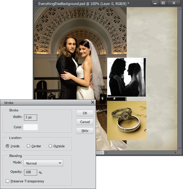
Now, back to our album page. Let’s add a white stroke around the small photos. Click on the Couple Medium layer in the Layers palette to make it the active layer, then press-and-hold the Ctrl (Mac: Command) key and click on the layer’s thumbnail. This puts a selection around whatever is on that layer. Click on the Create a New Layer icon at the top of the palette to create a new layer on top of this layer. From the Edit menu, choose Stroke (Outline) Selection. Set the Width to 3 px, the Color to white (click on the swatch), the Location to Inside, and click OK. Press Ctrl-D (Mac: Command-D) to Deselect and you’ll see a white stroke around the photo. Go ahead and rename this stroke layer something descriptive, too.
Step 17:
Let’s add the same stroke to the other square photo. Repeat the same steps: click on the layer, Ctrl-click on the layer thumbnail, add a new layer, then add your stroke. When the Stroke dialog opens, it should already have the correct settings, so just click OK. Now, deselect and rename your layer.

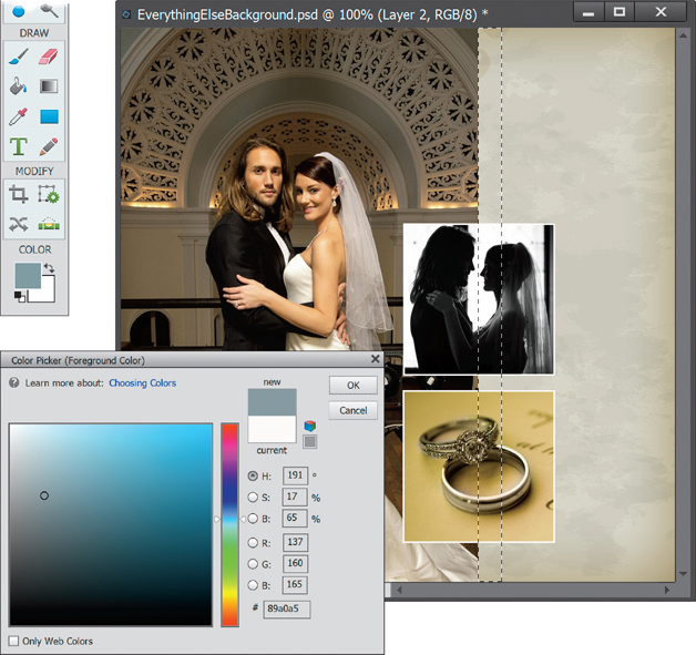
Step 18:
Next, let’s add some simple colored rectangles to the background. Click on the background texture layer in the Layers palette to make it the active layer, then click on the Create a New Layer icon to add a new layer above the background texture, but below the large photo of the couple. Using the Rectangular Marquee tool, make a tall, thin selection to the right of the main couple photo. Click on the Foreground color swatch at the bottom of the Toolbox to open the Color Picker and set the color to R: 137, G: 160, B: 165. Click OK to close the Color Picker.
Step 19:
Now, press Alt-Backspace (Mac: Option- Delete) to fill that selection with the Foreground color, and then press Ctrl-D (Mac: Command-D) to Deselect. Since the color appears a little obtrusive as it is, let’s make it a bit more subtle. At the top right of the Layers palette, reduce the Opacity setting of this layer to 50% (we did this earlier in the project with the texture background for the gradient layer we added below it).
Step 20:
Click on the Create a New Layer icon again to add one more new layer on top of the current rectangle layer. Then, create another thin rectangular selection (thinner than the first one and to its left) with the Rectangular Marquee tool. Press D, then X to set your Foreground color to white, and press Alt-Backspace (Mac: Option-Delete) to fill that selection with white. Deselect, reduce the layer’s Opacity to 70%, and now you’ve got some extra color and a nice way to separate that large photo from the background.

Step 21:
Another task to do often is delete any layers that aren’t needed or that you just don’t like. For example, let’s say you don’t like the teal rectangle you added a few steps back. You could click on the little Eye icon to the left of the layer thumbnail to turn it off, but that still leaves the layer. To delete it permanently, click on that layer and drag it onto the Trash icon at the top right of the Layers palette (as shown here). Once you know you want something removed, deleting layers is a good habit to get into as you’re working, because it helps keep file size to a minimum and Elements running faster overall. Plus, it cuts down on clutter in the Layers palette. I kinda like it with the teal rectangle, so I’m not going to delete it, but I wanted to show you how it’s done.

Step 22:
Finally, I’d merge any layers that don’t need to stay editable. You see, every layer you have in the Layers palette takes up space in your file and your computer’s memory. Plus, too many layers are just plain hard to deal with. Who wants an image with 20, 30, or even more layers in it? So I merge (flatten) layers often when I know I don’t need to change something. A great example here would be the small square photos and their stroke layers. To merge them, select both layers first (as seen here). Then from the Layers palette’s flyout menu, choose Merge Layers. This squishes both layers into one. You won’t be able to edit the stroke independently of the photo it was around anymore, but you probably don’t care at this point (if you do care, just create a layer group for them instead—see the Tip a few pages back). That’s it! The über layers project is complete. The only thing left to do is add some type with the Horizontal Type tool, and then save the image as a PSD file, so you can reopen it later and still edit all of the layers if you need to.

Layer Blend Modes for Photographers
Blending layers is the next level of merging your images together. There are a lot of ways to blend layers together that go beyond simply changing the opacity. One of those ways is called blend modes. It’s like opacity on steroids, and the effects you can get with blend modes are unlike any other effects you’ll find in Elements. That said, I gotta tell ya, there are a lot of blend modes in Elements. My goal here is to show you only those you really need to know about. Most of the blend modes will probably never get used, so we’re just going to concentrate on the ones that you’re going to use often.
Step One:
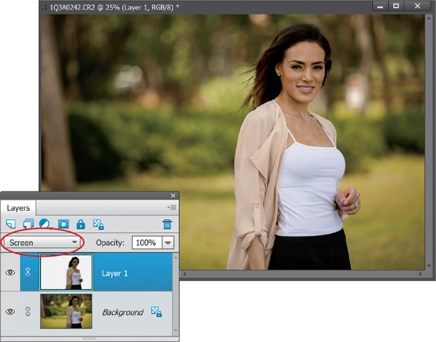
One of the first ways you’ll see blend modes can help with photos is when you have a photo with a dark or underexposed area. In our example here, we have a really common problem with portraits taken outdoors. Sometimes the face (or the entire person, in this case) in a portrait will show up a little darker than we’d like. But the Screen blend mode comes in really handy and can fix that in no time flat.

Step Two:
Grab the Lasso tool (L) or the Quick Selection tool (A) and make a quick selection of our model. Press Ctrl-J (Mac: Command-J) to duplicate the selection onto its own layer, so now you’ll have two layers in the Layers palette. Then, at the top left of the palette, change the blend mode of the top layer to Screen. Because Screen is a lightening blend mode, it has the effect of lightening everything on that layer.
TIP: Use a Shortcut for Screen
You can use the keyboard shortcut Alt-Shift-S (Mac: Option-Shift-S) to switch to the Screen blend mode quickly.
Step Three:
Now, if your subject looks too bright for their surroundings, you could stop here if you wanted a good prank to play on a friend, but let’s assume you want to move on. One option is to get the Eraser tool (E), then click on the Brush thumbnail in the Tool Options Bar, and choose a small, soft-edged brush from the Brush Picker. Then, just click-and-drag to erase away any areas that don’t need the lightening effect (any really bright spots on them). Also, try reducing the opacity of the layer to help it blend in better with the original layer below it, as I did here, but I only lowered it to 97%.

Step Four:
Another problem that blend modes can help with is when you have a bright, faded area in a photo. Here I’ve opened a travel photo where the sky looks good, but the mountains and foreground are a bit too bright and flat-looking. The first step is to duplicate the Background layer by pressing Ctrl-J (Mac: Command-J).

Step Five:
Change the blend mode of the duplicate layer to Multiply. Since Multiply is a darkening blend mode, this darkens everything in the photo. It may look just fine like that, so feel free to leave it alone. However, in this photo, it made the sky way too dark. So, get the Quick Selection Tool (press A until you have it) and paint over the sky to select it.
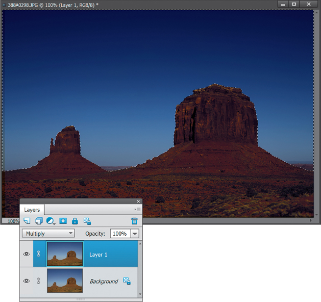
Step Six:
Press the Backspace (Mac: Delete) key to remove (or erase) the sky, then press Ctrl-D (Mac: Command-D) to Deselect. The darkening effect of the Multiply blend mode should now only affect the mountains and foreground, so they have a little more punch to them. Also, feel free to reduce the opacity of that top layer if the effect is too dark. Here, I reduced it to 60%.

Step Seven:
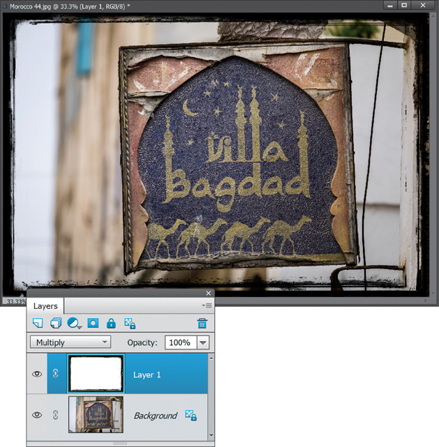
Here’s another example of what Multiply can be used for: Open one of those cool, grungy black frame images, and you’ll find most of them have white in the middle where a photo is supposed to go. To start, press Ctrl-A (Mac: Command-A) to put a selection around the entire frame image.

Step Eight:
Press Ctrl-C (Mac: Command-C) to Copy the frame, then open another image and press Ctrl-V (Mac: Command-V) to Paste it into that image. Press Ctrl-T (Mac: Command-T) if you need to resize it to fit the photo. Then, change the blend mode of the frame layer to Multiply, and Photoshop will automatically drop out the white and leave you with just the black frame around the photo. No selections, no nuthin’.
Step Nine:
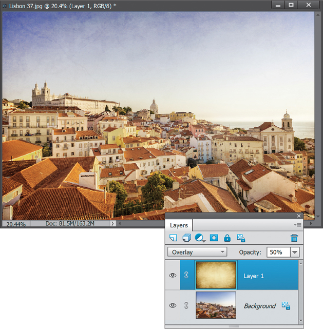
As you’ll see in Chapter 10, when you have a photo with a bright sky and a dark foreground, you can use a gradient to act like a graduated neutral density gradient filter. You simply change the gradient layer’s blend mode to Overlay or Soft Light. Well, here’s a totally different example to improve your photos with the Overlay or Soft Light blend mode: Open a photo and a texture image. It could be something you’ve downloaded or created in Elements, or you could just take a photo of a wall. Copy-and-paste the texture image into the photo. Change the texture layer to Overlay (or Soft Light), lower the Opacity (if needed), and it gives the photo a very rugged and faded style, as seen below.
©ISTOCK/DAVID M. SCHRADER
The Power of Layer Masks
One of the things that Elements didn’t have in the beginning that the full version of Photoshop did was layer masks. It was always one of the big features that people liked more about the full version of Photoshop. Well, after a while, Adobe decided to add layer masks to Elements. Yup, the same layer masks as Photoshop. These things are a huge help when it comes to working on your photos. Whether it’s retouching, color correction, sharpening—you name it—layer masks play a key role. We’ll give you a quick introduction here, but you’ll see them pop up plenty of times throughout the book.
Step One:
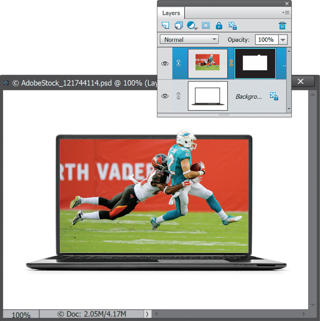
In order to really take advantage of layer masks, you need to have at least two layers. So, go ahead and open two images that you’d like to combine in some way. In this example, we’re going to put the photo of the football players into the computer screen and make it look like one of the players is coming out of the screen.
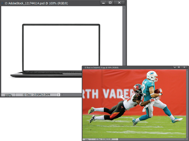
©ADOBESTOCK/DENNIS ROZHNOVSKY
Step Two:
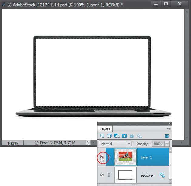
Click on the photo of the players, press Ctrl-A (Mac: Command-A) to Select All, then press Ctrl-C (Mac: Command-C) to copy the photo. Switch over to the photo of the laptop, and press Ctrl-V (Mac: Command-V) to paste the players on top of the laptop screen on a separate layer. Press Ctrl-T (Mac: Command-T) to go into Free Transform (if you can’t see the edges of the photo or the control handles, press Ctrl-0 [zero; Mac: Command-0]). With the Constrain Proportions checkbox turned on in the Tool Options Bar, grab a corner handle and drag inward to make the image smaller, then move it so the bottom-right corner of the photo meets the white space at the bottom-right corner of the screen. Once you’ve got the players positioned like you see here, press Enter (Mac: Return) to lock in your changes, and close the original photo of them, so you’re left with only the document with two layers.

Step Three:
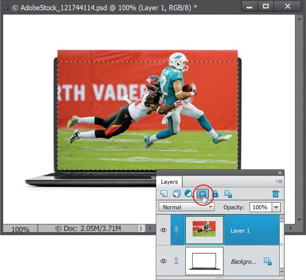
There are two main ways to work with layer masks: selections and brushes. Let’s look at selections first. Hide the top layer (the players) by clicking on the Eye icon to the left of it in the Layers palette (it’s circled here in red), so you only see the laptop. Now, use the Rectangular Marquee tool (M) to make a selection of the white area inside the laptop screen.
Step Four:
Unhide the photo of the players by clicking on the Eye icon again, and just make sure that layer is active (highlighted). When working with layer masks, a selection tells Elements that you want to keep that portion of a layer and hide the rest of it. Notice I said hide, not delete. Give it a try. Click on the Add Layer Mask icon at the top of the Layers palette (shown circled here) and see what happens.
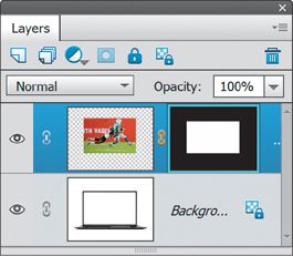
Step Five:
You should now see only the rectangular area (that was previously selected) of the photo. Again, when you have a selection active, a layer mask tells Elements that you want to keep the selected area visible and hide everything that isn’t selected. In our case, a portion of the layer with the players on it was selected, so that stays visible. But part of the helmet was hidden (again, not deleted—just hidden for now).

Step Six:
Now take a look at the layer itself. Notice it has a black-and-white thumbnail next to the image thumbnail? That’s the layer mask. The layer mask is the same size as the layer. The white part of the thumbnail corresponds to the rectangular portion of the photo (the players) that we see. The black part corresponds to the area we don’t see. In other words, white shows you whatever is on the layer that the layer mask is attached to and black hides that part of the layer and shows you whatever is below it in the layer stack (in this case, the laptop).
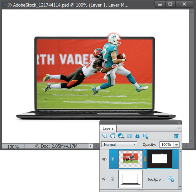
Step Seven:
The biggest advantage of layer masks is that nothing is permanent. Even though it looks like we’ve deleted the top of the image, it’s still there. Go ahead and look at the layer thumbnail (circled here) and you’ll see it looks exactly the same. Nothing was deleted—just hidden. Layer masks are non-destructive and always give you a way out. Just to demonstrate really quickly, click once on the layer mask thumbnail (not the layer thumbnail) to select it. Then go under the Edit menu and choose Fill Layer. Set the Use pop-up menu to White and click OK to fill the whole mask with white again. Things are back to normal, as if nothing ever happened.

Step Eight:
Press Ctrl-Z (Mac: Command-Z) to undo that last step, so the black-and-white layer mask is back again. Let’s take a look at the other main way to work with layer masks: adjusting them after the fact with brushes. In our example, the player’s helmet is cut off. We can fine-tune the mask to show it, though. Remember, layer masks just care about one thing: black and white. It doesn’t matter how black and white get there. Earlier, we did it with a selection, but you can also use a brush to get the ultimate flexibility and control over the mask. Click on the mask thumbnail, then get the Brush tool (B), click on the Brush thumbnail in the Tool Options Bar and choose a small, soft-edged brush from the Brush Picker. Press D to set your Foreground color to white (remember, white allows us to keep whatever is on this layer visible) and paint over the top of the helmet. You’ll see it reappear, because it wasn’t permanently gone in the first place.
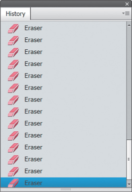
Step Nine:
Why all the trouble? If you’re asking yourself, why not just erase away the unwanted areas instead of adding a layer mask, then read on. If not, skip to the next step. So, what would happen if we erased away the top of the image with the Eraser tool, and then we erased some more background? At some point, maybe we’d erase away part of the player’s helmet. But then we’d continue to erase away the background until we got to the point where we were done, and we’d realize we’d erased some of the helmet. Well, each one of those clicks of the mouse when we erase is a history state. They build up, so we’d have to undo all the work we did to get back to the point where we inadvertently erased his head. Needless to say, that’d be a big pain in the neck. Plus, since layer masks are part of the layer, we can save our image as a PSD file and open it again tomorrow (or at some later date) and change it. Layer masks allow us to be non-destructive in our editing, so we can always come back and change something later if we need to.
Step 10:
You can see in Step Eight that I went a little overboard with the white brush and brought back parts of the background, too. No sweat. Remember that black and white thing? We were painting with white to bring areas back into view, so if we switch to black, the opposite will happen. Press the letter X on your keyboard to switch your Foreground color to black. Then, press Ctrl-+ (Mac: Command-+) to zoom in if you need to, and paint on the mask again to hide those areas and reveal the laptop and white background behind the helmet.

Final