3
Legibility
Typographic legibility is widely misunderstood and often neglected by designers. Yet it is a subject that requires careful study and constant evaluation. Legibility is achieved by controlling the qualities and attributes inherent in typography that make type readable. These attributes make it possible for a reader to comprehend typographic forms with the least amount of difficulty.
Typographers and designers have a definite responsibility to their readers to communicate as clearly and appropriately as possible. This responsibility is suggested by Henry David Thoreau in Walden: “A written word is the choicest of relics. It is something at once more intimate with us and more universal than any other work of art.”
BASIC PRINCIPLES OF LEGIBILITY
As signs representing sounds in spoken language, letters are basic to legible typography. The primary purpose of a letterform is to convey a recognizable meaning to the mind. Therefore, letterforms must be designed with clarity, each being distinct within the alphabet. The contrast among individual characters makes it possible for the reader to decipher written information without confusion.
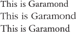
The most legible typefaces are those timeless examples characterized by three qualities upon which legibility is dependent: contrast, simplicity, and proportion. These typefaces exemplify beautiful and functional letterforms. A close look at typefaces such as Garamond, Baskerville, and Bodoni will reveal why their forms are as vital now as when they were first designed. (See the type specimens in Chapter 13.) The use of well-designed typefaces, however, is no guarantee that typography will be legible. Effective typography depends upon such factors as the communications context and the subtle adjustment of letterforms and their spatial relationships, each of which may have an effect upon how easily typography is read. Making type legible is a masterful achievement, requiring a process of intelligent decision making.
In the strictest sense, legible typography is a means of communicating information objectively. However, typographic designers sometimes bend the traditional criterion of legibility for expressive purposes. Designers, with their instinctive curiosity, have experimented with typography, playing with forms, imposing new meaning, and changing the standards of typographic communication. Innovative typography poses original questions, challenges edicts of the past, and redefines the concepts of legibility and functionality.
This chapter approaches legibility as an art of spatial synthesis. As an art, it is not absolute. Therefore, information derived from legibility research should be considered only a guideline. The knowledge designers have of legibility is based upon a legacy of typographic history and a keen awareness of the visible world. This knowledge will continually evolve, creating new standards for readability and functional typography.
Distinguishing characteristics of letters
The alphabet consists of twenty-six letters, each of which has evolved over the centuries to a unique place within this system of signs. This evolution has occurred gradually. It is no accident that the individual shapes of letterforms have developed out of a need to improve the communication process. As the alphabet has evolved, it has become a flexible system of signs in which all letters are distinct, yet all work together harmoniously as visible language.
In spite of the innumerable variations of size, proportion, weight, and elaboration in letterform design, the basic structure of each letterform must remain the same. For example, the capital A always consists of two oblique strokes joined at the top and connected by a horizontal stroke at their midsection. Sufficient contrast must exist between the letters in a font so that they can be easily distinguished (Fig. 3-1).
![]()
3-1 As the top stroke of the letter a rises to become the ascender of the d, intermediate forms are not easily deciphered by the reader.
Letters can be clustered into four groups, according to their contrasting properties. These are letterforms with strokes that are vertical, curved, a combination of vertical and curved, or oblique (Fig. 3-2). From these groupings, one notices not only that letters are similar in many ways but also that there are some important differences. Obviously, letters with similar characteristics are more likely to be confused, while letters with distinct qualities provide contrast within a word. Letters within a word are most legible when they are taken, in equal number, from each group.
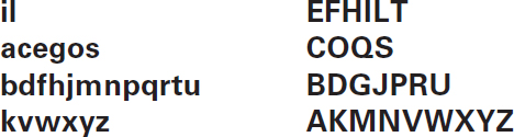
3-2 Four groupings show the structural relationships of all letters in the alphabet. The divisions are based on the dominant strokes of each letter.
3-3 The upper halves of words are read with ease, while the lower halves are less legible.
3-4 More letters remain recognizable when only their right halves are exposed; however, there are exceptions (b,p).
![]()
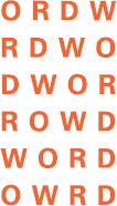
3-5 Words have a tendency to be misread and confused with one another when composed of letters of similar shape.
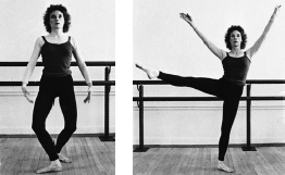
3-6 and 3-7 As with the changing position of the dancer, subtle changes in the drawing of the forms and counterforms significantly affect perception.
A closer look at the alphabet reveals additional characteristics distinguishing letters. The upper halves of letters provide more visual cues for letter recognition than the lower halves (Fig. 3-3). Likewise, the right halves of letters are more recognizable than the left halves (Fig. 3-4). Dominant letters within the alphabet that aid in word recognition are those that have either ascenders or descenders. Through tests, researchers have contributed valuable information about the comparative legibility of each letter in the alphabet. Findings vary only slightly. Lowercase letters can be ranked according to their distinctiveness as follows: d k m g h b p w u l j t v z r o f n a x y e i q c s. This varies, however, with different typefaces.
The most frequently used letters, such as the vowels a e i o u, are among the most illegible, and c g s x are easily missed in reading. Other letters that often cause confusion and are mistaken for one another are f i j l t. For example, the words fail, tail, and jail each begin with letters of similar shape and could easily be misread. The eye could possibly perceive f as t, or t as j (Fig. 3-5). The designer should carefully study the words in display typography to identify such potential problems in legibility.
The perception of a letter is based upon the form/counterform relationship. Counterforms are as significant to legibility as the shapes of the letters themselves. This principle relates to all aspects of visual phenomena. A dancer manipulates space with the body, “making shape,” defining, and redefining space (Fig. 3-6). If the shape of a letter is changed, so is the way in which that letter is perceived. Letter shapes are cues that distinguish one letter in the alphabet from another (Fig. 3-7).
Much controversy has surrounded the issue of the comparative legibility of serif and sans serif typefaces. One argument claims that serif text type is more readable because the serifs reinforce the horizontal flow of each line. Serif typefaces also offer more character definition: for example, the serif on the bottom horizontal stroke of a capital E accentuates the difference between it and a capital F. However, the relative legibility between serif and sans serif typefaces is negligible. Reader familiarity and the control of other legibility factors (to be discussed later) are far more significant than the selection of a serif or sans serif typeface. (See the type specimens in Chapter 13 to compare the legibility of serif and sans serif type.)
The nature of words
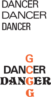
While individual letters as discrete units, affecting all other spatial and aesthetic considerations, are the basis for a discussion of legibility, one reads and perceives words and groups of words, and not just letters. In discussing typographic legibility, Frederic Goudy observed that “a letter may not be considered apart from its kinsmen; it is a mere abstract and arbitrary form far remote from the original picture or symbol out of which it grew, and has no particular significance until it is employed to form part of a word.” There are two important factors involved in the reading process: word shape and internal pattern. Words are identified by their distinctive word shapes, strings of letters that are instantaneously perceived, permitting the reader to grasp content easily (Fig. 3-8). Counterforms create internal word patterns that provide cues for word recognition.
When these internal spaces are altered sufficiently, the perceptual clarity of a word may also be altered. The weight of letters is vital to word recognition and influences an adequate internal pattern. The combination of word shape and internal pattern creates a word structure, an all-inclusive term describing the unique composition of each word (Fig. 3-9).
3-8 Word recognition is based on word structure, a combination of word shape (defined by the contours of the letters) and internal word pattern. The word set in lowercase letters is more distinct than the word set in all capitals, because its irregular word shape makes it more recognizable.
3-9 Letters can be grouped in myriad combinations. Words that are perceived as having meaning are those with which we have become familiar over time. They form a distinct and familiar shape.

3-10 Misfit letter combinations and irregular spacing can be a problem, particularly for display type. Optical adjustments should be made to achieve spatial consistency between elements.
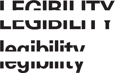
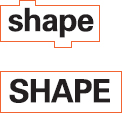
If text is set entirely in capital letters, it suffers a loss of legibility and the reader is placed at a significant disadvantage. Type set in this manner severely retards reading—more so than any other legibility factor. Figure 3-8 demonstrates that a word set in all capital letters is characterized by a straight horizontal alignment, creating an even word outline with letters of similar shape and size. A reader is not provided with the necessary visual cues that make words recognizable.
TEXT SET IN ALL CAPITAL LETTERS ALSO USES A SIGNIFICANTLY GREATER AMOUNT OF SPACE THAN TEXT SET IN LOWERCASE LETTERS OF THE SAME SIZE. AS MUCH AS 35 PERCENT MORE SPACE CAN BE CONSUMED WHEN USING ALL CAPITAL LETTERS.
On the other hand, text set in lowercase letters forms words that are distinct, based upon their irregular word shape and internal pattern. A variety of letter shapes, ascenders, and descenders provides rich contrasts that assure satisfactory perception. Once a specific word shape is perceived, it is stored in the reader's memory until the eye confronts it again while reading. A reader can become confused if a word takes on an appearance that differs from the originally learned word shape.
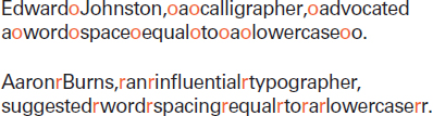
Interletter and interword spacing
The spacing of letterforms has a significant impact on legibility. Most readers are unaware of the typographic designer's attention to this detail. Minute spatial relationships are controlled to create not only readable but beautiful and harmonious typographic communication. It takes great skill to specify spaces between letters and words, determining proper spatial relationships. Letters must flow rhythmically and gracefully into words, and words into lines.
Typographic texture and tone are affected by the spacing of letters, words, and lines. When the texture and the spatial intervals between typographic elements are consistent, the result is an easily readable text. Texture is also affected by qualities unique to the design of specific typefaces. Sometimes designers arrange type for specific spatial effects, sensitively balancing norms of legibility with graphic impact. (See the type specimens in Chapter 13.)
Reading is disrupted by inappropriate wordspacing
Too much or too little space between letters and words destroys the normal texture intended by the typeface designer. As you read this sentence, notice that the narrow letter- and wordspacing causes words to merge together visually. Likewise, the extremely wide letterspacing of this sentence is also disruptive for the reader.
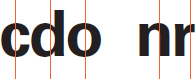
There is often a danger of misfit letter combinations, which, in earlier typesetting systems such as Linotype, could not be easily corrected. (If the type size is small and the type is evenly textured, this is a minor problem.) With phototypesetting and digital typesetting, these details can be corrected easily. The kerning of specific letter combinations can be programmed into the typesetting system. As type is set, appropriate letterspacing appears automatically (Fig.3-10).
Space between letters and words should be proportional to the width of letters. This proportion is often open to personal judgment (Fig. 3-11). With experience and practice comes an understanding of the spacing that is suitable to a particular design project.
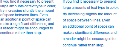
An appropriate line length is essential for achieving a pleasant reading rhythm, allowing a reader to relax and concentrate on the content of the words. Overly short or long lines will tire a reader. Excess energy is expended when reading long lines, and it is difficult to find the next line. A short column measure requires the eye to change lines too often, and there is an inadequate supply of horizontal perceptual cues.
Type size, line length, and interline spacing
Critical to spatial harmony and legibility is an understanding of the triadic relationship of type size, line length, and interline spacing. When properly employed, these variables can improve the legibility of even poorly designed letterforms, or enhance the legibility of those forms considered highly legible.
It is difficult to generalize about which sizes of type should be used, how long lines should be, or how much space should be inserted between lines. These decisions are based upon comparative judgments. The guidelines discussed in this section can never replace the type designer's sensitively trained eye for typographic detail. The normal reading distance for most printed matter is from twelve to fourteen inches, a fact to be kept in mind when making decisions about type size, since it affects the way in which a specific type size is perceived.
Text type that is too small or too large makes reading difficult. Small type reduces visibility by destroying counterforms, which affect word recognition, while large type can force a reader to perceive type in sections rather than as a whole. According to legibility research, the most legible sizes of text type at normal reading distances range from 9 to 12 point. This range results from the wide variation of x-height in different typefaces.
That is, when typefaces of the same point size are placed side by side, they may appear to be different sizes because their x-heights vary radically. This is important to keep in mind when selecting typefaces and sizes.
An interesting comparison is the relationship between Univers 55 and Baskerville. Univers 55 has a very large x-height, with short ascenders and descenders. It appears much larger than Baskerville set in the same size, which has a smaller x-height and large ascenders and descenders. (See the type specimens in Chapter 13.)
Type sizes larger than 12 point may require more fixation pauses, making reading uncomfortable and inefficient. A fixation pause occurs when the eye stops on a line of type during reading, actually perceiving the meaning of groups of words. When there are fewer fixation pauses, there is greater reading efficiency and comprehension. When text type is smaller than 9 point, internal patterns can break down, destroying legibility. The reading audience is also a major consideration. For example, children learning to read need large type sizes in simple formats, as do adults with poor eyesight.
An appropriate line length is essential for achieving a pleasant reading rhythm, allowing a reader to relax and concentrate on the content of the words. Overly short or long lines will tire a reader. Excess energy is expended when reading long lines, and it is difficult to find the next line. A short column measure requires the eye to change lines too often, and there is an inadequate supply of horizontal perceptual cues. Compare the legibility of this paragraph with the legibility of Figures 3-12 and 3-13.
Certainly, every typographic problem has its own legibility requirements. The following data can serve as a point of departure in determining how to create legible typography. Line length is dependent upon both the size of type and the amount of space between lines. When working with the optimum sizes of 9-, 10-, 11-, and 12-point text type, a maximum of ten to twelve words (or sixty to seventy characters) per line would be acceptable. This would equal a line length of approximately 18 to 24 picas. An optimum line length for the average 10-point type is 19 picas.
An appropriate line length is essential for achieving a pleasant reading rhythm, allowing a reader to relax and concentrate on the content of the words. Overly short or long lines will tire a reader. Excess energy is expended when reading long lines, and it is difficult to find the next line. A short column measure requires the eye to change lines too often, and there is an inadequate supply of horizontal perceptual cues.
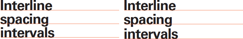
The amount of interline spacing is dependent upon several factors. Generally, lines with no added space between them are read more slowly than lines with added space. Proper interline spacing carries the eye naturally from one line to the next. When there is inadequate space between lines, the eye takes in other lines as well. If lines are too widely spaced, a reader may have trouble locating the next line. As column measure increases, the interline spacing should also increase to maintain a proper ratio of column length to interline spacing.
Typefaces with larger x-heights need more interline spacing than those with smaller x-heights. Also, when working with display types, the frequency with which ascenders and descenders occur makes a difference. They can optically lessen the amount of white space between lines. Optical adjustments in display types should be made when spaces between lines appear inconsistent because of ascenders and descenders (Fig. 3-14). Generally, the maximum line length for text type with a small x-height—used without interline spacing—is about sixty-five characters. When text type with a large x-height is used without interline spacing, legibility is diminished when line length exceeds about fifty-two characters.
Research has shown that for the optimum sizes of text type (9, 10, 11, and 12 point), 1 to 4 points of interline spacing can be effectively added between lines to increase legibility. Remember, this is not to say that type set outside these optimum specifications will be illegible, for critical judgment can ensure legible typography without inhibiting fresh approaches.
Weight
When considering the legibility of a typeface, the thickness (weight) of the strokes should be examined. A typeface that is too light or too heavy has diminished legibility. Light typefaces cannot be easily distinguished from their background, while a typeface that is too heavy has a tendency to lose its internal pattern of counterforms.
Typefaces of median weight are most legible.
Weight can be used advantageously to provide contrast and clarity between typographic page elements such as titles, headlines, and subheads. A heavier or lighter weight can emphasize one piece of information over another, thereby making information more comprehensible.
In text type, weight change significantly affects legibility.
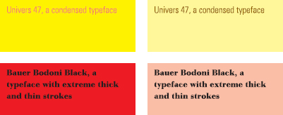
Extreme thick and thin strokes within letters of a particular typeface make reading more difficult, preventing smooth transitions from one word or group of words to the next. Thin strokes are less visible, creating confusion with letters of similar shape. When a typeface with extreme contrasts between thick and thin strokes is used in a text setting, a dazzle or sparkle effect is created. The reader begins to have difficulty distinguishing the words, and legibility decreases significantly.
Character width
The shape and size of the page or column can influence the selection of character width. For example, a condensed typeface might be selected far a narrow page or column, achieving proportional harmony and on adequate number of characters and words to the line.
In text type, legibility is affected when condensed or expanded typefaces are used.
The width of letters is also an important legibility factor. Generally, condensed type is more difficult to read. A narrower letter changes the form/counterform relationship, causing letters to have an extreme vertical posture that can alter eye movement and reading patterns, diminishing legibility.
Italics and Obliques
Similar to other situations where typeforms deviate from a reader's expectations, italics impede reading. An extreme italic slant can slow the reading process and is disliked by many readers. However, italic type can be very effective when used as a means of providing emphasis.
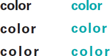
Incorporating color into type significantly affects legibility, and the most important consideration when working with type and color is to achieve an appropriate contrast between type and its background. The degree of legibility sought depends entirely upon the intent of the designer and the nature of the content.
It has long been considered that black type on a white background is most legible. While this combination remains an excellent choice, other alternatives may offer equal if not improved legibility due to improved digital and printing technologies, and the fact that color is a relative phenomenon (Fig. 3-15). When applied to type, color should be evaluated in relationship to the conditions in which it is read. In print, for example, one should consider the specific nature of the paper. If the paper is white, is it a warm or cool white? Is the surface of the paper rough or smooth? Is it coated or uncoated? What typeface is being considered, and in what size will it appear?
Generally, all legibility guidelines related to working with color and type in print apply also to type appearing on a computer screen. However, the use of color and type on a screen should also take into consideration the conditions of screen resolution and luminescence, as well as whether the type is static or in motion. Digital technologies have vastly changed the way in which designers use color and type, making it possible to easily assign color from palettes containing millions of colors. Also, the range of typographic applications continues to expand, with type asserting a role not only in printed and environmental communications, but also in on-screen media such as the Internet.
Appropriate contrast between type and its background requires that designers carefully weigh the three basic color properties of hue, value, and saturation. By definition, hue and tone are simply more specific names for color. Value refers to the lightness or darkness of a color, and saturation—also called chroma or intensity—is the relative brightness of a color.
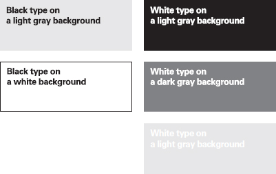
3-15 Black type on a white background and on a light gray background prove highly legible. Legibility suffers as the contrast between type and its background diminishes. The color temperature of the paper upon which type is printed and the choice of typeface also have a relative effect upon legibility.
3-16 Legibility is greatly compromised when type and background are assigned complementary colors. Adjusting the value of either color improves contrast and thus legibility. In this example, the orange background is lightened, and the blue background is darkened, in each case improving legibility.
3-17 The analogous hues yellow-green and blue are sufficiently different in value, resulting in an acceptable combination. A moderate adjustment of the yellow-green to a lighter value further improves legibility.
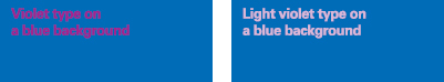
3-18 Blue and violet hues exist very close to each other on the color wheel, and when used for type and background do not offer sufficient contrast. A tint or shade of one of the colors, however, improves legibility.
3-19 By scrutinizing the roles of value and hue contrast, the legibility of most typefaces can be improved. Typefaces that are visually challenging because of extreme proportions (heavy, light, wide, or thin) can be made more legible by assigning appropriate color combinations.
3-20 The smaller and more delicate the type, the more contrast is needed to ensure adequate legibility.
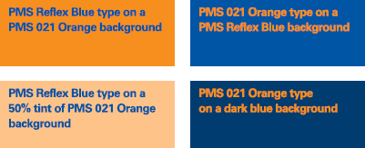
All colors possess characteristics of hue, value, and saturation. When combining color and type, balancing these properties is a critical legibility concern. For example, the highly saturated, complementary colors blue and orange offer maximum hue contrast, but when applied to type and background the effect is one of vibration that quickly tires the eye. These colors compete in brightness and vie for attention. If the type or background is lightened or darkened by selecting a tint or shade of the hue, legibility is improved (Fig. 3-16).
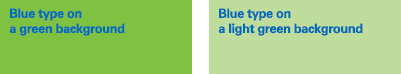
But not all fully saturated hues are of the same value. Two highly saturated, analogous colors, such as blue and green, provide sufficient contrast without a dizzying effect. (Analogous colors are those that appear in close proximity on a color wheel.) Because the green is actually lighter in value and brighter in saturation than the blue, there may be no need for further adjustment (Fig. 3-17). However, if analogous colors are too close to each other on the color wheel, adjustments in contrast will be necessary (Fig. 3-18).
Of all the contrasts of color, value affects legibility most significantly. Value contrasts effectively preserve the shapes and formal details of letters, thus making them more easily recognizable.
Typefaces possess unique shapes, proportions, and individual characteristics that should be taken into consideration when selecting color. A typeface with fine serifs, ultrathin strokes, small counters, or any number of other visual eccentricities may appear illegible if color is not carefully articulated. By turning value or intensity up or down in these situations, legibility can improve greatly (Fig. 3-19).
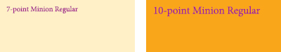
The type size is also an important consideration in the planning of color. At smaller sizes, type requires backgrounds that are significantly different in hue and/or value (Fig. 3-20).
Whether type is printed on paper or appears on screen, an optical effect referred to as typographic color occurs. Not to be confused with the particular hue of a typographic element, this effect is the result of the visual qualities inherent in individual typefaces and the spacing of letters, words, and lines of type (Fig. 3-21). Typographic color is an important tool, for it is an effective means by which hierarchical order and emphasis are achieved between different typographic elements. Also, if a large amount of text is set in an elaborate or unusual color setting, an increase in the space between lines can significantly improve legibility (Fig. 3-22).
The reading process can be severely retarded when reading type on textured or photographic backgrounds, for they potentially interfere with the internal patterns of words and their distinctive word shapes. This problem is further exacerbated when such backgrounds and the type appearing on them are incompatible in color for reasons stated earlier in this discussion.
3-21 Words set in various typefaces appear different in typographic color. As interletter spacing increases, the words also appear lighter in tone.
3-22 The illusion of lighter or darker text is achieved with the introduction of additional interline spacing; in some situations, legibility is improved.
Compare the legibility of the justified and unjustified columns.
justified
Justified and unjustified typography
Traditionally, it was common practice to set type in a justified alignment. This was done for reasons of efficiency; in addition, it was more familiar and was considered more refined. In the 1920s, designers began to question this typographic convention and experiment with alternative text-setting styles. Unjustified and asymmetrical typography began to find widespread acceptance. Among experimental typographic designers was Herbert Bayer, who said, “I have long believed that our conventional way of writing and setting type could be improved for easier reading. In my first typographic works in the early twenties, I started to abandon the flush-left-and-right system for short lines of text and have introduced the flush-left system, leaving a ragged-right outline.”
There are appropriate reasons for setting either justified or unjustified typography, but type set flush left and ragged right promotes greater legibility. If properly used, flush-left, ragged-right typography provides visual points of reference that guide the eye smoothly down the page from line to line. Because each line is either shorter or longer than the next, the eye is cued from one line to another. In a justified setting, all lines are of equal length. Lacking are visual cues that promote easy reading.
With the use of unjustified typography, wordspacing is even, creating a smooth rhythm and a consistent texture. The indiscriminate placement of additional space between words in order to justify lines causes awkward gaps or “rivers” in paragraphs, which are disruptive to reading. Hyphenations at the end of lines should be used—but not overused—whenever possible to keep wordspacing consistent.
When setting ragged-right text, care should be taken not to rag the type too much. Uncontrolled line breaks of erratic rhythm can create awkward spaces that inhibit reading. In ragged-right type, care should be given to the selection of interline spacing, for it influences legibility and appearance. Spatial consistency and rhythmic line breaks result from careful typographical decisions.
unjustified (flush-left, ragged right)
The breaking of lines can be determined by the author's meaning rather than by appearance. This method, sometimes referred to as thought-unit typography, arranges lines into discrete parts related to the meaning of the text. Ragged-right lines may be of any length, with line breaks that are logical and focus on the intended message of the writer (Fig. 3-23).
Paragraphs and indentions
An important goal for a designer is to distinguish typographically one thought from another, clarify content, and increase reader comprehension. Clear separation of paragraphs in a body of text is one way to accomplish this goal.
It is common practice in the design of books, magazines, and newspapers to indent each paragraph, usually with moderate indention of one to three ems. It is also typographic practice not to indent the first paragraph in an article, chapter, or advertisement so that the square corner of the first column can be maintained.
Paragraphs can also be separated by inserting additional space between them. This space should be proportional to the amount of interline spacing, which corresponds to the vertical measurement of the typographic grid. Paragraphs are often separated by one line space. This method should be avoided if the original copy is full of short, choppy paragraphs. Spaces between such paragraphs could be very disturbing, consuming too much space. Indentions and additional line spaces are also used to establish order within complex tabular matter, such as financial charts and scientific data.
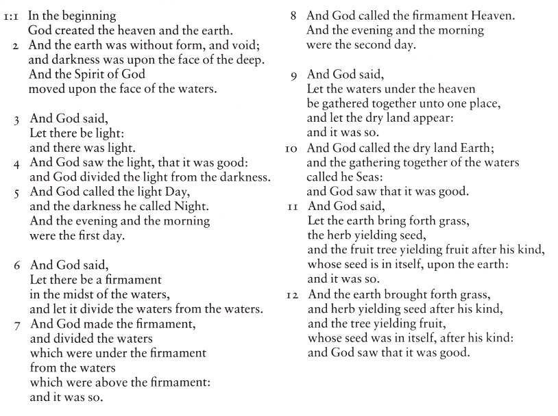
3-23 Thought-unit typography from the Washburn College Bible. (Designer: Bradbury Thompson)
LEGIBILITY AND DIGITAL TYPOGRAPHY
New legibility issues emerged when the digital revolution occurred in typography and design. This includes concerns relating to software, discussed in this section, and problems related to on-screen display, covered in Chapter 8. Digital typography offers designers more possibilities for type manipulation than ever before, resulting in an obligation to know more about the cultural and formal evolution of typography than in times past. Without adequate knowledge of typographic legibility, it is easy for designers to blindly follow fads, succumb to common visual clichés provided by software, or thoughtlessly yield to the built-in defaults of a computer application or coding framework. Legibility is a concern that should be continually addressed as technology changes. Because designers now work at a keyboard, they are directly responsible for composing legible type—a task once accomplished by sending specifications to a compositor at a typesetting firm.
As a result of desktop technology and type-design software, new typefaces and revivals of old typefaces are being released at an unprecedented rate. Some of these are well designed; others are not. Many typefaces from various digital foundries carry the same name, yet their design is far removed from the original (Fig. 3-24). It is not enough to make typeface selections on the basis of name alone; designers should make visual comparisons before deciding which typefaces are most suitable for a task.
Tools available in desktop software enable type to be outlined, stretched, rotated, skewed, mirrored, placed on a curved baseline, and manipulated in innumerable other ways. Upon determining the objectives, requirements, and limitations of the typographic problem at hand, designers can creatively employ these tools while also addressing legibility needs. These tools are best used to express visual ideas, rather than to merely embellish a page. Though type set on a curved baseline loses legibility compared to type set on a horizontal baseline, it can still be addressed by carefully spacing the letters and choosing an appropriate typeface.
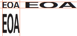
Gross distortion of the optical relationships within a font occurs when only one axis, such as its width or height, is changed, as shown in Figure 3-25 and 3-26. Adobe introduced its multiple master font technology in 1991 to address the need to alter letterforms by changing more than one axis while maintaining their design integrity. Multiple master type is discussed in Chapter 7.
3-24 Three typefaces have the same name but significantly different properties. The size, weight width, and shape of characters differ.
3-25 When letters are stretched horizontally or vertically on a computer to create condensed and expanded letterforms, their proportions change. The optical relationships of the original typeface design are destroyed.
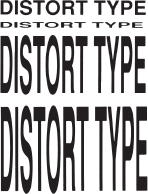
3-26 The bottom letterforms have been stretched excessively, causing the optical relationships to become distorted. The crossbar of the T has become too thick; the S and O extend too far above and below the baseline.
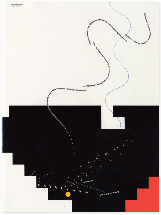
3-27 Experimental typography exploring manipulation of type. (Text: Ann Zwinger; Designer: Rob Carter)
Typographic experimentation allows designers to probe the relationships between type, space, and expression. Syntactic exploration reveals boundless potential to inform, amuse, and astonish. In recent years designers have extended their range of possibilities by approaching work as play and tools as toys. One example of the expressive potential of manipulated type is seen in a page from a series of experiments created to document wanderings in canyons of the Utah desert (Fig. 3-27).
Typographic details
In typography, attention to detail is an ever-present need. Every letter, word, and line of type is a matter of detail, of which it is the designer's responsibility to be alert and aware. To those just learning the intricacies of typographic form and nuance, adherence to the following recommendations will be highly beneficial, and the practices they are meant to encourage will eventually become second nature.
These recommendations apply primarily to normative typography, typography charged with the task expressed by Thomas James Cobden-Sanderson in The Book Beautiful: “The whole duty of typography, as with calligraphy, is to communicate to the imagination, without loss by the way, the thought or image intended to be communicated by the author.” Expressive forms of typography may intelligently ignore these recommendations altogether.