2
The Anatomy of Typography
Typographic design is a complex human activity, requiring a broad background for informed practice. This chapter explores the basic language of typography. Letterforms, the fundamental components of all typographic communications, are carefully examined. Nomenclature, measurement, and the nature of typographic font and family are presented.
The alphabet is a series of elemental visual signs in a fixed sequence, representing spoken sounds. Each letter signifies only one thing: its elementary sound or name. The twenty-six characters of our alphabet can be combined into hundreds of thousands of words, creating a visual record of the spoken language. This is the magic of writing and typography, which have been called “thoughts made visible” and “frozen sounds.”
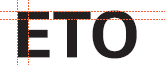
LETTERFORMS ANALYZED
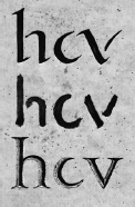
2-1 Strokes made with a reed pen (top), with a brush (middle), and with a chisel (bottom).
The four timelines in Chapter 1 graphically present the evolution of letterforms and typographic design from the beginning of writing to the present. Our contemporary typographic forms have been forged by this historical evolution. Typography evolved from handwriting, which is created by making a series of marks by hand; therefore, the fundamental element constructing a letterform is the linear stroke. Each letter of our alphabet developed as a simple mark whose visual characteristics clearly separated it from all the others.
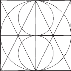
The marking properties of brush, reed pen, and stone engraver's chisel influenced the early form of the alphabet (Fig. 2-1). The reed pen, used in ancient Rome and the medieval monastery, was held at an angle, called a cant, to the page. This produced a pattern of thick and thin strokes. Since the time of the ancient Greeks, capital letterforms have consisted of simple geometric forms based on the square, circle, and triangle. The basic shape of each capital letter can be extracted from the structure in Figure 2-2, which is composed of a bisected square, a circle, a triangle, an inverted triangle, and two smaller circles.
The resulting vocabulary of forms, however, lacks several important attributes: optically adjusted proportions, expressive design properties, and maximum legibility and readability. The transition from rudimentary marks to letterforms with graphic clarity and precision is a matter of design.
Because early capital letters were cut into stone, these letters developed with a minimum number of curved lines, for curved strokes were difficult to cut (Fig. 2-3). Lowercase letters evolved with reed-pen writing. Curved strokes could be written quickly and were used to reduce the number of strokes needed to write many characters.
2-3 Capital and lowercase letterform construction.
The parts of letterforms
Over the centuries, a nomenclature has evolved that identifies the various components of individual letterforms. By learning this vocabulary, designers and typographers can develop a greater understanding of and sensitivity to the visual harmony and complexity of the alphabet.
In medieval times, horizontal guidelines were drawn to contain and align each line of lettering. Today, letterforms and their parts are drawn on imaginary guidelines to bring uniformity to typography. All characters align optically on the baseline. The body height of lowercase characters aligns optically at the x-height, and the tops of capitals align optically along the capline. To achieve precise alignments, the typeface designer makes optical adjustments.
Figures 2-4 to 2-12 identify the major components of letterform construction.
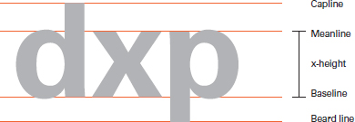
Capline: An imaginary line that runs along the tops of capital letters and the ascenders of lowercase letters.
Meanline: An imaginary line that establishes the height of the body of lowercase letters.
x-height: The distance from the baseline to the meanline. Typically, this is the height of lowercase letters and is most easily measured on the lowercase x.
Baseline: An imaginary line upon which the base of each capital rests.
Beard line: An imaginary line that runs along the bottoms of descenders.
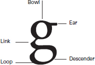
Bowl: A curved stroke enclosing the counterform of a letter. An exception is the bottom form of the lowercase roman g, which is called a loop.
Ear: A small stroke that projects from the upper right side of the bowl of the lowercase roman g.
Link: The stroke that connects the bowl and the loop of a lowercase roman g.
Descender: A stroke on a lowercase letterform that falls below the baseline.
Loop: See Bowl.
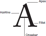
Apex: The peak of the triangle of an uppercase A.
Hairline: The thinnest stroke within a typeface that has strokes of varying weights.
Fillet: The contoured edge that connects the serif and stem in bracketed serifs. (Bracketed serifs are connected to the main stroke by this curved edge; unbracketed serifs connect to the main stroke with an abrupt angle without this contoured transition.)
Crossbar: The horizontal stroke connecting two sides of the letterform (as in e, A, and H) or bisecting the main stroke (as in f and t).
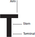
Arm: A projecting horizontal stroke that is unattached on one or both ends, as in the letters T and E.
Stem: A major vertical or diagonal stroke in the letterform.
Terminal: The end of any stroke that does not terminate with a serif.
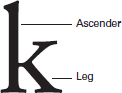
Ascender: A stroke on a lowercase letter that rises above the meanline.
Leg: The lower diagonal stroke on the letter k.
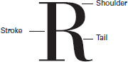
Shoulder: A curved stroke projecting from a stem.
Stroke: Any of the linear elements within a letterform; originally, any mark or dash made by the movement of a pen or brush in writing.
Tail: A diagonal stroke or loop at the end of a letter, as in R or j.
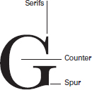
Serifs: Short strokes that extend from and at an angle to the upper and lower ends of the major strokes of a letterform.
Counter: The negative space that is fully or partially enclosed by a letterform.
Spur: A projection smaller than a serif that reinforces the point at the end of a curved stroke, as in the letter G.
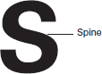
Spine: The central curved stroke of the letter S.
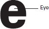
Eye: The enclosed part of the lowercase e.
Proportions of the letterform
The proportions of the individual letterform are an important consideration in typography. Four major variables control letterform proportion and have considerable impact upon the visual appearance of a typeface: the ratio of letterform height to stroke width; the variation between the thickest and thinnest strokes of the letterform; the width of the letters; and the relationship of the x-height to the height of capitals, ascenders, and descenders.
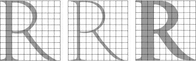
Stroke-to-height ratio. The roman letterform, above, has the stroke-width-to-capital-height proportion found on Roman inscriptions (Fig. 2-13). Superimposition on a grid demonstrates that the height of the letter is ten times the stroke width. In the adjacent rectangles, the center letter is reduced to one-half the normal stroke width, and the letter on the right has its stroke width expanded to twice the normal width. In both cases, pronounced change in the weight and appearance of the letterform occurs.
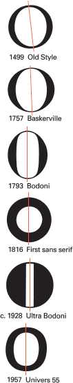
Contrast in stroke weight. A change in the contrast between thick and thin strokes can alter the optical qualities of letterforms. The series of O's in Figure 2-14, shown with the date of each specimen, demonstrates how the development of technology and printing has enabled typeface designers to make thinner strokes.
In the Old Style typography of the Renaissance, designers attempted to capture some of the visual properties of pen writing. Since the writing pens of the period had a flat edge, they created thick and thin strokes. Stress is the term used to define this thickening of the strokes, which is particularly pronounced on curves. Note how the placement of weight within the Old Style O creates a diagonal axis. As time has passed, type designers have been less influenced by writing.
By the late 1700s, the impact of writing declined, and this axis became completely vertical in many typefaces of that period. In many of the earliest sans serif typefaces, stress disappeared completely. Some of these typefaces have a monoline stroke that is completely even in weight.
Expanded and condensed styles. The design qualities of a typographic font change dramatically when the widths of the letterforms are expanded or condensed. The word proportion, set in two sans serif typefaces, demonstrates extreme expansion and condensation (Fig. 2-15). In the top example, set in Aurora Condensed, the stroke-to-height ratio is 1 to 9. In the bottom example, set in Information, the stroke-to-height ratio is 1 to 2. Although both words are exactly the same height, the condensed typeface takes up far less area on the page.
x-height and proportion. The proportional relationship between the x-height and capital, ascender, and descender heights influences the optical qualities of typography in a significant way. The same characters are set in 72-point type using three typefaces with widely varying x-heights (Fig. 2-16). This example demonstrates how these proportional relationships change the appearance of type. The impact of x-height upon legibility will be discussed in Chapter 3.
![]()
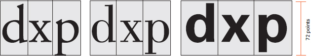
2-16 On the same-size body (72 point), the x-height variation between three typefaces—Garamond 3, Bodoni, and Univers—is shown. The proportion of the x-height to the point size significantly affects the appearance of type.
THE TYPOGRAPHIC FONT
A font is a set of characters of the same size and style containing all the letters, numbers, and marks needed for typesetting. A typographic font exhibits structural unity when all the characters relate to one another visually. The weights of thick and thin strokes must be consistent, and the optical alignment of letterforms must appear even. The distribution of lights and darks within each character and in the spaces between characters must be carefully controlled to achieve an evenness of tone within the font.
In some display faces, the font might include only the twenty-six capital letters. In a complete font for complex typesetting, such as for textbooks, it is possible to have nearly two hundred characters. The font for Adobe Garamond (Fig. 2-17) includes the following types of characters:
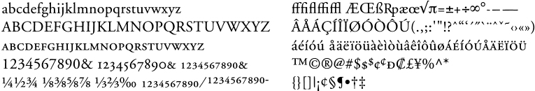
Lowercase: The smaller set of letters, so named because in metal typesetting these were stored in the lower part of a type case.
Capitals: The set of large letters that is used in the initial position.
Small caps: A complete set of capital letters that are the same height as the x-height of the lowercase letters. These are often used for abbreviations, cross-references, and emphasis.
Lining figures: Numbers that are the same height as the capital letters and sit on the baseline.
Old Style figures: A set of numbers that are compatible with lowercase letters; 1, 2, and 0 align with the x-height; 6 and 8 have ascenders; and 3, 4, 5, 7, and 9 have descenders.
Superior and inferior figures: Small numbers, usually slightly smaller than the x-height, used for footnotes and fractions. Superior figures hang from the capline, and inferior figures sit on the baseline.
Fractions: Common mathematical expressions made up of a superior figure, an inferior figure, and a slash mark. These are set as a single type character.
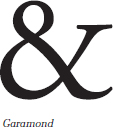
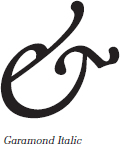
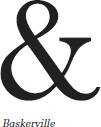
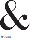
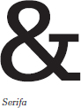
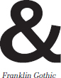
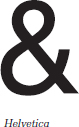
Ligatures: Two or more characters linked together as one unit, such as ff. The ampersand is a ligature originating as a letter combination for the French word et (and) in medieval manuscripts.
Digraphs: Ligatures composed of two vowels, which are used to represent a dipthong (a monosyllabic speech sound composed of two vowels).
Mathematical signs: Characters used to notate basic mathematical processes.
Punctuation: A system of standard signs used in written and printed matter to structure and separate units and to clarify meaning.
Accented characters: Characters with accents for foreign language typesetting or for indicating pronunciation.
Dingbats: Assorted signs, symbols, reference marks, and ornaments designed for use with a type font.
Monetary symbols: Logograms used to signify monetary systems (U.S. dollar and cent marks, British pound mark, and so on).
Optical relationships within a font
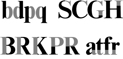
Mechanical and mathematical letterform construction can result in serious spatial problems, because diverse forms within an alphabet appear optically incorrect. These letterform combinations show the optical adjustment necessary to achieve visual harmony within a font.
Pointed and curved letters (Fig. 2-18) have little weight at the top and/or bottom guidelines; this can make them appear too short. To make them appear the same height as letters that terminate squarely with the guidelines, the apexes of pointed letters extend beyond the baseline and capline. Curved letterforms are drawn slightly above and below these lines to prevent them from appearing too small.
In two-storied capitals and figures (Fig. 2-19), the top half appears too large if the form is divided in the mathematical center. To balance these letters optically, the center is slightly above the mathematical center, and the top halves are drawn slightly narrower than the bottom half.
Horizontal strokes (Fig. 2-20) are drawn slightly thinner than vertical strokes in both curved and straight letterforms. Otherwise, the horizontals would appear too thick.
Tight junctions where strokes meet (Fig. 2-21) are often opened slightly to prevent the appearance of thickening at the joint.
Letters combining diagonal and vertical strokes (Fig. 2-22) must be designed to achieve a balance between the top and bottom counterforms.
Strokes can be tapered slightly to open up the spaces, and adjustments in the amount of stroke overlap can achieve a harmony of parts. Letters whose vertical strokes determine their height (Fig. 2-23) are drawn slightly taller than letters whose height is determined by a horizontal stroke. Optically, they will appear to be the same height.
The stroke weight of compact letterforms (Fig. 2-24), such as those with closed counterforms, are drawn slightly smaller than the stroke weight of letterforms having open counterforms. This balances the weight optically.
Curved strokes are usually thicker at their midsection than vertical strokes, to achieve an even appearance (Fig. 2-25).
These adjustments are very subtle and are often imperceptible to the reader. However, their overall effect is a more ordered and harmonious appearance.

![]()


![]()


2-26 Curved capitals share a common round stroke.
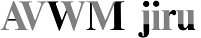
The diagonal strokes of the A are repeated in V W M. Lowercase letters have common serifs.

F E B demonstrates that the more similar letters are, the more common parts they share. Repetition of the same stroke in m n h u t creates unity.
Likewise, the letters b d p q share parts. Capital serifs recur in similar characters.
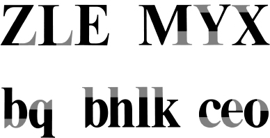
Subtle optical adjustments can be seen. For example, the bottom strokes of the capital Z and L have longer serifs than the bottom stroke of the E. This change in detail compensates for the larger counterform on the right side of the first two letters.
Unity of design in the type font
Tremendous diversity of form exists in the typographic font. Twenty-six capitals, twenty-six lowercase letters, ten numerals, punctuation, and other graphic elements must be integrated into a system that can be successfully combined into innumerable words.
Letterform combinations from the Times Roman Bold font (Fig. 2-26) demonstrate visual similarities that bring wholeness to typography. Letterforms share similar parts. Repeated curves, verticals, horizontals, and serifs are combined to bring variety and unity to typographic designs using this typeface. All well-designed type fonts display this principle of repetition with variety that is demonstrated in Times Roman Bold.
HISTORICAL CLASSIFICATION OF TYPEFACES
An infinite variety of type styles is available today. Digital typography has made the entire array of typefaces developed over the centuries available for contemporary use. Numerous efforts have been made to classify typefaces, with most falling into the following major categories. Some classification systems add a decorative, stylized, or novelty category for the wide range of fanciful type styles that defy categorization. A selection of decorative typefaces appears on pages 324 and 325.
Old Style
Old Style type began with designs of the punch cutter Francesco Griffo, who worked for the famous Venetian scholar-printer Aldus Manutius during the 1490s. Griffo's designs evolved from earlier Italian type designs. His Old Style capitals were influenced by carved Roman capitals; lowercase letters were inspired by fifteenth-century humanistic writing styles, based on the earlier minuscules. Old Style letterforms have the weight stress of rounded forms at an angle, as in handwriting. The serifs are bracketed (that is, unified with the stroke by a tapered, curved line). Also, the top serifs on the lowercase letters are at an angle.
Italic
Italic letterforms slant to the right. Today, we use them primarily for emphasis and differentiation. When the first italic appeared in the earliest “pocket book,” printed by Aldus Manutius in 1501, it was used as an independent typestyle. The first italic characters were close-set and condensed; therefore, Manutius was able to get more words on each line. Some italic styles are based on handwriting, with connected strokes, and are called scripts.
Transitional
During the 1700s, typestyles gradually evolved from Old Style to Modern. Typefaces from the middle of the eighteenth century, including those by John Baskerville, are called transitional. The contrast between thick and thin strokes is greater than in Old Style faces. Lowercase serifs are more horizontal, and the stress within the rounded forms shifts to a less diagonal axis. Transitional characters are usually wider than Old Style characters.
Modern
Late in the 1700s, typefaces termed Modern evolved from transitional styles. These typefaces have extreme contrasts between thick and thin strokes. Thin strokes are reduced to hairlines. The weight stress of rounded characters is vertical. Serifs are horizontal hairlines that join the stems at a right angle without bracketing. The uppercase width is regularized; wide letters such as M and W are condensed, and other letters, including P and T, are expanded. Modern Style typefaces have a strong geometric quality projected by rigorous horizontal, vertical, and circular forms.
Egyptian
In 1815, the English typefounder Vincent Figgins introduced slab serif typestyles under the name Antique. At the time, there was a mania for ancient Egyptian artifacts, and other typefounders adopted the name Egyptian for their slab serif designs. These typestyles have heavy square or rectangular serifs that are usually unbracketed. The stress of curved strokes is often minimal. In some slab serif typefaces, all strokes are the same weight.
Sans serif
The first sans serif typestyle appeared in an 1816 specimen book of the English typefounder William Caslon IV. The most obvious characteristic of these styles is, as the name implies, the absence of serifs. In many sans serif typefaces, strokes are uniform, with little or no contrast between thick and thin strokes. Stress is almost always vertical. Many sans serif typefaces are geometric in their construction; others combine both organic and geometric qualities. Sans serif typefaces can be further classified as described here.
Grotesque
The earliest sans serif typestyle to be developed was Grotesque. In Grotesque, strokes have some varied contrast in width. Curves have a squareness, with curling, close-set jaws. The capital R often has a curled leg, and the capital G has a spur. Curved strokes are usually terminated obliquely, adding to the often idiosyncratic characteristics of Grotesque typefaces.
Neo-grotesque
As the name implies, Neo-grotesque typefaces are a further derivation of Grotesque. That said, they have less contrast in stroke width than Grotesque typefaces and are simpler in form and proportion. Curved strokes usually terminate as a horizontal. Higher x-heights and shorter descenders combine with wider openings between stroke terminations, giving letterforms a more uniform appearance and a more open form.
Humanist
Instead of being derived from Grotesques, humanist typefaces share the proportions and pronounced stroke width variation of handwritten Roman capitals and of lowercase Caroline minuscules. Letterforms are more calligraphic than other sans serif typefaces and display some diagonal stress. The lowercase a and g are usually two-storied.
Geometric
Geometric typefaces are composed of simple geometric shapes like circles and rectangles. To emphasize this simple form, stroke width variation is minimal. To strongly unify letterforms, many visual components and glyphs are shared. The lowercase a and g are single-storied.
Digital technology has stimulated the design and production of countless new typefaces whose visual characteristics defy standard classification. The visual traits of these hybrid forms may fall into more than one of the historical classifications presented on the preceding pages. The following is a classification system derived from the visual features common to letters throughout the typeface kingdom. It may be used for comparative purposes to pinpoint the most dominant traits of specific typefaces. Type designers use these variations to create a family of typefaces. The type family is discussed on pages 45–48.
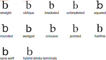
Serifs
Serifs provide some of the most identifiable features of typefaces, and in some cases they reveal clues about their evolution. The serifs shown are those that appear most frequently in typefaces (Fig. 2-27).
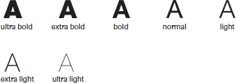
Weight
This is a feature defined by the ratio between the relative width of the strokes of letterforms and their height. On the average, a letter of normal weight possesses a stroke width of approximately 15 percent of its height, whereas bold is 20 percent and light is 10 percent (Fig. 2-28).
Width
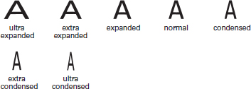
Width is an expression of the ratio between the black vertical strokes of the letterforms and the intervals of white between them. When white intervals appear larger, letters appear wider. A letter whose width is approximately 80 percent of its height is considered normal. A condensed letter's width is 60 percent of its height, and an expanded letter's width is 100 percent of its height (Fig. 2-29).
Posture
Roman letters that slant to the right but are structurally the same as upright roman letters are referred to as oblique. Italic letters, which are based on handwriting, are structurally different from roman letters of the same type family. Italic letters with connecting strokes are called scripts. The angle of posture varies from typeface to typeface; however, a slant of approximately 12 percent is considered normal (Fig. 2-30).
![]()
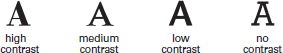
Thick/thin contrast
This visual feature refers to the relationship between the thinnest parts of the strokes in letters and the thickest parts. The varying ratios between these parts produce a wide range of visual textures in text type (Fig. 2-31).
![]()
x-height
As it is based on the height of lowercase letters without ascenders or descenders, x-height can vary immensely in different typefaces of the same size. Typically, x-heights are considered “large” when they are at least two-thirds the height of capital letters. They are “small” when they measure one-half the height of capital letters (Fig. 2-32).
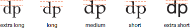
Ascenders/descenders
Ascenders and descenders may appear longer in some typefaces and shorter in others, depending on the relative size of the x-height. Descenders are generally slightly longer than ascenders among letters of the same typeface (Fig. 2-33).
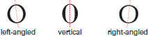
Stress
The stress of letters, which is a prominent visual axis resulting from the relationships between thick and thin strokes, may be left-angled, vertical, or right-angled in appearance (Fig. 2-34).
TYPOGRAPHIC MEASUREMENT
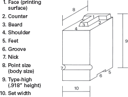
Our measurement system for typography was originally developed for the handset metal type invented by Johann Gutenberg around 1450. The rectangular metal block of type (Fig. 2-35) has a raised letterform on top, which was inked to print the image.
Metal type measurement
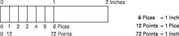
The small sizes of text type necessitated the development of a measuring system with extremely fine increments. There were no standards for typographic measurements until the French type designer and founder Pierre Simon Fournier le Jeune introduced his point system of measurement in 1737. The contemporary American measurement system, which was adopted during the 1870s, has two basic units: the point and the pica (Fig. 2-36). There are approximately seventy-two points in an inch (each point is 0.138 inches) and twelve points in a pica. There are about six picas in an inch.
Metal type exists in three dimensions, and an understanding of typographic measurement begins with this early technology. The depth of the type (Fig. 2-35, caption 8) is measured in points and is called the point size or body size. All metal type must be the exact same height (Fig. 2-35, caption 9), which is called type-high (0.918 inch). This uniform height enabled all types to print a uniform impression upon the paper. The width of a piece of type is called the set width (Fig. 2-35, caption 10) and varies with the design of each individual letter. The letters M and W have the widest set width; i and I have the narrowest. The length of a line of type is the sum of the set width of all the characters and spaces in the line. It is measured in picas.
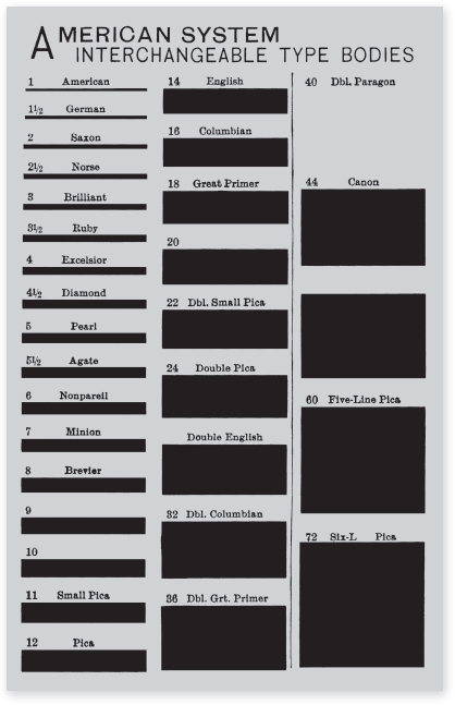
Before the development of the point and pica system, various sizes of type were identified by names, such as brevier, long primer, and pica; these became 8-point, 10-point, and 12-point type. The chart in Figure 2-37, reproduced from a nineteenth-century printers' magazine, shows the major point sizes of type with their old names.
Type that is 12 point or less is called body type and is primarily used for paragraphs of text. Sizes above 14 point are called display type, and they are used for titles, headlines, signage, and the like.
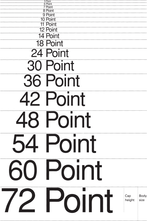
Traditional metal type had a range of text and display sizes in increments from 5 point to 72 point (Fig. 2-38). The measurement of point size is a measurement of the metal block of type including space above and below the letters; therefore, one cannot measure the point size from printed letters themselves. This is sometimes confusing. Refer to the labels for x-height, cap height, and point size on Figure 2-38 and observe that the point size includes the cap height plus a spatial interval above and below the letters.
2-37 Reproduced actual size from the Inland Printer, April 1885.
Spatial measurement
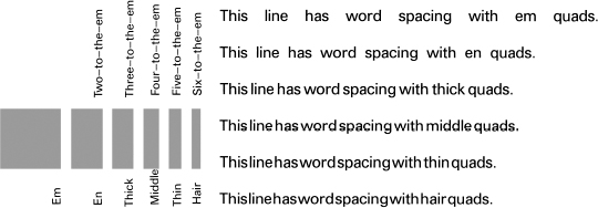
In addition to measuring type, the designer also measures and specifies the spatial intervals between typographic elements. These intervals are: interletter spacing (traditionally called letterspacing), which is the interval between letters; interword spacing, also called wordspacing, which is the interval between words; and interline spacing, which is the interval between two lines of type. Traditionally, interline space is called leading, because thin strips of lead are placed between lines of metal type to increase the spatial interval between them.
In traditional metal typography, interletter and interword spacing are achieved by inserting metal blocks called quads between the pieces of type. Because these are not as high as the type itself, they do not print. A quad that is a square of the point size is called an em. One that is one-half an em quad is called an en. In metal type, other smaller divisions of space are fractions of the em (Fig. 2-39). These metal spacers are used for letter- and wordspacing, paragraph indentions, and centering or justifying lines of type.
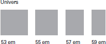
For design considerations, the em of a condensed typestyle can be narrower than a square, and the em of an expanded typestyle can be wider than a square. This is demonstrated by the em quads from four styles in the Univers family of typefaces (Fig. 2-40).
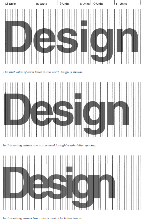
While em and en are still used as typographic terms, spacing in digital typesetting uses a unit system. The unit is a relative measurement determined by dividing the em (that is, the square of the type size) into equal vertical divisions. Different typesetting systems use different numbers of units; 16, 32, and 64 are common. Desktop publishing software permits adjustments in thousandths of an em. The width of each character (Fig. 2-41) is measured by its unit value.
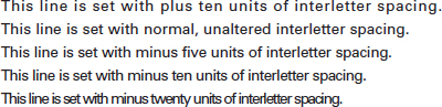
During typesetting, the character is generated, then the software advances the number of units assigned to that character before generating the next character. The unit value includes space on each side of the letter for normal interletter spacing. Adding or subtracting units to expand or contract the space between letters is called tracking. Changing the tracking changes the tone of the typography (Fig. 2-42). Tracking influences the aesthetics and legibility of typesetting.
Some letter combinations, such as TA, have awkward spatial relationships. An adjustment in the interletter space to make the interval more consistent with other letter combinations is called kerning. In metal type, kerning was achieved by sawing notches in the type blocks. Contemporary typesetting software contains automatic kerning pairs, and the designer can manually change the kerning between characters when these awkward combinations appear.
THE TYPE FAMILY
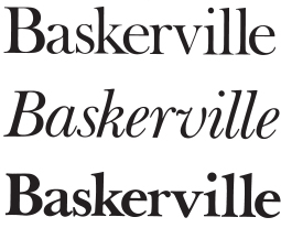
A type family consists of a group of related typefaces, unified by a set of similar design characteristics. Each face in the family is individual, and each has been created by changing visual aspects of the parent font. Early type families consisted of three fonts: the regular roman face, a bolder version, and an italic. The roman, bold, and italic fonts of the Baskerville family (Fig. 2-43) demonstrate that a change in stroke weight produces the bold version, and a change in stroke angle creates the italic. The bold font expands typographic possibilities by bringing impact to titles, headings, and display settings. Today, italics are primarily used for emphasis, by contrast with roman. In addition to weight and angle changes, additional members of a type family are created by changing proportions or by design elaboration.
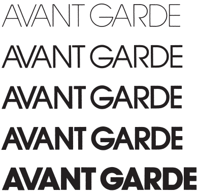
Weight changes. By simply changing the stroke width relative to the height of the letters, a whole series of alphabets, ranging from extremely light to very bold, can be produced. In England, a classification standard has been developed that contains eight weights: extralight, light, semilight, medium, semibold, bold, extrabold, and ultrabold. Most type families do not, however, consist of eight weights. Four weights—light, regular or book, medium, and bold—are often sufficient for most purposes. In the Avant Garde family (Fig. 2-44), stroke weight is the only aspect that changes in these five fonts.
Proportion. Changing the proportions of a typestyle by making letterforms wider (expanded) or narrower (condensed), as discussed earlier, is another method for adding typefaces to a type family. Terms used to express changes in proportion include: ultraexpanded, extraexpanded, expanded, regular, condensed, extracondensed, and ultracondensed.
Sometimes confusion results because there is no standardized terminology for the variations in type families. For example, the regular face is sometimes called normal, roman, or book. Light weights are named lightline, slim, and hairline. Black, elephant, massive, heavy, and thick have been used to designate bold weights. Names given to condensed variations include narrow, contracted, elongated, and compressed. Expanded faces have been called extended, wide, and stretched.
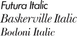
Angle. In our discussion about the basic classification of typefaces, italics were presented as a major independent category. They were first introduced four hundred years ago as a new style. Now italics serve as a member of type families, and they are used for contrast or emphasis. Italic fonts that retain curvilinear strokes inspired by handwriting are called cursives or scripts. In geometric typefaces constructed with drafting instruments, the italic fonts created by slanting the stroke angle are called obliques. Baskerville Italic (Fig. 2-45) is a cursive, demonstrating the influence of handwriting; Futura Italic is an oblique face; and Bodoni Italic has both cursive and oblique qualities. Although the Bodoni family was constructed with the aid of drafting instruments, details in the italic font (for example, some of the lower serifs) evidence a definite cursive quality.
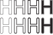
Elaboration. In design, an elaboration is an added complexity, fullness of detail, or ornamentation. Design elaboration can be used to add new typefaces to a type family. These might include outline fonts, three-dimensional effects, and the application of ornaments to letterforms. Some of the variations of Helvetica (Fig. 2-46) that are available from the German firm of Dr. Boger Photosatz GmbH include outlines, inlines, perspectives, rounded terminals, and even a chipped antique effect.
While many elaborations are gaudy and interfere with the integrity and legibility of the letterforms, others can be used successfully.
Gill Sans Shadowed (Fig. 2-47) is based on Gill Sans. A black shape, suggesting dimensionality, is placed behind each letter.
Decorative and novelty typestyles should be used with great care by the graphic designer. At best, these can express a feeling appropriate to the content and can allow for unique design solutions. Unfortunately, the use of design elaboration is often a mere straining for effect.
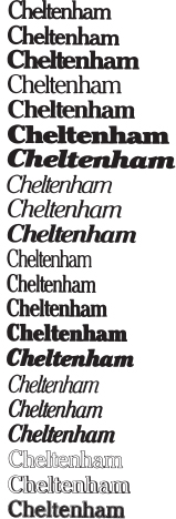
The Cheltenham family
One of the most extensive type families is the Cheltenham series of typefaces (Fig. 2-48). The first version, Cheltenham Old Style, was initially designed around the turn of the century by architect Bertram G. Goodhue in collaboration with Ingalls Kimball of the Cheltenham Press in New York City. When this typeface went into commercial production at the American Type Founders Company, designer Morris F. Benton supervised its development. Benton designed about eighteen additional typefaces for the Cheltenham family. Variations developed by other typefounders and manufacturers of typesetting equipment expanded this family to more than thirty styles. The design properties linking the Cheltenham family are short, stubby slab serifs with rounded brackets, tall ascenders and long descenders, and a moderate weight differential between thick and thin strokes.
2-46 Elaborations of Helvetica Medium.
![]()
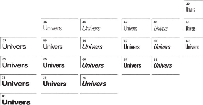
A full range of typographic expression and visual contrast becomes possible when all the major characteristics—weight, proportion, and angle—are orchestrated into a unified family. An exceptional example is the Univers family (Fig. 2-49). This family of twenty-one typestyles was designed by Adrian Frutiger. Instead of the usual terminology, Frutiger used numerals to designate the typefaces. Univers 55 is the “parent” face; its stroke weight and proportions are the norm from which all the other designs were developed. The black to white relationships and proportions of Univers 55 are ideal for text settings. Careful study of Figure 2-49 reveals that the first digit in each font's number indicates the stroke weight, 3 being the lightest and 8 the heaviest. The second digit indicates expansion and contraction of the spaces within and between the letters, which results in expanded and condensed styles. Roman fonts are designated with an odd number, and oblique fonts are designated with an even number.
In the design of Univers, Frutiger sparked a trend in type design toward a larger x-height. The lowercase letters are larger relative to ascenders, descenders, and capitals; the size and weight of capitals are closer to the size and weight of lowercase letters. This creates increased harmony on the page of text. Because the twenty-one members of the Univers family share the same x-height, capital height, and ascender and descender length and are produced as a system, they can be intermixed and used together without limitation. This gives extraordinary design flexibility to the designer (Fig. 2-50).
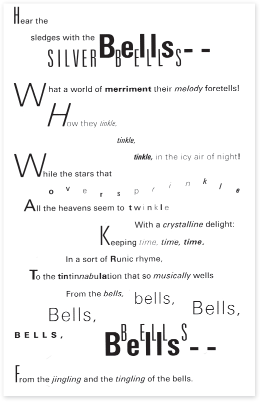
2-50 Typographic interpretation of “The Bells,” by Edgar Allan Poe, using the Univers family. (Designer: Philip Meggs)