4
The Typographic Grid
A grid is a skeletal framework used by designers to organize information within a spatial field. It is a system characterized by the dualities of freedom and constraint, simplicity and complexity. It provides a strategy for composing text and other visual information in two- and three-dimensional space, including those of printed materials, film, computer screens, built environments, and typographic installations. Grid systems aid designers in making information clear and optimally accessible—highly desirable traits in a world increasingly inundated by visual noise. When used effectively, typographic grids provide form and space with proportional harmony and aesthetic beauty. The final result is clearer and more accessible communication.
BACKGROUND
The grid as we know it today is rooted in the earliest written forms, from columnar cuneiform tablets impressed by the Mesopotamians as early as 3000 BCE, to hieroglyphic writing on papyrus (see Figs. 1-5 and 1-8).
The mechanization of printing in Europe during the fifteenth century led to structural conventions and typographic principles that have survived for centuries. The architecture of movable type and the mechanics of letterpress printing yielded rectilinear structures—text set into blocks framed by margins. Gutenberg's forty-two-line Bible was Europe's first typographic book; other similarly structured books were created during the Renaissance in Germany, France, and Italy (see Figs. 1-38, 1-49, and 1-59).
The development of the modern grid cannot be attributed to a single individual or to an accidental discovery. It is the result of many pioneering efforts, including experiments by renegade designers associated with the movements of Futurism, Dadaism, Constructivism, and de Stijl, breakthroughs initiated at the Bauhaus, and the functionalist works and writings of Jan Tschichold (Fig. 4-1). The grid finally emerged as a programmatic system of mathematical precision in Switzerland during the 1950s. Among others, designer Max Bill embraced absolute order in his work. During the last half of the twentieth century, the typographic grid achieved universal acceptance as a visual organizational tool.
Now, grids are ubiquitous carriers of information, to the degree that we are not consciously aware of them on a daily basis. Yet the grid, artifice of time and space, is woven deeply into our subconscious. Grids serve as the underlying structure for modeling and archiving human thought, interactions, and events.
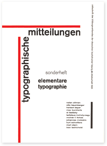
4-1 In 1925, Jan Tschichold designed this cover for the journal Typographische Mitteilungen. His twenty-four-page insert for this journal presented and advocated asymmetrical typography to its readers. This marked a movement toward a new language of typographic form and structure. (Designer: Jan Tschichold)
STRUCTURE AND SPACE
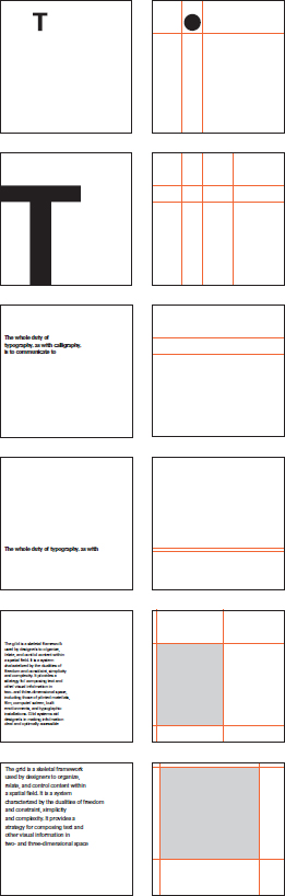
4-2 The shapes of typographic elements have directional qualities that are echoed as implied spatial corridors. These divisions establish proportional relationships and give the space movement and kinetic energy.

4-3 Letterforms gain velocity as they move toward the edges of space. Here, submitting to the force of gravity, the letter T appears to topple.
Space is the common denominator for all typographic communication. When typographic elements are introduced into space, they create subliminal divisions, and these divisions create spatial structure. As typographic elements shift syntactically in size, weight, and position, new structures emerge (Fig. 4-2).
Another way of thinking about type and its relationship to space is to imagine a letterform as a point in space, the extension of a point as a line in space (line of text), and the extension of a line as a plane in space (text block). This analogy suggests that typographic elements are kinetic in nature, that they are in perpetual motion.
Consider the single letterform. When centered, it appears motionless. When placed off center, it appears to move, gaining velocity as it approaches the outermost boundaries of the space. Rotate the letter and it appears to tumble. Lines of type are put into motion from the direction of their origin (usually left to right) at the moment they are read. They suggest horizontal movement, unless of course they are positioned vertically or at an angle in space. The kinetic possibilities of typographic elements are potentially endless (Fig. 4-3).
Firmly grounded by gravity, we are oriented to the earth in terms of the horizontal and the vertical. We perceive the natural world according to these opposites, and we create the built environment in relationship to them. We are more comfortable with the horizontal—in this realm we feel safe. The vertical dimension is more challenging—we are afraid both of flying and of falling.
PROPORTION
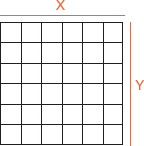
Divided space is perceived as a system of proportional relationships. To work effectively with the typographic grid is to understand that it also is a system of proportions. A grid ratio, which is a mathematical relationship between two or more grid measurements, governs the size and placement of typographic elements. The ratio X:2X (one unit to two units), for example, indicates the basic grid ratio. This stepped progression of X:2X establishes an underlying proportional system among the parts (Fig. 4-4).
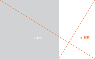
Designers most often rely upon an innate sense of proportion. But it is helpful also to consider models that have been handed down over centuries. The most familiar of these is the golden section, which is a law of proportionality found frequently in nature and the human body, and used throughout centuries in art, architecture, design, and music. First developed by Vitruvius, the golden section is basically a relationship or ratio between two numbers (or objects) wherein the ratio of the smaller number to the larger number is the same as the sum of both numbers. The algebraic expression of this relationship is a:b = b:(a+b). Stated numerically, the ratio is 1:1.618, and stated in percentages the ratio is 38 percent to 62 percent (Fig. 4-5). The golden section, which can easily be constructed from the square (Fig. 4-6), dominated as the proportional system for the design of medieval manuscripts (Fig. 4-7).
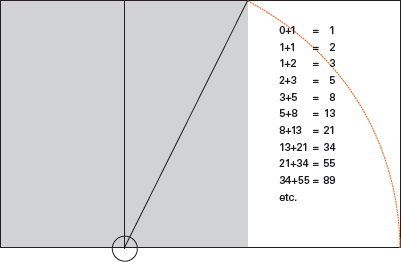
The Fibonacci sequence is another important proportional model. Closely related to the golden section, this is a mathematical sequence wherein a number is the sum of the two preceding numbers; in other words, you add the two current numbers to get the third number. The progressive series of mathematical relationships found in the Fibonacci sequence can be observed throughout nature, from seashells and pine cones to the arrangement of seeds on flowering plants (Fig. 4-8).
4-4 This exploratory composition exhibits modular relationships among elements. (Designer: Debra Thompson)
4-5 Removing the square from a golden rectangle leaves another golden rectangle.
4-6 The golden rectangle can be drawn by making a square, dividing it in half, and striking an arc from the half-point of one side of the square to the opposite corner of the square.
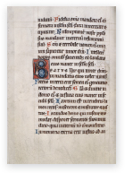
4-7 Medieval manuscript (psalterium) from the twelfth century. Shown is a page of text with three-line and one-line initials proportioned according to the golden ratio.
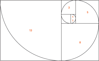
4-8 The golden spiral winds through a series of conjoined golden rectangles. The spiral is linked to many forms in nature and is related to the Fibonacci sequence.
THE SQUARE
A natural division of the golden section is the basic square. This archetypal form has influenced the development of the modern grid perhaps more than any other system of proportion. Squares in combination lend an infinite variety of visual patterns. In Japan, for example, the tatami mat, a straw floor covering based on double square modules, is a system for creating asymmetrical spaces in traditional Japanese homes (Fig. 4-9).
Paul Rand used squares as metaphorical building blocks and as an organizational strategy for a book cover. It appears as contemporary today as it was when it was created in 1955 (Fig. 4-10). The homepage for Martin Venezky's Appetite Engineers website utilizes squares for an animated marquee of type and image (Fig 4-11).
4-9 An example of a tatami mat layout illustrates the flexibility and proportional beauty of this modular system.
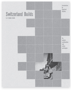
4-10 A book cover divided into a grid of eighty squares is used as an organizational system. Five squares forming the Swiss cross provide a window into Swiss architecture. (Designer: Paul Rand)
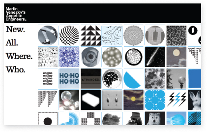
4-11 Located within assigned squares, animated shapes, words, and images entice users to explore the Appetite Engineers website. (Designer: Martin Venezky)
A square subdivided into a 256-unit grid of smaller squares displays an enormous range of proportional possibilities (Fig. 4-12). The language of the horizontal and the vertical was elevated to spiritual status by practitioners of the de Stijl movement. In his studied paintings, Piet Mondrian sought to reveal proportions of perfect harmony, proportions that could also be infused into the designs of everyday living (see Fig. 1-132).
4-12 Selectively removing lines from the grid to discover new spatial divisions is a process that trains the eye for proportional possibilities. The golden rectangle is revealed in the example with the diagonal orange line.
SINGLE COLUMN GRIDS
4-13 In this classic example, both text and page size share golden mean proportions.
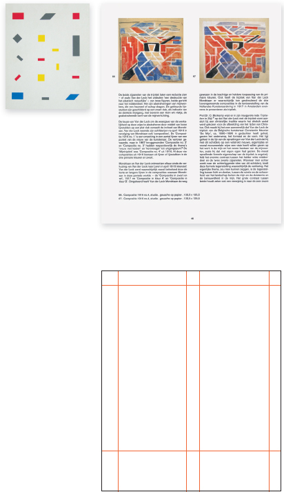
When text appears as a simple, linear narrative, as in the traditional novel or exhibition panel, it is often best to set it as a single block. There exist many ways to orient single text blocks to pages (or other spatial fields). These choices are most often related to budget constraints, standard paper sizes, and the function of typographic information. Some designers still find it rewarding to revisit the golden section from time to time (Fig. 4-13). But more often than not, alternative approaches to proportions are developed. The designer's own intuitive sense of proportion is nurtured through observation and practice.
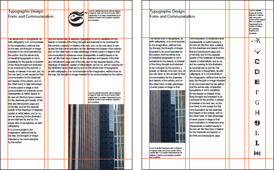
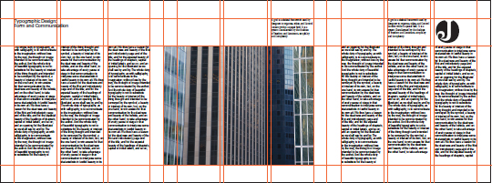
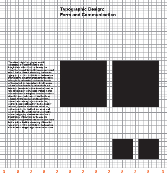
The problem is always to consider the text block and the margins of the page as a proportional system. Margins function to set the typographic stage; they may be dynamically asymmetrical or quietly symmetrical. Margins also accommodate marginalia, separate typographic parts that support the text. These include folios, running heads, running feet, and notes. The negative space of margins flows gently into the text, a mingling of positive and negative space (see “Column and margin,” pp. 92 – 95). The text block can be sized and adjusted within the page to attain a variety of proportional relationships (Fig. 4-14).
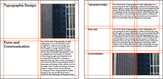
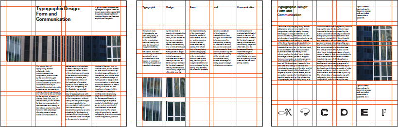
4-14 The manner in which text blocks are placed on the page can greatly affect the overall tone of the communication. These sample layouts suggest an abundance of possibilities. Note the different ways in which text blocks, images, and marginalia are organized to define the space.
Single-column grids may appear quite unremarkable to the average reader, but in reality effective layouts are crafted with the utmost concern for minute detail. Choosing the right typeface for the content; adjusting letter-, word-, and linespacing for optimum legibility; and developing the proportions to set an appropriate tone are some of the issues that require the designer's attention (Figs. 4-15 to 4-17).
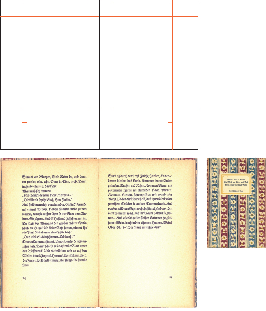
4-15 Cover and spread from a small book published in 1957 by the German publisher Insel Verlag. The lively texture of Fraktur type contrasts with the quiet of generous margins.
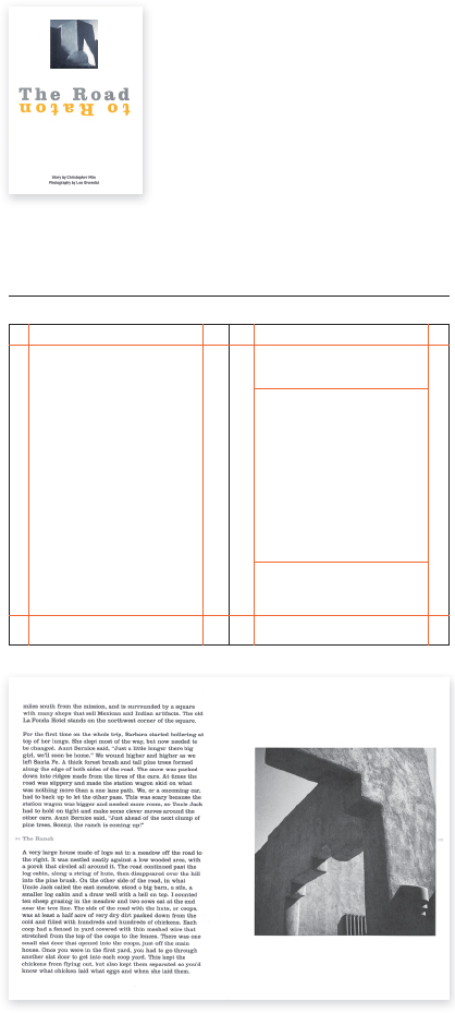
4-16 An exhibition catalog combines the photography of Leo Divendal and a childhood story by dancer and actor Christopher Milo. The text, set within narrow margins, reflects the expanse of the New Mexico landscape where the photographs and story originate. (Designer: Rob Carter)
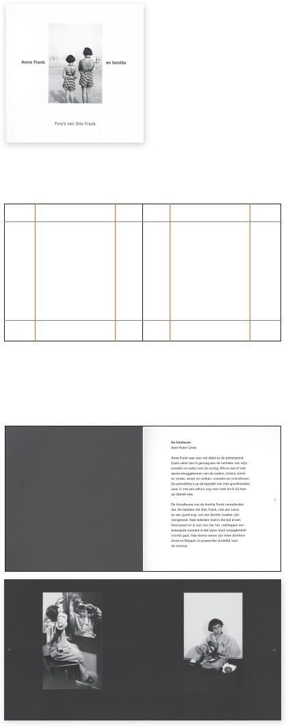
4-17 Set within comfortable margins, the text of this intimate book is a thoughtful reflection on the selection of photographs for a book and exhibition on the photographs of Otto Frank. The book respectfully displays the photographs, which are positioned alone on the page. (Designer: Victor Levie)
MULTICOLUMN GRIDS
An elemental grid is based upon a Cartesian coordinate system of intersecting, perpendicular axes (Fig. 4-18). It consists of rectangular modules defined by a network of horizontal and vertical lines.
Before any decision can be made about the construction of the typographic grid, the designer must first become thoroughly acquainted with the amount of text, its content, the audience for which it is intended, and the medium used for its delivery. A book, an exhibition, a website—each requires special consideration. Though the designer thoroughly grasps the material to be organized, grid structures often require adjustment throughout the design process.
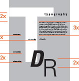
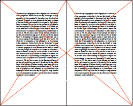
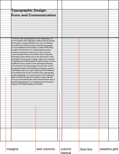
Multicolumn grids possess unique anatomical characteristics. These include margins that provide boundaries for typographic elements and define the active space of the page; text columns; gutters that separate text columns; and flow lines that create a dominant axis for the alignment of elements from page to page. The baseline grid represents the baselines of the primary text, which run from the top margin to the bottom margin. These horizontal divisions of space aid the designer in aligning text elements from column to column (Fig. 4-19).
To structure type is to organize typographic forms into a unified whole, and to establish visual pathways between them. Two columns or many columns can be employed depending upon the complexity of the content. Multilevel information, as found in most typographic communication today, can be translated into clear and accessible typographic layouts (Fig. 4-20).
The type area within a grid is composed of vertical columns. The width of text columns and the intervals between them should promote optimum legibility when required. The size of type should be measured on the column width to achieve the ideal number of characters per line.
4-18 Horizontal lines running along the x-axis and vertical lines running along the y-axis are the elements composing a basic grid.
4-19 The multicolumn grid is a structure with features specifically suited to the physical properties of typographic elements.
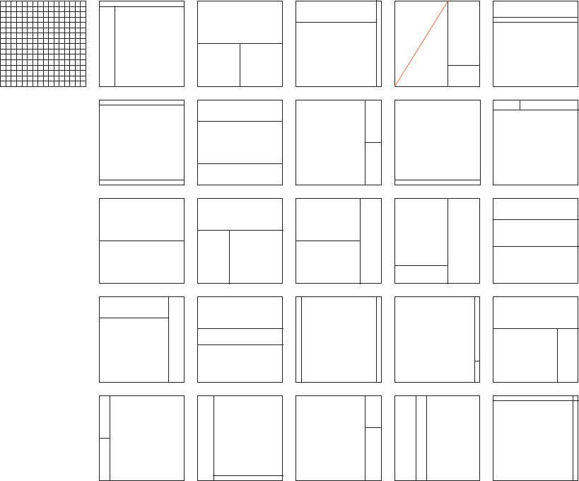
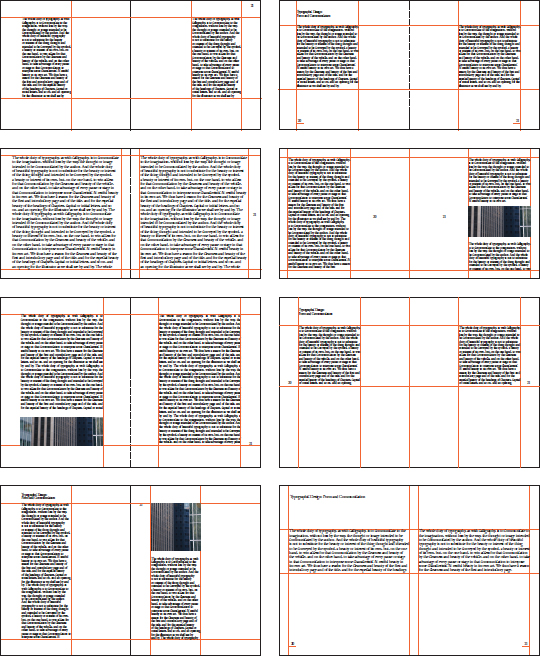
4-20 Sample multicolumn grids ranging from two to eight columns. As the number of columns increases, so too does the number of organizational possibilities. Note how the use of white space both separates and connects elements to achieve a clear and logical informational hierarchy, and how columns are adjusted in length to achieve a pleasing rag along the bottom of the pages.
When working with multicolumn grids, it is essential to balance three interdependent variables. These are type size, line length, and interline spacing (leading). An adjustment to any one of these aspects will most likely require an adjustment to the others. Changing the size of type, for example, will probably create a need to adjust the line length. Since the typographic space is divided horizontally into columns of varying widths, it is possible to control these variables while also creating a rhythmic visual field. (See “Type size, line length, and interline spacing,” pp. 54 and 55)
Rhythm is achieved by the repetition and contrast of columns and other visual elements. White space rhythmically separates elements and breathes energy into the typographic field.
In the normative sense, column intervals separating text columns are adjusted to enable the eye to flow logically from one column to the next without confusion about reading direction. However, exploring unconventional gutter intervals can lead to striking typographic rhythms and patterns.
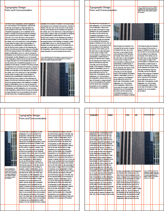
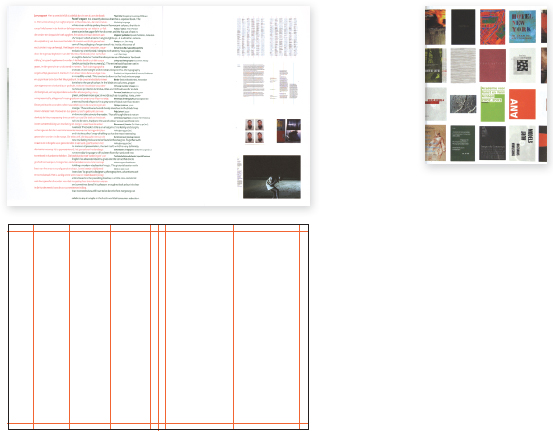
Grids may consist of primary and secondary divisions of space. For example, the grid used in this book consists of two columns as the dominant structure, with an optional structure of six columns (note the visible grid lines on this page). Concurrent grids not only provide added flexibility, they also enable the designer to layer typographic elements, achieving the illusion of three-dimensional space (Figs. 4-21 and 4-22).
Experimentation with multicolumn grids can yield visually surprising and functional results. Columns can be shifted horizontally and vertically, placed at opposing angles, or behave in ways extending typographic tradition. However, such effects should only be used when they contribute to the interpretation of the text (Figs. 4-23 to 4-26).
4-21 Concurrent grids and multicolumn grids with irregular column intervals can be used to accommodate information needing special treatment. Specific types of information can inhabit assigned columnar zones to preserve their autonomy. In the example shown, the far right column is reserved for the display of alphabetic characters.
4-22 Multicolumn grids can be applied to many different situations, as in this format consisting of three panels, each divided into three columns.
4-23 Strict adherence to a two-column grid proves an orderly environment for the presentation of text and paintings by artist and designer Bart van der Leck. (Designer: Wigger Bierma)
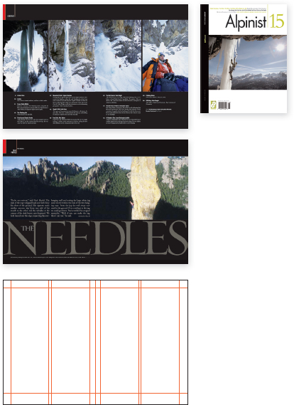
4-24 The purity and serenity of climbing is reflected in this elegant and restrained design. The magazine layout consists of three columns that facilitate a balanced integration of text and spectacular photographs. (Editor/creative director: Christian Beckwith; designer: Sam Serebin)
4-25 In a book entitled The Best Dutch Book Designs, text columns shift laterally to achieve a woven texture. The columns are assigned texts in both Dutch and English. (Designer: Typography, Interiority, & Other Serious Matters)
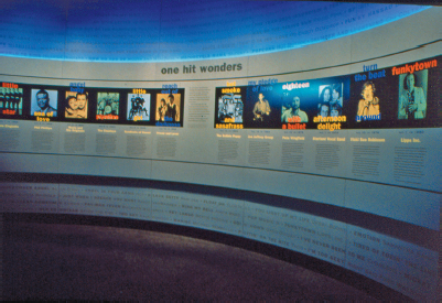
4-26 For the One Hit Wonders exhibit in the Rock and Roll Hall of Fame and Museum in Cleveland, Ohio, multiple columns featuring song titles, artist's names, and descriptive text arch dramatically along a curved wall to achieve both visual resonance and maximum interpretive clarity. (Project directors: Bruce Burdick and Susan Burdick; Graphics director: Stuart McKee, The Burdick Group)
MODULAR GRIDS
When is the adoption of a modular grid more desirable than the standard columnar grid? Though these two methods for organizing information are cousins, the modular grid offers opportunities to present more complex information with a high degree of accuracy and clarity.
Modules are formed by the intersections of horizontal and vertical lines. These units provide zones for the placement of different parts of information. The goal is to create a distinct hierarchy between units of information. This is achieved by understanding the different levels of information and representing them as contrasting elements.
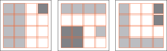
At first, the modular grid appears mathematical, repetitive, and unimaginative. But it is important to think of the grid as a system for organizing information and not as a physical, impenetrable fortress. Grid systems are flexible, and they evolve as the designer works to understand and represent information. Figure 4-27 displays a modular grid system consisting of thirty-six square modules. This example shows modules of equal size, but grid systems can be developed with modules consisting of any number of proportions. The beauty of the system is that modules can be combined into varied sizes and shapes to serve as zones for content elements.
As a general rule, the more complex the grid structure, the more flexible the organizational possibilities. The process of organizing material within a grid structure is a balancing act between variety and unity. Too much variety deprives design of hierarchical clarity, and too much unity can become monotonous for the reader.
4-27 A thirty-six-module grid extracted from 4,096 individual square units represents but one of an enormous range of grid constructions. In this example, the smaller vertical divisions function as a baseline grid. The complexity of this system offers a wide range of compositional choices. However, the goal remains to organize a collection of elements into a cohesive whole.
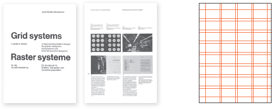
4-28 The cover, an interior page, and the grid of Josef Müller-Brockmann's classic book, Grid Systems. (Designer: Josef Müller-Brockmann)
An excellent model for illustrating the modular grid is the work of Josef Müller-Brockmann, a major contributor to its wide acceptance (Fig. 4-28). A leader in the development of the International Typographic Style during the 1950s and 1960s, Müller-Brockmann sought pure objectivity in typography and graphic expression.
His work, including posters that remain as fresh today as they were when first designed, attest to the power and visual impact of his work. This rational philosophy, which he shared with other pioneers of the movement, was assimilated throughout Europe and the United States. In his 1981 book, Grid Systems, Müller-Brockmann states, “The use of the grid as an ordering system is the expression of a certain mental attitude inasmuch as it shows that the designer conceives his work in terms that are constructive and oriented to the future.”
4-29 Progressing from simple to complex, these grids systematically illustrated a diverse number of modular configurations.
4-30 Spatial interaction and compositional balance are achieved when modules define void spaces that are integral to the geometry of the page.
Grids allow for the distribution of typographic elements into a clearly intelligible order. Within the internal structure created, headlines, text, captions, images, and other parts of the message are integrated. The areas occupied, which correspond to specific modules or groups of modules, are referred to as spatial zones. After identifying all the parts of a message, the designer assigns them to specific zones. The result is a logical hierarchy of parts, and information that is more accessible to readers (Fig. 4-29).
In the tradition of modern design, the spatial zones within a typographic grid are not violated. The designer works within the grid framework to objectively present information, while utilizing the principles of ABA form to establish relationships between the parts and to imbue the composition with rhythmic and textural variety (see “ABA form,” pp. 106 – 110). But rules can be broken and risks are possible; skilled designers are capable of violating the grid to optimize clarity and maximize visual effect.
A successful grid is a performance, a concerto of typographical instruments working independently yet together. In the end, individual images and sounds work toward a common goal. What is perceived as the whole is greater than the virtuoso of any individual part (Fig. 4-30).
The following examples reveal variations on the modular typographic grid used inventively across various media. In a highly complex information environment, it is necessary to provide audiences with articulate structures that also resonate visually. This is as true for books as for websites and other delivery venues (Figs. 4-31 to 4-36).
4-31 The book American Graphic Design Timelines features a highly flexible grid that makes it possible for readers to compare and contrast timelines of several related themes, including major events in world and U.S. history, cultural events, and American graphic designers, companies, organizations, and publications.
Timelines in all sections are organized in a nine-column grid, with each column corresponding to a decade in the twentieth century. As readers turn the pages, this time-oriented structure remains constant from section to section, making it possible for information to be studied in context.
Depending upon need, readers may take any of several pathways through the book. It may be read traditionally as a linear narrative from section to section, or it may be used as a reference book where readers make specific connections by comparing the information found on the timelines. (Designer: Keith Jones)
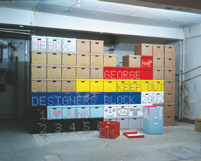
4-32 The MeBox is a customizable cardboard box storage system. The ends of each box have a grid of perforated disks that can be punched out as needed to make initials, numbers, symbols, and text. The boxes can be arranged in rows to create longer messages. (Designer: Graphic Thought Facility, London)

4-33 Visual unity among the many components of the Grasslands outdoor exhibition is established through a modular system of squares. By combining the smallest square unit into larger groups of rectilinear units, images and type are presented in many different sizes for visually dynamic displays. (Exhibition designers: Michael Mercadante and David Whitemyer; graphic designer: Polly Baldwin)
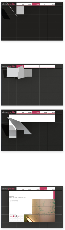
4-34 The website for Demographik—a design agency based in Florida that develops media solutions—is based on an animated system of square modules. While navigating the site, “tiles” appear to lift from the surface of the screen, casting shadows, and dynamically spinning into new locations where transformed spaces reveal information about the company. (Designer: Juan Benedit)
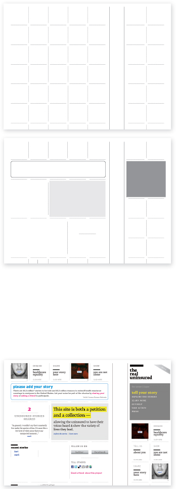
4-35 theRealUninsured.org is an online petition and community advocating for universal healthcare in the United States. A strict modular grid forms a visual framework that fills with the stories contributed by site members. The more participation the site garners, the fuller the interface appears. (Designer: Mark Sanders)
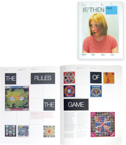
4-36 IF/THEN is a book utilizing concurrent grid structures that provide visual variety while also preserving unity among pages. (Designer: Mevis & Van Deursen)
IMPROVISATIONAL STRUCTURES
4-37 The improvisational structure inherent in this poster is built upon dynamic relationships between horizontal, vertical, and diagonal axes. (Designer: David Colley)
Improvisational structures evolve in response to the specific elements of information, as opposed to modular grids, which are predetermined organizational devices. A complete grasp of the visual material in question enables designers to understand the relationships between parts and to create visual hierarchies among them. In the metaphorical sense, typographic designers are information architects—they “build” typographic environments for clear and accessible information.
Typographical materials are the building blocks of improvisational structures. Once it is known which elements are dominant, subdominant, and subordinate, they are translated into typographic forms reflecting their hierarchical status. These forms, consisting of different sizes and shapes, are then introduced into the spatial field and intuitively arranged until a rational and aesthetic solution is found. For a poster announcing a lecture series, designer David Colley has organized the information into five distinct zones: title, speakers, venues, sponsor, and tertiary information. The improvised structure not only communicates clearly through legible typography and the effective organization of contrasting parts, it also provides a dynamic viewing experience based on the language of asymmetrical composition (Fig. 4-37).
This flexible construction process involves inserting typographic forms in space to establish form and content relationships, substituting these forms with revised forms as necessary, and omitting forms that are inconsequential.
Working with improvisational structures calls for a firm understanding of asymmetrical composition, the dynamics of positive and negative space, and the essential role of visual contrast among typographic elements.